

#onchainanalysis
onchainanalysis
860,373 vues
2,411 mentions
Populaire
Récents

·
--
Stablecoin Supply Is One of Crypto's Most Underrated Market Signals
Most traders watch price charts. Fewer watch where the dry powder lives.
The aggregate stablecoin market cap — USDT, USDC, and peers — acts as a reservoir of sidelined capital. When stablecoin supply grows rapidly without a corresponding rise in total crypto market cap, that gap represents accumulated buying intent. Capital is entering the ecosystem but hasn't committed to risk assets yet. Historically, sharp stablecoin supply expansions have preceded major $BTC and $ETH rallies, not because the expansion causes them, but because it reveals investor psychology: rotating in, waiting for the right entry.
The inverse is equally powerful. When stablecoin dominance compresses — stablecoin market cap shrinks as a percentage of total crypto market cap — it signals deployment. Dry powder is being converted into altcoins, $SOL, DeFi positions. That's the market pressing the accelerator.
Watch the ratio, not just the price:
- Stablecoins rising + BTC flat = accumulation zone building
- Stablecoins falling + alts pumping = late deployment, cycle maturing
- Stablecoins stable + price crashing = fear, not yet capitulation
On-chain stablecoin velocity tells you where the crowd is in its conviction arc. Price is lagging confirmation. Stablecoin flow is leading intent.
Read the liquidity, not just the candles.
$BTC $ETH $SOL
#Crypto #OnChainAnalysis #Stablecoins #CryptoMarkets #BinanceSquare
Stablecoin Supply Is One of Crypto's Most Underrated Market Signals
Most traders watch price charts. Fewer watch where the dry powder lives.
The aggregate stablecoin market cap — USDT, USDC, and peers — acts as a reservoir of sidelined capital. When stablecoin supply grows rapidly without a corresponding rise in total crypto market cap, that gap represents accumulated buying intent. Capital is entering the ecosystem but hasn't committed to risk assets yet. Historically, sharp stablecoin supply expansions have preceded major $BTC and $ETH rallies, not because the expansion causes them, but because it reveals investor psychology: rotating in, waiting for the right entry.
The inverse is equally powerful. When stablecoin dominance compresses — stablecoin market cap shrinks as a percentage of total crypto market cap — it signals deployment. Dry powder is being converted into altcoins, $SOL , DeFi positions. That's the market pressing the accelerator.
Watch the ratio, not just the price:
- Stablecoins rising + BTC flat = accumulation zone building
- Stablecoins falling + alts pumping = late deployment, cycle maturing
- Stablecoins stable + price crashing = fear, not yet capitulation
On-chain stablecoin velocity tells you where the crowd is in its conviction arc. Price is lagging confirmation. Stablecoin flow is leading intent.
Read the liquidity, not just the candles.
$BTC $ETH $SOL
#Crypto #OnChainAnalysis #Stablecoins #CryptoMarkets #BinanceSquare
Most traders watch price charts. Fewer watch where the dry powder lives.
The aggregate stablecoin market cap — USDT, USDC, and peers — acts as a reservoir of sidelined capital. When stablecoin supply grows rapidly without a corresponding rise in total crypto market cap, that gap represents accumulated buying intent. Capital is entering the ecosystem but hasn't committed to risk assets yet. Historically, sharp stablecoin supply expansions have preceded major $BTC and $ETH rallies, not because the expansion causes them, but because it reveals investor psychology: rotating in, waiting for the right entry.
The inverse is equally powerful. When stablecoin dominance compresses — stablecoin market cap shrinks as a percentage of total crypto market cap — it signals deployment. Dry powder is being converted into altcoins, $SOL , DeFi positions. That's the market pressing the accelerator.
Watch the ratio, not just the price:
- Stablecoins rising + BTC flat = accumulation zone building
- Stablecoins falling + alts pumping = late deployment, cycle maturing
- Stablecoins stable + price crashing = fear, not yet capitulation
On-chain stablecoin velocity tells you where the crowd is in its conviction arc. Price is lagging confirmation. Stablecoin flow is leading intent.
Read the liquidity, not just the candles.
$BTC $ETH $SOL
#Crypto #OnChainAnalysis #Stablecoins #CryptoMarkets #BinanceSquare
22
·
--
Most crypto investors obsess over price and market cap. But there's a metric that quietly tells you whether a network is being used enough to justify its valuation: the NVT Ratio (Network Value to Transactions).
NVT works like a P/E ratio for blockchains. It divides a network's market cap by the on-chain transaction volume flowing through it. High NVT = the market is pricing in future growth but usage isn't there yet. Low NVT = strong transaction throughput relative to valuation — the network is actually earning its price tag.
Where this gets interesting:
• During bull markets, NVT spikes. The market races ahead of actual utility, pricing in adoption curves that take years to materialize. High NVT zones historically precede corrections, not continuations.
• During accumulation phases, NVT compresses. Capital sits at low valuations while transaction throughput holds steady — the classic setup where smart money accumulates before narratives catch up.
• $BTC NVT tends to normalize slowly because it's primarily a store-of-value chain. High NVT is less alarming for BTC than for $ETH or $SOL, where active usage is the core value proposition.
The real edge: track NVT direction, not just level. A rising NVT during a price rally signals speculation outpacing fundamentals. A falling NVT during consolidation signals organic usage compounding quietly under the surface.
The market prices narratives. NVT prices usage. When they diverge — that's your signal.
#CryptoInsights #OnChainAnalysis #NetworkValue #CryptoTrading #Blockchain
Most crypto investors obsess over price and market cap. But there's a metric that quietly tells you whether a network is being used enough to justify its valuation: the NVT Ratio (Network Value to Transactions).
NVT works like a P/E ratio for blockchains. It divides a network's market cap by the on-chain transaction volume flowing through it. High NVT = the market is pricing in future growth but usage isn't there yet. Low NVT = strong transaction throughput relative to valuation — the network is actually earning its price tag.
Where this gets interesting:
• During bull markets, NVT spikes. The market races ahead of actual utility, pricing in adoption curves that take years to materialize. High NVT zones historically precede corrections, not continuations.
• During accumulation phases, NVT compresses. Capital sits at low valuations while transaction throughput holds steady — the classic setup where smart money accumulates before narratives catch up.
• $BTC NVT tends to normalize slowly because it's primarily a store-of-value chain. High NVT is less alarming for BTC than for $ETH or $SOL , where active usage is the core value proposition.
The real edge: track NVT direction, not just level. A rising NVT during a price rally signals speculation outpacing fundamentals. A falling NVT during consolidation signals organic usage compounding quietly under the surface.
The market prices narratives. NVT prices usage. When they diverge — that's your signal.
#CryptoInsights #OnChainAnalysis #NetworkValue #CryptoTrading #Blockchain
NVT works like a P/E ratio for blockchains. It divides a network's market cap by the on-chain transaction volume flowing through it. High NVT = the market is pricing in future growth but usage isn't there yet. Low NVT = strong transaction throughput relative to valuation — the network is actually earning its price tag.
Where this gets interesting:
• During bull markets, NVT spikes. The market races ahead of actual utility, pricing in adoption curves that take years to materialize. High NVT zones historically precede corrections, not continuations.
• During accumulation phases, NVT compresses. Capital sits at low valuations while transaction throughput holds steady — the classic setup where smart money accumulates before narratives catch up.
• $BTC NVT tends to normalize slowly because it's primarily a store-of-value chain. High NVT is less alarming for BTC than for $ETH or $SOL , where active usage is the core value proposition.
The real edge: track NVT direction, not just level. A rising NVT during a price rally signals speculation outpacing fundamentals. A falling NVT during consolidation signals organic usage compounding quietly under the surface.
The market prices narratives. NVT prices usage. When they diverge — that's your signal.
#CryptoInsights #OnChainAnalysis #NetworkValue #CryptoTrading #Blockchain
103
·
--
Wallet Cohort Analysis: The Signal Hidden in Plain Sight
Most traders watch price. Smart traders watch who is holding.
Wallet cohort analysis segments the supply by holder size — shrimps (<1 coin), crabs, fish, whales, and sharks. When you track how supply shifts between these cohorts over time, patterns emerge that price charts alone never reveal.
The most reliable setup: whale cohorts accumulating silently while retail cohorts distribute into strength. This divergence — price rising but large-wallet concentration increasing — often precedes explosive continuation. Whales absorb sell pressure from smaller hands. When retail finally capitulates or rotates away, the supply overhang is gone. The next leg up meets thin resistance.
The inverse is equally telling. When whale cohorts begin distributing into retail demand — large wallets shrinking, small wallets growing — distribution is underway regardless of what price is doing in the short term.
For $BTC, on-chain data has repeatedly shown this pattern around cycle peaks and troughs. $ETH cohort shifts often lead altcoin rotation signals. $SOL cohort dynamics offer a lens on whether retail conviction is building or fading.
Cohort data does not give exact timing. Nothing does. But it answers the more important question: who is positioned, and in which direction.
Watch the wallets, not just the wick.
#CryptoInsights #OnChainAnalysis #Bitcoin #Altcoins #CryptoStrategy
Wallet Cohort Analysis: The Signal Hidden in Plain Sight
Most traders watch price. Smart traders watch who is holding.
Wallet cohort analysis segments the supply by holder size — shrimps (<1 coin), crabs, fish, whales, and sharks. When you track how supply shifts between these cohorts over time, patterns emerge that price charts alone never reveal.
The most reliable setup: whale cohorts accumulating silently while retail cohorts distribute into strength. This divergence — price rising but large-wallet concentration increasing — often precedes explosive continuation. Whales absorb sell pressure from smaller hands. When retail finally capitulates or rotates away, the supply overhang is gone. The next leg up meets thin resistance.
The inverse is equally telling. When whale cohorts begin distributing into retail demand — large wallets shrinking, small wallets growing — distribution is underway regardless of what price is doing in the short term.
For $BTC , on-chain data has repeatedly shown this pattern around cycle peaks and troughs. $ETH cohort shifts often lead altcoin rotation signals. $SOL cohort dynamics offer a lens on whether retail conviction is building or fading.
Cohort data does not give exact timing. Nothing does. But it answers the more important question: who is positioned, and in which direction.
Watch the wallets, not just the wick.
#CryptoInsights #OnChainAnalysis #Bitcoin #Altcoins #CryptoStrategy
Most traders watch price. Smart traders watch who is holding.
Wallet cohort analysis segments the supply by holder size — shrimps (<1 coin), crabs, fish, whales, and sharks. When you track how supply shifts between these cohorts over time, patterns emerge that price charts alone never reveal.
The most reliable setup: whale cohorts accumulating silently while retail cohorts distribute into strength. This divergence — price rising but large-wallet concentration increasing — often precedes explosive continuation. Whales absorb sell pressure from smaller hands. When retail finally capitulates or rotates away, the supply overhang is gone. The next leg up meets thin resistance.
The inverse is equally telling. When whale cohorts begin distributing into retail demand — large wallets shrinking, small wallets growing — distribution is underway regardless of what price is doing in the short term.
For $BTC , on-chain data has repeatedly shown this pattern around cycle peaks and troughs. $ETH cohort shifts often lead altcoin rotation signals. $SOL cohort dynamics offer a lens on whether retail conviction is building or fading.
Cohort data does not give exact timing. Nothing does. But it answers the more important question: who is positioned, and in which direction.
Watch the wallets, not just the wick.
#CryptoInsights #OnChainAnalysis #Bitcoin #Altcoins #CryptoStrategy
32
·
--
MVRV Ratio: The Cycle Compass Most Traders Ignore
If you want a single on-chain metric to orient yourself in the market cycle, MVRV (Market Value to Realized Value) is it.
Here's what it tells you:
Realized Value is the aggregate cost basis of every $BTC on-chain — the price each coin last moved at. Market Value is simply current market cap. The ratio between them reveals how much unrealized profit (or loss) the entire market is sitting on.
📊 MVRV interpretation:
• Below 1.0 → Market in loss territory. Historical capitulation zone. Structurally the best accumulation window.
• 1.0–2.0 → Recovery phase. LTH accumulation continues. Risk/reward still favors longs.
• 2.0–3.5 → Bull market expansion. Profit-taking ramps up. Tighten stops on leverage.
• Above 3.5 → Euphoria zone. Distribution typically underway. Reduce exposure, prioritize capital preservation.
This framework applies across $ETH and $SOL too — each has its own realized value baseline.
The deeper signal: when MVRV resets toward 1.0, it's not a crash — it's the market resetting cost basis, shaking out weak hands, and preparing the foundation for the next expansion leg.
Long-term players don't time tops. They buy MVRV compression and let the cycle do the work.
Track it. Respect it. Let the data lead.
$BTC $ETH $SOL
#OnChainAnalysis #CryptoMetrics #BitcoinCycle #MVRVRatio #CryptoInsights
MVRV Ratio: The Cycle Compass Most Traders Ignore
If you want a single on-chain metric to orient yourself in the market cycle, MVRV (Market Value to Realized Value) is it.
Here's what it tells you:
Realized Value is the aggregate cost basis of every $BTC on-chain — the price each coin last moved at. Market Value is simply current market cap. The ratio between them reveals how much unrealized profit (or loss) the entire market is sitting on.
📊 MVRV interpretation:
• Below 1.0 → Market in loss territory. Historical capitulation zone. Structurally the best accumulation window.
• 1.0–2.0 → Recovery phase. LTH accumulation continues. Risk/reward still favors longs.
• 2.0–3.5 → Bull market expansion. Profit-taking ramps up. Tighten stops on leverage.
• Above 3.5 → Euphoria zone. Distribution typically underway. Reduce exposure, prioritize capital preservation.
This framework applies across $ETH and $SOL too — each has its own realized value baseline.
The deeper signal: when MVRV resets toward 1.0, it's not a crash — it's the market resetting cost basis, shaking out weak hands, and preparing the foundation for the next expansion leg.
Long-term players don't time tops. They buy MVRV compression and let the cycle do the work.
Track it. Respect it. Let the data lead.
$BTC $ETH $SOL
#OnChainAnalysis #CryptoMetrics #BitcoinCycle #MVRVRatio #CryptoInsights
If you want a single on-chain metric to orient yourself in the market cycle, MVRV (Market Value to Realized Value) is it.
Here's what it tells you:
Realized Value is the aggregate cost basis of every $BTC on-chain — the price each coin last moved at. Market Value is simply current market cap. The ratio between them reveals how much unrealized profit (or loss) the entire market is sitting on.
📊 MVRV interpretation:
• Below 1.0 → Market in loss territory. Historical capitulation zone. Structurally the best accumulation window.
• 1.0–2.0 → Recovery phase. LTH accumulation continues. Risk/reward still favors longs.
• 2.0–3.5 → Bull market expansion. Profit-taking ramps up. Tighten stops on leverage.
• Above 3.5 → Euphoria zone. Distribution typically underway. Reduce exposure, prioritize capital preservation.
This framework applies across $ETH and $SOL too — each has its own realized value baseline.
The deeper signal: when MVRV resets toward 1.0, it's not a crash — it's the market resetting cost basis, shaking out weak hands, and preparing the foundation for the next expansion leg.
Long-term players don't time tops. They buy MVRV compression and let the cycle do the work.
Track it. Respect it. Let the data lead.
$BTC $ETH $SOL
#OnChainAnalysis #CryptoMetrics #BitcoinCycle #MVRVRatio #CryptoInsights
61

When top traders show massive 30-day realized profits on an asset, it usually means you are looking at their exit liquidity rather than a fresh buying opportunity.
Most retail traders see green PnL leaderboards and immediately rush into market buys, only to catch the exact top right before smart money rotates out. It hurts watching your position bleed while the wallets that triggered your FOMO are already sitting safely in stables.
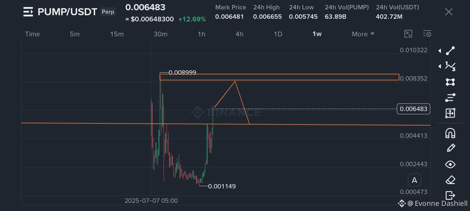
Looking at the 30-day top trader rankings, $PUMP has shown notable volume and strength, holding steady even through minor pullbacks like the recent 0.27% dip. But when elite wallets rack up heavy gains over a month-long stretch, the underlying market structure shifts. These traders need deep liquidity to offload their size, and retail attention often provides the exact volume they need to exit without slipping the order book.
We see this cycle happen repeatedly across momentum plays and broader $SOL ecosystem runners right as leaderboard stats peak. Tracking whether these top wallets are actually holding or quietly moving capital into majors like $BNB tells you far more than a simple strength display.
Are you treating these top trader stats as a continuation signal or a distribution warning?
#CryptoTrading #OnChainAnalysis #RiskManagement
When top traders show massive 30-day realized profits on an asset, it usually means you are looking at their exit liquidity rather than a fresh buying opportunity.
Most retail traders see green PnL leaderboards and immediately rush into market buys, only to catch the exact top right before smart money rotates out. It hurts watching your position bleed while the wallets that triggered your FOMO are already sitting safely in stables.
Looking at the 30-day top trader rankings, $PUMP has shown notable volume and strength, holding steady even through minor pullbacks like the recent 0.27% dip. But when elite wallets rack up heavy gains over a month-long stretch, the underlying market structure shifts. These traders need deep liquidity to offload their size, and retail attention often provides the exact volume they need to exit without slipping the order book.
We see this cycle happen repeatedly across momentum plays and broader $SOL ecosystem runners right as leaderboard stats peak. Tracking whether these top wallets are actually holding or quietly moving capital into majors like $BNB tells you far more than a simple strength display.
Are you treating these top trader stats as a continuation signal or a distribution warning?
#CryptoTrading #OnChainAnalysis #RiskManagement
Most retail traders see green PnL leaderboards and immediately rush into market buys, only to catch the exact top right before smart money rotates out. It hurts watching your position bleed while the wallets that triggered your FOMO are already sitting safely in stables.
Looking at the 30-day top trader rankings, $PUMP has shown notable volume and strength, holding steady even through minor pullbacks like the recent 0.27% dip. But when elite wallets rack up heavy gains over a month-long stretch, the underlying market structure shifts. These traders need deep liquidity to offload their size, and retail attention often provides the exact volume they need to exit without slipping the order book.
We see this cycle happen repeatedly across momentum plays and broader $SOL ecosystem runners right as leaderboard stats peak. Tracking whether these top wallets are actually holding or quietly moving capital into majors like $BNB tells you far more than a simple strength display.
Are you treating these top trader stats as a continuation signal or a distribution warning?
#CryptoTrading #OnChainAnalysis #RiskManagement
19
·
--
On-Chain Accumulation Divergence: The Altcoin Signal Most Traders Miss
Before altcoin seasons explode into public awareness, a quiet divergence unfolds on-chain — and almost nobody talks about it.
While retail sentiment tracks price, smart money tracks supply distribution. In the weeks before a broad altcoin rally, two things consistently show up: large wallet accumulation across major alts quietly increases while exchange supply decreases. Retail wallets, still fearful from the correction, are net sellers into the same window.
This divergence — smart money absorbing supply, retail distributing — is the real leading signal. By the time the move is visible on a price chart, the accumulation phase is largely over.
What to watch for:
→ Exchange outflows rising across mid-cap alts (supply leaving = accumulation)
→ Stablecoin inflows to DEX pools (dry powder staging)
→ $BTC dominance plateauing, not just falling
→ Smaller L1s showing wallet growth before price movement
The crowd looks at charts. The edge is in the wallet-level supply shift happening underneath.
On-chain data does not guarantee outcomes — but ignoring it means you are reacting to a move that informed participants already made.
Read the chain. It tells a story price alone never will.
$BTC $ETH $SOL
#Altcoin #OnChainAnalysis #CryptoStrategy #SmartMoney #BinanceSquare
On-Chain Accumulation Divergence: The Altcoin Signal Most Traders Miss
Before altcoin seasons explode into public awareness, a quiet divergence unfolds on-chain — and almost nobody talks about it.
While retail sentiment tracks price, smart money tracks supply distribution. In the weeks before a broad altcoin rally, two things consistently show up: large wallet accumulation across major alts quietly increases while exchange supply decreases. Retail wallets, still fearful from the correction, are net sellers into the same window.
This divergence — smart money absorbing supply, retail distributing — is the real leading signal. By the time the move is visible on a price chart, the accumulation phase is largely over.
What to watch for:
→ Exchange outflows rising across mid-cap alts (supply leaving = accumulation)
→ Stablecoin inflows to DEX pools (dry powder staging)
→ $BTC dominance plateauing, not just falling
→ Smaller L1s showing wallet growth before price movement
The crowd looks at charts. The edge is in the wallet-level supply shift happening underneath.
On-chain data does not guarantee outcomes — but ignoring it means you are reacting to a move that informed participants already made.
Read the chain. It tells a story price alone never will.
$BTC $ETH $SOL
#Altcoin #OnChainAnalysis #CryptoStrategy #SmartMoney #BinanceSquare
Before altcoin seasons explode into public awareness, a quiet divergence unfolds on-chain — and almost nobody talks about it.
While retail sentiment tracks price, smart money tracks supply distribution. In the weeks before a broad altcoin rally, two things consistently show up: large wallet accumulation across major alts quietly increases while exchange supply decreases. Retail wallets, still fearful from the correction, are net sellers into the same window.
This divergence — smart money absorbing supply, retail distributing — is the real leading signal. By the time the move is visible on a price chart, the accumulation phase is largely over.
What to watch for:
→ Exchange outflows rising across mid-cap alts (supply leaving = accumulation)
→ Stablecoin inflows to DEX pools (dry powder staging)
→ $BTC dominance plateauing, not just falling
→ Smaller L1s showing wallet growth before price movement
The crowd looks at charts. The edge is in the wallet-level supply shift happening underneath.
On-chain data does not guarantee outcomes — but ignoring it means you are reacting to a move that informed participants already made.
Read the chain. It tells a story price alone never will.
$BTC $ETH $SOL
#Altcoin #OnChainAnalysis #CryptoStrategy #SmartMoney #BinanceSquare
48
·
--
Exchange reserve depletion is one of the clearest on-chain signals of an impending supply squeeze — and right now it deserves serious attention.
When BTC balances on centralized exchanges trend lower over weeks or months, it tells you something important: holders are moving coins off-venue into cold storage. They are not selling. That persistent drawdown shrinks the immediately available float, meaning any surge in demand hits thinner order books and produces sharper price moves.
The same dynamic plays out across $ETH and $SOL, but with an added layer. ETH leaving exchanges often flows straight into staking or restaking protocols, permanently locking it from near-term sale. SOL outflows frequently land in validators or DeFi vaults. The supply constraint compounds.
What to watch for:
— Exchange reserves declining for 30+ consecutive days
— Outflows accelerating even during sideways price action
— Illiquid supply ratio rising alongside stablecoin inflows
When those three line up, the setup is not a prediction — it is a structural condition where even modest demand increments can produce outsized moves.
For $BTC, declining exchange reserves signal conviction: holders are staging for long-term positions, not exits.
Track reserves. Track stablecoin dry powder. The price move announces itself last.
$BTC $ETH $SOL
#CryptoInsights #OnChainAnalysis #Bitcoin #BinanceSquare #Crypto
Exchange reserve depletion is one of the clearest on-chain signals of an impending supply squeeze — and right now it deserves serious attention.
When BTC balances on centralized exchanges trend lower over weeks or months, it tells you something important: holders are moving coins off-venue into cold storage. They are not selling. That persistent drawdown shrinks the immediately available float, meaning any surge in demand hits thinner order books and produces sharper price moves.
The same dynamic plays out across $ETH and $SOL , but with an added layer. ETH leaving exchanges often flows straight into staking or restaking protocols, permanently locking it from near-term sale. SOL outflows frequently land in validators or DeFi vaults. The supply constraint compounds.
What to watch for:
— Exchange reserves declining for 30+ consecutive days
— Outflows accelerating even during sideways price action
— Illiquid supply ratio rising alongside stablecoin inflows
When those three line up, the setup is not a prediction — it is a structural condition where even modest demand increments can produce outsized moves.
For $BTC , declining exchange reserves signal conviction: holders are staging for long-term positions, not exits.
Track reserves. Track stablecoin dry powder. The price move announces itself last.
$BTC $ETH $SOL
#CryptoInsights #OnChainAnalysis #Bitcoin #BinanceSquare #Crypto
When BTC balances on centralized exchanges trend lower over weeks or months, it tells you something important: holders are moving coins off-venue into cold storage. They are not selling. That persistent drawdown shrinks the immediately available float, meaning any surge in demand hits thinner order books and produces sharper price moves.
The same dynamic plays out across $ETH and $SOL , but with an added layer. ETH leaving exchanges often flows straight into staking or restaking protocols, permanently locking it from near-term sale. SOL outflows frequently land in validators or DeFi vaults. The supply constraint compounds.
What to watch for:
— Exchange reserves declining for 30+ consecutive days
— Outflows accelerating even during sideways price action
— Illiquid supply ratio rising alongside stablecoin inflows
When those three line up, the setup is not a prediction — it is a structural condition where even modest demand increments can produce outsized moves.
For $BTC , declining exchange reserves signal conviction: holders are staging for long-term positions, not exits.
Track reserves. Track stablecoin dry powder. The price move announces itself last.
$BTC $ETH $SOL
#CryptoInsights #OnChainAnalysis #Bitcoin #BinanceSquare #Crypto
111
·
--
On-chain data has a quirk most traders overlook: whale accumulation often happens quietly during the sideways chop that frustrates retail the most.
When $BTC price compresses into a narrow range for weeks, many retail participants lose patience and exit. But on-chain cohort data tells a different story — addresses holding 100–10,000 BTC tend to increase their balance during these exact consolidation windows. The accumulation doesn't broadcast itself. It shows up as slow, steady exchange outflows and growing illiquid supply, not in the price.
The same dynamic appears in $ETH. Large-cohort staking inflows often spike during low-volatility periods, a signal that conviction holders are locking supply away at precisely the moment sentiment is most neutral.
For $BNB, on-chain staking participation rates serve a similar function — when staking ratios climb without a corresponding price rally, it often means sophisticated holders are positioning, not speculating.
The practical takeaway: before chasing a breakout, check whether the accumulation groundwork was laid. A breakout with pre-existing whale accumulation behind it carries a structurally different risk profile than one driven purely by momentum.
On-chain data isn't a crystal ball. But it is a window into what patient capital is actually doing — and that window is often more honest than price alone.
$BTC $ETH $BNB
#Bitcoin #OnChainAnalysis #CryptoInsights #WhaleTracking #BinanceSquare
On-chain data has a quirk most traders overlook: whale accumulation often happens quietly during the sideways chop that frustrates retail the most.
When $BTC price compresses into a narrow range for weeks, many retail participants lose patience and exit. But on-chain cohort data tells a different story — addresses holding 100–10,000 BTC tend to increase their balance during these exact consolidation windows. The accumulation doesn't broadcast itself. It shows up as slow, steady exchange outflows and growing illiquid supply, not in the price.
The same dynamic appears in $ETH . Large-cohort staking inflows often spike during low-volatility periods, a signal that conviction holders are locking supply away at precisely the moment sentiment is most neutral.
For $BNB , on-chain staking participation rates serve a similar function — when staking ratios climb without a corresponding price rally, it often means sophisticated holders are positioning, not speculating.
The practical takeaway: before chasing a breakout, check whether the accumulation groundwork was laid. A breakout with pre-existing whale accumulation behind it carries a structurally different risk profile than one driven purely by momentum.
On-chain data isn't a crystal ball. But it is a window into what patient capital is actually doing — and that window is often more honest than price alone.
$BTC $ETH $BNB
#Bitcoin #OnChainAnalysis #CryptoInsights #WhaleTracking #BinanceSquare
When $BTC price compresses into a narrow range for weeks, many retail participants lose patience and exit. But on-chain cohort data tells a different story — addresses holding 100–10,000 BTC tend to increase their balance during these exact consolidation windows. The accumulation doesn't broadcast itself. It shows up as slow, steady exchange outflows and growing illiquid supply, not in the price.
The same dynamic appears in $ETH . Large-cohort staking inflows often spike during low-volatility periods, a signal that conviction holders are locking supply away at precisely the moment sentiment is most neutral.
For $BNB , on-chain staking participation rates serve a similar function — when staking ratios climb without a corresponding price rally, it often means sophisticated holders are positioning, not speculating.
The practical takeaway: before chasing a breakout, check whether the accumulation groundwork was laid. A breakout with pre-existing whale accumulation behind it carries a structurally different risk profile than one driven purely by momentum.
On-chain data isn't a crystal ball. But it is a window into what patient capital is actually doing — and that window is often more honest than price alone.
$BTC $ETH $BNB
#Bitcoin #OnChainAnalysis #CryptoInsights #WhaleTracking #BinanceSquare
79
·
--
Long-term holder supply is one of the most underrated signals in crypto cycle analysis and right now it deserves close attention.
On-chain data separates wallets into two behavioral groups: short-term holders (STH), who moved coins within the last 155 days, and long-term holders (LTH), who have held beyond that threshold. Historically, LTH supply peaks at bear market bottoms as patient capital absorbs selling pressure from weaker hands, then begins compressing during bull phases as holders take profit.
The pattern is consistent: when LTH supply crosses above 70% of circulating $BTC supply, it has reliably marked either a bottom or a deep accumulation zone. Conversely, when LTH supply drops sharply, it confirms that a distribution phase is maturing.
What makes this signal powerful is that it reflects conviction, not price action. A wallet that holds through a 70% drawdown is not operating on short-term speculation. That behavior anchors price floors in ways order books cannot.
$ETH shows a similar dynamic through staking lock-up: staked supply is economically equivalent to LTH supply, illiquid, conviction-driven, and structurally price-supportive. $SOL validator staking ratios serve as a useful proxy for the same mechanic across newer L1s.
The takeaway: track LTH supply trends alongside price. Supply structure tells you what smart money is doing, not what it is saying.
#Bitcoin #OnChainAnalysis #CryptoInvesting #LongTermHolder #CycleAnalysis
Long-term holder supply is one of the most underrated signals in crypto cycle analysis and right now it deserves close attention.
On-chain data separates wallets into two behavioral groups: short-term holders (STH), who moved coins within the last 155 days, and long-term holders (LTH), who have held beyond that threshold. Historically, LTH supply peaks at bear market bottoms as patient capital absorbs selling pressure from weaker hands, then begins compressing during bull phases as holders take profit.
The pattern is consistent: when LTH supply crosses above 70% of circulating $BTC supply, it has reliably marked either a bottom or a deep accumulation zone. Conversely, when LTH supply drops sharply, it confirms that a distribution phase is maturing.
What makes this signal powerful is that it reflects conviction, not price action. A wallet that holds through a 70% drawdown is not operating on short-term speculation. That behavior anchors price floors in ways order books cannot.
$ETH shows a similar dynamic through staking lock-up: staked supply is economically equivalent to LTH supply, illiquid, conviction-driven, and structurally price-supportive. $SOL validator staking ratios serve as a useful proxy for the same mechanic across newer L1s.
The takeaway: track LTH supply trends alongside price. Supply structure tells you what smart money is doing, not what it is saying.
#Bitcoin #OnChainAnalysis #CryptoInvesting #LongTermHolder #CycleAnalysis
On-chain data separates wallets into two behavioral groups: short-term holders (STH), who moved coins within the last 155 days, and long-term holders (LTH), who have held beyond that threshold. Historically, LTH supply peaks at bear market bottoms as patient capital absorbs selling pressure from weaker hands, then begins compressing during bull phases as holders take profit.
The pattern is consistent: when LTH supply crosses above 70% of circulating $BTC supply, it has reliably marked either a bottom or a deep accumulation zone. Conversely, when LTH supply drops sharply, it confirms that a distribution phase is maturing.
What makes this signal powerful is that it reflects conviction, not price action. A wallet that holds through a 70% drawdown is not operating on short-term speculation. That behavior anchors price floors in ways order books cannot.
$ETH shows a similar dynamic through staking lock-up: staked supply is economically equivalent to LTH supply, illiquid, conviction-driven, and structurally price-supportive. $SOL validator staking ratios serve as a useful proxy for the same mechanic across newer L1s.
The takeaway: track LTH supply trends alongside price. Supply structure tells you what smart money is doing, not what it is saying.
#Bitcoin #OnChainAnalysis #CryptoInvesting #LongTermHolder #CycleAnalysis
36

·
--
#Ethereum
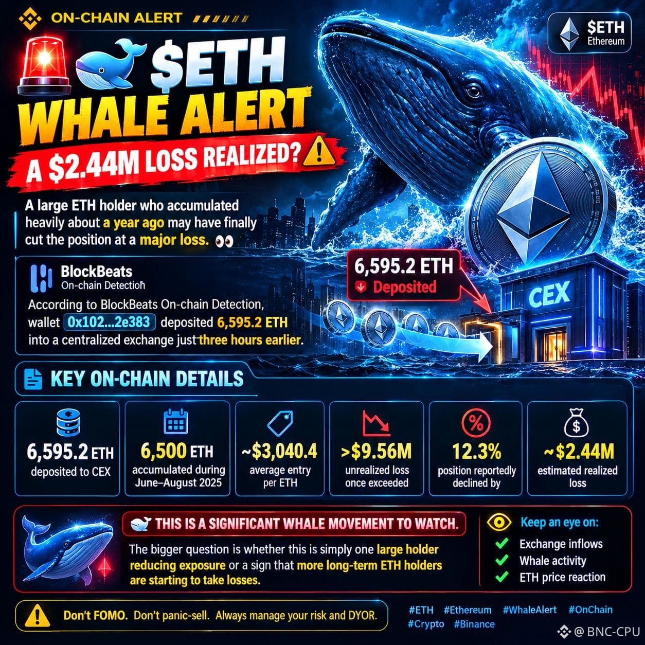
🚨🐋 $ETH WHALE ALERT — A $2.44M LOSS REALIZED?
A large ETH holder who accumulated heavily about a year ago may have finally cut the position at a major loss. 👀
According to BlockBeats On-chain Detection, wallet 0x102…2e383 deposited 6,595.2 ETH into a centralized exchange just three hours earlier.
Key On-Chain Details: • 6,595.2 ETH deposited to CEX
• 6,500 ETH accumulated during June–August 2025
• Average entry: ~$3,040.4 per ETH
• Unrealized loss once exceeded $9.56M
• Position reportedly declined by 12.3%
• Estimated realized loss: ~$2.44M
This is a significant whale movement to watch.
The bigger question is whether this is simply one large holder reducing exposure or a sign that more long-term ETH holders are starting to take losses.
👀 Keep an eye on exchange inflows, whale activity and ETH price reaction.
#WhaleAlert #ETH #OnChainAnalysis
#Ethereum
🚨🐋 $ETH WHALE ALERT — A $2.44M LOSS REALIZED?
A large ETH holder who accumulated heavily about a year ago may have finally cut the position at a major loss. 👀
According to BlockBeats On-chain Detection, wallet 0x102…2e383 deposited 6,595.2 ETH into a centralized exchange just three hours earlier.
Key On-Chain Details: • 6,595.2 ETH deposited to CEX
• 6,500 ETH accumulated during June–August 2025
• Average entry: ~$3,040.4 per ETH
• Unrealized loss once exceeded $9.56M
• Position reportedly declined by 12.3%
• Estimated realized loss: ~$2.44M
This is a significant whale movement to watch.
The bigger question is whether this is simply one large holder reducing exposure or a sign that more long-term ETH holders are starting to take losses.
👀 Keep an eye on exchange inflows, whale activity and ETH price reaction.
#WhaleAlert #ETH #OnChainAnalysis
🚨🐋 $ETH WHALE ALERT — A $2.44M LOSS REALIZED?
A large ETH holder who accumulated heavily about a year ago may have finally cut the position at a major loss. 👀
According to BlockBeats On-chain Detection, wallet 0x102…2e383 deposited 6,595.2 ETH into a centralized exchange just three hours earlier.
Key On-Chain Details: • 6,595.2 ETH deposited to CEX
• 6,500 ETH accumulated during June–August 2025
• Average entry: ~$3,040.4 per ETH
• Unrealized loss once exceeded $9.56M
• Position reportedly declined by 12.3%
• Estimated realized loss: ~$2.44M
This is a significant whale movement to watch.
The bigger question is whether this is simply one large holder reducing exposure or a sign that more long-term ETH holders are starting to take losses.
👀 Keep an eye on exchange inflows, whale activity and ETH price reaction.
#WhaleAlert #ETH #OnChainAnalysis
87
·
--
Whale wallets don't lie — on-chain accumulation patterns are one of the most reliable signals in crypto.
When large, dormant addresses start moving funds from exchanges to self-custody wallets, it typically signals conviction buying, not trading. The opposite — exchange inflows from whale addresses — often precedes sell pressure. This isn't insider information; it's publicly verifiable behavior on-chain.
The nuance most people miss: it's not just the size of the move, it's the pattern. A single whale moving $50M once is noise. The same wallet accumulating steadily over 4–6 weeks during sideways price action? That's signal.
$BTC historically shows this most cleanly — long-term holder supply has compressed during every major bear market bottom, even as retail sentiment was at its worst. $ETH shows it through staking inflows: validators don't unstake lightly. $ADA also has traceable foundation wallet movements that the patient observer can monitor.
Practical takeaway: bookmark a blockchain explorer. Watch a few known whale addresses. When they quietly accumulate over weeks, price often follows — months later.
On-chain is the only financial market where the big players' moves are fully transparent. Use it.
#OnChainAnalysis #CryptoInsights #WhaleWatching #BlockchainData #CryptoStrategy
Whale wallets don't lie — on-chain accumulation patterns are one of the most reliable signals in crypto.
When large, dormant addresses start moving funds from exchanges to self-custody wallets, it typically signals conviction buying, not trading. The opposite — exchange inflows from whale addresses — often precedes sell pressure. This isn't insider information; it's publicly verifiable behavior on-chain.
The nuance most people miss: it's not just the size of the move, it's the pattern. A single whale moving $50M once is noise. The same wallet accumulating steadily over 4–6 weeks during sideways price action? That's signal.
$BTC historically shows this most cleanly — long-term holder supply has compressed during every major bear market bottom, even as retail sentiment was at its worst. $ETH shows it through staking inflows: validators don't unstake lightly. $ADA also has traceable foundation wallet movements that the patient observer can monitor.
Practical takeaway: bookmark a blockchain explorer. Watch a few known whale addresses. When they quietly accumulate over weeks, price often follows — months later.
On-chain is the only financial market where the big players' moves are fully transparent. Use it.
#OnChainAnalysis #CryptoInsights #WhaleWatching #BlockchainData #CryptoStrategy
When large, dormant addresses start moving funds from exchanges to self-custody wallets, it typically signals conviction buying, not trading. The opposite — exchange inflows from whale addresses — often precedes sell pressure. This isn't insider information; it's publicly verifiable behavior on-chain.
The nuance most people miss: it's not just the size of the move, it's the pattern. A single whale moving $50M once is noise. The same wallet accumulating steadily over 4–6 weeks during sideways price action? That's signal.
$BTC historically shows this most cleanly — long-term holder supply has compressed during every major bear market bottom, even as retail sentiment was at its worst. $ETH shows it through staking inflows: validators don't unstake lightly. $ADA also has traceable foundation wallet movements that the patient observer can monitor.
Practical takeaway: bookmark a blockchain explorer. Watch a few known whale addresses. When they quietly accumulate over weeks, price often follows — months later.
On-chain is the only financial market where the big players' moves are fully transparent. Use it.
#OnChainAnalysis #CryptoInsights #WhaleWatching #BlockchainData #CryptoStrategy
157

📊 تحليل Glassnode يشير إلى سلوك بيع بين مستثمري بيتكوين
كشفت بيانات تحليلية حديثة من Glassnode أن مستثمري بيتكوين الذين دخلوا السوق خلال ارتفاع العام الماضي، بدأوا يبيعون كميات متزايدة من عملاتهم. هذا السلوك البيعي يتزامن مع اقتراب سعر البيتكوين من نقطة تعادلهم، مما يشير إلى تصرفات تسعى لتحقيق الربح أو تقليل الخسائر.
━━━━━━━━━━━━━━
📊 التأثير: 📈 مرتفع
🏷️ BITCOIN
#Bitcoin #OnChainAnalysis #MarketUpdate #CryptoData
📰 المصدر: biztoc.com
📊 تحليل Glassnode يشير إلى سلوك بيع بين مستثمري بيتكوين
كشفت بيانات تحليلية حديثة من Glassnode أن مستثمري بيتكوين الذين دخلوا السوق خلال ارتفاع العام الماضي، بدأوا يبيعون كميات متزايدة من عملاتهم. هذا السلوك البيعي يتزامن مع اقتراب سعر البيتكوين من نقطة تعادلهم، مما يشير إلى تصرفات تسعى لتحقيق الربح أو تقليل الخسائر.
━━━━━━━━━━━━━━
📊 التأثير: 📈 مرتفع
🏷️ BITCOIN
#Bitcoin #OnChainAnalysis #MarketUpdate #CryptoData
📰 المصدر: biztoc.com
كشفت بيانات تحليلية حديثة من Glassnode أن مستثمري بيتكوين الذين دخلوا السوق خلال ارتفاع العام الماضي، بدأوا يبيعون كميات متزايدة من عملاتهم. هذا السلوك البيعي يتزامن مع اقتراب سعر البيتكوين من نقطة تعادلهم، مما يشير إلى تصرفات تسعى لتحقيق الربح أو تقليل الخسائر.
━━━━━━━━━━━━━━
📊 التأثير: 📈 مرتفع
🏷️ BITCOIN
#Bitcoin #OnChainAnalysis #MarketUpdate #CryptoData
📰 المصدر: biztoc.com
15
·
--
Validator economics are a leading indicator most traders ignore.
When staking yields compress — not because of price, but because participation rates spike — it signals something important: long-term holders are locking capital away. They are not selling. They are committing to network security in exchange for modest yield. That is structurally bullish, not neutral.
On $ETH, staking participation above 25% of total supply means over a quarter of all ETH is earning yield rather than sitting idle or being traded. Each new validator added is a holder making a multi-month commitment. Watch the entry queue length: a long queue means demand to stake exceeds onboarding capacity — that is conviction showing up on-chain before it shows up in price.
$DOT and $ADA take this further with on-chain governance: staked tokens vote. A rising participation rate in governance proposals signals an engaged community — often a precursor to ecosystem activity surges.
The thesis: validator revenue health + staking queue depth + governance participation = three underused on-chain signals that map network conviction before the market prices it in.
Price action gets the headlines. Stake-rate trends get the edge.
Stake-rate trends deserve a place in your macro dashboard alongside price and volume.
#CryptoInsights #OnChainAnalysis #Staking #Web3 #BinanceSquare
Validator economics are a leading indicator most traders ignore.
When staking yields compress — not because of price, but because participation rates spike — it signals something important: long-term holders are locking capital away. They are not selling. They are committing to network security in exchange for modest yield. That is structurally bullish, not neutral.
On $ETH , staking participation above 25% of total supply means over a quarter of all ETH is earning yield rather than sitting idle or being traded. Each new validator added is a holder making a multi-month commitment. Watch the entry queue length: a long queue means demand to stake exceeds onboarding capacity — that is conviction showing up on-chain before it shows up in price.
$DOT and $ADA take this further with on-chain governance: staked tokens vote. A rising participation rate in governance proposals signals an engaged community — often a precursor to ecosystem activity surges.
The thesis: validator revenue health + staking queue depth + governance participation = three underused on-chain signals that map network conviction before the market prices it in.
Price action gets the headlines. Stake-rate trends get the edge.
Stake-rate trends deserve a place in your macro dashboard alongside price and volume.
#CryptoInsights #OnChainAnalysis #Staking #Web3 #BinanceSquare
When staking yields compress — not because of price, but because participation rates spike — it signals something important: long-term holders are locking capital away. They are not selling. They are committing to network security in exchange for modest yield. That is structurally bullish, not neutral.
On $ETH , staking participation above 25% of total supply means over a quarter of all ETH is earning yield rather than sitting idle or being traded. Each new validator added is a holder making a multi-month commitment. Watch the entry queue length: a long queue means demand to stake exceeds onboarding capacity — that is conviction showing up on-chain before it shows up in price.
$DOT and $ADA take this further with on-chain governance: staked tokens vote. A rising participation rate in governance proposals signals an engaged community — often a precursor to ecosystem activity surges.
The thesis: validator revenue health + staking queue depth + governance participation = three underused on-chain signals that map network conviction before the market prices it in.
Price action gets the headlines. Stake-rate trends get the edge.
Stake-rate trends deserve a place in your macro dashboard alongside price and volume.
#CryptoInsights #OnChainAnalysis #Staking #Web3 #BinanceSquare
136

·
--
Last week as $BTC began sliding, coins quietly started leaving the exchanges instead of piling in.
Most traders see that red chart and dump their bags out of fear, locking in losses while the real accumulation happens off-platform and they miss the eventual bounce.
From September 22 to 24 major exchanges including Binance recorded about $2.52 billion in net $BTC outflows. Price weakened at the same time available supply tightened, creating a clear divergence that often gets ignored in the heat of a dip.
This setup echoes the 2022 lows when similar outflows continued through falling prices and later fueled a multi-month recovery as coins moved into cold storage. Competing assets like $ETH and $SOL frequently show the opposite pattern with inflows during those windows as traders chase quicker plays.
The lesson is that a dropping price plus shrinking exchange supply usually means holders are positioning long-term rather than distributing, which can reduce sell pressure and set up a sharper move once buyers return.
Where do you think this $BTC divergence heads next?
#Bitcoin #BTC #OnChainAnalysis
Last week as $BTC began sliding, coins quietly started leaving the exchanges instead of piling in.
Most traders see that red chart and dump their bags out of fear, locking in losses while the real accumulation happens off-platform and they miss the eventual bounce.
From September 22 to 24 major exchanges including Binance recorded about $2.52 billion in net $BTC outflows. Price weakened at the same time available supply tightened, creating a clear divergence that often gets ignored in the heat of a dip.
This setup echoes the 2022 lows when similar outflows continued through falling prices and later fueled a multi-month recovery as coins moved into cold storage. Competing assets like $ETH and $SOL frequently show the opposite pattern with inflows during those windows as traders chase quicker plays.
The lesson is that a dropping price plus shrinking exchange supply usually means holders are positioning long-term rather than distributing, which can reduce sell pressure and set up a sharper move once buyers return.
Where do you think this $BTC divergence heads next?
#Bitcoin #BTC #OnChainAnalysis
Most traders see that red chart and dump their bags out of fear, locking in losses while the real accumulation happens off-platform and they miss the eventual bounce.
From September 22 to 24 major exchanges including Binance recorded about $2.52 billion in net $BTC outflows. Price weakened at the same time available supply tightened, creating a clear divergence that often gets ignored in the heat of a dip.
This setup echoes the 2022 lows when similar outflows continued through falling prices and later fueled a multi-month recovery as coins moved into cold storage. Competing assets like $ETH and $SOL frequently show the opposite pattern with inflows during those windows as traders chase quicker plays.
The lesson is that a dropping price plus shrinking exchange supply usually means holders are positioning long-term rather than distributing, which can reduce sell pressure and set up a sharper move once buyers return.
Where do you think this $BTC divergence heads next?
#Bitcoin #BTC #OnChainAnalysis
147
everyone thinks we're in the early innings of a massive altcoin bull run but actually there are some real caution flags that most people are sleeping on.
ngl watching your alts dump after fomo buying at local tops is brutal. you end up not knowing when to exit and just holding bags hoping for a bounce that never comes.
looking at the current market as a case study, altcoin exchange deposit transactions are at levels last seen around october 2025. although the dollar value remains below previous bull-cycle levels it still signals potential selling intent.
meanwhile altcoin open interest has barely grown which makes this look less like a leverage-driven blow-off in $ETH $SOL or other majors.
ser this doesn't scream euphoria to me. more like a trap for late buyers while $BTC holds it down.
anyone else seeing this and thinking we might be closer to a local top than we realize?
#altseason #onchainanalysis #crypto
everyone thinks we're in the early innings of a massive altcoin bull run but actually there are some real caution flags that most people are sleeping on.
ngl watching your alts dump after fomo buying at local tops is brutal. you end up not knowing when to exit and just holding bags hoping for a bounce that never comes.
looking at the current market as a case study, altcoin exchange deposit transactions are at levels last seen around october 2025. although the dollar value remains below previous bull-cycle levels it still signals potential selling intent.
meanwhile altcoin open interest has barely grown which makes this look less like a leverage-driven blow-off in $ETH $SOL or other majors.
ser this doesn't scream euphoria to me. more like a trap for late buyers while $BTC holds it down.
anyone else seeing this and thinking we might be closer to a local top than we realize?
#altseason #onchainanalysis #crypto
ngl watching your alts dump after fomo buying at local tops is brutal. you end up not knowing when to exit and just holding bags hoping for a bounce that never comes.
looking at the current market as a case study, altcoin exchange deposit transactions are at levels last seen around october 2025. although the dollar value remains below previous bull-cycle levels it still signals potential selling intent.
meanwhile altcoin open interest has barely grown which makes this look less like a leverage-driven blow-off in $ETH $SOL or other majors.
ser this doesn't scream euphoria to me. more like a trap for late buyers while $BTC holds it down.
anyone else seeing this and thinking we might be closer to a local top than we realize?
#altseason #onchainanalysis #crypto

46

·
--
Bitcoin's "Bull Score" just hit 90/100 — but there's a catch 📊
CryptoQuant's Bull Score reached 90 after BTC broke above its 365-day moving average. Looks as bullish as it gets.
But apparent demand (new coins mined vs. coins moved after a year+) has fallen ~170,000 BTC over 30 days. The market's absorbing fewer coins than being created.
Strong momentum signal, fading demand underneath — that's the tension right now.
Context: BTC's up 6.12% this month, on track for its best quarter since Q4 2024, with Fed hike odds for October below 50%.
Which do you trust more — the momentum score or the demand data?
$BTC
{spot}(BTCUSDT)
$ETH
{spot}(ETHUSDT)
#bitcoin #CryptoMarket #OnChainAnalysis
Bitcoin's "Bull Score" just hit 90/100 — but there's a catch 📊
CryptoQuant's Bull Score reached 90 after BTC broke above its 365-day moving average. Looks as bullish as it gets.
But apparent demand (new coins mined vs. coins moved after a year+) has fallen ~170,000 BTC over 30 days. The market's absorbing fewer coins than being created.
Strong momentum signal, fading demand underneath — that's the tension right now.
Context: BTC's up 6.12% this month, on track for its best quarter since Q4 2024, with Fed hike odds for October below 50%.
Which do you trust more — the momentum score or the demand data?
$BTC
$ETH
#bitcoin #CryptoMarket #OnChainAnalysis
CryptoQuant's Bull Score reached 90 after BTC broke above its 365-day moving average. Looks as bullish as it gets.
But apparent demand (new coins mined vs. coins moved after a year+) has fallen ~170,000 BTC over 30 days. The market's absorbing fewer coins than being created.
Strong momentum signal, fading demand underneath — that's the tension right now.
Context: BTC's up 6.12% this month, on track for its best quarter since Q4 2024, with Fed hike odds for October below 50%.
Which do you trust more — the momentum score or the demand data?
$BTC
$ETH
#bitcoin #CryptoMarket #OnChainAnalysis

84

·
--

Article
🔍 El "Truco Secreto" de las Ballenas para Comprar Antes que Nadie 🐋📊🔍 El "Truco Secreto" de las Ballenas para Comprar Antes que Nadie 🐋📊
¿Alguna vez has vendido una criptomoneda y justo después el precio explotó hacia arriba? ¿O compraste en verde y a los cinco minutos el mercado se desplomó?
No es mala suerte. Lo que ocurre es que los gráficos de velas tradicionales muestran el pasado, mientras que el análisis de métricas en cadena (On-Chain Data) te muestra lo que las instituciones están haciendo en tiempo real en la blockchain.
Hoy te comparto 3 indicadores clave que debes revisar antes de abrir cualquier operación.
1. Reservas de BTC en los Exchanges 📉🏦
Cuando los grandes inversionistas quieren vender, transfieren sus monedas desde sus billeteras frías hacia las plataformas de trading.
Reserva Subiendo: Si entra un gran flujo de $BTC a los exchanges, prepárate: suele ser señal de una posible venta masiva (sell-off).
Reserva Cayendo: Si las monedas están saliendo de los exchanges hacia billeteras privadas, significa que las ballenas están acumulando para guardar a largo plazo.
2. MVRV Z-Score (¿El mercado está caro o barato?) 🌡️
Esta métrica compara el valor de mercado actual de una criptomoneda con el precio promedio al que se movió por última vez.
Zona Verde (Sobreventa): Indica que la mayoría del mercado está en pérdidas o en punto de equilibrio. Históricamente, son las mejores zonas de compra acumulativa.
Zona Roja (Sobrecalentamiento): Señala que el mercado está saturado de ganancias especulativas y se acerca una corrección.
3. Movimientos en Stablecoins 💵⚡
Las stablecoins son el "efectivo" del mundo cripto.
Si ves que la reserva de dólares digitales en los exchanges aumenta bruscamente, significa que hay liquidez lista para comprar la siguiente caída.
Es el combustible perfecto para impulsar activos como $ETH y $SOL.
🎯 Conclusión para tu Trading:
El precio en la gráfica es solo la consecuencia; los datos en la cadena son la causa. Combinar tu análisis técnico con estas métricas te evitará ser la "liquidez de salida" de los grandes capitales.
💬 Pregunta para la Comunidad:
¿Sueles revisar datos On-Chain antes de operar o te basas únicamente en el gráfico de precios?
👉 Toca en los cashtags ($BTC, $ETH,$SOL) para analizar las tendencias de acumulación de hoy.
¡Nos vemos en los comentarios! 👇
#BinanceSquare #OnChainAnalysis #bitcoin #crypto #BTC #ETH #SOL
$BTC
{spot}(BTCUSDT)
🔍 El "Truco Secreto" de las Ballenas para Comprar Antes que Nadie 🐋📊
🔍 El "Truco Secreto" de las Ballenas para Comprar Antes que Nadie 🐋📊
¿Alguna vez has vendido una criptomoneda y justo después el precio explotó hacia arriba? ¿O compraste en verde y a los cinco minutos el mercado se desplomó?
No es mala suerte. Lo que ocurre es que los gráficos de velas tradicionales muestran el pasado, mientras que el análisis de métricas en cadena (On-Chain Data) te muestra lo que las instituciones están haciendo en tiempo real en la blockchain.
Hoy te comparto 3 indicadores clave que debes revisar antes de abrir cualquier operación.
1. Reservas de BTC en los Exchanges 📉🏦
Cuando los grandes inversionistas quieren vender, transfieren sus monedas desde sus billeteras frías hacia las plataformas de trading.
Reserva Subiendo: Si entra un gran flujo de $BTC a los exchanges, prepárate: suele ser señal de una posible venta masiva (sell-off).
Reserva Cayendo: Si las monedas están saliendo de los exchanges hacia billeteras privadas, significa que las ballenas están acumulando para guardar a largo plazo.
2. MVRV Z-Score (¿El mercado está caro o barato?) 🌡️
Esta métrica compara el valor de mercado actual de una criptomoneda con el precio promedio al que se movió por última vez.
Zona Verde (Sobreventa): Indica que la mayoría del mercado está en pérdidas o en punto de equilibrio. Históricamente, son las mejores zonas de compra acumulativa.
Zona Roja (Sobrecalentamiento): Señala que el mercado está saturado de ganancias especulativas y se acerca una corrección.
3. Movimientos en Stablecoins 💵⚡
Las stablecoins son el "efectivo" del mundo cripto.
Si ves que la reserva de dólares digitales en los exchanges aumenta bruscamente, significa que hay liquidez lista para comprar la siguiente caída.
Es el combustible perfecto para impulsar activos como $ETH y $SOL.
🎯 Conclusión para tu Trading:
El precio en la gráfica es solo la consecuencia; los datos en la cadena son la causa. Combinar tu análisis técnico con estas métricas te evitará ser la "liquidez de salida" de los grandes capitales.
💬 Pregunta para la Comunidad:
¿Sueles revisar datos On-Chain antes de operar o te basas únicamente en el gráfico de precios?
👉 Toca en los cashtags ($BTC , $ETH,$SOL) para analizar las tendencias de acumulación de hoy.
¡Nos vemos en los comentarios! 👇
#BinanceSquare #OnChainAnalysis #bitcoin #crypto #BTC #ETH #SOL
$BTC
¿Alguna vez has vendido una criptomoneda y justo después el precio explotó hacia arriba? ¿O compraste en verde y a los cinco minutos el mercado se desplomó?
No es mala suerte. Lo que ocurre es que los gráficos de velas tradicionales muestran el pasado, mientras que el análisis de métricas en cadena (On-Chain Data) te muestra lo que las instituciones están haciendo en tiempo real en la blockchain.
Hoy te comparto 3 indicadores clave que debes revisar antes de abrir cualquier operación.
1. Reservas de BTC en los Exchanges 📉🏦
Cuando los grandes inversionistas quieren vender, transfieren sus monedas desde sus billeteras frías hacia las plataformas de trading.
Reserva Subiendo: Si entra un gran flujo de $BTC a los exchanges, prepárate: suele ser señal de una posible venta masiva (sell-off).
Reserva Cayendo: Si las monedas están saliendo de los exchanges hacia billeteras privadas, significa que las ballenas están acumulando para guardar a largo plazo.
2. MVRV Z-Score (¿El mercado está caro o barato?) 🌡️
Esta métrica compara el valor de mercado actual de una criptomoneda con el precio promedio al que se movió por última vez.
Zona Verde (Sobreventa): Indica que la mayoría del mercado está en pérdidas o en punto de equilibrio. Históricamente, son las mejores zonas de compra acumulativa.
Zona Roja (Sobrecalentamiento): Señala que el mercado está saturado de ganancias especulativas y se acerca una corrección.
3. Movimientos en Stablecoins 💵⚡
Las stablecoins son el "efectivo" del mundo cripto.
Si ves que la reserva de dólares digitales en los exchanges aumenta bruscamente, significa que hay liquidez lista para comprar la siguiente caída.
Es el combustible perfecto para impulsar activos como $ETH y $SOL.
🎯 Conclusión para tu Trading:
El precio en la gráfica es solo la consecuencia; los datos en la cadena son la causa. Combinar tu análisis técnico con estas métricas te evitará ser la "liquidez de salida" de los grandes capitales.
💬 Pregunta para la Comunidad:
¿Sueles revisar datos On-Chain antes de operar o te basas únicamente en el gráfico de precios?
👉 Toca en los cashtags ($BTC , $ETH,$SOL) para analizar las tendencias de acumulación de hoy.
¡Nos vemos en los comentarios! 👇
#BinanceSquare #OnChainAnalysis #bitcoin #crypto #BTC #ETH #SOL
$BTC
AjedrezBlitz:
Hola, ¿ cuáles serían las páginas recomendadas para analizar la blockchain?
3
3
23
7.8k
·
--
Every coin carries a quiet piece of metadata: the date it last moved.
On-chain analysts call it coin age. Most traders ignore it. They shouldn't.
Coins that haven't moved in 12+ months belong, almost by definition, to hands that don't panic. They survived previous drawdowns without selling. That supply is inert — until it isn't. When old coins suddenly wake up and move to exchanges, it's rarely noise: long-term holders have historically been the most patient sellers, and their activity marks regime changes more reliably than any indicator.
This is what makes on-chain behavior unique among market data. Price tells you what people think. Coin age tells you what people actually did — and how long they've been willing to sit on a position.
The composition of supply is a slow-moving variable, but it's the one that determines whether a rally has fuel. Newer coins churn through fast hands and amplify volatility. Old coins are the ballast. Watch the ratio, not the hype.
One nuance: staking changes the picture. On PoS networks, locked tokens distort dormancy metrics — a coin can be 'old' simply because it's earning yield. Read the mechanism before reading the metric.
Blockchains don't forget. They log every holder's patience or panic, in real time. That's the most honest behavioral dataset in markets.
$BTC $ETH $ADA
#OnChainAnalysis #Bitcoin #CryptoInsights #Blockchain #Crypto
Every coin carries a quiet piece of metadata: the date it last moved.
On-chain analysts call it coin age. Most traders ignore it. They shouldn't.
Coins that haven't moved in 12+ months belong, almost by definition, to hands that don't panic. They survived previous drawdowns without selling. That supply is inert — until it isn't. When old coins suddenly wake up and move to exchanges, it's rarely noise: long-term holders have historically been the most patient sellers, and their activity marks regime changes more reliably than any indicator.
This is what makes on-chain behavior unique among market data. Price tells you what people think. Coin age tells you what people actually did — and how long they've been willing to sit on a position.
The composition of supply is a slow-moving variable, but it's the one that determines whether a rally has fuel. Newer coins churn through fast hands and amplify volatility. Old coins are the ballast. Watch the ratio, not the hype.
One nuance: staking changes the picture. On PoS networks, locked tokens distort dormancy metrics — a coin can be 'old' simply because it's earning yield. Read the mechanism before reading the metric.
Blockchains don't forget. They log every holder's patience or panic, in real time. That's the most honest behavioral dataset in markets.
$BTC $ETH $ADA
#OnChainAnalysis #Bitcoin #CryptoInsights #Blockchain #Crypto
On-chain analysts call it coin age. Most traders ignore it. They shouldn't.
Coins that haven't moved in 12+ months belong, almost by definition, to hands that don't panic. They survived previous drawdowns without selling. That supply is inert — until it isn't. When old coins suddenly wake up and move to exchanges, it's rarely noise: long-term holders have historically been the most patient sellers, and their activity marks regime changes more reliably than any indicator.
This is what makes on-chain behavior unique among market data. Price tells you what people think. Coin age tells you what people actually did — and how long they've been willing to sit on a position.
The composition of supply is a slow-moving variable, but it's the one that determines whether a rally has fuel. Newer coins churn through fast hands and amplify volatility. Old coins are the ballast. Watch the ratio, not the hype.
One nuance: staking changes the picture. On PoS networks, locked tokens distort dormancy metrics — a coin can be 'old' simply because it's earning yield. Read the mechanism before reading the metric.
Blockchains don't forget. They log every holder's patience or panic, in real time. That's the most honest behavioral dataset in markets.
$BTC $ETH $ADA
#OnChainAnalysis #Bitcoin #CryptoInsights #Blockchain #Crypto
139

·
--
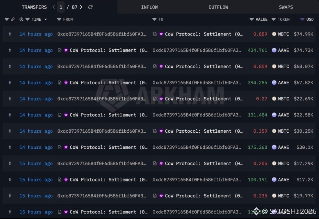
🚀 Втеча у DeFi: Навіщо великі кити обміняли WBTC на $4.26 млн на токени AAVE?
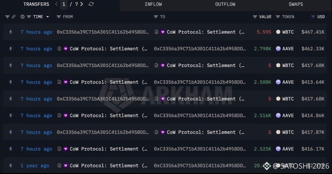
Глобальний ончейн-моніторинг зафіксував запуск інституційної ротації капіталу. Поки роздрібні трейдери тримають Біткоїн, два приховані гаманці провели скоординований маневр, конвертувавши загорнутий метал у топовий DeFi-актив.
• Анатомія.
Логи відображають синхронний обмін ліквідності. Два великі інвестори повністю закрили свої позиції, вивівши з обігу 50,95 $WBTC на загальну фінансову вартість понад $4,26 мільйона.
• Акумуляція.
Уся вивільнена сума була хірургічно спрямована на поглинання пропозиції в секторі децентралізованого кредитування. Кити викупили зі стаканів 25 502 $AAVE із середнім входом по $167 за токен.
$AAVE
{future}(AAVEUSDT)
Підписуйтесь на канал, тут ми розбираємо маневри великого капіталу без нудної теорії та ілюзій ринку! 🚀
#AAVE #WBTC #Arkham #WhaleAlert #DeFi #SmartMoney #OnchainAnalysis #BinanceSquare
🚀 Втеча у DeFi: Навіщо великі кити обміняли WBTC на $4.26 млн на токени AAVE?
Глобальний ончейн-моніторинг зафіксував запуск інституційної ротації капіталу. Поки роздрібні трейдери тримають Біткоїн, два приховані гаманці провели скоординований маневр, конвертувавши загорнутий метал у топовий DeFi-актив.
• Анатомія.
Логи відображають синхронний обмін ліквідності. Два великі інвестори повністю закрили свої позиції, вивівши з обігу 50,95 $WBTC на загальну фінансову вартість понад $4,26 мільйона.
• Акумуляція.
Уся вивільнена сума була хірургічно спрямована на поглинання пропозиції в секторі децентралізованого кредитування. Кити викупили зі стаканів 25 502 $AAVE із середнім входом по $167 за токен.
$AAVE
Підписуйтесь на канал, тут ми розбираємо маневри великого капіталу без нудної теорії та ілюзій ринку! 🚀
#AAVE #WBTC #Arkham #WhaleAlert #DeFi #SmartMoney #OnchainAnalysis #BinanceSquare
Глобальний ончейн-моніторинг зафіксував запуск інституційної ротації капіталу. Поки роздрібні трейдери тримають Біткоїн, два приховані гаманці провели скоординований маневр, конвертувавши загорнутий метал у топовий DeFi-актив.
• Анатомія.
Логи відображають синхронний обмін ліквідності. Два великі інвестори повністю закрили свої позиції, вивівши з обігу 50,95 $WBTC на загальну фінансову вартість понад $4,26 мільйона.
• Акумуляція.
Уся вивільнена сума була хірургічно спрямована на поглинання пропозиції в секторі децентралізованого кредитування. Кити викупили зі стаканів 25 502 $AAVE із середнім входом по $167 за токен.
$AAVE
Підписуйтесь на канал, тут ми розбираємо маневри великого капіталу без нудної теорії та ілюзій ринку! 🚀
#AAVE #WBTC #Arkham #WhaleAlert #DeFi #SmartMoney #OnchainAnalysis #BinanceSquare

1
155
·
--
Whales are still buying the top while retail gets used as exit liquidity. Most people see huge institutional purchases and immediately FOMO in, thinking the price can only go higher, only to end up holding heavy bags the moment momentum shifts.
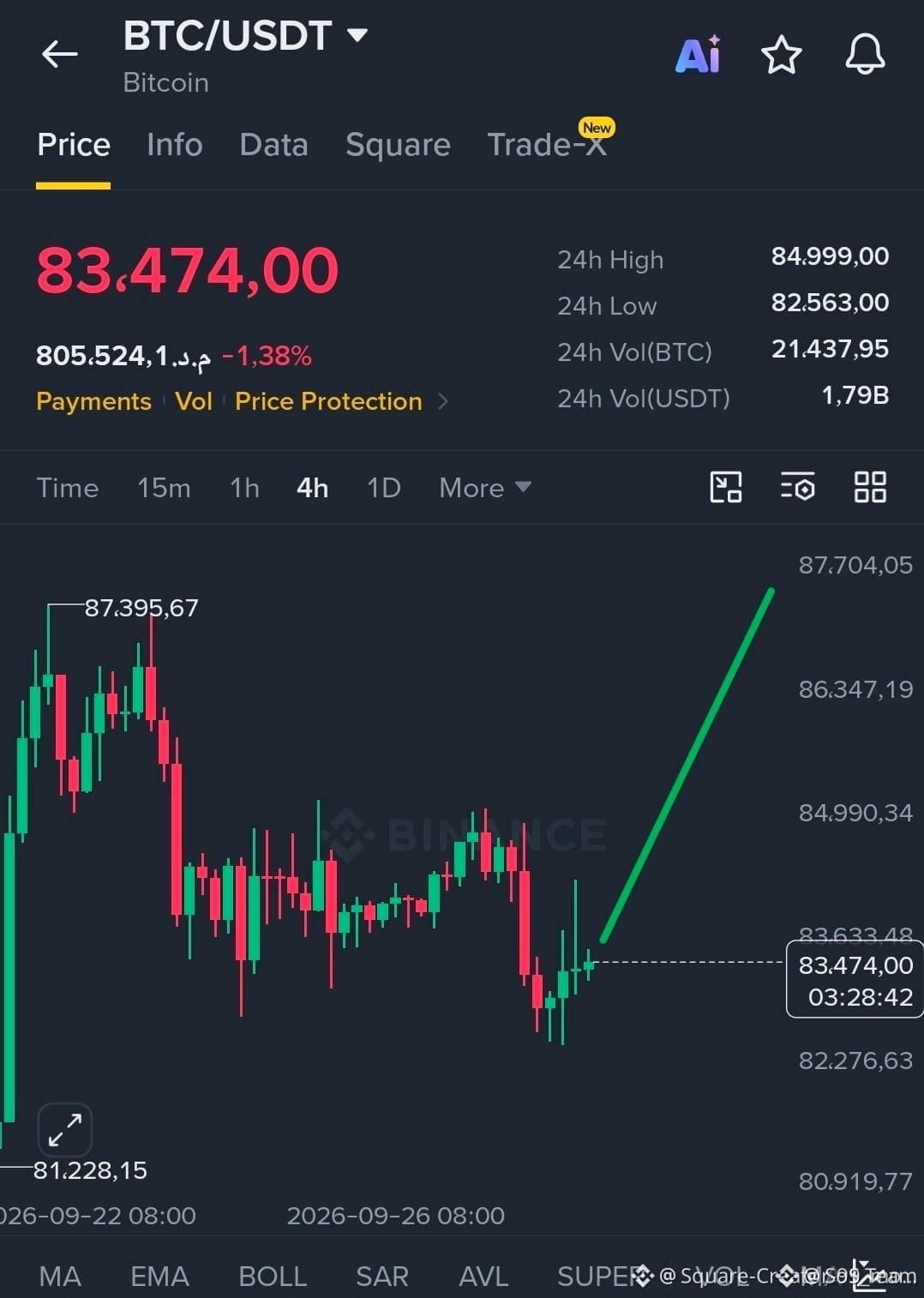
Take the latest on-chain moves from MicroStrategy as an example. They just deployed another $142.7M into $BTC last week, adding to their stash at an average entry of $85,681. On paper, it looks bullish because big balance sheets are buying. But remember, mega-funds operate on multi-year time horizons and can easily absorb 30% drawdowns without breaking a sweat, whereas retail leverage gets wiped in minutes.
Blindly copying whale entries without a clear invalidation plan usually ends in forced liquidations. When giants stack at high price levels, they often create local tops before volatility shakes out overleveraged late longs across both Bitcoin and majors like $ETH.
Are you treating these institutional buys as a green light to add spot, or is this looking more like late-cycle euphoria to you?
#Bitcoin #CryptoTrading #OnChainAnalysis
Whales are still buying the top while retail gets used as exit liquidity. Most people see huge institutional purchases and immediately FOMO in, thinking the price can only go higher, only to end up holding heavy bags the moment momentum shifts.
Take the latest on-chain moves from MicroStrategy as an example. They just deployed another $142.7M into $BTC last week, adding to their stash at an average entry of $85,681. On paper, it looks bullish because big balance sheets are buying. But remember, mega-funds operate on multi-year time horizons and can easily absorb 30% drawdowns without breaking a sweat, whereas retail leverage gets wiped in minutes.
Blindly copying whale entries without a clear invalidation plan usually ends in forced liquidations. When giants stack at high price levels, they often create local tops before volatility shakes out overleveraged late longs across both Bitcoin and majors like $ETH .
Are you treating these institutional buys as a green light to add spot, or is this looking more like late-cycle euphoria to you?
#Bitcoin #CryptoTrading #OnChainAnalysis
Take the latest on-chain moves from MicroStrategy as an example. They just deployed another $142.7M into $BTC last week, adding to their stash at an average entry of $85,681. On paper, it looks bullish because big balance sheets are buying. But remember, mega-funds operate on multi-year time horizons and can easily absorb 30% drawdowns without breaking a sweat, whereas retail leverage gets wiped in minutes.
Blindly copying whale entries without a clear invalidation plan usually ends in forced liquidations. When giants stack at high price levels, they often create local tops before volatility shakes out overleveraged late longs across both Bitcoin and majors like $ETH .
Are you treating these institutional buys as a green light to add spot, or is this looking more like late-cycle euphoria to you?
#Bitcoin #CryptoTrading #OnChainAnalysis
30
Connectez-vous pour découvrir plus de contenu
Rejoignez la communauté mondiale des adeptes de cryptomonnaies sur Binance Square
⚡️ Suviez les dernières informations importantes sur les cryptomonnaies.
💬 Jugé digne de confiance par la plus grande plateforme d’échange de cryptomonnaies au monde.
👍 Découvrez les connaissances que partagent les créateurs vérifiés.
Adresse e-mail/Nº de téléphone
Sujets d’actualité
1
#BinanceLaunchesBinanceIntelligence
125,013 vues
1,252 mentions
2
#StriveBuys2000BTCFor$169M
4,698 vues
54 mentions
3
#EvernorthXRPTreasuryCompletesSPACMerger
79,594 vues
816 mentions
4
#ADAGains10%Above$0.27
41,633 vues
235 mentions
5
#ETHUp70%InQ3ButLiquidityFalls
279,674 vues
1,878 mentions
6
#EthStakingExitQueueHits2026High
105,313 vues
1,253 mentions
7
#FedOctoberHoldOdds82.3%
112,323 vues
1,217 mentions
8
#Nikkei225Jumps2.5%ToThreeMonthHigh
109,061 vues
1,409 mentions
9
#CircleMints$2.75BUSDCOnSolanaIn7Days
2,887 vues
60 mentions
10
#DriftHackVictimsBeginClaims
224,100 vues
2,084 mentions