
DopamineGLOBAL
282 Posts

DopamineGLOBAL
Report
Block User
hi im dopamine
x.com/dopamine_crypto
nanotradingclub.xyz
9 Following
4 Followers
7 Liked
Posts
A green move with the crowd redrawn behind it: $BICO is up 47.7% over 24h, but the account ratio has collapsed from 2.50 to 0.52 over the week.
At the same time, open interest exploded 1736%. That combination says the move wasn’t just old longs sitting through a rally. The perp book was rebuilt as price moved, with the account count now tilted short even after the sharp gain. Funding is still positive at 11% annualized, so longs are paying shorts despite being the smaller side by account count.
The naive read is “OI surged, so traders are bullish.” OI has no direction by itself. Every new long needs a short, and the account ratio measures accounts, not position size. A smaller group can still carry the larger notional exposure.
This is a crowded, newly leveraged market after a large move, not clean confirmation of either side’s conviction. The snapshot also can’t show whether the short-heavy account mix is hedging, profit-taking, or fresh directional risk.
Not financial advice. Do your own research.
#BICO #Perpetuals #OpenInterest
A green move with the crowd redrawn behind it: $BICO is up 47.7% over 24h, but the account ratio has collapsed from 2.50 to 0.52 over the week.
At the same time, open interest exploded 1736%. That combination says the move wasn’t just old longs sitting through a rally. The perp book was rebuilt as price moved, with the account count now tilted short even after the sharp gain. Funding is still positive at 11% annualized, so longs are paying shorts despite being the smaller side by account count.
The naive read is “OI surged, so traders are bullish.” OI has no direction by itself. Every new long needs a short, and the account ratio measures accounts, not position size. A smaller group can still carry the larger notional exposure.
This is a crowded, newly leveraged market after a large move, not clean confirmation of either side’s conviction. The snapshot also can’t show whether the short-heavy account mix is hedging, profit-taking, or fresh directional risk.
Not financial advice. Do your own research.
#BICO #Perpetuals #OpenInterest
At the same time, open interest exploded 1736%. That combination says the move wasn’t just old longs sitting through a rally. The perp book was rebuilt as price moved, with the account count now tilted short even after the sharp gain. Funding is still positive at 11% annualized, so longs are paying shorts despite being the smaller side by account count.
The naive read is “OI surged, so traders are bullish.” OI has no direction by itself. Every new long needs a short, and the account ratio measures accounts, not position size. A smaller group can still carry the larger notional exposure.
This is a crowded, newly leveraged market after a large move, not clean confirmation of either side’s conviction. The snapshot also can’t show whether the short-heavy account mix is hedging, profit-taking, or fresh directional risk.
Not financial advice. Do your own research.
#BICO #Perpetuals #OpenInterest
3
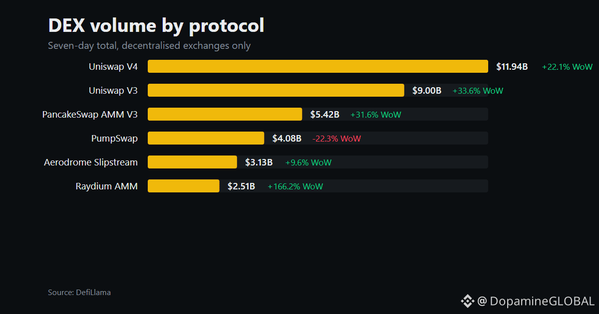
A $1.07B weekly volume print from HumidiFi is too large to dismiss, but the +1600% week-over-week jump isn’t evidence of organic demand by itself.
For that volume to reflect real adoption, traders would need to be repeatedly routing meaningful flow through the Solana venue, not just farming an incentive, cycling transactions, or reacting to a listing or launch. The same dollar can turn over many times, so volume measures activity, not unique users, retained liquidity, or profitable demand.
The dexvol chart helps place HumidiFi against other DEX protocols, but it can’t identify the source of the flow. That’s the missing piece here. Until a launch, incentive program, or listing is confirmed, the cleanest read is a sharp activity shock with an unknown cause, not a proven shift in Solana trading preference.
$SOL
Not financial advice. Do your own research.
#Solana #DEX #DeFi
A $1.07B weekly volume print from HumidiFi is too large to dismiss, but the +1600% week-over-week jump isn’t evidence of organic demand by itself.
For that volume to reflect real adoption, traders would need to be repeatedly routing meaningful flow through the Solana venue, not just farming an incentive, cycling transactions, or reacting to a listing or launch. The same dollar can turn over many times, so volume measures activity, not unique users, retained liquidity, or profitable demand.
The dexvol chart helps place HumidiFi against other DEX protocols, but it can’t identify the source of the flow. That’s the missing piece here. Until a launch, incentive program, or listing is confirmed, the cleanest read is a sharp activity shock with an unknown cause, not a proven shift in Solana trading preference.
$SOL
Not financial advice. Do your own research.
#Solana #DEX #DeFi
For that volume to reflect real adoption, traders would need to be repeatedly routing meaningful flow through the Solana venue, not just farming an incentive, cycling transactions, or reacting to a listing or launch. The same dollar can turn over many times, so volume measures activity, not unique users, retained liquidity, or profitable demand.
The dexvol chart helps place HumidiFi against other DEX protocols, but it can’t identify the source of the flow. That’s the missing piece here. Until a launch, incentive program, or listing is confirmed, the cleanest read is a sharp activity shock with an unknown cause, not a proven shift in Solana trading preference.
$SOL
Not financial advice. Do your own research.
#Solana #DEX #DeFi
11
$BTC is down 3.11% over the latest 7d, but the stablecoin base barely moved. Aggregate USD-pegged supply sits at $310.23B, down just 0.04%, or $131.68M.
That gap matters because a broad risk-off move usually gets an easy narrative: money left crypto. The supply data doesn’t support that. There hasn’t been a meaningful wave of stablecoins leaving the system. The cleaner read is rotation inside the existing pool, with capital moving between assets, venues, or positions rather than fresh dollars arriving to absorb the selling.
Don’t overread a flat supply line, though. It can’t show whether stablecoins are sitting idle, moving to exchanges, or being deployed into leverage. It also says nothing about who is selling BTC or whether buyers are using existing balances. So this isn’t proof of hidden demand. It’s evidence that the weekly move happened without a material expansion in on-chain dollar liquidity.
The mistake is treating stablecoin supply as a live order-book gauge. It’s a pool-size metric, not a flow map. Right now, the pool is nearly unchanged while the asset mix inside it is doing the work.
Not financial advice. Do your own research.
#Bitcoin #Stablecoins #OnChain
$BTC is down 3.11% over the latest 7d, but the stablecoin base barely moved. Aggregate USD-pegged supply sits at $310.23B, down just 0.04%, or $131.68M.
That gap matters because a broad risk-off move usually gets an easy narrative: money left crypto. The supply data doesn’t support that. There hasn’t been a meaningful wave of stablecoins leaving the system. The cleaner read is rotation inside the existing pool, with capital moving between assets, venues, or positions rather than fresh dollars arriving to absorb the selling.
Don’t overread a flat supply line, though. It can’t show whether stablecoins are sitting idle, moving to exchanges, or being deployed into leverage. It also says nothing about who is selling BTC or whether buyers are using existing balances. So this isn’t proof of hidden demand. It’s evidence that the weekly move happened without a material expansion in on-chain dollar liquidity.
The mistake is treating stablecoin supply as a live order-book gauge. It’s a pool-size metric, not a flow map. Right now, the pool is nearly unchanged while the asset mix inside it is doing the work.
Not financial advice. Do your own research.
#Bitcoin #Stablecoins #OnChain
That gap matters because a broad risk-off move usually gets an easy narrative: money left crypto. The supply data doesn’t support that. There hasn’t been a meaningful wave of stablecoins leaving the system. The cleaner read is rotation inside the existing pool, with capital moving between assets, venues, or positions rather than fresh dollars arriving to absorb the selling.
Don’t overread a flat supply line, though. It can’t show whether stablecoins are sitting idle, moving to exchanges, or being deployed into leverage. It also says nothing about who is selling BTC or whether buyers are using existing balances. So this isn’t proof of hidden demand. It’s evidence that the weekly move happened without a material expansion in on-chain dollar liquidity.
The mistake is treating stablecoin supply as a live order-book gauge. It’s a pool-size metric, not a flow map. Right now, the pool is nearly unchanged while the asset mix inside it is doing the work.
Not financial advice. Do your own research.
#Bitcoin #Stablecoins #OnChain
18
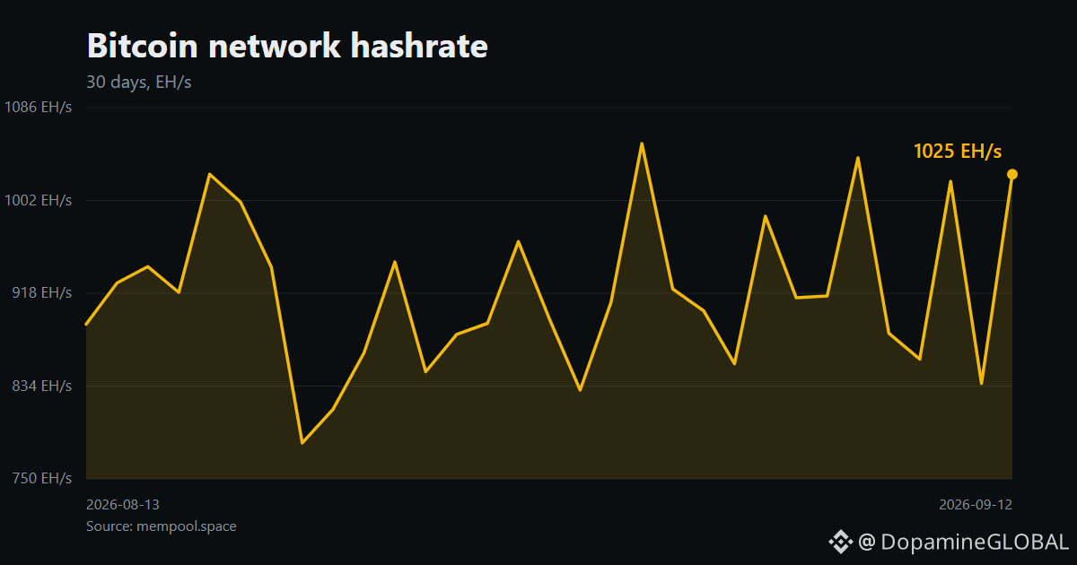
Bitcoin’s fee market is at the floor while the machines keep piling in. The next-block fee is 1 sat/vB, and the fee economy is also 1 sat/vB. Against that, network hashrate sits at 1025 EH/s, up 15.27% over 30d.
That’s a bad combination for anyone reading hashrate as a simple health meter. More hashrate means more computing power competing for the same block space. It does not mean more users are transacting, nor does it prove miners are profitable. $BTC can have a stronger security budget on paper while the fee side gives miners very little extra income.
The 30-day hashrate chart shows capacity expanding, but it can’t identify which operators are absorbing the cost, how efficient their hardware is, or whether treasury sales are happening. The pressure mechanism is clear enough: expensive competition meeting a fee market that’s paying the minimum visible rate.
That’s why “hashrate up” is not automatically bullish for miner economics. It can describe a tougher race, not better cash flow.
Not financial advice. Do your own research.
#Bitcoin #Mining #Onchain
Bitcoin’s fee market is at the floor while the machines keep piling in. The next-block fee is 1 sat/vB, and the fee economy is also 1 sat/vB. Against that, network hashrate sits at 1025 EH/s, up 15.27% over 30d.
That’s a bad combination for anyone reading hashrate as a simple health meter. More hashrate means more computing power competing for the same block space. It does not mean more users are transacting, nor does it prove miners are profitable. $BTC can have a stronger security budget on paper while the fee side gives miners very little extra income.
The 30-day hashrate chart shows capacity expanding, but it can’t identify which operators are absorbing the cost, how efficient their hardware is, or whether treasury sales are happening. The pressure mechanism is clear enough: expensive competition meeting a fee market that’s paying the minimum visible rate.
That’s why “hashrate up” is not automatically bullish for miner economics. It can describe a tougher race, not better cash flow.
Not financial advice. Do your own research.
#Bitcoin #Mining #Onchain
That’s a bad combination for anyone reading hashrate as a simple health meter. More hashrate means more computing power competing for the same block space. It does not mean more users are transacting, nor does it prove miners are profitable. $BTC can have a stronger security budget on paper while the fee side gives miners very little extra income.
The 30-day hashrate chart shows capacity expanding, but it can’t identify which operators are absorbing the cost, how efficient their hardware is, or whether treasury sales are happening. The pressure mechanism is clear enough: expensive competition meeting a fee market that’s paying the minimum visible rate.
That’s why “hashrate up” is not automatically bullish for miner economics. It can describe a tougher race, not better cash flow.
Not financial advice. Do your own research.
#Bitcoin #Mining #Onchain
51
$TUT is showing a nasty split in the perp book right now. Price is up 369.2% over 24h, open interest has exploded 868% over 7d, yet the long/short account ratio fell from 1.72 to 0.45.
That doesn’t mean shorts control the trade. It means the number of short accounts now exceeds long accounts. Account ratios say nothing about position size, and the 33% annualized positive funding rate says longs are still paying shorts in aggregate.
The likely mechanism is fresh two-sided leverage arriving after the move, with more small accounts leaning short while larger long exposure keeps the funding skew positive. A 0.45 ratio looks bearish if read alone. Paired with rising OI and positive funding, it describes a crowded, contested book instead.
The chart can show funding extremes, but it can’t settle who carries the larger notional or whether this leverage is being opened by informed traders. OI also doesn’t distinguish new longs from new shorts. $TUT has more leverage around the move, not a clean directional signal.
Not financial advice. Do your own research.
#TUT #Perpetuals #Positioning
$TUT is showing a nasty split in the perp book right now. Price is up 369.2% over 24h, open interest has exploded 868% over 7d, yet the long/short account ratio fell from 1.72 to 0.45.
That doesn’t mean shorts control the trade. It means the number of short accounts now exceeds long accounts. Account ratios say nothing about position size, and the 33% annualized positive funding rate says longs are still paying shorts in aggregate.
The likely mechanism is fresh two-sided leverage arriving after the move, with more small accounts leaning short while larger long exposure keeps the funding skew positive. A 0.45 ratio looks bearish if read alone. Paired with rising OI and positive funding, it describes a crowded, contested book instead.
The chart can show funding extremes, but it can’t settle who carries the larger notional or whether this leverage is being opened by informed traders. OI also doesn’t distinguish new longs from new shorts. $TUT has more leverage around the move, not a clean directional signal.
Not financial advice. Do your own research.
#TUT #Perpetuals #Positioning
That doesn’t mean shorts control the trade. It means the number of short accounts now exceeds long accounts. Account ratios say nothing about position size, and the 33% annualized positive funding rate says longs are still paying shorts in aggregate.
The likely mechanism is fresh two-sided leverage arriving after the move, with more small accounts leaning short while larger long exposure keeps the funding skew positive. A 0.45 ratio looks bearish if read alone. Paired with rising OI and positive funding, it describes a crowded, contested book instead.
The chart can show funding extremes, but it can’t settle who carries the larger notional or whether this leverage is being opened by informed traders. OI also doesn’t distinguish new longs from new shorts. $TUT has more leverage around the move, not a clean directional signal.
Not financial advice. Do your own research.
#TUT #Perpetuals #Positioning
139
Price can rise while open interest falls. That isn’t a contradiction. It usually means existing positions are being closed faster than new contracts are being created.
Open interest counts outstanding derivative contracts. It doesn’t count bullish conviction, and it doesn’t show whether the remaining traders are mostly long or short. Every open contract has both sides, so rising open interest means new exposure is being added. It does not tell you which side is “right.”
A hypothetical example: $BTC moves higher while open interest drops from 100 contracts to 80. The lazy read is “shorts are getting squeezed.” That can happen, but the number alone can’t prove it. Shorts may be closing into the move, yet longs could also be taking profit, with fewer fresh positions replacing them.
The cleaner distinction is this: rising open interest says the move is attracting new risk. Falling open interest says positions are being removed. Price direction supplies context, not a verdict. A rally with falling open interest can be powered by short covering. A selloff with falling open interest can reflect long exits. Neither reading identifies who initiated the closing trades.
Treat open interest as a measure of participation, not intent. $ETH can show less outstanding risk even as its chart looks stronger. That often means the move is being driven by exits, not a fresh wave of leverage.
Not financial advice. Do your own research.
#OpenInterest #Futures #CryptoTrading
Price can rise while open interest falls. That isn’t a contradiction. It usually means existing positions are being closed faster than new contracts are being created.
Open interest counts outstanding derivative contracts. It doesn’t count bullish conviction, and it doesn’t show whether the remaining traders are mostly long or short. Every open contract has both sides, so rising open interest means new exposure is being added. It does not tell you which side is “right.”
A hypothetical example: $BTC moves higher while open interest drops from 100 contracts to 80. The lazy read is “shorts are getting squeezed.” That can happen, but the number alone can’t prove it. Shorts may be closing into the move, yet longs could also be taking profit, with fewer fresh positions replacing them.
The cleaner distinction is this: rising open interest says the move is attracting new risk. Falling open interest says positions are being removed. Price direction supplies context, not a verdict. A rally with falling open interest can be powered by short covering. A selloff with falling open interest can reflect long exits. Neither reading identifies who initiated the closing trades.
Treat open interest as a measure of participation, not intent. $ETH can show less outstanding risk even as its chart looks stronger. That often means the move is being driven by exits, not a fresh wave of leverage.
Not financial advice. Do your own research.
#OpenInterest #Futures #CryptoTrading
Open interest counts outstanding derivative contracts. It doesn’t count bullish conviction, and it doesn’t show whether the remaining traders are mostly long or short. Every open contract has both sides, so rising open interest means new exposure is being added. It does not tell you which side is “right.”
A hypothetical example: $BTC moves higher while open interest drops from 100 contracts to 80. The lazy read is “shorts are getting squeezed.” That can happen, but the number alone can’t prove it. Shorts may be closing into the move, yet longs could also be taking profit, with fewer fresh positions replacing them.
The cleaner distinction is this: rising open interest says the move is attracting new risk. Falling open interest says positions are being removed. Price direction supplies context, not a verdict. A rally with falling open interest can be powered by short covering. A selloff with falling open interest can reflect long exits. Neither reading identifies who initiated the closing trades.
Treat open interest as a measure of participation, not intent. $ETH can show less outstanding risk even as its chart looks stronger. That often means the move is being driven by exits, not a fresh wave of leverage.
Not financial advice. Do your own research.
#OpenInterest #Futures #CryptoTrading
76
$COOKIE’s 19.0% 24h rally is getting more leveraged, but the account mix is moving against the obvious read.
Open interest is up 159% over 7d while the long/short account ratio fell from 3.14 to 1.66. Long accounts still outnumber short accounts, but the gap has narrowed sharply as the move extended. That points to fresh short-side participation arriving into a rising market, rather than the candle being explained only by existing longs adding risk.
The mechanism matters. A higher price plus higher open interest usually means new positions are being opened, not just shorts closing. The falling ratio suggests short accounts entered faster than long accounts during that expansion. Still, this is account positioning, not notional exposure. It can’t tell us whether the larger traders are long or short, or whether those positions are concentrated.
Funding is -3% annualized, so the perpetual market isn’t charging longs heavily for access right now. The board is more balanced than the headline candle looks, with leverage building while the crowd becomes less one-sided.
Not financial advice. Do your own research.
#COOKIE #Perpetuals #Positioning
$COOKIE ’s 19.0% 24h rally is getting more leveraged, but the account mix is moving against the obvious read.
Open interest is up 159% over 7d while the long/short account ratio fell from 3.14 to 1.66. Long accounts still outnumber short accounts, but the gap has narrowed sharply as the move extended. That points to fresh short-side participation arriving into a rising market, rather than the candle being explained only by existing longs adding risk.
The mechanism matters. A higher price plus higher open interest usually means new positions are being opened, not just shorts closing. The falling ratio suggests short accounts entered faster than long accounts during that expansion. Still, this is account positioning, not notional exposure. It can’t tell us whether the larger traders are long or short, or whether those positions are concentrated.
Funding is -3% annualized, so the perpetual market isn’t charging longs heavily for access right now. The board is more balanced than the headline candle looks, with leverage building while the crowd becomes less one-sided.
Not financial advice. Do your own research.
#COOKIE #Perpetuals #Positioning
Open interest is up 159% over 7d while the long/short account ratio fell from 3.14 to 1.66. Long accounts still outnumber short accounts, but the gap has narrowed sharply as the move extended. That points to fresh short-side participation arriving into a rising market, rather than the candle being explained only by existing longs adding risk.
The mechanism matters. A higher price plus higher open interest usually means new positions are being opened, not just shorts closing. The falling ratio suggests short accounts entered faster than long accounts during that expansion. Still, this is account positioning, not notional exposure. It can’t tell us whether the larger traders are long or short, or whether those positions are concentrated.
Funding is -3% annualized, so the perpetual market isn’t charging longs heavily for access right now. The board is more balanced than the headline candle looks, with leverage building while the crowd becomes less one-sided.
Not financial advice. Do your own research.
#COOKIE #Perpetuals #Positioning
52
BSC and Hyperliquid are moving in opposite directions across the latest 7d snapshot, but the gap is too large to dismiss as ordinary noise. BSC TVL slipped 1.28% to $5.56B, while Hyperliquid L1 fell 11.38% to $1.38B. Across all tracked networks, TVL sits at $86.95B.
That looks like relative capital preference for BSC, especially with $BNB’s 7d move limited to -1.24%. But TVL isn’t a clean deposit meter. It can change because of token prices, collateral values, withdrawals, or bridge activity. The data shows a sharper contraction on Hyperliquid, not exactly how much liquidity left or where it went.
The useful read is the asymmetry. A network holding up while another loses nearly a ninth of its tracked TVL suggests the same week is being experienced very differently across venues. It doesn’t prove funds rotated into BSC, and it says nothing about whether the remaining liquidity is active or merely parked.
Not financial advice. Do your own research.
#DeFi #TVL #BSC #Hyperliquid
BSC and Hyperliquid are moving in opposite directions across the latest 7d snapshot, but the gap is too large to dismiss as ordinary noise. BSC TVL slipped 1.28% to $5.56B, while Hyperliquid L1 fell 11.38% to $1.38B. Across all tracked networks, TVL sits at $86.95B.
That looks like relative capital preference for BSC, especially with $BNB ’s 7d move limited to -1.24%. But TVL isn’t a clean deposit meter. It can change because of token prices, collateral values, withdrawals, or bridge activity. The data shows a sharper contraction on Hyperliquid, not exactly how much liquidity left or where it went.
The useful read is the asymmetry. A network holding up while another loses nearly a ninth of its tracked TVL suggests the same week is being experienced very differently across venues. It doesn’t prove funds rotated into BSC, and it says nothing about whether the remaining liquidity is active or merely parked.
Not financial advice. Do your own research.
#DeFi #TVL #BSC #Hyperliquid
That looks like relative capital preference for BSC, especially with $BNB ’s 7d move limited to -1.24%. But TVL isn’t a clean deposit meter. It can change because of token prices, collateral values, withdrawals, or bridge activity. The data shows a sharper contraction on Hyperliquid, not exactly how much liquidity left or where it went.
The useful read is the asymmetry. A network holding up while another loses nearly a ninth of its tracked TVL suggests the same week is being experienced very differently across venues. It doesn’t prove funds rotated into BSC, and it says nothing about whether the remaining liquidity is active or merely parked.
Not financial advice. Do your own research.
#DeFi #TVL #BSC #Hyperliquid
12
BNB’s retail book got more long-heavy into a losing week, but the leverage underneath went the other way.
Over the latest 7d snapshot, the long/short account ratio climbed from 2.08 to 2.62. That puts 72.4% of accounts on the long side, while $BNB fell 1.24%. The naive read is “more longs means more long exposure.” It doesn’t.
Open interest dropped 7.3% over the same window. For the ratio to rise while total positions shrink, shorts may be closing faster than longs, or smaller long positions may be replacing larger ones. Account counts don’t show trade size, so 72.4% is a headcount signal, not a net-exposure figure.
Funding is 0.0% annualized. There’s no current funding premium confirming an aggressively crowded long book. The positioning shift is real, but it describes who is left in the account tally, not how much risk they’re carrying or where price goes next.
$BNB’s board looks less like fresh leverage arriving and more like one side leaving faster than the other.
Not financial advice. Do your own research.
#BNB #Futures #Positioning
BNB’s retail book got more long-heavy into a losing week, but the leverage underneath went the other way.
Over the latest 7d snapshot, the long/short account ratio climbed from 2.08 to 2.62. That puts 72.4% of accounts on the long side, while $BNB fell 1.24%. The naive read is “more longs means more long exposure.” It doesn’t.
Open interest dropped 7.3% over the same window. For the ratio to rise while total positions shrink, shorts may be closing faster than longs, or smaller long positions may be replacing larger ones. Account counts don’t show trade size, so 72.4% is a headcount signal, not a net-exposure figure.
Funding is 0.0% annualized. There’s no current funding premium confirming an aggressively crowded long book. The positioning shift is real, but it describes who is left in the account tally, not how much risk they’re carrying or where price goes next.
$BNB ’s board looks less like fresh leverage arriving and more like one side leaving faster than the other.
Not financial advice. Do your own research.
#BNB #Futures #Positioning
Over the latest 7d snapshot, the long/short account ratio climbed from 2.08 to 2.62. That puts 72.4% of accounts on the long side, while $BNB fell 1.24%. The naive read is “more longs means more long exposure.” It doesn’t.
Open interest dropped 7.3% over the same window. For the ratio to rise while total positions shrink, shorts may be closing faster than longs, or smaller long positions may be replacing larger ones. Account counts don’t show trade size, so 72.4% is a headcount signal, not a net-exposure figure.
Funding is 0.0% annualized. There’s no current funding premium confirming an aggressively crowded long book. The positioning shift is real, but it describes who is left in the account tally, not how much risk they’re carrying or where price goes next.
$BNB ’s board looks less like fresh leverage arriving and more like one side leaving faster than the other.
Not financial advice. Do your own research.
#BNB #Futures #Positioning

2
A 19.2% 24h drop left $HEI with open interest up 155% over 7d. That’s not a normal “leverage got flushed” read. Contracts were added into the move, so the selloff is being met with fresh derivatives exposure rather than a clean unwind.
The account ratio sits at 1.01, basically balanced. That kills the lazy conclusion that this is simply a crowded long trade getting punished. New shorts may be opening, longs may be averaging into weakness, or both sides may be adding around the same size. Open interest measures participation, not direction.
Funding is 0% annualized, which adds another wrinkle. There’s no meaningful payment signal pointing to one side paying to stay in. The movers chart can show $HEI’s size of move, but it can’t settle who supplied the new risk or whether those positions are profitable.
The useful read is narrower: price broke lower while the derivatives footprint expanded, and the account mix hasn’t picked a side. That’s a live positioning expansion, not proof of bullish conviction or an automatic short squeeze setup.
Not financial advice. Do your own research.
#HEI #OpenInterest #Derivatives
A 19.2% 24h drop left $HEI with open interest up 155% over 7d. That’s not a normal “leverage got flushed” read. Contracts were added into the move, so the selloff is being met with fresh derivatives exposure rather than a clean unwind.
The account ratio sits at 1.01, basically balanced. That kills the lazy conclusion that this is simply a crowded long trade getting punished. New shorts may be opening, longs may be averaging into weakness, or both sides may be adding around the same size. Open interest measures participation, not direction.
Funding is 0% annualized, which adds another wrinkle. There’s no meaningful payment signal pointing to one side paying to stay in. The movers chart can show $HEI ’s size of move, but it can’t settle who supplied the new risk or whether those positions are profitable.
The useful read is narrower: price broke lower while the derivatives footprint expanded, and the account mix hasn’t picked a side. That’s a live positioning expansion, not proof of bullish conviction or an automatic short squeeze setup.
Not financial advice. Do your own research.
#HEI #OpenInterest #Derivatives
The account ratio sits at 1.01, basically balanced. That kills the lazy conclusion that this is simply a crowded long trade getting punished. New shorts may be opening, longs may be averaging into weakness, or both sides may be adding around the same size. Open interest measures participation, not direction.
Funding is 0% annualized, which adds another wrinkle. There’s no meaningful payment signal pointing to one side paying to stay in. The movers chart can show $HEI ’s size of move, but it can’t settle who supplied the new risk or whether those positions are profitable.
The useful read is narrower: price broke lower while the derivatives footprint expanded, and the account mix hasn’t picked a side. That’s a live positioning expansion, not proof of bullish conviction or an automatic short squeeze setup.
Not financial advice. Do your own research.
#HEI #OpenInterest #Derivatives

260
The $SOL crowd added long accounts into a losing week. Its long/short account ratio rose from 1.90 to 2.24, putting 69.2% of accounts on the long side, while SOL fell 2.27% over the latest 7d.
That doesn’t read like fresh leverage piling in. Open interest fell 9.6% over the same window, and funding is only 3.7% annualized. The cleaner explanation is account composition changing as positions were closed, with the remaining account count leaning more long. More bullish accounts, less aggregate exposure.
That distinction matters. A long/short ratio counts accounts, not the size of their positions. One large short can outweigh a crowd of small longs, so the 69.2% figure can’t establish who has more capital at risk.
The move also lacks the extreme funding signature seen in crowded perpetual trades. SOL’s positioning is tilted, but the derivatives footprint has shrunk rather than expanded. The ratio alone makes the shift look stronger than the open-interest data supports.
Not financial advice. Do your own research.
#SOL #Perpetuals #Positioning
The $SOL crowd added long accounts into a losing week. Its long/short account ratio rose from 1.90 to 2.24, putting 69.2% of accounts on the long side, while SOL fell 2.27% over the latest 7d.
That doesn’t read like fresh leverage piling in. Open interest fell 9.6% over the same window, and funding is only 3.7% annualized. The cleaner explanation is account composition changing as positions were closed, with the remaining account count leaning more long. More bullish accounts, less aggregate exposure.
That distinction matters. A long/short ratio counts accounts, not the size of their positions. One large short can outweigh a crowd of small longs, so the 69.2% figure can’t establish who has more capital at risk.
The move also lacks the extreme funding signature seen in crowded perpetual trades. SOL’s positioning is tilted, but the derivatives footprint has shrunk rather than expanded. The ratio alone makes the shift look stronger than the open-interest data supports.
Not financial advice. Do your own research.
#SOL #Perpetuals #Positioning
That doesn’t read like fresh leverage piling in. Open interest fell 9.6% over the same window, and funding is only 3.7% annualized. The cleaner explanation is account composition changing as positions were closed, with the remaining account count leaning more long. More bullish accounts, less aggregate exposure.
That distinction matters. A long/short ratio counts accounts, not the size of their positions. One large short can outweigh a crowd of small longs, so the 69.2% figure can’t establish who has more capital at risk.
The move also lacks the extreme funding signature seen in crowded perpetual trades. SOL’s positioning is tilted, but the derivatives footprint has shrunk rather than expanded. The ratio alone makes the shift look stronger than the open-interest data supports.
Not financial advice. Do your own research.
#SOL #Perpetuals #Positioning
25
The weird part of $DEXE right now is that the account count leans long, yet the contract is printing -217% annualized funding.
That isn’t a clean “everyone is short” signal. A 1.72 long/short account ratio only counts accounts, not the size of their positions. Larger shorts can still control the funding payment, especially while open interest is down 14% over seven days.
Price is also down 3.6% over 24h. The likely mechanism is forced or voluntary position reduction, with short-side exposure still heavy enough among the remaining contracts to push funding deeply negative. The long-account headline misses the sizing question.
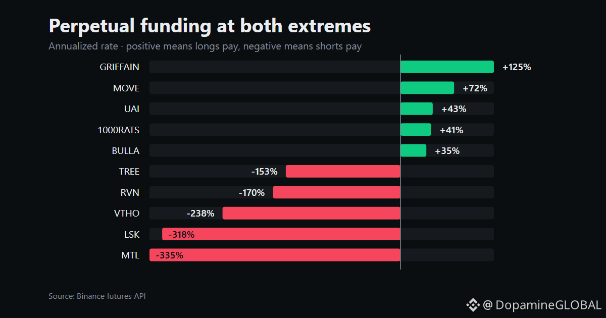
The funding chart shows the extremity, but it can’t tell us whether this is fresh shorting or old positions being unwound. Nor does it predict the next price move. It says the perp market is paying a steep rate for one side of the trade right now, while participation has thinned.
$DEXE has a crowded-looking account split, but the money-weighted positioning may be leaning the other way.
Not financial advice. Do your own research.
#DEXE #Funding #Perpetuals
The weird part of $DEXE right now is that the account count leans long, yet the contract is printing -217% annualized funding.
That isn’t a clean “everyone is short” signal. A 1.72 long/short account ratio only counts accounts, not the size of their positions. Larger shorts can still control the funding payment, especially while open interest is down 14% over seven days.
Price is also down 3.6% over 24h. The likely mechanism is forced or voluntary position reduction, with short-side exposure still heavy enough among the remaining contracts to push funding deeply negative. The long-account headline misses the sizing question.
The funding chart shows the extremity, but it can’t tell us whether this is fresh shorting or old positions being unwound. Nor does it predict the next price move. It says the perp market is paying a steep rate for one side of the trade right now, while participation has thinned.
$DEXE has a crowded-looking account split, but the money-weighted positioning may be leaning the other way.
Not financial advice. Do your own research.
#DEXE #Funding #Perpetuals
That isn’t a clean “everyone is short” signal. A 1.72 long/short account ratio only counts accounts, not the size of their positions. Larger shorts can still control the funding payment, especially while open interest is down 14% over seven days.
Price is also down 3.6% over 24h. The likely mechanism is forced or voluntary position reduction, with short-side exposure still heavy enough among the remaining contracts to push funding deeply negative. The long-account headline misses the sizing question.
The funding chart shows the extremity, but it can’t tell us whether this is fresh shorting or old positions being unwound. Nor does it predict the next price move. It says the perp market is paying a steep rate for one side of the trade right now, while participation has thinned.
$DEXE has a crowded-looking account split, but the money-weighted positioning may be leaning the other way.
Not financial advice. Do your own research.
#DEXE #Funding #Perpetuals

538
XRP’s account ratio says 71.5% of accounts are long, but the derivatives footprint is shrinking. In the current 7d snapshot, $XRP open interest is down 12.7% while the token is down 3.48%.
That isn’t a clean “retail is long, so leverage is building” read. The long/short ratio counts accounts, not the size of their positions. A large number of small long accounts can coexist with bigger shorts, or with traders closing both sides. Falling OI says positions are leaving the market, but it cannot identify whether longs or shorts are doing most of the closing.
The funding rate adds another wrinkle: -2.5% annualized means shorts are paying longs to keep the perpetual balanced. So the account count leans long, funding leans toward short-side demand, and aggregate exposure is being reduced. Those metrics aren’t contradictory. They measure different layers of the trade.
The funding chart can show where XRP sits against the most extreme contracts, but it doesn’t settle the exposure question by itself. Account ratios aren’t a capital-flow gauge.
Not financial advice. Do your own research.
#XRP #Perpetuals #Positioning
XRP’s account ratio says 71.5% of accounts are long, but the derivatives footprint is shrinking. In the current 7d snapshot, $XRP open interest is down 12.7% while the token is down 3.48%.
That isn’t a clean “retail is long, so leverage is building” read. The long/short ratio counts accounts, not the size of their positions. A large number of small long accounts can coexist with bigger shorts, or with traders closing both sides. Falling OI says positions are leaving the market, but it cannot identify whether longs or shorts are doing most of the closing.
The funding rate adds another wrinkle: -2.5% annualized means shorts are paying longs to keep the perpetual balanced. So the account count leans long, funding leans toward short-side demand, and aggregate exposure is being reduced. Those metrics aren’t contradictory. They measure different layers of the trade.
The funding chart can show where XRP sits against the most extreme contracts, but it doesn’t settle the exposure question by itself. Account ratios aren’t a capital-flow gauge.
Not financial advice. Do your own research.
#XRP #Perpetuals #Positioning
That isn’t a clean “retail is long, so leverage is building” read. The long/short ratio counts accounts, not the size of their positions. A large number of small long accounts can coexist with bigger shorts, or with traders closing both sides. Falling OI says positions are leaving the market, but it cannot identify whether longs or shorts are doing most of the closing.
The funding rate adds another wrinkle: -2.5% annualized means shorts are paying longs to keep the perpetual balanced. So the account count leans long, funding leans toward short-side demand, and aggregate exposure is being reduced. Those metrics aren’t contradictory. They measure different layers of the trade.
The funding chart can show where XRP sits against the most extreme contracts, but it doesn’t settle the exposure question by itself. Account ratios aren’t a capital-flow gauge.
Not financial advice. Do your own research.
#XRP #Perpetuals #Positioning

18
The altcoin crowd is leaning further long while the futures board gets smaller.
On $SOL, the long/short account ratio rose from 1.90 to 2.24 in a week. Yet price fell 2.27% and open interest dropped 9.6%. $XRP shows the same structure: the ratio moved from 2.14 to 2.51, price fell 3.48%, and open interest contracted 12.7%.
That isn’t clean evidence of aggressive long buildup. The account ratio counts how many accounts sit on each side. Open interest measures outstanding exposure, not conviction. So more accounts can be long while the market is carrying less total risk, especially if larger positions are being closed as smaller accounts lean one way.
The naive read is “retail is adding leverage and getting punished.” The data only supports the first half partially. It shows a more long-heavy account mix during broad deleveraging. It cannot tell us whether those new longs are large enough to matter, or whether the biggest positions are long or short.
The same pattern is visible in $BNB, where the ratio reached 2.62 as open interest fell 7.3% and the weekly move was -1.11%. Positioning is shifting, but the exposure behind it is thinning.
Not financial advice. Do your own research.
#Altcoins #Futures
The altcoin crowd is leaning further long while the futures board gets smaller.
On $SOL , the long/short account ratio rose from 1.90 to 2.24 in a week. Yet price fell 2.27% and open interest dropped 9.6%. $XRP shows the same structure: the ratio moved from 2.14 to 2.51, price fell 3.48%, and open interest contracted 12.7%.
That isn’t clean evidence of aggressive long buildup. The account ratio counts how many accounts sit on each side. Open interest measures outstanding exposure, not conviction. So more accounts can be long while the market is carrying less total risk, especially if larger positions are being closed as smaller accounts lean one way.
The naive read is “retail is adding leverage and getting punished.” The data only supports the first half partially. It shows a more long-heavy account mix during broad deleveraging. It cannot tell us whether those new longs are large enough to matter, or whether the biggest positions are long or short.
The same pattern is visible in $BNB , where the ratio reached 2.62 as open interest fell 7.3% and the weekly move was -1.11%. Positioning is shifting, but the exposure behind it is thinning.
Not financial advice. Do your own research.
#Altcoins #Futures
On $SOL , the long/short account ratio rose from 1.90 to 2.24 in a week. Yet price fell 2.27% and open interest dropped 9.6%. $XRP shows the same structure: the ratio moved from 2.14 to 2.51, price fell 3.48%, and open interest contracted 12.7%.
That isn’t clean evidence of aggressive long buildup. The account ratio counts how many accounts sit on each side. Open interest measures outstanding exposure, not conviction. So more accounts can be long while the market is carrying less total risk, especially if larger positions are being closed as smaller accounts lean one way.
The naive read is “retail is adding leverage and getting punished.” The data only supports the first half partially. It shows a more long-heavy account mix during broad deleveraging. It cannot tell us whether those new longs are large enough to matter, or whether the biggest positions are long or short.
The same pattern is visible in $BNB , where the ratio reached 2.62 as open interest fell 7.3% and the weekly move was -1.11%. Positioning is shifting, but the exposure behind it is thinning.
Not financial advice. Do your own research.
#Altcoins #Futures
26
A big percentage move means far less on a thin book than traders think.
The mechanic is simple: the percentage uses a small starting point, while the order book may have very little liquidity to absorb trades. A hypothetical token with $100,000 in daily volume can print a 20% volume increase from just $20,000 of extra trading. The same dollar flow is only 0.2% against a $10 million market.
That doesn’t make the move fake. It means the headline is describing scale relative to a weak base, not broad participation. A few market orders can lift offers, trigger stops and pull in bots. The chart then looks decisive because the book was shallow, not because a large crowd reached the same conclusion.
People also read the percentage as proof of strength. It isn’t. Volume growth can’t tell you whether trades were aggressive buying or aggressive selling. A sharp percentage move in $BTC or $ETH usually needs more capital than the same percentage move in a small token, but the headline often hides that difference.
Check the dollar amount and the depth around the market. Without them, percentage change is a magnifying glass pointed at the denominator.
Not financial advice. Do your own research.
#CryptoTrading #MarketStructure #Liquidity
A big percentage move means far less on a thin book than traders think.
The mechanic is simple: the percentage uses a small starting point, while the order book may have very little liquidity to absorb trades. A hypothetical token with $100,000 in daily volume can print a 20% volume increase from just $20,000 of extra trading. The same dollar flow is only 0.2% against a $10 million market.
That doesn’t make the move fake. It means the headline is describing scale relative to a weak base, not broad participation. A few market orders can lift offers, trigger stops and pull in bots. The chart then looks decisive because the book was shallow, not because a large crowd reached the same conclusion.
People also read the percentage as proof of strength. It isn’t. Volume growth can’t tell you whether trades were aggressive buying or aggressive selling. A sharp percentage move in $BTC or $ETH usually needs more capital than the same percentage move in a small token, but the headline often hides that difference.
Check the dollar amount and the depth around the market. Without them, percentage change is a magnifying glass pointed at the denominator.
Not financial advice. Do your own research.
#CryptoTrading #MarketStructure #Liquidity
The mechanic is simple: the percentage uses a small starting point, while the order book may have very little liquidity to absorb trades. A hypothetical token with $100,000 in daily volume can print a 20% volume increase from just $20,000 of extra trading. The same dollar flow is only 0.2% against a $10 million market.
That doesn’t make the move fake. It means the headline is describing scale relative to a weak base, not broad participation. A few market orders can lift offers, trigger stops and pull in bots. The chart then looks decisive because the book was shallow, not because a large crowd reached the same conclusion.
People also read the percentage as proof of strength. It isn’t. Volume growth can’t tell you whether trades were aggressive buying or aggressive selling. A sharp percentage move in $BTC or $ETH usually needs more capital than the same percentage move in a small token, but the headline often hides that difference.
Check the dollar amount and the depth around the market. Without them, percentage change is a magnifying glass pointed at the denominator.
Not financial advice. Do your own research.
#CryptoTrading #MarketStructure #Liquidity
6
ETH is near the top of its 30-day range, but the leverage underneath hasn’t expanded with it.
$ETH sits at 2,465.37, or 86% through the 1,864–2,567 band, after gaining 31.15% over 30 days. The account mix is long-heavy too: the long/short ratio climbed from 2.23 to 2.74 in a week, leaving 73.2% of accounts on the long side.
That looks bullish if you read the ratio alone. It isn’t that simple. Open interest fell 2.5% over the same period, while funding is only 6.8% annualized. More accounts are net long, but the total pool of open positions is slightly smaller. That points more toward shorts being reduced or positions being redistributed than a clean wave of fresh leverage.
The funding chart shows ETH’s carrying cost is positive, but it doesn’t settle who has the larger notional exposure. Account ratios count traders, not position size, and they say nothing about whether those longs are profitable.
So the live signal is crowded sentiment near the upper end of the range, without matching OI growth. That’s a thinner claim than “everyone is piling into ETH,” and the data supports only the former.
Not financial advice. Do your own research.
#Ethereum #ETH #Derivatives
ETH is near the top of its 30-day range, but the leverage underneath hasn’t expanded with it.
$ETH sits at 2,465.37, or 86% through the 1,864–2,567 band, after gaining 31.15% over 30 days. The account mix is long-heavy too: the long/short ratio climbed from 2.23 to 2.74 in a week, leaving 73.2% of accounts on the long side.
That looks bullish if you read the ratio alone. It isn’t that simple. Open interest fell 2.5% over the same period, while funding is only 6.8% annualized. More accounts are net long, but the total pool of open positions is slightly smaller. That points more toward shorts being reduced or positions being redistributed than a clean wave of fresh leverage.
The funding chart shows ETH’s carrying cost is positive, but it doesn’t settle who has the larger notional exposure. Account ratios count traders, not position size, and they say nothing about whether those longs are profitable.
So the live signal is crowded sentiment near the upper end of the range, without matching OI growth. That’s a thinner claim than “everyone is piling into ETH,” and the data supports only the former.
Not financial advice. Do your own research.
#Ethereum #ETH #Derivatives
$ETH sits at 2,465.37, or 86% through the 1,864–2,567 band, after gaining 31.15% over 30 days. The account mix is long-heavy too: the long/short ratio climbed from 2.23 to 2.74 in a week, leaving 73.2% of accounts on the long side.
That looks bullish if you read the ratio alone. It isn’t that simple. Open interest fell 2.5% over the same period, while funding is only 6.8% annualized. More accounts are net long, but the total pool of open positions is slightly smaller. That points more toward shorts being reduced or positions being redistributed than a clean wave of fresh leverage.
The funding chart shows ETH’s carrying cost is positive, but it doesn’t settle who has the larger notional exposure. Account ratios count traders, not position size, and they say nothing about whether those longs are profitable.
So the live signal is crowded sentiment near the upper end of the range, without matching OI growth. That’s a thinner claim than “everyone is piling into ETH,” and the data supports only the former.
Not financial advice. Do your own research.
#Ethereum #ETH #Derivatives

9
ETH’s account count leaned harder long this week, but the aggregate exposure didn’t follow.
The long/short account ratio rose from 2.23 to 2.74, putting 73.2% of accounts on the long side. Yet ETH open interest fell 2.5% over the same seven days, while price slipped 0.49%. Funding also sat at -2.3% annualized.
That combination points to a split between who is trading and how much they’re trading. More accounts can be long while larger positions are being closed, or while new longs are small enough to replace fewer contracts than the market loses. The ratio is account-weighted, not capital-weighted, so 73.2% long does not mean 73.2% of ETH exposure is long.
Negative funding adds another wrinkle: longs aren’t paying a premium to shorts despite the bullish account skew. The snapshot can show positioning pressure, not trader conviction or liquidation risk. $ETH
Not financial advice. Do your own research.
#Ethereum #Derivatives #MarketStructure
ETH’s account count leaned harder long this week, but the aggregate exposure didn’t follow.
The long/short account ratio rose from 2.23 to 2.74, putting 73.2% of accounts on the long side. Yet ETH open interest fell 2.5% over the same seven days, while price slipped 0.49%. Funding also sat at -2.3% annualized.
That combination points to a split between who is trading and how much they’re trading. More accounts can be long while larger positions are being closed, or while new longs are small enough to replace fewer contracts than the market loses. The ratio is account-weighted, not capital-weighted, so 73.2% long does not mean 73.2% of ETH exposure is long.
Negative funding adds another wrinkle: longs aren’t paying a premium to shorts despite the bullish account skew. The snapshot can show positioning pressure, not trader conviction or liquidation risk. $ETH
Not financial advice. Do your own research.
#Ethereum #Derivatives #MarketStructure
The long/short account ratio rose from 2.23 to 2.74, putting 73.2% of accounts on the long side. Yet ETH open interest fell 2.5% over the same seven days, while price slipped 0.49%. Funding also sat at -2.3% annualized.
That combination points to a split between who is trading and how much they’re trading. More accounts can be long while larger positions are being closed, or while new longs are small enough to replace fewer contracts than the market loses. The ratio is account-weighted, not capital-weighted, so 73.2% long does not mean 73.2% of ETH exposure is long.
Negative funding adds another wrinkle: longs aren’t paying a premium to shorts despite the bullish account skew. The snapshot can show positioning pressure, not trader conviction or liquidation risk. $ETH
Not financial advice. Do your own research.
#Ethereum #Derivatives #MarketStructure
4
Bitcoin’s weekly positioning got thinner while the account mix leaned harder long.
Over 7d, $BTC fell 3.58% and open interest dropped 10.7%. At the same time, the long/short account ratio jumped from 0.78 to 1.60, putting 61.6% of accounts on the long side.
The naive read is “traders are bullish.” The cleaner read is that exposure is being removed, while the accounts still active are skewing long. Those are different signals. A shrinking OI base means fewer open contracts are left to express that view, so the ratio can improve even as total risk comes down.
There’s another catch: this is an account count, not a position-weighted balance. One large short can outweigh many smaller long accounts, and this snapshot can’t tell us that split. It also can’t prove the remaining longs are fresh conviction rather than traders closing shorts or adding small size.
That leaves a market with less leverage outstanding, but a more one-sided account composition among those still open. $BTC positioning looks more concentrated, not necessarily stronger.
Not financial advice. Do your own research.
#Bitcoin #Derivatives
Bitcoin’s weekly positioning got thinner while the account mix leaned harder long.
Over 7d, $BTC fell 3.58% and open interest dropped 10.7%. At the same time, the long/short account ratio jumped from 0.78 to 1.60, putting 61.6% of accounts on the long side.
The naive read is “traders are bullish.” The cleaner read is that exposure is being removed, while the accounts still active are skewing long. Those are different signals. A shrinking OI base means fewer open contracts are left to express that view, so the ratio can improve even as total risk comes down.
There’s another catch: this is an account count, not a position-weighted balance. One large short can outweigh many smaller long accounts, and this snapshot can’t tell us that split. It also can’t prove the remaining longs are fresh conviction rather than traders closing shorts or adding small size.
That leaves a market with less leverage outstanding, but a more one-sided account composition among those still open. $BTC positioning looks more concentrated, not necessarily stronger.
Not financial advice. Do your own research.
#Bitcoin #Derivatives
Over 7d, $BTC fell 3.58% and open interest dropped 10.7%. At the same time, the long/short account ratio jumped from 0.78 to 1.60, putting 61.6% of accounts on the long side.
The naive read is “traders are bullish.” The cleaner read is that exposure is being removed, while the accounts still active are skewing long. Those are different signals. A shrinking OI base means fewer open contracts are left to express that view, so the ratio can improve even as total risk comes down.
There’s another catch: this is an account count, not a position-weighted balance. One large short can outweigh many smaller long accounts, and this snapshot can’t tell us that split. It also can’t prove the remaining longs are fresh conviction rather than traders closing shorts or adding small size.
That leaves a market with less leverage outstanding, but a more one-sided account composition among those still open. $BTC positioning looks more concentrated, not necessarily stronger.
Not financial advice. Do your own research.
#Bitcoin #Derivatives
8
A huge open-interest percentage can describe a tiny positioning change.
That’s the mistake traders make with $BTC derivatives. They see OI up 100% and read it as a massive wave of new risk. The percentage only compares today’s contracts with the starting base. It says nothing about how large that base was.
Hypothetical example: a market going from $1 million of OI to $2 million has doubled, but added just $1 million. Another market moving from $100 million to $110 million is up only 10%, yet traders added ten times as much exposure.
The mechanism matters. OI rises when new positions are opened, but the percentage can look extreme simply because the market began quiet. A small venue, a thin contract, or a newly launched pair can produce dramatic-looking growth without attracting much capital.
OI also can’t tell you whether longs or shorts dominate, whether the positions are hedged, or whether the added exposure is likely to remain open. It measures outstanding contracts, not conviction.
Read the percentage beside the absolute OI. Ignore the first number and you may mistake a small market waking up for a major positioning shift.
Not financial advice. Do your own research.
#Bitcoin #Derivatives
A huge open-interest percentage can describe a tiny positioning change.
That’s the mistake traders make with $BTC derivatives. They see OI up 100% and read it as a massive wave of new risk. The percentage only compares today’s contracts with the starting base. It says nothing about how large that base was.
Hypothetical example: a market going from $1 million of OI to $2 million has doubled, but added just $1 million. Another market moving from $100 million to $110 million is up only 10%, yet traders added ten times as much exposure.
The mechanism matters. OI rises when new positions are opened, but the percentage can look extreme simply because the market began quiet. A small venue, a thin contract, or a newly launched pair can produce dramatic-looking growth without attracting much capital.
OI also can’t tell you whether longs or shorts dominate, whether the positions are hedged, or whether the added exposure is likely to remain open. It measures outstanding contracts, not conviction.
Read the percentage beside the absolute OI. Ignore the first number and you may mistake a small market waking up for a major positioning shift.
Not financial advice. Do your own research.
#Bitcoin #Derivatives
That’s the mistake traders make with $BTC derivatives. They see OI up 100% and read it as a massive wave of new risk. The percentage only compares today’s contracts with the starting base. It says nothing about how large that base was.
Hypothetical example: a market going from $1 million of OI to $2 million has doubled, but added just $1 million. Another market moving from $100 million to $110 million is up only 10%, yet traders added ten times as much exposure.
The mechanism matters. OI rises when new positions are opened, but the percentage can look extreme simply because the market began quiet. A small venue, a thin contract, or a newly launched pair can produce dramatic-looking growth without attracting much capital.
OI also can’t tell you whether longs or shorts dominate, whether the positions are hedged, or whether the added exposure is likely to remain open. It measures outstanding contracts, not conviction.
Read the percentage beside the absolute OI. Ignore the first number and you may mistake a small market waking up for a major positioning shift.
Not financial advice. Do your own research.
#Bitcoin #Derivatives
32
ZBT perpetuals are pricing a crowded short side right now: funding is -391% annualized, while the long/short account ratio sits at 0.73. Shorts are paying longs to keep those positions open, even as short accounts outnumber long accounts.
That combination is more useful than either figure alone. The crowd is leaning short by account count, but the funding bill says the short side is paying up for leverage. This isn’t a clean bearish signal. It’s a sign that the trade is expensive for shorts if the position remains open.
Open interest is down only 2% over 7d, and ZBT is down 1.7% over 24h. So this doesn’t look like a fresh wave of contracts flooding in. Existing positioning is being repriced, with shorts still dominant enough to push funding deeply negative.
The funding chart shows the extremity, but it can’t tell us whether this is large traders or many smaller accounts. The 0.73 ratio is account-based, not a measure of position size. $ZBT’s next move isn’t settled by funding alone.
Not financial advice. Do your own research.
#ZBT #Funding #Perpetuals
ZBT perpetuals are pricing a crowded short side right now: funding is -391% annualized, while the long/short account ratio sits at 0.73. Shorts are paying longs to keep those positions open, even as short accounts outnumber long accounts.
That combination is more useful than either figure alone. The crowd is leaning short by account count, but the funding bill says the short side is paying up for leverage. This isn’t a clean bearish signal. It’s a sign that the trade is expensive for shorts if the position remains open.
Open interest is down only 2% over 7d, and ZBT is down 1.7% over 24h. So this doesn’t look like a fresh wave of contracts flooding in. Existing positioning is being repriced, with shorts still dominant enough to push funding deeply negative.
The funding chart shows the extremity, but it can’t tell us whether this is large traders or many smaller accounts. The 0.73 ratio is account-based, not a measure of position size. $ZBT ’s next move isn’t settled by funding alone.
Not financial advice. Do your own research.
#ZBT #Funding #Perpetuals
That combination is more useful than either figure alone. The crowd is leaning short by account count, but the funding bill says the short side is paying up for leverage. This isn’t a clean bearish signal. It’s a sign that the trade is expensive for shorts if the position remains open.
Open interest is down only 2% over 7d, and ZBT is down 1.7% over 24h. So this doesn’t look like a fresh wave of contracts flooding in. Existing positioning is being repriced, with shorts still dominant enough to push funding deeply negative.
The funding chart shows the extremity, but it can’t tell us whether this is large traders or many smaller accounts. The 0.73 ratio is account-based, not a measure of position size. $ZBT ’s next move isn’t settled by funding alone.
Not financial advice. Do your own research.
#ZBT #Funding #Perpetuals

235
Log in to explore more content
Join global crypto users on Binance Square
⚡️ Get latest and useful information about crypto.
💬 Trusted by the world’s largest crypto exchange.
👍 Discover real insights from verified creators.
Email / Phone number
Trending Topics
CryptoLiquidations$674MIn24H
59 views
12 Discussing
📉 MARKET LIQUIDATION ALERT: $674M Wiped Out in 24 Hours
Data from CoinGlass reveals massive volatility over the last 24 hours, triggering $674 Million in forced liquidations across major exchanges (Binance, Bybit, OKX).
📍 The Numbers Breakdown:
Total Liquidated Volume: $674.00 Million
Short Liquidations: $381.00 Million (56.5% of total)
Long Liquidations: $292.00 Million (43.5% of total)
💡 Key Takeaways for Traders:
Short Squeeze Pressure: The heavy concentration in short liquidations ($381M) signals aggressive upward spikes sweeping over-leveraged bears before price action stabilized.
Two-Way Volatility: With long traders also losing $292M, the market experienced severe stop-hunting and liquidation wicks in both directions.
Cascading Market Orders: High leverage on $BTC and$ETH triggered automated forced market sales, creating rapid domino-style volatility.
💬 Market Debate:
Was this liquidations cascade the final leverage flush before a continuation breakout, or are we heading for deeper downside? Drop your bias below! 👇
Click here to view the chart 👇️
$XRP #CPIwatch #CryptoLiquidations$674MIn24H #RevolutConfirmsFakeGovEmailDataBreach #CanadaOSFISaysTokenizedDepositsEqualTraditionalDeposits #NvidiaInTalksToInvestUpTo$10BInAnthropicIPO
KimHotbae
·0 Likes
·34 views
RevolutConfirmsFakeGovEmailDataBreach
2,875 views
126 Discussing
CanadaOSFISaysTokenizedDepositsEqualTraditionalDeposits
417 views
28 Discussing