

There are moments in every market where price appears to move on its own, and yet when you look closely, you realize the behaviour started forming long before any candle broke structure. @Morpho Labs 🦋 is entering one of those phases now, and the most interesting part is that you can see the entire pattern unfold through its new on-chain metrics before the chart even starts responding. What looks like volatility on the surface is simply the delayed effect of liquidity decisions happening inside the protocol. Morpho’s new dashboard makes that relationship visible in a way that feels almost predictive.
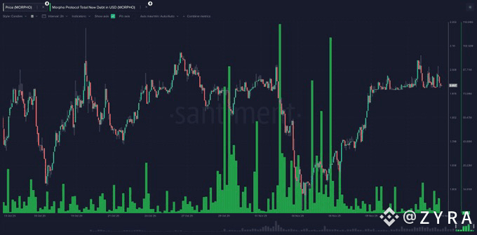
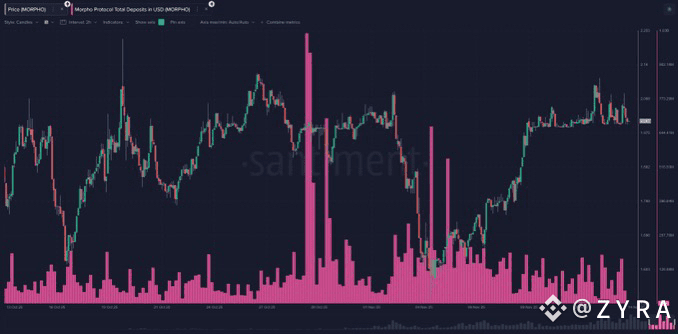
The first thing that stands out is the rhythm between Total Borrowed and price. Borrowing is not a passive data point on Morpho. It is a direct expression of how confident lenders and borrowers feel about yield, stability, and market conditions. Each surge on the borrowing chart represents a moment where users take more leverage because they see opportunity. Each drop shows hesitation or active deleveraging. When you align these borrowing spikes with the price chart, you notice something surprisingly consistent. Borrowing tends to rise before the market turns aggressive, and deleveraging often begins before any visible top. This tells you that liquidity behaviour inside Morpho acts as an early signal for traders watching the broader market.
The charts show this clearly during the periods where borrowing volume suddenly expands even when price is consolidating. These moments are often lost in the noise, but Morpho exposes them clearly. Borrowers move early. Spot moves later. It becomes obvious when you compare the bright pink borrowing bar spikes with the price structure. They begin showing patterns that reveal where momentum is silently building behind the scenes. The same applies when borrowing collapses sharply. Those drops align with liquidity being pulled back across the ecosystem, and price eventually responds to that absence of confidence. When you treat these borrowing bars as behavioral signals rather than statistics, the market starts making a lot more sense.
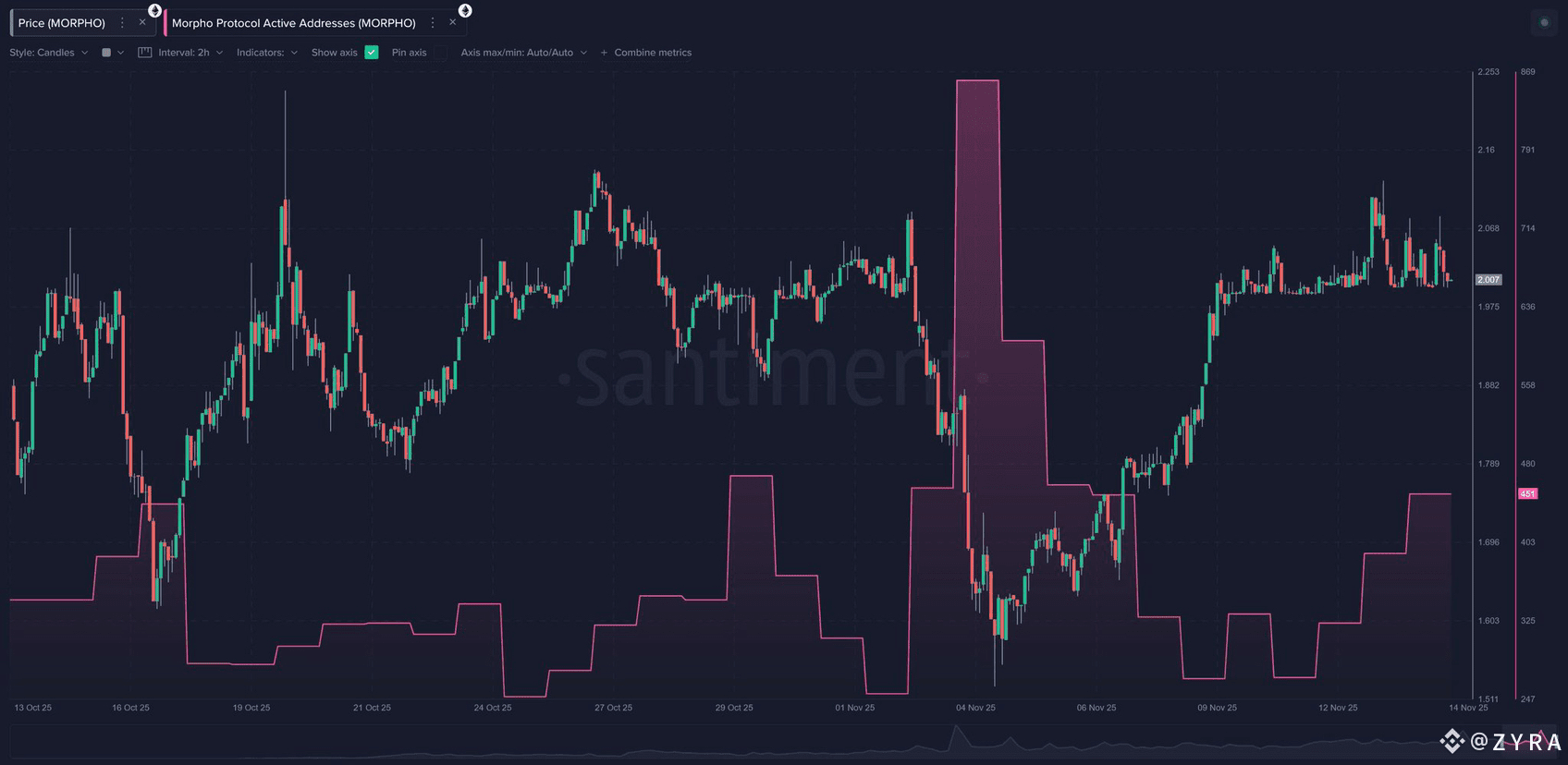
Active addresses add another dimension to this story. Many people treat active address metrics as if they simply reflect user interest, but on Morpho, they reveal something deeper. They show when capital is rotating. You can see spikes in active addresses during moments where users are repositioning aggressively, moving collateral, refinancing debt, or shifting into higher-yield vaults. Those movements are not random. They represent the internal restructuring of the market before it becomes visible in price. When active addresses increase during periods of falling price, it signals accumulation behavior. When they drop during rising candles, it often means the move is losing strength.
One of the most interesting patterns appears when you look at the moments where active addresses surge while borrowing volume also spikes. These moments usually reflect coordinated conviction. Many participants make the same decision at the same time, not because they are influenced by each other, but because the market is presenting the same opportunity across multiple vaults and assets. This alignment becomes one of the most reliable early-momentum signals Morpho provides. It shows where liquidity is preparing to move, not where it has already gone.
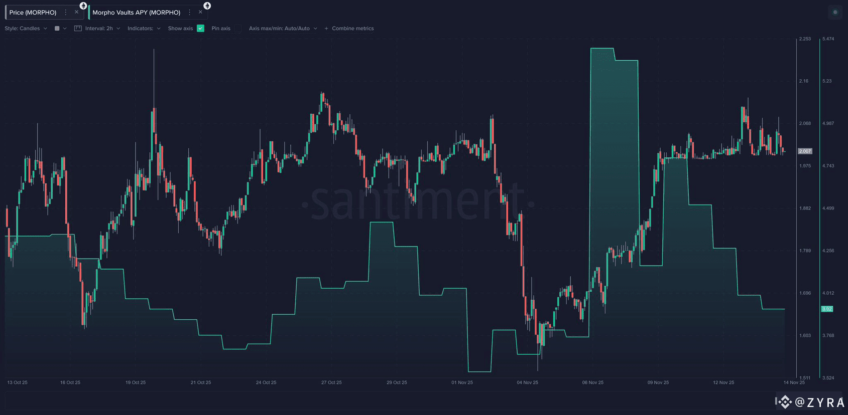
Vault APY shifts complete the picture. APY on Morpho is not a cosmetic yield number. It reflects real lending demand, real borrower appetite, and real liquidity pressure inside the protocol. When APY rises sharply, it tells you that borrowers are willing to pay more for leverage. When it falls, it signals that liquidity is plentiful and borrowing has slowed. These APY steps often appear before major market shifts because they reflect the demand side of liquidity rather than the visible price side. If APY rises during sideways movement, it usually means capital is quietly positioning for volatility. If APY collapses during an uptrend, it often signals exhaustion ahead of the chart.
When I look at these three metrics together Total Borrowed, Active Addresses and Vault APY, each one contains a different part of the story. Borrowed amount tells you about leverage buildup. Address activity tells you about user rotation. APY tells you about liquidity pressure. When all three align, the market moves. And when they diverge, they reveal hesitation, uncertainty, or hidden imbalances. These imbalances often precede trend reversals, making Morpho’s dashboard less of an analytics tool and more of a behavioral map.
Once you begin treating Morpho’s metrics as a behavioral map instead of isolated datapoints, the relationship between user actions and market structure becomes much clearer. What appears at first to be noise begins forming recognizable cycles, and these cycles often start well before price acknowledges them. The value of this kind of visibility is that it tells you not only where liquidity is flowing, but also where confidence is returning or fading. As markets become more complex, being able to see that confidence shift at the protocol level becomes a real advantage.
One of the strongest early signals emerges when you compare borrowing spikes with periods of flat price action. There are several moments across the chart where borrowing volume rises sharply during periods when the candle structure seems neutral or even unremarkable. These moments are important because borrowers are rarely neutral participants. They commit capital when they expect movement. Their willingness to pay interest is itself a signal of conviction. When borrowers increase positions during consolidation, it often means they see risk as limited and opportunity as building. When you watch these bars expand underneath a silent chart, you begin to catch a glimpse of the next wave of positioning before it reflects in candles.
The opposite pattern is just as revealing. When borrowing rapidly unwinds without any dramatic price movement yet, it often means liquidity providers are stepping out early to avoid exposure. Price tends to react later, and when it does, the move usually feels sudden even though the liquidity exit began long before. Morpho’s dashboard makes this visible in a way that removes that sense of surprise. It exposes the internal unwind of leverage that rarely shows up on centralized exchange charts. This matters because it explains why some selloffs feel sharper than expected. They happen in markets where leverage was already weakening internally, and the protocol was showing that change before the chart confirmed it.
Active addresses add another layer of early detection. When user activity rises sharply during a downtrend, it does not necessarily mean panic. Often it represents a rotation of positions where users are adjusting collateral, securing healthier margin positions, or selectively redeploying during volatility. This kind of address activity becomes a sign of accumulation rather than fear. You can see this clearly during periods where address activity increases even though price is falling. These moments reflect engagement rather than withdrawal. Markets tend to recover more strongly when user engagement persists through weakness, and Morpho’s data reveals that resilience long before any reversal candle appears.
A different signal emerges when address activity collapses even while the chart attempts to move upward. Rising price with declining participation rarely sustains itself. It reflects a move powered by thin liquidity rather than genuine appetite. When active addresses decline into an uptrend, it often means that the foundational support of the ecosystem is not aligned with the move. These unconfirmed rises frequently fade, and Morpho’s dashboard shows the disconnect early enough for traders to recognize it before the structure breaks.
The APY regime completes this picture by telling you how pressure moves inside the protocol. When APY rises quickly, it indicates that borrowing demand is climbing faster than available liquidity. This tends to happen when users expect volatility or see opportunity ahead. When APY rises during flat price action, the signal becomes even stronger because it shows that appetite for leverage is increasing despite the absence of external catalysts. It suggests that the market is preparing for movement even though harga candles have not yet adjusted. These APY transitions often act like fault lines beneath the chart, showing where pressure is building before the surface cracks.
In contrast, when APY falls sharply during what looks like healthy price action, it reveals a different kind of weakness. It means that borrowing appetite is drying even though candles are rising. This mismatch is often a precursor to a fading trend. It shows that the internal drivers of liquidity are not aligned with the visible move, and price eventually adjusts to reflect that lack of support. Morpho’s dashboard exposes that misalignment early enough for it to matter.
When I view Borrowed Amount, Active Addresses and APY together, the patterns begin forming a story that price alone cannot tell. Imagine a moment where borrowed volume increases, active addresses surge, and APY climbs at the same time. That alignment almost always precedes a major shift because the market is signaling momentum from every angle. Liquidity builds. Participation strengthens. Borrowers show conviction. The protocol reacts with rising pressure. And eventually, the chart follows. These rare alignments represent some of the clearest signals Morpho provides, because they show the internal market preparing for expansion before it becomes visible externally.
Across the charts, there are moments where all three metrics move at once, especially around areas where price begins turning after long stretches of uncertainty. When these three on-chain signals converge, they do more than confirm sentiment. They show that liquidity and conviction are synchronizing. They reflect a moment where multiple groups of users independently make decisions that align in direction and timing. Price is always the final expression of this alignment, not the first.
I think Morpho’s new dashboard offers an unusually clean window into early market structure because it reveals the mechanics behind user behaviour rather than the surface-level outcome. Borrowing exposes leverage buildup. Address activity exposes engagement and rotation. APY exposes liquidity pressure. Together, they form a map that lets you see the market prepare for movement before the movement becomes obvious. In environments where every second of clarity matters, a signal map like this becomes more than an analytics tool. It becomes a way of reading the intentions of the market itself, long before those intentions turn into action.
