Brothers, what do we fear the most while mingling in the circle?
It’s not about missing out or being trapped; it’s about investing a lot of time researching and thinking a project's fundamentals and token model are perfect, only to be crushed by a few 'scientists' or project team's related wallets right after launch, while you stand at the peak, looking at the K-line chart, not knowing what happened.
We always say that Web3 is transparent and decentralized. That's true; browsers like Etherscan lay all transactions before us. But the problem is, it's just a series of cold codes and addresses, like a book written in oracle bone script. We can see how much currency A address transferred to B address, but it's hard for us to intuitively see whether dozens of addresses like A, B, C, and D are all controlled by the same person.
This information asymmetry is the 'hidden weapon' that whales and project teams use to harvest us.
What I want to talk about today, Bubblemaps, is a 'mirror' that reveals these 'hidden weapons.' It doesn’t do complex indicator analysis but focuses on one thing: visualizing the holding relationships of a token in the most intuitive 'bubble chart.'
It’s not data; it’s relationships.
You might say that I can see the holding rankings on the blockchain browser. It’s not the same; it’s completely different.
The browser shows you a static, fragmented list of top holders. Bubblemaps provides you with a dynamic, interconnected relationship map.
Each 'bubble' represents a wallet holding tokens; the larger the bubble, the more tokens held.
The 'lines' between bubbles represent transfers of tokens or gas fees (ETH/BNB, etc.) between them.
This simple logic can instantly help you uncover many scams:
Unmasking 'pseudo-decentralization': Project teams often say, 'Our token distribution is very healthy, with no whales.' But when you look at it with Bubblemaps, you might find that out of the top 50 holding addresses, 30 are connected to the same initial wallet through a web of transfers. This is not decentralization; it's clearly a 'front' for shifting assets between hands, a 'chain bomb' that could detonate at any moment.
Tracking smart money/whale movements: When a new token is launched, and you find that several large bubbles (whales) are connected to the hot wallets of Binance and OKX, with no direct connections between them, what does that indicate? It suggests that several unrelated parties may be smart money, simultaneously betting on and building positions after withdrawing from the exchange. The attention value of such projects is far higher than those monopolized by a few connected wallets.
Warning of potential selling pressure risks: When a VC or institution's token unlocks, you will clearly see on the chart a gigantic bubble starting to distribute tokens to dozens of smaller bubbles like flowers scattering in the wind. This indicates they are preparing to offload, breaking down large stakes into smaller ones to avoid one big order crashing the market. If you see this signal, shouldn't you run?
Here's a real example (to avoid impact, we use pseudonyms)
Recently, there was a very popular meme project called $DOGE2.0, which saw a very strong price movement after its launch. Many people shouted to chase it. Habitually, I input its contract address into Bubblemaps.
The result made me gasp.
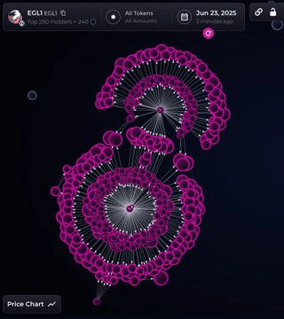
The chart clearly shows that apart from exchanges and LP pools, the largest bubble cluster is distributed by a core wallet to over 20 sub-wallets, collectively holding 15% of the total token supply. These wallet addresses seem unrelated, but under the 'celestial eye,' they form a 'joint fleet.'
What does this mean? As long as that core controller is willing, they can silently offload through these 20+ wallets at any time we perceive 'market sentiment is good,' leaving retail investors completely unaware.
Understanding this chart may only take 30 seconds. But those 30 seconds could help you avoid a deep pit.
How can ordinary people use it?
This tool has almost no barriers to entry:
Enter the Bubblemaps official website.
Select the corresponding chain (ETH, BSC, Polygon, etc.).
Paste the contract address of the token you care about.
Wait a few seconds, and a 'relationship chart' exclusive to this token will be generated.
You can clearly see which are CEX (exchange) wallets, which are DEX LP pools, and more importantly, you can see those concealed underwater, interconnected wallet clusters.
Finally, I want to say a few heartfelt words:
In the dark forest of Web3, ordinary people wanting to make money must first learn how not to lose money. Tools like Bubblemaps may not provide you with a wealth code, but they can give you a pair of eyes to spot dangers, enhancing your DYOR (Do Your Own Research) perspective.
It allows us not to just focus on K-lines and the community's FOMO sentiment, but to truly dive beneath the surface and examine the underlying capital structure of a project.
This may be one of the few fair opportunities for us ordinary people in this harsh market.