Recently, the market has been quite volatile, and many people have been asking me how to find truly valuable Alpha amid the massive amount of information. Rather than where to find it, I want to talk about 'how to look at it'. Today, I won't discuss a specific track or a popular token; instead, I want to share a 'secret weapon' I've used for a long time but haven't seriously talked about — BubbleMaps.

To be honest, when I first started getting into Web3, I was just like everyone else, opening Etherscan felt like reading hieroglyphs, with a bunch of addresses and hash values that made my head spin. We often hear about the movements of 'smart money' on-chain, but those complex tools and data felt like a high wall, firmly blocking us ordinary players from entering. We were like pressing our ears against the wall, trying hard to hear what was happening inside.
Bubble Maps feels to me like someone opened a window for us on this high wall, a visual window.
What it actually does is quite simple: it turns those cold, unrelated wallet addresses into bubbles of various sizes. The more tokens in the wallet, the bigger the bubble. More importantly, if there are transfer relationships between wallets, it will connect these bubbles with a line.
With just this simple change, everything becomes different.
Let me give a real example from my own experience. I previously followed a small project, and the token model seemed perfect, with high community enthusiasm. But when I entered its token contract address into Bubble Maps, I saw a chilling sight: a huge bubble (an early whale) stretching out countless thin lines, connecting dozens of seemingly unrelated 'small bubbles' that actually held a large amount of tokens.
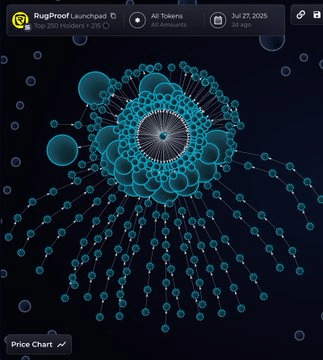
What does this mean? The project team or some early whales, through a large number of separate accounts, have diluted the holding ratios we see from regular block explorers. Once they decide to sell, this seemingly dispersed selling pressure will actually form an unstoppable force to crash the market. If it weren't for Bubble Maps, I might have rushed in excitedly and become yet another batch of 'chives' being harvested.
This is the power that the 'visualization' of on-chain data brings us. It does not predict the market; rather, it gives us a perspective that is closer to the 'truth'.
Of course, Bubble Maps can do much more than this. You can use it to:
Track the movements of 'smart money': See which new tokens those highly profitable whale wallets are currently investing in.
Identify potential risks: Check the token distribution of a new project to see if the chips are too concentrated and if there are potential 'mouse warehouses'.
Discover Alpha: Observing the flow of tokens between exchanges and wallets can sometimes help you sense market anomalies in advance.

It's like turning professional on-chain detective tools into something as simple as a picture description. In the Web3 world, I think this is a true 'user empowerment'.
Having talked so much, I'm not 'selling' this tool; there are many excellent data analysis platforms on the market. I want to use Bubble Maps as an example to discuss a topic with you all:
In the increasingly complex Web3 world, how should we ordinary investors make good use of these tools to build our own investment research system, rather than merely staying at the level of chasing KOLs and the FOMO emotions of the community?


