In financial markets, a trend line is a diagonal line connecting specific data points on a chart, helping analysts and traders intuitively understand price changes and grasp market trends. It is one of the foundational tools of technical analysis and is widely used in stocks, fiat currencies, derivatives, and cryptocurrencies.
Essentially, trend lines are similar in principle to support and resistance levels, but they are diagonal lines (with positive and negative slopes) rather than horizontal lines. Generally, the greater the slope, the more significant the trend. Trend lines are mainly divided into two categories:
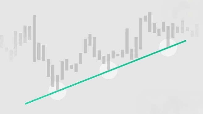
Uptrend line: drawn from the low points on the chart to the high points, connecting two or more lows (such as the higher lows formed in the candlestick chart).
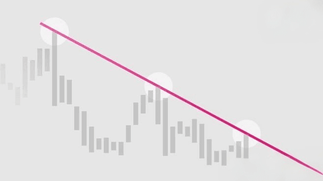
Downtrend line: drawn from the high points on the chart to the low points, connecting two or more highs (i.e., the lower highs formed in the candlestick chart).
How to use trend lines to analyze market conditions?
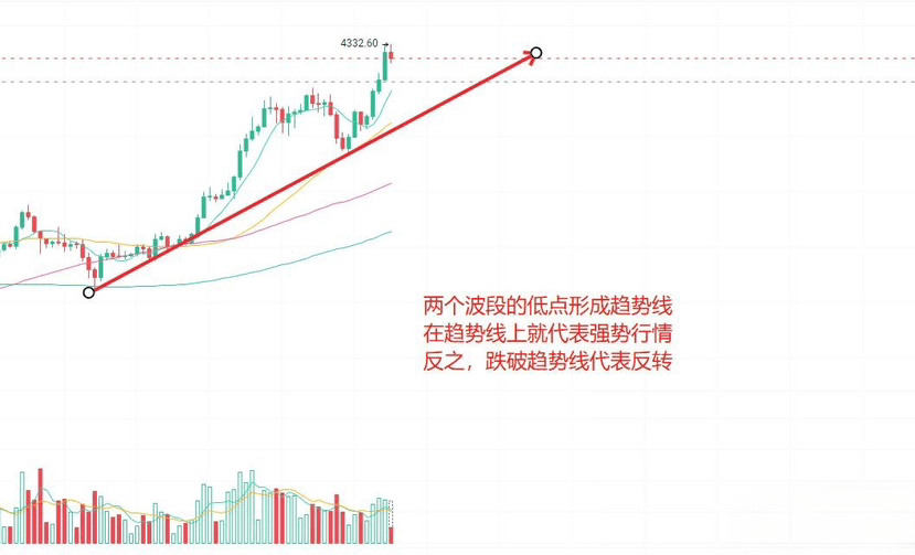
The core function of a trend line is to show the brief impacts and returns of price on the main trend by connecting high and low points. It can be extended to predict future key levels and needs to withstand multiple tests— as long as it has not broken the critical point, it has analytical value.
In financial charts (based on market prices), trend lines can reflect supply and demand relationships:
Uptrend line represents strengthened buying power (undersupply) and can be seen as a support level, making it generally difficult for the price to break below.
The downtrend line reflects weakened buying power (oversupply) and can be seen as a resistance level, making it generally difficult for the price to break above.
If the price breaks through the support level (the uptrend line is broken down) or the resistance level (the downtrend line is broken up), the original trend may become invalid, and the market direction often changes accordingly. However, analysis should consider trading volume: for example, if the price rises but trading volume decreases, it may suggest that demand is overstated.
Drawing trend lines with analytical value
Technically, a trend line must connect at least two points, but most analysts believe that a trend line connecting three or more points is more meaningful. The first two points can suggest a potential trend, while the third and subsequent points (extending over time) are used to validate the trend's validity—if the price touches the trend line three times or more without breaking the critical point, it indicates that the trend is not due to random fluctuations.
Additionally, when drawing, consideration should be given to the scale settings of the chart:
Linear scale: The distance that the price moves up and down on the Y-axis directly reflects the change in absolute value (for example, the segment length from $5 to $10 is the same as from $120 to $125).
Semi-logarithmic scale: Reflects volatility in percentage (for example, the 100% increase from $5 to $10 represents a larger proportion, while the 4% increase from $120 to $125 represents a smaller proportion).
Different scales may lead to discrepancies in high and low points, which can affect the drawing of trend lines.
Summary
Trend lines are effective tools in technical analysis but are not absolutely reliable. Their accuracy is influenced by the subjectivity of the chosen points: for example, some people draw based solely on the bodies of candlesticks, while others refer to the highs and lows of the shadows. Therefore, it is necessary to combine various technical analysis methods with fundamental analysis to reduce risk.