I cannot be called wealthy; I barely have financial freedom. In terms of living, I can only say that my expenses are covered. As long as the path in life and the market is correct, then just strive, and the harvest will not be less!
I still remember when I first entered the market; I thought trading cryptocurrencies was very simple, so I learned a few strategies and several K lines, and I couldn't wait to prove my ability in the crypto space, only to pay a heavy price for my arrogance. Later, when my father found out, he gave me a severe scolding; it was the first time he taught me a lesson, and I secretly resolved not to disappoint him.
The core of successful investing is not to grasp more opportunities but to patiently wait and make good use of a single opportunity, to refine a particular asset. When the opportunity arises, exert tremendous willpower to maximize the trading opportunity. Such trading results are far better than discovering ten trading opportunities and merely skimming the surface each time.
Mastering technology and firmly grasping the main upward trend is key. This is not mere rhetoric; as someone who has been through it, I do not wish for others to walk the same winding path I did. Only those who have been through the rain understand the importance of shielding others from it! I am undoubtedly lucky; I had a mentor once, and now I hope to be that kind of person for others, shielding them from the winds and rains.

So how can one excel in cryptocurrency trading? Once a person enters the financial market, it is hard to turn back. If you are currently at a loss and still feel confused, while planning to treat cryptocurrency trading as a second profession, you must understand the 'simplest MACD strategy'. Understanding and grasping it will help avoid many detours, as these are personal experiences and feelings. It is recommended to save it and ponder over it repeatedly!
The MACD indicator is the most classic technical indicator among all technical indicators. By correctly using this indicator, in conjunction with K lines (daily K lines, weekly K lines), individual stocks, volume, market trends, and news of good or bad events, one can generally achieve better buying and selling outcomes. Below, I will share the most comprehensive uses of the MACD indicator; only those who can truly understand it are experts, and this will only be shared once! #BTC returns to 110,000
The general judgment standards for the MACD indicator mainly revolve around the conditions and forms of the fast and slow moving averages (DIF and DEA lines) and the red and green bars (MACD bars). General analysis methods mainly include the position of DIF and DEA, the crossing conditions of DIF and DEA, the shrinking of red bars, and the forms of MACD charts, analyzed in four major aspects.

01 MACD is the most commonly used indicator by experts
The role of the MACD indicator in technical analysis is extremely special; it can be said to be an essential part of learning technical analysis. Its importance includes at least the following points:
The MACD indicator is the most effective technical indicator verified by historical trends and is also the most widely used indicator.
The MACD indicator is derived from the EMA moving average indicator and has a good application effect in grasping trending markets. Trend investors generally refer to this indicator in practice.
The divergence of the MACD indicator is recognized as the best 'bottom fishing and top escaping' method; this method is an important tool for the specification of trend theory and wave theory.
Many veterans have had the experience: when they first started learning the MACD indicator, they gradually discarded it. After a long period of study and comparison, especially after practical verification, they ultimately returned to the MACD indicator. This shows the uniqueness of this indicator.
The application of the MACD indicator in quantitative trading is also extremely widespread.
Because of these advantages, the MACD indicator has become the most commonly used technical indicator among professional traders.
02
The concept and calculation of the MACD indicator
The MACD indicator, also known as the Exponential Moving Average Convergence Divergence (MACD) indicator, was created by Gerald Appel and is used to track price trends and analyze K line buying and selling opportunities. This indicator is a common tool in trading software and is known as the 'king of indicators'. As shown in Figure 1.
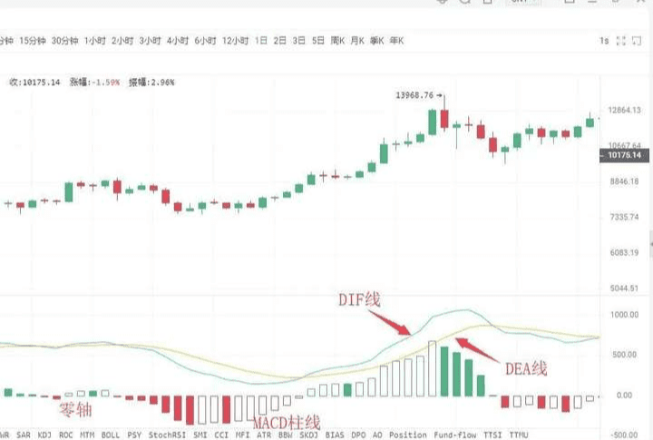
The MACD indicator in the cryptocurrency space consists of the DIF fast line, DEA slow line, MACD bars, and the zero axis, referred to as 'three lines and one axis'. Investors analyze prices through the intersections, divergences, breakouts, supports, and resistances of these 'three lines and one axis'. The MACD indicator can become...
Many trading software list it as a preferred indicator, which shows its wide application; this also indirectly indicates that this indicator is one of the most effective and practical indicators verified by history. #BinanceAlpha new release
03
The golden cross and death cross of MACD
The 'golden cross' and 'death cross' patterns are extremely important formations in technical indicator analysis.
The golden cross pattern, also known as the golden crossover, refers to the crossing of a relatively short-term indicator line upwards through a relatively long-term indicator line (of the same type), usually indicating the emergence of a short-term buying opportunity. If the golden cross pattern appears in...
①. After a short-term rapid downward movement during a downward trend;
②. After a wave of pullback during an upward trend;
③. During the consolidation phase of an upward trend,
When the golden cross pattern appears at a temporary low, it is a more reliable buy signal.
The death cross pattern, also known as the death crossover, refers to the crossing of a relatively short-term indicator line downwards through a relatively long-term indicator line (of the same type), usually indicating the emergence of a short-term selling opportunity. If the death cross pattern appears in...
①. After a consolidation phase during a downward trend;
②. After a wave of rebound during an upward trend;
③. After a short-term rapid upward movement during an upward trend,
When the death cross pattern appears at a temporary high, it is a more reliable sell signal.
After understanding the golden cross and death cross patterns, we can specifically look at the golden cross and death cross shapes of the MACD indicator lines; the appearance of the golden cross and death cross at different positions will reflect different market meanings.
Situation 1: The buying point of a low-level golden cross occurs when the DIFF line crosses above the DEA line. If this appears below the zero axis and is far from the zero axis, this golden cross is referred to as a low-level golden cross. Investors can consider this golden cross merely as a short-term rebound in price; whether the K line can form a true reversal still requires observation and confirmation with other indicators.
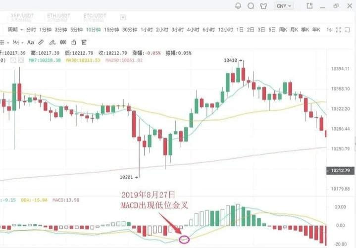
As shown in the figure above: On August 27, 2019, in the 10-minute K line chart of BTC, a low-level golden cross appeared as the price retraced, followed by a rebound of 200 dollars. Short-term investors can seize the opportunity to enter.
Situation 2: Buying point of a golden cross near the zero axis #Non-farm employment data is coming
If an upward trend has formed, and a golden cross occurs between the DIFF line and DEA line near the zero axis, this often presents an excellent buying opportunity for investors.
This is because, after the upward trend forms, a golden cross near the zero axis indicates that the adjustment has completely ended, and a new round of upward movement has begun. If accompanied by a golden cross of the average volume line, it indicates that the price increase is supported by trading volume, making the buy signal even more reliable. Once this buying point appears, investors should not miss it; otherwise, they will miss a significant upward trend.
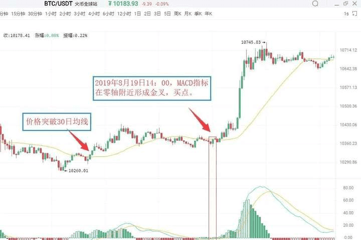
As shown in the figure above: On August 19, 2019, at 09:30, in the 5-minute K line chart of BTC, Bitcoin broke above the 30-day moving average, indicating that an upward trend had initially formed. For a period afterward, the price almost continuously hovered above the 30-day moving average. At 14:00 on August 19, 2019, the MACD indicator formed a golden cross near the zero axis, indicating that the market was about to experience a substantial upward movement. Investors can buy decisively.
Situation 3: Buying point of a high-level golden cross
If the golden cross occurs between the DIFF line and DEA line above the zero axis and is at a distance from the zero axis, this golden cross is referred to as a high-level golden cross. High-level golden crosses generally appear in...
The consolidation phase during the K line's upward process indicates that the consolidation has ended, and the K line is about to resume the previous upward trend. Therefore, once a high-level golden cross appears, it serves as a good additional buying signal. In practice, when an upward trend forms, and the K line rises slowly and continues for a long period, once the MACD indicator forms a high-level golden cross, it is often a harbinger of an accelerated upward movement of the K line. For this reason, high-level golden crosses can also be used for swing trading. Investors can use the MACD indicator to continuously target upward waves during an upward trend.
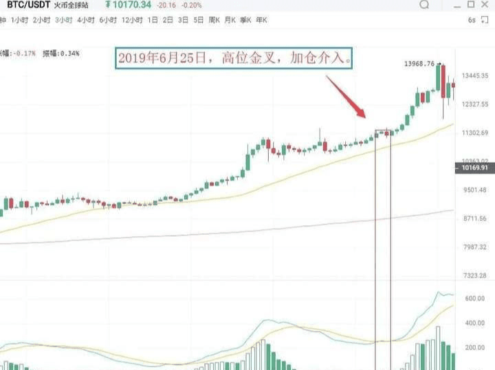
As shown in the figure above: On June 25, 2019, in the 3-hour K line chart of BTC, the price of Bitcoin rose after a consolidation phase and then rose again while the MACD indicator showed a high-level golden cross. This indicates that the correction has ended, and the price will continue the previous upward trend. Investors should pay attention to seizing this additional buying point.
Situation 4: Selling point of a low-level death cross
A low-level death cross refers to a death cross that occurs far below the zero axis. This type of low-level death cross often appears at the end of an upward rebound during a downward trend. Therefore, a low-level death cross serves as a sell signal indicating the end of the rebound. At this point, investors in the market should observe and those who are deeply trapped in positions can sell first and then buy back later to lower costs after the price declines.
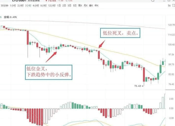
As shown in the figure above: On July 14, 2019, in the 3-hour K line chart of LTC, the MACD indicator of Litecoin showed a low-level golden cross, and the price experienced a small rebound before quickly declining. Shortly after, the MACD indicator showed a death cross below the zero axis, and the K line began a new round of downward movement. Spot investors can sell at the death cross position and then buy back to lower the holding cost.
Situation 5: Selling point of a death cross near the zero axis. If the previous market direction has been a downward trend, and the DIFF line crosses below the DEA line near the zero axis, this crossover is referred to as a death cross near the zero axis. It indicates that the market has accumulated considerable downward momentum near the zero axis. The appearance of the death cross suggests that the downward momentum in the market is beginning to release, and the K line will continue the original downward trend, serving as a sell signal.
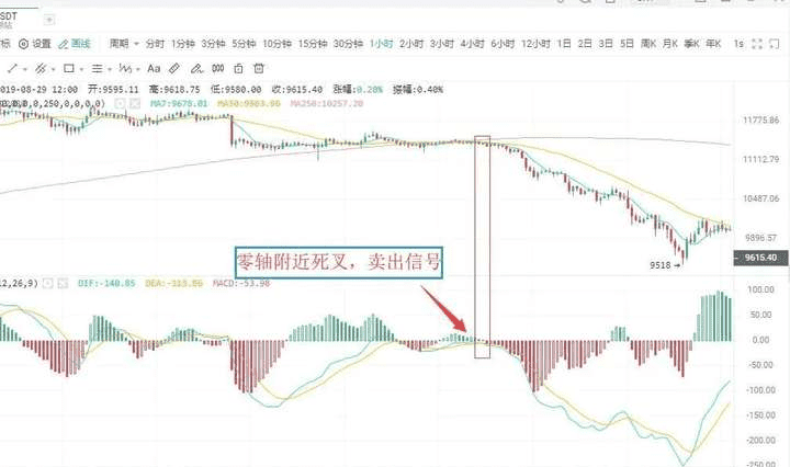
As shown in the figure above: On August 12, 2019, in the 1-hour K line chart of BTC, the DIFF line of Bitcoin crossed below the DEA line near the zero axis, forming a death cross. This indicates that the market's downward momentum has begun to release, serving as a sell signal. Investors should sell decisively, or they will be deeply trapped.
Situation 6: Selling point of a high-level death cross
The DIFF line crossing below the DEA line at a distance above the zero axis is referred to as a high-level death cross. This type of death cross pattern is sometimes accompanied by a top divergence of the MACD. The manifestation is as follows: during the continuous upward trend, the price keeps setting new highs, but the MACD indicators, the DIF line and DEA line, do not continue to rise or push higher, but instead diverge from the price trend and gradually move downwards.
When the DIF line crosses below the DEA line above the zero axis, forming a downward crossover, this is a death cross and a relatively reliable sell signal.
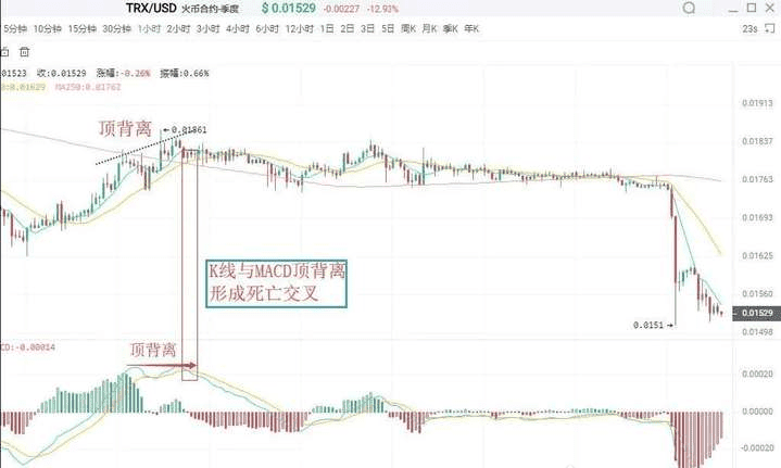
As shown in the figure above: On August 23, 2019, in the 1-hour K line chart of TRX, after a wave of rise, the price of Tron continued to set new highs, but the DIF line and DEA line no longer continued to rise, subsequently forming a death cross, indicating a sell signal.
04
Divergence between MACD and K line
Divergence is a term used in physics to describe momentum; in technical analysis, it is a widely used method with a high success rate. During a downward trend, when the price sets a new low, but the indicator line does not set a new low, it is referred to as bottom divergence, indicating that upward momentum is accumulating.
is a buy signal. In an upward trend, when the price sets a new high while the indicator lines do not set a new high, it is called a top divergence, indicating that downward momentum is accumulating, which is a sell signal.
Ⅰ. Bottom Divergence
Bottom divergence between MACD bars and DIFF line
The bottom divergence between the DIFF line and price indicates that during a downtrend, when the price sets a new low, the DIFF line does not set a new low. This indicates that the decline of the DIFF line is less than that of the price during the decline, and upward momentum is continuously gathering, suggesting that the price will stop falling, with a higher probability of rising in the next period. The MACD bars are hidden behind the DIFF line, divided into red and green, and their divergence from the price is an important application of the MACD indicator, widely used in practice. The bottom divergence between the MACD bars and price means that when the price sets a new low repeatedly, the MACD bars do not follow suit. Upward momentum is accumulating, and the price is about to stop falling, with a higher probability of rising in the next period. When a bottom divergence appears, investors can grasp specific buying points through two methods.
Specific buying timing
The bottom divergence between the DIFF line, MACD bars, and price is not a specific point in time but a pattern that occurs over a period. However, the specific buying point for investors is a specific moment, indicating that the price is about to stop falling. Therefore, to grasp the specific buying timing, when the DIFF line, MACD bars, and K line show bottom divergence, investors must combine bottom divergence with other technical analysis tools to specify the buying point.
First: Bars changing color or the MACD golden cross
When the bars change color, it indicates that the upward momentum in the market has begun to take the lead. This generally appears after 'bar shortening', and while it may be slightly delayed, it is more reliable. Once a bottom divergence appears, if the bars change color or form a golden cross, investors can buy.
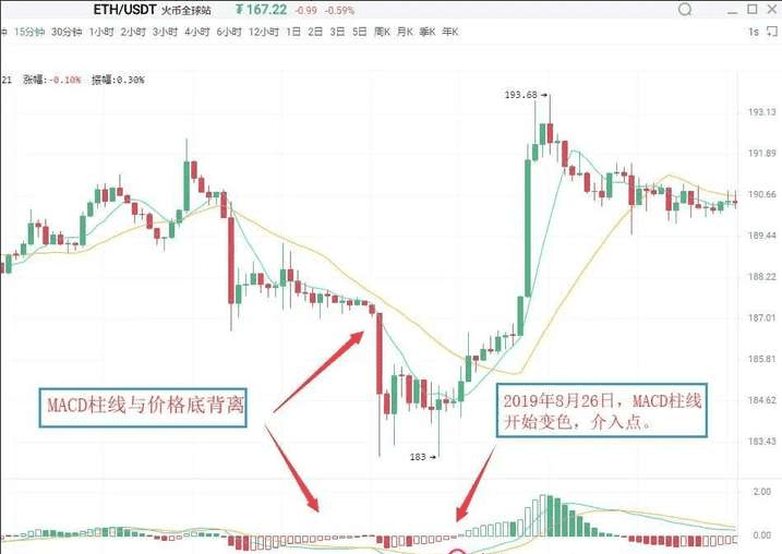
As shown in the figure above: On August 26, 2019, in the 15-minute K line chart of Ethereum (ETH), the price of Ethereum set a new low during a downtrend, but the MACD bars did not reach a new low, forming a bottom divergence pattern between the bars and the price. This indicates that market upward momentum is starting to gather, and there is a high probability that the price will experience an upward trend. Following that, the bars changed color, and these two sequential buy signals combined further increased the reliability of the upward significance. Investors can enter when the bars change color.
Secondly: Combining bottom divergence with K line reversal patterns, such as the 'single needle bottom' or 'three soldiers at the bottom', is a specific application of the 'multi-indicator combination' principle.
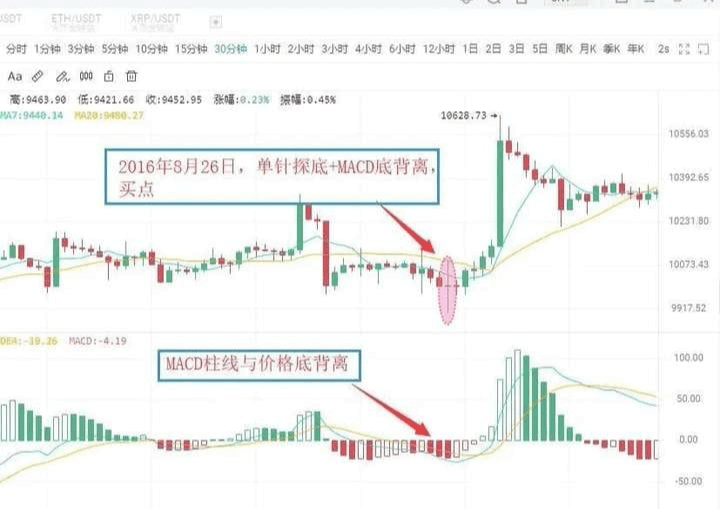
As shown in the figure above: On August 26, 2016, in the 30-minute K line chart of BTC, the price of Bitcoin set a new low, but the MACD bars did not set a new low, forming a bottom divergence pattern between the bars and the price, indicating that market upward momentum is continuously strengthening. Accompanied by the price bottoming out, it formed a buying signal of 'MACD bars and price bottom divergence + K line single needle bottom'. The price then experienced an upward movement.
Ⅱ. Top Divergence
Top divergence between MACD bars and DIFF line
The top divergence between the MACD bars and the K line indicates that during an upward trend, when the price sets a new high, the MACD bars do not set a new high. This indicates that downward momentum is accumulating, and the price may drop at any time.
The top divergence between the DIFF line and K line indicates that during an upward trend, when the price sets a new high, the DIFF line does not set a new high. This indicates that downward momentum is continuously accumulating, and there is a significant likelihood that the price will experience a downturn. The specific selling timing is similar to bottom divergence; in practice, based on the principle of multi-indicator combination, investors can use the following methods to make the sell signal more specific.
First: Bars changing color or the MACD death cross
After the top divergence between the MACD bars and the K line forms, if the bars suddenly shorten significantly, it indicates that the market's downward momentum has begun to release. Investors should pay attention to sell in a timely manner. The change in color of the MACD bars indicates that the market's downward momentum has taken the lead, generally appearing after the bars continue to shrink. If the bars show a top divergence with the K line and then change color or exhibit a MACD death cross, investors should pay attention to exit in a timely manner.
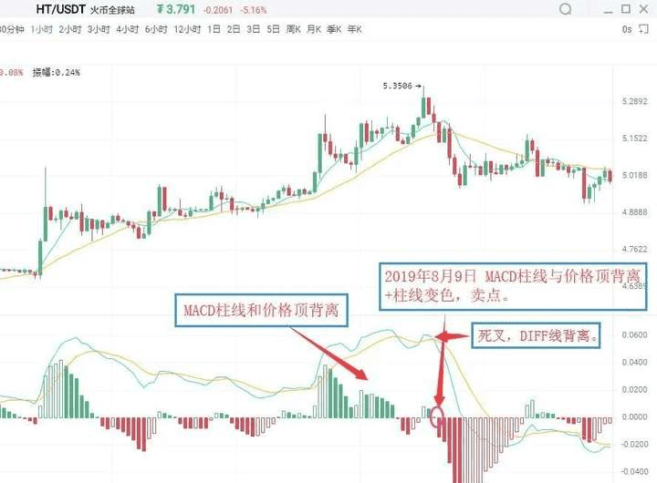
As shown in the figure above: On August 9, 2019, in the 1-hour K line chart of HT, the price of Huobi set a new high, but the MACD bars did not reach a new high, forming a top divergence pattern between the bars and the price. This indicates that downward momentum is continuously accumulating, and the price may experience a downturn at any time. Subsequently, the MACD bars changed from red to green, issuing a sell signal of 'bars and price top divergence + bars changing color'. Investors should pay attention to exit in a timely manner.
Secondly: When combined with other technical analysis tools and K line reversal patterns, if the MACD bars and price show a top divergence, and other technical analysis tools also simultaneously present sell signals, then the reliability of the market sell signal will greatly increase. At this time, investors should be cautious and exit decisively. Common sell signals in this category include 'bars and price top divergence + K line reversal pattern', etc.
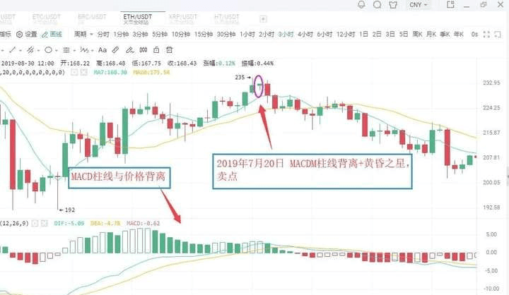
As shown in the figure above: On July 20, 2019, in the 3-hour K line chart of ETH, the price of Ethereum set a new high, but the MACD bars did not reach a new high, forming a top divergence pattern between the bars and the price. This indicates that market downtrend momentum is continuously strengthening, and the price may experience a downturn. Subsequently, the MACD bars gradually shortened, while the K line formed a bearish evening star pattern. Investors should be cautious and exit in a timely manner, as the K line subsequently experienced a significant downtrend.
05
Modification of MACD parameters
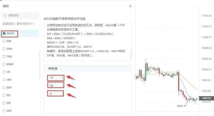
The lag in response to price changes sometimes makes the buying and selling prices less than ideal, which is one of the drawbacks of the MACD indicator. One way to change this situation is to adjust the indicator parameters to make the MACD indicator respond more sensitively to trends, thus allowing for more ideal buying and selling points. In commonly used trading software, the default parameters for the MACD indicator are 12/26/9. Under this parameter setting, the MACD indicator often has a significant lag in response to price changes. The lag of the MACD indicator can be resolved by adjusting the parameters. Common parameter combinations include 5/34/5, 5/10/30, etc. Investors can also try and explore more in practice.
Evening Star: In the process of an upward trend, a relatively long bullish candle first appears, followed by a shorter candlestick (either bullish or bearish) the next day, which people liken to a star; this is the main part of the candlestick pattern. The third candlestick is a long bearish candle that has penetrated deep into the body of the first candlestick. The evening star signals a price peak and subsequent decline, with some predicting an accuracy rate of over 80%.
In the cryptocurrency space, it boils down to a battle between retail investors and market makers; if you lack insider information and firsthand data, you'll only be cut! Welcome like-minded people in the crypto space to grow strong together~
The martial arts secrets have been given to you; whether you can become famous in the community depends on yourself.
No matter how diligent a fisherman is, he will not go out to sea during a storm but will guard his fishing boat carefully. This season will pass, and a sunny day will surely come! Follow Lao Chen, and I will teach you both how to fish and how to fish sustainably. The door to the cryptocurrency world is always open; only by going with the trend can one have a life in sync with the trend. Save this and keep it in mind!
$ETH $BTC #现货黄金创历史新高