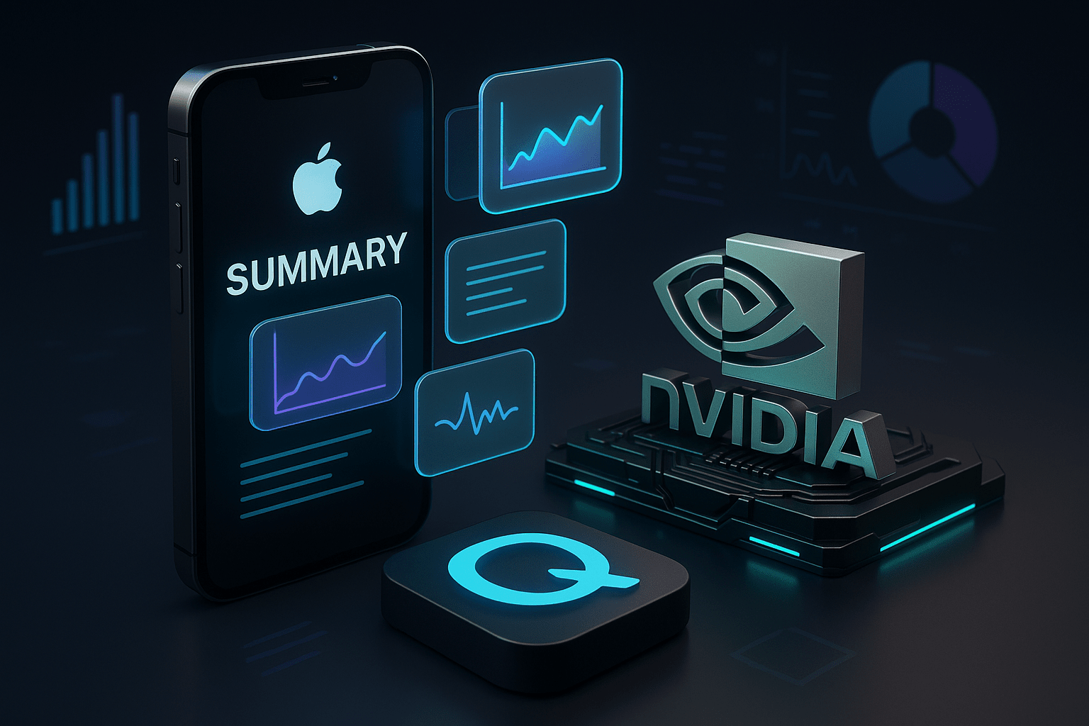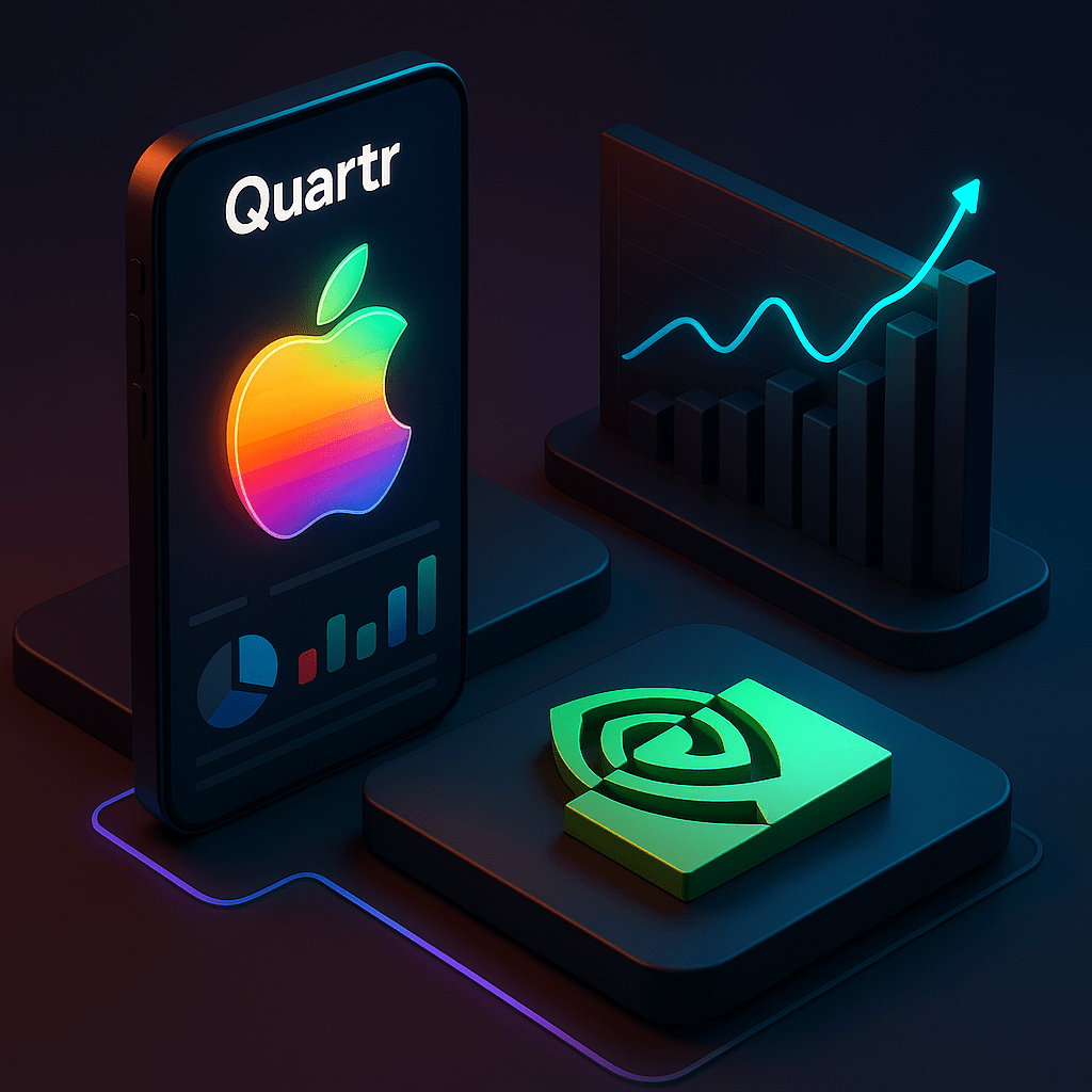
Quartr is an application that summarizes events, press releases, and earnings calls of publicly traded companies.
Yet, what truly captures attention and generates buzz are their visuals.
Why this strategy works
Iconic brands, a new angle: They present familiar names (think Apple, NVIDIA) under a completely refreshing aesthetic.
Impactful graphics: Their visuals are polished and immediately catch the eye, standing out in the flow.
The touch of nostalgia: The artistic style used is not trivial; it creates an instant emotional connection with the audience.
"Show, don't tell": They show us what a company does, instead of just telling us.
Marketing lesson: You don't need to display a huge graphic of your logo to explain what you do. (Personally, I argue that it says absolutely nothing to people).
Users want to see beautiful things. That's the purpose of social networks.
The perfect conversion tunnel
Here's how I became a user:
Attraction: The design drew me to their profile.
Information: I understood what they were doing thanks to their slogan.
Conversion: I downloaded the free app.
I bet this design approach has brought them a whole new wave of users.
It's a real pleasure to see good design come back to the center of the game.