Many people using Bubblemaps for the first time just think the graph looks good. But for me, its real value is in standardizing 'suspicious relationships'. My process is divided into three steps:
The first step is 'static physical examination'. I will take samples around the issuance date or significant announcements to draw the cluster graph of the top 50 addresses. As long as I see dense edges, small radius, and frequent mutual transfers, I will first label it as 'potential control'.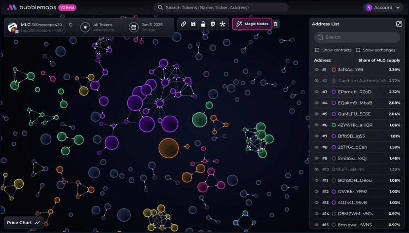
The second step is 'time travel'. I will play along the timeline to see if the cluster distribution is becoming more dispersed. If core clusters synchronize transportation at resistance levels or around announcements, and it coincides with increased trading volume, that is almost certainly an action by the team or market makers.
The third step is 'label crossover'. I will label the exchange hot wallets, cross-chain bridges, multi-signature funds, and blacklisted addresses, eliminating the normal paths, leaving the abnormal net worth. For example, in the Rugproof case, 162 wallets consumed half of the chips at the opening, and this anomaly was first identified by Bubblemaps, later confirmed by the media and exchanges.
I have also stepped into pitfalls. For example, the mutual transfers of custodial wallets may look like control, but they are actually just internal compartmentalization. The aggregation and splitting of cross-chain bridges often create 'false positives' on the graph. Therefore, I added a review step for myself: any conclusion must include three elements—screenshot, time/block height, and transaction hash. This way, others can reproduce it within three steps and not get stuck in the subjectivity of 'I think'.
@Bubblemaps.io #Bubblemaps $BMT