What is it?
Graphic figures are recurring formations on the chart that help traders predict further price movement.
They can be conditionally divided into:
Continuation patterns (the price is more likely to continue moving in the same direction).
Reversal patterns (the price changes direction).
Main Figures:
1. Triangles
The price is squeezed into a 'corridor', where the peaks and troughs gradually converge. It can be: ascending, descending, and symmetrical.
Ascending - usually a signal for growth.
Descending - more often a signal for a decline.
Symmetrical - can go both up and down (looking at the breakout).
The market is 'compressing a spring'. When the price breaks through the boundary of the triangle, a strong movement often follows in the direction of the breakout.
2. Flag
This is a sharp price impulse (flag pole), followed by a short pause/correction (the flag itself). Often, this is a continuation pattern. The market rests before continuing its movement.
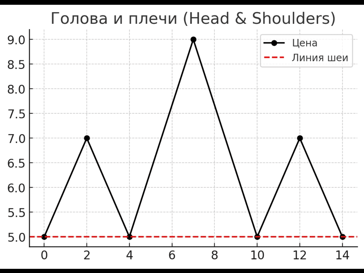
3. Head and Shoulders
This is three peaks, where the middle (head) is higher than the two side (shoulders). It is a reversal pattern.
The figure is divided into two types:
Regular - a signal for a reversal downward
Inverted - a signal for a reversal upward
These figures are one of the most popular tools in technical analysis because they are easy to see even for beginners. The main thing to remember is that they do not guarantee outcomes, but only increase the probability of a certain scenario.
They help traders read market sentiment and look for entry/exit points.


