From my personal experience, the end of trading cryptocurrencies is not bankruptcy but wealth.
It's not that I'm keen on trading cryptocurrencies; rather, I'm eager to make money and work hard to improve the living standards of myself and my family. The ways to make money in the world are nothing more than these few:
1. Starting a company leads to overcapacity; under the shadow of the pandemic, the competition is fierce. These days, starting a company is equivalent to seeking death.
2. Individual buying and selling, starting a small food stall is possible, but good locations are hard to rent, while poor locations have no business. Street vendors are also an option, but can you endure the hardships of living outdoors and being covered in grease?
3. The self-media entrepreneurial competition is intense, with more self-media competing for traffic than traffic itself. It seems that those big influencers look glamorous, but the hardships behind them are known only to themselves. For example, I answer questions wholeheartedly, yet receive only a few perfunctory likes.
4. Working is certainly no problem; it is equivalent to having a crisis buffer (the boss) to rely on. However, working can only give you a salary; can it give you wealth? It cannot. Unless you are a technical expert, highly educated, or a sales champion, then it might be possible.
However, 99% of the world's people are not.
I started trading cryptocurrencies in early 2015, and over the years, I have accumulated over 10 million.
I know that for some people, this amount of money is not considered much. After all, some people are so conservative that they think university students should study hard and not start their own businesses.
I made my money in the cryptocurrency space, and they always think that the cryptocurrency space is not a serious endeavor.
But I feel that I have been very successful in these years. (I hate showing off, I don't think I'm outstanding in every aspect, but my ability to make money is definitely not bad, at least for now.)
Accumulated money is one aspect; more importantly, it's experience.
Currently, the people who understand me best are only those closest to me, as they know how I have come this far.
When I made 100,000, I felt it was too little and thought, what can 100,000 do? After all, a lot of people can earn that much in a year with hard work in other jobs.
When I made 300,000, I felt it wasn't enough, thinking that 300,000 can't last a lifetime, and then I started talking about inflation again.
When I made a million, I might not have complained about making too little, but I still felt that my money was gambled. I estimate many people want to see my joke, to see how I squander my earned money. Then some people will use inflation as an example, saying that money will depreciate and so on.
Those who do not support me can always find various reasons.
People have differences.
Some people see others making money and think about how to find opportunities;
Some people see others making money and always think that the source of that person's money is unclean; in their perception, they are right, their mediocrity is due to bad luck, and others' success is just sheer luck.
Since that's the case, I will continue to earn, striving to earn tens of millions, hundreds of millions, and more, ultimately using the money I earn to contribute to the fields of biological health and artificial intelligence.
I estimate that those who deny me will still deny me, even if I achieve targets of ten million or over a hundred million in the future.


1. The selected coin must be in an uptrend; of course, those in consolidation are also acceptable. However, those in a downtrend or where the moving averages are all pointing downwards should definitely not be chosen.
2. Divide the funds into three equal parts. When the price breaks above the 5-day moving average, buy lightly with 30% of the position; when the price breaks above the 15-day moving average, buy another 30%. Similarly, buy the last 30% when it breaks above the 30-day moving average. This requirement must be strictly followed.
3. If the price does not continue to break above the 15-day moving average after breaking above the 5-day moving average and instead pulls back, as long as the pullback does not break the 5-day line, maintain the original position, and sell if it breaks.
4. Similarly, if the price breaks above the 15-day moving average but does not continue to break upward, and the pullback does not break the 15-day moving average, hold it. If it breaks, sell 30% first, and if it does not break the 5-day moving average, hold onto 30% of the position at the 5-day moving average.
5. When the price continues to break above the 30-day moving average and then pulls back, dispose of it according to the previous method.
6. When selling, the opposite is true. When the price is high and falls below the 5-day line, sell 30% first. If it doesn't continue downward, hold the remaining 60% position. If all the 5-day, 15-day, and 30-day lines are broken, sell all, and do not harbor any illusions.
Ultimately, the difficulty in making money is not the method but the execution.
A trading system is a tool that can help you achieve stable profits.
It can help you mark key levels, discover entry signals, and find trading opportunities that can make you money.
So, back to the point, as long as there is a stable trading system, just act when opportunities arise within the system. If you lose, you can get revenge; do what you should do, and leave the rest to the market. After all, in the end, you can always cover losses with profits.
However, 99% of people’s biggest problem is not having their own trading system, so they fear losing money when trading because lost money cannot be earned back. Even if they earn it back by luck, they will eventually lose it all through their own abilities.
So how do you have a trading system?
I will take everyone through the 'BOSS' and 'BEAR' as well as more other price action chart patterns.
Price Action Pattern #1: Bullish Engulfing Strong Support (BOSS)
That is, the bullish engulfing candlestick pattern appearing at a strong support level. The most important thing here is not the exact candlestick chart but its position. Ideally, it should be located right at or slightly below the support level.

As the name suggests, the BOSS pattern is one of the best price action patterns. The above image is one of the best charts describing this pattern from a book on price action.
From the above image, it can be seen that after the BOSS price action chart pattern formed, the price experienced a significant rise.
There are many such cases; one recent example is the BOSS price action chart pattern of EUR/USD:
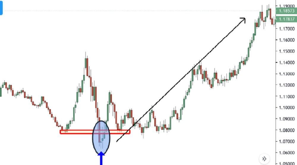
The above chart has a major demand area/support level. When the price tests it, it will form an inside bar and attract a large number of market participants to enter. One reason I call this pattern a strong support bullish engulfing is that any candlestick pattern can serve as a triggering factor.
Price Action Pattern #2: Bearish Engulfing Strong Resistance (BEAR)
This price action chart pattern means that the price needs to test a strong resistance level or supply zone.
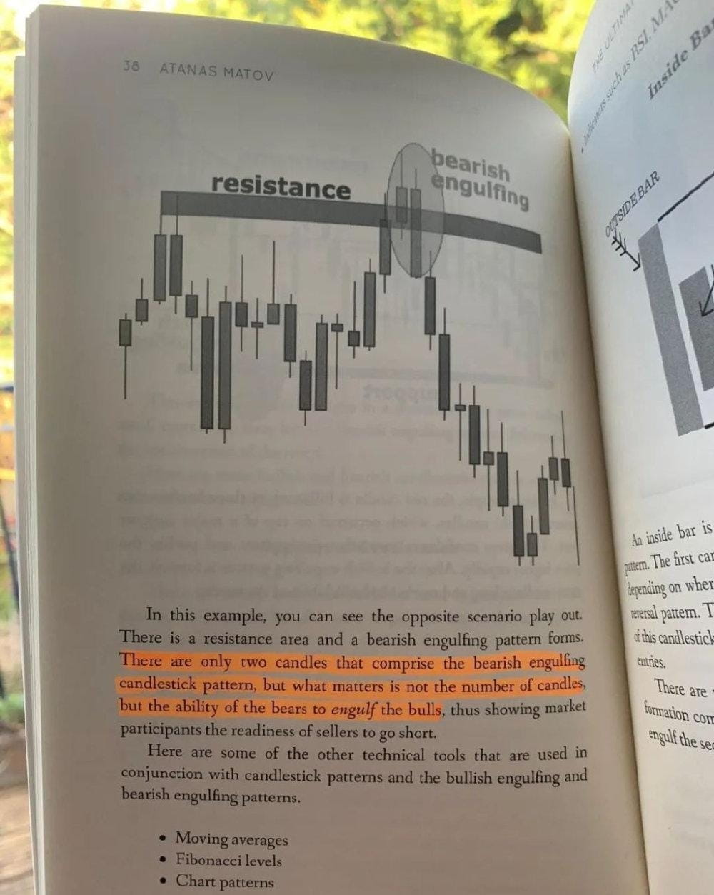
The above image is also taken from (Price Action Trading Handbook).
I find that for this price action pattern, the bearish engulfing may be the best candlestick pattern. But over the long term, this chart pattern will keep appearing.
This is an example of a GBP/USD daily chart from 2018:

From the above figure, it can be seen that this double candlestick entity bearish engulfing candlestick pattern has a very strong trend-changing effect. The engulfing pattern can consist of multiple candlestick entities. Importantly, the bearish candlestick (red) completely covers the previous bullish candlestick (green) entity. This indicates that the bears are ready to push the price long-term in another direction.
The BEAR price action chart pattern is one of the best bearish price action chart patterns I've encountered in my trading career.
Price Action Pattern #3: Inside Bar within a Trend (IBWT)

The IBWT price action pattern is one of my favorite candlestick patterns for two main reasons:
1. High reliability
2. Provides a high risk-to-reward ratio
From the perspective of trading returns, this may be the highest price action chart pattern.
Let's see why that is.

Looking at the above chart, the reason this candlestick pattern has such a high risk-to-reward ratio is that the closing price of the red candlestick is very close to the low of the green candlestick.
This allows for setting stricter stop losses, thus presenting a higher risk-to-reward ratio. In other words, it means you can risk less money to gain more profit.
The image below is another example of an inside bar in the Daily DAX chart:

You can see from the above chart that the inside bar only allows you to use a very small stop loss to 'aim' for larger returns. The risk-reward ratio in the above chart is almost 1:12.
This means that if your entry point is 9502 and your stop loss is at 9339, you are taking a risk of 163 pips, but if the take profit target is 11349, it means the potential return of this trade is a profit of 1847 pips.

I have to say this is a very nice trade, with a risk-to-reward ratio of 11.38.
Price Action Pattern #4: Pin Bar in Supply Area (SUP)
The SUP chart pattern is one of the most effective bearish continuation patterns. We need the following two conditions to confirm this pattern's emergence:
1. Major/Minor supply zone/resistance level
2. Price action pattern of price rebound

The above image is from the gold 1-hour chart on October 23, 2020. We can see that the pin bar encountered resistance at the important level of $1912.
Once the price rises to the pivot level, price rejection may occur, followed by a sudden price drop.

At this point, you need to decisively enter the market to seize these trading opportunities. As you can see, after the pin bar encounters resistance, the next candlestick will be a very long bearish candlestick.
Price Action Pattern #5: Random Resistance Rejection (RRR)

The above image shows the GBP/USD 1-hour chart. It demonstrates a price action chart pattern called RRR (Random Resistance Rejection).
It is called 'random' because it can occur at any point in time and at significant 'event convergence zones.'
Like the previous price action patterns, RRR appears within different time frame charts. The rule of thumb tells us: 'The higher the time frame, the more accurate the signal.'
In this case, we observe a resistance level turning into a support level, and a pin bar forms a bounce at that level. Coincidentally, the candlestick on the daily chart is an inside bar.
This is a very good example of high probability trading. However, it is important to note that this pattern should not be confused with breakouts.
Price Action Pattern #6: Demand Zone Candlestick (DZC)

The above image is a price action chart pattern obtained from the EUR/USD hourly chart, which is a demand zone candlestick pattern.
To validate this price action pattern, we need to follow two important rules:
1. Minor demand zone 2. Candlestick confirmation
This chart pattern is very similar to the bullish strong support (BOSS). The only main difference is that it usually appears in minor demand areas rather than major demand areas. See the figure below:

Those who are familiar with me should know that in trading, I try to stay away from diagonal trend lines or channels. Here, I am just showing everyone a classic example.
Once a minor demand zone is identified, we can mark it on the chart and wait near the price. When the price is 'trapped' in the demand zone, what we need to do is confirm with price action and then look for trading opportunities.
This may be one of the most powerful trend continuation techniques, which can also be used to implement strict stop losses.
Price Action Pattern #7: Theory and Reality (TVR)

The chart pattern that cannot operate as expected or theoretically in reality. Many traders blindly follow converging triangle patterns, but in reality, they are not as precise as people imagine.
One of the advantages of converging triangles is that they are easy to identify. The problem with this trading setup is that because it is so easily identified, many traders will try to profit from it.
You should know that trading is a zero-sum game that does not allow such behavior to exist. Traders who blindly chase highs become the ones who get harvested.
One of the problems with the TVR price action pattern is shown in the picture below:

When you notice this triangular pattern, most traders will expect the price to break upwards.
However, contrary to expectations, the price went in the opposite direction.

The reason we did not see an upward breakout is that the price was not strong enough to withstand the test of the resistance level and started to turn down.
Before starting to decline, pay attention to the inside bar.
Price Action Pattern #8: Theory and Reality 2 (TVR2)

Let's look at the last price action chart pattern. Of course, this does not mean that we have explained all price action patterns. These eight price action patterns are just some common ones in our daily trading.
So, what can we expect from price action patterns?
When we see prices fluctuate within a range, a breakout is expected. Traders can easily fall into this trap. The closer the price gets to the resistance level, the more eager they are to buy.
Let's illustrate it with a sketch:

Here are three scenarios in which novice traders hope to go long:
1. The price is slightly above the middle level of the range; I should go long, or I will miss the opportunity.
2. The price is just below the resistance level, and I worry that if the price rises too quickly, I will miss the best entry opportunity.
3. The price has just broken through the resistance level, and I don't want to miss this trading opportunity.
The above three scenarios are typical trading methods for retail traders. This is a trap you should try to avoid.
The closer you are to the resistance level, the higher your stop loss, and paradoxically, the greater the chance of being stopped out.
If you can look at it from the opposite perspective, you can gain a good trading opportunity.
Think this way: The closer you are to the resistance level or supply zone, the more you should short.
Let's take the USD/CAD 4-hour chart as an example:

Seeing this situation, you might rush in to go long. However, the reality is as shown in the figure below:

So unfortunate! You didn't short; instead, you went long...
Summary
In this article, we have listed eight price action chart patterns. They each have their own advantages and disadvantages. However, what everyone really needs to consider is the potential return of each price action chart and the risks involved.
These trading patterns tell us that traders can easily fall into traps in the market, so we must strictly adhere to trading rules. Trading may be the best way to test your discipline.
Please remember not to rush into trades with overly high expectations. If you want to become a consistently profitable trader, this will require a lot of time, discipline, and dedication.$HMSTR $ARDR #币安HODLer空投RESOLV #美国加征关税
Finally, I wish you successful trading!

