
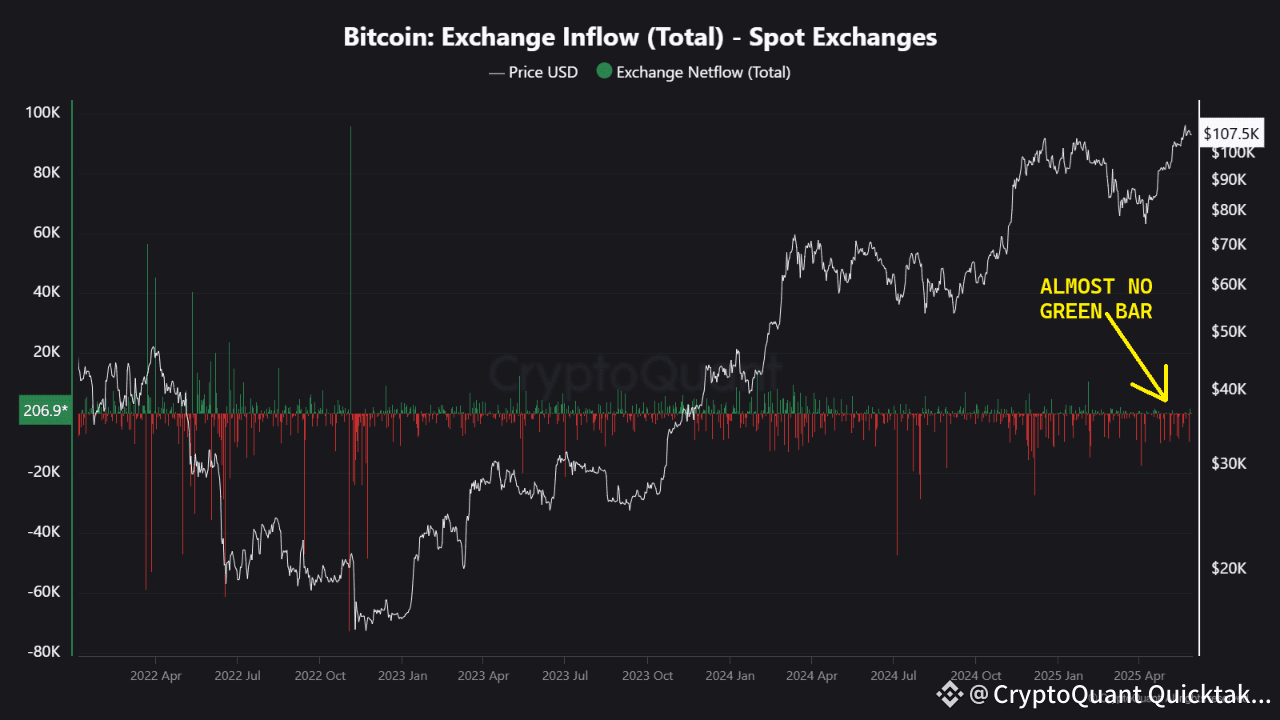
👉🏻 The Netflow data for the SPOT sections of centralized exchanges looks quite promising. Netflow shows the difference between the amount of BTC sent to exchanges (inflow) and the amount of BTC withdrawn from them (outflow). (Netflow = Inflow - Outflow)
If more BTC is sent to exchanges, green bars appear in the chart below. If more BTC is withdrawn from exchanges, red bars appear instead.
There can be many reasons to send BTC to exchanges, but the most common reason is to SELL.
Right now, when we look at the Netflow data, we can see that there have been almost no green bars in recent weeks. This means less BTC is being sent to exchanges, and more BTC is being withdrawn. This gives a very positive and bullish outlook.
👉🏻 Another important data point is the one that shows us the volume difference (delta) cumulatively, which shows the difference between TAKER BUY (MARKET BUY) orders and TAKER SELL (MARKET SELL) orders in cumulatively. As clearly seen in the chart, in recent weeks, taker buys have been stronger and dominant on the SPOT markets of centralized exchanges. This is another positive and promising signal.
👉🏻 Also, the amount of USDT on centralized exchanges continues to increase. This means there is available liquidity ready to be used for buying if needed. It shows there is no liquidity shortage.
⚠️ Of course, the price of BTC is not only shaped by the SPOT markets of centralized exchanges. To analyze the full picture, we also need to look at Derivatives (Futures, Perps, Options), ETFs, CME Futures, OTC institutional buying, and other markets.
And USDT liquidity is not the only factor. For example, ETFs are bought directly with fiat money (USD).
Still, the SPOT markets of centralized exchanges are an important part of price action, and the current picture looks hopeful and bullish. (As long as unpredictable events or statements from figures like US President Trump don’t change this good mood.)


Written by CryptoMe
