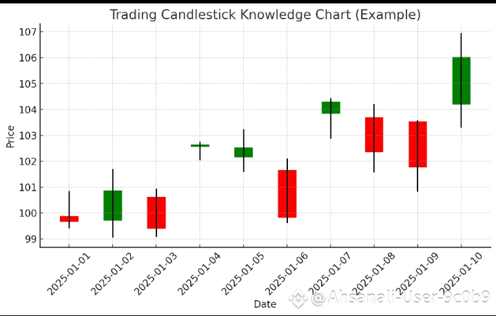
Here’s a simple candlestick knowledge chart 🔥.
The black vertical line shows the price range (low to high).
The colored body shows the open vs close:
🟩 Green = price closed higher than it opened.
🟥 Red = price closed lower than it opened.
This is the basic way traders read market moves at a glance. Want me to break down the different candle types (like doji, hammer, engulfing) in a chart too?