Wondering when to buy which cryptocurrency? While researching cryptocurrency assets, you may encounter a special type of price chart called a 'candlestick chart.' Therefore, it is best to take some time to understand how it works.
Similar to more common line charts and bar charts, candlesticks display time on the horizontal axis and price data on the vertical axis. However, unlike simpler charts, candlesticks provide more information. At a glance, you can see the highest and lowest prices the asset reached within a given time range, as well as its opening and closing prices.
What is a candlestick chart?
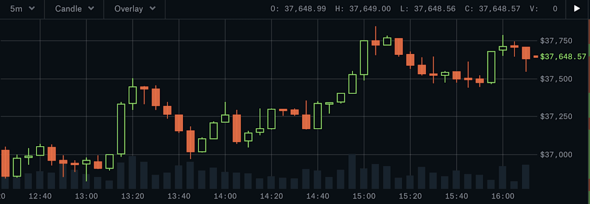
Candlesticks allow you to instantly understand whether market prices are trending upward or downward, and to what extent. The time range displayed by candlesticks can vary significantly. For example, Coinbase Pro's default time is six hours, with each candlestick representing a five-minute period, but users can set it to longer or shorter. (It is also worth noting that, unlike the stock market, the cryptocurrency market is open 24/7. Therefore, the 'open' and 'close' prices are the prices at the beginning and end of the selected time range.)
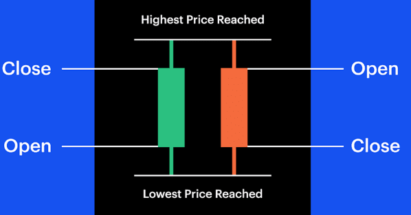
A bullish candlestick (green) indicates a price increase, so the opening price is at the bottom of the body, while the closing price is at the top. A bearish candlestick (red) indicates a price decrease, so the opening price is at the top of the body, and the closing price is at the bottom.
Each candlestick is composed of a body and shadows. The body tells you what the opening and closing prices are within the time range represented by the candlestick.
The lines extending from the top and bottom of the body are shadows. They represent the highest and lowest prices the asset reached during the trading time range.
What signals do candlestick charts release?
Candlesticks reflect not only price changes over time; experienced traders also look for patterns within them to assess market sentiment and predict potential future trends and directions. Here are some of their points of focus:
For example, a long lower shadow at the bottom of a candlestick may indicate that traders are buying the asset as its price declines, which could be a good indicator that the asset is trending upward.
In contrast, a long upper shadow on a candlestick may suggest that traders are seeking arbitrage, indicating that there may soon be significant selling pressure.
If the body occupies almost the entire candlestick and the shadows on either side are short (or there are no visible shadows), it may indicate strong bullish sentiment (green candlestick) or strong bearish sentiment (red candlestick) in the market.
Understanding the signals released by candlesticks in the context of a specific asset or under specific market conditions is an element of technical analysis trading strategies. Technical analysis refers to investors trying to use past price movements to identify trends and potential future opportunities.
How to read a 'single candlestick signal'
Short-term traders sometimes focus on just one candlestick. Familiarity with these 'candlestick signals' can be quite helpful for beginners. The following figure illustrates four common candlestick signals:
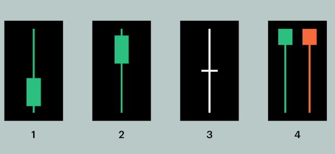
A long upper shadow may signal a downward trend, indicating that investors are seeking to sell and take profits. The longer the upper shadow, the stronger this signal.
A long lower shadow may signal bullishness, indicating that investors are scrambling to buy, which will push prices higher. The longer the lower shadow, the more reliable this signal.
A doji has no body because its opening and closing prices are the same. This is usually interpreted as a strong wait-and-see sentiment in the market and may also be an indicator of an impending price reversal. (Why is it called a 'doji'? Candlestick charts were first used by Japanese rice traders in the 18th century. The term 'doji' denotes a mistake—probably because the scenario of the opening and closing prices being exactly the same is not common.)
The red umbrella is also known as a hammer. When you see a hammer, it usually means there is significant buying pressure for the asset, and the price may rise quickly. On the other hand, the green umbrella has an ominous nickname: hanging man, or 'inverted hammer.' These signals typically indicate that sellers are ready to cash out, reversing the upward trend.
It is important to note that a single candlestick may be an important clue, but accurately understanding the market requires grasping a more complete background. Identifying trends and patterns in candlestick charts is not easy. If you are unsure which investment strategy suits you, consult a professional advisor.