Now that I have entered my 30s, I embarked on the journey of digital currency investment since I was 23. Between 2023 and 2024, my assets successfully crossed the milestone of 8 digits. Today, my quality of life has significantly improved.
In contrast to the hard work of the older generation in the real industry or the struggles of the post-80s e-commerce entrepreneurs, my lifestyle appears particularly comfortable and carefree. In my investment career, I have hardly ever been caught up in complicated business entanglements, and life's troubles seem to always take a detour.
In my opinion, the key to investing in digital currencies is to maintain a good mindset, while mastering the technical aspects is secondary. This calmness and composure may be the secret to my success and substantial gains in the crypto world.
So how can we excel in trading cryptocurrencies? Once a person enters the financial market, it is difficult to turn back. If you are currently losing and still feel confused, but plan to treat cryptocurrency trading as a second career, you must understand the 'MACD indicator strategy.' Grasping and comprehending it can save you from many detours. These are personal experiences and feelings, and I recommend you save and review them repeatedly!
No more nonsense! Let's get to the point!
MACD indicator +
The MACD indicator is formed by two lines and one histogram. The fast line is DIF (white line), the slow line is DEA (yellow line), and the histogram is MACD.
Basic practical application of MACD
MACD golden cross: DIFF breaks up through DEA from below, serving as a buy signal.
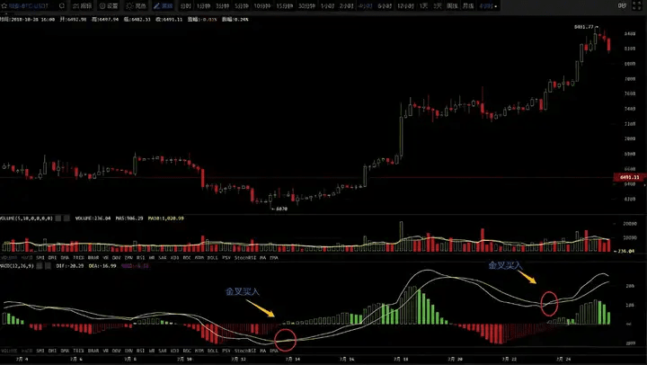
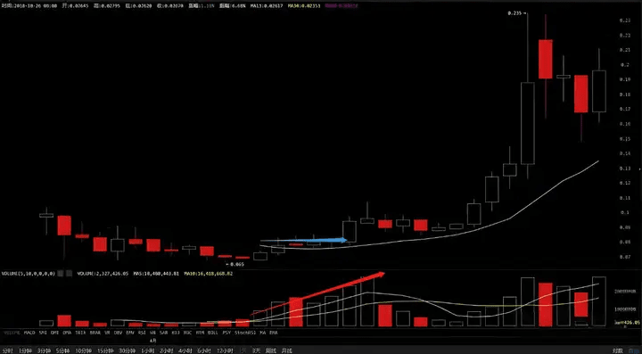
As you can see, when the white line of the MACD crosses above the yellow line, a golden cross is formed in the MACD chart, and the coin price starts to rise. When the MACD keeps trending upwards, the coin price also fluctuates upwards. Therefore, the MACD golden cross can be seen as a simple buy signal. This can be applied on the 1-hour, 4-hour, and daily charts.
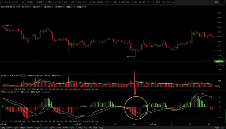
1. MACD death cross: DIFF breaks down through DEA from above, serving as a sell signal.
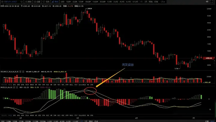
From the BTC candlestick chart above, we can see that when the white line of the MACD crosses below the yellow line, it is referred to as a death cross. After the death cross, it indicates that a downward trend may begin, so the death cross is a bearish signal.
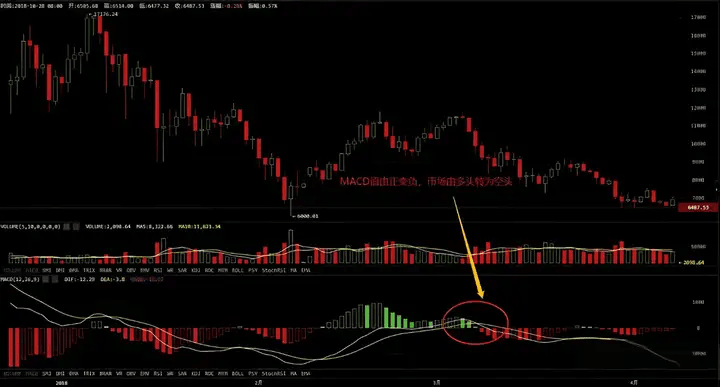
2. MACD turning green to red: The MACD value changes from positive to negative, indicating a shift from a bullish to a bearish market.
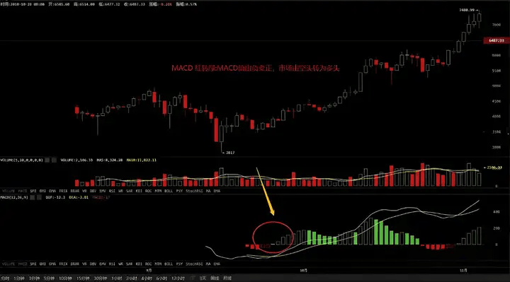
3. MACD turning red to green: The MACD value changes from negative to positive, indicating a shift from a bearish to a bullish market.
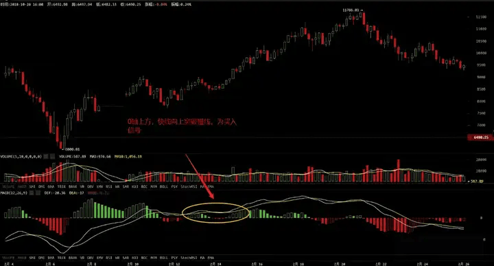
4. When both DIFF and DEA are positive, meaning they are both above the zero line, the market is considered a bullish market. If DIFF breaks up through DEA, it can serve as a buy signal, commonly referred to as an 'above zero golden cross.'
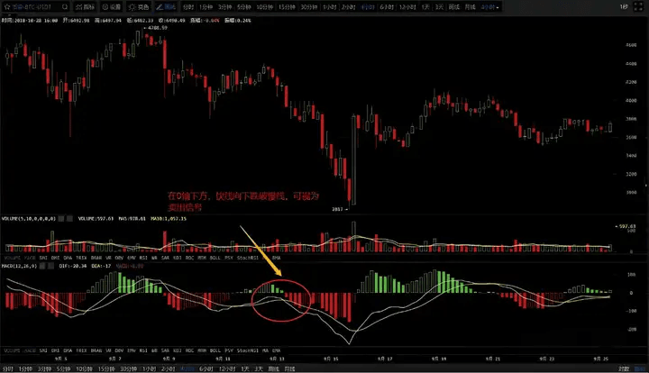
5. When both DIFF and DEA are negative, meaning they are both below the zero line, the market is considered a bearish market. If DIFF breaks down below DEA, it can serve as a sell signal, commonly referred to as a 'below zero death cross.'
Analysis of the histogram in the MACD indicator
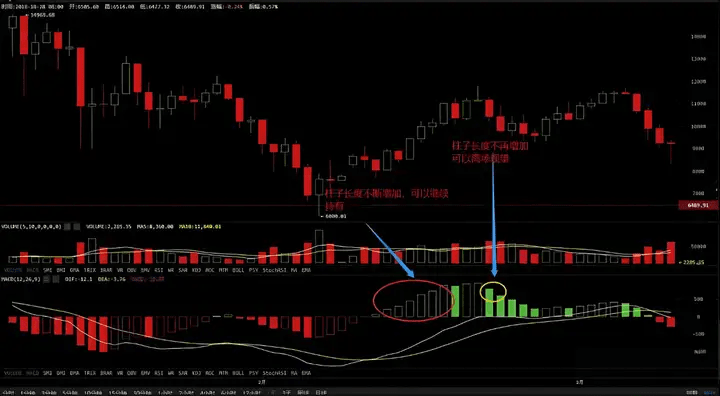
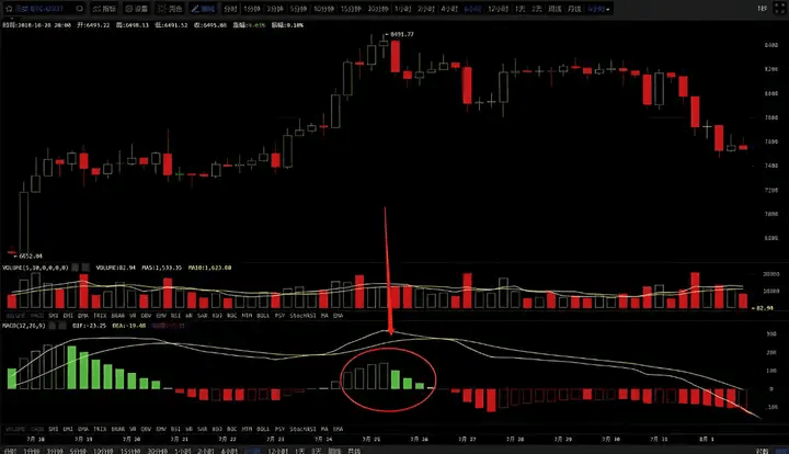
1. When the green histogram continues to expand, it indicates that the market is in an upward trend, and the price will continue to rise. At this time, you can continue to hold until the green histogram can no longer expand before considering selling.
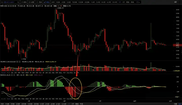
2. When the red histogram continues to expand, it indicates that the market is in a downward trend and the price will continue to drop. At this point, one should mainly observe until the red histogram starts to shrink before considering a small position.
3. When the green histogram starts to shrink, it indicates that the current trend is about to end (or enter a consolidation phase), and the price will undergo a correction. At this point, one can choose to take profits from previous positions.
4. When the red histogram starts to shrink, it indicates that the current downward trend is about to end, and the price may stop falling and rise (or enter a consolidation phase). At this point, one can consider building a small position but should not sell easily.
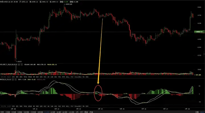
5. When the green histogram begins to disappear and the red histogram starts to increase, it indicates that the current upward trend or consolidation is about to end, and the price will experience a pullback.
6. When the red histogram begins to disappear and the green histogram starts to increase, it indicates that the current downward trend or consolidation is about to end, and the price will start to rise.
Top divergence + Bottom divergence +
The divergence in the MACD indicator refers to when the MACD indicator's trend is opposite to that of the candlestick chart. There are two types of divergence: top divergence and bottom divergence.
(1) Top divergence
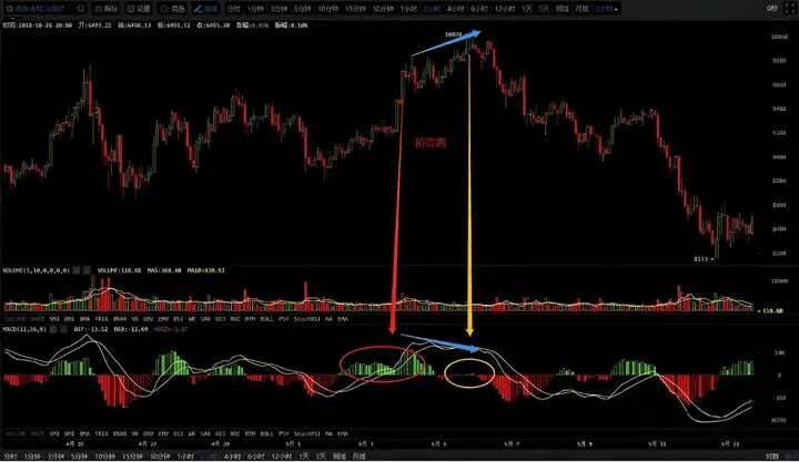
When the price trend on the candlestick chart keeps making higher peaks, the price is continuously rising, while the MACD indicator's histogram is making lower peaks, meaning that when the price's highs are higher than the previous highs, but the MACD's highs are lower than the previous highs, this is called a top divergence phenomenon. Top divergence generally signals that the price at a high level is about to reverse, indicating a short-term decline or adjustment, which is a sell signal.
(2) Bottom divergence
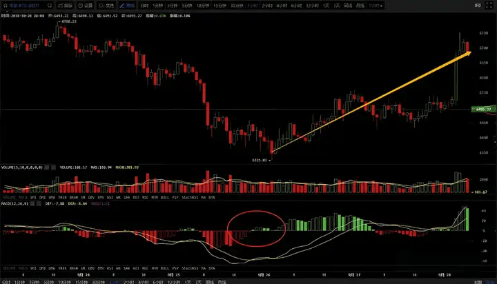
Bottom divergence usually occurs in the price's low range. When the price trend on the candlestick chart keeps making lower peaks, the coin price is still declining, while the MACD indicator's trend shows higher lows, meaning that the price's lows are lower than the previous lows, but the indicator's lows are higher than the previous lows. This is called a bottom divergence phenomenon. Bottom divergence generally signals that the price may reverse upwards at low levels, indicating a short-term buying signal.
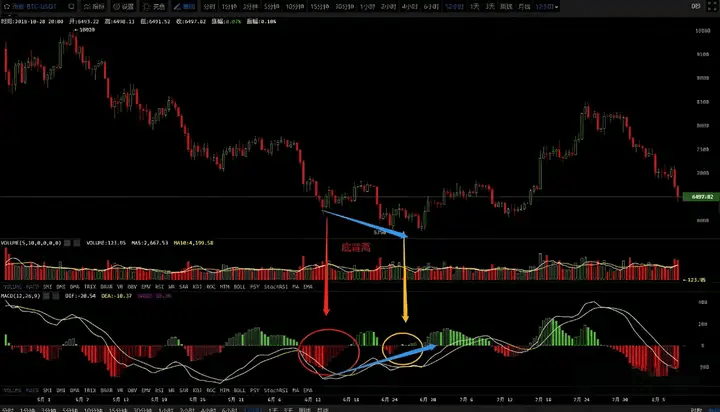
In practical application, the divergence of the MACD indicator generally appears more reliably in strong trends. When the price is at a high level, usually only one occurrence of the divergence pattern is enough to confirm that the price is about to reverse. However, when the price is at a low level, it usually requires several occurrences of divergence to confirm. Therefore, the accuracy of the MACD's top divergence assessment is higher than that of the bottom divergence.
Support and resistance levels
First, let's understand the meaning of support and resistance levels. A support level means that under the condition of a falling candlestick pattern, once it falls to a certain point, it cannot drop further, creating a feeling of support. Therefore, if you can predict the support level in advance, you won't panic as much when the market falls.
So how do we find the support level of a coin? First, let's understand the principle of support levels. The simplest principle of support and resistance levels is the 'dense trading area.' What is a dense trading area? It is the interval where chips are concentrated and the trading volume is large. For example, let's take a look at the EOS chart below.
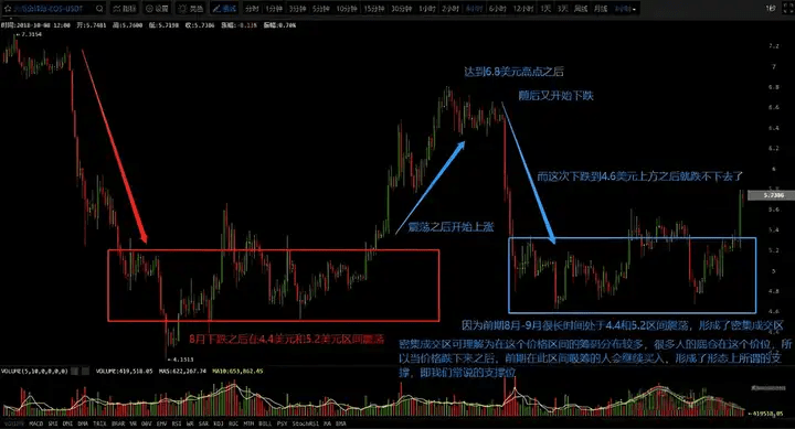
In fact, the support level can be understood as a previous dense trading area for the coin price. Looking at EOS's trend in the chart, we have also provided text descriptions. When EOS fell to around $4 in August and began to rise on August 27 to reach the top of $6.8, it subsequently fell, and the price directly dropped to around $4.7, achieving stabilization and forming another consolidation range seen in the candlestick chart.
This is also because EOS oscillated in the range of $4.4-5.2 for a long time in August. At that time, many people bought EOS at an average price of around $4.7. So when the market rose and then fell, dropping to the previous dense trading area, it formed market recognition. In other words, those who bought EOS in the $4.4-5.2 range in August would re-enter the market when EOS fell back to this range in September, creating the support effect we observe.
Similarly, let's discuss the points that dropped in the first wave in August. In the first image, we can see that EOS fell to around $4 in August. So why did it stop falling after reaching $4? Let's take a look at the next image.
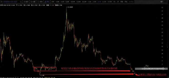
Why did EOS stabilize and stop falling when it dropped to around $4 in August? By enlarging the candlestick chart, we can look for the dense trading area we mentioned. You might be surprised to find that in March, EOS also oscillated in the range of $4 before starting a significant trend in April. Therefore, when the upward trend ends and the price drops to the previous initial point, which is the dense trading area in March, it again forms a trend support level. Around August 15, when EOS fell to around $4, it couldn't drop further, which is also an understanding of the support from the dense trading area.
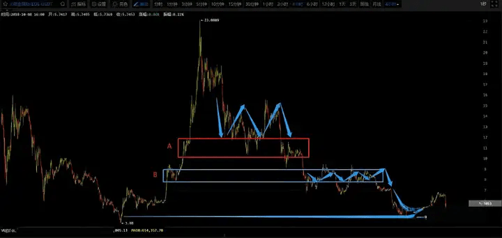
In fact, we can also look for related intervals in the previous downward trend and those previous dense trading areas. Everyone can find that whenever the price drops to a previous dense trading area during a downward trend, it forms a brief support. Therefore, we can straightforwardly understand the concept of support levels as the previous dense trading areas. In comparison to the current market conditions and previous dense trading areas, these are some fundamental concepts that our analyst has summarized, which are easy to understand and down-to-earth.
After discussing support levels, let's talk about resistance levels. In fact, once you understand what we talked about above, it's quite easy to understand resistance levels as well. They are analogous to support levels. Let's continue to look at EOS's candlestick chart using our first image. It was mentioned that after EOS stabilized around $4 on August 15, it formed an upward trend on August 27. You can also notice this is when we mentioned conspiracy theories. After EOS rose all the way to around $6.8, it couldn't rise any further. So was it hindered by the resistance level? Let's check the previous dense trading area.
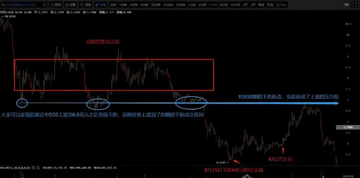
After the conspiracy theory, EOS began a brief rise, reaching $6.8 before being hindered and falling. We can see that on June 25, July 13, and around August 5, EOS hit the $6.8 mark three times, indicating that there were many bottom chips here. When EOS fell below the support level of $6.8 on August 8, many funds were trapped, and it wasn't until early September that EOS rose back to $6.8. When EOS rose to $6.8, it corresponded to the previous dense trading area of $6.8, which served as a resistance level. Many people who were previously trapped will exert selling pressure when the coin price returns to this level, forming what we call a resistance level.
Thus, the reasoning for pressure and support levels is the same, which is to look at the previous dense trading areas. The support level is to find the previous low dense trading area during a downward trend, while the pressure level is to find the previous high dense trading area during an upward trend. These are some of the principles of technical indicators. We hope to convey these principles to everyone so that you can learn them yourself and judge support and resistance levels in the future.
Trend indicators +
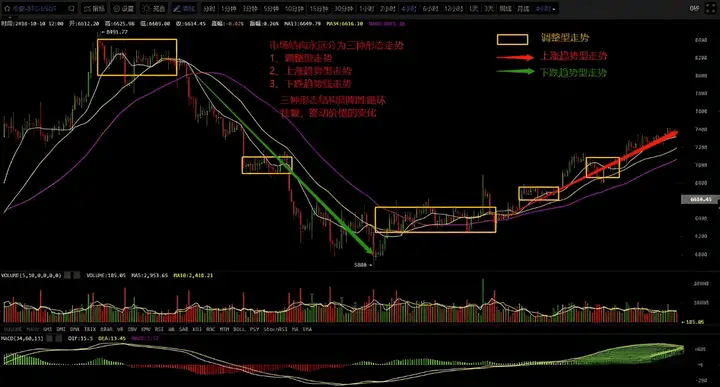
1. Structure of the market
Let's first look at the types of market structures: 1. Trend types, 2. Adjustment types. Among trend types, there are upward trends and downward trends, while adjustment types refer to price fluctuations within a certain range, which is what we usually call a consolidation range.
2. Definition of trends
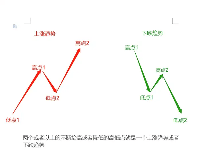
What is a trend? It is when the price runs in a certain direction for a long time.
An upward trend is one where the price continuously rises and the rise lasts for a long time.
A downward trend is when the price continuously makes new lows over an extended period.
3. Structure of trends
The structure of a trend consists of upward, downward, and adjustment phases, which can be referenced in the chart below.
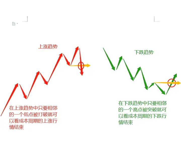
4. The end of a trend.
The end of a trend is generally indicated by the effective breaking or breakthrough of two adjacent support or resistance levels.
5. Levels of trends
Trends exist in any time frame, whether it's 1 minute, 5 minutes, 15 minutes, 1 hour, 4 hours, daily, weekly, monthly, or yearly.
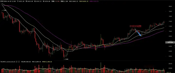
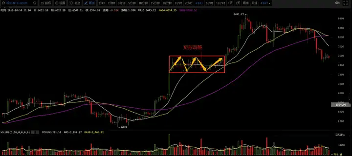
6. Trend adjustment patterns
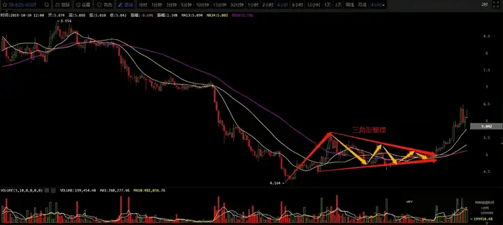
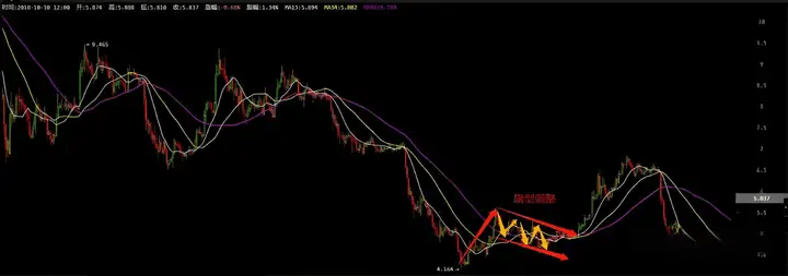
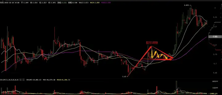
Trends include adjustment patterns. Trend patterns are simply an upward or downward phase, while adjustment patterns are somewhat more complex. To make it easier for everyone to understand, we will categorize adjustment patterns into several common forms, including: a secondary wave adjustment pattern, a rectangular adjustment pattern, a triangular adjustment pattern, a flag adjustment pattern, and a wedge adjustment pattern, listed below for your reference.
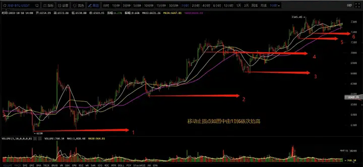
7. Exit points in trending markets - follow the trend using a trailing stop-loss.
By using a trailing stop-loss method to follow the trend, one can maximize trend profits; the longer the trend continues, the better.
Volume-price relationship indicator
What is trading volume? Trading volume is a reflection of market sentiment. When market sentiment is good, trading volume is relatively high; conversely, trading volume is low. So what are the relationships between volume and price? They can be divided into five situations: increasing volume with stable price, increasing volume with rising price, decreasing volume with rising price, increasing volume with falling price, and decreasing volume with falling price. Let's delve into these five situations and their impacts on the market.
Once the price turns up or down with effective volume coordination, it indicates the formation of a bottom or top.
From the above chart, we can clearly see that after the previous decline, the volume suddenly started to increase, but the price remained relatively stable. After the adjustment, an upward trend began, confirming the formation of a relative bottom.
Increasing volume with rising prices: trading volume and price rise in sync, primarily a phenomenon of volume-price coordination. Increasing volume with rising prices occurs only in upward trends, mostly at the beginning of an upward trend, with a small portion occurring in the middle of the upward trend. It indicates that the market will continue to rise.
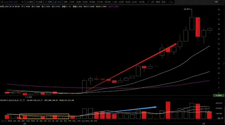
In the above chart, we can also see that both volume and price are continuously increasing, so the market trend is also continuing.
Decreasing volume with rising prices: trading volume begins to weaken while the price continues to rise. This phenomenon of decreasing volume with rising prices often appears at the end of an upward trend and occasionally during a rebound in a downward trend. In a sustained upward trend, moderate decreasing volume with rising prices indicates a high level of control by the main force, with a large number of circulating chips locked by the main force. Therefore, if there is a subsequent increase in trading volume, it may indicate that the main force is taking profits at high levels.
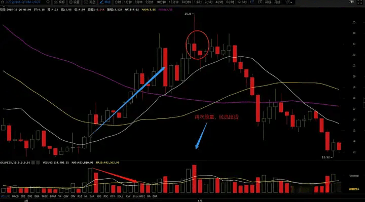
As shown in the figure above, after the trading volume shrinks, the price continues to rise, and finally, after a new round of increased volume, the market begins to reverse, continuing the initial downward trend.
Increasing volume with falling prices: trading volume increases while the price begins to fall. After a significant price increase, more profit-taking chips enter the market, leading investors to sell off, resulting in a price decline. This phenomenon of increasing volume with falling prices at high levels is a sell signal.
In the chart above, we can see that after the price increased in the previous period, the volume began to gradually increase. At this point, there are obvious signs of selling, so increasing volume with falling prices can be seen as a sign of large funds exiting.
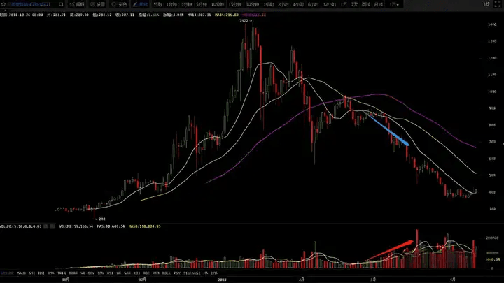
Decreasing volume with falling prices: trading volume decreases while the price begins to fall. This phenomenon can occur in the middle of a downward trend or in the middle of an upward trend. In a downward trend, decreasing volume with falling prices indicates that investors are no longer doing 'short covering' after exiting (having been bearish and waiting for the price to stabilize before re-entering), and the price will continue to fall. In an upward trend, it may indicate that some funds that previously took profits are exiting, and when funds re-enter, the price will continue to rise.
The chart above shows the phenomenon of decreasing volume with falling prices during a downward trend because investors have a very strong willingness to sell, and no one wants to buy again, so the price continues to fall.
The chart above shows the phenomenon of decreasing volume with falling prices during an upward trend, which we usually refer to as a pullback. The price will continue the upward trend in the future.
The main manifestations of volume-price divergence are decreasing volume with rising prices and increasing volume with falling prices.
A big shot in the crypto world once said that as long as retail investors can achieve these six points, then they can easily turn 100,000 into 5 million. What are the six points?
Point one: You must understand stop-loss and take-profit.
We trade coins for transactions and speculation, not to hold forever! When you're making money, you think about earning more, but when you're losing, you don't want to sell. This mindset is definitely not advisable. When the trend of your position goes wrong, you need to sell decisively.
Point two: Do not always think about buying low and selling high.
Because the market will only have lower points and higher points. Ordinary people cannot achieve this mechanism, so don't pursue so-called highs and lows. What we really need to do is buy and sell in the bottom and top areas.
Point three: Volume and price must work perfectly together.
For those positions that rise without volume or reach new highs without volume, we must be cautious. It is very likely a signal indicating that the main force is unable to sell, leading to a signal of exhaustion. Never chase; it's better to miss out than to make a mistake.
Point four: Be quick to react.
When information appears, we must immediately identify which sectors and companies benefit from it. If you can't keep up with the first tier, then we must promptly act on the second tier, which will also yield significant gains.
Point five: Learn to rest.
As the saying goes, it takes three months to see the bottom and three days to see the top. This means that the main rising wave of a known cycle of rising coin prices lasts only a little bit of time. Therefore, we must learn to seize this main rising wave; otherwise, we usually rest during the other times.
Point six: The biggest good news for the market is a sharp decline, because a sharp decline often brings many greater opportunities. When others are greedy, you must learn to be fearful; when others are fearful, we must be greedy. So when the market experiences a sharp decline, do not be afraid; at this time, we choose quality positions and build them in a timely manner.
These six points sound simple, but few can actually achieve them. Why? If you cannot overcome the weaknesses of human nature, you will never earn your first five million in life.
Stop getting lost. If you want to steadily multiply your investments, soar, or make a comeback, follow my approach!
I lead the rhythm, choose the coins, set the direction, providing 2-5 strong signals daily with precise alerts!
Stop relying on gut feelings to trade. We rely on discipline and strategy to achieve results!


