Crypto isn’t just about charts, coins, and candles — it’s about experience.
And recently, Binance gave its app a stunning UI makeover. But… does it really matter?
🧠 Why UI = Trust in Crypto
First impressions matter — especially when real money’s on the line.
✅ Clean layout = easier trades
✅ Simple design = fewer mistakes
✅ Smooth flow = faster execution
✅ And yes — it just feels better
A confusing UI can literally cost you money. And let’s be honest:
No one wants to misclick a 100x long.
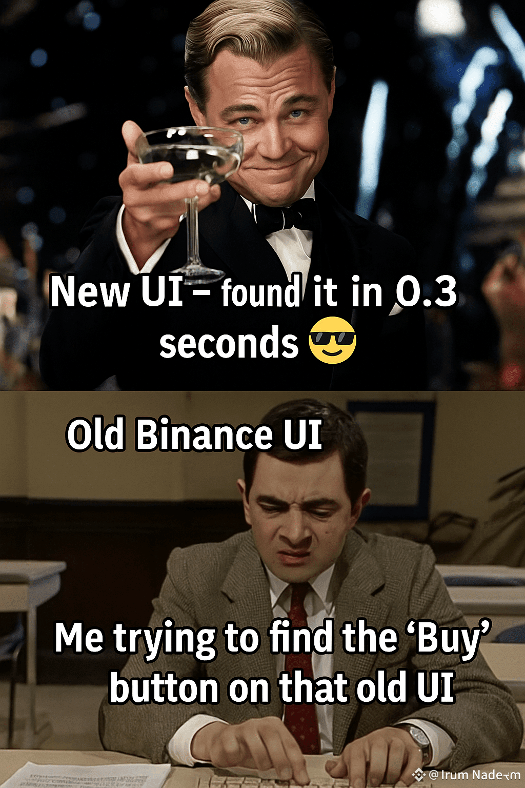
📱 Binance’s New Look — What’s Changed?
Binance quietly rolled out a refined interface:
✨ Sleeker navigation
✨ Quicker access to core features
✨ More intuitive icons
✨ Light & Dark mode feels smoother
✨ Less clutter — more control
It’s not just cosmetic — users are reporting faster, more confident trading.
🧪 UX Psychology: The Apple Effect
Design isn't decoration — it’s communication.
Studies show:
💡 Clean UIs increase user trust
💡 Familiar layouts = higher retention
💡 Better UX = more loyalty
Think Apple. Think Tesla.
Now think Binance.
🚀 Why This Update Actually Matters
Crypto is growing — and complex.
If we want mainstream adoption, we need platforms that feel simple.
This UI update isn’t just about aesthetics — it’s a signal:
Binance wants crypto to feel like a pro app, not a puzzle.
📲 Update your Binance app. Try the new look.
Then come back here and tell us:
👇 Did the new UI change the way you trade?
#BinanceUIRefined #UXMatters #CryptoDesign #BinanceAppUpdate #BinanceSquare