Opening with 1000u at 10x leverage has a position value of 10000u, opening with 2000u at 5x leverage also has a position value of 10000u. The value is the same, but the liquidation prices are different. However, in trading, do not focus on the liquidation price; what matters is the stop-loss.
Many people find it difficult to profit in the market due to high leverage requiring strict stop-loss discipline. You must adhere to the rules and immediately stop loss if it goes against you. Important stop-loss, not liquidation price. All day discussing what the liquidation price is, looking at others' orders, the first thing is to check the liquidation price. Are you opening a position just to get liquidated?
Beginners should trade spot and use the profits from spot to trade contracts. Many beginners come in with 50x contracts and lose their money within minutes. Formulate an opening and closing signal and execute it. It is not to say that this signal has to be very accurate or have a high probability; just having one is sufficient. Because no signal can achieve a high win rate and high profit-loss ratio for a long time.
After seven years of trading coins, I peaked at 500,000 and traded it up to over 9.6 million, but I also experienced weeks of going to zero, feeling hopeless for half a year. I returned to the coin circle, opened a new account, and traded 50,000 to where I am now. In fact, the so-called insight in trading coins is to remain calm and composed regardless of market conditions, inner state, or profit curves!
I have used 80% of the methods and techniques in the market, but the most practical one is still bottom fishing! I will share everything today, which will surely help you achieve wealth from recovery to profit.
The method and underlying logic for screening hundredfold coins:
1. The circulating market cap and total market cap should be low. The total market cap of public chains is best below 50 million, and DApp protocols should be below 5 million. The circulating market cap is easy to understand. If the market cap is too high, there is not enough room for growth, so the lower, the better. Why must the total market cap be low? This is because in the next 1-2 years, tokens will be released gradually. If the total market cap is too high, it means that the project team (the operators) does not need to push the price up; they can directly offload their stock and become rich.
2. The ceiling of the track must be high. At least in a bull market, the valuation should reach over 1 billion dollars. If it is a meme coin, you can refer to Dogecoin; if it is a public chain, you can refer to ETH, SOL, MATIC; if it is a DApp or protocol, refer to UNI, AAVE, LDO, etc.
3. New narratives, avoid participating in too niche tracks. It is best to solve practical problems. New narratives must be long-term value discovery, not short-term cyclical speculation. For example, the current AIGPU computing power narrative, a safer, faster, and more decentralized public chain, spans several foundational infrastructures of the Metaverse, chain games, AR, etc.
4. Hundredfold dark horse coins must be in places that no one cares about. Because coins that everyone knows are basically high open (ICP) or normal valuation (ARB), do you think their unit price can rise by 100 times? At the opening, the total market value is several hundred billion, several trillion. Don't mention a 100 times increase; even a 10 times increase would catch up with ETH or BTC.
5. The liquidity of early hundredfold coins is generally very poor, usually on-chain or small exchanges. Therefore, many beginners, when they see others recommending early coins, do not go to research their value and keep saying that they do not want to go to small exchanges, which seem too much like low-quality coins, and the purchasing process is too cumbersome with no apps, so they do not participate. These are all surface phenomena and do not see the essence of value.
In 2021, when I bought Magic, cross-chain transactions were quite troublesome. Later, it increased tenfold in a month. In February 2023, when I bought PPI, it also required dual wallets for cross-chain transactions. I tried many exchanges that did not support it, and later Gate supported Espace withdrawals. Later, BRC20 tokens also had high thresholds, requiring points and OTC, which were cumbersome. In short, high thresholds block non-experts' paths. Binance has no threshold but is very hard to make money on; all are sold after listing. Refer to the recent trends of RDNT, GNS, PEPE, FLOKI.
6. The launch time of tokens is best at the end of a bull market or the beginning of a bear market. When researching or buying, it is best that the listing and wash period is 6-12 months, and the circulation rate is best above 50%. KAS was launched in May 2022, underwent deep washing for about six months, and this year had a maximum increase of over 100 times. PPI was launched in May 2022, and after a deep wash for nine months, it began to explode, currently with a circulation rate of about 60%, and this year has a maximum increase of about 50 times.
7. The unit price should be low, with many zeros after the decimal point. If the unit price goes up to several hundred U or several thousand U, it will scare away over 80% of the retail investors. Especially during a bull market, the newcomers coming in only look at the unit price without understanding the market cap. Meme coins and public chain coins usually start with very low unit prices, where having 3-5 zeros is quite normal.
8. It is best to choose public chains or top protocols on public chains. The best way to make money in the coin circle is public chains. In the bull market of 2021, more than ten hundredfold public chain coins emerged, such as SOL, MATIC, AVAX, SOL, FTM, each with its advantages. There were also many top protocols, such as UNI, AAVE, KAKEXVS, etc. Why do I not participate in Hong Kong hot coins like ACH, LINAKDY? Because they are not public chains. Many things have a short life cycle, and the hype ends after a wave. But public chains are different; they always remain hot and always have to build ecosystems and market capitalization.
9. Founders, team background, investment institutions, and financing amounts must be reliable. The founder should preferably be a well-known figure in the coin circle, such as a core team member of Ethereum. For instance, the founder of KAS is Y, and the founder of ROSE is Professor Song, etc. If a well-known institution is involved in the investment, it adds an extra layer of endorsement. The financing amount and project valuation are also important. Good public chain projects generally have high valuations, often in the tens of billions.
10. Do not participate in anything that violates value investment logic. What does it mean to violate value investment logic? For example, stable AMPL, and a previous deflationary token on ARB that reduces the amount of coins held over time. Whenever you see something like this, no matter how innovative, do not participate; it will surely end in a mess and cause severe losses. AMPL has caused many influential figures to lose money. If you think you are a naturally fast runner, then I won’t say anything.
11. Avoid participating in old coins unless there is a very strong new narrative. For example, RNDRCFX is an old coin this round, but its narrative is very good and perfectly aligns with the main theme of this new bull market. The former spans several tracks in AIGPUNFT chain games, ARVR, and the Metaverse, and is a foundational setup that is hard to be eliminated.
The latter is a better, faster, safer public chain, and it has the support of national government resources. Furthermore, Hong Kong aims to become a core center of the new WEB3.0, making CFX a core target of Hong Kong's hotspots. Leaving aside this Hong Kong hotspot, it is also a relatively good public chain with its own ecosystem and value.
12. Choose the leading track and try to avoid the later ones. I chose CFX as the hotspot in Hong Kong, and for the ecological coins above, I chose the DEX token PPI. The ecological coins on CFX are all incubated on PPI, so it is the ecological coin leader.
If you have seriously read through the above twelve points, you should understand that all the coins mentioned above are not worth looking at anymore because they have already passed their market cycle. It is highly probable that there will be no second wave of hundredfold or even tenfold market increases. What you need to do is to use these twelve ironclad rules to filter out new coins.
During the trading process, have you ever felt the need for a more advanced skill to accurately identify market trends? Do you often feel frustrated by multiple conflicting signals coming from traditional candlestick patterns? Or have you ever made a trade when you were sure you should exit, only to watch it reverse and continue in the expected direction, becoming a profitable opportunity? Based on these questions, I found a solution – the Renko chart, which is a hidden gem on the Tradingview platform.
In this article, you will learn the following:
(1) Definition and characteristics of Renko charts.
(2) How to effectively use Renko charts for trading.
(3) How to easily identify clear trends.
(4) How to use Renko charts to capture significant profit opportunities.
(5) How Renko charts reduce market noise.
(6) How to easily identify your favorite chart patterns.
(7) Demonstrate a practical moving average strategy for you to test in real trading.
2. What are Renko charts
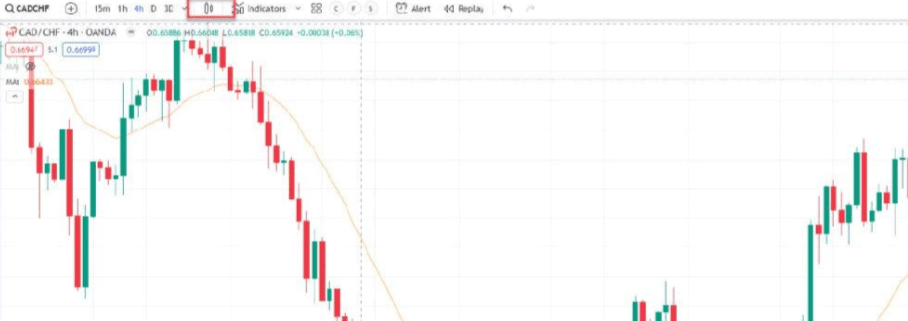
Before entering the Renko chart, it is crucial to know how to access this tool. First, open the Tradingview platform, where you will find a series of options and tools at the top, as shown in the image below.
Choose any chart type you are currently using, whether it's a candlestick chart or another type of chart. When you click on the highlighted icon on the interface, you will enter a window as shown in the image below.
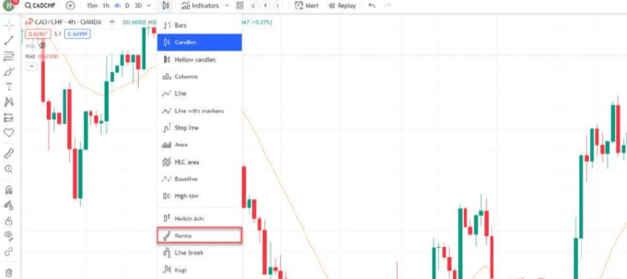
In the lower part of the interface, you will find the options for Renko graphics. Select 'Renko', and your chart will be converted to Renko format accordingly, as shown in the image below.
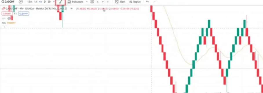
Next, let's explore the essence of Renko charts. You might ask what the main differences are between Renko bricks and candlesticks, and whether Renko bricks are worth learning or using. It is certain that Renko bricks can greatly change your trading strategy. Renko bricks only form when the preset brick size is reached within a predetermined time frame, which is different from the candlesticks that form regardless of price within the same time frame. Moreover, when the price rises or falls by a preset amount (such as points, cents, or dollars, set by you) within the preset timeframe, a Renko brick will form. Each Renko brick can be considered an extension of the previous brick. Whenever the price rises, the entire structure rises, forming a clear upward trend. However, new Renko bricks only form when the price closes within the preset time frame at the preset value. Let me show you an example of a Renko chart, as shown in the image below.
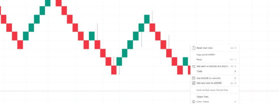
In the current example, the time frame is set to 'daily', and the brick size is set to 50 points. Therefore, you can see that whenever the price rises by 50 points, a new brick is formed. This means that if the price is 150 points higher than the previous day within one day, three new bricks will be formed consecutively on the chart. At the end of the preset time frame (in this case, one day), multiple bricks will be printed simultaneously. However, if the price moves 180 points in one day, only three bricks will still be formed because you need an additional 20 points to reach the 200 points required to create the fourth brick. Now, the remaining 20 points may form on the second day, and in that case, as long as the closing price remains at that level or higher at the end of the day, the next brick will be formed. At this moment, you may ask how to determine the size of each brick should be? Every chart is different. I have a solution to guide you; you need to right-click on the chart and select 'Settings' to access chart settings, as shown in the image below.
Then select the 'Symbol' tab and you will see this table as shown in the image below.
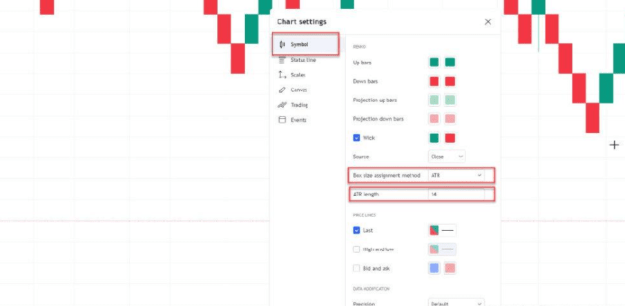
The settings for Renko bricks can use either 'traditional' or 'ATR' methods. ATR (Average True Range) is an ideal setup method that can automatically adjust the size of Renko bricks without having to manually adjust traditional values each time the chart is switched. ATR analyzes the previous 14 candles (this value can be adjusted) and uses the average true range to determine the size of new bricks. This method can be very useful as it adapts to changing market conditions, and it allows you to switch between different asset classes, such as from forex to stocks, cryptocurrencies, etc., without going through the cumbersome process of determining the best brick size for each asset or currency. Of course, I still encourage you to try traditional setting values as well to determine which values work best for you.
How does the time frame affect Renko charts?
It is important to recognize that time frames still play a significant role in Renko charts. In the example above, I have set the time frame to 'daily', meaning bricks will only print and form at the daily close. If the time frame of the chart is changed to 'hourly', new bricks will form every hour. If using ATR (Average True Range), this will impact the calculation of each brick's size (lower time frame = lower ATR = smaller brick size). The following examples will further illustrate the above concepts.
(1) Example: AUD/USD Daily Renko Chart
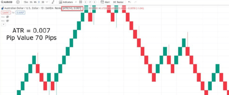
In the current example, I have highlighted the ATR (Average True Range) value for you. Within the daily time frame, you can see that the average true range is 0.007, which is equivalent to 70 points. This means that based on this chart, the average daily price fluctuation range for AUD/USD is 70 points. If you switch to the hourly chart, you will be able to observe how the ATR value changes with the time frame.
(2) Example: AUD/USD 1 Hour Renko Chart
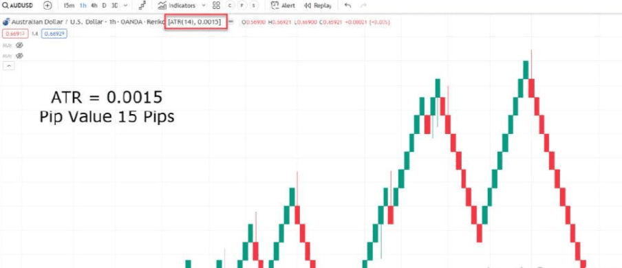
In the current example, on average, the closing price per hour is around 15 points. Therefore, our ATR (Average True Range) value is set to 0.0015, which means the Renko brick size is 15 points, forming once every hour, while the previous daily closing price was 70 points. I hope you understand why using ATR to determine brick size requires some estimation; it also indicates that Renko charts can be used across various time frames.
3. How Renko helps identify trends
Using Renko charts can simplify the process of trend identification, specifically in the following aspects.
(1) Example: AUD/USD Daily Renko Chart
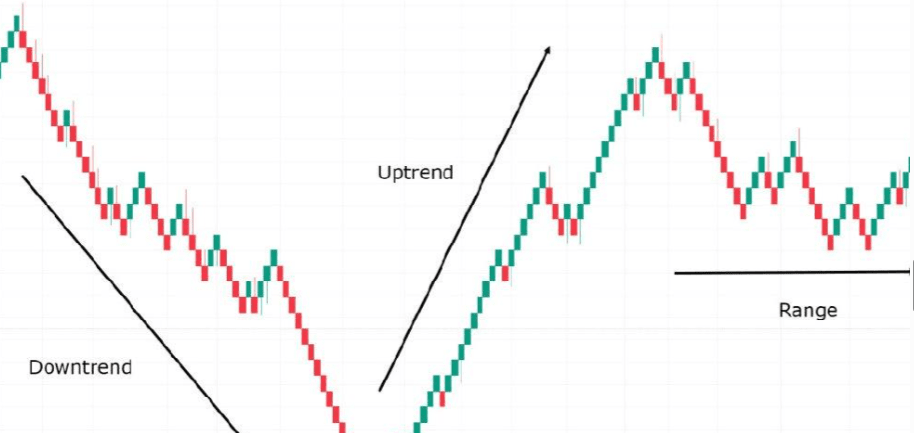
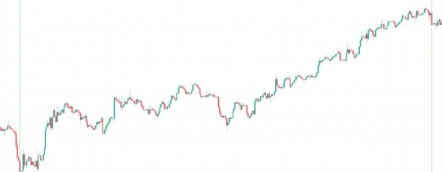
With Renko charts, you can clearly observe the formations of lows and highs. Renko bricks provide a visual representation of the direction of the current trend. When you see multiple green bricks forming consecutively, you can confirm that the market is in an uptrend. Similarly, if a large number of red bricks form one after another, it can almost certainly confirm that the market is in a downtrend. Finally, if you only see a few red bricks followed by a few green bricks, you can confirm that the market is in a sideways consolidation state.
As you can see, Renko charts can easily identify trends without being affected by indicators like moving averages. In fact, I believe any trader can look at a Renko chart and clearly point out the direction of the trend. However, let's explore this topic further. If you are a trend trader, I believe you know how important it is to capture the entire trend rather than be distracted by market noise. Fortunately, Renko charts provide an ideal platform for capturing full trends. The advantage of trend identification using Renko is that it can provide a clear signal when a trend may lose momentum. Now, let's explore how to use the Renko chart to track trends through an example.
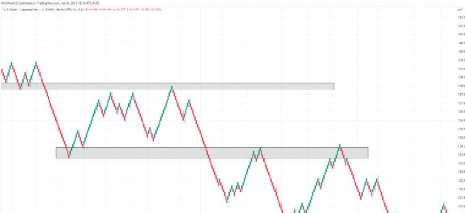
(2) Example: EUR/CAD 4 Hour Renko Chart
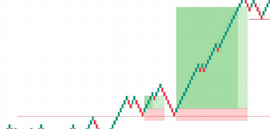
Suppose you are using a Renko chart with a support and resistance type method. Let's assume that after a certain level of backtesting and analysis on a currency pair, you decide to exit the trade when two Renko bricks form against your trading direction. You may observe that if you exit when trying to convert the resistance level into a support level for the first time, you will only achieve a meager profit. However, when the support level is hit again, the Renko chart allows you to capture significant trends while filtering out the candlesticks and volatility noise that may come from news events. Therefore, when combined with other time frames, the Renko chart becomes a powerful tool for capturing most trends before momentum starts to shift. Of course, you won't always be able to capture 100% of trend movements, but using the Renko chart makes identifying your entry and exit points simpler and safer.
4. How Renko eliminates market 'noise'
Have you ever browsed through charts and felt confused? Candlestick charts can indeed provide you with rich details, but one of their downsides is that there may be too much noise on the chart. There’s a pin bar here, a double bottom there, an engulfing pattern, but the information at different levels contradicts each other. I call this 'analysis paralysis.' Sometimes, too much information can hinder you from making the decisions you ought to make. However, Renko charts simplify this process by eliminating all market noise. Please take a look at the chart below.
Example: GBPCAD 4 Hour Renko Chart
Please observe this chart now, as shown in the image below.
Example: GBP/CAD 4 Hour Candlestick Chart
 Which chart is easier to understand? This is the same currency pair over the same time period, but I am sure I prefer which chart to look at. Clearly, in trying to make rational decisions with a clear mind, confusion must be eliminated. Renko charts allow you to observe the market with a clear, impurity-free chart. As you can see above, simplicity is strength; when trying to identify trends or determine entry and exit points, less confusion can make these decisions more straightforward. Now that we have clarified our thoughts, let's explore how to identify some patterns.
5. Renko and chart patterns
(1) Support and resistance levels
As I mentioned earlier, the market can sometimes be filled with various noises, making it difficult to accurately identify clear levels. Renko charts provide you with a new perspective to examine these levels.
Example: USD/JPY 1 Hour Renko Chart
As you observe on the chart, prices encounter rejection at these key levels. By drawing support and resistance zones, you can look for rejection or reversal patterns that occur in key areas while filtering out market noise. Additionally, you can first use Renko charts to analyze key levels, then switch back to candlestick charts to look for suitable entry candles. This method not only cleans up the chart to identify clear support and resistance levels but also allows you to switch back to candlestick charts while waiting for specific patterns or candlesticks to appear.
(2) Chart Patterns
By using Renko charts, recognizing typical chart patterns becomes easier. Since Renko charts can eliminate a lot of market noise, the process of pattern recognition becomes more direct and clear.
Example: USD/JPY 4 Hour Renko Chart
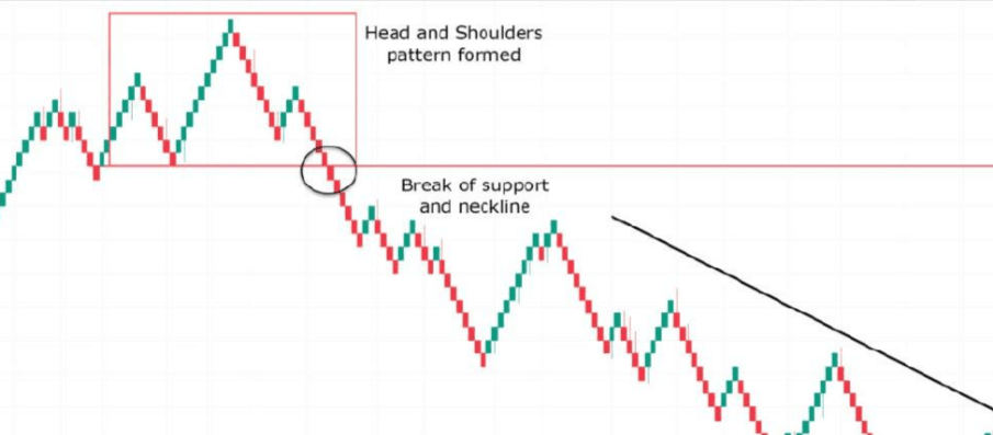
In the example above, you will observe that the price forms a head-and-shoulders pattern at the top of the trend, and when the support level or neckline is broken, this provides an ideal opportunity to short the market and ride the downward trend. This principle also applies to other patterns, such as double tops and double bottoms.
6. How to use moving averages in Renko charts
When using technical analysis tools, combining multiple tools can improve your success rate. Combining moving averages with Renko charts provides you with a powerful trigger platform for entering and exiting trades. I will provide you with an example so that you can start exploring this issue more deeply.
Example: GBP/CHF 4 Hour Renko Chart
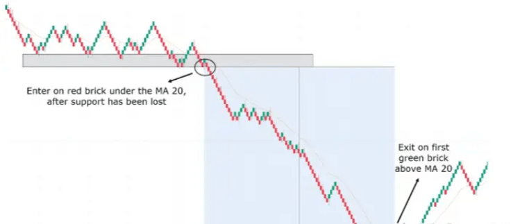
The above chart shows GBPCHF in a 4-hour time frame. The moving average chosen for this example is the 20-day moving average. You can see a clear support level that is waiting to be broken. Once the price breaks below the support level and below the 20-day moving average, you can establish a short position. As you observe, even green bricks appear during a downtrend, they do not close above the moving average, which allows you to stay in the trade longer while exiting at the best time as the price trends change. This is a classic example of allowing your profitable position to continue to grow. For us, it is necessary to try different moving averages and ATR values to find the method that works best for you.
7. Advantages of Renko charts
(1) Renko charts help easily identify trends.
In the example above, you have learned that Renko charts can identify trends more effectively.
(2) Renko charts help clearly identify resistance and support levels.
Support and resistance levels become clearer, even if Renko charts are used solely to find these initial areas before switching back to your preferred chart type.
(3) Renko charts reduce noise
When attempting to make clear decisions, sometimes 'less is more.' Renko charts excel at eliminating the daily noise in the market that you typically find in candlestick charts.
(4) Renko charts can be highly customized
Renko charts allow you to customize highly based on each currency pair to fit your own trading style, time frame, and strategy.
(5) Renko charts are suitable for various time frames
Due to their customizability, Renko charts can be used across any time frame.
(6) Renko charts provide accurate entry and exit points.
Finally, Renko charts allow you to use them in conjunction with traditional candlestick charts. Renko charts can help identify trend changes early through the color changes of the bricks, and then allow you to look for candlestick patterns and more precise entry or exit points on candlestick charts. For example, you can enter trades using typical candlestick or line charts, then switch to a Renko chart to see when the trend begins to turn in your favor, allowing you to gain more profit than using only candlestick or line charts.
8. Disadvantages of Renko charts
(1) Renko charts may produce misleading signals.
Like most trading tools, the functionality of Renko charts is not flawless. Understanding these limitations is crucial for making more accurate and robust trading decisions. In volatile market environments, Renko charts may give false signals, leading to prices fluctuating within a certain range, first printing green bricks, followed by red bricks sequentially.
(2) The information provided by Renko charts is somewhat limited
If you are a trader who needs to extract a lot of information from charts, then Renko charts may not be suitable for you. The main advantage of Renko charts is to eliminate noise, but this also means that they may eliminate valuable information for traders, such as candlestick patterns.
(3) Renko charts may simultaneously form multiple bricks.
Another disadvantage of Renko charts is that multiple bricks may form simultaneously, which can cause you to miss the best entry opportunities, or the price may have moved too much to enter, depending on your strategy when creating bricks.
(4) Brick size may be difficult to determine.
Brick size may be the best choice based on past data, but that does not necessarily mean it will still be the best choice for future data. Market conditions can change, so a brick size of 15 points that was best in the past may no longer be applicable in future market environments.
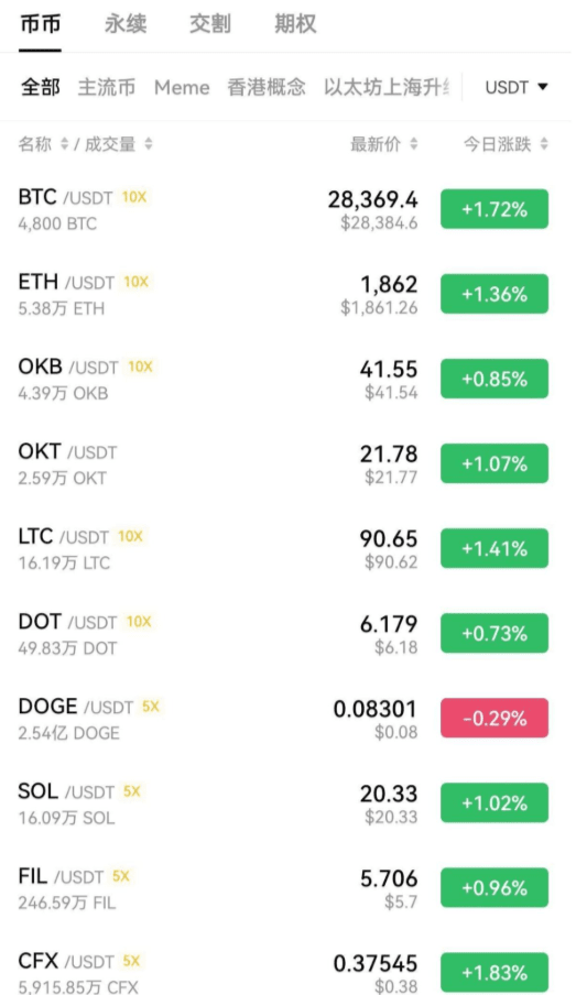
#MichaelSaylor暗示增持BTC #美国加征关税
$BTC

