 Many beginners look at the chart as if it is a set of lines and colors without meaning... but the truth is that Japanese candles are a powerful visual tool that tells you what is happening in the market, in a language understood by every trader if they learn its basics.
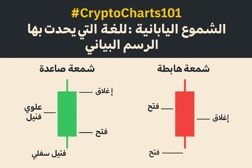
🔍 What is a Japanese candle?
It is a visual representation of price movement over a specific period (like 1 minute, 1 hour, or 1 day), and consists of:
• The Body: Represents the difference between the opening and closing prices.
• The Upper Shadow: The highest price reached by the asset during the period.
• The Lower Shadow: The lowest price reached by the asset during the same period.
📈 Is it a bullish or bearish candle?
• The Bullish Candle: The closing price is higher than the opening, and it is often green or white.
• The Bearish Candle: The closing price is lower than the opening, and it is often red or black.
A long candle indicates a strong movement in a certain direction, while long shadows indicate volatility or 'price rejection.'
💡 A quick example from the market:
If a one-hour candle opens at $25,000 and closes at $25,200, it is a bullish candle.
However, if it opens at $25,000 and closes at $24,700, it is a bearish candle, which may reveal selling pressure during that period.
🧠 Why start with it?
Because it is the foundation of technical analysis. Before you learn indicators and patterns, you must master reading a single candle, as it is the key to understanding price behavior.
✍️ Summary:
Japanese candles are not difficult, but enjoyable. Each candle on the chart is a 'message' from the market, and your job as an analyst is to understand the message well.