The MACD indicator can also be used with short, medium, and long-term combination parameters. The short-term MACD parameters are 6, 15, 6; medium-term is 10, 20, 10; long-term is 30, 60, 30; in fact, using MACD is quite simple; there are five aspects to pay attention to.

1. Distinction between strength and weakness.
First, check whether the MACD indicator is above or below the 0 axis. If it is above the 0 axis, it indicates strength; if it is below, it indicates weakness. This is the first standard for judgment: is it above the 0 axis or below it?
2. The relationship between lines.
One yellow line DIF and one white line DEA; when the yellow line crosses above the white line, the stock price will rise; when the yellow line crosses below the white line, the stock price will fall. This is the second rule for judgment.

3. Judging strength and weakness through the color of MACD.
If the red columns of the MACD increase, it indicates the stock is continuously rising; if the green columns increase, it indicates the stock is continuously falling. By observing the quantity of red and green columns, we can judge the rise and fall.

4. Judging strength and weakness through the length of MACD.
We also need to look at which MACD red and green columns are longer. If the green column changes from long to short, it indicates a potential rebound; if the red column changes from long to short, it indicates a potential pullback.

5. The relationship between long, medium, and short MACDs.
In the operation, one can also use the long-term line as a basis; only when the long-term MACD yellow line is greater than the white line and the red column keeps increasing can one proceed with operations. This is safer. It is similar to KDJ, where features such as amplification, reduction, double tops, double bottoms, top divergences, and bottom divergences are the same. The key is to adjust the parameters and observe the use of these three MACDs simultaneously, making operations in stocks safer and more reliable, reducing risk and increasing profit potential. Because the MACD indicator is relatively intuitive, especially the red and green columns, it is easy to understand at a glance. First, use the long-term line as a benchmark to operate through the short-term line. If the operation is not good, then use the long-term MACD as a basis to hold or sell. When the long-term MACD performs well, then buy stocks.
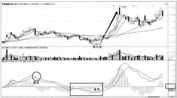
Eight buying patterns of MACD.
1. After the golden cross, upward adjustment followed by a rebound.
As shown in the figure, after the DIF and DEA golden cross, they rise with the stock price, and then fall with the stock price's pullback. When the main force washes the position, the stock price pulls back, and when the DIF line adjusts to near the MACD line's 0 value, the DIF line reverses upwards, forming a pattern of golden cross followed by upward adjustment and then rebound, presenting a buying opportunity.

2. Second golden cross below the zero axis after the dead cross.
After the DIF line below the zero axis crosses the DEA line, it does not cross above the zero axis or briefly crosses and then returns below the zero axis, and then crosses downwards to the DEA. After a few days, it crosses the DEA line again (as shown in the figure below). This pattern indicates the stock price after a downward bottoming process, presenting a bottom pattern when selling pressure is exhausted. It should be understood as a signal for a bottom rebound, and one can choose the right time to enter the market.

3. Dead cross piercing the zero axis rebounding into a golden cross.
The dead cross piercing the zero axis and rebounding into a golden cross refers to the DIF line being above the zero axis, crossing below the DEA line, then piercing the zero axis, and forming a golden cross at or above the zero axis with DEA (as shown in the figure below). This pattern indicates that the stock price is consolidating during a recovery after hitting a bottom, and it may also indicate a bottom formation, showing an upward momentum. It should be understood as a signal for active intervention, and one should decisively enter the market.
4. The golden cross below the zero axis without a dead cross reversal.
The golden cross below the zero axis without a dead cross reversal indicates that the DIF crosses the DEA line below the zero axis, and subsequently does not cross the zero axis but pulls back, approaching the DEA. The MACD red column shortens but does not dead cross with the DEA and then reverses upwards again, while the MACD red column lengthens. The formation of this pattern is often a bottom pattern, indicating the stock price presenting a bottom pattern after a downward bottoming process when selling pressure is exhausted. It should be understood as a main force building area, and one can choose the right time to intervene.

5. After the golden cross crossing the axis line, the two lines stick together and then separate.
The golden cross crossing the axis line and then the two lines sticking together and separating refers to the MACD indicator where the DIF was below the zero axis crossing above the DEA line, then running above the zero axis for a while, and then adjusting with the stock price causing the DIF to also start to adjust downwards. When the DIF adjusts to the DEA line, the two lines stick together as one line, and when they separate again while the bulls diverge, a buying opportunity is formed, and a new upward trend begins (as shown in the figure below). The appearance of this pattern is often due to upper-level consolidation and position washing by the main force. After a brief adjustment in the stock price during the rise, it shows a strong upward trend, which should be understood as a signal for active intervention, and one should decisively buy in.

6. Golden cross after the dead cross above the zero axis.
A golden cross after the dead cross above the zero axis mainly refers to the DIF line crossing below the DEA line above the zero axis, but not crossing below the zero axis, and then a few days later crosses above DEA again above the zero axis (as shown in the figure below). The appearance of this pattern is often due to upper-level consolidation, primarily for the purpose of washing the position. After a brief adjustment, the stock price shows strong upward momentum, which can be understood as a signal for active intervention, and one should decisively buy in. If there is continuous volume, one can be more resolute in being bullish.

7. Golden cross after linear movement below the zero value.
The golden cross pattern after linear movement below the zero value mainly refers to the DIF and DEA continuously moving in a straight line below the zero value (as shown in the figure below). At this time, the stock price is mostly in a sustained downward phase. After a period, the DIF and DEA form a golden cross, presenting a buying opportunity.

8. Second golden cross below the zero axis.
The second golden cross below the zero axis indicates that the DIF generates a second golden cross below the zero axis (as shown in the figure), indicating that the stock has completed bottoming and starts to emerge from the bottom, and one can choose the right time to enter. From the figure below, we can see that the stock has produced two golden crosses below the zero axis, and there is also a dead golden cross in between. Therefore, after the first golden cross, we need to observe whether it is a genuine rebound. After the dead cross appears, we should be cautious about entering, and when the second golden cross appears, the upward trend is confirmed, and we should decisively buy in.

The red and green columns of the MACD.
The red and green columns of the MACD indicate the distance between DIF and DEA. When DIFF is above DEA, it shows a red column. When the MACD red column appears, it indicates that the market will unfold a bullish trend, which is a buying signal. In the case of continuous increases in the red columns, the stock price will continuously hit new highs.
How to better understand, illustrative example:
1. Bullish market energy.

Both are above the zero axis; being above the zero axis indicates a strong bullish market.
Figure 1, bullish energy columns strengthen, typically the strongest area of a wave, a zone for concentrated profit release.
Figure 2, bullish energy columns decline, bullish energy is weakening.

Figure 3, bearish energy columns strengthen. DIF and DEA are above the zero axis, the red column turns into a green column, indicating that in a bullish market, the upward trend is worsening during the adjustment.
Figure 4, bearish energy columns shorten. The strengthening of bearish energy columns (Figure 3) transforms into the shortening of bearish energy columns (Figure 4), suggesting that the adjustment may end at any time and the upward trend resumes.
2. Bearish market energy columns.

Figure 5, bearish energy columns strengthen: DIF and DEA are below the zero axis, in a weak market, green energy increases, indicating a sell-off process with high risk and no profit.
Figure 6, bearish energy columns decline: DIF and DEA are below the zero axis, indicating a poor overall market environment, suggesting that bearish momentum is declining and a rebound may occur.

Figure 7, bearish energy columns strengthen. After the green energy columns shorten, they turn red, and the red columns begin to strengthen, indicating that within a weak outcome, the rebound is strengthening.
Figure 8, bearish energy columns shorten. The environment is still below the zero axis, and the red column trend is downward. In a weak structure, it is merely a corrective rebound, insufficient to form a large structure, so the rebound can end at any time.
Analysis Case 1:

Point 1, zero axis circle: from green to red, indicates bullish energy. The bullish point, where the DIF crosses the DEA circle from below the zero axis: is a golden cross below the zero axis, and the corresponding stock price pattern for the golden cross below the zero axis and the transition from green to red bullish energy is a bottom structure.
Point 2, the stock price stagnates and falls back, corresponding to the shortening of the red column, indicating a decline in bullish momentum, but it has not turned green, which does not constitute a top result. The position corresponding to 2 is a trend rebound structure, representing a continuation of the rebound structure.
Point 3, the stock price stagnates and falls back, the overall environment remains above the zero axis, and the bullish momentum is weakening without turning red. This is a retracement structure.
Point 4, the market environment is above the zero axis: the red column starts to shorten from this position, indicating that bullish momentum is beginning to weaken and has not turned green. Operationally, we can still wait a bit.
Point 5, the high point after a rebound, the market environment is a strong market above the zero axis, a dead cross occurs simultaneously, indicating a change from red to green energy. At this time, one should short.
Analysis Case 2:

Point 1, the energy column changes from red to green, the DIF and DEA form a dead cross, and the stock price forms a top structure during the adjustment process.
Point 2, DIF and DEA are below the zero axis, in a weak market environment. The weak market environment undergoes minor changes, meaning the green column shortens and bearish momentum is insufficient; the stock price indeed stops falling.
Is this a rebound or a continuation of the decline? Look at whether the green energy column changes from green to red. If it changes from green to red, then there is a possibility of a rebound at this position, not a continuation of the decline. In fact, the green has changed from short to long. If trading, it can only be left-side trading with a stop loss set.
Point 3, the energy column begins to shorten again. The bearish momentum is insufficient; whether it is a rebound or a continuation of the decline, if the energy column changes from short to long, this position is still a continuation of the decline, and left-side trading can be done with a stop loss set.
Point 4, the energy column shortens and turns red, indicating insufficient bearish momentum, and the stock price has stopped falling. The only difference between point 4 and points 3 and 2 is that the energy column has changed, i.e., a golden cross occurs below the zero axis. One golden cross combined with the energy column changing from green to red may extend into a bottom structure, forming a wave of rebound, and while engaging in left-side trading, one can also increase positions.
MACD red and green column rise and fall strategy.
Based on the graphical characteristics of the column line, the MACD column lines can be divided into the following five patterns: single peak (valley) pattern, double peak (valley) pattern, triple peak (valley) pattern, spoon pattern, and hovering pattern above and below the zero axis.
1. Single peak (valley) pattern.
The single peak pattern refers to a set of red columns adjacent to the green columns above the 0 axis undergoing one divergence and one convergence, forming a shape resembling a mountain.

The single peak pattern is mostly caused by a short-term rise in stock prices and often occurs in positions with significant market divergence. At this time, whether we enter the market requires combining with other technical analysis tools for a comprehensive judgment.
After comprehensive judgment, if the market is likely to show a downward trend next, then the single peak pattern is the best selling opportunity. We can actively sell when the column line converges significantly; if the market is in a consolidation phase, we can hold off on operations or sell short when the column line converges; if the market is likely to show an upward trend next, we should pay attention to holding stocks and waiting for a rise.

From August 2 to August 26, 2016, the MACD column of New Meixing (300509) showed a single peak pattern.
Case Analysis: On August 29, the columns above the 0 axis began to converge sharply, while the DIFF line and DEA line have been running below the 0 axis for a long time. At this point, they are hindered again near the 0 axis, indicating a high probability that the stock price will continue its original downward trend. We can actively sell our holdings at this time.
The single valley pattern is the opposite of the single peak pattern, formed by a set of green columns adjacent to the red columns undergoing one divergence and one convergence.

The single valley pattern is mostly caused by a brief decline in stock prices. At this time, there is considerable market divergence. Whether to buy requires combining with other technical analysis tools for a comprehensive judgment of market trends.
When the market is about to show a wave of upward trend, the single valley pattern is the best buying opportunity. We can actively buy when the column line converges significantly; when the market is in a consolidation phase, we can hold back or buy short when the column line converges; when the market is in a downward trend, we should pay attention to holding back and observing.

The MACD column of Wanhui High-tech (600063) shows a single valley pattern.
Case Analysis: The stock's MACD column line starts to converge sharply upwards. At the same time, the D1FF line forms a bottom divergence with the stock price, and the stock price candlestick forms a bullish engulfing pattern, indicating that the market is about to show an upward trend. These three buying signals combined significantly increase the bullish meaning, and we can actively buy in at this time.
2. Double peak (valley) pattern.
The double peak pattern refers to a set of red columns adjacent to the green columns above the 0 axis undergoing two divergences and convergences, forming two peak values that present a shape resembling two mountains.

The double peak pattern is caused by two waves of upward movement. In between these two upward movements, the stock price only undergoes a small adjustment, indicating strong bullish momentum at this time. When the second peak forms, if the market remains in an upward trend, we can look to buy during the subsequent pullback; if the market is about to show a downward trend or is in a downward trend, we can sell in a timely manner after the second peak when the column significantly converges.
The heights between the peaks before and after the double peak pattern also have a certain judgment effect on the trend. When the second peak is lower than the first peak, it indicates weak bullish momentum. Especially if the stock price creates a new high at this time, it forms a top divergence pattern with the column line and stock price, greatly increasing the probability of a subsequent decline in the stock price.

The MACD column of Kaichuang International (600097) forms a double peak pattern.
Case Analysis: After the second peak forms, the column starts to converge downwards noticeably. Meanwhile, the stock's D1FF line and DEA line have been running below the 0 axis for a long time. At this point, being hindered by the zero axis, the stock price has a high probability of continuing its previous downward trend, and the stock price candlestick pattern forms a bearish engulfing pattern. This indicates that a market decline is about to begin, and we should pay attention to selling our holdings in time.
The double valley pattern is the opposite of the double peak pattern. Below the 0 axis, a set of green columns adjacent to the red columns undergoes two divergences and convergences, forming two valley-like shapes.

The double valley pattern is formed by two waves of downward movement. During these two downward waves, the stock price only experiences a slight rebound, indicating strong bearish momentum in the market. When the second valley forms, if the market is in an upward trend or an upward trend is about to emerge, the significant convergence of the column line indicates a buying opportunity; if the market is in a downward trend, we can look to sell after the second valley to minimize losses.
The heights between the valleys before and after the double valley pattern also have a certain judgment effect on the trend. When the second valley is higher than the first valley, it indicates strong bullish momentum. Especially when the stock price creates a new low at this time, it forms a bottom divergence pattern with the column line and stock price, greatly increasing the probability of a subsequent upward trend in the stock price.
3. Triple peak (valley) pattern.
The triple peak pattern refers to a set of red columns adjacent to the green columns above the 0 axis undergoing three divergences and convergences, forming three peaks that present a shape resembling three mountains. The most common situation is that the middle peak is higher than the two side peaks, referred to as the 'head and shoulders top pattern.'
The triple peak pattern is caused by three waves of upward movement. During these three upward movements, the stock price only undergoes two brief pullbacks, indicating strong bullish momentum in the market. When the third peak forms, if the overall market is still in a downward trend or about to transition from bullish to bearish, we can sell when the third peak converges significantly; if the market is still in an upward trend, we can wait for the stock price to pull back before looking to increase our positions.

The peak values of the three peaks in this pattern also play an important role in trend judgment. The lower the peak value behind, the weaker the bullish momentum in the market starts to be. Especially when the peak value decreases, while the stock price reaches a new high, the MACD column line and stock price will form a top divergence, which is a clear sell signal.

The MACD column of Dongfang Jinyu (600086) shows a triple peak pattern.
Case Analysis: The third peak of the triple peak pattern starts to converge noticeably. Meanwhile, the stock forms a bearish divergence pattern with the MACD column line and the stock price. These two sell signals combined make the market decline more significant. We should pay attention to selling our holdings in time.
The triple valley pattern is the opposite of the triple peak pattern. Below the 0 axis, a set of green columns adjacent to the red columns undergoes three divergences and convergences, forming three valley-like shapes, which is the triple valley pattern. A common form of the triple valley pattern is where the middle valley value is lower than the valley values on either side, referred to as the 'head and shoulders bottom pattern.'

The triple valley pattern is formed by three waves of downward movement. During these three downward waves, the stock price only experiences a brief rise, indicating strong bearish momentum in the market. In subsequent movements, if the market remains in an upward trend or is about to transition from a bearish to a bullish trend, we can actively buy in when the third peak converges significantly; if the market is in a downward trend, it is best to hold back or buy short.
In the triple valley pattern, when the subsequent valley value is higher than the previous one, while the stock price creates a new low, it indicates that the market forms a bottom divergence pattern with the MACD column line and stock price, providing a buying signal.

The MACD column of Keda Clean Energy (600499) forms a triple valley pattern.
Case Analysis: The third valley of the triple valley pattern begins to converge notably upwards. At the same time, the stock's MACD column line forms a bullish divergence pattern with the stock price, but at this time, the DIFF line and DEA line are below the 0 axis.
It indicates that the market is in a downward trend, but the upward momentum is strong in the short term, and the stock price may experience a wave of upward movement, but whether it can completely turn the trend depends on whether the DIFF line and DEA line can break through the 0 axis upwards.
Therefore, friends can buy in the short term at this position. Subsequently, the stock price shows a wave of upward movement, and by late February, the DIFF line and the DEA line return near the 0 axis but cannot break through upwards, indicating that the bearish momentum is still strong, and the overall market remains in a downward trend. The stock price will end the rebound and continue its original downward trend. At this time, friends should pay attention to selling in time.
4. Spoon pattern.
The spoon pattern is categorized into upward spoon pattern and downward spoon pattern based on the MACD column lines being above or below the zero axis.
The upward spoon pattern refers to a set of red columns gradually diverging upwards above the 0 axis, then quickly converging downwards to form a shape resembling a spoon.

In the upward spoon pattern, the gently sloping 'handle' of the spoon is caused by the stock price rising consecutively over a long period; then the rapid convergence of the column is caused by the abrupt halt of the upward trend and the stock price quickly falling in a short time. This situation is often closely related to some unfavorable news about the listed company.
Therefore, once the column line in the upward spoon pattern suddenly converges sharply downwards, we should pay attention to appropriate reduction in positions.

The MACD column of Xingxing Electric Power (600101) shows an upward spoon pattern.
Case Analysis: The MACD column converges sharply downwards, while the stock's candlestick pattern forms a 'torrential rain' bearish signal, indicating that the previous continuous rise in stock prices has abruptly stopped, and we should pay attention to reducing our positions in time.
The downward spoon pattern is the opposite of the upward spoon pattern. Below the 0 axis, a set of green columns first diverge, then rapidly converge to form a shape resembling a spoon, which is the downward spoon pattern.

The downward spoon pattern indicates that the market's downward trend has abruptly stopped and the stock price's upward momentum suddenly starts. This is often due to the announcement of some important favorable news. Once we see this pattern, we can buy lightly when the column lines converge noticeably, but we must pay attention to strict stop-loss.
5. Hovering pattern above (or below) the zero axis.
The hovering pattern above the zero axis refers to a set of extremely short red columns near the 0 axis, arranged irregularly without a clear pattern.
Hovering above the zero axis, the DIFF line and DEA line are almost running together, indicating that the stock price fluctuates little, and the market continues to operate in the original trend. At this time, we should continue the original trading strategy; friends holding stocks should be careful not to sell casually, and friends holding cash should be careful not to enter the market casually.

As people say, a stock that is neither dead nor alive is in a sideways phase at this position; we should hold our stocks and wait for a rise.
Hovering below the zero axis is the opposite of hovering above the zero axis. Below the 0 axis, a set of extremely short green columns is arranged irregularly, forming a column shape without a clear pattern.

When hovering below the zero axis, the DIFF line runs below the DEA line, and the two lines are nearly sticking together, indicating that the stock price fluctuates little, and the market continues to operate in the original trend. At this time, we should continue the original trading strategy; friends holding stocks should be careful not to sell casually, and friends holding cash should be careful not to enter the market casually.
Hello everyone! I am the Guizai, having navigated the market for many years, deeply understanding the opportunities and traps within, going through many twists and turns before slowly gaining insight. I hope to provide some help to everyone’s understanding and thinking about trading coins.
You will definitely gain something; helping others is helping oneself. There are no bad markets, only bad operations. I hope that regardless of how the market changes, we can continue to walk together, and ten years later, we can still smile at the coin circle.
PLQ: 999 Let's explore the secrets of success in the coin circle together!
Intraday focus on currencies: UFT MLN BROCCOLI714 VIDL ZRO
$FUN $TUT $VIDT