If you’ve been watching the charts this week, the shift in momentum is getting hard to ignore.
Take a look at this chart from Glassnode.
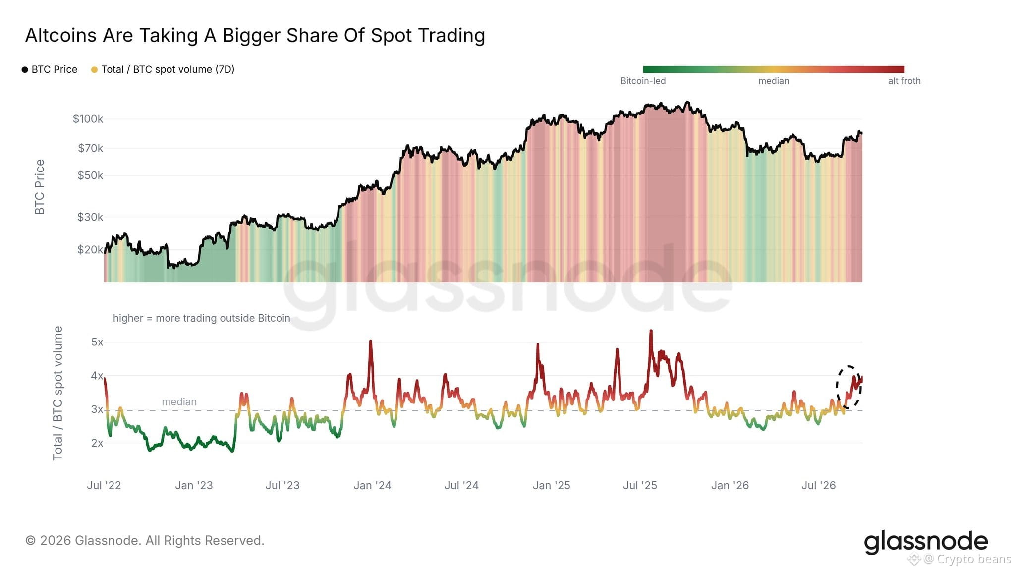
The top shows $BTC ’s price action, but the real story is happening in the bottom chart—the Total / BTC Spot Volume ratio.
For the past few months, we’ve been hovering around the median (3x), but look at that dashed circle on the far right. We’re starting to spike back towards 4x.
Historically, when this ratio breaks above the median and starts pushing toward 5x, it means one thing: liquidity is rotating from Bitcoin into altcoins.
You can see it in the background shading of the top chart too. The green (Bitcoin-led) phase is fading, and the red (alt froth) is creeping back in.
$VET $PENGU
Take a look at this chart from Glassnode.
The top shows $BTC ’s price action, but the real story is happening in the bottom chart—the Total / BTC Spot Volume ratio.
For the past few months, we’ve been hovering around the median (3x), but look at that dashed circle on the far right. We’re starting to spike back towards 4x.
Historically, when this ratio breaks above the median and starts pushing toward 5x, it means one thing: liquidity is rotating from Bitcoin into altcoins.
You can see it in the background shading of the top chart too. The green (Bitcoin-led) phase is fading, and the red (alt froth) is creeping back in.
$VET $PENGU