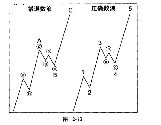
What constitutes the correct appearance simply refers to how to properly label the waves. I personally believe this section is very important. Why do different people label the same shape in different ways, even leading to the saying that 'a thousand people have a thousand waves'? Previously, I also held this bias and never delved deeply into understanding wave theory. Now, through in-depth understanding, I find that wave theory is indeed very great.
The overall shape of a wave must be consistent with the appropriate diagram. Although we can label the initial three subdivisions as a single wave A, thereby representing any five-wave sequence as three waves, as shown in the diagram:

But this approach is not correct. If such distortions are allowed to exist, then Elliott's theory analysis will lose its foundation. If the fourth wave ends at a position significantly higher than the top of the first wave, then this five-wave sequence must be classified as an impulse wave. In this hypothetical situation, since wave A consists of three waves, wave B may drop near the starting point of wave A, just like in a platform-shaped corrective wave, but wave B clearly did not do so. Although the number of internal waves is a guide to its classification, the correct overall shape is often a guide to its correct internal wave count.
In practice, we find that simply because various patterns in wave theory are quite flexible, it is extremely dangerous to accept wave counts that reflect disproportionate relationships or distorted wave patterns.
Elliott warned that the 'correct appearance' does not necessarily manifest simultaneously in the trends of all wave degrees. The solution is to focus on the clearest wave degree. If the hourly chart is ambiguous, then look back at the daily and weekly charts. Conversely, if the weekly chart provides too many possibilities, pay attention to short-term market movements until the larger picture becomes clear. In general, you need short-term charts to analyze subdivisions in fast-moving markets and long-term charts to analyze movements in slower markets.
For example, the recent BTC daily chart has been very tangled. Just when it seems ready to break out and rise, it falls again. By analyzing the weekly chart, it becomes much clearer.
