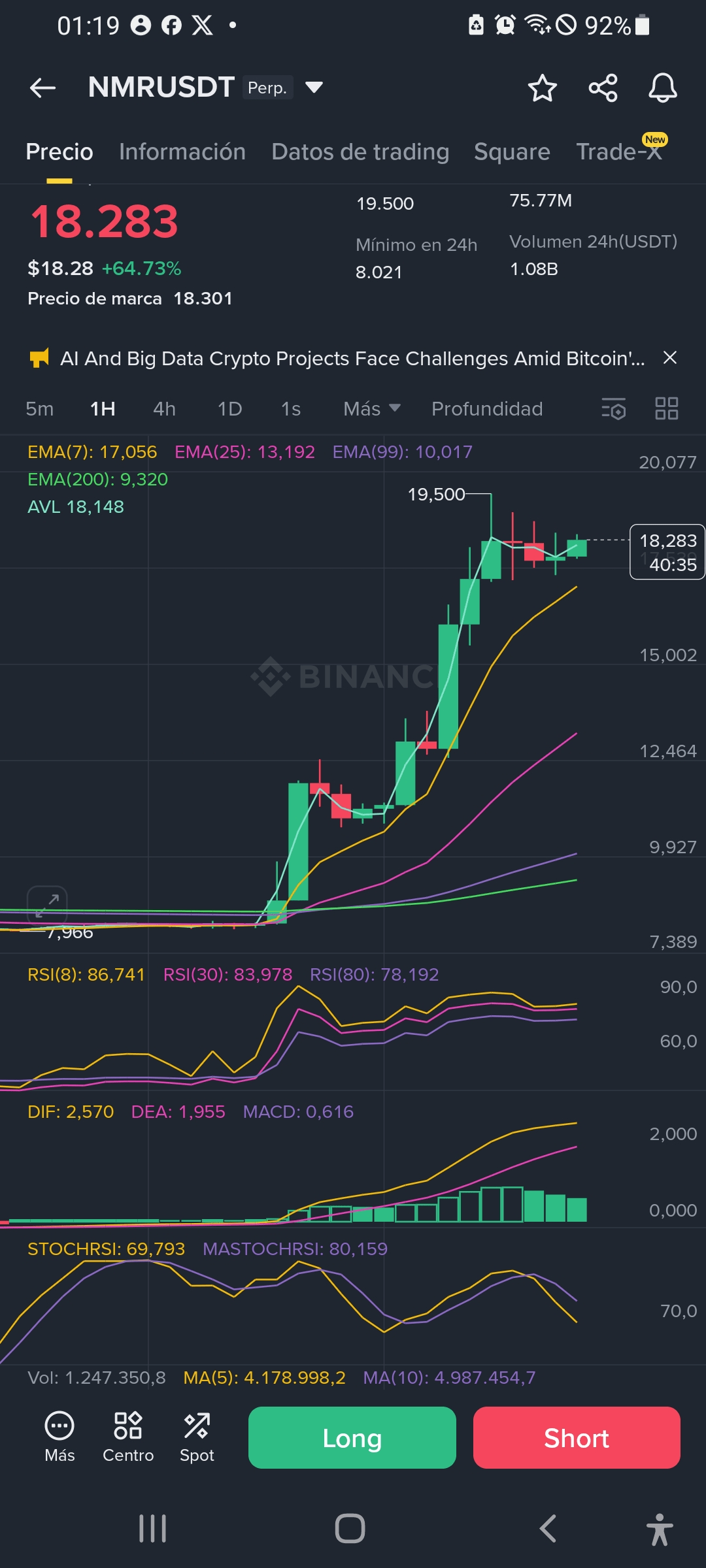
$NMR I asked the AI.

Based on the image, the pattern that can be clearly identified is that of a Golden Cross.
This is a bullish trading pattern and is the opposite of the Death Cross, which is a bearish signal. The Golden Cross is one of the most followed technical signals by traders and investors, as it can indicate the beginning of a long-term upward trend.
What is the Golden Cross?
The Golden Cross is formed when a short-term moving average crosses above a long-term moving average. In the provided chart, it can be seen that the shorter exponential moving average (EMA(7), the yellow line) has crossed above the long-term moving averages (EMA(25) and EMA(99)).
* Short-term moving average: The yellow line (EMA(7)) represents the average price of the last 7 periods.
* Long-term moving averages: The blue line (EMA(25)) and the purple line (EMA(99)) represent the average price of the last 25 and 99 periods, respectively.
The upward crossing of the yellow line over the other two defines the Golden Cross pattern. This movement indicates that the recent average price of the asset is increasing at a faster rate than its long-term average price, which is a strong signal that market momentum has shifted from bearish to bullish.
Pattern Confirmation
In addition to the crossing of the EMAs, the image shows other indicators that confirm the bullish pattern:
* RSI (Relative Strength Index): All RSI values are above 70, indicating that the asset is in an overbought zone. While this may suggest a possible correction or consolidation, in the context of strong momentum, it often indicates the strength of the upward trend.
* MACD (Moving Average Convergence/Divergence): The DIF line is above the DEA line, and the histogram is positive and increasing. This confirms the strong upward momentum in the market.
In summary, the most evident trading pattern in the chart is a Golden Cross, supported by other technical indicators suggesting a strong and continuous upward trend.
