The Mirror of Illusion in Crypto
When Lewis Carroll wrote Through the Looking-Glass, he described a world where everything looked familiar, yet the truth was inverted. In crypto, the same paradox plays out every day. A token may boast thousands of holders, a trending price chart, and millions in liquidity, but beneath the surface lies a fragile ecosystem dominated by a handful of wallets.

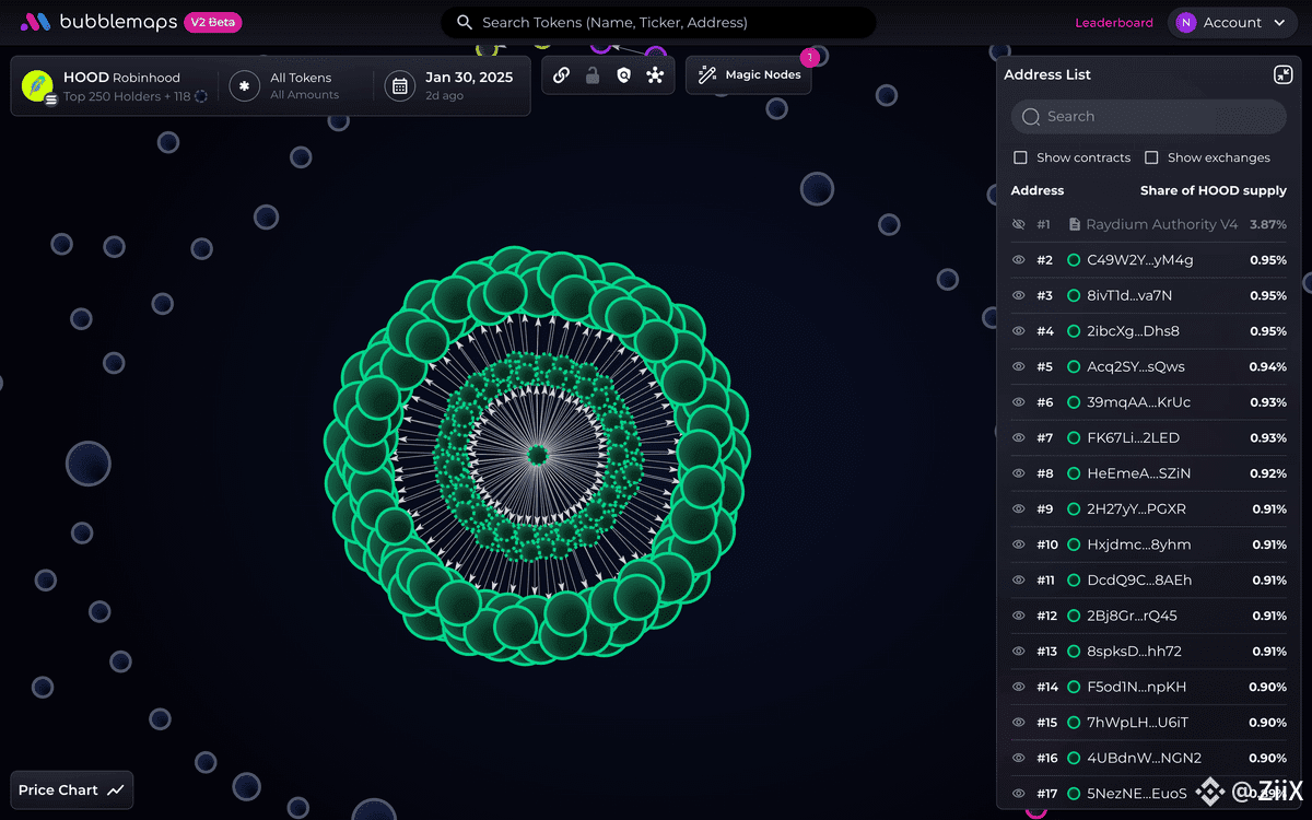
Bubblemaps acts as that looking glass—turning raw blockchain data into a mirror that reveals the distortions hidden from plain sight.
Surface Numbers vs. Hidden Reality
On paper, token distribution often appears decentralized. A project might claim 50,000 unique holders and $25 million in trading volume. But when Bubblemaps reveals that the top 10 wallets control over 72% of the supply, the story changes dramatically.
In one case study from early 2025, a meme token trending on DEXTools showed a 30-day growth of 280%. Traders rushed in, believing the community drive was fueling the rally. Bubblemaps uncovered a different reality: three wallets, all linked through transfers, collectively held $14 million worth of the token, while the other 49,997 wallets split just $5 million.
That’s not decentralization—that’s a performance.
Wallet Clusters and Whale Shadows
The most dangerous concentration isn’t always in holder counts—it’s in liquidity. For instance:
A project launched with a $12 million liquidity pool.
Bubblemaps showed one wallet controlling $8.4 million (70%) of that pool.
Within three weeks, the wallet withdrew its share, causing the price to collapse 93% overnight.
For traders looking at CoinGecko charts, the project looked alive until the very end. Through Bubblemaps, the imbalance was visible weeks before the rug pull.
This kind of insight transforms raw numbers into warnings you can act on.
The Tale of Two Tokens
Let’s compare two fictional, but realistic, examples that Bubblemaps could expose:
Token A: 40,000 holders, market cap of $180M, but the top 5 wallets hold 65% of supply. Liquidity pool has just $3M locked, mostly in two wallets. Risk: if either whale exits, the token spirals.
Token B: 22,000 holders, market cap of $90M, with the top 50 wallets collectively holding 40%. Liquidity pool is $7M, spread across hundreds of addresses. Risk: far lower, as no single wallet can destabilize the system.
Both look successful from the outside, but Bubblemaps reveals which one is more sustainable.
Wash Trading and Fake Volumes
Another illusion that Bubblemaps pierces is inflated volume. In 2024, an NFT collection boasted $60M in trading volume in one month. But mapping the wallets showed the same cluster of addresses passing assets back and forth.
The real organic trade volume? Barely $6M. That’s a 10x exaggeration, designed to lure retail buyers.

By visualizing suspicious wallet-to-wallet trades, Bubblemaps uncovers this sort of market choreography that would otherwise look like genuine demand.
Why Traders Need the Looking Glass
In traditional finance, ownership concentration above 40% in a public company would trigger regulatory scrutiny. In crypto, it happens daily without warning labels. Bubblemaps gives traders the power regulators don’t—immediate visibility into who really owns the market.
A project with 20,000 holders but 80% controlled by insiders is not a community token.
A liquidity pool with 95% tied to one wallet is not stable liquidity
A collection with millions in fake wash-traded volume is not a thriving market.
These are not rare edge cases—they are weekly realities.
Conclusion: Seeing What Others Miss
Stepping “through the looking glass” with @Bubblemaps.io means seeing beyond the glossy marketing and polished community numbers. It means distinguishing between organic growth and artificial inflation.
In a landscape where illusions can drain portfolios overnight, #Bubblemaps offers clarity: the ability to see wallets as clusters, whales as shadows, and fake volume as empty theater.
For traders, that vision isn’t just data—it’s survival. $BMT