What's the most exciting part of 'mining gold' in the Web3 world? Is it the ecstasy of discovering a hundredfold coin? Or the thrill of participating in a new project from zero to one? I think both are true. But what is the most headache-inducing and the least reassuring?
For me, it's that kind of **'blind men touching an elephant'** feeling.
For a project, the white paper may be beautifully written, and the community may be shouting loudly, but what is the real situation of the token? How much inventory do the big holders have? Is the project team just transferring back and forth? This core information is like being hidden in a black box, making it hard for us ordinary users to see clearly. To be honest, I have also fallen into traps more than once.
About half a year ago, I stumbled upon a tool called Bubblemaps, and it is not an exaggeration to say that it completely changed the way I research projects. Today's article is not a promotion for a 'wealth code', but more like a reflection I want to share with friends on a podcast—an exhilarating feeling of cutting through the fog and seeing the truth.
From 'guessing' to 'seeing': Bubblemaps gave me my 'aha' moment.
The first time I got 'hooked' on Bubblemaps was while researching a popular Meme project at the time.
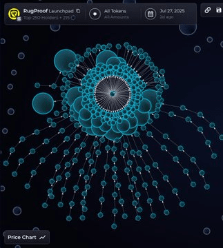
At that time, the community was heavily influenced by Fomo, but I always felt something was off. So, I entered its contract address into Bubblemaps. Seconds later, a chart made up of colorful bubbles appeared before me.
At that moment, I was stunned.
(Note: This is a schematic diagram)
On the chart, each 'bubble' represents a wallet address; the larger the bubble, the more holdings it has. And most importantly, there are connections between the bubbles. These connections represent the transfer records between wallets.
What did I see?
I saw a dozen large wallets that seemed unrelated (large landowner bubbles), yet they were tightly connected like a bunch of grapes through a series of small, discreet transfers. Within minutes after the token launched, they obtained a large amount of chips from the same source wallet.
This discovery sent chills down my spine. The so-called 'decentralized community' turned out to be just a carefully arranged setup by a few people in the face of data visualization. Sure enough, a few days later, this project staged a 'high dive', and that string of 'grape' wallets had already quietly exited at a high position.
Without Bubblemaps, I might still be in the community listening to various 'diamond hands' legends, and I could even become one of the harvested. But with it, I saw risks for the first time so intuitively. This feeling isn't from reading financial reports or analyzing K-lines; it's a shock that brings you closer to the truth on-chain.
Not just a 'mirror for revealing the truth', but also a 'navigator'
The most powerful aspect of Bubblemaps is that it transforms complex, cold on-chain data into a 'relationship graph' that ordinary people can understand.
Creativity: It doesn't just give you a bunch of tables, but uses the highly visual 'bubbles' format, allowing you to immediately identify the 'power centers'. This unconventional presentation style turns tedious data analysis into a detective game.
Professionalism: It not only displays holdings. You can use its 'Time Travel' feature to trace back to the chip distribution when the token was just released and see how early whales built their positions. You can also click on any bubble to jump directly to the on-chain browser for deeper analysis. This density of information and logical structure is the foundation of professional investment research.
Relevance: In the market of 2025, what narratives are the hottest? Meme, AI, DePIN... But regardless of how narratives change, the foundation of a project—the health of its token economy—remains core. Bubblemaps is precisely the best tool to test all of this. If a Meme coin claims to be community-driven, then use the chart to see if the chips are truly distributed; if a DePIN project claims to disrupt the industry, then use the chart to check for any abnormal insider trading among node wallets.
Some time ago, Bubblemaps officially used its tool to expose insider trading of the NEIRO token. They found that up to 78% of the supply was 'sniped' by 80 associated wallets at launch, with these insiders ultimately profiting over 4.5 million dollars. Such deep on-chain tracing would be nearly impossible for ordinary people without the assistance of visualization tools.