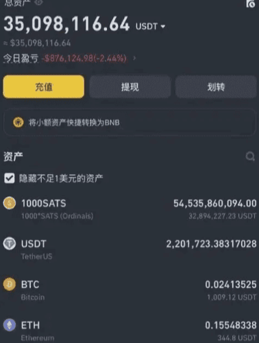
Today I speak from the heart; every word is true! I have been trading cryptocurrencies for 10 years. In the first three years, I continuously lost money, leaving me with only 30,000 from an initial capital of 300,000! It was truly painful! My wife and family did not support or understand me! Later, I quit my job and devoted all my thoughts to it! Every day I was busy exploring and summarizing! Now I can finally stabilize the compound interest, earning back over 40 million in my account!
In addition to solid techniques, I would like to share nine super iron rules of trading cryptocurrencies with you, hoping to provide some inspiration for newcomers in the crypto space and help them avoid detours! Grow by standing on the shoulders of giants! If you learn this, you can achieve doubling!
1. Avoid revenge trading
When a trade closes, whether it is profitable or at a loss, it is essential to resolutely adhere to the rules. After executing a stop-loss, try not to look at it again within 24 hours. This can effectively avoid revenge trading; entering trades out of revenge can likely exacerbate losses. Some believe that one should get back up from where they fell, but it is more important to remain calm and observe until new entry conditions are triggered. Since traders typically look at charts for several hours daily, it is difficult to resist the temptation to open a new trade after a stop-loss. When using leverage for swing trades, it is particularly necessary to avoid a revenge mentality.
2. Avoid trading during weekends as much as possible
Every weekend, the volatility of cryptocurrency prices increases, and the trading volume is very low. This makes it difficult to predict short-term price movements. The reason is simple; weekend buy and sell orders are generally small, market liquidity is low, and whales can more easily manipulate short-term prices, making the disadvantages of retail traders more pronounced. Additionally, since the cryptocurrency market operates 24/7 without pause, the trading intensity is much higher than that of the stock market, and weekends are a great time to decompress and rest; after all, life is greater than trading.
3. Maintain trading during specific times
As previously mentioned, the cryptocurrency market operates 24/7 without stopping; even full-time traders cannot monitor the market continuously. To maintain a clear mind, you can set fixed trading hours for yourself. After opening a position during trading hours, set stop-loss and take-profit orders, and then you can do other things. This eliminates the impulse to constantly check your phone or analyze candlesticks, allowing you to trade without affecting your normal life.
4. Do not develop feelings for a particular asset
If you fall in love with the asset you are trading, it is easy to lead to misguided decisions. Excellent traders make money through efficiency and rules, giving them an advantage, as most people's trading behaviors in the market are driven by emotions. "Be an emotionless trading machine" can ensure decisiveness and principled trading. Many traders suffer heavy losses primarily because they easily become emotionally attached to certain altcoins, teams, or projects. This may be acceptable for medium to long-term investors but is a potential disaster for short-term traders.
5. Maintain simple trading rules
Traders usually combine various indicators, news, and candlestick patterns in an attempt to find convergence points suitable for trading. There is nothing wrong with that, but be careful to avoid overanalyzing, which complicates matters. In fact, when a candlestick pattern that fits one’s own system appears on the chart, trading can be initiated. At the same time, it is important to set stop-loss and position control; this is particularly crucial.
6. Only trade with the correct mindset
When you feel angry, tired, or stressed about something, do not trade, as your mindset can affect your judgment. The key to maintaining a good mindset is to have other daily activities outside of trading. For example, fitness, reading, and spending time with family and friends all help cultivate the right trading philosophy.
7. Keep a trading diary
Reviewing trading diaries can be tedious, but it is actually very meaningful because it helps you avoid making the same mistakes. There are specific reasons behind both profitable and losing trades; recording trading details is a way to learn and can help you grow quickly.
8. Do not attempt to catch falling knives barehanded
"Catching falling knives barehanded" refers to traders attempting to bottom out assets in a sharp decline. The motivation to bottom out is usually to lower the cost price to make up for losses caused by a significant drop. Attempting to accurately bottom out during a sharp decline is unwise. Waiting for stabilization and a rebound, with resistance turning into support before entering is a more prudent approach.
9. Do not ignore extreme market conditions
While referencing technical analysis indicators, one cannot ignore black swan events or other extreme market conditions. Ultimately, the market is driven by supply and demand relationships, and at times, the market can be extremely imbalanced.
Trading is a long-term practice; if you want to make a living from trading, you must follow the rules and build your own trading system!
So how to excel in trading cryptocurrencies? Once a person enters the financial market, it is difficult to turn back. If you are currently losing and still feel lost, but plan to make cryptocurrency trading your second career, you must understand 'the simplest MACD trading strategy.' Understanding and comprehending it can help you avoid many detours, all based on personal experiences and feelings; I suggest you save it and ponder it repeatedly!
The MACD indicator is the most classic technical indicator among all technical indicators. Correctly using this indicator by combining it with candlesticks (daily candlestick, weekly candlestick), individual stock trends, volume, market trends, and negative/positive news can generally achieve a good buying and selling effect. Below, I will share the most comprehensive uses of the MACD indicator; those who truly understand it are experts, and this is only shared once!
The general judgment criteria for the MACD indicator mainly revolve around the conditions and shapes of the fast and slow moving averages (DIF and DEA lines) and the red and green histograms (MACD bars). General analysis methods mainly include analyzing the positions of DIF and DEA, their crossing situations, the contraction of red histograms, and the shapes of the MACD chart.

I. MACD is the most commonly used indicator among experts
The MACD indicator plays a very special role in technical analysis and can be said to be an essential part of learning technical analysis. Its importance can be summarized in the following points:
The MACD indicator is the most effective technical indicator tested by historical trends and is also the most widely used indicator.
The MACD indicator evolved from the EMA moving average indicator and has a good application effect for grasping trending markets. Trend investors generally refer to this indicator in practical operations.
The top and bottom divergence of the MACD indicator is recognized as the best method for 'buying low and selling high,' and this method is an important tool for concretizing trend theory and wave theory.
Many veterans have had this experience: when they first entered the market, they started learning the MACD indicator, then slowly discarded it, and after a long time of learning and comparison, especially after real-world verification, they ultimately returned to the MACD indicator. This shows the uniqueness of this indicator.
The application of the MACD indicator in quantitative trading is also extremely widespread.
It is precisely because of these advantages that the MACD indicator has become the most commonly used technical indicator among professional traders.
II. Concept and calculation of the MACD indicator
The MACD indicator, also known as the Exponential Moving Average Convergence Divergence (MACD), was created by Gerald Appel and is a technical analysis tool used to track price trends and assess candlestick buying and selling opportunities. This indicator is commonly used in trading software and is known as the 'king of indicators.' As shown in [Figure 1].
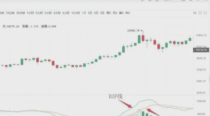
In the cryptocurrency circle, the MACD indicator consists of the DIF fast line, DEA slow line, MACD histogram, and zero axis, known as the 'three lines and one axis.' Investors analyze price through the crossing, divergence, breakthrough, support, and resistance of these 'three lines and one axis.' The MACD indicator can become...
Many trading software list it as a preferred indicator, which shows its extensive application, and this also indirectly indicates that this indicator is one of the most effective and practical indicators tested by history.
III. The golden cross and death cross of the MACD
"Golden cross" and "death cross" patterns are extremely important shapes in technical indicator analysis.
The golden cross shape, also known as the golden crossover, refers to when a relatively short-period indicator line crosses upward and surpasses a relatively longer-period indicator line (of the same type), often indicating the emergence of a short-term buying opportunity. If the golden cross pattern appears in...
①. After a short-term rapid decline during the downward trend;
②. After a wave of pullback during the rise;
③. After a consolidation trend during the rise,
That is, when the golden cross pattern appears at a stage low point, it is a more reliable buy signal.
The death cross pattern, also known as the death crossover, refers to when a relatively short-period indicator line crosses downward and surpasses a relatively longer-period indicator line (of the same type), often indicating the emergence of a short-term selling opportunity. If the death cross pattern appears in...
①. After a consolidation trend during the downward movement;
②. After a wave of upward rebound during the rise;
③. After a short-term rapid increase during the rise,
That is, when the death cross pattern appears at a stage high point, it is a more reliable sell signal.
Having understood the golden cross and death cross patterns, we can now look specifically at the golden cross and death cross patterns of the MACD indicator line, which manifest different market meanings when they appear at different positions.
Situation one: Buy point of a low-level golden cross. If the position of the DIFF line and DEA line golden cross appears below the zero axis and is far from the zero axis, this golden cross is called a low-level golden cross. Investors can view this golden cross merely as a short-term rebound in price, and whether the candlestick can form a true reversal still requires observation and confirmation with other indicators.
As shown in the figure above: On August 27, 2019, the BTC 10-minute candlestick chart showed that with the price pullback, a low-level golden cross appeared, followed by a rebound of $200. Short-term investors can seize the opportunity to enter.
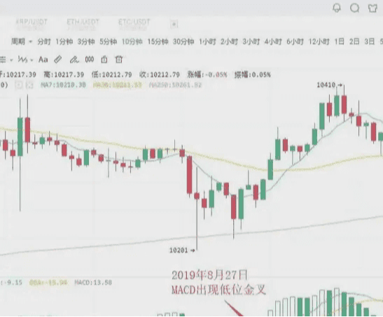
Situation two: Buy point of golden cross near the zero axis
If an upward trend has formed, a golden cross occurring near the zero axis between the DIFF line and DEA line is often an excellent buying opportunity for investors.
This is because, after an upward trend forms, the golden cross near the zero axis indicates that the adjustment has completely finished, and a new round of upward movement has started. If this is accompanied by the golden cross of the average volume line, it indicates that the price's rise is supported by trading volume, making the buying signal even more reliable. Once this buying point appears, investors should absolutely not miss it, or they will miss a significant upward movement.
As shown in the figure above: On August 19, 2019, at 09:30, the BTC 5-minute candlestick chart showed that Bitcoin broke above the 30-day moving average, indicating that an upward trend had begun to take shape. For a while after that, the price remained almost entirely above the 30-day moving average. At 14:00 on August 19, 2019, the MACD indicator formed a golden cross near the zero axis, indicating that the market was about to experience a significant upward trend. Investors can decisively buy.
Situation three: Buy point of a high-level golden cross
If the golden cross of the DIFF line and DEA line occurs above the zero axis, and is at a distance from the zero axis, then this golden cross is called a high-level golden cross. High-level golden crosses generally appear when...
In the process of upward movement in the candlestick, a consolidation trend indicates that the consolidation has ended, and the candlestick is about to continue the previous upward trend. Therefore, once a high-level golden cross appears, it is a good signal to add positions. In practical operations, when an upward trend is formed, and the candlestick rises slowly and lasts for a long time, once the MACD indicator forms a high-level golden cross, it often indicates that the candlestick is about to accelerate upward. For this reason, high-level golden crosses can also be used for swing trading. Investors can use the MACD indicator to continuously target upward swings during an upward trend.
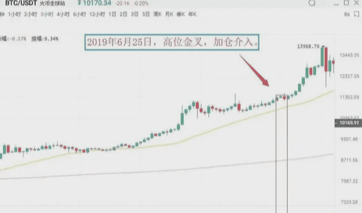
As shown in the figure above: On June 25, 2019, the BTC 3-hour candlestick chart showed that Bitcoin's price was in an upward trend, and after consolidation, it rose again, while the MACD indicator showed a high-level golden cross. This indicates that the pullback has ended, and the price will continue the previous upward trend. Investors should pay attention to seize this opportunity to add positions.
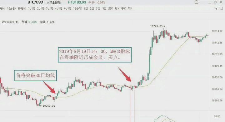
Situation four: Sell point of a low-level dead cross
A low-level dead cross refers to a dead cross that occurs far below the zero axis. This type of low-level dead cross often appears at the end of a rebound during a downward trend, so the low-level dead cross is a sell signal indicating the end of the rebound. At this time, investors without positions should remain cautious, while those deeply trapped can sell first and buy back after the price declines to lower costs.
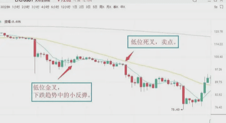
As shown in the figure above: On July 14, 2019, the LTC 3-hour candlestick chart showed that Litecoin's MACD indicator had a low-level golden cross, with the price experiencing a slight rebound, followed quickly by a downward movement. Subsequently, the MACD indicator formed a death cross below the zero axis, initiating a new round of downward movement for the candlestick. Spot investors can sell positions at the death cross and then buy back to lower their holding costs.
Situation five: Sell point of a death cross near the zero axis. If the previous market direction has consistently been a downward trend, when the DIFF line crosses below the DEA line near the zero axis, it is called a death cross near the zero axis, indicating that the market has accumulated considerable downward momentum near the zero axis. The appearance of the death cross signifies that downward momentum in the market is beginning to release, and the candlestick will continue the original downward trend, serving as a sell signal.
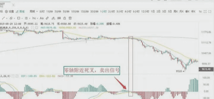
As shown in the figure above: On August 12, 2019, the BTC 1-hour candlestick chart showed that Bitcoin's DIFF line broke below the DEA line near the zero axis, indicating that the market's downward momentum was beginning to release, serving as a sell signal. Investors should decisively sell their positions; otherwise, they may become deeply trapped.
Situation six: Sell point of a high-level dead cross
The DIFF line breaks below the DEA line at a distance above the zero axis to form a crossover, which is called a high-level dead cross. This type of death cross pattern is sometimes accompanied by the MACD's top divergence. The manifestation is as follows: during a continuous upward trend, the price keeps hitting new highs, but the MACD indicator's DIF line and DEA line no longer keep rising or continue to go up, but instead diverge from the price's trend, gradually moving down.
Above the zero axis, when the DIF line crosses downwards through the DEA line, forming a downward crossover, it is considered a death cross and serves as a relatively reliable sell signal.
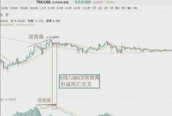
As shown in the figure above: On August 23, 2019, the TRX 1-hour candlestick chart showed that after a previous upward wave, the price continued to hit new highs, but the DIF line and DEA line no longer continued to rise, subsequently forming a death cross, signaling a sell.
Four, MACD and candlestick divergence
Divergence is a term describing momentum in physics, and in technical analysis, it is a widely applied method with a high success rate. During a downward trend, when the price hits a new low and the indicator line does not create a new low, it is called bottom divergence, indicating that upward momentum is accumulating.
It is a buy signal. In an upward trend, the price hits a new high while the indicator line does not create a new high, which is called top divergence, indicating that downward momentum is accumulating, which is a sell signal.
Ⅰ. Bottom divergence
Bottom divergence of the MACD histogram and DIFF line
The bottom divergence of the DIFF line and price indicates that during a downward trend, when the price hits a new low, the DIFF line does not create a new low. It indicates that during the price decline, the DIFF line's downward extent is less than that of the price, and upward momentum in the market is continuously accumulating, indicating that the price is about to stop declining, and there is a higher probability of an upward movement in the next period.
The MACD histogram is the MACD bar hidden behind the DIFF line, divided into red and green. Its divergence with the price is an important use of the MACD indicator, widely applied in practice. The bottom divergence between the MACD histogram and the price indicates that when the price continuously hits new lows, the MACD histogram does not create new lows. The upward momentum in the market is accumulating, and the price is about to stop declining, indicating a higher probability of an upward movement in the next period.
When bottom divergence occurs, investors can grasp specific buy points in two ways.
Specific buying opportunity
The bottom divergence of the DIFF line, MACD histogram, and price is not a specific time point, but a pattern that occurs over a period of time. However, the specific buying opportunity for investors is a specific point in time, indicating that the price is about to stop declining. Therefore, to seize the specific buying opportunity, when the DIFF line, MACD histogram, and candlestick show bottom divergence, investors must combine the bottom divergence with other technical analysis tools to specify the buying point.
First: Histogram color change or MACD golden cross
The histogram color change indicates that upward momentum in the market has begun to dominate. It usually appears after 'histogram shortening,' and although it may be delayed for a while, it is more reliable. When the bottom divergence occurs, if the histogram smoothly changes color or forms a golden cross, investors can buy.
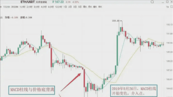
As shown in the figure above: On August 26, 2019, the Ethereum (ETH) 15-minute candlestick chart showed that Ethereum's price hit a new low during a decline, but the MACD histogram did not create a new low, forming a bottom divergence pattern between the histogram and the price. This indicates that market upward momentum is starting to accumulate, and there is a high probability that the price will experience an upward trend afterward. Immediately afterward, the histogram changed color, and these two sequential buy signals reinforced the reliability of the upward significance, allowing investors to enter when the histogram changes color.
Second: Combine bottom divergence with other technical analysis tools and candlestick reversal patterns, such as 'single needle probing bottom' and 'three soldiers at the bottom,' which is a concrete application of the 'multi-indicator combination' principle.
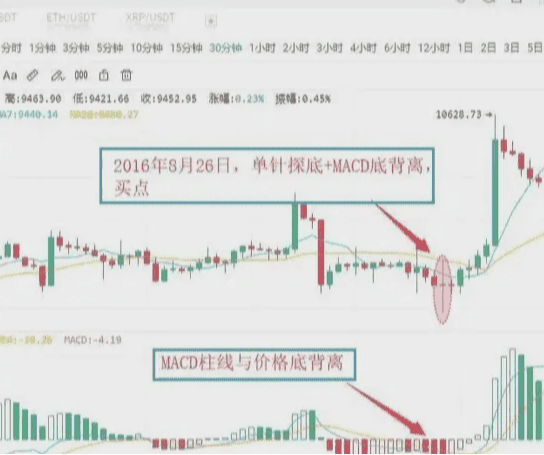
As shown in the figure above: On August 26, 2016, the BTC 30-minute candlestick chart showed that the price of Bitcoin hit a new low, but the MACD histogram did not create a new low, forming a bottom divergence pattern between the histogram and the price, signaling a continuous strengthening of market upward momentum. With the price's downward exploration stopping, it formed a buy signal of 'MACD histogram and price bottom divergence + candlestick single needle probing bottom'. Subsequently, the price experienced an upward trend.
Ⅱ. Top divergence
MACD histogram and DIFF line top divergence
The top divergence between the MACD histogram and the candlestick indicates that in an upward trend, when the price hits a new high, the MACD histogram does not create a new high. It signifies that downward momentum in the market is accumulating, and the price could decline at any moment.
The top divergence between the DIFF line and candlestick indicates that during an upward trend, when the price hits a new high, the DIFF line does not create a new high. It signifies that downward momentum in the market is continuously accumulating, and the price is likely to experience a downward trend next. The specific sell timing is similar to bottom divergence; in practice, based on the principle of multi-indicator combination, investors can apply several methods to make the sell signal more specific.
First: Histogram color change or MACD death cross
After the top divergence between the MACD histogram and the candlestick forms, if the histogram suddenly shortens significantly, it indicates that the market's downward momentum is beginning to release. Investors should pay attention to sell in a timely manner. The change in color of the MACD histogram indicates that downward momentum in the market has already taken over, usually appearing after the histogram continues to shorten. If the histogram and the candlestick show top divergence, and the histogram changes color or the MACD shows a death cross, investors should pay attention to exit in a timely manner.
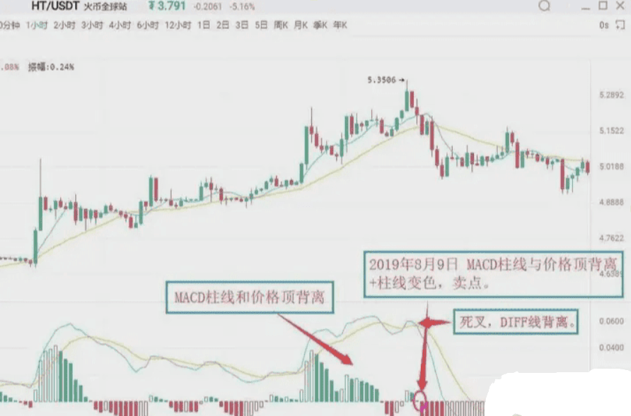
As shown in the figure above: On August 9, 2019, the HT 1-hour candlestick chart showed that Huobi's price hit a new high, but the MACD histogram did not create a new high, forming a top divergence pattern between the histogram and the price. This indicates that downward momentum in the market is starting to accumulate, and the price could experience a downward trend at any moment. Subsequently, the MACD histogram changed from red to green, issuing a sell signal of 'histogram and price top divergence + histogram color change'. Investors should pay attention to exit in a timely manner.
Second: When combined with other technical analysis tools and candlestick reversal patterns, after the MACD histogram and price top divergence occurs, if other technical analysis tools also simultaneously issue sell signals, the reliability of the market's selling significance will greatly increase. At this time, investors should be aware and exit decisively. Common sell signals of this type include 'histogram and price top divergence + candlestick reversal patterns', etc.
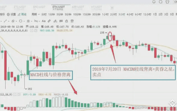
As shown in the figure above: On July 20, 2019, the ETH 3-hour candlestick chart showed that Ethereum's price hit a new high, but the MACD histogram did not create a new high, forming a top divergence pattern between the histogram and the price. This indicates that market downward momentum is continuously strengthening, and the price could experience a downward trend. Subsequently, the MACD histogram gradually shortened, while the candlestick formed a evening star bearish pattern. Investors should pay attention to exit in a timely manner; afterward, the candlestick experienced a significant downward trend.
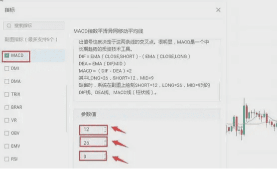
Five, modifications to the MACD parameters
The lagging response to price changes sometimes results in less than ideal buy and sell prices, which is a flaw of the MACD indicator. One way to change this situation is to adjust the indicator parameters, making the MACD indicator more responsive to price movements, thereby allowing for more ideal buy and sell price levels. In commonly used trading software, the default parameters for the MACD indicator are 12/26/9. Under this parameter setting, the MACD indicator often shows a noticeable lag in response to price changes. The lagging nature of the MACD indicator can be addressed through parameter adjustments. Common parameter combinations include 5/34/5, 5/10/30, etc. Investors can also try and explore extensively in practice.
Evening Star: In the process of a rising candlestick, a long bullish candlestick appears first, followed by a second candlestick with a shorter body (either bullish or bearish), likened to a star, which is the main part of the candlestick combination. The third candlestick is a long bearish candlestick that has deeply penetrated the body of the first candlestick. The evening star signals that the price has peaked and is about to retreat, with some predicting an accuracy rate of over 80%.
Finally, those who have been through the rain always want to hold an umbrella for others. Having experienced days of isolation and helplessness, they can empathize with others' losses. They want to lend a helping hand, hoping to make up for the regret of wanting to be pulled up during those times, as if crossing time and space to hold an umbrella for their past selves who were caught in the rain.
Mu Qing only does real trading, and the team still has positions to enter quickly.

