Want to learn how to read the Bitcoin candlestick chart?
The candlestick chart is a visual price trend chart widely used in financial markets such as stocks, gold, crude oil, and cryptocurrency.
Understanding candlesticks is one of the essential foundational skills in technical analysis. Compared to simple price trend lines, candlesticks provide more information. This introductory article on candlesticks will explain what a candlestick chart is, the principles of candlesticks, how to interpret them, and how to choose the right time frame candlestick based on trading style.
What is a candlestick chart?
A candlestick chart is a visual chart used to present changes in asset prices. Each candlestick can simultaneously show the opening price, closing price, highest price, and lowest price, making it one of the most common basic tools in technical analysis, widely used in stock, foreign exchange, crude oil, and cryptocurrency markets. Each candlestick looks like a red or green stick, and it is also referred to as a 'candlestick.'
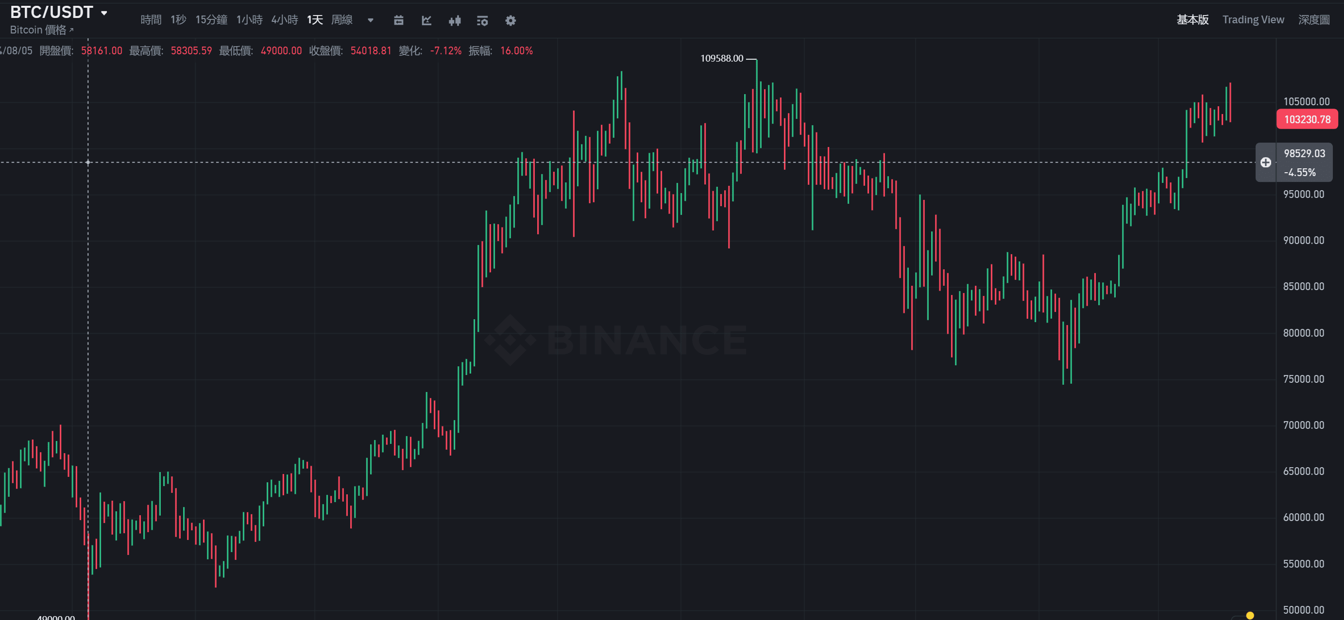
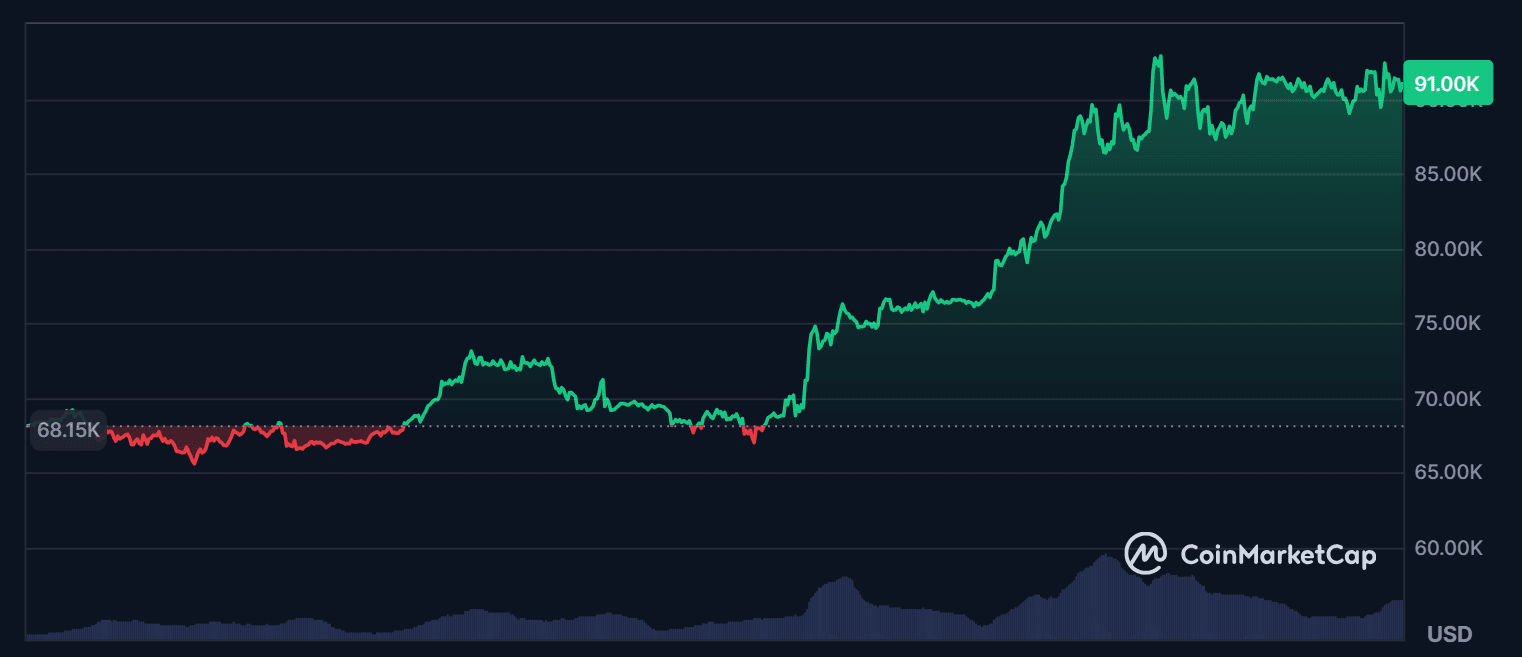
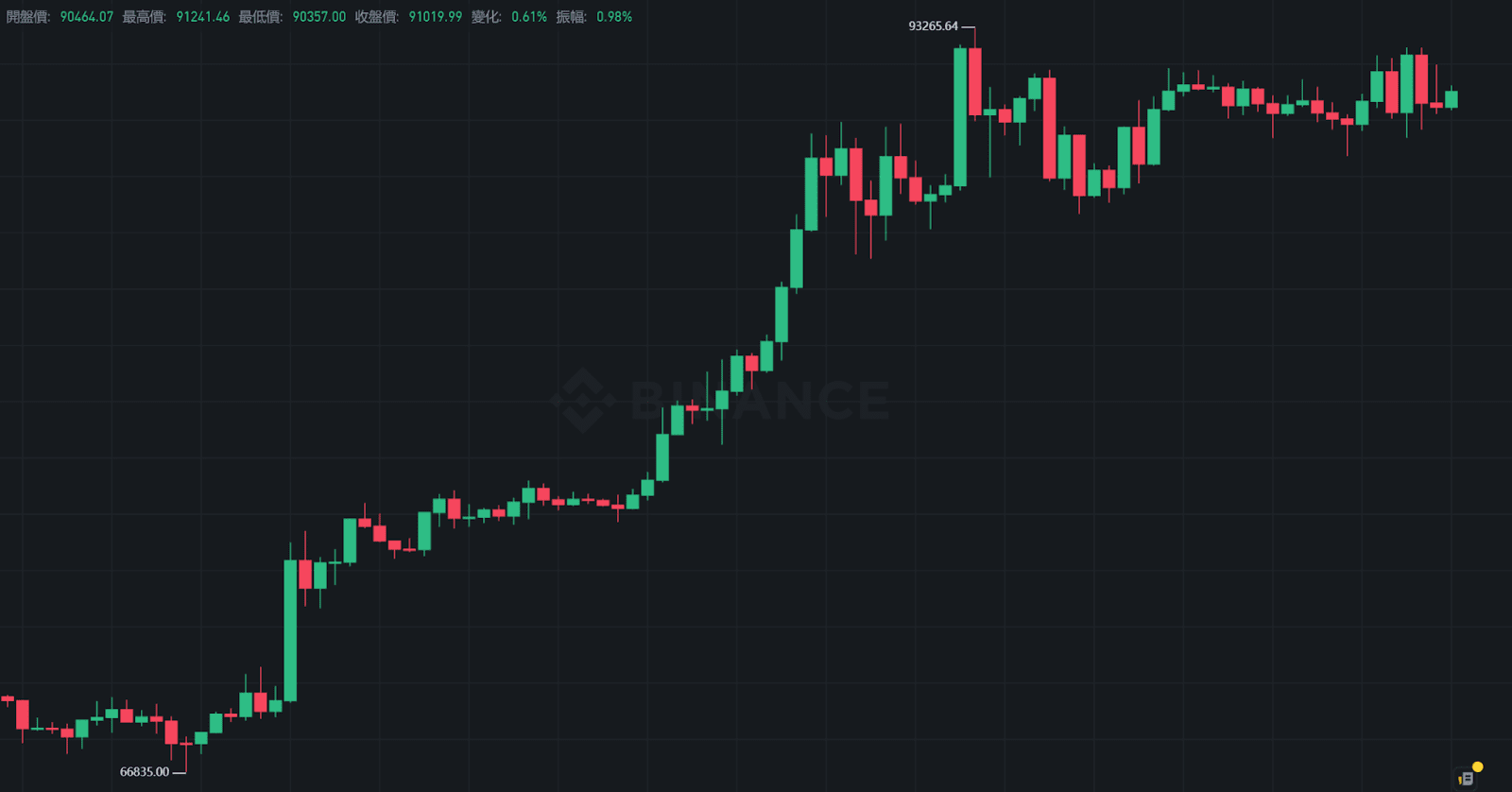
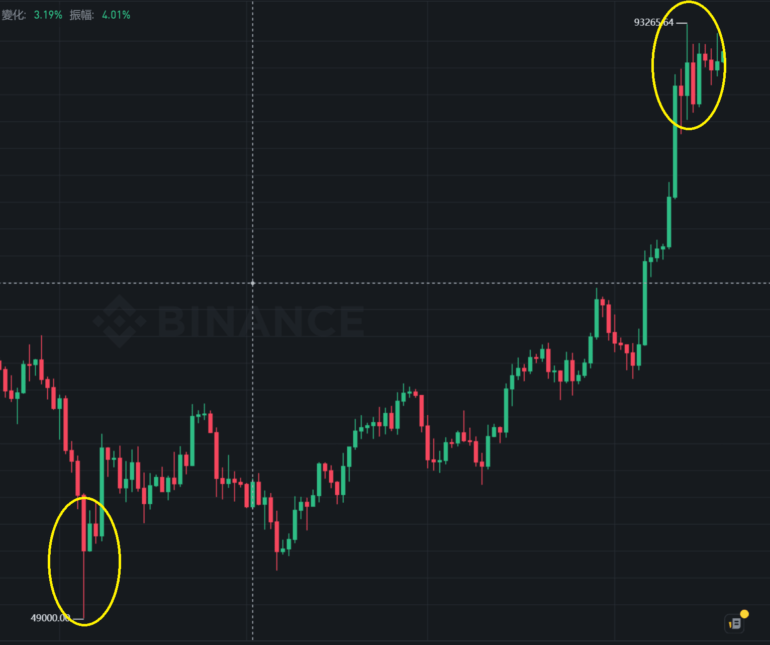
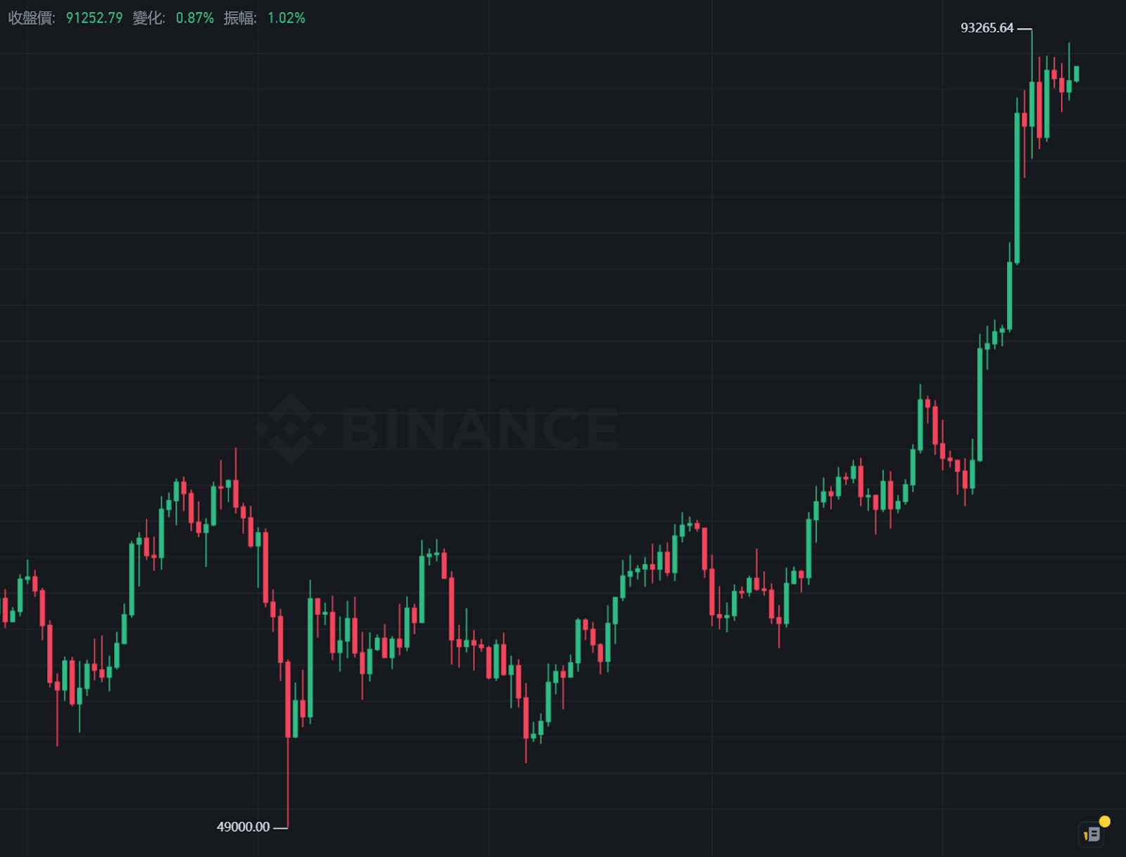
The following is a candlestick chart of Bitcoin on the Binance exchange, where the red and green are all candlesticks, each representing price changes within the corresponding time (in this chart, it's four hours). By observing the arrangement and changes of the candlesticks, one can determine the current market trend: whether it is rising, falling, or consolidating.
Basic composition of a candlestick
Five basic elements of candlesticks:
Opening price
Closing price
Highest price during the period
Lowest price during the period
Rise or fall (Opening price > Closing price = Rise, Opening price < Closing price = Fall)
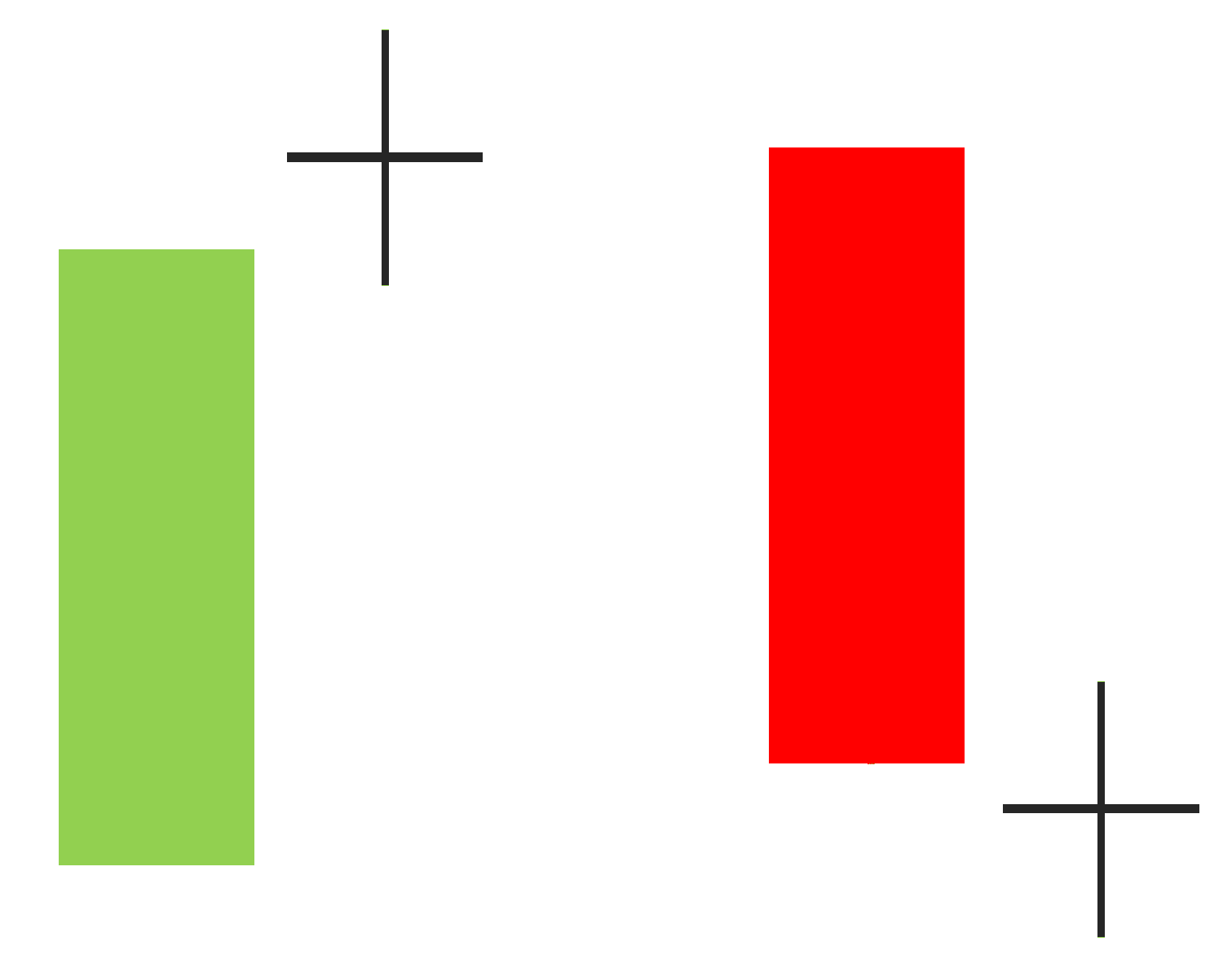
It looks like this when actually drawn:
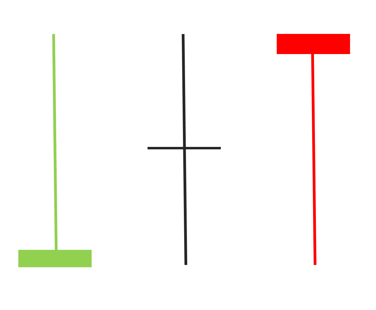
The area between the opening and closing prices is the candlestick's body
The highest and lowest prices are the lines above and below the body, known as upper shadow / lower shadow
Default colors: Green for rising, red for falling (colors can be adjusted)
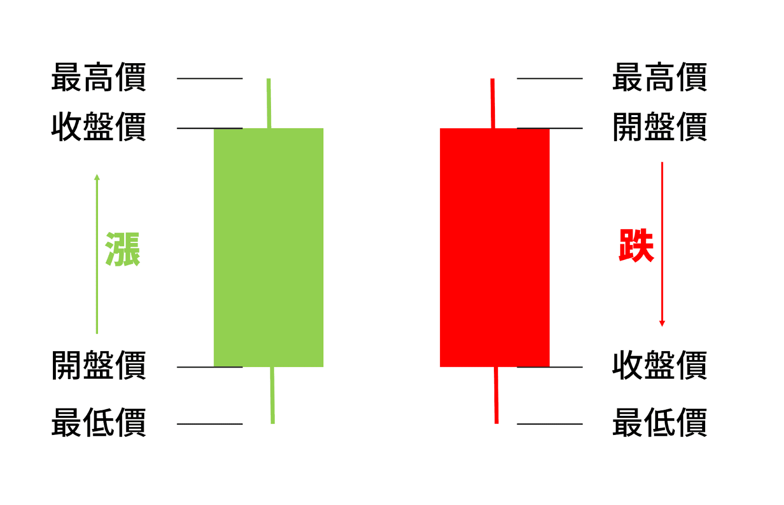
Candlesticks look somewhat like candles; some people also call them candle charts. The body part is the candle body, and the shadow part is the candle wick.
Candle body (body): Represents the range between the opening and closing prices
Candle wick (shadow): Divided into upper and lower shadows, respectively showing the highest and lowest prices during that time
Color distinction: Green indicates the closing price is higher than the opening price (rise), red indicates the closing price is lower than the opening price (fall), colors can be adjusted
For example:
Green body with no shadows, indicating a strong bull market during that time
Red solid body with upper and lower shadows, indicating significant price volatility, closing at a low point
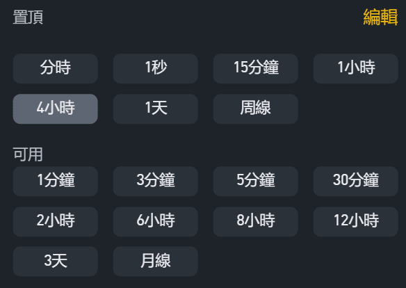
Time frame and characteristics of the Bitcoin market:
Different time frames create different candlestick charts, for example:
One '1-hour candlestick' records the price changes within an hour
One 'daily candlestick' records the price changes from 00:00 to 23:59 each day
Unlike traditional stock markets, the cryptocurrency market operates 24/7 without opening and closing hours. The starting price for that period is used as the opening price, and the final price for that period is used as the closing price. The candlestick time is based on UTC or the exchange's settings.
For example, taking the 1-day candlestick as an example, the system automatically takes the daily opening price, closing price, highest price, and lowest price to form a candlestick. If looking at the 4-hour candlestick, there will be 6 candlesticks in one day; if looking at the 15-minute candlestick, there will be 96 candlesticks in one day.
Longer ones can be measured in days, weeks, or months. Generally, medium to long-term traders focus on 4-hour, daily, or weekly time frames.
Difference between candlestick charts and general price line charts
General price trend chart:
Candlestick trend chart:
General price trend charts only show lines connecting closing prices, without revealing the fluctuations and trading strength within.
The information provided by the candlestick chart is more diverse: it can not only show price direction but also infer the tug-of-war state between bulls and bears, as well as the strength of buying and selling forces, which is crucial for judging market trends.
You can know the rise and fall during that time just by looking at the color
By looking at the body and shadow lengths, one can estimate the amplitude of fluctuations and turning signals
How to read a single candlestick? Common shapes and practical signal interpretations
Beginners do not need to try to interpret every single candlestick from the start. Begin with a few 'special shapes' to learn to capture signals that may indicate market turning points.
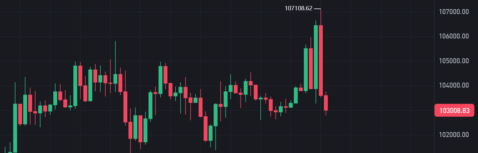
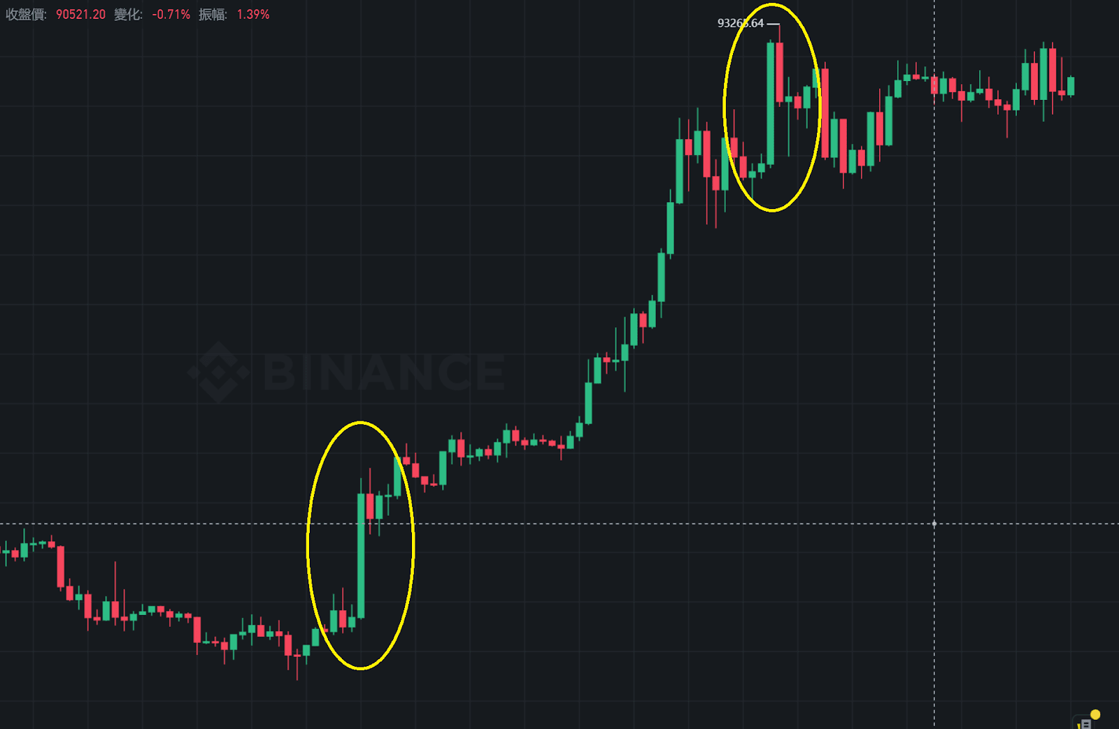
Interpretation of long bodies and short shadows (strong trend or exhaustion signal)

This type of candlestick has almost no shadows, with the body (solid) being very long, appearing like a complete red or green stick, making it one of the easiest signals to identify and worth paying attention to.
A long green candlestick indicates strong buying pressure during this time
A long red candlestick indicates that selling pressure dominates the overall trend
The position of the candlestick affects the interpretation direction:
✅ A large candlestick breakout after a consolidation: It may signal a 'strong trend declaration,' moving in a new direction (bullish or bearish)
⚠️ A large candlestick appearing after a significant rise or drop: It may be a signal of 'exhaustion,' indicating that the current trend may be nearing its end
As shown in the figure, the two large green candlesticks on the left and right have different interpretations depending on their positions.
Interpretation of long shadows and short bodies (turning or hesitation signals)
This type of candlestick has a very short body, but the upper and lower shadows are significantly long, often referred to as 'doji', 'pin bar', 'needle', etc.
This pattern represents intense tug-of-war in the market during that time, but neither the bulls nor the bears have significantly prevailed, easily appearing at turning points or hesitation periods.
If it appears after a long unilateral trend, such as a continuous rise or fall followed by a needle, it may be an early signal that the trend will reverse
If it appears within a volatile consolidation range, it may indicate that the market is still observing and has not yet made a directional choice
As shown in the figure, needles can almost be found at every high and low point, representing increased market hesitation
The occurrence of two combined forms (increased probability of trend reversal)
If a long solid candlestick appears continuously in the same segment, followed by a long shadow candlestick, it indicates that the forces of bulls and bears are rapidly changing, increasing the risk of a trend reversal, which requires heightened vigilance.
Where can I view the Bitcoin candlestick chart?
If you want to practice observing the Bitcoin candlestick chart, there are many tools available; two platforms recommended for beginners and advanced users are:
Binance Exchange
Binance is the largest cryptocurrency exchange in the world, providing real-time market trends and various time frame candlestick charts (such as 1 minute, 5 minutes, 1 hour, daily, etc.), with a clean and intuitive interface, suitable for trading while observing.
Binance exchange referral code | Account registration tutorial | Scam preventionTradingView
TradingView is the most widely used technical analysis chart platform globally, supporting various custom indicators, drawing tools, layer management, and notification features. It can be used not only for Bitcoin but also for stocks, indices, gold, and foreign exchange, making it the first choice for advanced analysis.
Interpreting market sentiment, a comprehensive analysis of the 5 major functions of TradingView
How many minutes should the candlestick chart be viewed? Choosing the right time frame is essential for judging the trend
With so many time scales for candlesticks, which one should you look at?
Candlesticks of different time scales are suitable for different trading cycles. Choosing the right time frame is essential to effectively determine market trends and entry/exit timing.
Interpreting candlesticks needs to be combined with the preceding and following trends; to see the trend from the candlestick chart, at least several dozen candlesticks are needed. Which time scale to look at? It depends on the trading cycle.
Long-term investors(With an operating cycle measured in months or quarters)
→ Suitable forDaily candlesticks or Weekly candlesticksMedium-term traders(Trading within a few days to a week)
→ Can choose 4-hour chart or 1-hour chartShort-term traders / Day traders(Multiple trades within a day)
→ Recommended 15-minute, 30-minute or shorter candlestick charts
✅ Reminder: To determine the trend, it usually requires observing 'at least several dozen candlesticks' to avoid misjudging the market direction due to insufficient sample observation.
Common Q&A about the Bitcoin candlestick chart
Q: What is a candlestick chart? How is it different from a price trend chart?
A1: The candlestick chart not only shows price direction but also includes opening price, closing price, highest and lowest prices, helping to judge the strength of bulls and bears and market trends. Compared to price trend charts, the information is more complete.
Q2: Where should beginners go to view the Bitcoin candlestick chart?
A2: It is recommended to start with Binance or TradingView. Binance has a simple interface suitable for beginners, while TradingView has more complete functions suitable for advanced analysis.
Q3: Which time period should you choose for the candlestick?
A3: It depends on the frequency of operations. Long-term investments can look at daily or weekly charts, medium-term can look at daily or 4-hour charts, and short-term trading can refer to 1-hour or 15-minute charts.
Summary: Start by understanding candlesticks, then further learn technical analysis and pattern recognition.
Understanding the candlestick chart is the first step in conducting technical analysis. Whether you are a beginner just starting out or a trader hoping to improve your judgment, learning to interpret candlesticks is an important starting point for building trading logic.
The history of candlestick charts can be traced back to the Edo period, reportedly invented by Japanese rice merchants to record daily price fluctuations. Due to its long history, there is a wealth of related knowledge and research, and several books on candlestick charts can easily be found in bookstores/libraries. To this day, it remains a core tool for global traders to observe market sentiment and price behavior.
Once you are familiar with the structure and basic shapes of individual candlesticks, you can further learn:
Logic for interpreting candlestick combinations (such as engulfing, reversal)
Identification techniques for common technical patterns (such as W bottoms, M tops, flags)
Unlike analyzing whether a cryptocurrency project is worth investing in by reading project white papers, studying token economic models, and observing community energy, technical analysis focuses more on finding trading opportunities from price movements, representing another form of analysis.
Technical analysis is not about predicting the future, but finding patterns and possibilities from past price behavior, helping to make more logical trading decisions.

