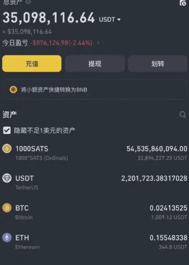
Today I speak the truth; every word is true! I have been trading cryptocurrencies for 10 years, and in the first three years, I continuously lost money, starting with 300 and ending with 30,000! It was really painful! My wife and family did not support or understand me! Later, I resigned and dedicated all my thoughts to this! I was busy exploring and summarizing every day! Now I can finally stabilize my compounding returns, and I have earned back over 40 million in my account!
In addition to solid techniques, I will first share 9 super trading rules that I have summarized, hoping to provide some insights for newbies in the cryptocurrency world and help them avoid detours! Grow by standing on the shoulders of giants! If you learn it, you can achieve a doubling of your investments!
1. Avoid revenge trading
When a trade closes, whether in profit or loss, it is necessary to steadfastly adhere to the rules. After executing a stop loss, try not to look at it again within 24 hours. This can effectively avoid revenge trading; trading with a vengeful mindset can significantly amplify losses. Some believe that one should get up from where they fell, but it is more important to calmly observe until new entry conditions are triggered. Since traders look at charts for several hours each day, it is difficult to resist the temptation to open a new position to recover after a stop loss. This is especially true when using leverage for swing trading, where a vengeful mindset should be avoided.
2. Try to avoid trading on weekends
Every weekend, the volatility of cryptocurrency prices increases, and trading volume is small. This makes it difficult to predict short-term price trends. The reason is simple: weekend buy and sell orders are usually small, and market liquidity is low, making it easier for whales to manipulate short-term prices, which makes retail traders' disadvantages more apparent. Additionally, since the cryptocurrency market operates 24/7 without pause, the trading intensity is much higher than in the stock market, and weekends are a good time to decompress and rest; after all, life is more important than trading.
3. Maintain trading at specific times
As mentioned earlier, the cryptocurrency market operates continuously 24/7 without rest, and even full-time traders cannot keep their eyes on the market all the time. To maintain a clear mind, you can set fixed trading times for yourself. After opening a position during trading hours, set your take profit and stop loss, and then you can go do other things. This eliminates the impulse to constantly check your phone or study candlestick charts, allowing you to maintain a normal lifestyle while trading.
4. Do not develop an emotional attachment to any asset
If you fall in love with the asset you are trading, it can easily lead to poor decision-making. Excellent traders make money through efficiency and rules, gaining the upper hand, as the trading behavior of most people in the market is driven by emotions. 'Be a trading machine without emotions' can ensure decisiveness and adherence to principles in trading. One major reason many traders experience significant losses is that they easily become emotionally attached to certain altcoins, teams, or projects. This can be acceptable for medium to long-term investors but poses potential disasters for short-term traders.
5. Maintain simple trading rules
Traders usually combine multiple indicators, news, and K line patterns to try to find suitable convergence points for trading. This in itself is not a problem, but one should be careful to avoid overanalyzing, which complicates matters. In fact, when a K line pattern suitable for one's trading system appears on the chart, one can start trading. At the same time, it is crucial to set stop-loss levels and control positions; this is especially important.
6. Only trade with the right mindset
When you feel angry, tired, or stressed about something, do not trade; your mindset will affect your judgment. The key to maintaining a good mindset is to have other daily activities outside of trading. Activities like fitness, reading, and spending time with family and friends all help cultivate the right trading mindset.
7. Keep a trading diary
Reviewing a trading diary can be tedious, but it is meaningful because it helps you avoid making the same mistakes. Behind every profit and loss, there are specific reasons, and recording trading details is a way to learn that can help you grow quickly.
8. Do not attempt to catch falling knives barehanded
"Catching falling knives barehanded" refers to traders attempting to bottom fish in a plummeting asset. The motivation for bottom fishing is usually to lower the cost price and make up for losses caused by significant declines. Attempting to accurately bottom fish during a crash is unwise. Waiting for stabilization and rebound, after resistance levels turn into support levels, is a more prudent approach.
9. Do not ignore extreme market conditions
While referencing technical analysis indicators, one must not ignore black swan events or other extreme market conditions. Ultimately, the market is driven by supply and demand, and sometimes the market is extremely unbalanced.
Trading is a long-term practice; to make a living from trading, one must abide by the rules and build their own trading system!
So how to excel at trading cryptocurrencies? Once a person enters the financial market, it is difficult to turn back. If you are currently losing money but still feel lost and plan to make cryptocurrency trading your second career, you must know the 'simplest MACD trading strategy'; understanding it deeply can help you avoid many detours—these are personal experiences and feelings that I suggest you collect and ponder repeatedly!
The MACD indicator is the most classic technical indicator among all technical indicators. By correctly using this indicator in conjunction with K lines (daily K lines, weekly K lines), individual stock trends, volume, overall market trends, and news, one can essentially achieve good buying and selling results. Below, I will share the most comprehensive usage of the MACD indicator; only those who truly understand it are experts, and I share this once!
The general assessment criteria for the MACD indicator mainly revolve around the conditions and forms of the fast and slow moving average lines (DIF and DEA lines) and the red and green histogram (MACD histogram). The general analysis methods mainly include analyzing the positions of the DIF and DEA lines, their crossover situations, the contraction of red histogram, and the patterns of the MACD graph.

1. MACD is the most commonly used indicator by experts
The role of the MACD indicator in technical analysis is extremely special, and it can be said to be an essential part of learning technical analysis. Its importance can be summarized in at least the following points:
The MACD indicator is one of the most effective technical indicators that has been tested by historical trends and is also the most widely used indicator.
The MACD indicator is derived from the EMA moving average indicator and has good application effects in grasping trending markets. Trend investors generally refer to this indicator in practice.
The top and bottom divergence of the MACD indicator is recognized as the best method for 'bottom fishing and top escaping'; this method is an important tool for concretizing trend theory and wave theory.
Many experienced traders have this experience: when they first entered the market, they started learning about the MACD indicator, then gradually discarded it, and after a long period of study and comparison—especially after practical testing—ultimately returned to the MACD indicator. This illustrates the special nature of this indicator.
The application of the MACD indicator in quantitative trading is also very extensive.
These advantages make the MACD indicator the most commonly used technical indicator among professional traders.
II. Concept and algorithm of the MACD indicator
The MACD indicator, also known as the Moving Average Convergence Divergence, was created by Gerald Appel and is used to track price trends and assess K line buying and selling timing in technical analysis. This indicator is commonly used in trading software and is known as the 'king of indicators'. As shown in 【Figure 1】.
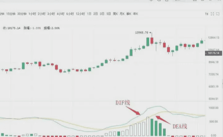
The MACD indicator in the cryptocurrency market consists of DIF fast line, DEA slow line, MACD histogram, and the zero axis, referred to as the 'three lines and one axis'. Investors assess prices through the intersections, divergences, breakthroughs, support, and resistance of these 'three lines and one axis'. The MACD indicator can become
one of the most preferred indicators listed by many trading software, indicating its widespread application, which also suggests that this indicator has been historically proven to be one of the most effective and practical indicators.
Three, the golden cross and death cross of MACD
"Golden cross" patterns and "death cross" patterns are extremely important formations in technical indicator analysis.
The golden cross pattern, also known as the golden cross, refers to a relatively short-period indicator line crossing upwards through a relatively long-period indicator line (of the same type), often signaling the emergence of a short-term buying opportunity. If the golden cross pattern appears at a
①. After a short-term rapid downward trend during the decline;
②. After a wave of pullback during the upward trend;
③. Following a consolidation trend during the rise,
That is, when a golden cross pattern appears at a local low, it is a more reliable buy signal.
The death cross pattern, also known as the death cross, refers to a relatively short-period indicator line crossing downwards through a relatively long-period indicator line (of the same type), often signaling the emergence of a short-term selling opportunity. If the death cross pattern appears at a
①. After a consolidation trend during the downward phase;
②. After a wave of rebound during the upward trend;
③. Following a short-term rapid upward trend during the rise,
That is, when the death cross pattern appears at a local high, it is a more reliable selling signal.
After understanding the golden cross and death cross patterns, we can look specifically at the golden cross and death cross forms of the MACD indicator line; the positions of the golden cross and death cross will reflect different market implications.
Situation one: Buying point of a low-position golden cross. If the DIFF line and DEA line golden cross occurs below the zero axis and is far from the zero axis, this golden cross is referred to as a low-position golden cross. Investors should view this golden cross at this time merely as a short-term price rebound; whether the K line can form a true reversal still requires observation and confirmation with other indicators.
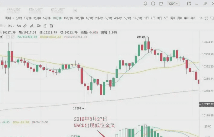
As shown in the figure: On August 27, 2019, in the BTC 10-minute K line chart, a low-position golden cross appeared with the price pullback, followed by a rebound of $200. Short-term investors can seize the opportunity to enter the market.
Situation two: Buying point of a golden cross near the zero axis
If an upward trend has formed, and the DIFF line and DEA line golden cross occurs near the zero axis, it often represents an excellent buying opportunity for investors.
This is because, after an upward trend forms, a golden cross near the zero axis indicates that the adjustment has completely ended and a new upward trend has begun. If this is accompanied by a golden cross in the volume line, it indicates that the price rise is supported by trading volume, making the buying signal even more reliable. Once this buying point appears, investors should absolutely not miss it; otherwise, they will miss a significant upward opportunity.
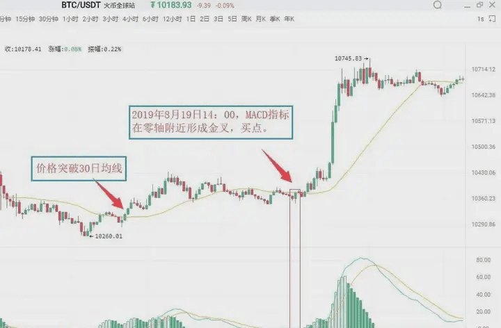
As shown in the figure: On August 19, 2019, at 09:30, in the BTC 5-minute K line chart, Bitcoin broke through the 30-day moving average, indicating that an upward trend has begun to form. For a period afterwards, the price remained above the 30-day moving average. At 14:00 on August 19, 2019, the MACD indicator formed a golden cross near the zero axis, indicating that a significant upward trend is about to occur in the market. Investors can decisively buy.
Situation three: Buying point of a high-position golden cross
If the DIFF line and DEA line's golden cross occurs above the zero axis and is far from the zero axis, then this golden cross is referred to as a high-position golden cross. High-position golden crosses generally appear at
In the consolidation trend during the K line's upward process, it indicates that the consolidation has ended, and the K line is about to continue the previous upward trend. Therefore, once a high-position golden cross appears, it is a good signal to increase positions. In practice, when an upward trend is formed and the K line rises slowly and continues for a long time, once the MACD indicator forms a high-position golden cross, it often signifies that the K line is about to accelerate upward. Because of this, a high-position golden cross can also be used for swing trading. Investors can use the MACD indicator to continuously hunt for upward swings during an upward trend.
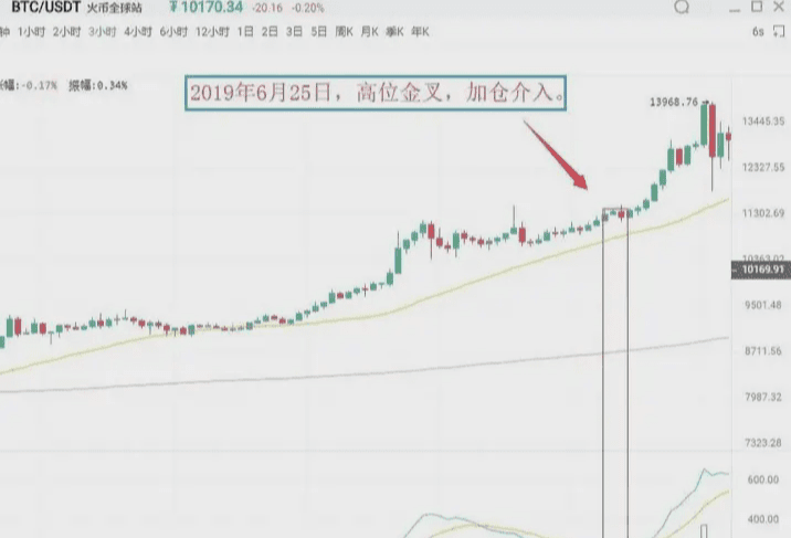
As shown in the figure: On June 25, 2019, in the BTC 3-hour K line chart, the Bitcoin price rose after consolidating, and at the same time, the MACD indicator showed a high-position golden cross. It indicates that the pullback has ended, and the price will continue the previous upward trend. Investors should pay attention to seizing this opportunity to increase positions.
Situation four: Selling point of a low-position death cross
A low-position death cross refers to a death cross that occurs far below the zero axis. This type of low-position death cross often appears at the end of a rebound during a downward trend, thus serving as a selling signal for the end of the rebound. At this time, investors who are not in the market should be cautious and observe; those who are deeply trapped in positions can sell first, waiting to buy back at a lower price to reduce costs.
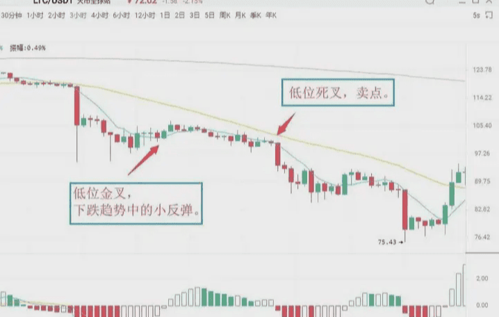
As shown in the figure: On July 14, 2019, in the LTC 3-hour K line chart, the MACD indicator of Litecoin exhibited a low-position golden cross, followed by a slight price rebound, which quickly dropped again. Immediately thereafter, the MACD indicator showed a death cross below the zero axis, and the K line began a new downward trend. Investors can sell their positions at the death cross, then buy back to lower their holding costs.
Situation five: Selling point of a death cross near the zero axis. If the previous market direction has been a downward trend, and the DIFF line crosses below the DEA line near the zero axis, this is referred to as a death cross near the zero axis. It indicates that the market has accumulated considerable downward momentum near the zero axis, and the appearance of a death cross signals the release of downward momentum, leading the K line to continue its original downward trend, serving as a selling signal.
As shown in the figure: On August 12, 2019, in the BTC 1-hour K line chart, the DIFF line of Bitcoin broke below the DEA line, forming a death cross near the zero axis. It indicates that market downward momentum is beginning to release, serving as a selling signal, and investors should sell decisively; otherwise, they will be deeply trapped.
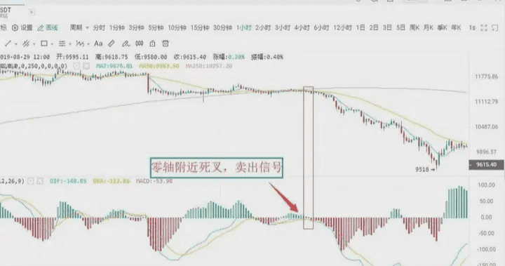
Situation six: Selling point of a high-position death cross
The DIFF line breaking below the DEA line at a distance above the zero axis forms a crossover, known as a high-position death cross. This type of death cross pattern is sometimes accompanied by a MACD top divergence. It manifests as: during a continuous upward price trend, new highs are constantly reached, but the MACD indicators' DIF line and DEA line no longer continue to rise or trend upward, instead diverging from the price trend and gradually moving downward.
Above the zero axis, if the DIF line crosses below the DEA line, forming a downward crossover, it constitutes a death cross and is a relatively reliable selling signal.
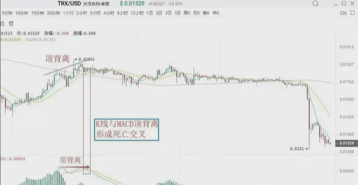
As shown in the figure: On August 23, 2019, in the TRX 1-hour K line chart, after a wave of rise in TRX, the price continued to hit new highs, but the DIF line and DEA line no longer continued to rise, forming a death cross and selling signal.
Four, the divergence between MACD and K line
Divergence is a term used in physics to describe momentum; in technical analysis, it is a widely used analysis method with a high success rate. In a downward trend, when the price reaches a new low while the indicator line does not reach a new low, it is called bottom divergence, indicating that upward momentum is accumulating.
is a buying signal. In an upward trend, when the price reaches new highs while the indicator line does not reach new highs, it is called top divergence, indicating that downward momentum is accumulating, signaling a selling point;
I. Bottom divergence
MACD histogram and DIFF line's top divergence
The bottom divergence between the DIFF line and price refers to the situation in a downward trend when the price reaches a new low, but the DIFF line does not reach a new low. It indicates that during the price decline, the magnitude of the DIFF line's decline is smaller than that of the price, and upward momentum is continuously accumulating, suggesting that the price is about to stop falling, with a high probability of rising in the near future.
The MACD histogram is hidden behind the DIFF line and is divided into red and green; it is an important use of the MACD indicator in divergence analysis with price. The bottom divergence between the MACD histogram and price indicates that when the price repeatedly reaches new lows, the MACD histogram does not reach new lows. The upward momentum is accumulating, suggesting that the price is about to stop falling, with a high probability of rising in the near future.
When a bottom divergence appears, investors can grasp specific buying points in two ways.
Specific buying opportunities
The bottom divergence between the DIFF line, MACD histogram, and price is not a specific point in time, but a pattern that appears over a period. However, the specific buying point for investors is a specific time, indicating that the price is about to stop falling. Therefore, to grasp the specific buying opportunity, when the DIFF line, MACD histogram, and K line appear in bottom divergence, investors must combine the bottom divergence with other technical analysis tools to specify the buying point.
First: Histogram changes color or MACD's golden cross
A change in the histogram color indicates that the market's upward momentum has begun to dominate. It usually appears after the histogram has shortened, although it may be slightly delayed but is more reliable. When a bottom divergence occurs, if the histogram successfully changes color or forms a golden cross, investors can buy.
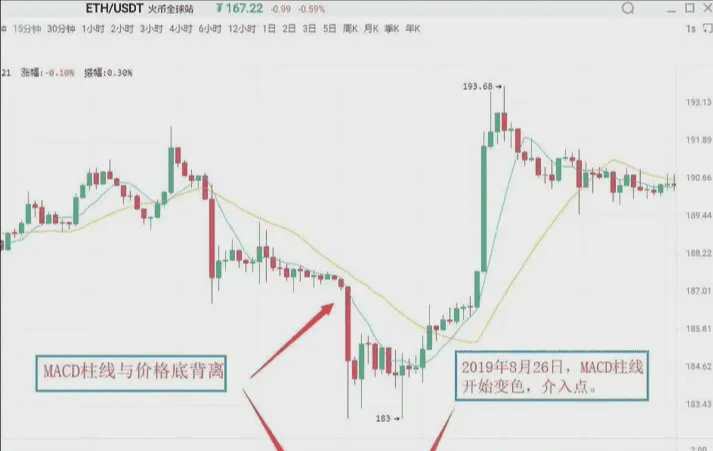
As shown in the figure: On August 26, 2019, in the Ethereum (ETH) 15-minute K line chart, Ethereum's price reached a new low during the decline, but the MACD histogram did not reach a new low, forming a bottom divergence between the histogram and price. It indicates that market upward momentum is beginning to accumulate, and there is a significant possibility that the price will exhibit an upward trend. Subsequently, the histogram changed color, and these two sequential buying signals combined further increase the reliability of the upward movement, allowing investors to enter when the histogram changes color.
Second: Combine bottom divergence with other technical analysis tools and K line reversal patterns, such as the combination of 'single needle probing the bottom' and 'three soldiers at the bottom', which is a concrete application of the 'multiple indicators combination' principle.
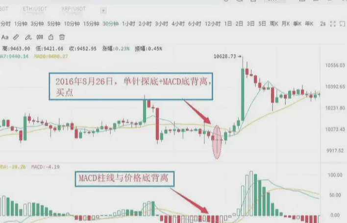
As shown in the figure: On August 26, 2016, in the BTC 30-minute K line chart, Bitcoin's price reached a new low, but the MACD histogram did not reach a new low, forming a bottom divergence between the histogram and price, indicating the continuous strengthening of the market's upward momentum. Accompanied by the price finding a bottom and stopping its decline, it formed a buying signal of 'MACD histogram and price bottom divergence + K line single needle probing the bottom'. The price subsequently exhibited an upward trend.
II. Top divergence
The top divergence between the MACD histogram and DIFF line
The top divergence between the MACD histogram and K line refers to the situation in an upward trend when the price reaches new highs while the MACD histogram does not reach new highs. It indicates that market downward momentum is accumulating, and the price may decline at any time.
The top divergence between the DIFF line and K line refers to the situation in an upward trend when the price reaches new highs, but the DIFF line does not reach new highs. It indicates that market downward momentum is continuously accumulating, with a significant possibility of a downward trend. The specific selling timing is similar to bottom divergence, and in practice, based on the principle of combining multiple indicators, investors can use several methods to make the selling signal more specific.
First: Histogram changes color or MACD's death cross
After the MACD histogram and K line form a top divergence, if the histogram suddenly shortens significantly, it indicates that the market's downward momentum is beginning to release. Investors should pay attention to sell in a timely manner. A change in the MACD histogram color indicates that the market's downward momentum has gained dominance and usually appears after the histogram continues to shrink. If the histogram changes color or a MACD death cross occurs after a top divergence with the K line, investors should pay attention to exit in a timely manner.
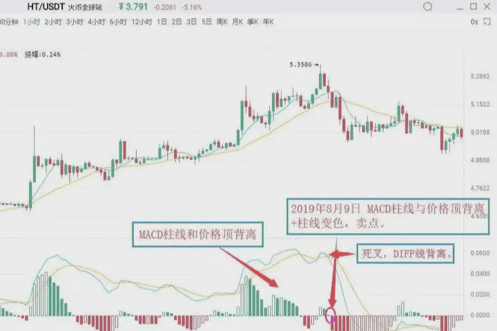
As shown in the figure: On August 9, 2019, in the HT 1-hour K line chart, Huobi's price reached a new high, but the MACD histogram did not reach a new high, forming a top divergence between the histogram and price. It indicates that market downward momentum is starting to accumulate, and the price could potentially experience a downward trend at any time. Subsequently, the MACD histogram changed from red to green, issuing a "histogram and price top divergence + histogram color change" selling signal. Investors should pay attention to exit in a timely manner.
Second: Combine with other technical analysis tools, K line reversal patterns. If the MACD histogram and price top divergence appears, and other technical analysis tools also show a selling signal simultaneously, the reliability of the market selling signal will greatly increase, and investors should be decisive in exiting. Common selling signals include "histogram and price top divergence + K line reversal patterns," etc.
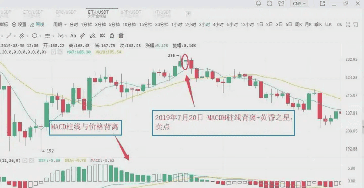
As shown in the figure: On July 20, 2019, in the ETH 3-hour K line chart, Ethereum's price reached a new high, but the MACD histogram did not reach a new high, forming a top divergence between the histogram and price. It indicates that the market's downward momentum is continuously strengthening, and the price may experience a downward trend. Subsequently, the MACD histogram gradually shortened while the K line formed a bearish evening star pattern. Investors should pay attention to exit in a timely manner, as the K line later exhibited a significant downward trend.
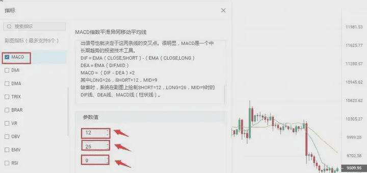
Five, modification of MACD parameters
The lag in response to price changes makes buying and selling levels sometimes less than ideal, which is a flaw of the MACD indicator. One of the ways to change this situation is to adjust the indicator parameters so that the MACD indicator reacts more sensitively to trends, allowing for more favorable buying and selling levels. In commonly used trading software, the default parameters for the MACD indicator are 12/26/9. Under such parameter settings, the MACD indicator often shows a noticeable lag in response to price changes. The lag of the MACD indicator can be solved by adjusting parameters. Common parameter combinations include 5/34/5, 5/10/30, etc. Investors can also try and explore more in practice.
Evening Star: In the process of an upward movement, a longer bullish candle appears first, followed by a shorter candlestick (either bullish or bearish) the next day, which is likened to a star, forming the main part of the candlestick combination. The third candlestick is a longer bearish candle that penetrates into the body of the first candlestick. The evening star is a signal for price to peak and retreat, with some predicting an accuracy rate of over 80%.
Finally, those who have been through rain always want to hold an umbrella for others. Having experienced days of isolation and helplessness, they empathize with others' losses and want to extend a helping hand, compensating for the regret of wanting to be pulled up at that time, as if crossing time and space to hold an umbrella for their past self drenched in rain.


