Let's break down what's happening with BNB/USDT (Binance Coin against US Dollar Tether) $BNB
and try to understand if it's bullish (likely to go up) or bearish (likely to go down).
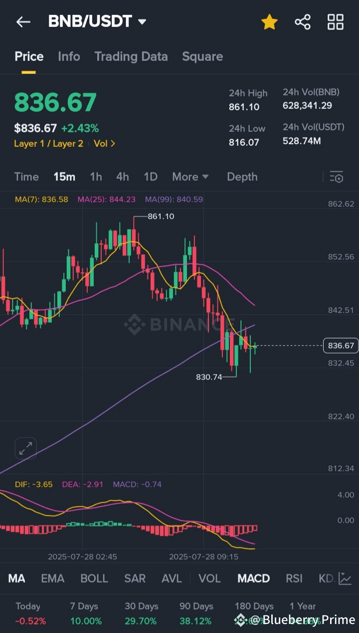
Overall Impression:
Looking at the current moment in the chart, the price seems to be in a bit of a recovery after a recent dip. While it's trying to move up, there are still some signs that suggest caution.
Here's a detailed breakdown for a newbie:
1. The Asset and Its Price:
* BNB/USDT: This means you're looking at the price of one Binance Coin (BNB) in terms of US Dollar Tether (USDT). USDT is a "stablecoin" that's designed to stay at $1, so you can think of it as tracking the US Dollar.
* Current Price: $836.67: This is the current exchange rate. One BNB is worth $836.67.
* Price Change: $836.67 (+2.43%): This tells you that the price has increased by $836.67 (which is 2.43%) since a certain starting point (usually the last 24 hours or the beginning of the current trading period). The "+" and green color indicate it's up.
2. Price Range (Last 24 Hours):
* 24h High: 861.10: This is the highest price BNB reached in the last 24 hours.
* 24h Low: 816.07: This is the lowest price BNB reached in the last 24 hours.
* What this tells you: The price has moved quite a bit within the last day, indicating some volatility.
3. Trading Volume:
* 24h Vol(BNB): 628,341.29: This is the total number of BNB coins that have been traded (bought and sold) in the last 24 hours.
* 24h Vol(USDT): 528.74M: This is the total value of the trades in USDT, which is over $528 million.
* What this tells you: High trading volume suggests that there's a lot of activity and interest in BNB, which is generally a good sign as it means there's liquidity (easy to buy/sell without big price swings due to lack of buyers/sellers).
4. The Candlestick Chart (The "Mountain Range" in the Middle):
* Candlesticks: Each "candle" (the green and red bars) represents the price movement over a specific time period. Here, it looks like you're looking at 15-minute candles, based on the "15m" selected.
* Green Candle: Means the price went up during that 15-minute period (the closing price was higher than the opening price).
* Red Candle: Means the price went down during that 15-minute period (the closing price was lower than the opening price).
* The "Wicks" (Thin Lines extending from the candles): These show the absolute highest and lowest prices reached within that 15-minute period.
* What's Happening in the Chart:
* You can see a peak around the 861.10 mark, followed by a significant drop (a series of red candles).
* More recently, the price has stabilized and is showing some green candles, suggesting a potential rebound.
* The latest candle is green, indicating the price is currently moving up.
5. Moving Averages (The Colored Lines on the Chart):
* These lines smooth out the price data to show the average price over a certain number of past periods. They help identify trends.
* MA(7) (Green Line - currently 836.58): This is the average price over the last 7 periods (e.g., 7 * 15 minutes if you're on a 15-min chart).
* MA(25) (Yellow Line - currently 844.23): This is the average price over the last 25 periods.
* MA(99) (Purple Line - currently 840.59): This is the average price over the last 99 periods.
* What they tell you:
* When a shorter-term MA (like MA7) is above a longer-term MA (like MA25 or MA99), it's generally considered bullish.
* When a shorter-term MA crosses below a longer-term MA, it can be a bearish signal.
* Currently, the MA(7) (green) is hovering right around the current price, and it's below MA(25) and MA(99). This indicates that while the price is trying to recover, the short-term average is still below the medium and long-term averages, which is a bit of a bearish signal for now. The price is currently below the MA(25) and MA(99), suggesting the recent downtrend is still influencing the averages.
6. MACD (Moving Average Convergence Divergence) - The Bars at the Bottom:
* DIF: -3.65 (Blue Line): This is the difference between two exponential moving averages.
* DEA: -2.91 (Orange Line): This is the moving average of the DIF line.
* MACD: -0.74 (The Bars): These are the bars below the lines, representing the difference between DIF and DEA.
* What it tells you:
* The MACD is a momentum indicator. It helps to spot changes in strength, direction, momentum, and duration of a trend.
* When the DIF line crosses above the DEA line, it's generally a bullish signal (meaning upward momentum is increasing).
* When the MACD bars are above the zero line, it's generally bullish; below, it's bearish.
* Currently, all values are negative (DIF: -3.65, DEA: -2.91, MACD: -0.74) and the DIF line is below the DEA line (blue line below orange line). This is a bearish signal, indicating that the downward momentum is still present, even though the price is currently rising. The MACD bars are also below the zero line, confirming bearish momentum.
7. "Today," "7 Days," "30 Days," etc. Performance:
* Today: -0.52%: This shows the performance from the start of the current day.
* 7 Days: 10.00%: BNB is up 10% over the last 7 days.
* 30 Days: 29.70%: BNB is up almost 30% over the last 30 days.
* 1 Year: 44.98%: BNB is up almost 45% over the last year.
* What this tells you: While the recent activity shows a dip and current attempts at recovery, the longer-term performance (7 days, 30 days, 1 year) has been quite positive, suggesting a strong underlying asset.
Is it Bullish or Bearish?
This is where it gets a bit nuanced:
* Short-Term (Right Now): It's exhibiting mixed to slightly bearish signals.
* The recent price action shows a recovery from a dip (some green candles).
* However, the moving averages (MA7 below MA25 and MA99) and especially the MACD (all values negative and DIF below DEA) are pointing to continued bearish momentum or at least a lack of strong bullish conviction.
* The price is still below the recent high of $861.10.
* Medium to Long-Term: The longer-term performance numbers (7 days, 30 days, 1 year) are bullish, indicating that despite recent pullbacks, BNB has been in an overall uptrend.
Conclusion for a Newbie:
Right now, BNB is trying to bounce back after a drop. While it's moving up a little at this very moment, some of the technical indicators (like the MACD and the arrangement of the moving averages) suggest that the market still has some downward momentum from the recent dip. It's not a clear strong "buy" signal in the immediate short-term, but it's also not collapsing. Over the longer term, BNB has shown good performance.
If you were considering buying, you might want to see if the moving averages start to cross back into a bullish alignment (e.g., MA7 goes above MA25 and MA99) and if the MACD turns positive or shows a clear bullish cross. For now, it's in a period of attempting to find its footing after a decline.