In the cryptocurrency space, playing around essentially boils down to a competition between retail investors and whales. If you don't have cutting-edge news or first-hand information, you can only be cut! Those who want to layout together and harvest the whales can follow me and welcome like-minded people in the cryptocurrency space to discuss together~
Contract MACD Practical Mnemonic:
1. When the MACD is above the zero axis, every golden cross indicates that the coin price is about to reach a new high.
2. When MACD is below the zero axis, every death cross indicates that the coin price is about to reach a new low.
3. When the MACD forms a golden cross below the zero axis, it belongs to a rebound market in a downward trend; only participate once it is above the zero axis.
4. When the MACD is above the zero axis and forms a golden cross, it belongs to a bullish trend in a rising market, allowing for high selling and low buying until a top divergence occurs. When the MACD sells small, and the coin price rises, if the next wave of red histogram is shorter than the previous high, it will drop.
6. MACD buys small: if the coin price declines or flattens, followed by a wave of green histogram shorter than the previous one, it will rise.
7. MACD high-level squeeze: after a sharp rise in coin price, if MACD moves away from the zero axis and the red histogram shortens, exit quickly.
8. MACD low-level golden cross: after a sharp drop in coin price, if MACD moves away from the zero axis, it will rise, and a second golden cross will lead to an even stronger upward trend.
9. MACD golden pit: after a wave of price increase, if MACD forms a death cross within 7 days and the green histogram is shorter than the previous one, it will rise.
The role of the MACD indicator in technical analysis is very special; it can be said to be an essential part of learning technical analysis. Its importance includes at least the following points.
1. The MACD indicator is the most effective technical indicator tested by historical trends and is also the most widely used indicator.
2. The MACD indicator is derived from the EMA moving average indicator and has good application effects in grasping trending markets. Trend investors in practical operations generally refer to this indicator.
3. The top and bottom divergence of the MACD indicator is recognized as the best 'buy low and sell high' method, which is an important tool for the concretization of trend theory and wave theory.
4. Many veterans have had this experience: when they first entered the market, they began to learn the MACD indicator, then slowly discarded it. After a long period of learning and comparison, especially after practical testing, they ultimately returned to the MACD indicator. This shows the uniqueness of this indicator.
5. The application of the MACD indicator in quantitative trading is also extremely widespread.
It is precisely because of these advantages that the MACD indicator has become the most commonly used technical indicator among professional traders.
Concept and Calculation of the MACD Indicator
The MACD indicator, also known as the Exponential Moving Average Convergence Divergence (MACD), was created by Gerald Appel to track price trends and evaluate candlestick buy and sell timing. This indicator is a common indicator in market software and has the reputation of 'King of Indicators.' As shown in the figure below.
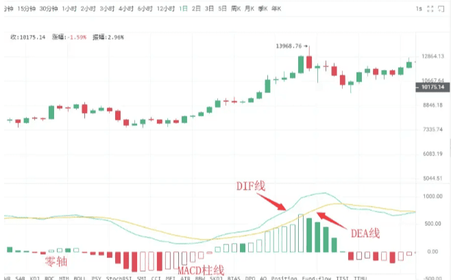
The MACD indicator in cryptocurrency consists of the DIF fast line, DEA slow line, MACD histogram, and the zero axis, the 'three lines and one axis.' Investors analyze price movements through the cross, divergence, breakthrough, support, and resistance of these 'three lines and one axis.' The MACD indicator has become a preferred indicator in many market software, demonstrating its wide application, which also indirectly indicates that this indicator is one of the most effective and practical indicators tested by history.
The golden cross and death cross of the MACD
The 'golden cross' and 'death cross' patterns are extremely important patterns in technical indicator analysis. The golden cross pattern, also known as a golden cross, refers to when the shorter-term indicator line crosses from below to above the longer-term indicator line (of the same type), often indicating a potential short-term buying opportunity. If the golden cross pattern appears in
①. After a short-term rapid decline during a downward trend;
②. After a wave of pullback during the upward trend;
③. After a consolidation phase during an upward trend, when the golden cross pattern appears at a phase's low point, it is a more reliable buying signal.
A death cross pattern, also known as a death cross, refers to a shorter-term indicator line crossing from above to below a longer-term indicator line (of the same type), often indicating a potential short-term selling opportunity. If a death cross pattern appears in
①. After a consolidation phase during a downward trend;
②. After a wave of rebound during an upward trend;
③. After a short-term rapid upward movement during an upward trend, when the death cross pattern appears at a phase's high point, it is a more reliable sell signal.
After understanding the golden cross and death cross patterns, we can take a closer look at the golden cross and death cross patterns of the MACD indicator. The occurrence of golden and death crosses at different positions reflects different market meanings.
Situation One: Buy Point at Low-Level Golden Cross
If the position of the DIFF line and DEA line's golden cross occurs below the zero axis and is far from the zero axis, this golden cross is referred to as a low-level golden cross. Investors should view this golden cross only as a short-term price rebound, while whether the candlestick can form a true reversal still needs to be observed and confirmed with other indicators.
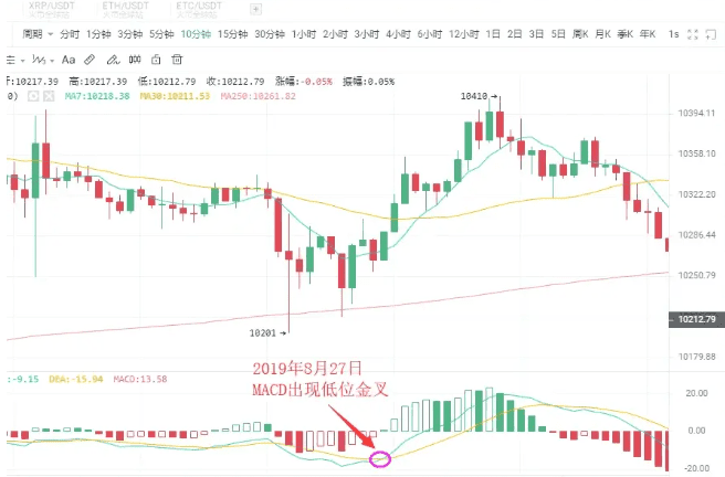
As shown in the figure above:
On August 27, 2019, BTC 10-minute candlestick chart, a low-level golden cross appeared with the price's pullback, followed by a rebound of $200. Short-term investors can seize the opportunity to enter the market.
Situation Two: Buy Point Near Zero Axis Golden Cross
If an upward trend has formed, and the DIFF line and DEA line have a golden cross near the zero axis, it is often an excellent opportunity for investors to buy.
This is because, after an upward trend forms, a golden cross near the zero axis indicates that the adjustment has completely ended, and a new round of upward trend has started. If this also coincides with a golden cross of the volume line, it shows that the price increase is supported by trading volume, making the buy signal even more reliable.
Once this buying point appears, investors absolutely should not miss it; otherwise, they will miss a major rally.
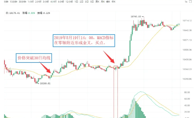
As shown in the figure above:
On August 19, 2019, at 09:30, BTC 5-minute candlestick chart showed that Bitcoin broke through the 30-day moving average, indicating that the upward trend has initially formed. For a period afterward, the price remained almost always above the 30-day moving average.
On August 19, 2019, at 14:00, the MACD indicator formed a golden cross near the zero axis, indicating that the market is about to experience a significant upward trend. Investors can decisively buy.
Situation Three: Buy Point at High-Level Golden Cross
If the golden cross of the DIFF line and DEA line occurs above the zero axis and is located at a considerable distance from the zero axis, it is referred to as a high-level golden cross. High-level golden crosses generally appear during consolidation phases in the upward movement of the candlestick, indicating that the consolidation has ended, and the candlestick is about to continue the previous upward trend. Therefore, once a high-level golden cross appears, it is a good signal to increase positions.
In practice, when an upward trend is formed, and the candlestick slowly rises and remains for a long time, once the MACD indicator forms a high-level golden cross, it is often a sign that the candlestick is about to accelerate upward.
It is precisely for this reason that a high-level golden cross can also be used for swing trading. Investors can use the MACD indicator to continuously target upward swings during an upward trend.
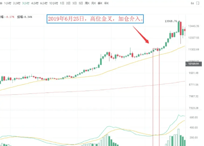
As shown in the figure above:
On June 25, 2019, BTC 3-hour candlestick chart, the price of Bitcoin, after consolidating during the upward trend, rose again, while the MACD indicator showed a high-level golden cross. This indicates that the pullback has ended, and the price will continue the previous upward trend. Investors should pay attention to seize this opportunity to increase positions.
Situation Four: Sell Point at Low-Level Death Cross
A low-level death cross refers to a death cross that occurs at a considerable distance below the zero axis. This type of low-level death cross often appears at the end of a rebound during a downward trend, thus signaling the end of the rebound. At this time, investors who are not in the market should observe, while those who are deeply trapped can sell first and buy back later to lower costs after the price declines.
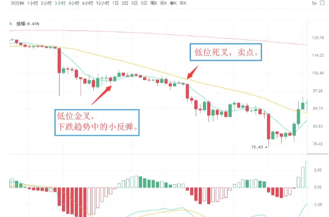
As shown in the figure above:
On July 14, 2019, LTC 3-hour candlestick chart, the MACD indicator for Litecoin showed a low-level golden cross, leading to a slight rebound in price, which then quickly moved downward.
Immediately after, the MACD indicator showed a death cross below the zero axis, and the candlestick began a new round of downward movement. Spot investors can sell their positions at the death cross position and then buy back to lower their holding costs.
Situation Five: Sell Point at Death Cross Near Zero Axis
If the previous market direction has been a downward trend, then the intersection formed when the DIFF line breaks below the DEA line near the zero axis is referred to as a death cross near the zero axis. It indicates that the market has accumulated considerable downward momentum near the zero axis, and the appearance of a death cross suggests that the downward momentum in the market is starting to release, and the candlestick will continue the original downward trend, serving as a sell signal.
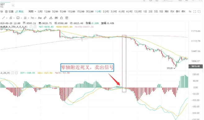
As shown in the figure above:
On August 12, 2019, BTC 1-hour candlestick chart, Bitcoin's DIFF line broke below the DEA line near the zero axis. This indicates that the market's downward momentum is beginning to release, serving as a sell signal, and investors should sell their positions decisively, or they will be deeply trapped.
Situation Six: Sell Point at High-Level Death Cross
The DIFF line breaking below the DEA line at a considerable distance above the zero axis forms an intersection called a high-level death cross. This type of death cross pattern is sometimes accompanied by the MACD's top divergence. The performance is that during a continuous upward trend, the price keeps reaching new highs, but the MACD indicator's DIF line and DEA line no longer continue to rise or attack but diverge from the price trend, gradually moving downward.
Above the zero axis, when the DIF line crosses below the DEA line to form a downward crossing trend, it belongs to a death cross, which is a relatively reliable sell signal.
As shown in the figure above:
On August 23, 2019, TRX 1-hour candlestick chart, after a previous upward wave for Tron, the price continued to reach new highs, but the DIF line and DEA line no longer continued to rise, leading to a death cross and a sell signal.
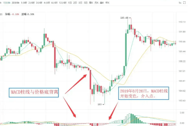
Divergence between MACD and candlestick
Divergence is a term in physics that describes momentum; in technical analysis, it is a highly successful and widely used analytical method. In a downward trend, when the price reaches a new low, but the indicator line does not reach a new low, it is called bottom divergence, indicating that upward momentum is accumulating, and is a buy signal. In an upward trend, when the price reaches a new high, but the indicator line does not reach a new high, it is called top divergence, indicating that downward momentum is accumulating, and is a sell signal.
I. Bottom Divergence
(1) Divergence between the MACD histogram and the DIFF line
The bottom divergence between the DIFF line and price refers to when, during a downward trend, the price reaches a new low, but the DIFF line does not reach a new low. It indicates that during the price's decline, the decrease in the DIFF line is less than that of the price, showing that upward momentum is continuously accumulating, and the price is about to stop falling, with a high probability of rising in the next period.
The MACD histogram is the MACD histogram line hidden behind the DIFF line, divided into red and green. Its divergence with the price is an important application of the MACD indicator, widely used in practice. The bottom divergence between the MACD histogram and price refers to when the price continuously reaches new lows while the MACD histogram does not reach new lows. Upward momentum is accumulating in the market, and the price is about to stop falling, with a high probability of a rise in the next period.
When bottom divergence occurs, investors can grasp specific buying points through two methods.
(2) Specific buying timing
The bottom divergence between the DIFF line, MACD histogram, and price is not a specific point in time, but a pattern that appears over a period of time. However, the specific buying timing for investors is a specific point in time, indicating that the price is about to stop falling. Therefore, to grasp the specific buying timing, when the DIFF line, MACD histogram, and candlestick show bottom divergence, investors must combine the bottom divergence with other technical analysis tools to specify the buying points.
First: Histogram color change or MACD golden cross
A change in the color of the histogram indicates that upward momentum in the market has begun to dominate. It generally appears after the 'shortening of the histogram,' and although it may be delayed for a while, it is more reliable. When bottom divergence occurs, if the histogram successfully changes color or forms a golden cross, investors can buy.
As shown in the figure above:
On August 26, 2019, Ethereum (ETH) 15-minute candlestick chart, the price of Ethereum reached a new low during the downward trend, but the MACD histogram did not reach a new low, forming a bottom divergence pattern between the histogram and the price. This indicates that upward momentum in the market is beginning to accumulate, and there is a high probability that a wave of upward movement will occur.
Immediately after, the histogram changes color; these two sequential buy signals combined together further increase the reliability of the upward signal, and investors can enter the market when the histogram changes color.
Second: Combined with other technical analysis tools and candlestick reversal patterns
Bottom divergence combined with candlestick reversal patterns, such as 'single needle bottom' and 'three soldiers at the bottom,' is a specific application of the principle of 'multi-indicator combination.'
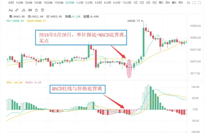
As shown in the figure above:
On August 26, 2016, BTC 30-minute candlestick chart, the price of Bitcoin reached a new low, but the MACD histogram did not reach a new low, forming a bottom divergence pattern between the histogram and the price, indicating the continuous strengthening of upward momentum in the market.
Accompanied by the price's decline and stabilization, a buy signal is formed with 'MACD histogram and price bottom divergence + candlestick single needle bottom.' The price then shows an upward trend.
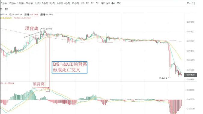
II. Top Divergence
(1) Divergence between MACD histogram and DIFF line
The divergence between the MACD histogram and the candlestick is when, during an upward trend, the price reaches a new high, but the MACD histogram does not reach a new high. It indicates that downward momentum is accumulating in the market, and the price may drop at any time.
The divergence between the DIFF line and the candlestick indicates that during an upward trend, when the price reaches a new high, the DIFF line does not reach a new high. It indicates that downward momentum is continuously accumulating in the market, and there is a significant possibility that the price will experience a downward trend.
(2) Specific selling timing
Similar to bottom divergence, in practice, investors can use the principle of multi-indicator combination to make sell signals more specific.
First: Histogram color change or MACD death cross
After the divergence between the MACD histogram and the candlestick forms, if the histogram suddenly shortens significantly, it indicates that the downward momentum in the market is beginning to release. Investors should pay attention to sell in a timely manner. A change in the color of the MACD histogram indicates that downward momentum in the market has gained an advantage, and this generally occurs after the histogram has been continuously diminishing. If the histogram and candlestick diverge, and then the histogram changes color or a MACD death cross occurs, investors should pay attention to exit in a timely manner.
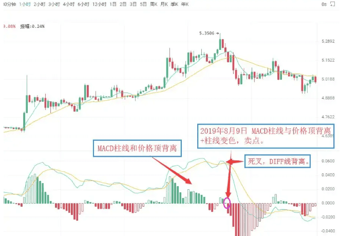
As shown in the figure above:
On August 9, 2019, HT 1-hour candlestick chart, Huobi's price reached a new high, but the MACD histogram did not reach a new high, forming a top divergence pattern between the histogram and the price. This indicates that downward momentum in the market is continuously accumulating, and the price may experience a downward trend at any time.
Subsequently, the MACD histogram changed from red to green, issuing the 'histogram and price top divergence + histogram color change' sell signal. Investors should pay attention to exit in a timely manner.
Second: Combined with other technical analysis tools and candlestick reversal patterns
After the divergence between the MACD histogram and price occurs, if other technical analysis tools also simultaneously show sell signals, the reliability of the market's sell meaning will greatly increase, and investors should pay attention to exit decisively. Common sell signals in this category include 'histogram and price top divergence + candlestick reversal pattern', etc.
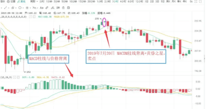
As shown in the figure above:
On July 20, 2019, ETH 3-hour candlestick chart, the price of Ethereum reached a new high, but the MACD histogram did not reach a new high, forming a divergence pattern between the histogram and the price. This indicates that downward momentum in the market is continuously strengthening, and the price may experience a downward trend.
Subsequently, the MACD histogram gradually shortened, while the candlestick formed a bearish evening star pattern. Investors should pay attention to exit in a timely manner, as a significant downward trend in the candlestick followed.
Appendix:
Evening Star: In the process of an upward trend, a longer bullish candlestick appears first, followed by a shorter entity candlestick (either bullish or bearish) the next day, which people metaphorically refer to as a star, forming the main body of the candlestick combination. The third candlestick is a longer bearish candlestick that penetrates deeply into the body of the first candlestick. The evening star is a signal that the price has peaked and is about to decline, with some predicting an accuracy rate of over 80%.
(About some candlestick patterns indicating tops and bottoms. We will have several lessons dedicated to this later, so please continue to follow.)
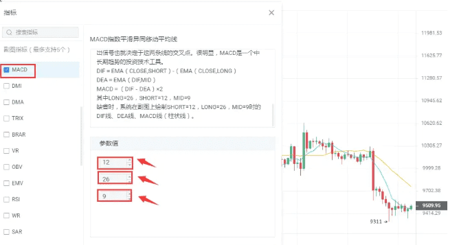
Modification of MACD parameters
The lag in the response to price changes sometimes makes the buy and sell prices less than ideal, which is a defect of the MACD indicator. One of the ways to change this situation is by adjusting the indicator parameters to make the MACD indicator's response to trends more sensitive, thereby allowing for more ideal buy and sell prices.
In commonly used market software, the default parameters for the MACD indicator are 12/26/9. Under such parameter settings, the MACD indicator's reaction to price changes often has a noticeable lag.
The lag of the MACD indicator can be addressed by adjusting the parameters. Common parameter combinations include 5/34/5, 5/10/30, etc. Investors can also explore these in practice.
Execution is a hard injury in trading; holding positions is a common problem in investing. Without good execution, even the best strategy cannot be realized, but due to excessive holding, even minor mistakes are magnified, like a disease that multiplies. When you really can't hold on anymore and leave this market, I estimate no one will say goodbye to you; even if you come, a year later, no one will remember you. Any entry cannot rely on luck to hold positions; any speculation cannot be bet on with full positions. One misstep means leaving; a hundred successes is what success means.
I am Ah Yue, focused on analysis and teaching, a mentor and friend on your investment journey! I hope that everyone investing in the market can sail smoothly. As an analyst, the most basic thing is to help everyone make money. I can help solve confusion, trapped positions, and provide operational advice, speaking with strength. When you lose direction and don't know what to do, come find me.
Old Bo only does live trading; the team still has positions available for entry.