Today, I speak from the heart, and every word is true! I have been trading cryptocurrency for 10 years. The first three years were continuous losses, and I went from 300 in capital to 30,000! It was truly painful! My wife and family did not support or understand! Later, I quit my job and invested all my thoughts into it! Every day was spent exploring and summarizing! Now I can finally stabilize my compound interest, achieving financial freedom with over 35 million in my account!
In addition to having solid skills, I first want to share the 9 iron rules of cryptocurrency trading that I have summarized, hoping to inspire newcomers in the crypto sphere and help them avoid detours! Grow by standing on the shoulders of giants! If you learn it, you can also achieve doubling!
1. Avoid revenge trading.
When closing a trade, whether for profit or loss, it is necessary to strictly adhere to the rules. After executing a stop-loss, try not to look at it again within 24 hours. This can effectively avoid revenge trading; entering trades out of revenge may significantly increase losses. Some believe that you should rise from where you fell, but before triggering new entry conditions, it is more important to remain calm and observe. Since traders need to look at charts for several hours daily, it is difficult to resist the temptation to re-enter after a stop-loss. When using leverage for wave trading, it is especially important to avoid a revenge mentality.
2. Try to avoid trading on weekends.
Every weekend, the volatility of cryptocurrency prices increases, and trading volume is low. This makes it difficult to predict short-term price movements. The reason is simple: buy and sell orders on weekends are usually small, and market liquidity is low, making it easier for whales to manipulate short-term prices, which makes the disadvantage of retail traders more apparent. Moreover, since the cryptocurrency market operates 24/7, the trading intensity is much higher than in the stock market, and weekends are a good time to decompress and rest, as life is greater than trading.
3. Maintain trading at specific times.
It was just mentioned that the cryptocurrency market operates 24/7 without rest. Even full-time traders cannot keep an eye on the market all the time. To maintain a clear mind, one can set fixed trading hours. After opening a position during trading hours, set stop-loss and take-profit levels, and then you can do other things. This eliminates the impulse to constantly check your phone or study K-lines, allowing you to trade without affecting your normal life.
4. Do not become emotionally attached to a particular asset.
If you become emotionally attached to the asset you are trading, it can easily lead to poor decision-making. Excellent traders make money using efficiency and rules, giving themselves an advantage, as most traders in the market are driven by emotions. "Be an emotionless trading machine" ensures decisiveness and adherence to principles in trading. Many traders suffer heavy losses largely due to emotional attachments to certain altcoins, teams, or projects. This may be acceptable for medium to long-term investors, but it is a potential disaster for short-term traders.
5. Maintain simple trading rules.
Traders usually combine various indicators, news, and K-line patterns to find convergence points suitable for trading. There is nothing wrong with this, but one should be careful to avoid overanalyzing, which complicates the problem. In fact, when a suitable K-line pattern appears on the chart, trading can begin. At the same time, it is crucial to set stop-loss levels and position control.
6. Trade only with the correct mindset.
When you feel angry, tired, or stressed about something, do not trade; your mindset will affect your judgment. The key to maintaining a good mindset is to have other daily activities outside of trading, such as exercising, reading, and spending time with family and friends; these help cultivate the right trading mindset.
7. Keep a trading journal.
Reviewing trading journals can be tedious, but it is actually very meaningful because it can help you avoid making the same mistakes. Both profitable and losing trades have specific reasons behind them, and recording trading details is a way of learning that can help you grow quickly.
8. Do not attempt to catch falling knives barehanded.
"Catching falling knives" refers to traders attempting to bottom fish during a sharp decline in asset price. The motivation to bottom fish is usually to lower the cost price and make up for losses incurred during a significant drop. Attempting to accurately bottom fish during a sharp decline is unwise. Waiting for stabilization and a rebound, with resistance levels turning into support levels before entering the market, is a more prudent approach.
9. Do not overlook extreme market conditions.
While referencing technical analysis indicators, one must not ignore black swan events or other extreme market conditions. Ultimately, the market is driven by supply and demand, and sometimes the market is extremely unbalanced.
Trading is a long-term practice. To make a living from trading, you must adhere to rules and build your trading system!
So how do you do well in cryptocurrency trading? Once a person enters the financial market, it is hard to turn back. If you are currently at a loss and still feel confused, but plan to treat cryptocurrency trading as a second career, you must know the "simplest MACD strategy." Understanding and comprehending it can help you avoid many detours, as these are personal experiences and feelings; I suggest you keep them and contemplate repeatedly!
The MACD indicator is the most classic technical indicator among all technical indicators. By correctly using this indicator and combining it with K-lines (daily K-lines, weekly K-lines), individual stock trends, volume, market trends, and news, one can achieve better trading results. Below, I will share the most comprehensive usages of the MACD indicator; those who can truly understand it are experts, and I will only share this once!
The general judgment standard of the MACD indicator mainly revolves around the conditions and shapes of the fast and slow moving averages (DIF and DEA lines) and the red and green histogram (MACD bars). General analysis methods mainly include the positions of DIF and DEA, their crossing situations, the contraction of the red bars, and the shapes of the MACD graph.
01
MACD is the most commonly used indicator among experts.
The MACD indicator plays a particularly special role in technical analysis and can be said to be an essential part of learning technical analysis. Its importance can be summarized in at least the following points:
The MACD indicator is the most effective technical indicator tested by historical trends and is also the most widely used indicator.
The MACD indicator is derived from the EMA moving average indicator and has a good application effect in grasping trending markets. Trend investors generally refer to this indicator in practice.
The top and bottom divergence of the MACD indicator is recognized as the best method for 'bottom fishing and top escaping'. This method is an important tool for the concretization of trend theory and wave theory.
Many experienced traders have had this experience: when they first start learning the MACD indicator, they gradually abandon it. After a long period of study, especially after practical verification, they eventually return to the MACD indicator. This shows the unique nature of this indicator.
The application of the MACD indicator in quantitative trading is also very extensive.
These advantages make the MACD indicator the most commonly used technical indicator among professional traders.
02
Concept and algorithm of the MACD indicator.
The MACD indicator, also known as the Moving Average Convergence Divergence, was created by Gerald Appel to track price trends and analyze the timing of K-line trades. This indicator is commonly used in market analysis software and is known as the 'king of indicators'. As shown in Figure 1.
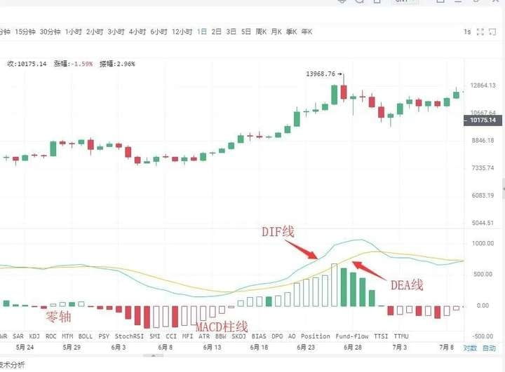
The MACD indicator in the cryptocurrency market consists of the DIF fast line, DEA slow line, MACD histogram, and zero axis, which are referred to as the 'three lines and one axis.' Investors analyze price movements through the crossings, divergences, breakouts, support, and resistance of these lines and axis. The MACD indicator is recognized as...
Many market analysis software rank it as a preferred indicator, indicating its wide applicability, which also indirectly shows that this indicator is one of the most effective and practical indicators tested by history.
03
The golden cross and death cross of the MACD.
"Golden cross" and "death cross" patterns are extremely important patterns in technical indicator analysis.
The golden cross pattern, also known as the golden crossover, refers to when a relatively short-term indicator line crosses upward and intersects with a relatively long-term indicator line (of the same type), often indicating the emergence of a short-term buying opportunity. If the golden cross pattern appears in...
①. After a short-term rapid decline during a downward trend;
②. After a wave of pullback during an upward move;
③. After a consolidation trend during an upward move,
That is, when the golden cross pattern appears at a phase low, it is a more reliable buying signal.
The death cross pattern, also known as the death crossover, refers to when a relatively short-term indicator line crosses downward and intersects with a relatively long-term indicator line (of the same type), often indicating the emergence of short-term selling opportunities. If the death cross pattern appears in...
①. After a consolidation trend during a downward move;
②. After a wave of rebound in the upward trend;
③. After a short-term rapid upward movement during an upward trend;
That is, when the death cross pattern appears at a phase high, it is a more reliable sell signal.
After understanding the golden cross and death cross patterns, we can take a closer look at the golden cross and death cross patterns of the MACD indicator lines. The appearance of golden crosses and death crosses in different positions reflects different market meanings.
Situation one: Buying point of low-level golden cross. If the golden cross of the DIFF line and DEA line occurs below the zero axis and is far from the zero axis, this golden cross is referred to as a low-level golden cross. Investors may view this golden cross merely as a short-term price rebound. Whether the K-line can form a true reversal still needs to be observed and confirmed in conjunction with other indicators.
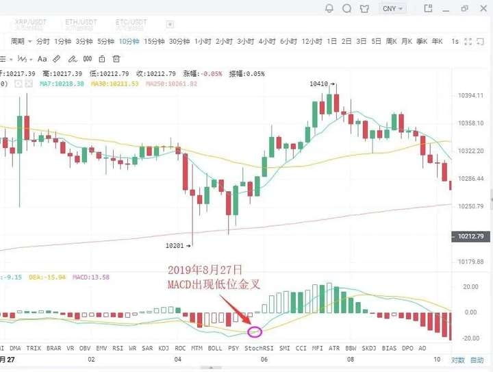
As shown in the figure: On August 27, 2019, in the BTC 10-minute K-line chart, with the price's pullback, a low-level golden cross appeared, followed by a rebound of $200. Short-term investors can grasp the timing to enter.
Situation two: Buying point of golden cross near the zero axis.
If an upward trend has formed, and the golden cross of the DIFF line and DEA line occurs near the zero axis, this is often an excellent buying opportunity for investors.
This is because once an upward trend is formed, a golden cross near the zero axis indicates that the adjustment phase has completely ended, and a new round of upward movement has begun. If it is also accompanied by a golden cross of the volume line, it indicates that the price's rise is supported by trading volume, making the buy signal even more reliable. Once this buying point appears, investors should not miss it; otherwise, they will miss a significant upward trend.
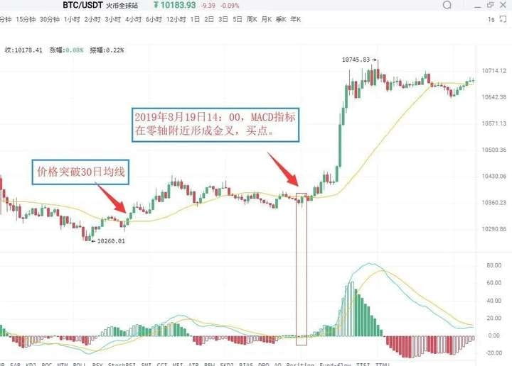
As shown in the figure: On August 19, 2019, at 09:30, in the BTC 5-minute K-line chart, Bitcoin broke through the 30-day moving average, indicating that an upward trend had initially formed. For a period afterward, the price almost continuously ran above the 30-day moving average. On August 19, 2019, at 14:00, the MACD indicator formed a golden cross near the zero axis, indicating that the market is about to experience a significant upward trend. Investors can buy decisively.
Situation three: Buying point of high-level golden cross.
If the golden cross of the DIFF line and DEA line occurs above the zero axis and is far from the zero axis, this golden cross is called a high-level golden cross. High-level golden crosses usually appear in...
In the consolidation trend during the K-line upward process, it indicates that the consolidation has ended, and the K-line is about to continue the previous upward trend. Therefore, once a high-level golden cross appears, it is a good signal to increase positions. In practice, when an upward trend is formed, and the K-line rises slowly and continues for a long time, once the MACD indicator forms a high-level golden cross, it often indicates that the K-line is about to accelerate upward. For this reason, high-level golden crosses can also be used for wave operations. Investors can use the MACD indicator to continuously target upward waves in an upward trend.
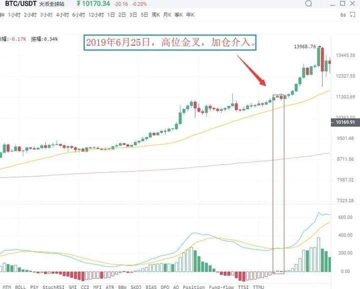
As shown in the figure: On June 25, 2019, in the BTC 3-hour K-line chart, the price of Bitcoin was in an upward trend, and after a consolidation, it rose again, while the MACD indicator showed a high-level golden cross. This indicates that the pullback has ended, and the price will continue its previous upward trend. Investors should pay attention to seizing this buying point.
Situation four: Selling point of low-level death cross.
A low-level death cross refers to a death cross that occurs far below the zero axis. This kind of low-level death cross often appears at the end of an upward rebound in a downward trend, thus it serves as a sell signal at the end of the rebound. At this time, investors without positions should be cautious and observe, while those who are deeply trapped may consider selling first, and then buying back after the price drops to reduce costs.
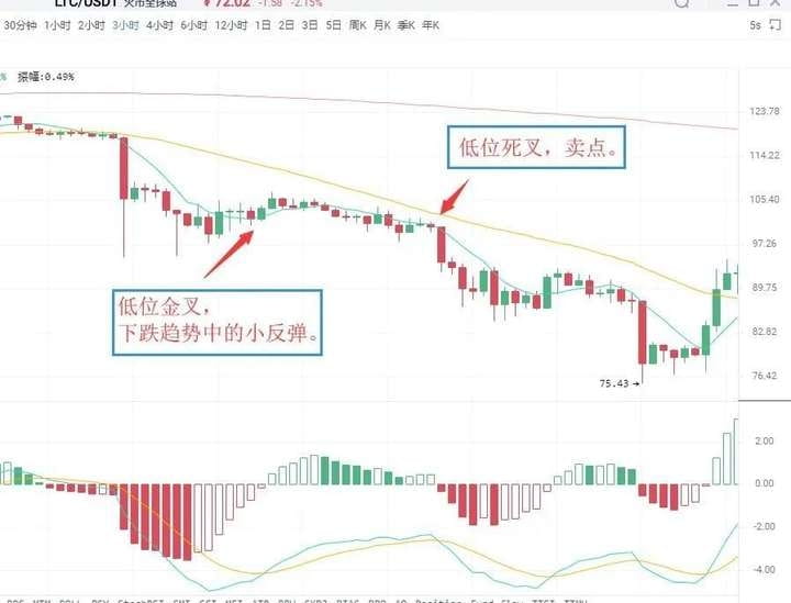
As shown in the figure: On July 14, 2019, in the LTC 3-hour K-line chart, the MACD indicator of Litecoin appeared a low-level golden cross, resulting in a slight price rebound, followed by a rapid decline. Subsequently, the MACD indicator appeared a death cross below the zero axis, after which the K-line began a new downward trend. Spot investors can sell at the death cross position and then buy back to reduce the holding cost.
Situation five: Selling point of the death cross near the zero axis. If the previous market direction has been a downward trend, the cross formed by the DIFF line breaking below the DEA line near the zero axis is referred to as a death cross near the zero axis. It indicates that the market has accumulated considerable downward momentum near the zero axis, and the appearance of a death cross suggests that the downward momentum is beginning to be released, and the K-line will continue its original downward trend, serving as a sell signal.
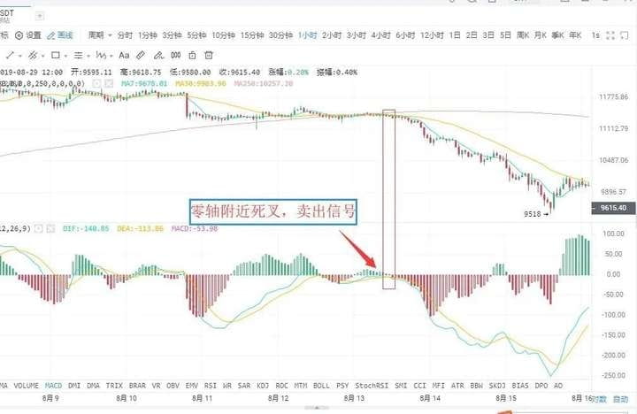
As shown in the figure: On August 12, 2019, in the 1-hour K-line chart of BTC, the DIFF line of Bitcoin broke below the DEA line, forming a death cross near the zero axis. This indicates that the market's downward momentum is beginning to be released, serving as a sell signal. Investors should decisively sell their positions; otherwise, they will face deep entrapment.
Situation six: Selling point of high-level death cross.
When the DIFF line breaks downward through the DEA line at a distance above the zero axis, it is referred to as a high-level death cross. This type of death cross pattern is sometimes accompanied by the MACD's top divergence. It presents as: during a sustained upward movement, the price continuously creates new highs, but the MACD indicator's DIF line and DEA line no longer continue to rise or attack but diverge from the price trend, gradually moving downward.
Above the zero axis, when the DIF line crosses downward through the DEA line, it forms a downward crossover pattern, which is considered a death cross and is a relatively reliable sell signal.
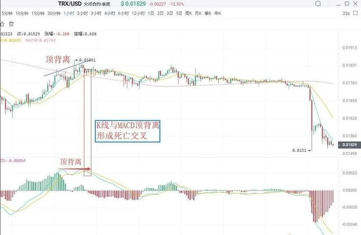
As shown in the figure: On August 23, 2019, in the TRX 1-hour K-line chart, after the TRON coin rose in a wave, the price continued to reach new highs, but the DIF line and DEA line no longer continued to rise and then formed a death cross, signaling a sell.
04
Divergence between MACD and K-line.
Divergence is a term used in physics to describe momentum; in technical analysis, it is a highly successful and widely applicable analysis method. In a downward trend, when the price creates a new low, but the indicator line does not, this is called a bottom divergence, indicating that upward momentum is accumulating.
It is a buying signal. In an upward trend, when the price creates a new high while the indicator line does not, this is called a top divergence, indicating that downward momentum is accumulating, serving as a sell signal.
I. Bottom divergence.
Bottom divergence between the MACD histogram and the DIFF line.
The bottom divergence between the DIFF line and price refers to a situation in a downward trend where the price creates a new low while the DIFF line does not. It indicates that during the price decline, the drop in the DIFF line is less than that of the price, and the upward momentum in the market is continuously accumulating, suggesting a high probability that the price will stop declining and rise in the coming period.
The MACD histogram is the MACD bar hidden behind the DIFF line, divided into red and green. Its divergence from the price is an important application of the MACD indicator, widely used in practice. The bottom divergence between the MACD histogram and price refers to when the price creates new lows in waves, while the MACD histogram does not follow suit. The upward momentum in the market is accumulating, and the price is about to stop declining, suggesting a high probability of a rise in the upcoming period.
When a bottom divergence occurs, investors can grasp specific buying points in two ways.
Specific buying opportunities.
The bottom divergence between the DIFF line, MACD histogram, and price is not a specific moment but a pattern that appears over a period. However, when investors seek to buy, it is a specific moment that indicates the price is about to stop declining. Therefore, to grasp specific buying opportunities, when the DIFF line, MACD histogram, and K-line show bottom divergence, investors must combine the bottom divergence with other technical analysis tools to specify the buying point.
First: Histogram changes color or MACD golden cross.
The change in color of the histogram indicates that the market's upward momentum has begun to take advantage. This usually appears after 'the histogram shortens' and, although it may come a while later, it is more reliable. When a bottom divergence occurs, and the histogram successfully changes color or forms a golden cross, investors can buy.
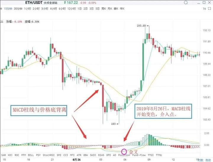
As shown in the figure: On August 26, 2019, in the 15-minute K-line chart of Ethereum (ETH), the price of Ethereum created a new low during the decline, but the MACD histogram did not create a new low, forming a bottom divergence pattern between the histogram and the price. This indicates that the market's upward momentum is beginning to accumulate, and there is a high probability that a wave of upward movement will occur in the price. Immediately afterward, the histogram changed color, and these two sequential buy signals combined further increased the reliability of the upward significance. Investors can enter when the histogram changes color.
Second: Combine bottom divergence with other technical analysis tools and K-line reversal patterns, such as 'single needle probing bottom' or 'three soldiers at the bottom,' which is precisely the practical application of the 'multiple indicators combination' principle.
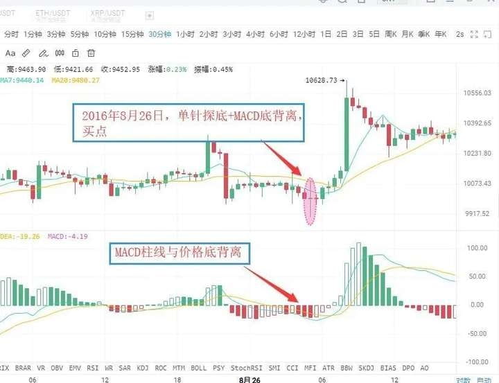
As shown in the figure: On August 26, 2016, in the BTC 30-minute K-line chart, the price of Bitcoin reached a new low, but the MACD histogram did not create a new low, forming a bottom divergence pattern between the histogram and price, indicating a continuous strengthening of the market's upward momentum. Accompanied by the price's dip stopping, it formed a buying signal of 'MACD histogram and price bottom divergence + K-line single bottom probing.' After that, the price experienced a wave of upward movement.
II. Top divergence.
Top divergence between the MACD histogram and the DIFF line.
The top divergence between the MACD histogram and K-line refers to a situation in an upward trend where the price creates a new high, but the MACD histogram does not. It indicates that the downward momentum in the market is accumulating, and the price may drop at any time.
The top divergence between the DIFF line and K-line refers to a situation where, in an upward trend, when the price creates a new high, the DIFF line does not create a new high. It indicates that the market's downward momentum is continuously accumulating, and there is a significant probability that the price will experience a wave of downward movement. The specific selling timing is similar to that of bottom divergence; in practice, according to the principle of multiple indicator combinations, investors can combine the following methods to make the sell signal more specific.
First: Histogram changes color or MACD death cross.
After the MACD histogram and K-line form a top divergence, if the histogram suddenly shortens significantly, it indicates that the market's downward momentum is beginning to be released. Investors should pay attention to selling in a timely manner. The change in color of the MACD histogram indicates that the market's downward momentum has gained an advantage, usually appearing after the histogram continually shortens. If after the top divergence between the histogram and K-line, there is a change in color of the histogram or a MACD death cross, investors should pay attention to exiting in a timely manner.
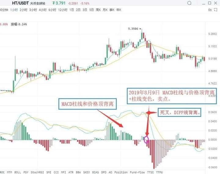
As shown in the figure: On August 9, 2019, in the 1-hour K-line chart of HT, the Huobi price reached a new high, but the MACD histogram did not create a new high, forming a top divergence pattern between the histogram and the price. This indicates that the market's downward momentum is beginning to accumulate, and the price may soon experience a wave of downward movement. Subsequently, the MACD histogram changed from red to green, issuing a sell signal of 'histogram and price top divergence + histogram color change'. Investors should pay attention to exiting in a timely manner.
Second: Combine with other technical analysis tools and K-line reversal patterns. After the MACD histogram and price top divergence occurs, if other technical analysis tools also simultaneously show sell signals, the reliability of the market sell signal will greatly increase. At this time, investors should pay attention to exiting decisively. Common sell signals of this type include 'histogram and price top divergence + K-line reversal pattern', etc.
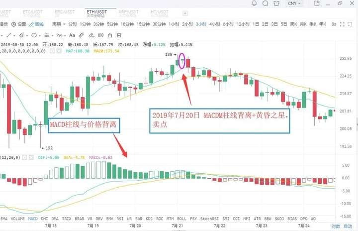
As shown in the figure: On July 20, 2019, in the ETH 3-hour K-line chart, the price of Ethereum reached a new high, but the MACD histogram did not create a new high, forming a top divergence pattern between the histogram and price. This indicates that the market's downward momentum is continually increasing, and the price may experience a wave of downward movement. Subsequently, the MACD histogram gradually shortens, while the K-line forms an evening star bearish pattern. Investors should pay attention to exiting in a timely manner, after which the K-line experienced a significant downward trend.
05
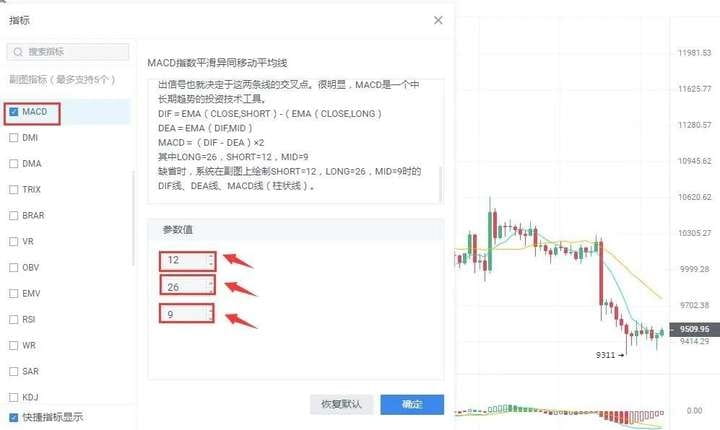
Modification of MACD parameters.
The lag in responding to price changes sometimes makes buy and sell price levels not ideal, which is a defect of the MACD indicator. One way to address this is to adjust the indicator parameters, making the MACD indicator react more sensitively to trends, thereby allowing buy and sell price levels to be more favorable. In commonly used market analysis software, the default parameters for the MACD indicator are 12/26/9. Under this parameter setting, the MACD indicator's response to price changes often shows obvious lag. The lag of the MACD indicator can be addressed by adjusting parameters. Common parameter combinations include 5/34/5, 5/10/30, etc. Investors can also try and discover more in practice.
//////////
Evening Star: During the rising process of the K-line, a longer bullish candle appears first, followed by a shorter candlestick (either bullish or bearish) the next day, which people metaphorically refer to as a star; this constitutes the main part of the K-line combination. The third candlestick is a longer bearish candle that penetrates deeply into the body of the first candlestick. The evening star is a signal that the price has peaked and is about to retrace, with some predicting an accuracy rate of over 80%.
Finally, those who have been through the rain tend to want to hold an umbrella for others. Having experienced days of isolation and helplessness, they empathize with others' losses. They want to lend a helping hand, hoping to make up for the regret of wanting to be pulled up back then, as if to shield their past selves who were caught in the rain.
This is also my original intention to share, hoping to help many retail investors avoid some detours!
To help everyone avoid detours, I am also sharing my insights gathered from ten years of trading cryptocurrency, hoping that those destined to see this will take it seriously. Whether you are a beginner or an experienced trader, regardless of your wealth or level, it will help you. Friends who find my sharing useful can forward it to those around them to benefit more people!
No matter how diligent a fisherman is, he will not go out to sea during a stormy season but will carefully guard his fishing boat. This season will eventually pass, and a sunny day will come! Pay attention to Yan An, who will teach you to fish as well as how to fish. The cryptocurrency world is always open, and only by going with the trend can one have a life in tune with the trend. Keep this in mind and remember it!
