Many people hold on when the market falls and can't hold on when it rises. It might be a good idea to seriously understand these nine patterns; you never know when they could come in handy.
As always, please like, bookmark, or comment 888 to show your support. Mulan shares stock trading insights every day to make sure you can find them later when you want to review. This issue is simple and practical, easy for beginners to understand.
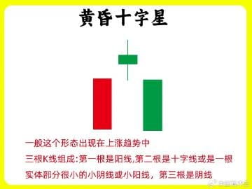
1. Evening Star
At a high stock price, the first candlestick is still a medium to large bullish candle in an upward trend, the second candlestick has long upper and lower shadows with a very small body. Here's a detail: the longer the upper and lower shadows, the greater the divergence at that moment. By the close, the market is in balance. The third candlestick is a bearish candle, and the closing price is lower than that of the star; the greater the decline, the stronger the bears. Overall, this represents a transition from bulls to balance and then to bears. So we often say that each candlestick represents a battlefield of bullish and bearish contention.
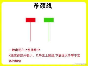
2. Hanging Man
It can only be called a Hanging Man when it appears at the end of an uptrend and the beginning of a downtrend. The lower shadow is very long, and the body is very small, several times smaller than the lower shadow. The longer the lower shadow, the stronger the bearish force. The bullish force begins to weaken, and the overall shape and logic are similar to a Evening Star. The Hanging Man can be either a bearish or bullish candle, but the bearish candle is often stronger than the bullish one.
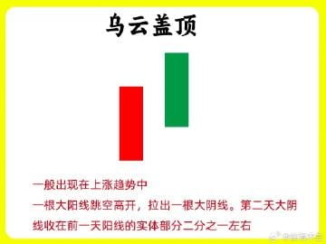
3. Dark Cloud Cover
At the end of an uptrend, the first candle is a medium to large bullish candle, continuing the previous trend. The next day opens high and closes low, with the closing price directly breaking below half of the bullish candle or more. The larger the drop, the stronger the bearish force. If this occurs after a significant rise, the main force has already begun to sell off.
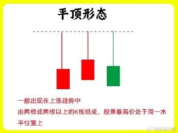
4. Double Top Pattern
When the stock price is high, multiple candles reach the same price range with very little deviation, at least two candles, and the trading volume below starts to gradually decrease. This indicates a significant lack of upward momentum, and it cannot continue to break through, facing strong resistance above.
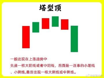
5. Head and Shoulders Top
After a significant rise in stock price, a medium to large bullish candle appears, and the market remains relatively strong. The next day, a series of small bearish and bullish candles emerge, followed by a decline in stock price. This pattern requires more than 7 candles to form, and once formed, it indicates that the stock price is building a top.
6. Rounded Top Pattern
The stock price forms a rounded curve at a high position, usually consisting of small bearish and bullish candles or doji. It suddenly gaps down, leaving a downward gap, and the downward trend begins, which is the rounded top pattern. The entire formation resembles an island reversal pattern, also having a gap. The gap represents support and resistance, indicating a force.
7. Two Black Gaps
On the day after a medium to large bullish candle, a bearish candle opens high and closes low. On the third day, another bearish candle opens high and closes low, wrapping the second day's bearish candle. Moreover, the gap did not break down during the high open and low close. This is the Two Black Gaps pattern, indicating that the upward momentum is starting to weaken, and the market is showing divergence.
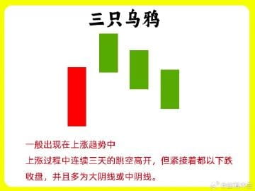
8. Three Black Crows
This pattern is familiar to everyone. At the end of an uptrend, three consecutive bearish candles appear, with continuously lower lows, and the bodies are relatively long, with almost no upper or lower shadows. The three consecutive bearish candles indicate significant selling pressure, and the trend has begun to change.
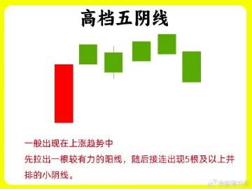
9. High Five Bearish Candles
In an uptrend, a relatively long bullish candle appears first, followed by consecutive bearish candles the next day. It may not necessarily be five bearish candles; there may be more, and they are declining on reduced volume. We need to be cautious; the upward momentum is insufficient, and the main force is secretly selling off.
Alright! These are the nine common top patterns we see. Below, I have prepared nine case charts that will help you understand the patterns in the article at a glance. Remember to keep them in mind. I hope this content helps or inspires you. Don't forget to like and share it. See you in the next issue.