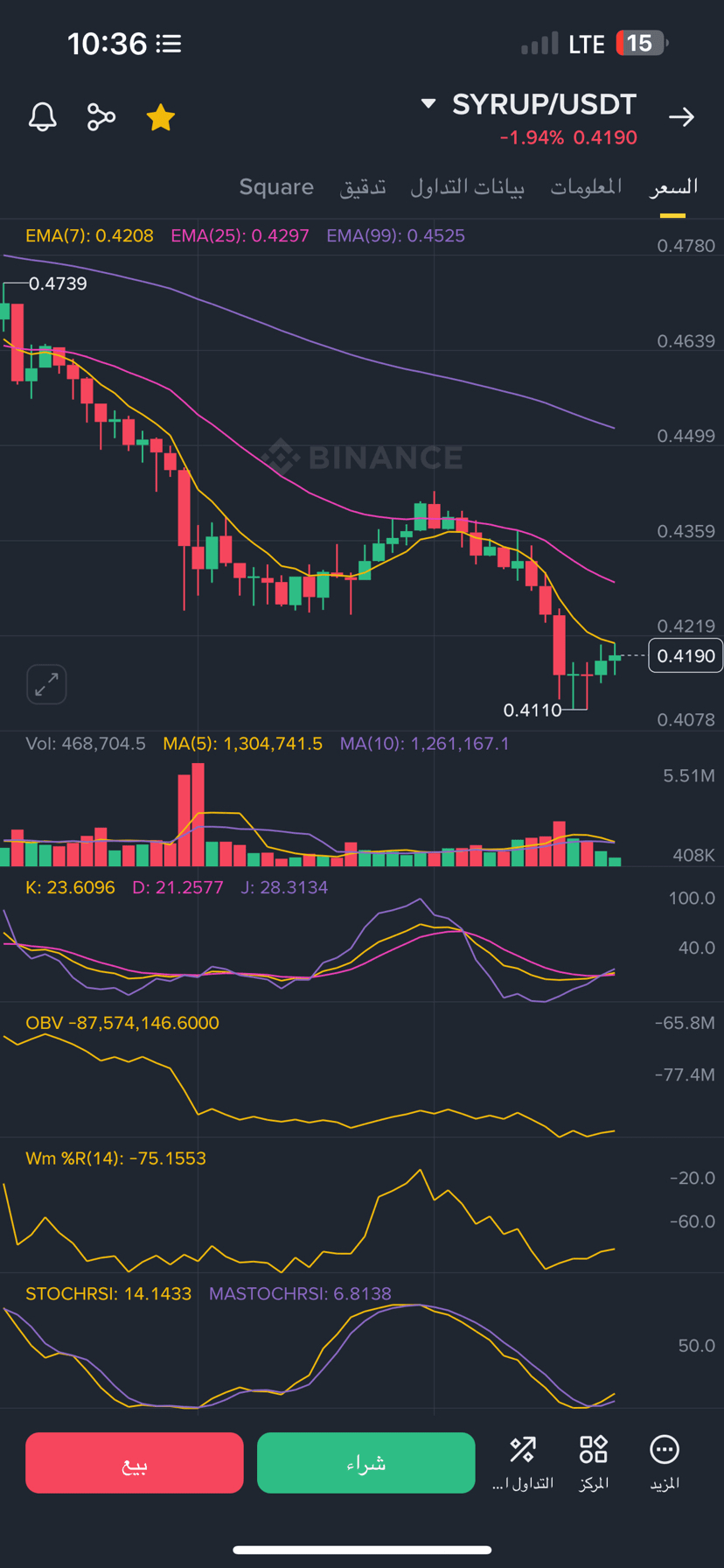
We will take a screenshot of the #syrup coin
And it explains the lines
First: In the price chart (top)
- Yellow line EMA 7: Average price of the last 7 candles, short-term and follows price movement quickly.
- Pink line EMA 25: Average price of the last 25 candles, medium-term and gives a clearer picture of the trend.
- Purple line EMA 99: Average price of the last 99 candles, long-term and shows the general trend of the market.
---
Second: In the trading volume chart
- Yellow line MA 5: Average trading volume of the last 5 candles.
- Purple line MA 10: Average trading volume of the last 10 candles.
- The rise of these lines with large candles indicates strong liquidity entering or exiting.
---
Third: Volatility Indicators
1. Slow Stochastic Indicator (K, D, J)
- K Yellow, D Pink, J Purple.
- If they are below level 20 → Oversold (possible bullish reversal).
- If they are above 80 → Overbought (possible decline).
2. OBV (On-Balance Volume) Yellow
- Measures liquidity flow.
- If it rises with the price → Confirmation of the uptrend.
- If it decreases with the price → Confirmation of the downtrend.
3. Williams %R Yellow
- Measures overbought or oversold conditions.
- Below -80 → Oversold.
- Above -20 → Overbought.
4. Stochastic RSI
- Yellow line STOCHRSI and purple line MASTOCHRSI.
- Below 20 → Oversold.
- Above 80 → Overbought.