What is a trend line?
In the financial market, a trend line refers to a diagonal line drawn on the chart. The trend line connects specific data points, allowing chart experts and traders to easily understand price movements and grasp market trends.
Trend lines are considered one of the foundational tools in the field of technical analysis (TA) and are widely used in the stock, fiat currency, derivatives, and cryptocurrency markets.
Essentially, the principle of trend lines is similar to support and resistance levels, but trend lines are composed of diagonal lines rather than horizontal lines. Therefore, trend lines have positive and negative slopes. Generally, the steeper the slope, the more pronounced the trend.
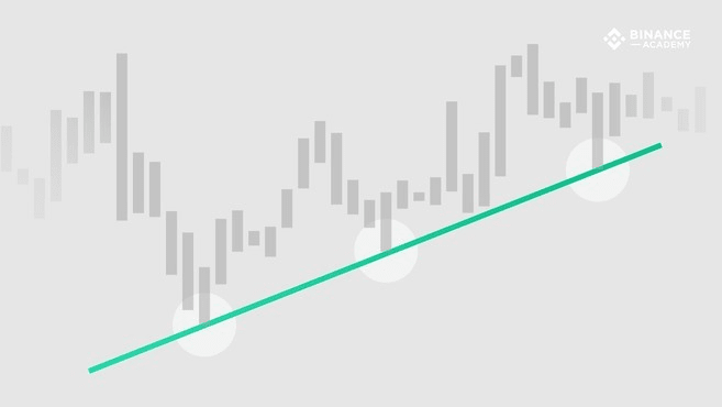
We can categorize trend lines into two basic types: upward (bullish trend) and downward (bearish trend). As the name suggests, an upward trend line is drawn from the lower points of the chart to the higher points. This line connects two or more points, as shown in the figure below.
A downward trend line, on the contrary, is drawn from the high points of the chart to the low points. This line connects two or more points.
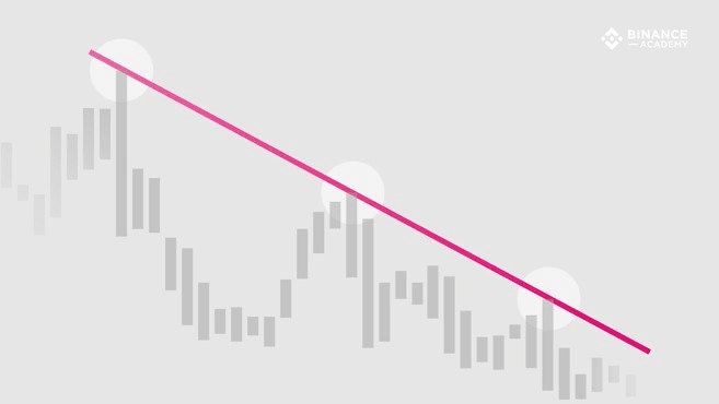
Thus, the difference between the two types of trend lines lies in the selection of points for drawing the trend line. In an upward trend, the trend line is drawn using the lowest points in the chart (where the candlestick chart forms higher lows). On the other hand, a downward trend line is drawn using the highest values (where the candlestick chart forms lower highs).
How to use trend lines
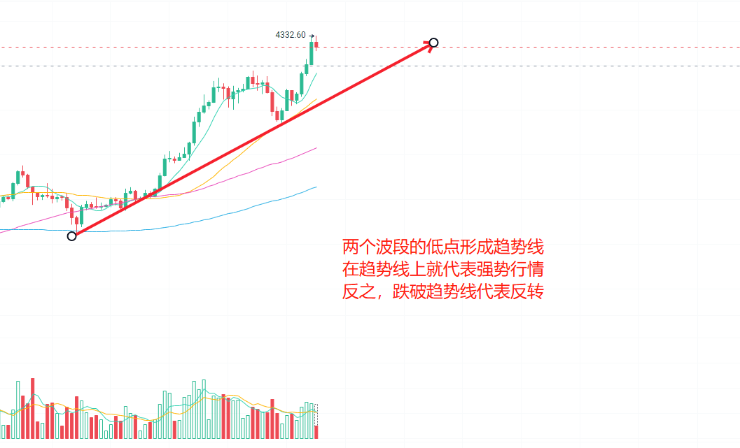
By observing the highest and lowest prices on the chart, trend lines will show the points where prices briefly impact the main trend, returning to favorable positions after testing. Trend lines can be extended to predict various key levels in the future. As long as they have not broken the critical point, trend lines that withstand multiple tests hold analytical value.
Although trend lines can be applied to various types of data charts, in reality, their application is most widespread in financial charts (based on market prices). This is because trend lines allow relevant parties to gain insights into market supply and demand conditions. Undoubtedly, an upward trend line represents a continuous increase in purchasing power (demand exceeds supply), while a downward trend line indicates a persistent decrease in prices, signifying a continuous decline in purchasing power (supply exceeds demand).
However, when analyzing, trading volume must also be taken into account. For example, if prices rise but trading volume declines or remains relatively low, it may create an illusion of inflated demand.
As mentioned earlier, trend lines can be used to grasp the specifics of support and resistance levels, which are two fundamental concepts very important in technical analysis. An upward trend line shows support levels, where prices are unlikely to fall below the support level. Conversely, a downward trend line shows resistance levels, where prices are unlikely to rise above the resistance level.
In other words, if the stock price breaks through the support or resistance level, whether it is a downward breakthrough (for upward trend lines) or an upward breakthrough (for downward trends), the market trend no longer holds analytical significance. In many cases, if these critical levels cannot stabilize the trend, the market often changes direction.
Nevertheless, technical analysis is a relatively subjective field, as everyone often employs different methods when drawing trend lines. Therefore, it is essential to combine various technical analysis methods with fundamental analysis to effectively reduce risks.
Drawing analytically meaningful trend lines
From a technical perspective, a trend line can connect only two points in the chart. However, most chart experts agree that a trend line must connect three or more points to have analytical value. In some cases, the first two points can show potential trends, while the third point (extended into the future) can test its validity.
Therefore, if the price touches the trend line three times or more without breaking the critical point, that trend can be considered analytically valuable. Multiple tests of the trend line indicate that the trend may not merely be a coincidence caused by price fluctuations.
Scale settings
When drawing trend lines, in addition to selecting enough points to give the trend line analytical significance, it is also necessary to consider appropriate setup factors. Among them, the most important chart setting is the scale settings.
In financial charts, the specific scale may depend on how the displayed prices change. The two most commonly used scales are arithmetic scale and semi-logarithmic scale. In an arithmetic chart, price movement on the Y-axis can clearly display variability. On the other hand, a semi-logarithmic chart reflects fluctuations in percentage form.
For example, in an arithmetic chart, the price movement from $5 to $10 is equal in segment distance to the movement from $120 to $125. In a semi-logarithmic chart, a 100% gain (from $5 to $10) will take up a larger space on the chart, while the movement from $120 to $125 only reflects a 4% increase.
When drawing trend lines, it is essential to consider the scale settings. Different types of charts may yield different high and low prices, and therefore, trend lines may vary slightly.
Summary
Although trend lines are a powerful tool in technical analysis, they are not infallible. The points selected for drawing trend lines may affect their accuracy in reflecting market cycles and actual trends, to some extent being subjective.
For example, some chart experts only consider the body of the candlestick chart when drawing trend lines, ignoring the wicks. Others draw trend lines based on the highest and lowest prices of the wicks.