👋 Hey there, crypto explorer!
If you've ever looked at a crypto chart and thought,
"What the heck is that green-and-red Lego block mess?"
You're not alone. 😅
That "mess" is actually a candlestick chart, and once you learn how to read it, you'll never look at price the same way again. Candlesticks help you see the mood of the market, spot trends early, and make smarter trading decisions. 🧠💰
Let’s break it down—: no fluff, no stress, just real talk.
🕯️ What’s a Candlestick Chart, Anyway?
A candlestick chart is a fancy way of saying:
"Here's what the price did during a specific time."
Each candle shows you 4 things:
Open: Where the price started
Close: Where the price ended
High: The highest it went
Low: The lowest it dipped
⏳ Time frame? That’s up to you. You can look at 1-minute candles, 1-hour, 1-day... even 1-week. (Most newbies start with 1H or 1D.)
🧱 Anatomy of candles
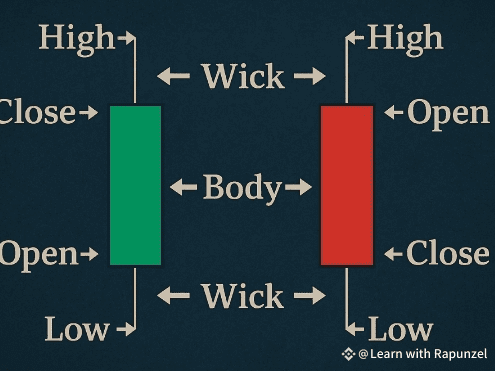
If the Close > Open, it's a green candle (price went UP 📈)
If the Open > Close, it's a red candle (price went DOWN 📉)
👀 Real Talk: Why Candles Matter in Crypto
Candlestick charts show you:
🧠 Market psychology: Fear, greed, hesitation—it’s all in there
🔍 Price patterns: Clues to what's coming next
📊 Support & resistance zones: Where price often bounces or breaks
💡 Common Candlestick Patterns You’ll Want to Know
Here are a few patterns that can help you spot trends or reversals:
1. Doji – 🧘 Market is unsure
Small body, long wicks. Price opened and closed at the same level. Expect volatility.
2. Hammer – 🔨 Bullish reversal
Looks like a lollipop. Appears after a downtrend—might mean price is about to bounce up.
3. Shooting Star – 🌠 Bearish reversal
Upside-down hammer. Appears after an uptrend—could signal a drop.
4. Bullish Engulfing – 💪 Buyers taking over
A small red candle gets fully “eaten” by a big green candle.
5. Bearish Engulfing – 😨 Sellers taking control
A small green candle gets crushed by a larger red one.
🧪 Try It Yourself: Look at a Real Chart
Head to Binance Advanced Trading View 👈
Switch to Candlestick View
Pick a time frame (start with 1H or 4H)
See if you can spot:
Green and red candles
Long wicks = price rejection
Patterns like hammers or engulfing
👇 Here's a screenshot to help:
(Add screenshot of Binance candlestick chart here)
⚠️ Quick Tips for Beginners
✅ Don’t overanalyze every candle—look for patterns and context
✅ Always check the trend before trusting a pattern
✅ Combine candles with indicators (like RSI or volume) for better accuracy
✅ Practice makes confidence—use Binance’s demo or low-stakes trading to learn
🔁 TL;DR – Candlestick Charts Made Easy
Candles = mini price stories
Green = price went up | Red = price went down
Body shows Open & Close; wicks show High & Low
Patterns like Doji, Hammer, and Engulfing help predict market direction
Use them on Binance with your fave crypto pairs
🧠 Remember: Candlestick charts don’t predict the future—but they do help you understand the present. And the more you learn, the better your trading instincts become.
Now go look at some candles 🔥

