If the previous Binance App @binance was a 'toolbox,' the new UI has now evolved into a Web3 trading cabin exclusively for you.
As someone who has been active on-chain for a long time, accustomed to monitoring the market daily and striking at any moment, I had no expectations for 'app updates.' After all, most updates are just optimizing bugs or slightly adjusting color blocks, neither painful nor beneficial.
But this new version of Binance is truly a 'complete transformation' in terms of experience dimension—it's not a fine-tuning, but a shift from 'you are using Binance' to 'Binance is serving you.'
Organizing your trading entrance like tidying your desk.
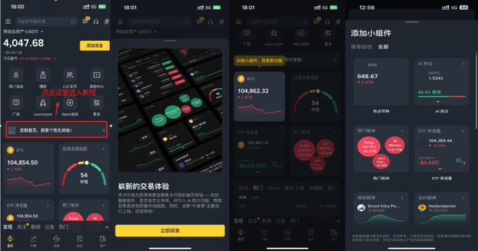
When you open the new version of the app, the most intuitive change is that the homepage is no longer a 'cookie-cutter interface' but has transformed into a draggable, removable, and sortable widget panel.
Feelings summed up in one sentence: You are using Binance, but this time it's your own Binance.
For example, I personally like:
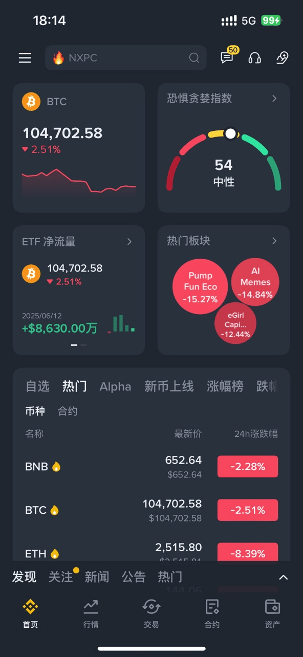
The first row displays the real-time BTC/K-line chart + market sentiment index.
The second row is ETF fund flows + popular sectors.
The third row shows selected, mainstream, and alpha coin price increases.
The whole experience feels a bit like organizing your iPhone desktop, where each module can adjust in size and position. Want to add something? Just click '+'. Want to delete something? Long press and swipe. No more jumping back and forth between multiple tabs; it truly achieves 'one screen does it all.'
What's even better is that each component has its own independent function page; there's no feeling of getting lost when you click something and jump to another menu. It's very suitable for users who are used to quick actions. There are also other features like spot trading, contract tracking information, and financial management sections that you can explore.
You can't have an upgrade without AI.
The crypto space is never short of hot topics, but what you lack is the ability to filter out the truly noteworthy hotspots.

The 'AI Hot Discussion' feature added in the new version of the app can be considered the most 'intelligent' module in this upgrade. It integrates multiple signal sources, including Binance Square, KOL social content, on-chain movements, etc., using algorithms to automatically identify projects with a surge in discussions over a recent period, and directly lists the sentiment data of the tokens.
It's like having a 24/7 intelligence analyst who actively tells you: 'These two projects are hot right now, you might want to check them out.'
If the DIY homepage is your 'visual dashboard,' then AI Hot Discussion is your 'navigation radar,' constantly monitoring market fluctuations.
Previously, I would check the greed index on Site A, look at ETF inflows and outflows on Platform B, and browse hot sentiment on X and Discord, resulting in often chaotic, repetitive, or even delayed information. Now, all these data dimensions have been integrated into one app, improving efficiency while reducing judgment errors caused by data fragmentation.
Especially in high-volatility markets, the new UI gives you a sense of 'control': all key data and entry points are on one screen, shortening the information decision chain and speeding up response time.
From 'tool-like' to 'participatory,' the real transformation of the Binance App.
This UI upgrade is not just about stacking functions, but a deep refinement around 'personalization + high efficiency.' You are no longer looking for functions but using an assistant that fits your behavioral habits; it understands you, assists you, and gradually adapts to you as you use it.
For me, the current Binance App is no longer just a 'trading software' but my 'on-chain workstation' + 'hot radar station' + 'asset scheduling system.'
#币安新UI