After trading stocks for so long, this is the only point I want to share, and I believe it is the most important: Chip Distribution! The only golden rule to restrain the main force—chip distribution.
No method is perfect; each method has its strengths and weaknesses. Those who seek a perfect trading method will ultimately be disappointed.
Traders who consistently profit understand that they must stick to their advantageous aspects while avoiding disadvantages. This is the 'rule of adhering to advantageous strategies'. Only traders who comprehend this principle can begin their journey towards stable profits.

Part One: Meaning and Forms
1. What is Chip Distribution?
Chip distribution, as the name suggests, is an indicator for analyzing chip distribution. It is an effective tool for helping us conduct cost analysis because it allows us to see others' holding costs, thereby judging whether our buying price is too high. It is similar to playing hide-and-seek with your opponent—seeing through their costs and then deciding whether to trade at that price. This is undoubtedly a game theory mindset, so chip distribution actually showcases a dynamic game process.
Additionally, chip distribution has three major characteristics that differ from traditional indicators like MACD and KDJ. First, traditional indicators have a fixed display shape, while chip distribution can vary in presentation across different software. Due to the lack of uniformity in shape, there is not much training available for this indicator in the market. Another point is that foreign software seems not to have the concept of chip distribution; this indicator was created within the domestic A-share market environment. Yet, chip distribution is a standard indicator across all domestic software, holding significant meaning. Thirdly, chip distribution cannot be found in standard definitions like MACD on Baidu Encyclopedia. Our definition is derived from practical understanding, aiming to facilitate learning and comprehension.
We believe that chip distribution is centered around the cost of trading positions, utilizing algorithms to simulate the cost distribution of different shareholders' holdings. First, we emphasize that it is a simulation algorithm, not something that can genuinely reveal everyone’s holding costs, as no one would openly allow you to tally their accounts. The holding costs of stocks are generally in the areas of previous highest and lowest trading positions. This indicator simulates the corresponding chip shapes through varying cost distributions. Thus, we say it simulates holding cost distribution. Finally, the reason it centers on the cost of trading positions is that chips are not static; the process of chips gradually moving upwards from below is actually a continuous trading process that brings about chip turnover. In the figure, a stock originally has a chip distribution in shape (1), but then shareholder B sells 3 shares to a chasing buyer D when the stock price rises to 14 yuan, transforming the chip distribution into shape (2).

Thus, chip distribution is not static; it is a dynamic game process where chips flow between different investors. This indicator simulates the evolution of holding cost through continuous trading, ultimately modeling the cost distribution of chips.
Finally, I want to emphasize that chip distribution is used to solve the issue of stock holding cost structure. Simply put, know yourself and your opponent; understand your costs and want to know your opponent's costs as well. Is your buying cost higher or lower than most people's, and by how much? For instance, Moutai is well known as a good stock, but looking at the chip distribution, most chips are below 1200 yuan. So, if you buy at 1800, what is the point? Similarly, if you see a stock that has trapped positions from 10 yuan to 20 yuan, are you looking to be the 'liberation army'?

2. Chip Distribution Indicator Patterns
The chip distribution indicator can be understood through color, peak value, related concepts, and the common patterns listed below.
1. Color and Peak Value

From a color perspective, as shown in the figure, the green part represents the loss area, indicating that the costs of these chips are higher than the current stock price; the red part represents the profit area, where the costs of these chips are lower than the current stock price. The two are separated by a yellow line, which represents the chip center of gravity—the weighted average price of all chips. For example, if a group of chips is distributed around 5 yuan and another around 10 yuan, the final average center of gravity could be just over 7 yuan.
From the peak perspective, the most obvious aspects are peak tops and peak bottoms. The more chips there are in a certain cost area, the longer the length will be, and the longer positions are referred to as peak tops, while the relatively shorter positions form the peak bottoms. The chip distribution of the same stock can have multiple peak tops and multiple peak bottoms. Of course, regarding peaks and troughs, not all stocks will have peaks and troughs in any situation; sometimes it's challenging to describe where the peaks and troughs are, or it may not be necessary to distinguish them, and we should consider the overall picture.
2. Related Concepts (Profit/Trapped Position Ratio, Chip Concentration Degree, Chip Divergence Rate)
① Profit (Trapped) Position Ratio

The so-called profit position ratio refers to the proportion of profitable parts within the total cost, and the trapped position is analogous. It is worth noting that when hovering over a certain K-line, the profit ratio on the chip distribution indicator is calculated based on that day's closing price, meaning the proportion of profit positions are below that day's closing price. As shown in the figure, the profit ratio is 94.38%, indicating that below the current price of 261.15, there are a large number of profit positions. Currently, over 94% of shareholders are making money.
Another concept used more often is the profit ratio marked by the yellow line at xxx in the screenshot above. In practice, we more often look not at the profit ratio at the closing price but instead move the mouse up and down to calculate the profit and trapped positions in each range. This is the method we should most commonly use. For example, moving the mouse to 132.63 yuan in the screenshot shows a profit ratio of only 36.82%. This indicates that most people (60-70%) actually have a buying cost above 132 yuan. Therefore, if you buy at the current price of 261, your cost is significantly higher than that of everyone else. In summary, do not rigidly view the profit ratio at the closing price but should analyze it by moving the mouse.
② Chip Concentration Degree

Concentration levels are generally observed at 90% and 70% of chip concentration. If 90% of the chips are concentrated in a narrow range, the value will become very small, indicating high concentration. For example, in the figure above of Baiyun Airport, 90% of chips are concentrated in the range of 12.96-17.50, with a concentration value of 14.88. Meanwhile, 70% of the chips are concentrated in the range of 13.78-15.96, with a concentration value of 7.31, both indicating that the stock was relatively concentrated at that time. Generally, a concentration degree value of 70% reaching below 10 is relatively easy to achieve, but if the 90% concentration degree value is below 10, it becomes difficult. Once both concentration values are below 10, it indicates a high level of concentration, potentially signaling that the main force has completed accumulation. Conversely, if both values are relatively high, it suggests that the chips are more dispersed, meaning some investors have a holding cost of 100, while others have costs of 500, indicating that the chip distribution is not concentrated.
③Chip Divergence Rate
The calculation of chip divergence is the degree of deviation of the current stock price from the chip center of gravity. High chip divergence is a risk signal because it indicates that the stock price is striving to rise while the chips are not following suit, representing a locked-up rise. Although this is generally caused by high control, one should also note the principle of extremes; when the stock price rises to a certain extent, there is a high profit position below, which may lead to profit-taking pressure. As shown in the case, after three consecutive bullish days, on the fourth trading day, the stock price surged to 8.38, and the chip distribution indicator showed that the profit position at this point was 100%, indicating that everyone was either making money or breaking even. Meanwhile, the chip divergence rate reached as high as 11.79, and everyone opted to cash out, resulting in a pullback in the stock price.

3. Several Common Forms of Chip Distribution
The shape of chips is generally described as concentrated or dispersed; this can be observed through chip concentration levels. A very small concentration value indicates concentration, while the opposite indicates dispersion. Thus, concentration and dispersion are relative concepts, not defined by a certain standard concentration value. Additionally, we use peak tops and peak bottoms for judgment. Certainly, not all stocks will form peaks or troughs under any circumstances; sometimes it is difficult or unnecessary to distinctly separate where the peak or trough is and focusing on the overall situation is preferable.
①Single Peak Concentration
A standard single peak concentration should show chip distribution as an isosceles triangle, as shown in the figure below, indicating that chips are very concentrated, the main force's cost is near the chip center, and there is potential for a breakout. At this point, one can consider entering the market and following the main force to profit.

However, single peaks also come in different types; not all can achieve such a standard complete convergence. More commonly, a single peak may have tails either above or below, or even both. As shown in the figure below, a tail at the bottom means that during the upward movement, one must always be alert for selling pressure. A tail at the top indicates that there are trapped chips that have not yet been sold. Regardless of which type, they are all manifestations of chip dispersion and are not the best choice in practice unless you want to be the one accompanying it as it breaks through the heavy pressure above and occasional selling pressure below.

② Multi-Peak Dispersion
When multiple peaks appear in chip distribution, it indicates severe dispersion, and the space for stock price rises is limited, making it less suitable for entry at this time. This multi-peak state can be further divided into two types. One is as shown in the figure (1), where there is a heavy trapped position above, meaning every time there is an upward force, it will be pushed back like 'whack-a-mole'. The stock currently shows a rebound from a low position, and one can imagine that each peak above is a thick ceiling, resulting in significant selling pressure upon upward movement. The other type, as shown in figure (2), although there is profit support below, overall it is relatively dispersed. This trend stock appears to have unlimited upward space, but as the stock price rises, you will increasingly worry about whether someone will 'pull your leg' from below, causing you to be trapped at a high position, which is referred to as 'the coldness of being at a high place'. Therefore, in general, as long as the chips are dispersed, especially if there is heavy trapped selling above in a multi-peak pattern, it may not be the best option.

③ Double Peak Valley
Double Peak Valley, as the name suggests, presents two chip peaks, with a valley in between them. As shown in the figure below.

The appearance of a double peak dispersion shape is due to significant fluctuations in stock price previously. If it needs to gather chips again to converge into a single peak, the process of shifting from two peaks to one peak will also involve considerable fluctuations in stock price, thereby adjusting and aggregating. At this time, there is no need to worry; as long as you see chips moving towards the peak and valley positions, you can confidently employ a high sell low buy strategy. As shown at position ①, following a significant decline that formed a double peak valley shape, the stock price moved from position ① to position ②, gradually filling the chips from the upper and lower peak tops into the middle valley, with the stock price experiencing wide fluctuations.

Part Two: Four Fundamental Principles of Chip Distribution
1. The upper peak does not move, and the downward trend does not cease.
This means that in a downward trend, the uppermost chips have yet to loosen, indicating that everyone still holds onto the hope of a rebound or reversal, and retail investors are still reluctant to sell. Therefore, the drop will continue until the trapped investors become 'calm as water', cutting losses and selling out, while some buyers enter the market to bottom fish. After a period of low volume, a mild increase in volume will begin, and at this point, the upper chips will shift to the lower positions, signaling the end of the downward trend. (Note: The end of the downward trend does not mean an immediate reversal; there is often a period of bottom building where the chips concentrate again at the bottom. Additionally, it does not mean that all upper chips will disappear; after all, shareholder chips or value investment chips can withstand the ups and downs of trend stocks.) As shown in the figure, when the stock price was at position ①, the chip peak was at a high level, and during the downward journey, it dropped to position ②, where most of the chips had shifted downwards, leaving only a small number of trapped investors holding on. After a rebound, the upper chips basically disappeared, leading to a change in the downward trend starting from position ③. This illustrates the concept of 'when the upper peak does not move, the downward trend does not cease.'

2. Lower Peak Locked, Trend is Not Finished
In an upward trend, to determine whether the upward momentum has peaked, one can observe the chip distribution indicator. If a large number of chips below remain locked or show no signs of loosening, it indicates only temporary profit selling pressure, and after the adjustment, there will still be upward momentum, making a pullback a good opportunity to increase positions. Once the chips have shifted to a high position and concentrated, it indicates that profit positions have been fully distributed, and the chips have been handed over to high-level buyers. At this time, the upward trend is considered ended, and it is crucial to exit decisively. As shown in the figure, at position ①, the stock price is low, and the chip peak is concentrated, indicating that the market is starting. When it reaches position ③, the chips below have transferred upwards, indicating a clear rise in the center of gravity. Position ② represents the mid-upward journey, where a large number of chips are locked below, while some profit positions are sold, leading to a corresponding increase in the upper chip distribution. Subsequently, the market continues to push up, with the chips basically moving to position ③. This pattern illustrates the concept of 'the lower peak is locked, and the trend is not over yet.'

3. Double Peaks Filling Valleys, Buy High Sell Low
In the double peak valley shape, the upper and lower peak tops will gradually move toward the valley position in between. During this process, the stock price will experience significant fluctuations, providing opportunities for high sell low buy actions. Each time the stock price approaches the upper peak, it will encounter selling pressure, as the chip peak demonstrates a pressure effect. Therefore, we can follow the trend and sell high. Conversely, each time the price drops to the lower chip peak, there will be certain support, meaning the chip peak demonstrates a support role, providing us with good low buy opportunities. As shown in the figure at position ①, the obvious double peak valley shape then leads to wide fluctuations in the stock price, ultimately converging to the single peak concentration at position ②, followed by another upward surge. Therefore, during the process of filling the valley from position ① to position ②, employing a high sell low buy strategy is a preferable choice.

4. Chip Concentration, Strengths and Weaknesses Differentiated
Highly concentrated chips are generally considered a good shape, but they need to be divided into two situations: one is bottom accumulation, where the main force is building positions, anticipating a rise; this shape at the end of convergence represents an excellent buying point. The other is concentrated chips at high positions, which require vigilance as there is a possibility of a trend reversal at any time. High concentration at a peak indicates that profit positions and lower chips have been mostly distributed, leaving high-level buyers, meaning that those who continue to chase after the trend are at risk of facing the last bullish line at the top. Therefore, the position of concentrated chips should also be taken into account, as shown in the figure where chips are relatively concentrated at low and high positions, but high-level concentrations indeed indicate a trend reversal.

Part Three: Basic Functional Applications of Chip Distribution
1. Chip Distribution Observes Support and Pressure
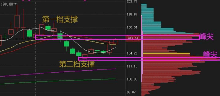
1. Single Peak Concentration, the upper edge of the chip peak serves as support.
Single peak concentration, where the upper edge of the chip peak serves as typical support, but it should be noted that such a pullback is unlikely to be purely single peak unless you are a gap-up trader. Otherwise, as long as the stock price rises, trading will occur, and chips will move upwards. Therefore, the single peak support mentioned here actually refers to 'the stock price has only just broken through a little bit, and there hasn't been much transaction; the stock price hasn't risen significantly yet.' At this point, the stock price's upward adjustment will receive support from the upper edge of the chip peak, and after the adjustment, the chips will move upwards during the subsequent rise. For instance, in the figure of digital authentication, it initially showed single peak concentration because both the 70% and 90% chip concentration values were below 10, indicating that chips were highly concentrated, presenting a startup opportunity. Then the stock price rose rapidly, releasing many trapped positions and reaching a state where basically everyone was in profit. Thus, there will be a short-term need for adjustment, and there will also be selling pressure from released positions. Consequently, it will reach the situation shown in figure ③, where during the pullback, the upper edge of the chip peak will become a strong support. Once the support is confirmed successfully, it is expected to lead to an explosive move like in figure ④. Under such a rise in figure ④, the chips below will quickly move upwards.

2. Multi-Peak State, Peak Top Support or Valley Support
When chips exhibit a multi-peak state, finding support has two approaches: one is to still create support at the peak tops, and the other is to look for the double peak valley. First, observe the support at the peak tops of chip distribution, as shown in the figure below; when the stock price retraces, it will first receive support from the first peak top. Of course, many chip peaks will overlap significantly with intelligent auxiliary lines, moving averages, gaps, etc. Therefore, not looking at the chips, other indicators can also provide support signals. Observing chip distribution is thus a resonance of signals. It is important to note that when you first retrace seeking peak top support, the support level set for the second retracement should also look for peak tops, as shown below.
Another type is the valley support between double peaks, where the valley refers to the lowest position between two chip peaks, as shown in the figure below, representing a standard double peak valley. This also overlaps with intelligent auxiliary line support. Therefore, when the stock price drops to the valley during three consecutive bearish days, it will receive some support. As expected, once the support is effective, a large bullish candle will immediately follow.

3. Invisible Chips Also Play a Role (Support/Pressure)
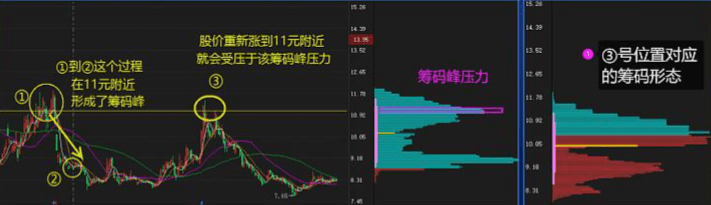
In the process of chip operation, the chips that have already disappeared also play a role. The so-called 'disappearing chips' refer to positions that, although they no longer have previous trapped positions, have seen the cost of chips decrease through continuous averaging down. For example, if you were trapped at 15 yuan and averaged down to 12 yuan when the price dropped to 10 yuan, the chips at 15 yuan would have 'disappeared'. However, when the stock price rises back to this level, there will still be invisible pressure because when the stock rebounds to 12 yuan, everyone will still think of their cost as 15 yuan, always wanting to sell when it reaches 15 yuan again. This phenomenon is called 'disappearing chip pressure'. This pressure usually requires multiple impacts to dissipate, and the first impact is likely to encounter resistance.
Just like the figure below of Jidong Equipment— the reason it surged and then retreated at position ③, where the chip pattern seemed fine, was that a double peak valley formed at the earlier position ②. The chip peak above would thus create pressure for an upward attack at position ③. So even though the chip distribution at position ③ shows no peak from position ②, this 'disappearing chip' still exerted a suppressive effect during the first impact, making it impossible to break through in one go.
Therefore, in practice, whether selecting stocks or timing the market, it is best to review the chip operation trajectory and examine the chip patterns at previous highs and lows to anticipate the upcoming support or resistance levels for the stock price.
2. Chip Distribution Observing Historical Operation Trajectories
Chip distribution is a dynamic indicator with a strong game theory aspect. The focus of analysis should be on compressing the chart to observe the chip's operation trajectory, rather than solely focusing on static charts. For example, in the case of Hangyang Co., this wave of rise is very beautiful, and it is currently in a 'lower peak locked' state. How did this wave start, and how did the chips move from dispersion to convergence and finally explode?
As shown in the figure at position ①, the chips are evenly dispersed, indicating that the number of trapped shares is about the same everywhere. As the stock rises, bottom funds increase, and the number of trapped or cutting loss funds also increases, until it reaches position ②, where the chip distribution range has not undergone significant changes but is gradually concentrating, showing a bit of convergence. However, this convergence is not sufficient to build momentum for a rise, so the stock will continue to experience wide fluctuations, and the chips will gradually gather through high sell low buy actions until reaching position ③, where the chips are still essentially fully trapped, but unlike position ①, the chips at position ③ are now highly concentrated.

At this point, we can track and observe its starting point, and when more signals appear, we can indeed take action. As shown in the figure below, it then underwent a wash without abnormal volume, and when it reached position ④, the chips were once again concentrated, breaking through strongly and liberating all trapped positions. Moreover, during the liberation process, the chip pattern did not change significantly, indicating that the number of willing sellers was decreasing, and the chips began to enter a locked position, initiating a rising trend in the stock price.

3. Analyzing Main Force Behavior through Chip Distribution (Washing, Rising, Distribution)
Based on the chip distribution indicator pattern, we can detect the main force's accumulation, rising, and distribution. Simply put, the main force's accumulation usually takes several months to half a year or even longer. This stage corresponds to chip distribution, which must gradually shift from dispersion to concentration. Because the main force needs to gather enough cheap chips to initiate a rise, stocks with bottom accumulation by the main force always experience this process of chip concentration. As shown in the figure below, this stock underwent two years of large box fluctuations at the bottom, where the chip was extremely dispersed at position ①, and basically, the entire market was trapped, followed by a rebound. The process from ① to ② saw the stock price's low point rise and the chips move upward from dispersion to the single peak concentration at position ②. Therefore, seeing this shift from dispersion to concentration in chip patterns indicates the main force's bottom accumulation.

Once the accumulation is complete, the main force will initiate the rise. At this point, it is reflected in the chip distribution indicator as the lower chips remain locked and unsold, with no signs of loosening, while the stock price rises rapidly, similar to the process from position ② to position ③ in the figure above. It is evident that although the chips at position ③ are increasing, this is merely due to the rise attracting a significant influx of funds, while the chip shape below essentially remains unchanged, indicating that the chips are locked and not sold.
Finally, there is the distribution phase of the main force, which can also be identified through chip distribution. The signal—at the beginning, the chip peaks at the bottom may only shorten, and then slowly a significant portion of profit positions disappear, indicating that the main force has attracted a large number of buyers at high positions while quietly distributing stocks. Once all the stocks are distributed, the lower part of the chip distribution will completely disappear. Continuing from the previous example, starting from position ③, as the stock price rises, the lower chip area gradually shortens, although it hasn't completely vanished yet, the main force's distribution behavior is already visible. If you chase after a surge at this point, you need to remain vigilant; once you see a large amount of chips being distributed at the bottom, you should decisively exit.

Part Four: Comprehensive Application of Chip Distribution
1. Stock Price Crossing Different Chip Intervals
1. Buy stocks without trapped positions above, beware of selling pressure below.
The question of what kind of stock shape one wishes to buy is actually a very important mindset issue. Because we say observing chips is about understanding the cost situation of opponents, it is a game theory mindset. If you want to buy stocks that do not have trapped positions above, it implies seeing the sky when you look up, meaning limitless possibilities.
On the other hand, it also means that your current buying price is higher than most people. The advantage is that you do not have to experience the slow process of releasing trapped positions, while the downside is that there may be selling pressure below that pulls you back. For example, Wuliangye, the chip distribution clearly shows that about 61% of the costs are below 210, and about 45% below 140 yuan. Currently, the stock price is 270, meaning everyone is in profit. Therefore, if you buy at this point, it means your buying price is generally higher than everyone else's. However, luckily, nearly 40% of the chip costs are above 210 yuan, meaning many people entered the market during the rise, rather than having all large funds in the lower range of 1250 yuan, like Kweichow Moutai. Thus, your current buying cost is only slightly higher than theirs, making selling pressure more controllable.
Therefore, for trend stocks at historical new highs, our buying price can be higher than others, but it is not recommended to be excessively high; we need to consider whether there will be selling pressure after a significant rise.

2. Buy stocks that are fully trapped above; you can capture a rebound.
Chip distribution indicates that stocks that are fully trapped are generally those at historical lows, indicating that no one is cutting losses anymore—the stock price has fallen to a point where it cannot drop further. At this time, everyone's cost is higher than yours. If it is at the end of a bear market, bottom fishing can lead to substantial profits; if it is during a regular market, it can also be an opportunity to catch a rebound. However, the key is how to determine if it truly cannot fall further. As shown in the figure of Guancheng shares, when it hit a historical low (closing price of 18.83), the chip distribution indicated that the profit positions were less than 0.68% after the closing that day. Additionally, looking at the chart, at this point, it was basically fully trapped. Moving the mouse reveals that the K-line for that day had approximately 0.55% of profit positions below the closing price, indicating a very low willingness to cut losses. Therefore, it indeed presented a rebound opportunity. Of course, although your buying cost is lower than everyone else's, your downside might not have any chips left. In this case, such a rebound would require exiting.

3. Buy stocks within chip intervals; crossing the concentrated peaks is preferable.
The first two types represent extreme situations of 'no chip interval'; one has no ceiling above, and the other has no chips below. However, more often we operate on stocks that have typical chip intervals and tend towards concentrated chips. Observing the chip distribution indicator focuses on the opponent’s position; do you prefer that everyone’s costs are similar to yours, or do you prefer that some people below are making a lot more than you, while above there are many who are seriously trapped? In what scenarios is it more advantageous for your game? Undoubtedly, it is when the chip costs are similar.
Moreover, during the crossing, it is easy to determine whether the chip state is locked or fluctuating. This is because retail investors generally find it easiest to trade within ±10%. A profit of 10 points prompts a desire to take profit, while a loss of more than 10 points makes them reluctant to cut losses. Therefore, the concentrated chip patterns, especially single peak concentrations, are worth tracking regardless of whether they can break through later.
① Crossing the Single Peak Concentration

As shown in the figure, at position ①, the chip distribution of the stock is a clear downward tail single peak concentration. Then, on the second trading day (position ②), it surged and hit the limit up, while the chip distribution pattern did not change much, indicating that the rise that day was a locked-up breakthrough. Therefore, the limit up crossing the chip area suggests that the future trend of the stock appears to have considerable potential. Indeed, it subsequently hit the limit up again.
② Crossing Complex Multi-Peaks

As shown in the figure, position ② also saw a volume breakthrough, with a limit up at the close that day. Additionally, from the previous trading day's doji to that day's breakthrough, the chip shape did not change much, indicating it was also a locked-up breakthrough. However, the stock's trend clearly continued to decline. This is because the stock's chip distribution is actually a complex multi-peak dispersion. At this point, although the stock price has broken through the chip peaks, it may not be as good as the single peak concentration crossing shape. This is easy to understand because even if the stock has broken through this round, there will still be heavy pressure on the way up.
2. 'Appealing' Chip Shapes
1. Standard single peak concentration, stock price at the upper edge of the concentrated peak.
Although such single peak concentrations are not easily formed or commonly seen in practice, more often they appear with tails or in dispersed or concentrated forms. Therefore, when such patterns are encountered, they should be grasped well. As shown in the figure below, this pattern typically needs to meet two conditions: first, the stock price has just crossed the chip peak, and most people have been released from their trapped positions, resulting in low upward pressure. Second, the K-line shape is showing a converging pattern of small bearish and small bullish movements with no abnormal volume, indicating that chips are locked, and there is no agitation among traders. After such accumulation, the upward surge will be more potent.

2. High Concentration Multi-Peak Forms
Generally, a center of gravity at a high position requires caution because 'the lower peak is locked, and the trend is not over yet.' However, if the lower peak has shifted to the upper peak, then it must be taken seriously. If it is a multi-peak shape with a center of gravity at a high position, then if it meets these three conditions simultaneously, it can also indicate a good bullish trend. First, the peak top at a high position must be the longest, indicating that the area with the most chips is above, meaning many are in this area, while there are still some chips locked below, suggesting that chips are transitioning upwards without excessive distribution. Then, looking back at the stock price, it must be exactly at the most concentrated area of chips, meaning your holding cost is similar to that of most people. The last condition is that the stock price must be in a recent state of small bearish and small bullish horizontal consolidation, with low volume. These signals indicate that everyone is remaining calm and not selling after making profits, suggesting that it can rise in the future, as illustrated in the example below.

3. Multi-Peak with Center of Gravity at Low Position and Uniform Dispersion
Unlike the second type of shape above, this one has a low center of gravity. The advantage is that whenever there is a pullback, there will be enough support layers. Otherwise, when missing out, the safety net may not be thick enough, or there may not be adequate defensive depth. However, it is important to note that for stocks displaying this shape, the buying price should not deviate too much from the lowest chip peak; otherwise, there will still be risks of high divergence.

Part Five: Precautions for Chip Distribution
1. The precise cost of the main force cannot be identified through chip distribution.
The definition of chip distribution—focusing on the cost of trading positions, using algorithms to simulate the cost distribution of different shareholders' holdings. Since it is a simulation algorithm, it is impossible to know exactly where the main force's cost lies or what that cost is. Therefore, one should not be so fixated on thinking that it can reveal everyone's chip holding situation. It merely simulates to calculate the current distribution of stock holdings. We prefer 'vaguely correct' to 'precisely wrong'.
2. Observing chip distribution reflects the dynamic game of trading.
The reason why many say chip distribution is difficult is that this indicator carries a very strong game theory mindset. Trading behavior itself is highly variable; your actions influence others, and others' actions influence you. Therefore, observing chips is a process of examining dynamic games and should not solely emphasize fixed values or forms. Furthermore, our chip distribution indicator does not actually care whether the chips belong to shareholder A or shareholder B; rather, it focuses on the entire dynamic process of chip exchange.
3. Chip Distribution is a Tool for Finding Medium to Long-Term Bull Stocks
Chip distribution is a powerful tool for identifying medium to long-term bull stocks, although it may not be particularly helpful for short-term traders. While we can use chip distribution to find some individual stocks' starting points and then profit from short-term trades, it is more focused on medium to long-term research, helping us observe the main force's low position accumulation, preparing for the concentration of chips before a surge, and the process of distribution at the high point during the final stage of control. Therefore, it is more suitable for medium to long-term trend stocks.
4. It is not certain that a single peak will definitely lead to a rise.
Generally speaking, concentrated chips, especially single peak concentrations, are better than more complex multi-peak forms. However, extremes can lead to the opposite outcome; the answer to whether a single peak will necessarily lead to a rise is no—it may also fall or remain highly concentrated for a long time. These need to be accumulated through practical operations.
5. Different software may display differently, so there is no comparability.
The chip distribution indicator may display slightly differently in various software, but the logic remains consistent. Thus, there is no comparability regarding which software is more accurate, nor is there a distinction between strong and weak or right and wrong.
I can no longer bear to see so many stock investors deceived, cutting losses at low points and missing out during surges, unclear on how to operate their stocks, doubtful about stock selection, deeply trapped in positions, and unable to grasp buying and selling points. You can pay attention to learning and communication, track operational trajectories, and grasp market movements. The ups and downs of the stock market are with you, hand in hand towards the journey of wealth!
Follow De Ge with precise strategy analysis and large AI data selection, positioning yourself for success? The market never lacks opportunities; the question is whether you can seize them. By aligning with experienced individuals, we can earn more!
#Strategy Increasing Bitcoin #Non-Farm Employment Data Approaching #Crypto Market Correction #Bitcoin Strategic Reserve
