1. MACD Theory and Bollinger Bands and TD
1.1. MACD - 5 Points
MACD does not indicate trends; it is a convergence-divergence indicator that measures strength. It primarily reflects the strength of bulls and bears, as well as the indicators that show the transitions between strengths. It cannot be used to identify upward and downward trends.
MACD should also consider trend lines, such as the weekly K trend line, the trend line of peaks or troughs. Of course, divergence phenomena should also be monitored. However, MACD focuses on long cycles, such as the trend of the weekly K.
1.1.1. Misleading Signals, Long Cycle
Although MACD is the king of indicators, it often misleads, so be cautious and combine it with KDJ for comprehensive judgment.
The misleading nature of MACD often occurs in small-level Golden Cross and Dead Cross signals, such as hourly misleading signals, but higher levels generally do not mislead and may provide signals in advance. However, divergence, whether at a large or small scale, generally does not mislead.
For example, on Thursday, August 18, 2022, the weekly K showed a MACD Golden Cross, but the result was a drop and a pullback because the weekly K's RSI support and resistance were not broken. So it seems like a false breakout, but in reality, this Golden Cross is also valid. MACD merely indicates the final direction, but many twists can occur in between. It can only indicate that MACD is meaningful for long cycles; for short cycles, it seems to have little significance and often misleads.
1.1.2. Volume and Golden Cross/Dead Cross.
1.1.3. The 0 Axis is Very Critical
Golden Cross and Dead Cross above the 0 axis, Golden Cross and Dead Cross near the 0 axis, Golden Cross and Dead Cross below the 0 axis.
1.1.4. MACD Divergence
Of course, this includes RSI divergence, KDJ divergence, mainly MACD divergence. Divergence cannot be broken, so be cautious when divergence occurs.
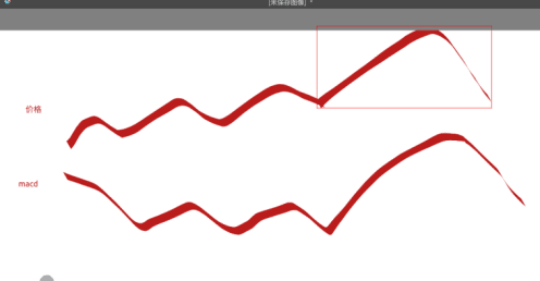
If a breakthrough occurs, meaning a higher peak or trough is formed in the MACD fast/slow lines, breaking the previous divergence, this divergence will no longer be effective. As shown in the figure below, the price rises while the MACD/RSI begins to fall, forming a peak divergence. However, if the price continues to break upwards sharply, the MACD/RSI will be pulled up quickly, causing the original peak divergence to fail. This is one way. --- In other words, under this scenario, if it is a peak divergence, the MACD/RSI is pulled higher by a sharp price increase, breaking the peak divergence, but this requires a significant price increase since the MACD/RSI needs to exceed all previous highs, which is quite difficult. If it is a trough divergence, it requires a sharp price drop to lower the MACD/RSI, thereby breaking the trough divergence. However, this method requires significant price fluctuations to make the MACD/RSI fall below any previous low, which is generally hard to achieve.
This breaking must be when the K-line price exceeds all previous divergence point prices. If it is a peak divergence, it refers to the price at the peak; if it is a trough divergence, it refers to the price at the trough. Only then can the divergence be broken.
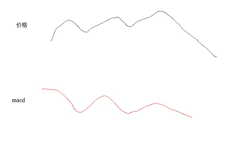
However, the problem is that generally, divergence causes K-line reversals only when the KDJ is at super values or extreme resonance at a large scale. Once there is MACD divergence, even if the large-scale KDJ reaches super values or extreme resonance, it will not cause a reversal. Once a breakthrough occurs, it will break the original divergence. As shown in the figure below, the price rises, and the MACD falls, forming a peak divergence. Through a sharp price drop, the MACD/RSI no longer shows peak divergence. This method is quite common. --- In other words, this method is relatively easy to achieve; for peak divergence, as long as the price drop causes the MACD/RSI to fall below the previous high, the peak divergence is broken. This is relatively easy to implement. Therefore, when a peak appears again, if the MACD/RSI at this bottom is lower than the previous peak, this divergence can be considered broken, and the divergence process ends. Similarly, for trough divergence, as long as the price increase causes the MACD/RSI to exceed the previous trough, it counts as breaking the trough divergence. This method only requires breaking the previous highs or lows to consider the divergence ended. However, the previous method requires breaking all previous highs or lows to be considered the end of divergence.
This breaking must be below the price level of the previous divergence point. If it is a peak divergence, it refers to the price at the peak; if it is a trough divergence, it refers to the price at the trough. Only then can the divergence be broken.
1.1.5. MACD Gradual Adjustment
Both MACD and Bollinger Bands have gradual adjustments similar to KDJ. Small levels are 1-2 hours, mainly 1 hour. Medium levels are 3-4-6 hours, mainly 4 hours. Large levels are 12 hours, daily - primarily daily. Super large levels are multi-day and weekly - mainly weekly.
1) Consistency of Golden Cross and Dead Cross across all levels: a Golden Cross indicates an upward trend, and a Dead Cross indicates a downward trend.
2) Inconsistency of Golden Cross and Dead Cross across levels: long-term view on super large scale, mid to long-term view on large scale, mid-term view on medium scale, short-term view on small scale. For example, super large scale Golden Cross indicates long-term bullish outlook. Large and medium scale Dead Cross indicates mid-term pullback, while small scale Golden Cross indicates a brief upward trend. Hence, the overall trend has not changed; it is only a mid-term adjustment.
If inconsistencies arise, the first comparison is between large and super large scales, followed by large and medium scales, and finally medium and small scales. This ultimately determines the trend.
1.2. Bollinger Bands - 3 Points
1.2.1. Three Bands
1.2.2. Convergence and Divergence
Especially when the support and resistance at a certain level is quite accurate.
1.2.3. Gradual Adjustment
The trend is also similar to KDJ gradual adjustment, known as Bollinger Bands gradual adjustment.
1) All levels are consistent with the midline: midline above indicates an upward trend, midline below indicates a downward trend.
2) Inconsistency of midlines across all levels: long-term view on super large scale, mid to long-term view on large scale, mid-term view on medium scale, short-term view on small scale. For example, if the midline is above on a large scale, it indicates support and bullish trend. If the midline is below on a medium scale, it indicates pressure and bearish trend. If the midline is above on a small scale, it indicates an upward trend, and the midline serves as support.
If inconsistencies arise, the first thing to check is whether the large scale has broken down. If it breaks below the midline, it indicates a bearish outlook. Next, check the medium scale, if it breaks above the upper line, it indicates an upward trend, ultimately determining the trend.
1.3. MA and EMA
Mainly observe bulls and bears and support and resistance.
1) The Golden Cross or Dead Cross formed by short-term MA and long-term MA serves as a strong support or resistance. If a range is very small but has strong support or resistance, then a significant rebound is quite difficult. Similarly, if a range contains multiple support or resistance lines, then a significant rebound is also difficult. Although sharp rises and falls breaking strong support or multiple support lines are possible, such movements are mostly orchestrated by institutions. Sudden surges and drops are hard to sustain without a large number of retail investors, ultimately leading to either a false breakout or a false breakdown.
2) Another method is to observe which moving average the K-line frequently touches; that moving average will serve as a strong support or resistance. For example, if the K-line frequently touches the lowest moving average, which is the 30-day moving average, then that is the strong support or resistance line. This also reveals a phenomenon similar to KDJ; the K-line frequently contacts a particular line until a K-line appears that does not frequently touch before the market adjustment begins. As shown in the figure below, if the highest 120-day moving average is not touched, it indicates insufficient volume and requires a pullback before there is enough energy to touch the 120-day moving average above.