

CoinsProbe
3.4k Publications

CoinsProbe
 Compte Square Vérifié+
Signaler
Bloquer l’utilisateur
Coinsprobe is the leading cryptocurrency platform that provides the latest news, breakouts, price predictions, airdrops, events, and ICO presales.
1 Suivis
9.8K+ Abonnés
12.6K+ J’aime
Publications
·
--
Article
PENGU Forms Hourly Bullish Flag — Analyst Eyes $0.0103 ResistanceKey Highlights
PENGU is forming an hourly bullish flag, per Ali Martinez (@alicharts).He expects one more dip toward flag support before another attempt at $0.0103.An hourly close above $0.0103 is the confirmation he requires. A wick through that level is not the signal.The breakout target beyond that close is $0.01250, about 27% above the current price near $0.00987.A close below the flag on elevated volume invalidates the pattern.
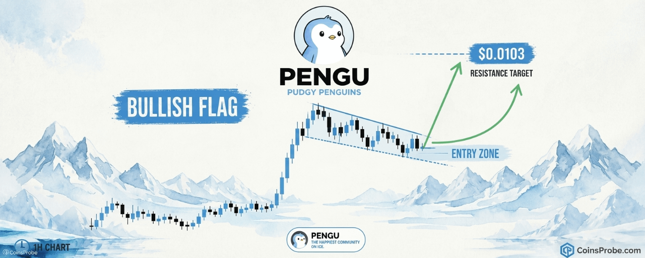
Pudgy Penguins’ token PENGU is forming a bullish flag on the hourly chart. Ali Martinez flagged the structure directly: “PENGU appears to be forming a bullish flag. I wouldn’t be surprised to see one more move toward the bottom of the flag, representing a buying opportunity, before another attempt at the $0.0103 resistance.”
The call has two steps. The first is the dip to flag support. The second is an hourly close above $0.0103. The breakout target past that close is $0.01250.
What a Bullish Flag Measures
A bullish flag is a two-part structure. A sharp advance forms the flagpole. A controlled, lower-volume channel sloping slightly down forms the flag. The pause is the point. Sellers absorb early profit-taking, and the pattern stays valid only if that drift stays inside the channel. A heavy-volume breakdown through the lower boundary cancels it.
Martinez’s read is that the flagpole is already in place and PENGU is in the consolidation. The detail that matters in his note is the expected push back toward the bottom of the flag. He frames that dip as a buying opportunity, not a failure of the pattern.
The $0.0103 Close, Then $0.01250
$0.0103 is the resistance he names. PENGU has stalled in this area before, including tests near $0.0106. An hourly close above $0.0103 is the filter. It is meant to show that buyers absorbed the supply, rather than a wick that fades back into the flag.
Once that close prints, the breakout target is $0.01250. From about $0.00987, that is roughly 27% upside. $0.0103 is the trigger. $0.01250 is the objective of the break, not a level already cleared.
PENGU 1H Chart | Source: @alicharts (X)
Flag Bottom
The actionable part of the note is the retest of the lower boundary before the attempt at $0.0103. In this pattern that dip shakes out entries made at the top of the flagpole and gives a defined spot for anyone who missed the first leg. The structure fails only if price closes below the flag, not if it tags the bottom of it.
Bullish Scenario — Hourly Close Above $0.0103, Target $0.01250
If PENGU dips toward flag support on lighter volume and then closes an hour above $0.0103, the flag is confirmed on Martinez’s terms. The breakout target from that close is $0.01250. Prior channel work on PENGU has pointed to $0.025 and $0.045 as later levels, but those sit beyond this flag. This setup’s stated objective after the $0.0103 close is $0.01250.
Bearish Scenario — Close Below the Flag
An hourly close beneath the lower boundary of the flag, especially on rising volume, invalidates the pattern. That would read as distribution inside the pause rather than a flag. In that case $0.0103 stays overhead supply, and $0.01250 is no longer the active target.
Summary
PENGU is building an hourly bullish flag. Martinez expects one more move toward the bottom of the flag, then another attempt at $0.0103. An hourly close above $0.0103 confirms the break. The breakout target is $0.01250, about 27% above the current price near $0.00987. A close below the flag cancels the setup.
Disclaimer: The views and analysis presented in this article are for informational purposes only and reflect the author’s perspective, not financial advice. Technical patterns and indicators discussed are subject to market volatility and may or may not yield anticipated results. Investors are advised to exercise caution, conduct independent research, and make decisions aligned with their individual risk tolerance.
PENGU Forms Hourly Bullish Flag — Analyst Eyes $0.0103 Resistance
Key Highlights
PENGU is forming an hourly bullish flag, per Ali Martinez (@alicharts).He expects one more dip toward flag support before another attempt at $0.0103.An hourly close above $0.0103 is the confirmation he requires. A wick through that level is not the signal.The breakout target beyond that close is $0.01250, about 27% above the current price near $0.00987.A close below the flag on elevated volume invalidates the pattern.
Pudgy Penguins’ token PENGU is forming a bullish flag on the hourly chart. Ali Martinez flagged the structure directly: “PENGU appears to be forming a bullish flag. I wouldn’t be surprised to see one more move toward the bottom of the flag, representing a buying opportunity, before another attempt at the $0.0103 resistance.”
The call has two steps. The first is the dip to flag support. The second is an hourly close above $0.0103. The breakout target past that close is $0.01250.
What a Bullish Flag Measures
A bullish flag is a two-part structure. A sharp advance forms the flagpole. A controlled, lower-volume channel sloping slightly down forms the flag. The pause is the point. Sellers absorb early profit-taking, and the pattern stays valid only if that drift stays inside the channel. A heavy-volume breakdown through the lower boundary cancels it.
Martinez’s read is that the flagpole is already in place and PENGU is in the consolidation. The detail that matters in his note is the expected push back toward the bottom of the flag. He frames that dip as a buying opportunity, not a failure of the pattern.
The $0.0103 Close, Then $0.01250
$0.0103 is the resistance he names. PENGU has stalled in this area before, including tests near $0.0106. An hourly close above $0.0103 is the filter. It is meant to show that buyers absorbed the supply, rather than a wick that fades back into the flag.
Once that close prints, the breakout target is $0.01250. From about $0.00987, that is roughly 27% upside. $0.0103 is the trigger. $0.01250 is the objective of the break, not a level already cleared.
PENGU 1H Chart | Source: @alicharts (X)
Flag Bottom
The actionable part of the note is the retest of the lower boundary before the attempt at $0.0103. In this pattern that dip shakes out entries made at the top of the flagpole and gives a defined spot for anyone who missed the first leg. The structure fails only if price closes below the flag, not if it tags the bottom of it.
Bullish Scenario — Hourly Close Above $0.0103, Target $0.01250
If PENGU dips toward flag support on lighter volume and then closes an hour above $0.0103, the flag is confirmed on Martinez’s terms. The breakout target from that close is $0.01250. Prior channel work on PENGU has pointed to $0.025 and $0.045 as later levels, but those sit beyond this flag. This setup’s stated objective after the $0.0103 close is $0.01250.
Bearish Scenario — Close Below the Flag
An hourly close beneath the lower boundary of the flag, especially on rising volume, invalidates the pattern. That would read as distribution inside the pause rather than a flag. In that case $0.0103 stays overhead supply, and $0.01250 is no longer the active target.
Summary
PENGU is building an hourly bullish flag. Martinez expects one more move toward the bottom of the flag, then another attempt at $0.0103. An hourly close above $0.0103 confirms the break. The breakout target is $0.01250, about 27% above the current price near $0.00987. A close below the flag cancels the setup.
Disclaimer: The views and analysis presented in this article are for informational purposes only and reflect the author’s perspective, not financial advice. Technical patterns and indicators discussed are subject to market volatility and may or may not yield anticipated results. Investors are advised to exercise caution, conduct independent research, and make decisions aligned with their individual risk tolerance.
PENGU is forming an hourly bullish flag, per Ali Martinez (@alicharts).He expects one more dip toward flag support before another attempt at $0.0103.An hourly close above $0.0103 is the confirmation he requires. A wick through that level is not the signal.The breakout target beyond that close is $0.01250, about 27% above the current price near $0.00987.A close below the flag on elevated volume invalidates the pattern.
Pudgy Penguins’ token PENGU is forming a bullish flag on the hourly chart. Ali Martinez flagged the structure directly: “PENGU appears to be forming a bullish flag. I wouldn’t be surprised to see one more move toward the bottom of the flag, representing a buying opportunity, before another attempt at the $0.0103 resistance.”
The call has two steps. The first is the dip to flag support. The second is an hourly close above $0.0103. The breakout target past that close is $0.01250.
What a Bullish Flag Measures
A bullish flag is a two-part structure. A sharp advance forms the flagpole. A controlled, lower-volume channel sloping slightly down forms the flag. The pause is the point. Sellers absorb early profit-taking, and the pattern stays valid only if that drift stays inside the channel. A heavy-volume breakdown through the lower boundary cancels it.
Martinez’s read is that the flagpole is already in place and PENGU is in the consolidation. The detail that matters in his note is the expected push back toward the bottom of the flag. He frames that dip as a buying opportunity, not a failure of the pattern.
The $0.0103 Close, Then $0.01250
$0.0103 is the resistance he names. PENGU has stalled in this area before, including tests near $0.0106. An hourly close above $0.0103 is the filter. It is meant to show that buyers absorbed the supply, rather than a wick that fades back into the flag.
Once that close prints, the breakout target is $0.01250. From about $0.00987, that is roughly 27% upside. $0.0103 is the trigger. $0.01250 is the objective of the break, not a level already cleared.
PENGU 1H Chart | Source: @alicharts (X)
Flag Bottom
The actionable part of the note is the retest of the lower boundary before the attempt at $0.0103. In this pattern that dip shakes out entries made at the top of the flagpole and gives a defined spot for anyone who missed the first leg. The structure fails only if price closes below the flag, not if it tags the bottom of it.
Bullish Scenario — Hourly Close Above $0.0103, Target $0.01250
If PENGU dips toward flag support on lighter volume and then closes an hour above $0.0103, the flag is confirmed on Martinez’s terms. The breakout target from that close is $0.01250. Prior channel work on PENGU has pointed to $0.025 and $0.045 as later levels, but those sit beyond this flag. This setup’s stated objective after the $0.0103 close is $0.01250.
Bearish Scenario — Close Below the Flag
An hourly close beneath the lower boundary of the flag, especially on rising volume, invalidates the pattern. That would read as distribution inside the pause rather than a flag. In that case $0.0103 stays overhead supply, and $0.01250 is no longer the active target.
Summary
PENGU is building an hourly bullish flag. Martinez expects one more move toward the bottom of the flag, then another attempt at $0.0103. An hourly close above $0.0103 confirms the break. The breakout target is $0.01250, about 27% above the current price near $0.00987. A close below the flag cancels the setup.
Disclaimer: The views and analysis presented in this article are for informational purposes only and reflect the author’s perspective, not financial advice. Technical patterns and indicators discussed are subject to market volatility and may or may not yield anticipated results. Investors are advised to exercise caution, conduct independent research, and make decisions aligned with their individual risk tolerance.
101
·
--
Article
SUI Daily Transactions Doubles in 30 Days as Stair-Step Pattern Targets $1.60Key Highlights
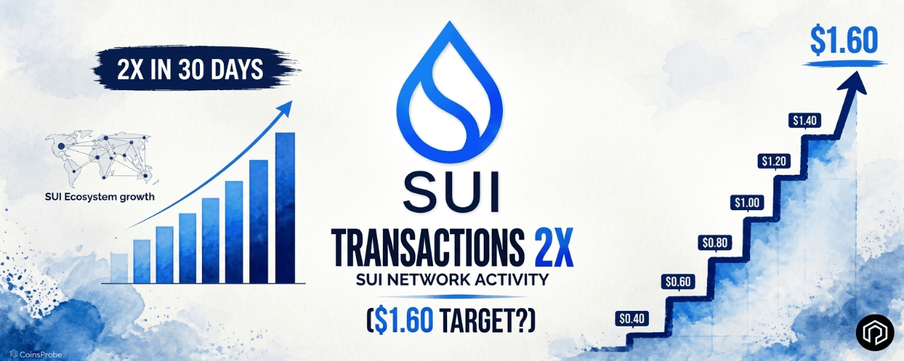
SUI is trading near $1.22 after three consolidation-and-breakout sequences since September 12.Daily transactions rose from about $16.9 million to $34.96 million on October 1, roughly double over the past month.Ali Martinez (@alicharts) says a fourth parallel channel is forming. The trigger is an hourly close above $1.27.The chart target on a confirmed break is $1.60, about 31% above $1.22. Support under the current channel is $1.11.
SUI** **has spent the past few weeks stepping higher in a structure that is easy to see on the 2-hour chart. Price consolidates inside a parallel channel, breaks out, builds another channel at a higher base, and breaks again. Ali Martinez flagged the sequence on October 2: since September 12 it has already played out three times, and another channel is now forming. The next leg, on his read, does not start until an hourly close clears $1.27.Activity on the network has moved with the price.
Daily transactions were near $16.9 million at the start of the lookback and printed $34.96 million on October 1, 2026. That is about a doubling over the month. The series was not a straight line. It ran in the high teens to mid-$20 millions through early September, dipped toward $16 million around September 11, then spiked above $45 million around September 20 before settling in a $30–$38 million band into the end of the month. The October 1 reading of $34.96 million sits in that higher band, not back at the early-September base.
SUI Daily Transaction | Source: suivision
The Pattern
The setup is a stair-step, not a single trendline break. Each box is a pause. Price trades a range, the range holds, and the break comes out of the top of the channel.
On the 2-hour chart the boxes stack higher. The first sits in the mid-$0.70s. Later channels form near $0.90 and around $1.00. The latest box is wider, with a midline marked near $1.18. Each prior box resolved upward. The most recent spike on that chart reached about $1.40 before price slipped back into the new range near $1.22.
SUI Stair-Step Pattern Repeats | Source: @alicharts (X)
Ali’s text is narrower than a full chart markup. He does not treat the $1.40 spike as the objective of the next leg. He says SUI is building another parallel channel, and the level he is watching is $1.27. An hourly close above it could confirm another bullish breakout and mark the start of the next leg higher.
The Trigger and the Target
$1.27 is the only confirmation in the post. A wick through it is not the signal he names. The condition is an hourly close above the top of the channel now forming.
If that close prints, the measured next level on the chart is $1.60. From $1.22, that is about 31% upside. It is a projection tied to the breakout, not a level already traded on this leg. The earlier print near $1.40 is the recent spike. $1.60 is the level the structure points to after $1.27 gives way.
The transaction pickup does not confirm that break. It does show the stair-step has not happened on flat network usage. Daily transactions are holding near $35 million after a peak above $45 million, well above the $16.9 million area from the start of the window.
Support
$1.11 is the support under the current channel. Holding above it keeps the stair-step intact while price works on $1.27. A dip into the box is normal for this pattern. The earlier pauses all traded a range before the break.
The $1.18 line on the chart sits inside the latest box. It is a reference through the channel, not the breakout trigger and not the floor. Support for the structure is $1.11. The trigger is $1.27.
Bullish Scenario
An hourly close above $1.27 confirms the breakout Ali is watching. From $1.22, the chart target is $1.60, about 31% higher. The path matches the last three sequences: channel, break, higher channel. Daily transactions holding near $34.96 million, rather than falling back toward $16.9 million, would fit a move that still has network activity behind it. The call stays unconfirmed until the hourly close prints and $1.11 continues to hold.
Bearish Scenario
Failure to close an hour above $1.27 leaves the new channel intact and the next leg unconfirmed. A move below $1.11 support would weaken the stair-step. The post does not give a lower measured target beyond that loss of support. Below $1.11, the prior channel area near $1.00 is the next zone visible on the same 2-hour chart. A drop in daily transactions back toward the mid-September trough would weaken the activity backdrop as well.
Summary
SUI has broken out of three parallel-channel consolidations since September 12. Daily transactions rose from about $16.9 million to $34.96 million by October 1. Ali says a fourth channel is forming. The trigger is an hourly close above $1.27. Support is $1.11. If the break confirms, the chart target is $1.60, about 31% above $1.22.
Disclaimer: The views and analysis presented in this article are for informational purposes only and reflect the author’s perspective, not financial advice. Technical patterns and indicators discussed are subject to market volatility and may or may not yield anticipated results. Investors are advised to exercise caution, conduct independent research, and make decisions aligned with their individual risk tolerance.
SUI Daily Transactions Doubles in 30 Days as Stair-Step Pattern Targets $1.60
Key Highlights
SUI is trading near $1.22 after three consolidation-and-breakout sequences since September 12.Daily transactions rose from about $16.9 million to $34.96 million on October 1, roughly double over the past month.Ali Martinez (@alicharts) says a fourth parallel channel is forming. The trigger is an hourly close above $1.27.The chart target on a confirmed break is $1.60, about 31% above $1.22. Support under the current channel is $1.11.
SUI** **has spent the past few weeks stepping higher in a structure that is easy to see on the 2-hour chart. Price consolidates inside a parallel channel, breaks out, builds another channel at a higher base, and breaks again. Ali Martinez flagged the sequence on October 2: since September 12 it has already played out three times, and another channel is now forming. The next leg, on his read, does not start until an hourly close clears $1.27.Activity on the network has moved with the price.
Daily transactions were near $16.9 million at the start of the lookback and printed $34.96 million on October 1, 2026. That is about a doubling over the month. The series was not a straight line. It ran in the high teens to mid-$20 millions through early September, dipped toward $16 million around September 11, then spiked above $45 million around September 20 before settling in a $30–$38 million band into the end of the month. The October 1 reading of $34.96 million sits in that higher band, not back at the early-September base.
SUI Daily Transaction | Source: suivision
The Pattern
The setup is a stair-step, not a single trendline break. Each box is a pause. Price trades a range, the range holds, and the break comes out of the top of the channel.
On the 2-hour chart the boxes stack higher. The first sits in the mid-$0.70s. Later channels form near $0.90 and around $1.00. The latest box is wider, with a midline marked near $1.18. Each prior box resolved upward. The most recent spike on that chart reached about $1.40 before price slipped back into the new range near $1.22.
SUI Stair-Step Pattern Repeats | Source: @alicharts (X)
Ali’s text is narrower than a full chart markup. He does not treat the $1.40 spike as the objective of the next leg. He says SUI is building another parallel channel, and the level he is watching is $1.27. An hourly close above it could confirm another bullish breakout and mark the start of the next leg higher.
The Trigger and the Target
$1.27 is the only confirmation in the post. A wick through it is not the signal he names. The condition is an hourly close above the top of the channel now forming.
If that close prints, the measured next level on the chart is $1.60. From $1.22, that is about 31% upside. It is a projection tied to the breakout, not a level already traded on this leg. The earlier print near $1.40 is the recent spike. $1.60 is the level the structure points to after $1.27 gives way.
The transaction pickup does not confirm that break. It does show the stair-step has not happened on flat network usage. Daily transactions are holding near $35 million after a peak above $45 million, well above the $16.9 million area from the start of the window.
Support
$1.11 is the support under the current channel. Holding above it keeps the stair-step intact while price works on $1.27. A dip into the box is normal for this pattern. The earlier pauses all traded a range before the break.
The $1.18 line on the chart sits inside the latest box. It is a reference through the channel, not the breakout trigger and not the floor. Support for the structure is $1.11. The trigger is $1.27.
Bullish Scenario
An hourly close above $1.27 confirms the breakout Ali is watching. From $1.22, the chart target is $1.60, about 31% higher. The path matches the last three sequences: channel, break, higher channel. Daily transactions holding near $34.96 million, rather than falling back toward $16.9 million, would fit a move that still has network activity behind it. The call stays unconfirmed until the hourly close prints and $1.11 continues to hold.
Bearish Scenario
Failure to close an hour above $1.27 leaves the new channel intact and the next leg unconfirmed. A move below $1.11 support would weaken the stair-step. The post does not give a lower measured target beyond that loss of support. Below $1.11, the prior channel area near $1.00 is the next zone visible on the same 2-hour chart. A drop in daily transactions back toward the mid-September trough would weaken the activity backdrop as well.
Summary
SUI has broken out of three parallel-channel consolidations since September 12. Daily transactions rose from about $16.9 million to $34.96 million by October 1. Ali says a fourth channel is forming. The trigger is an hourly close above $1.27. Support is $1.11. If the break confirms, the chart target is $1.60, about 31% above $1.22.
Disclaimer: The views and analysis presented in this article are for informational purposes only and reflect the author’s perspective, not financial advice. Technical patterns and indicators discussed are subject to market volatility and may or may not yield anticipated results. Investors are advised to exercise caution, conduct independent research, and make decisions aligned with their individual risk tolerance.
SUI is trading near $1.22 after three consolidation-and-breakout sequences since September 12.Daily transactions rose from about $16.9 million to $34.96 million on October 1, roughly double over the past month.Ali Martinez (@alicharts) says a fourth parallel channel is forming. The trigger is an hourly close above $1.27.The chart target on a confirmed break is $1.60, about 31% above $1.22. Support under the current channel is $1.11.
SUI** **has spent the past few weeks stepping higher in a structure that is easy to see on the 2-hour chart. Price consolidates inside a parallel channel, breaks out, builds another channel at a higher base, and breaks again. Ali Martinez flagged the sequence on October 2: since September 12 it has already played out three times, and another channel is now forming. The next leg, on his read, does not start until an hourly close clears $1.27.Activity on the network has moved with the price.
Daily transactions were near $16.9 million at the start of the lookback and printed $34.96 million on October 1, 2026. That is about a doubling over the month. The series was not a straight line. It ran in the high teens to mid-$20 millions through early September, dipped toward $16 million around September 11, then spiked above $45 million around September 20 before settling in a $30–$38 million band into the end of the month. The October 1 reading of $34.96 million sits in that higher band, not back at the early-September base.
SUI Daily Transaction | Source: suivision
The Pattern
The setup is a stair-step, not a single trendline break. Each box is a pause. Price trades a range, the range holds, and the break comes out of the top of the channel.
On the 2-hour chart the boxes stack higher. The first sits in the mid-$0.70s. Later channels form near $0.90 and around $1.00. The latest box is wider, with a midline marked near $1.18. Each prior box resolved upward. The most recent spike on that chart reached about $1.40 before price slipped back into the new range near $1.22.
SUI Stair-Step Pattern Repeats | Source: @alicharts (X)
Ali’s text is narrower than a full chart markup. He does not treat the $1.40 spike as the objective of the next leg. He says SUI is building another parallel channel, and the level he is watching is $1.27. An hourly close above it could confirm another bullish breakout and mark the start of the next leg higher.
The Trigger and the Target
$1.27 is the only confirmation in the post. A wick through it is not the signal he names. The condition is an hourly close above the top of the channel now forming.
If that close prints, the measured next level on the chart is $1.60. From $1.22, that is about 31% upside. It is a projection tied to the breakout, not a level already traded on this leg. The earlier print near $1.40 is the recent spike. $1.60 is the level the structure points to after $1.27 gives way.
The transaction pickup does not confirm that break. It does show the stair-step has not happened on flat network usage. Daily transactions are holding near $35 million after a peak above $45 million, well above the $16.9 million area from the start of the window.
Support
$1.11 is the support under the current channel. Holding above it keeps the stair-step intact while price works on $1.27. A dip into the box is normal for this pattern. The earlier pauses all traded a range before the break.
The $1.18 line on the chart sits inside the latest box. It is a reference through the channel, not the breakout trigger and not the floor. Support for the structure is $1.11. The trigger is $1.27.
Bullish Scenario
An hourly close above $1.27 confirms the breakout Ali is watching. From $1.22, the chart target is $1.60, about 31% higher. The path matches the last three sequences: channel, break, higher channel. Daily transactions holding near $34.96 million, rather than falling back toward $16.9 million, would fit a move that still has network activity behind it. The call stays unconfirmed until the hourly close prints and $1.11 continues to hold.
Bearish Scenario
Failure to close an hour above $1.27 leaves the new channel intact and the next leg unconfirmed. A move below $1.11 support would weaken the stair-step. The post does not give a lower measured target beyond that loss of support. Below $1.11, the prior channel area near $1.00 is the next zone visible on the same 2-hour chart. A drop in daily transactions back toward the mid-September trough would weaken the activity backdrop as well.
Summary
SUI has broken out of three parallel-channel consolidations since September 12. Daily transactions rose from about $16.9 million to $34.96 million by October 1. Ali says a fourth channel is forming. The trigger is an hourly close above $1.27. Support is $1.11. If the break confirms, the chart target is $1.60, about 31% above $1.22.
Disclaimer: The views and analysis presented in this article are for informational purposes only and reflect the author’s perspective, not financial advice. Technical patterns and indicators discussed are subject to market volatility and may or may not yield anticipated results. Investors are advised to exercise caution, conduct independent research, and make decisions aligned with their individual risk tolerance.
160
·
--
Article
Bitcoin and Ethereum ETFs Post Single-Day Outflows as 7-Day Totals Stay PositiveKey Highlights
Bitcoin ETFs: -1,796 BTC (-$150.24M) on Oct 1; 7-day net remains +3,096 BTC (+$258.99M) per LookonchainEthereum ETFs: -5,171 ETH (-$13.89M) on Oct 1; 7-day net holds +41,041 ETH (+$110.24M)Oct 1 BTC outflow erased 58.0% of the 7-day inflow in dollar terms; ETH daily outflow reversed only 12.6%Combined 7-day net inflows across BTC + ETH ETFs: ~$369.23M; Bitcoin accounts for 70.1% of the total
U.S. spot Bitcoin and Ethereum ETFs both recorded net outflows on October 1, 2026 — but the single-day redemptions have not erased the positive weekly momentum that built over the prior six sessions, according to data published by Lookonchain.
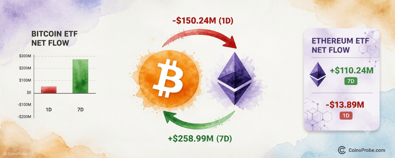
Bitcoin ETFs posted a one-day net outflow of 1,796 BTC, equivalent to $150.24 million. Ethereum ETFs recorded a one-day net outflow of 5,171 ETH, equivalent to $13.89 million. Both figures are red on the day. Both asset classes, however, remain net positive over the rolling seven-day window — and the divergence between the daily and weekly readings is where the structurally relevant signal sits.
Seven-Day Picture Holds Despite October 1 Reversal
Over the trailing seven days ending October 1, Bitcoin ETFs absorbed a net +3,096 BTC (+$258.99 million). Ethereum ETFs absorbed a net +41,041 ETH (+$110.24 million) over the same window, per Lookonchain.
Combined seven-day net inflows across both asset classes total approximately $369.23 million — with Bitcoin accounting for 70.1% of that figure and Ethereum accounting for 29.9%.
The October 1 single-day outflows represent a reversal of 58.0% of the seven-day Bitcoin ETF inflow in dollar terms ($150.24M against $258.99M). For Ethereum, the single-day outflow of $13.89M represents only 12.6% of the $110.24M seven-day inflow — a proportionally smaller drawback, though Ethereum’s daily outflow in coin terms (5,171 ETH) is notable given smaller overall AUM in spot Ethereum products.
BTC and ETH Spot ETF Flow | Source: @lookonchain (X)
Concentration and Magnitude — CoinsProbe Calculations
The combined total BTC referenced across both timeframes in the facts (1,796 BTC outflow + 3,096 BTC inflow) amounts to 4,892 BTC in gross activity. At Bitcoin’s current price of $84,304 (down 0.13% on the 24-hour window), 4,892 BTC represents approximately $412.5 million in gross two-directional flow — a volume reading that confirms institutional participation remains active even on a net-outflow session.
For Ethereum, the asymmetry is more pronounced: 5,171 ETH in single-day outflows against 41,041 ETH in seven-day inflows means the October 1 session unwound only 12.6% of the weekly build. This suggests the Ethereum ETF trend remains more intact on a relative basis than the Bitcoin ETF trend, despite both posting red on the day.
What the Data Confirms — and What It Does Not
A single-day net outflow does not reverse a weekly inflow trend. What October 1’s data confirms is that some portion of institutional holders chose to reduce exposure on that specific session — whether for end-of-month rebalancing, profit-taking, or macro-related repositioning is not determinable from flow data alone.
What the seven-day figures do confirm: both Bitcoin and Ethereum ETFs attracted net new capital over the rolling week ending October 1. The $258.99M seven-day Bitcoin ETF inflow and the $110.24M Ethereum ETF inflow are realized, aggregated net figures — not open interest or derivatives positioning. They represent actual share creation minus actual share redemption in spot ETF wrappers.
Traders watching Bitcoin’s technical structure alongside this flow data can reference the Bitcoin heatmap levels and bottom signal analysis for on-chain context that complements the ETF flow picture.
The key ratio to track going forward: if daily outflows begin to cumulatively exceed 50% of the prior seven-day inflow on consecutive sessions, the weekly trend line will compress toward flat. That threshold for Bitcoin ETFs sits at approximately $129.5M per day in net outflows (50% of $258.99M ÷ 2 remaining sessions in the week). Today’s $150.24M single-day outflow already crossed that marker — making tomorrow’s flow reading the deciding data point for whether the seven-day positive trend holds through the week.
Disclaimer: This article is for informational purposes only. Always refer to Pi Network's official channels for the most current partnership and protocol information.
Bitcoin and Ethereum ETFs Post Single-Day Outflows as 7-Day Totals Stay Positive
Key Highlights
Bitcoin ETFs: -1,796 BTC (-$150.24M) on Oct 1; 7-day net remains +3,096 BTC (+$258.99M) per LookonchainEthereum ETFs: -5,171 ETH (-$13.89M) on Oct 1; 7-day net holds +41,041 ETH (+$110.24M)Oct 1 BTC outflow erased 58.0% of the 7-day inflow in dollar terms; ETH daily outflow reversed only 12.6%Combined 7-day net inflows across BTC + ETH ETFs: ~$369.23M; Bitcoin accounts for 70.1% of the total
U.S. spot Bitcoin and Ethereum ETFs both recorded net outflows on October 1, 2026 — but the single-day redemptions have not erased the positive weekly momentum that built over the prior six sessions, according to data published by Lookonchain.
Bitcoin ETFs posted a one-day net outflow of 1,796 BTC, equivalent to $150.24 million. Ethereum ETFs recorded a one-day net outflow of 5,171 ETH, equivalent to $13.89 million. Both figures are red on the day. Both asset classes, however, remain net positive over the rolling seven-day window — and the divergence between the daily and weekly readings is where the structurally relevant signal sits.
Seven-Day Picture Holds Despite October 1 Reversal
Over the trailing seven days ending October 1, Bitcoin ETFs absorbed a net +3,096 BTC (+$258.99 million). Ethereum ETFs absorbed a net +41,041 ETH (+$110.24 million) over the same window, per Lookonchain.
Combined seven-day net inflows across both asset classes total approximately $369.23 million — with Bitcoin accounting for 70.1% of that figure and Ethereum accounting for 29.9%.
The October 1 single-day outflows represent a reversal of 58.0% of the seven-day Bitcoin ETF inflow in dollar terms ($150.24M against $258.99M). For Ethereum, the single-day outflow of $13.89M represents only 12.6% of the $110.24M seven-day inflow — a proportionally smaller drawback, though Ethereum’s daily outflow in coin terms (5,171 ETH) is notable given smaller overall AUM in spot Ethereum products.
BTC and ETH Spot ETF Flow | Source: @lookonchain (X)
Concentration and Magnitude — CoinsProbe Calculations
The combined total BTC referenced across both timeframes in the facts (1,796 BTC outflow + 3,096 BTC inflow) amounts to 4,892 BTC in gross activity. At Bitcoin’s current price of $84,304 (down 0.13% on the 24-hour window), 4,892 BTC represents approximately $412.5 million in gross two-directional flow — a volume reading that confirms institutional participation remains active even on a net-outflow session.
For Ethereum, the asymmetry is more pronounced: 5,171 ETH in single-day outflows against 41,041 ETH in seven-day inflows means the October 1 session unwound only 12.6% of the weekly build. This suggests the Ethereum ETF trend remains more intact on a relative basis than the Bitcoin ETF trend, despite both posting red on the day.
What the Data Confirms — and What It Does Not
A single-day net outflow does not reverse a weekly inflow trend. What October 1’s data confirms is that some portion of institutional holders chose to reduce exposure on that specific session — whether for end-of-month rebalancing, profit-taking, or macro-related repositioning is not determinable from flow data alone.
What the seven-day figures do confirm: both Bitcoin and Ethereum ETFs attracted net new capital over the rolling week ending October 1. The $258.99M seven-day Bitcoin ETF inflow and the $110.24M Ethereum ETF inflow are realized, aggregated net figures — not open interest or derivatives positioning. They represent actual share creation minus actual share redemption in spot ETF wrappers.
Traders watching Bitcoin’s technical structure alongside this flow data can reference the Bitcoin heatmap levels and bottom signal analysis for on-chain context that complements the ETF flow picture.
The key ratio to track going forward: if daily outflows begin to cumulatively exceed 50% of the prior seven-day inflow on consecutive sessions, the weekly trend line will compress toward flat. That threshold for Bitcoin ETFs sits at approximately $129.5M per day in net outflows (50% of $258.99M ÷ 2 remaining sessions in the week). Today’s $150.24M single-day outflow already crossed that marker — making tomorrow’s flow reading the deciding data point for whether the seven-day positive trend holds through the week.
Disclaimer: This article is for informational purposes only. Always refer to Pi Network's official channels for the most current partnership and protocol information.
Bitcoin ETFs: -1,796 BTC (-$150.24M) on Oct 1; 7-day net remains +3,096 BTC (+$258.99M) per LookonchainEthereum ETFs: -5,171 ETH (-$13.89M) on Oct 1; 7-day net holds +41,041 ETH (+$110.24M)Oct 1 BTC outflow erased 58.0% of the 7-day inflow in dollar terms; ETH daily outflow reversed only 12.6%Combined 7-day net inflows across BTC + ETH ETFs: ~$369.23M; Bitcoin accounts for 70.1% of the total
U.S. spot Bitcoin and Ethereum ETFs both recorded net outflows on October 1, 2026 — but the single-day redemptions have not erased the positive weekly momentum that built over the prior six sessions, according to data published by Lookonchain.
Bitcoin ETFs posted a one-day net outflow of 1,796 BTC, equivalent to $150.24 million. Ethereum ETFs recorded a one-day net outflow of 5,171 ETH, equivalent to $13.89 million. Both figures are red on the day. Both asset classes, however, remain net positive over the rolling seven-day window — and the divergence between the daily and weekly readings is where the structurally relevant signal sits.
Seven-Day Picture Holds Despite October 1 Reversal
Over the trailing seven days ending October 1, Bitcoin ETFs absorbed a net +3,096 BTC (+$258.99 million). Ethereum ETFs absorbed a net +41,041 ETH (+$110.24 million) over the same window, per Lookonchain.
Combined seven-day net inflows across both asset classes total approximately $369.23 million — with Bitcoin accounting for 70.1% of that figure and Ethereum accounting for 29.9%.
The October 1 single-day outflows represent a reversal of 58.0% of the seven-day Bitcoin ETF inflow in dollar terms ($150.24M against $258.99M). For Ethereum, the single-day outflow of $13.89M represents only 12.6% of the $110.24M seven-day inflow — a proportionally smaller drawback, though Ethereum’s daily outflow in coin terms (5,171 ETH) is notable given smaller overall AUM in spot Ethereum products.
BTC and ETH Spot ETF Flow | Source: @lookonchain (X)
Concentration and Magnitude — CoinsProbe Calculations
The combined total BTC referenced across both timeframes in the facts (1,796 BTC outflow + 3,096 BTC inflow) amounts to 4,892 BTC in gross activity. At Bitcoin’s current price of $84,304 (down 0.13% on the 24-hour window), 4,892 BTC represents approximately $412.5 million in gross two-directional flow — a volume reading that confirms institutional participation remains active even on a net-outflow session.
For Ethereum, the asymmetry is more pronounced: 5,171 ETH in single-day outflows against 41,041 ETH in seven-day inflows means the October 1 session unwound only 12.6% of the weekly build. This suggests the Ethereum ETF trend remains more intact on a relative basis than the Bitcoin ETF trend, despite both posting red on the day.
What the Data Confirms — and What It Does Not
A single-day net outflow does not reverse a weekly inflow trend. What October 1’s data confirms is that some portion of institutional holders chose to reduce exposure on that specific session — whether for end-of-month rebalancing, profit-taking, or macro-related repositioning is not determinable from flow data alone.
What the seven-day figures do confirm: both Bitcoin and Ethereum ETFs attracted net new capital over the rolling week ending October 1. The $258.99M seven-day Bitcoin ETF inflow and the $110.24M Ethereum ETF inflow are realized, aggregated net figures — not open interest or derivatives positioning. They represent actual share creation minus actual share redemption in spot ETF wrappers.
Traders watching Bitcoin’s technical structure alongside this flow data can reference the Bitcoin heatmap levels and bottom signal analysis for on-chain context that complements the ETF flow picture.
The key ratio to track going forward: if daily outflows begin to cumulatively exceed 50% of the prior seven-day inflow on consecutive sessions, the weekly trend line will compress toward flat. That threshold for Bitcoin ETFs sits at approximately $129.5M per day in net outflows (50% of $258.99M ÷ 2 remaining sessions in the week). Today’s $150.24M single-day outflow already crossed that marker — making tomorrow’s flow reading the deciding data point for whether the seven-day positive trend holds through the week.
Disclaimer: This article is for informational purposes only. Always refer to Pi Network's official channels for the most current partnership and protocol information.
1
365
·
--

Article
Bitcoin Whales Sold $2.52B While ETH Whales Bought — What It MeansKey Highlights
Bitcoin whales shed 30,000 BTC ($2.52B) between Sept 27–Oct 1 during sideways price action, per Santiment data via @alichartsEthereum whales added 60,000 ETH (~$162M) over the same period — a direct divergence from BTC's distribution signalBitcoin whale holdings floor at 5.22M BTC — a break below confirms ongoing distribution; recovery above shifts thesis to accumulationXRP whales stayed flat near 3.90 billion XRP over the past week.
Bitcoin is trading at $83,480 — up 0.57% in the past 24 hours — with a market cap of $1.676 trillion. But beneath the calm surface, a significant divergence is playing out between large holders across assets. While price moved sideways over the past week, whales were anything but idle.
Analyst Ali Martinez (@alicharts) published a five-part thread on October 1 tracking whale behavior across Bitcoin, Ethereum, and XRP during the recent lull. The headline finding: Bitcoin’s largest holders offloaded roughly 30,000 BTC — worth approximately $2.52 billion — while the market drifted sideways. Ethereum told the opposite story.
Bitcoin Whales: $2.52B in Quiet Distribution
Santiment data tracked by @alicharts shows Bitcoin whale holdings peaked at approximately 5.26 million BTC between September 27 and 28, then dropped sharply through September 29, before stabilizing near a floor of 5.22 million BTC as October began. The 30,000 BTC reduction — valued at $2.52 billion at current prices — did not occur during a price crash. It occurred during sideways consolidation.
That distinction matters. Panic selling in a downturn reflects reactive behavior. Distribution into flat price action reflects something more deliberate. When price holds steady but whale holdings decline sharply, large holders are offloading into whatever retail liquidity exists — not reacting to a move, but engineering the conditions for one. The Santiment chart shared by @alicharts shows the classic cliff-edge structure: a steep drop in holdings from Sept 27–29, followed by slight stabilization into October 1.
]
BTC Held by Whales — Analysis | Source: @alicharts (X)
The slight recovery in holdings into October bears close watching. If Bitcoin whale balances stabilize or reverse higher, it may signal accumulation resuming at lower realized prices. If holdings continue declining, the 30,000 BTC already distributed represents supply that the market must now absorb — a structural headwind that price pressure typically follows, not precedes. Bitcoin’s sideways action over the past week may already reflect this dynamic: the market absorbing supply without large buyers stepping in at scale.
This pattern is not isolated to Bitcoin. As noted in our earlier coverage, ADA futures open interest fell 9% as whales offloaded $22.5M in a single week — a sign that large-holder distribution has been a cross-asset theme in recent sessions.
Ethereum Whales: $162M in Active Accumulation
Ethereum’s whale data runs directly counter to Bitcoin’s. Over the same week, ETH large holders added approximately 60,000 ETH — worth around $162 million. Where Bitcoin whales distributed into the lull, Ethereum whales used the same flat market to accumulate. The divergence is notable precisely because the macro backdrop was identical for both assets: a sideways, low-volatility week with no major directional catalyst.
The contrast suggests asset-specific conviction rather than a macro risk-on or risk-off position. Ethereum whales were not buying because the market was bullish — they were buying during a period when Bitcoin whales were selling. For context, the scale of ETH accumulation (Ethereum whale transactions have surged in recent weeks) points to deliberate positioning rather than routine rebalancing.
ETH Held by Whales | Source: @alicharts (X)
Why Sideways Distribution Is the Bearish Signal — Not a Crash
The mechanism behind quiet distribution is straightforward. In a falling market, retail participants reduce exposure alongside whales — meaning there is less liquidity for large holders to sell into without moving price. In a sideways market, retail sentiment is neutral and passive buyers remain present. That liquidity allows whales to exit at scale without triggering the price decline that would otherwise reveal their selling. The result: holdings fall, price holds, and the structural imbalance builds until retail buying is exhausted.
This is why the Santiment data flagged by @alicharts is more consequential than a sharp single-session dump. A 30,000 BTC reduction across four days of flat price action implies that the selling was absorbed — meaning the supply overhang has already entered the market. The question now is whether demand at current levels is sufficient to prevent further drawdown once that absorption is complete.
Bullish Scenario — Whale Holdings Stabilize Above 5.22M BTC
If Santiment data shows Bitcoin whale balances recovering above 5.22 million BTC in the sessions ahead, it would indicate the distribution phase has ended and large holders are re-accumulating at current levels. A confirmed reversal in whale holdings, combined with price holding above $83,000, would shift the structural picture from distribution to accumulation — opening a path toward retesting the $88,000–$90,000 resistance zone.
Bearish Scenario — Holdings Continue Declining Below 5.22M BTC
If whale holdings break below the 5.22 million BTC floor identified on the Santiment chart, it confirms that distribution is ongoing rather than complete. The 30,000 BTC already sold represents $2.52 billion in supply that the market has absorbed — additional selling would add to that overhang. In this scenario, the sideways consolidation becomes a distribution top rather than a base, and Bitcoin’s next directional move would likely resolve to the downside. The $80,000 level becomes the immediate support to watch.
XRP Whales
@alicharts’ fourth update fills in the XRP side of the divergence. While Bitcoin whales cut about 30,000 BTC, worth roughly $2.52 billion, and Ethereum whales added about 60,000 ETH, worth around $162 million, XRP whales largely stayed put. Combined holdings hovered around 3.90 billion XRP over the past week, with no significant change.
XRP Held by Whales | Source: @alicharts (X)
That leaves a three-way split, not a clean rotation from Bitcoin into altcoins. Bitcoin’s largest holders reduced exposure during a flat week. Ethereum’s largest holders added. XRP’s largest holders waited. Ali’s own summary is the same: Bitcoin whales are reducing holdings, Ethereum whales are buying, and XRP whales are waiting.
The split is asset-specific. It does not show XRP whales following Bitcoin’s distribution or matching Ethereum’s accumulation. Santiment’s Bitcoin whale-holdings chart remains the metric to track on the BTC side: a continued decline below 5.22 million BTC confirms ongoing distribution, while a recovery above that floor would weaken the selling thesis. If Bitcoin whale selling continues, $80,000 is the level where absorption will be tested.
The full picture from @alicharts’ thread will clarify whether XRP whales are following Bitcoin’s distribution pattern or Ethereum’s accumulation signal.
The core takeaway from the data is structural. Bitcoin’s largest holders reduced exposure by $2.52 billion during a week when price gave no obvious reason to sell — which is precisely when informed selling happens. Ethereum’s largest holders added $162 million over the same period into the same flat market. The divergence points to asset-specific conviction at the institutional level. Santiment’s whale holdings chart is the metric to track in real time: a continued decline below 5.22 million BTC confirms ongoing distribution; a recovery above that floor shifts the thesis. Watch $80,000 as the level where absorption capacity will be tested if whale selling continues.
Disclaimer: The views and analysis presented in this article are for informational purposes only and reflect the author’s perspective, not financial advice. Technical patterns and indicators discussed are subject to market volatility and may or may not yield anticipated results. Investors are advised to exercise caution, conduct independent research, and make decisions aligned with their individual risk tolerance.
Bitcoin Whales Sold $2.52B While ETH Whales Bought — What It Means
Key Highlights
Bitcoin whales shed 30,000 BTC ($2.52B) between Sept 27–Oct 1 during sideways price action, per Santiment data via @alichartsEthereum whales added 60,000 ETH (~$162M) over the same period — a direct divergence from BTC's distribution signalBitcoin whale holdings floor at 5.22M BTC — a break below confirms ongoing distribution; recovery above shifts thesis to accumulationXRP whales stayed flat near 3.90 billion XRP over the past week.
Bitcoin is trading at $83,480 — up 0.57% in the past 24 hours — with a market cap of $1.676 trillion. But beneath the calm surface, a significant divergence is playing out between large holders across assets. While price moved sideways over the past week, whales were anything but idle.
Analyst Ali Martinez (@alicharts) published a five-part thread on October 1 tracking whale behavior across Bitcoin, Ethereum, and XRP during the recent lull. The headline finding: Bitcoin’s largest holders offloaded roughly 30,000 BTC — worth approximately $2.52 billion — while the market drifted sideways. Ethereum told the opposite story.
Bitcoin Whales: $2.52B in Quiet Distribution
Santiment data tracked by @alicharts shows Bitcoin whale holdings peaked at approximately 5.26 million BTC between September 27 and 28, then dropped sharply through September 29, before stabilizing near a floor of 5.22 million BTC as October began. The 30,000 BTC reduction — valued at $2.52 billion at current prices — did not occur during a price crash. It occurred during sideways consolidation.
That distinction matters. Panic selling in a downturn reflects reactive behavior. Distribution into flat price action reflects something more deliberate. When price holds steady but whale holdings decline sharply, large holders are offloading into whatever retail liquidity exists — not reacting to a move, but engineering the conditions for one. The Santiment chart shared by @alicharts shows the classic cliff-edge structure: a steep drop in holdings from Sept 27–29, followed by slight stabilization into October 1.
]
BTC Held by Whales — Analysis | Source: @alicharts (X)
The slight recovery in holdings into October bears close watching. If Bitcoin whale balances stabilize or reverse higher, it may signal accumulation resuming at lower realized prices. If holdings continue declining, the 30,000 BTC already distributed represents supply that the market must now absorb — a structural headwind that price pressure typically follows, not precedes. Bitcoin’s sideways action over the past week may already reflect this dynamic: the market absorbing supply without large buyers stepping in at scale.
This pattern is not isolated to Bitcoin. As noted in our earlier coverage, ADA futures open interest fell 9% as whales offloaded $22.5M in a single week — a sign that large-holder distribution has been a cross-asset theme in recent sessions.
Ethereum Whales: $162M in Active Accumulation
Ethereum’s whale data runs directly counter to Bitcoin’s. Over the same week, ETH large holders added approximately 60,000 ETH — worth around $162 million. Where Bitcoin whales distributed into the lull, Ethereum whales used the same flat market to accumulate. The divergence is notable precisely because the macro backdrop was identical for both assets: a sideways, low-volatility week with no major directional catalyst.
The contrast suggests asset-specific conviction rather than a macro risk-on or risk-off position. Ethereum whales were not buying because the market was bullish — they were buying during a period when Bitcoin whales were selling. For context, the scale of ETH accumulation (Ethereum whale transactions have surged in recent weeks) points to deliberate positioning rather than routine rebalancing.
ETH Held by Whales | Source: @alicharts (X)
Why Sideways Distribution Is the Bearish Signal — Not a Crash
The mechanism behind quiet distribution is straightforward. In a falling market, retail participants reduce exposure alongside whales — meaning there is less liquidity for large holders to sell into without moving price. In a sideways market, retail sentiment is neutral and passive buyers remain present. That liquidity allows whales to exit at scale without triggering the price decline that would otherwise reveal their selling. The result: holdings fall, price holds, and the structural imbalance builds until retail buying is exhausted.
This is why the Santiment data flagged by @alicharts is more consequential than a sharp single-session dump. A 30,000 BTC reduction across four days of flat price action implies that the selling was absorbed — meaning the supply overhang has already entered the market. The question now is whether demand at current levels is sufficient to prevent further drawdown once that absorption is complete.
Bullish Scenario — Whale Holdings Stabilize Above 5.22M BTC
If Santiment data shows Bitcoin whale balances recovering above 5.22 million BTC in the sessions ahead, it would indicate the distribution phase has ended and large holders are re-accumulating at current levels. A confirmed reversal in whale holdings, combined with price holding above $83,000, would shift the structural picture from distribution to accumulation — opening a path toward retesting the $88,000–$90,000 resistance zone.
Bearish Scenario — Holdings Continue Declining Below 5.22M BTC
If whale holdings break below the 5.22 million BTC floor identified on the Santiment chart, it confirms that distribution is ongoing rather than complete. The 30,000 BTC already sold represents $2.52 billion in supply that the market has absorbed — additional selling would add to that overhang. In this scenario, the sideways consolidation becomes a distribution top rather than a base, and Bitcoin’s next directional move would likely resolve to the downside. The $80,000 level becomes the immediate support to watch.
XRP Whales
@alicharts’ fourth update fills in the XRP side of the divergence. While Bitcoin whales cut about 30,000 BTC, worth roughly $2.52 billion, and Ethereum whales added about 60,000 ETH, worth around $162 million, XRP whales largely stayed put. Combined holdings hovered around 3.90 billion XRP over the past week, with no significant change.
XRP Held by Whales | Source: @alicharts (X)
That leaves a three-way split, not a clean rotation from Bitcoin into altcoins. Bitcoin’s largest holders reduced exposure during a flat week. Ethereum’s largest holders added. XRP’s largest holders waited. Ali’s own summary is the same: Bitcoin whales are reducing holdings, Ethereum whales are buying, and XRP whales are waiting.
The split is asset-specific. It does not show XRP whales following Bitcoin’s distribution or matching Ethereum’s accumulation. Santiment’s Bitcoin whale-holdings chart remains the metric to track on the BTC side: a continued decline below 5.22 million BTC confirms ongoing distribution, while a recovery above that floor would weaken the selling thesis. If Bitcoin whale selling continues, $80,000 is the level where absorption will be tested.
The full picture from @alicharts’ thread will clarify whether XRP whales are following Bitcoin’s distribution pattern or Ethereum’s accumulation signal.
The core takeaway from the data is structural. Bitcoin’s largest holders reduced exposure by $2.52 billion during a week when price gave no obvious reason to sell — which is precisely when informed selling happens. Ethereum’s largest holders added $162 million over the same period into the same flat market. The divergence points to asset-specific conviction at the institutional level. Santiment’s whale holdings chart is the metric to track in real time: a continued decline below 5.22 million BTC confirms ongoing distribution; a recovery above that floor shifts the thesis. Watch $80,000 as the level where absorption capacity will be tested if whale selling continues.
Disclaimer: The views and analysis presented in this article are for informational purposes only and reflect the author’s perspective, not financial advice. Technical patterns and indicators discussed are subject to market volatility and may or may not yield anticipated results. Investors are advised to exercise caution, conduct independent research, and make decisions aligned with their individual risk tolerance.
Bitcoin whales shed 30,000 BTC ($2.52B) between Sept 27–Oct 1 during sideways price action, per Santiment data via @alichartsEthereum whales added 60,000 ETH (~$162M) over the same period — a direct divergence from BTC's distribution signalBitcoin whale holdings floor at 5.22M BTC — a break below confirms ongoing distribution; recovery above shifts thesis to accumulationXRP whales stayed flat near 3.90 billion XRP over the past week.
Bitcoin is trading at $83,480 — up 0.57% in the past 24 hours — with a market cap of $1.676 trillion. But beneath the calm surface, a significant divergence is playing out between large holders across assets. While price moved sideways over the past week, whales were anything but idle.
Analyst Ali Martinez (@alicharts) published a five-part thread on October 1 tracking whale behavior across Bitcoin, Ethereum, and XRP during the recent lull. The headline finding: Bitcoin’s largest holders offloaded roughly 30,000 BTC — worth approximately $2.52 billion — while the market drifted sideways. Ethereum told the opposite story.
Bitcoin Whales: $2.52B in Quiet Distribution
Santiment data tracked by @alicharts shows Bitcoin whale holdings peaked at approximately 5.26 million BTC between September 27 and 28, then dropped sharply through September 29, before stabilizing near a floor of 5.22 million BTC as October began. The 30,000 BTC reduction — valued at $2.52 billion at current prices — did not occur during a price crash. It occurred during sideways consolidation.
That distinction matters. Panic selling in a downturn reflects reactive behavior. Distribution into flat price action reflects something more deliberate. When price holds steady but whale holdings decline sharply, large holders are offloading into whatever retail liquidity exists — not reacting to a move, but engineering the conditions for one. The Santiment chart shared by @alicharts shows the classic cliff-edge structure: a steep drop in holdings from Sept 27–29, followed by slight stabilization into October 1.
]
BTC Held by Whales — Analysis | Source: @alicharts (X)
The slight recovery in holdings into October bears close watching. If Bitcoin whale balances stabilize or reverse higher, it may signal accumulation resuming at lower realized prices. If holdings continue declining, the 30,000 BTC already distributed represents supply that the market must now absorb — a structural headwind that price pressure typically follows, not precedes. Bitcoin’s sideways action over the past week may already reflect this dynamic: the market absorbing supply without large buyers stepping in at scale.
This pattern is not isolated to Bitcoin. As noted in our earlier coverage, ADA futures open interest fell 9% as whales offloaded $22.5M in a single week — a sign that large-holder distribution has been a cross-asset theme in recent sessions.
Ethereum Whales: $162M in Active Accumulation
Ethereum’s whale data runs directly counter to Bitcoin’s. Over the same week, ETH large holders added approximately 60,000 ETH — worth around $162 million. Where Bitcoin whales distributed into the lull, Ethereum whales used the same flat market to accumulate. The divergence is notable precisely because the macro backdrop was identical for both assets: a sideways, low-volatility week with no major directional catalyst.
The contrast suggests asset-specific conviction rather than a macro risk-on or risk-off position. Ethereum whales were not buying because the market was bullish — they were buying during a period when Bitcoin whales were selling. For context, the scale of ETH accumulation (Ethereum whale transactions have surged in recent weeks) points to deliberate positioning rather than routine rebalancing.
ETH Held by Whales | Source: @alicharts (X)
Why Sideways Distribution Is the Bearish Signal — Not a Crash
The mechanism behind quiet distribution is straightforward. In a falling market, retail participants reduce exposure alongside whales — meaning there is less liquidity for large holders to sell into without moving price. In a sideways market, retail sentiment is neutral and passive buyers remain present. That liquidity allows whales to exit at scale without triggering the price decline that would otherwise reveal their selling. The result: holdings fall, price holds, and the structural imbalance builds until retail buying is exhausted.
This is why the Santiment data flagged by @alicharts is more consequential than a sharp single-session dump. A 30,000 BTC reduction across four days of flat price action implies that the selling was absorbed — meaning the supply overhang has already entered the market. The question now is whether demand at current levels is sufficient to prevent further drawdown once that absorption is complete.
Bullish Scenario — Whale Holdings Stabilize Above 5.22M BTC
If Santiment data shows Bitcoin whale balances recovering above 5.22 million BTC in the sessions ahead, it would indicate the distribution phase has ended and large holders are re-accumulating at current levels. A confirmed reversal in whale holdings, combined with price holding above $83,000, would shift the structural picture from distribution to accumulation — opening a path toward retesting the $88,000–$90,000 resistance zone.
Bearish Scenario — Holdings Continue Declining Below 5.22M BTC
If whale holdings break below the 5.22 million BTC floor identified on the Santiment chart, it confirms that distribution is ongoing rather than complete. The 30,000 BTC already sold represents $2.52 billion in supply that the market has absorbed — additional selling would add to that overhang. In this scenario, the sideways consolidation becomes a distribution top rather than a base, and Bitcoin’s next directional move would likely resolve to the downside. The $80,000 level becomes the immediate support to watch.
XRP Whales
@alicharts’ fourth update fills in the XRP side of the divergence. While Bitcoin whales cut about 30,000 BTC, worth roughly $2.52 billion, and Ethereum whales added about 60,000 ETH, worth around $162 million, XRP whales largely stayed put. Combined holdings hovered around 3.90 billion XRP over the past week, with no significant change.
XRP Held by Whales | Source: @alicharts (X)
That leaves a three-way split, not a clean rotation from Bitcoin into altcoins. Bitcoin’s largest holders reduced exposure during a flat week. Ethereum’s largest holders added. XRP’s largest holders waited. Ali’s own summary is the same: Bitcoin whales are reducing holdings, Ethereum whales are buying, and XRP whales are waiting.
The split is asset-specific. It does not show XRP whales following Bitcoin’s distribution or matching Ethereum’s accumulation. Santiment’s Bitcoin whale-holdings chart remains the metric to track on the BTC side: a continued decline below 5.22 million BTC confirms ongoing distribution, while a recovery above that floor would weaken the selling thesis. If Bitcoin whale selling continues, $80,000 is the level where absorption will be tested.
The full picture from @alicharts’ thread will clarify whether XRP whales are following Bitcoin’s distribution pattern or Ethereum’s accumulation signal.
The core takeaway from the data is structural. Bitcoin’s largest holders reduced exposure by $2.52 billion during a week when price gave no obvious reason to sell — which is precisely when informed selling happens. Ethereum’s largest holders added $162 million over the same period into the same flat market. The divergence points to asset-specific conviction at the institutional level. Santiment’s whale holdings chart is the metric to track in real time: a continued decline below 5.22 million BTC confirms ongoing distribution; a recovery above that floor shifts the thesis. Watch $80,000 as the level where absorption capacity will be tested if whale selling continues.
Disclaimer: The views and analysis presented in this article are for informational purposes only and reflect the author’s perspective, not financial advice. Technical patterns and indicators discussed are subject to market volatility and may or may not yield anticipated results. Investors are advised to exercise caution, conduct independent research, and make decisions aligned with their individual risk tolerance.
1
168
·
--
Article
Bitcoin MVRV Z-Score Holds Above 365-Day Average — Structure Still Favors UpsideKey Highlights
Bitcoin trades at $83,510 (+0.16%) with MVRV Z-Score holding above its 365-day average — a structural bull market signalPer @TraderGemin via CryptoQuant: 365-day MVRV average has acted as dynamic support across every prior Bitcoin bull phase since 2012Z-Score remains below the +0.8 red zone distribution threshold seen at 2017 and 2021 cycle peaks — not overheatedSustained Z-Score breakdown below the 365-day SMA is the single on-chain condition that would invalidate the bullish macro structure
Bitcoin is trading at $83,510 — up 0.16% in the past 24 hours — with a market cap of $1.678 trillion. Beneath the surface of this consolidation, one of the most reliable long-term on-chain valuation metrics is delivering a structurally bullish reading: the MVRV Z-Score is holding above its 365-day moving average, a condition that has historically defined the support floor of Bitcoin’s broader bull phases.
The observation comes from analyst @TraderGemin, published via @cryptoquant_com. His exact words: “Historically, once the MVRV Z-Score moved above its 365-day average, that average often acted as support during the broader bullish phase.” That is not a speculative call — it is a pattern documented across every major Bitcoin market cycle since 2012.
What the MVRV Z-Score Actually Measures
Before interpreting the current reading, the mechanics matter. The MVRV Z-Score is a composite on-chain metric derived from three components: Market Value (current market cap), Realized Value (the aggregate cost basis of every coin at its last on-chain movement), and a Z-Score normalization that removes cyclical extremes. The result is a single number that tells you whether Bitcoin is trading at a premium or discount relative to what the aggregate market actually paid for it.
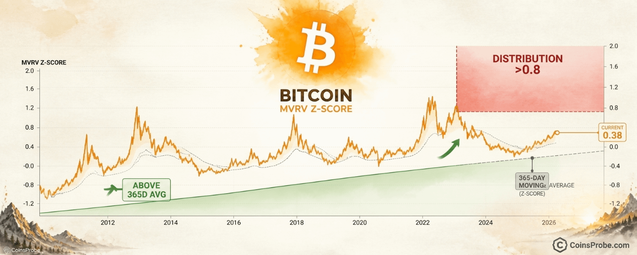
The chart’s zones clarify the thresholds with precision: readings above approximately +0.8 have historically marked distribution and peak euphoria — the red zone seen at the 2017 and 2021 cycle tops. Readings below approximately -0.8 have marked deep undervaluation — the green accumulation zones of 2018–2019 and 2022 bear market bottoms. The zero line represents fair value equilibrium. Everything above zero, with the 365-day SMA acting as a rising floor, is the structural bull market range.
The 365-Day Average as Dynamic Support — The Historical Record
The critical insight from @TraderGemin is not the raw Z-Score level — it is the relationship between the Z-Score and its own 365-day average. Once the Z-Score crosses above that annual moving average and sustains the position, the average has historically functioned as a trailing stop line for the bull market structure. Each retest of that average from above has, in prior cycles, preceded a resumption of the uptrend rather than a breakdown.
The chart published by @cryptoquant_com shows this pattern across the 2012–2026 data set. In the 2016–2017 cycle, the Z-Score held above its 365-day average throughout the bull run until the December 2017 peak — at which point the score spiked deep into the red zone before collapsing. In the 2020–2021 cycle, the same structure held: the annual average provided support across multiple pullbacks before the score peaked in early 2021. In both cases, the danger signal was not a retest of the average — it was a spike into the red zone above +0.8.
Bitcoin MVRV Z-Score Analysis | Source: @cryptoquant_com (X)
The current reading matters for one specific reason: the Z-Score has pulled back significantly from its 2021 peak levels but remains above the 365-day SMA. That is the definition of mid-cycle positioning — elevated enough to confirm a bull market, not elevated enough to signal distribution. The chart caption is precise: this is “cautiously bullish with macro structure intact.”
What the Current Reading Confirms — and What It Doesn’t
The MVRV Z-Score holding above its 365-day average confirms one thing with precision: the long-term cost-basis structure of the market remains in a zone where aggregate holders are in profit at a level consistent with ongoing bull market dynamics. It does not confirm direction for the next 30 days. It does not guarantee any specific price target. It is a regime indicator — it tells you which macro environment you are in, not when the next leg starts.
What it explicitly does not show: the red zone. The current Z-Score is below the +0.8 distribution threshold that marked the 2017 and 2021 cycle exits. That asymmetry is structurally significant. Prior bull markets ended when the Z-Score entered the red zone — not when it pulled back toward the annual average. The current reading has done the latter, not the former.
For context on how the realized value metric has behaved in prior stress events, see Bitcoin LTH MVRV Exits Stress Zone — What History Says Happens Next.
The One Level That Changes the Thesis
@TraderGemin’s framework identifies a single invalidation condition: if the MVRV Z-Score drops below the 365-day SMA, the historical precedent shifts from bullish to neutral-to-bearish. That level is not a fixed price — it is a moving threshold on the on-chain metric itself. But the implication for price is concrete: every prior instance where the Z-Score broke below its annual average for a sustained period corresponded to macro trend reversal in Bitcoin’s price — not a temporary correction.
The secondary risk is the opposite extreme. A spike into the red zone above +0.8 — driven by rapid price appreciation without proportional growth in realized value — would signal a distribution phase, historically a sell signal for long-term holders. Neither condition is present at $83,510.
Bullish Scenario
The MVRV Z-Score continues to hold above its 365-day average as Bitcoin consolidates in the $80K–$90K range. Each retest of the annual average from above is absorbed — consistent with the 2016–2017 and 2020–2021 precedents. The next macro leg higher follows, with the red zone above +0.8 remaining the only indicator-defined exit signal for long-term structure.
Bearish Scenario
A sustained breakdown of the MVRV Z-Score below its 365-day SMA — not a brief intraday dip, but a multi-week close below — would break the structural pattern that has defined every Bitcoin bull market since 2012. That would shift the regime signal from bullish to reversal-watch. The $80,000 price level, previously identified as the critical realized-value support zone, would become the immediate focus. For broader context on where Bitcoin sits in the current market cycle, Is Crypto in the Disbelief Phase? What Market Cycle Psychology Says Now provides the sentiment overlay.
The MVRV Z-Score above its 365-day average is a macro regime signal, not a price prediction. What it confirms at $83,510 is this: Bitcoin is operating within the on-chain structure that has characterized every bull market phase since 2012 — elevated above realized value, not overheated into the distribution zone, with the annual average acting as a rising floor. The one level that changes the entire structural read is a sustained Z-Score breakdown below the 365-day SMA. Until that happens, the long-term cost-basis structure of the market still favors the upside. Watch the 365-day MVRV average as the single most important trailing indicator of macro trend health.
Disclaimer: This article is for informational purposes only. Always refer to Pi Network's official channels for the most current partnership and protocol information.
Bitcoin MVRV Z-Score Holds Above 365-Day Average — Structure Still Favors Upside
Key Highlights
Bitcoin trades at $83,510 (+0.16%) with MVRV Z-Score holding above its 365-day average — a structural bull market signalPer @TraderGemin via CryptoQuant: 365-day MVRV average has acted as dynamic support across every prior Bitcoin bull phase since 2012Z-Score remains below the +0.8 red zone distribution threshold seen at 2017 and 2021 cycle peaks — not overheatedSustained Z-Score breakdown below the 365-day SMA is the single on-chain condition that would invalidate the bullish macro structure
Bitcoin is trading at $83,510 — up 0.16% in the past 24 hours — with a market cap of $1.678 trillion. Beneath the surface of this consolidation, one of the most reliable long-term on-chain valuation metrics is delivering a structurally bullish reading: the MVRV Z-Score is holding above its 365-day moving average, a condition that has historically defined the support floor of Bitcoin’s broader bull phases.
The observation comes from analyst @TraderGemin, published via @cryptoquant_com. His exact words: “Historically, once the MVRV Z-Score moved above its 365-day average, that average often acted as support during the broader bullish phase.” That is not a speculative call — it is a pattern documented across every major Bitcoin market cycle since 2012.
What the MVRV Z-Score Actually Measures
Before interpreting the current reading, the mechanics matter. The MVRV Z-Score is a composite on-chain metric derived from three components: Market Value (current market cap), Realized Value (the aggregate cost basis of every coin at its last on-chain movement), and a Z-Score normalization that removes cyclical extremes. The result is a single number that tells you whether Bitcoin is trading at a premium or discount relative to what the aggregate market actually paid for it.
The chart’s zones clarify the thresholds with precision: readings above approximately +0.8 have historically marked distribution and peak euphoria — the red zone seen at the 2017 and 2021 cycle tops. Readings below approximately -0.8 have marked deep undervaluation — the green accumulation zones of 2018–2019 and 2022 bear market bottoms. The zero line represents fair value equilibrium. Everything above zero, with the 365-day SMA acting as a rising floor, is the structural bull market range.
The 365-Day Average as Dynamic Support — The Historical Record
The critical insight from @TraderGemin is not the raw Z-Score level — it is the relationship between the Z-Score and its own 365-day average. Once the Z-Score crosses above that annual moving average and sustains the position, the average has historically functioned as a trailing stop line for the bull market structure. Each retest of that average from above has, in prior cycles, preceded a resumption of the uptrend rather than a breakdown.
The chart published by @cryptoquant_com shows this pattern across the 2012–2026 data set. In the 2016–2017 cycle, the Z-Score held above its 365-day average throughout the bull run until the December 2017 peak — at which point the score spiked deep into the red zone before collapsing. In the 2020–2021 cycle, the same structure held: the annual average provided support across multiple pullbacks before the score peaked in early 2021. In both cases, the danger signal was not a retest of the average — it was a spike into the red zone above +0.8.
Bitcoin MVRV Z-Score Analysis | Source: @cryptoquant_com (X)
The current reading matters for one specific reason: the Z-Score has pulled back significantly from its 2021 peak levels but remains above the 365-day SMA. That is the definition of mid-cycle positioning — elevated enough to confirm a bull market, not elevated enough to signal distribution. The chart caption is precise: this is “cautiously bullish with macro structure intact.”
What the Current Reading Confirms — and What It Doesn’t
The MVRV Z-Score holding above its 365-day average confirms one thing with precision: the long-term cost-basis structure of the market remains in a zone where aggregate holders are in profit at a level consistent with ongoing bull market dynamics. It does not confirm direction for the next 30 days. It does not guarantee any specific price target. It is a regime indicator — it tells you which macro environment you are in, not when the next leg starts.
What it explicitly does not show: the red zone. The current Z-Score is below the +0.8 distribution threshold that marked the 2017 and 2021 cycle exits. That asymmetry is structurally significant. Prior bull markets ended when the Z-Score entered the red zone — not when it pulled back toward the annual average. The current reading has done the latter, not the former.
For context on how the realized value metric has behaved in prior stress events, see Bitcoin LTH MVRV Exits Stress Zone — What History Says Happens Next.
The One Level That Changes the Thesis
@TraderGemin’s framework identifies a single invalidation condition: if the MVRV Z-Score drops below the 365-day SMA, the historical precedent shifts from bullish to neutral-to-bearish. That level is not a fixed price — it is a moving threshold on the on-chain metric itself. But the implication for price is concrete: every prior instance where the Z-Score broke below its annual average for a sustained period corresponded to macro trend reversal in Bitcoin’s price — not a temporary correction.
The secondary risk is the opposite extreme. A spike into the red zone above +0.8 — driven by rapid price appreciation without proportional growth in realized value — would signal a distribution phase, historically a sell signal for long-term holders. Neither condition is present at $83,510.
Bullish Scenario
The MVRV Z-Score continues to hold above its 365-day average as Bitcoin consolidates in the $80K–$90K range. Each retest of the annual average from above is absorbed — consistent with the 2016–2017 and 2020–2021 precedents. The next macro leg higher follows, with the red zone above +0.8 remaining the only indicator-defined exit signal for long-term structure.
Bearish Scenario
A sustained breakdown of the MVRV Z-Score below its 365-day SMA — not a brief intraday dip, but a multi-week close below — would break the structural pattern that has defined every Bitcoin bull market since 2012. That would shift the regime signal from bullish to reversal-watch. The $80,000 price level, previously identified as the critical realized-value support zone, would become the immediate focus. For broader context on where Bitcoin sits in the current market cycle, Is Crypto in the Disbelief Phase? What Market Cycle Psychology Says Now provides the sentiment overlay.
The MVRV Z-Score above its 365-day average is a macro regime signal, not a price prediction. What it confirms at $83,510 is this: Bitcoin is operating within the on-chain structure that has characterized every bull market phase since 2012 — elevated above realized value, not overheated into the distribution zone, with the annual average acting as a rising floor. The one level that changes the entire structural read is a sustained Z-Score breakdown below the 365-day SMA. Until that happens, the long-term cost-basis structure of the market still favors the upside. Watch the 365-day MVRV average as the single most important trailing indicator of macro trend health.
Disclaimer: This article is for informational purposes only. Always refer to Pi Network's official channels for the most current partnership and protocol information.
Bitcoin trades at $83,510 (+0.16%) with MVRV Z-Score holding above its 365-day average — a structural bull market signalPer @TraderGemin via CryptoQuant: 365-day MVRV average has acted as dynamic support across every prior Bitcoin bull phase since 2012Z-Score remains below the +0.8 red zone distribution threshold seen at 2017 and 2021 cycle peaks — not overheatedSustained Z-Score breakdown below the 365-day SMA is the single on-chain condition that would invalidate the bullish macro structure
Bitcoin is trading at $83,510 — up 0.16% in the past 24 hours — with a market cap of $1.678 trillion. Beneath the surface of this consolidation, one of the most reliable long-term on-chain valuation metrics is delivering a structurally bullish reading: the MVRV Z-Score is holding above its 365-day moving average, a condition that has historically defined the support floor of Bitcoin’s broader bull phases.
The observation comes from analyst @TraderGemin, published via @cryptoquant_com. His exact words: “Historically, once the MVRV Z-Score moved above its 365-day average, that average often acted as support during the broader bullish phase.” That is not a speculative call — it is a pattern documented across every major Bitcoin market cycle since 2012.
What the MVRV Z-Score Actually Measures
Before interpreting the current reading, the mechanics matter. The MVRV Z-Score is a composite on-chain metric derived from three components: Market Value (current market cap), Realized Value (the aggregate cost basis of every coin at its last on-chain movement), and a Z-Score normalization that removes cyclical extremes. The result is a single number that tells you whether Bitcoin is trading at a premium or discount relative to what the aggregate market actually paid for it.
The chart’s zones clarify the thresholds with precision: readings above approximately +0.8 have historically marked distribution and peak euphoria — the red zone seen at the 2017 and 2021 cycle tops. Readings below approximately -0.8 have marked deep undervaluation — the green accumulation zones of 2018–2019 and 2022 bear market bottoms. The zero line represents fair value equilibrium. Everything above zero, with the 365-day SMA acting as a rising floor, is the structural bull market range.
The 365-Day Average as Dynamic Support — The Historical Record
The critical insight from @TraderGemin is not the raw Z-Score level — it is the relationship between the Z-Score and its own 365-day average. Once the Z-Score crosses above that annual moving average and sustains the position, the average has historically functioned as a trailing stop line for the bull market structure. Each retest of that average from above has, in prior cycles, preceded a resumption of the uptrend rather than a breakdown.
The chart published by @cryptoquant_com shows this pattern across the 2012–2026 data set. In the 2016–2017 cycle, the Z-Score held above its 365-day average throughout the bull run until the December 2017 peak — at which point the score spiked deep into the red zone before collapsing. In the 2020–2021 cycle, the same structure held: the annual average provided support across multiple pullbacks before the score peaked in early 2021. In both cases, the danger signal was not a retest of the average — it was a spike into the red zone above +0.8.
Bitcoin MVRV Z-Score Analysis | Source: @cryptoquant_com (X)
The current reading matters for one specific reason: the Z-Score has pulled back significantly from its 2021 peak levels but remains above the 365-day SMA. That is the definition of mid-cycle positioning — elevated enough to confirm a bull market, not elevated enough to signal distribution. The chart caption is precise: this is “cautiously bullish with macro structure intact.”
What the Current Reading Confirms — and What It Doesn’t
The MVRV Z-Score holding above its 365-day average confirms one thing with precision: the long-term cost-basis structure of the market remains in a zone where aggregate holders are in profit at a level consistent with ongoing bull market dynamics. It does not confirm direction for the next 30 days. It does not guarantee any specific price target. It is a regime indicator — it tells you which macro environment you are in, not when the next leg starts.
What it explicitly does not show: the red zone. The current Z-Score is below the +0.8 distribution threshold that marked the 2017 and 2021 cycle exits. That asymmetry is structurally significant. Prior bull markets ended when the Z-Score entered the red zone — not when it pulled back toward the annual average. The current reading has done the latter, not the former.
For context on how the realized value metric has behaved in prior stress events, see Bitcoin LTH MVRV Exits Stress Zone — What History Says Happens Next.
The One Level That Changes the Thesis
@TraderGemin’s framework identifies a single invalidation condition: if the MVRV Z-Score drops below the 365-day SMA, the historical precedent shifts from bullish to neutral-to-bearish. That level is not a fixed price — it is a moving threshold on the on-chain metric itself. But the implication for price is concrete: every prior instance where the Z-Score broke below its annual average for a sustained period corresponded to macro trend reversal in Bitcoin’s price — not a temporary correction.
The secondary risk is the opposite extreme. A spike into the red zone above +0.8 — driven by rapid price appreciation without proportional growth in realized value — would signal a distribution phase, historically a sell signal for long-term holders. Neither condition is present at $83,510.
Bullish Scenario
The MVRV Z-Score continues to hold above its 365-day average as Bitcoin consolidates in the $80K–$90K range. Each retest of the annual average from above is absorbed — consistent with the 2016–2017 and 2020–2021 precedents. The next macro leg higher follows, with the red zone above +0.8 remaining the only indicator-defined exit signal for long-term structure.
Bearish Scenario
A sustained breakdown of the MVRV Z-Score below its 365-day SMA — not a brief intraday dip, but a multi-week close below — would break the structural pattern that has defined every Bitcoin bull market since 2012. That would shift the regime signal from bullish to reversal-watch. The $80,000 price level, previously identified as the critical realized-value support zone, would become the immediate focus. For broader context on where Bitcoin sits in the current market cycle, Is Crypto in the Disbelief Phase? What Market Cycle Psychology Says Now provides the sentiment overlay.
The MVRV Z-Score above its 365-day average is a macro regime signal, not a price prediction. What it confirms at $83,510 is this: Bitcoin is operating within the on-chain structure that has characterized every bull market phase since 2012 — elevated above realized value, not overheated into the distribution zone, with the annual average acting as a rising floor. The one level that changes the entire structural read is a sustained Z-Score breakdown below the 365-day SMA. Until that happens, the long-term cost-basis structure of the market still favors the upside. Watch the 365-day MVRV average as the single most important trailing indicator of macro trend health.
Disclaimer: This article is for informational purposes only. Always refer to Pi Network's official channels for the most current partnership and protocol information.
85
·
--
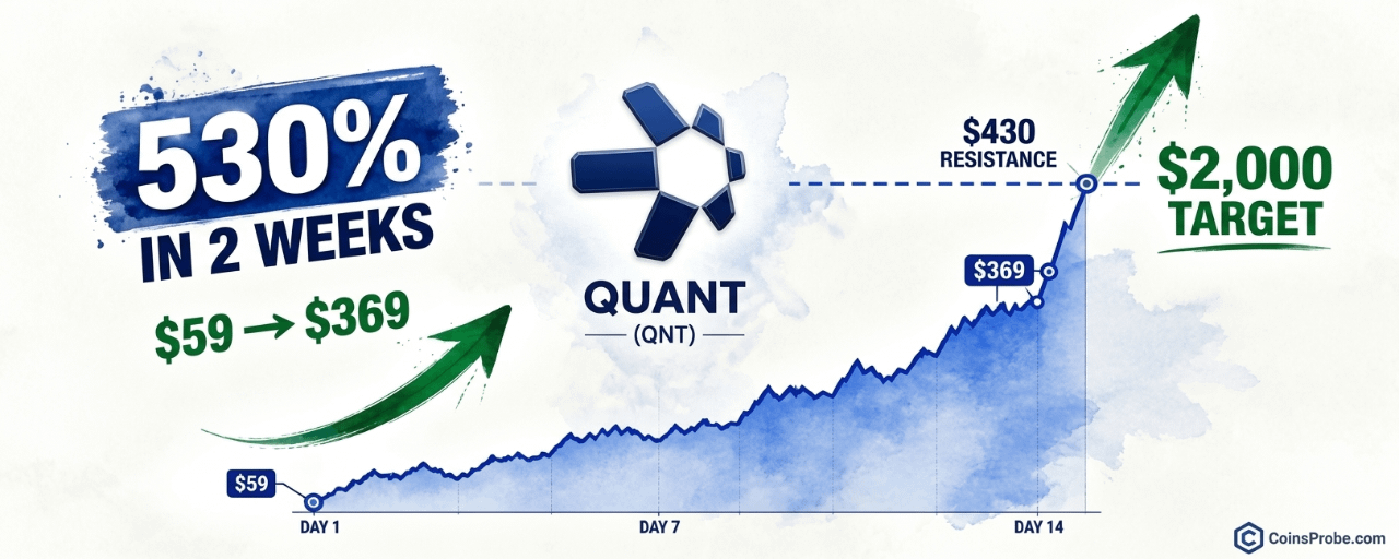
Article
Quant (QNT) Surges 530% in Two Weeks — Analyst Targets $2,000Key Highlights
QNT surged 530% in two weeks — from $59 to $369 — one of the sharpest large-cap moves on recordAnalyst @alicharts issues unhedged call: "QUANT: BULL RUN. TARGET $2,000" contingent on $430 break$430 is the decisive gate — channel top + 2021 ATH zone — 32% above chart price of $326$2,000 target represents +500% from current levels if price discovery phase activates
Quant (QNT) has posted one of the most violent two-week rallies in its history — climbing from approximately $59 to $369, a gain of roughly 530% — placing it among the sharpest short-duration moves recorded for a large-cap protocol token. At the time of writing, QNT is trading near $293 as bulls test the next major structural ceiling.
The move has drawn immediate attention from independent analyst Ali Martinez (@alicharts), who issued a direct, unhedged declaration: “QUANT: BULL RUN. TARGET $2,000.”
Martinez identifies the top of a multi-month ascending channel near $430 as the single pivotal level separating the current rally from a full price discovery phase — one that, if breached decisively, he argues could trigger a continuation toward that four-digit target.
The 530% Move
A 530% rally in fourteen days is not noise. It is a regime change in price structure. QNT opened the two-week period near $59 — a level last seen during the broader market compression of late 2025 — and has since compressed nearly five months of expected move into a single fortnight. To place this in context: QNT’s prior all-time high was approximately $427 in September 2021, meaning the token is now within striking distance of reclaiming that historical peak for the first time in roughly five years.
The velocity of the move matters analytically. Rallies of this magnitude in compressed timeframes typically fall into one of two categories: liquidity-driven short squeezes that fully retrace, or genuine demand-side re-rating events that find support at newly established equilibrium levels. The distinction is determined by what happens at resistance — in this case, the $430 channel top that Martinez has flagged as the decisive line.
The $430 Level — Channel Resistance and the Price Discovery Gate
Martinez’s analysis places the critical resistance at approximately $430, which aligns with the top of QNT’s ascending price channel on the weekly timeframe. This is not an arbitrary technical level — it coincides with QNT’s 2021 all-time high zone, making it a convergence of both channel structure and historical supply.
QNT 3DAY Chart | Source: @alicharts (X)
The significance of a channel breakout at this juncture is specific: once an asset clears its all-time high within the context of a well-defined channel, the chart structure provides no overhead supply reference. That is the technical definition of price discovery — a state where the next resistance level must be constructed from first principles, typically measured moves and psychological round numbers.
At $430, QNT would be approximately 16.5% above current levels. A decisive close above that level — not an intraday wick, not a brief tag — is the condition Martinez sets for the $2,000 thesis to activate.
Level Type Distance from$326 $326 Current Chart Price — $430 Channel Top / ATH Zone Resistance +32% $2,000 Analyst Price Discovery Target +500%
Key levels per @alicharts (X) — October 2026
The $2,000 Target — Measured Move or Speculation?
A $2,000 target from current levels represents a further +500% move from $326. That sounds extreme until framed against the already-documented 530% two-week rally. The question is not whether QNT can produce large moves — it demonstrably can — but whether the post-$430 structure supports a continuation of that magnitude.
In prior QNT cycles, the token’s move from its 2020 base near $5 to the 2021 peak near $427 represented an approximately 8,440% rally. A $2,000 target from a $59 cycle base would represent a roughly 3,290% total move — within the historical range of QNT’s prior bull cycle amplitude, though smaller in absolute percentage terms. This is the precedent-based case Martinez is implicitly referencing when he calls this a bull run rather than a bounce.
What separates this reading from generic price optimism is the structural anchor: the $430 level must break first. Without that confirmation, the $2,000 figure is a conditional target, not a current projection. Martinez’s framing is conditional — “a decisive break above that level could send Quant into price discovery” — which is analytically honest.
What Determines Whether the Rally Sustains
The metric to track is straightforward: a sustained weekly close above $430. That single condition determines whether QNT enters price discovery or reverts into the channel for a potential retest of lower support levels. Below, the immediate structural support following a 530% rally would logically sit near the prior breakout zone — approximately $200–$220, representing the area where momentum accelerated during the initial surge phase.
Bullish Scenario
A decisive weekly close above $430 — clearing both the channel top and the 2021 all-time high zone — would constitute a price discovery breakout with no historical overhead supply. Martinez’s $2,000 target (+500% from $326) would become the operative measured move. Intermediate resistance markers to watch on the way up: $600, $900, and $1,400 as psychological and round-number reference points in an uncharted zone.
Bearish Scenario
Failure to hold above $430 on a closing basis — particularly a weekly close back below the channel midline near $250 — would invalidate the price discovery thesis and suggest the two-week surge was a liquidity event rather than a demand re-rating. In that scenario, a retest of the $200–$220 structural zone is the base case, representing a 40–46% drawdown from current levels but still well above the $59 cycle base.
The Single Number That Resolves This
QNT has already done the extraordinary — 530% in two weeks from $59 to $369. The debate now is whether that move is a precursor or the entirety of this cycle’s move. Martinez’s framework makes the answer binary and testable: $430 is the gate. A decisive break above it opens price discovery and the $2,000 thesis. A rejection at $430 means the channel holds, and buyers must defend the $200–$220 zone to keep the broader bull structure intact.
Watch the weekly close at $430 as the single level that determines whether QNT’s bull run declaration becomes a confirmed breakout or a premature call.
Disclaimer: The views and analysis presented in this article are for informational purposes only and reflect the author’s perspective, not financial advice. Technical patterns and indicators discussed are subject to market volatility and may or may not yield anticipated results. Investors are advised to exercise caution, conduct independent research, and make decisions aligned with their individual risk tolerance.
Quant (QNT) Surges 530% in Two Weeks — Analyst Targets $2,000
Key Highlights
QNT surged 530% in two weeks — from $59 to $369 — one of the sharpest large-cap moves on recordAnalyst @alicharts issues unhedged call: "QUANT: BULL RUN. TARGET $2,000" contingent on $430 break$430 is the decisive gate — channel top + 2021 ATH zone — 32% above chart price of $326$2,000 target represents +500% from current levels if price discovery phase activates
Quant (QNT) has posted one of the most violent two-week rallies in its history — climbing from approximately $59 to $369, a gain of roughly 530% — placing it among the sharpest short-duration moves recorded for a large-cap protocol token. At the time of writing, QNT is trading near $293 as bulls test the next major structural ceiling.
The move has drawn immediate attention from independent analyst Ali Martinez (@alicharts), who issued a direct, unhedged declaration: “QUANT: BULL RUN. TARGET $2,000.”
Martinez identifies the top of a multi-month ascending channel near $430 as the single pivotal level separating the current rally from a full price discovery phase — one that, if breached decisively, he argues could trigger a continuation toward that four-digit target.
The 530% Move
A 530% rally in fourteen days is not noise. It is a regime change in price structure. QNT opened the two-week period near $59 — a level last seen during the broader market compression of late 2025 — and has since compressed nearly five months of expected move into a single fortnight. To place this in context: QNT’s prior all-time high was approximately $427 in September 2021, meaning the token is now within striking distance of reclaiming that historical peak for the first time in roughly five years.
The velocity of the move matters analytically. Rallies of this magnitude in compressed timeframes typically fall into one of two categories: liquidity-driven short squeezes that fully retrace, or genuine demand-side re-rating events that find support at newly established equilibrium levels. The distinction is determined by what happens at resistance — in this case, the $430 channel top that Martinez has flagged as the decisive line.
The $430 Level — Channel Resistance and the Price Discovery Gate
Martinez’s analysis places the critical resistance at approximately $430, which aligns with the top of QNT’s ascending price channel on the weekly timeframe. This is not an arbitrary technical level — it coincides with QNT’s 2021 all-time high zone, making it a convergence of both channel structure and historical supply.
QNT 3DAY Chart | Source: @alicharts (X)
The significance of a channel breakout at this juncture is specific: once an asset clears its all-time high within the context of a well-defined channel, the chart structure provides no overhead supply reference. That is the technical definition of price discovery — a state where the next resistance level must be constructed from first principles, typically measured moves and psychological round numbers.
At $430, QNT would be approximately 16.5% above current levels. A decisive close above that level — not an intraday wick, not a brief tag — is the condition Martinez sets for the $2,000 thesis to activate.
Level Type Distance from$326 $326 Current Chart Price — $430 Channel Top / ATH Zone Resistance +32% $2,000 Analyst Price Discovery Target +500%
Key levels per @alicharts (X) — October 2026
The $2,000 Target — Measured Move or Speculation?
A $2,000 target from current levels represents a further +500% move from $326. That sounds extreme until framed against the already-documented 530% two-week rally. The question is not whether QNT can produce large moves — it demonstrably can — but whether the post-$430 structure supports a continuation of that magnitude.
In prior QNT cycles, the token’s move from its 2020 base near $5 to the 2021 peak near $427 represented an approximately 8,440% rally. A $2,000 target from a $59 cycle base would represent a roughly 3,290% total move — within the historical range of QNT’s prior bull cycle amplitude, though smaller in absolute percentage terms. This is the precedent-based case Martinez is implicitly referencing when he calls this a bull run rather than a bounce.
What separates this reading from generic price optimism is the structural anchor: the $430 level must break first. Without that confirmation, the $2,000 figure is a conditional target, not a current projection. Martinez’s framing is conditional — “a decisive break above that level could send Quant into price discovery” — which is analytically honest.
What Determines Whether the Rally Sustains
The metric to track is straightforward: a sustained weekly close above $430. That single condition determines whether QNT enters price discovery or reverts into the channel for a potential retest of lower support levels. Below, the immediate structural support following a 530% rally would logically sit near the prior breakout zone — approximately $200–$220, representing the area where momentum accelerated during the initial surge phase.
Bullish Scenario
A decisive weekly close above $430 — clearing both the channel top and the 2021 all-time high zone — would constitute a price discovery breakout with no historical overhead supply. Martinez’s $2,000 target (+500% from $326) would become the operative measured move. Intermediate resistance markers to watch on the way up: $600, $900, and $1,400 as psychological and round-number reference points in an uncharted zone.
Bearish Scenario
Failure to hold above $430 on a closing basis — particularly a weekly close back below the channel midline near $250 — would invalidate the price discovery thesis and suggest the two-week surge was a liquidity event rather than a demand re-rating. In that scenario, a retest of the $200–$220 structural zone is the base case, representing a 40–46% drawdown from current levels but still well above the $59 cycle base.
The Single Number That Resolves This
QNT has already done the extraordinary — 530% in two weeks from $59 to $369. The debate now is whether that move is a precursor or the entirety of this cycle’s move. Martinez’s framework makes the answer binary and testable: $430 is the gate. A decisive break above it opens price discovery and the $2,000 thesis. A rejection at $430 means the channel holds, and buyers must defend the $200–$220 zone to keep the broader bull structure intact.
Watch the weekly close at $430 as the single level that determines whether QNT’s bull run declaration becomes a confirmed breakout or a premature call.
Disclaimer: The views and analysis presented in this article are for informational purposes only and reflect the author’s perspective, not financial advice. Technical patterns and indicators discussed are subject to market volatility and may or may not yield anticipated results. Investors are advised to exercise caution, conduct independent research, and make decisions aligned with their individual risk tolerance.
QNT surged 530% in two weeks — from $59 to $369 — one of the sharpest large-cap moves on recordAnalyst @alicharts issues unhedged call: "QUANT: BULL RUN. TARGET $2,000" contingent on $430 break$430 is the decisive gate — channel top + 2021 ATH zone — 32% above chart price of $326$2,000 target represents +500% from current levels if price discovery phase activates
Quant (QNT) has posted one of the most violent two-week rallies in its history — climbing from approximately $59 to $369, a gain of roughly 530% — placing it among the sharpest short-duration moves recorded for a large-cap protocol token. At the time of writing, QNT is trading near $293 as bulls test the next major structural ceiling.
The move has drawn immediate attention from independent analyst Ali Martinez (@alicharts), who issued a direct, unhedged declaration: “QUANT: BULL RUN. TARGET $2,000.”
Martinez identifies the top of a multi-month ascending channel near $430 as the single pivotal level separating the current rally from a full price discovery phase — one that, if breached decisively, he argues could trigger a continuation toward that four-digit target.
The 530% Move
A 530% rally in fourteen days is not noise. It is a regime change in price structure. QNT opened the two-week period near $59 — a level last seen during the broader market compression of late 2025 — and has since compressed nearly five months of expected move into a single fortnight. To place this in context: QNT’s prior all-time high was approximately $427 in September 2021, meaning the token is now within striking distance of reclaiming that historical peak for the first time in roughly five years.
The velocity of the move matters analytically. Rallies of this magnitude in compressed timeframes typically fall into one of two categories: liquidity-driven short squeezes that fully retrace, or genuine demand-side re-rating events that find support at newly established equilibrium levels. The distinction is determined by what happens at resistance — in this case, the $430 channel top that Martinez has flagged as the decisive line.
The $430 Level — Channel Resistance and the Price Discovery Gate
Martinez’s analysis places the critical resistance at approximately $430, which aligns with the top of QNT’s ascending price channel on the weekly timeframe. This is not an arbitrary technical level — it coincides with QNT’s 2021 all-time high zone, making it a convergence of both channel structure and historical supply.
QNT 3DAY Chart | Source: @alicharts (X)
The significance of a channel breakout at this juncture is specific: once an asset clears its all-time high within the context of a well-defined channel, the chart structure provides no overhead supply reference. That is the technical definition of price discovery — a state where the next resistance level must be constructed from first principles, typically measured moves and psychological round numbers.
At $430, QNT would be approximately 16.5% above current levels. A decisive close above that level — not an intraday wick, not a brief tag — is the condition Martinez sets for the $2,000 thesis to activate.
Level Type Distance from$326 $326 Current Chart Price — $430 Channel Top / ATH Zone Resistance +32% $2,000 Analyst Price Discovery Target +500%
Key levels per @alicharts (X) — October 2026
The $2,000 Target — Measured Move or Speculation?
A $2,000 target from current levels represents a further +500% move from $326. That sounds extreme until framed against the already-documented 530% two-week rally. The question is not whether QNT can produce large moves — it demonstrably can — but whether the post-$430 structure supports a continuation of that magnitude.
In prior QNT cycles, the token’s move from its 2020 base near $5 to the 2021 peak near $427 represented an approximately 8,440% rally. A $2,000 target from a $59 cycle base would represent a roughly 3,290% total move — within the historical range of QNT’s prior bull cycle amplitude, though smaller in absolute percentage terms. This is the precedent-based case Martinez is implicitly referencing when he calls this a bull run rather than a bounce.
What separates this reading from generic price optimism is the structural anchor: the $430 level must break first. Without that confirmation, the $2,000 figure is a conditional target, not a current projection. Martinez’s framing is conditional — “a decisive break above that level could send Quant into price discovery” — which is analytically honest.
What Determines Whether the Rally Sustains
The metric to track is straightforward: a sustained weekly close above $430. That single condition determines whether QNT enters price discovery or reverts into the channel for a potential retest of lower support levels. Below, the immediate structural support following a 530% rally would logically sit near the prior breakout zone — approximately $200–$220, representing the area where momentum accelerated during the initial surge phase.
Bullish Scenario
A decisive weekly close above $430 — clearing both the channel top and the 2021 all-time high zone — would constitute a price discovery breakout with no historical overhead supply. Martinez’s $2,000 target (+500% from $326) would become the operative measured move. Intermediate resistance markers to watch on the way up: $600, $900, and $1,400 as psychological and round-number reference points in an uncharted zone.
Bearish Scenario
Failure to hold above $430 on a closing basis — particularly a weekly close back below the channel midline near $250 — would invalidate the price discovery thesis and suggest the two-week surge was a liquidity event rather than a demand re-rating. In that scenario, a retest of the $200–$220 structural zone is the base case, representing a 40–46% drawdown from current levels but still well above the $59 cycle base.
The Single Number That Resolves This
QNT has already done the extraordinary — 530% in two weeks from $59 to $369. The debate now is whether that move is a precursor or the entirety of this cycle’s move. Martinez’s framework makes the answer binary and testable: $430 is the gate. A decisive break above it opens price discovery and the $2,000 thesis. A rejection at $430 means the channel holds, and buyers must defend the $200–$220 zone to keep the broader bull structure intact.
Watch the weekly close at $430 as the single level that determines whether QNT’s bull run declaration becomes a confirmed breakout or a premature call.
Disclaimer: The views and analysis presented in this article are for informational purposes only and reflect the author’s perspective, not financial advice. Technical patterns and indicators discussed are subject to market volatility and may or may not yield anticipated results. Investors are advised to exercise caution, conduct independent research, and make decisions aligned with their individual risk tolerance.
477
·
--
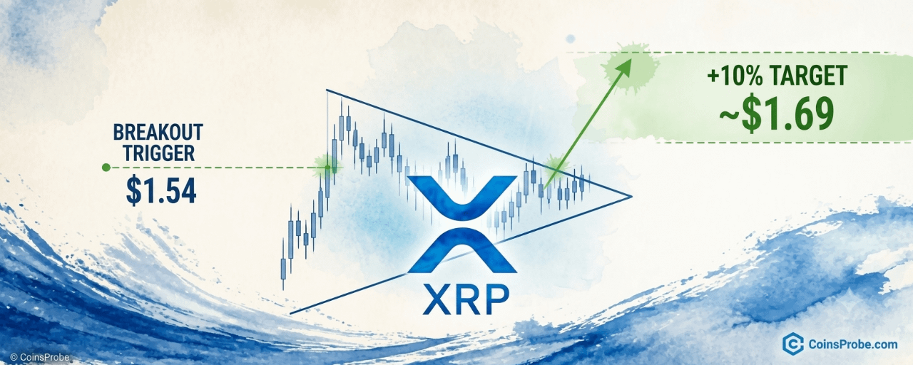
Article
XRP Forms Symmetrical Triangle — $1.54 Hourly Close Is the Breakout TriggerKey Highlights
XRP trades at $1.51 (+0.79% 24h) with a $95.06B market cap, compressing inside a symmetrical triangle on the hourly chartAnalyst @alicharts flags $1.54 as the exact breakout trigger — requires a confirmed hourly close above that levelA validated breakout above $1.54 projects a ~10% measured move targeting approximately $1.69Loss of the triangle's lower trendline near $1.46–$1.47 opens downside to the $1.37–$1.38 range
XRP is trading at $1.51 — up 0.79% in the past 24 hours — with a market cap of $95.06 billion, and the structure forming on its hourly chart may be more significant than the muted daily move suggests. The token is compressing inside a symmetrical triangle, and according to one closely-followed technical analyst, the entire near-term directional case hinges on a single price level.
That level is $1.54. Crypto analyst Ali Martinez (@alicharts) laid it out directly: “XRP appears to be developing a symmetrical triangle on the hourly chart. Now, everything comes down to $1.54. I’m waiting for an hourly close above $1.54 to confirm the breakout. If that happens, the pattern could trigger roughly a 10% rally.” There is no hedging in that framing — it is a binary setup with a clearly defined trigger.
The Symmetrical Triangle — What It Measures and Why It Matters Here
A symmetrical triangle forms when price makes progressively lower highs and higher lows, compressing into an apex as buyers and sellers reach temporary equilibrium. The pattern does not predict direction on its own — it quantifies the tension that has been building. What makes it analytically useful is that the compression itself creates a measurable release: the flagpole height at the triangle’s widest point projects forward as the minimum expected move once a side capitulates.
On XRP’s hourly chart, Martinez identifies this structure forming now, with $1.54 sitting at the upper trendline resistance. A confirmed hourly close above that level — not an intraday wick, not a touch — would signal that buyers have absorbed the pattern’s overhead supply and broken structure to the upside. The projected move from the triangle’s geometry: approximately 10%, which maps to a target near $1.69.
$1.54 — Why This Level Is the Entire Thesis
At $1.51, XRP is sitting roughly 2% below the breakout trigger. That gap is meaningful. The pattern is intact but unconfirmed. Martinez is explicit that he is waiting for the hourly close — not anticipating it, not trading ahead of it. This reflects a discipline that distinguishes technical discipline from speculation: the signal does not exist until the close prints above the level.
XRP 1H Chart | Source: @alicharts (X)
The $1.54 level functions simultaneously as the triangle’s upper boundary and the confirmation threshold. A close above it changes the chart’s structure — what was resistance becomes the first support reference point on any subsequent pullback. The 10% target near $1.69 represents the measured move projection, not an arbitrary price call.
Symmetrical triangles on hourly timeframes are typically resolved within the same trading session or the next, making this a short-duration setup. The compression is already visible at $1.51, meaning the breakout or breakdown should be resolved quickly — not over days.
The Level Below That Invalidates the Setup
Every breakout thesis requires a defined invalidation. For this triangle, a sustained move below the pattern’s lower trendline — which Martinez’s hourly structure places progressively above $1.45 as of the current session — would collapse the higher-lows sequence that defines the formation. That would not simply delay the breakout; it would confirm that sellers have absorbed the compression and broken structure downward, opening a separate measured move to the downside.
The asymmetry here is worth stating plainly: at $1.51, the breakout trigger is $0.03 away (approximately 2%). The invalidation level is further below current price, creating a setup where the trigger is closer than the stop — which is precisely the configuration that makes triangles worth monitoring in real time.
XRP’s broader macro backdrop adds context. Institutional interest in the asset has been building through structured vehicles — Crypto Spot ETFs logged $2.71B in weekly net inflows as recently as this month, with Bitcoin commanding the majority share but altcoin allocations following. Separately, the broader altcoin breakout narrative remains active, meaning an XRP hourly resolution carries cross-market attention.
Scenarios — Defined and Quantified
Bullish Scenario — Hourly Close Above $1.54
A confirmed hourly close above $1.54 triggers the symmetrical triangle breakout. The measured move from the pattern projects approximately 10% upside, placing the primary target near $1.69. $1.54 flips from resistance to first support on any subsequent pullback. Volume expansion on the breakout candle would strengthen the case.
Bearish Scenario — Loss of Triangle’s Lower Trendline
Failure to reclaim $1.54 and a breakdown below the ascending lower trendline — currently tracking near $1.46–$1.47 — collapses the formation. A downside measured move from the triangle would target the $1.37–$1.38 range, approximately 8–9% below current price. This would reset the hourly structure to bearish and require a full pattern rebuild before the breakout thesis can be revisited.
What Confirmation Actually Requires
Martinez’s framing is deliberately precise: it requires an hourly close above $1.54. Not a 15-minute close. Not a wick. The hourly candle must print and seal above that level. This distinction matters because symmetrical triangles generate frequent false wicks near the apex — intraday moves that touch the boundary without committing. Only a closed candle above $1.54 changes the technical structure and triggers the measured move projection.
Volume is the secondary confirmation. A breakout on below-average volume is statistically less reliable than one accompanied by a surge in hourly traded volume. XRP’s 24-hour volume at time of writing stands at $2.76 billion — the breakout candle should show a meaningful spike relative to the preceding compressed candles inside the triangle.
XRP is coiling at $1.51 with $1.54 as the line that separates a 10% measured move from a pattern breakdown. Martinez has defined the trigger. The market will answer it — likely within hours, not days. Watch the hourly close above $1.54 as the sole condition that activates the bullish thesis.
Disclaimer: The views and analysis presented in this article are for informational purposes only and reflect the author’s perspective, not financial advice. Technical patterns and indicators discussed are subject to market volatility and may or may not yield anticipated results. Investors are advised to exercise caution, conduct independent research, and make decisions aligned with their individual risk tolerance.
XRP Forms Symmetrical Triangle — $1.54 Hourly Close Is the Breakout Trigger
Key Highlights
XRP trades at $1.51 (+0.79% 24h) with a $95.06B market cap, compressing inside a symmetrical triangle on the hourly chartAnalyst @alicharts flags $1.54 as the exact breakout trigger — requires a confirmed hourly close above that levelA validated breakout above $1.54 projects a ~10% measured move targeting approximately $1.69Loss of the triangle's lower trendline near $1.46–$1.47 opens downside to the $1.37–$1.38 range
XRP is trading at $1.51 — up 0.79% in the past 24 hours — with a market cap of $95.06 billion, and the structure forming on its hourly chart may be more significant than the muted daily move suggests. The token is compressing inside a symmetrical triangle, and according to one closely-followed technical analyst, the entire near-term directional case hinges on a single price level.
That level is $1.54. Crypto analyst Ali Martinez (@alicharts) laid it out directly: “XRP appears to be developing a symmetrical triangle on the hourly chart. Now, everything comes down to $1.54. I’m waiting for an hourly close above $1.54 to confirm the breakout. If that happens, the pattern could trigger roughly a 10% rally.” There is no hedging in that framing — it is a binary setup with a clearly defined trigger.
The Symmetrical Triangle — What It Measures and Why It Matters Here
A symmetrical triangle forms when price makes progressively lower highs and higher lows, compressing into an apex as buyers and sellers reach temporary equilibrium. The pattern does not predict direction on its own — it quantifies the tension that has been building. What makes it analytically useful is that the compression itself creates a measurable release: the flagpole height at the triangle’s widest point projects forward as the minimum expected move once a side capitulates.
On XRP’s hourly chart, Martinez identifies this structure forming now, with $1.54 sitting at the upper trendline resistance. A confirmed hourly close above that level — not an intraday wick, not a touch — would signal that buyers have absorbed the pattern’s overhead supply and broken structure to the upside. The projected move from the triangle’s geometry: approximately 10%, which maps to a target near $1.69.
$1.54 — Why This Level Is the Entire Thesis
At $1.51, XRP is sitting roughly 2% below the breakout trigger. That gap is meaningful. The pattern is intact but unconfirmed. Martinez is explicit that he is waiting for the hourly close — not anticipating it, not trading ahead of it. This reflects a discipline that distinguishes technical discipline from speculation: the signal does not exist until the close prints above the level.
XRP 1H Chart | Source: @alicharts (X)
The $1.54 level functions simultaneously as the triangle’s upper boundary and the confirmation threshold. A close above it changes the chart’s structure — what was resistance becomes the first support reference point on any subsequent pullback. The 10% target near $1.69 represents the measured move projection, not an arbitrary price call.
Symmetrical triangles on hourly timeframes are typically resolved within the same trading session or the next, making this a short-duration setup. The compression is already visible at $1.51, meaning the breakout or breakdown should be resolved quickly — not over days.
The Level Below That Invalidates the Setup
Every breakout thesis requires a defined invalidation. For this triangle, a sustained move below the pattern’s lower trendline — which Martinez’s hourly structure places progressively above $1.45 as of the current session — would collapse the higher-lows sequence that defines the formation. That would not simply delay the breakout; it would confirm that sellers have absorbed the compression and broken structure downward, opening a separate measured move to the downside.
The asymmetry here is worth stating plainly: at $1.51, the breakout trigger is $0.03 away (approximately 2%). The invalidation level is further below current price, creating a setup where the trigger is closer than the stop — which is precisely the configuration that makes triangles worth monitoring in real time.
XRP’s broader macro backdrop adds context. Institutional interest in the asset has been building through structured vehicles — Crypto Spot ETFs logged $2.71B in weekly net inflows as recently as this month, with Bitcoin commanding the majority share but altcoin allocations following. Separately, the broader altcoin breakout narrative remains active, meaning an XRP hourly resolution carries cross-market attention.
Scenarios — Defined and Quantified
Bullish Scenario — Hourly Close Above $1.54
A confirmed hourly close above $1.54 triggers the symmetrical triangle breakout. The measured move from the pattern projects approximately 10% upside, placing the primary target near $1.69. $1.54 flips from resistance to first support on any subsequent pullback. Volume expansion on the breakout candle would strengthen the case.
Bearish Scenario — Loss of Triangle’s Lower Trendline
Failure to reclaim $1.54 and a breakdown below the ascending lower trendline — currently tracking near $1.46–$1.47 — collapses the formation. A downside measured move from the triangle would target the $1.37–$1.38 range, approximately 8–9% below current price. This would reset the hourly structure to bearish and require a full pattern rebuild before the breakout thesis can be revisited.
What Confirmation Actually Requires
Martinez’s framing is deliberately precise: it requires an hourly close above $1.54. Not a 15-minute close. Not a wick. The hourly candle must print and seal above that level. This distinction matters because symmetrical triangles generate frequent false wicks near the apex — intraday moves that touch the boundary without committing. Only a closed candle above $1.54 changes the technical structure and triggers the measured move projection.
Volume is the secondary confirmation. A breakout on below-average volume is statistically less reliable than one accompanied by a surge in hourly traded volume. XRP’s 24-hour volume at time of writing stands at $2.76 billion — the breakout candle should show a meaningful spike relative to the preceding compressed candles inside the triangle.
XRP is coiling at $1.51 with $1.54 as the line that separates a 10% measured move from a pattern breakdown. Martinez has defined the trigger. The market will answer it — likely within hours, not days. Watch the hourly close above $1.54 as the sole condition that activates the bullish thesis.
Disclaimer: The views and analysis presented in this article are for informational purposes only and reflect the author’s perspective, not financial advice. Technical patterns and indicators discussed are subject to market volatility and may or may not yield anticipated results. Investors are advised to exercise caution, conduct independent research, and make decisions aligned with their individual risk tolerance.
XRP trades at $1.51 (+0.79% 24h) with a $95.06B market cap, compressing inside a symmetrical triangle on the hourly chartAnalyst @alicharts flags $1.54 as the exact breakout trigger — requires a confirmed hourly close above that levelA validated breakout above $1.54 projects a ~10% measured move targeting approximately $1.69Loss of the triangle's lower trendline near $1.46–$1.47 opens downside to the $1.37–$1.38 range
XRP is trading at $1.51 — up 0.79% in the past 24 hours — with a market cap of $95.06 billion, and the structure forming on its hourly chart may be more significant than the muted daily move suggests. The token is compressing inside a symmetrical triangle, and according to one closely-followed technical analyst, the entire near-term directional case hinges on a single price level.
That level is $1.54. Crypto analyst Ali Martinez (@alicharts) laid it out directly: “XRP appears to be developing a symmetrical triangle on the hourly chart. Now, everything comes down to $1.54. I’m waiting for an hourly close above $1.54 to confirm the breakout. If that happens, the pattern could trigger roughly a 10% rally.” There is no hedging in that framing — it is a binary setup with a clearly defined trigger.
The Symmetrical Triangle — What It Measures and Why It Matters Here
A symmetrical triangle forms when price makes progressively lower highs and higher lows, compressing into an apex as buyers and sellers reach temporary equilibrium. The pattern does not predict direction on its own — it quantifies the tension that has been building. What makes it analytically useful is that the compression itself creates a measurable release: the flagpole height at the triangle’s widest point projects forward as the minimum expected move once a side capitulates.
On XRP’s hourly chart, Martinez identifies this structure forming now, with $1.54 sitting at the upper trendline resistance. A confirmed hourly close above that level — not an intraday wick, not a touch — would signal that buyers have absorbed the pattern’s overhead supply and broken structure to the upside. The projected move from the triangle’s geometry: approximately 10%, which maps to a target near $1.69.
$1.54 — Why This Level Is the Entire Thesis
At $1.51, XRP is sitting roughly 2% below the breakout trigger. That gap is meaningful. The pattern is intact but unconfirmed. Martinez is explicit that he is waiting for the hourly close — not anticipating it, not trading ahead of it. This reflects a discipline that distinguishes technical discipline from speculation: the signal does not exist until the close prints above the level.
XRP 1H Chart | Source: @alicharts (X)
The $1.54 level functions simultaneously as the triangle’s upper boundary and the confirmation threshold. A close above it changes the chart’s structure — what was resistance becomes the first support reference point on any subsequent pullback. The 10% target near $1.69 represents the measured move projection, not an arbitrary price call.
Symmetrical triangles on hourly timeframes are typically resolved within the same trading session or the next, making this a short-duration setup. The compression is already visible at $1.51, meaning the breakout or breakdown should be resolved quickly — not over days.
The Level Below That Invalidates the Setup
Every breakout thesis requires a defined invalidation. For this triangle, a sustained move below the pattern’s lower trendline — which Martinez’s hourly structure places progressively above $1.45 as of the current session — would collapse the higher-lows sequence that defines the formation. That would not simply delay the breakout; it would confirm that sellers have absorbed the compression and broken structure downward, opening a separate measured move to the downside.
The asymmetry here is worth stating plainly: at $1.51, the breakout trigger is $0.03 away (approximately 2%). The invalidation level is further below current price, creating a setup where the trigger is closer than the stop — which is precisely the configuration that makes triangles worth monitoring in real time.
XRP’s broader macro backdrop adds context. Institutional interest in the asset has been building through structured vehicles — Crypto Spot ETFs logged $2.71B in weekly net inflows as recently as this month, with Bitcoin commanding the majority share but altcoin allocations following. Separately, the broader altcoin breakout narrative remains active, meaning an XRP hourly resolution carries cross-market attention.
Scenarios — Defined and Quantified
Bullish Scenario — Hourly Close Above $1.54
A confirmed hourly close above $1.54 triggers the symmetrical triangle breakout. The measured move from the pattern projects approximately 10% upside, placing the primary target near $1.69. $1.54 flips from resistance to first support on any subsequent pullback. Volume expansion on the breakout candle would strengthen the case.
Bearish Scenario — Loss of Triangle’s Lower Trendline
Failure to reclaim $1.54 and a breakdown below the ascending lower trendline — currently tracking near $1.46–$1.47 — collapses the formation. A downside measured move from the triangle would target the $1.37–$1.38 range, approximately 8–9% below current price. This would reset the hourly structure to bearish and require a full pattern rebuild before the breakout thesis can be revisited.
What Confirmation Actually Requires
Martinez’s framing is deliberately precise: it requires an hourly close above $1.54. Not a 15-minute close. Not a wick. The hourly candle must print and seal above that level. This distinction matters because symmetrical triangles generate frequent false wicks near the apex — intraday moves that touch the boundary without committing. Only a closed candle above $1.54 changes the technical structure and triggers the measured move projection.
Volume is the secondary confirmation. A breakout on below-average volume is statistically less reliable than one accompanied by a surge in hourly traded volume. XRP’s 24-hour volume at time of writing stands at $2.76 billion — the breakout candle should show a meaningful spike relative to the preceding compressed candles inside the triangle.
XRP is coiling at $1.51 with $1.54 as the line that separates a 10% measured move from a pattern breakdown. Martinez has defined the trigger. The market will answer it — likely within hours, not days. Watch the hourly close above $1.54 as the sole condition that activates the bullish thesis.
Disclaimer: The views and analysis presented in this article are for informational purposes only and reflect the author’s perspective, not financial advice. Technical patterns and indicators discussed are subject to market volatility and may or may not yield anticipated results. Investors are advised to exercise caution, conduct independent research, and make decisions aligned with their individual risk tolerance.
181
·
--

Article
Pi Network Partners With Open Standard as OUSD Goes LiveKey Highlights
Pi Network has partnered with Open Standard, the company behind Open USD (OUSD) — a partner-governed dollar stablecoin that went live on September 30, 2026, backed by Visa, Google, Stripe, BlackRock, Mastercard, and more than 200 partners.Pi will explore Pioneer rewards programs and broader OUSD utility across the ecosystem — though implementation details and a rollout date have not yet been released.Protocol 28 Mainnet upgrade is scheduled for October 16, 2026 — node operators must upgrade by October 13 — improving smart contract batch upgrades, delayed transaction handling, and safer stored-data changes.
Pi Network closed September with two simultaneous announcements: a formal partnership with Open Standard, the company powering a newly launched dollar stablecoin with institutional-grade backing, and a confirmed timeline for the Protocol 28 Mainnet upgrade. The two developments are separate — one is a business partnership in early stages, the other is a scheduled infrastructure upgrade with a hard deadline. Both arrived on the same day.
The official Pi Core Team announcement is at @PiCoreTeam on X.
The Open Standard Partnership — What Pi Announced
On September 30, 2026, the Pi Core Team announced that Pi Network is partnering with Open Standard — the company behind Open USD (OUSD), a partner-governed dollar stablecoin designed as open financial infrastructure.
Open Standard’s partner network now includes more than 200 organizations spanning payments, finance, technology, and crypto — including Visa, Google, Stripe, Mastercard, Coinbase, BlackRock, and Shopify, alongside major banks and payment processors.
Pi Network Partners with Open Standard | Source: @PiCoreTeam (X)
According to the Pi Core Team, Pi will explore rewards programs for Pioneers and broader OUSD utility across the Pi ecosystem. No implementation details or rollout timeline have been published. The partnership is exploratory at this stage — Pi has not announced OUSD integration on Pi Mainnet, an exchange listing, or changes to Pi’s token supply.
OUSD — What the Stablecoin Is and What Went Live
OUSD went live on September 30, 2026. Businesses and developers can now mint, burn, and build with the stablecoin immediately.
OUSD is designed for banking, cross-border payments, settlement, institutional trading, and related use cases. It mints and redeems at a 1:1 USD conversion rate at no cost. Reserves are held at BlackRock, Lead Bank, and BNY — with monthly attestations published at reserves.bridge.xyz/ousd. OUSD is issued by Bridge, a Stripe company.
Building With OUSD — Live Integration Paths
Platform Availability BVNK Live from September 30 Stripe Live from September 30 Visa Stablecoin Platform Live from September 30 Coinbase Live from October 1, 2026
Each path provides APIs for settlement, payment orchestration, FX, wallets, cards, and more.
OUSD Chains and Venues
OUSD is natively supported on Base, Ethereum, Solana, and Tempo — and is available on Coinbase, Kraken, and Uniswap at launch, with more venues planned.
Official contract addresses:
Chain Contract Base 0xB2000000000000000000002fEb517dFeC7415344 Ethereum 0x9f6F3991D525015a6F8CaF062C83b62fD3AC4436 Solana ousd2mJsPEckLHcSCDxyKD7NDGARZcfLbDZkKiatYHB Tempo 0x20c0000000000000000000006a37DA5C996874BE
Partners earn rewards proportional to the supply and activity they drive — and have the opportunity to earn equity in Open Standard.
Why the Partnership Timing Matters
The Pi–Open Standard partnership is arriving as OUSD transitions from announced to live. Businesses can already build with the stablecoin today. Pi’s stated intention to explore Pioneer rewards and ecosystem utility is therefore connecting to an already-operational infrastructure layer — not a future product.
That distinction matters for how the partnership should be read. Pi has not committed to a specific OUSD integration, and no rollout date exists. What the Core Team has communicated is directional intent alongside a partner network that includes some of the largest names in global payments and institutional finance.
As covered in our Pi Network KYC and migration update fixing over 900,000 Pioneer blockers and Pi Desktop rename and SoloHost app rankings update, Pi has been progressively building out both its user-facing infrastructure and its developer ecosystem through 2026. The OUSD partnership is the first announcement that connects Pi’s ecosystem to an external stablecoin with institutional reserve backing and a live multi-chain deployment.
Protocol 28 — October 16 Mainnet Upgrade
The Protocol 28 timeline is separate from the Open Standard partnership and has a hard deadline.
Following the successful completion of the Protocol 27 upgrade on Pi Mainnet, Pi Testnet has already upgraded to Protocol 28. The Mainnet upgrade follows:
Milestone Date Node operator upgrade deadline October 13, 2026 Protocol 28 Mainnet activation October 16, 2026 Activation time Not yet announced
Protocol 28 — October 16 Mainnet Upgrade | Source: @PiCoreTeam (X)
What Protocol 28 Changes
Delayed transaction data handling: Improved network behavior when transaction data arrives late — reducing edge cases that could affect block confirmation under load.
Batch smart contract upgrades: Developers can now upgrade groups of smart contracts simultaneously — reducing the complexity and risk of multi-contract application updates.
Safer stored-data changes: Protocol 28 makes it safer for developers to modify stored data as their applications evolve — a meaningful improvement for longer-lived applications on Pi Mainnet.
Protocol 28 does not change Pi’s token supply, confirm OUSD integration, or announce any exchange listing. It is a scheduled infrastructure step — the next in Pi’s sequential mandatory upgrade path.
Node operators must upgrade to Protocol 28 by October 13, 2026. Nodes not upgraded before the October 16 Mainnet activation will fall out of consensus.
What to Watch
Two open questions follow from today’s announcements:
On the OUSD partnership: When does Pi publish implementation details — specifically, what Pioneer rewards look like and how OUSD utility integrates across the Pi ecosystem? The partnership is confirmed. The mechanics are not yet public.
On Protocol 28: Node operators have until October 13. Whether the broader developer community begins building with Protocol 28’s batch upgrade and stored-data capabilities after October 16 will determine how quickly the infrastructure improvement translates into ecosystem-level impact.
Disclaimer: This article is for informational purposes only. Always refer to Pi Network's official channels for the most current partnership and protocol information.
Pi Network Partners With Open Standard as OUSD Goes Live
Key Highlights
Pi Network has partnered with Open Standard, the company behind Open USD (OUSD) — a partner-governed dollar stablecoin that went live on September 30, 2026, backed by Visa, Google, Stripe, BlackRock, Mastercard, and more than 200 partners.Pi will explore Pioneer rewards programs and broader OUSD utility across the ecosystem — though implementation details and a rollout date have not yet been released.Protocol 28 Mainnet upgrade is scheduled for October 16, 2026 — node operators must upgrade by October 13 — improving smart contract batch upgrades, delayed transaction handling, and safer stored-data changes.
Pi Network closed September with two simultaneous announcements: a formal partnership with Open Standard, the company powering a newly launched dollar stablecoin with institutional-grade backing, and a confirmed timeline for the Protocol 28 Mainnet upgrade. The two developments are separate — one is a business partnership in early stages, the other is a scheduled infrastructure upgrade with a hard deadline. Both arrived on the same day.
The official Pi Core Team announcement is at @PiCoreTeam on X.
The Open Standard Partnership — What Pi Announced
On September 30, 2026, the Pi Core Team announced that Pi Network is partnering with Open Standard — the company behind Open USD (OUSD), a partner-governed dollar stablecoin designed as open financial infrastructure.
Open Standard’s partner network now includes more than 200 organizations spanning payments, finance, technology, and crypto — including Visa, Google, Stripe, Mastercard, Coinbase, BlackRock, and Shopify, alongside major banks and payment processors.
Pi Network Partners with Open Standard | Source: @PiCoreTeam (X)
According to the Pi Core Team, Pi will explore rewards programs for Pioneers and broader OUSD utility across the Pi ecosystem. No implementation details or rollout timeline have been published. The partnership is exploratory at this stage — Pi has not announced OUSD integration on Pi Mainnet, an exchange listing, or changes to Pi’s token supply.
OUSD — What the Stablecoin Is and What Went Live
OUSD went live on September 30, 2026. Businesses and developers can now mint, burn, and build with the stablecoin immediately.
OUSD is designed for banking, cross-border payments, settlement, institutional trading, and related use cases. It mints and redeems at a 1:1 USD conversion rate at no cost. Reserves are held at BlackRock, Lead Bank, and BNY — with monthly attestations published at reserves.bridge.xyz/ousd. OUSD is issued by Bridge, a Stripe company.
Building With OUSD — Live Integration Paths
Platform Availability BVNK Live from September 30 Stripe Live from September 30 Visa Stablecoin Platform Live from September 30 Coinbase Live from October 1, 2026
Each path provides APIs for settlement, payment orchestration, FX, wallets, cards, and more.
OUSD Chains and Venues
OUSD is natively supported on Base, Ethereum, Solana, and Tempo — and is available on Coinbase, Kraken, and Uniswap at launch, with more venues planned.
Official contract addresses:
Chain Contract Base 0xB2000000000000000000002fEb517dFeC7415344 Ethereum 0x9f6F3991D525015a6F8CaF062C83b62fD3AC4436 Solana ousd2mJsPEckLHcSCDxyKD7NDGARZcfLbDZkKiatYHB Tempo 0x20c0000000000000000000006a37DA5C996874BE
Partners earn rewards proportional to the supply and activity they drive — and have the opportunity to earn equity in Open Standard.
Why the Partnership Timing Matters
The Pi–Open Standard partnership is arriving as OUSD transitions from announced to live. Businesses can already build with the stablecoin today. Pi’s stated intention to explore Pioneer rewards and ecosystem utility is therefore connecting to an already-operational infrastructure layer — not a future product.
That distinction matters for how the partnership should be read. Pi has not committed to a specific OUSD integration, and no rollout date exists. What the Core Team has communicated is directional intent alongside a partner network that includes some of the largest names in global payments and institutional finance.
As covered in our Pi Network KYC and migration update fixing over 900,000 Pioneer blockers and Pi Desktop rename and SoloHost app rankings update, Pi has been progressively building out both its user-facing infrastructure and its developer ecosystem through 2026. The OUSD partnership is the first announcement that connects Pi’s ecosystem to an external stablecoin with institutional reserve backing and a live multi-chain deployment.
Protocol 28 — October 16 Mainnet Upgrade
The Protocol 28 timeline is separate from the Open Standard partnership and has a hard deadline.
Following the successful completion of the Protocol 27 upgrade on Pi Mainnet, Pi Testnet has already upgraded to Protocol 28. The Mainnet upgrade follows:
Milestone Date Node operator upgrade deadline October 13, 2026 Protocol 28 Mainnet activation October 16, 2026 Activation time Not yet announced
Protocol 28 — October 16 Mainnet Upgrade | Source: @PiCoreTeam (X)
What Protocol 28 Changes
Delayed transaction data handling: Improved network behavior when transaction data arrives late — reducing edge cases that could affect block confirmation under load.
Batch smart contract upgrades: Developers can now upgrade groups of smart contracts simultaneously — reducing the complexity and risk of multi-contract application updates.
Safer stored-data changes: Protocol 28 makes it safer for developers to modify stored data as their applications evolve — a meaningful improvement for longer-lived applications on Pi Mainnet.
Protocol 28 does not change Pi’s token supply, confirm OUSD integration, or announce any exchange listing. It is a scheduled infrastructure step — the next in Pi’s sequential mandatory upgrade path.
Node operators must upgrade to Protocol 28 by October 13, 2026. Nodes not upgraded before the October 16 Mainnet activation will fall out of consensus.
What to Watch
Two open questions follow from today’s announcements:
On the OUSD partnership: When does Pi publish implementation details — specifically, what Pioneer rewards look like and how OUSD utility integrates across the Pi ecosystem? The partnership is confirmed. The mechanics are not yet public.
On Protocol 28: Node operators have until October 13. Whether the broader developer community begins building with Protocol 28’s batch upgrade and stored-data capabilities after October 16 will determine how quickly the infrastructure improvement translates into ecosystem-level impact.
Disclaimer: This article is for informational purposes only. Always refer to Pi Network's official channels for the most current partnership and protocol information.
Pi Network has partnered with Open Standard, the company behind Open USD (OUSD) — a partner-governed dollar stablecoin that went live on September 30, 2026, backed by Visa, Google, Stripe, BlackRock, Mastercard, and more than 200 partners.Pi will explore Pioneer rewards programs and broader OUSD utility across the ecosystem — though implementation details and a rollout date have not yet been released.Protocol 28 Mainnet upgrade is scheduled for October 16, 2026 — node operators must upgrade by October 13 — improving smart contract batch upgrades, delayed transaction handling, and safer stored-data changes.
Pi Network closed September with two simultaneous announcements: a formal partnership with Open Standard, the company powering a newly launched dollar stablecoin with institutional-grade backing, and a confirmed timeline for the Protocol 28 Mainnet upgrade. The two developments are separate — one is a business partnership in early stages, the other is a scheduled infrastructure upgrade with a hard deadline. Both arrived on the same day.
The official Pi Core Team announcement is at @PiCoreTeam on X.
The Open Standard Partnership — What Pi Announced
On September 30, 2026, the Pi Core Team announced that Pi Network is partnering with Open Standard — the company behind Open USD (OUSD), a partner-governed dollar stablecoin designed as open financial infrastructure.
Open Standard’s partner network now includes more than 200 organizations spanning payments, finance, technology, and crypto — including Visa, Google, Stripe, Mastercard, Coinbase, BlackRock, and Shopify, alongside major banks and payment processors.
Pi Network Partners with Open Standard | Source: @PiCoreTeam (X)
According to the Pi Core Team, Pi will explore rewards programs for Pioneers and broader OUSD utility across the Pi ecosystem. No implementation details or rollout timeline have been published. The partnership is exploratory at this stage — Pi has not announced OUSD integration on Pi Mainnet, an exchange listing, or changes to Pi’s token supply.
OUSD — What the Stablecoin Is and What Went Live
OUSD went live on September 30, 2026. Businesses and developers can now mint, burn, and build with the stablecoin immediately.
OUSD is designed for banking, cross-border payments, settlement, institutional trading, and related use cases. It mints and redeems at a 1:1 USD conversion rate at no cost. Reserves are held at BlackRock, Lead Bank, and BNY — with monthly attestations published at reserves.bridge.xyz/ousd. OUSD is issued by Bridge, a Stripe company.
Building With OUSD — Live Integration Paths
Platform Availability BVNK Live from September 30 Stripe Live from September 30 Visa Stablecoin Platform Live from September 30 Coinbase Live from October 1, 2026
Each path provides APIs for settlement, payment orchestration, FX, wallets, cards, and more.
OUSD Chains and Venues
OUSD is natively supported on Base, Ethereum, Solana, and Tempo — and is available on Coinbase, Kraken, and Uniswap at launch, with more venues planned.
Official contract addresses:
Chain Contract Base 0xB2000000000000000000002fEb517dFeC7415344 Ethereum 0x9f6F3991D525015a6F8CaF062C83b62fD3AC4436 Solana ousd2mJsPEckLHcSCDxyKD7NDGARZcfLbDZkKiatYHB Tempo 0x20c0000000000000000000006a37DA5C996874BE
Partners earn rewards proportional to the supply and activity they drive — and have the opportunity to earn equity in Open Standard.
Why the Partnership Timing Matters
The Pi–Open Standard partnership is arriving as OUSD transitions from announced to live. Businesses can already build with the stablecoin today. Pi’s stated intention to explore Pioneer rewards and ecosystem utility is therefore connecting to an already-operational infrastructure layer — not a future product.
That distinction matters for how the partnership should be read. Pi has not committed to a specific OUSD integration, and no rollout date exists. What the Core Team has communicated is directional intent alongside a partner network that includes some of the largest names in global payments and institutional finance.
As covered in our Pi Network KYC and migration update fixing over 900,000 Pioneer blockers and Pi Desktop rename and SoloHost app rankings update, Pi has been progressively building out both its user-facing infrastructure and its developer ecosystem through 2026. The OUSD partnership is the first announcement that connects Pi’s ecosystem to an external stablecoin with institutional reserve backing and a live multi-chain deployment.
Protocol 28 — October 16 Mainnet Upgrade
The Protocol 28 timeline is separate from the Open Standard partnership and has a hard deadline.
Following the successful completion of the Protocol 27 upgrade on Pi Mainnet, Pi Testnet has already upgraded to Protocol 28. The Mainnet upgrade follows:
Milestone Date Node operator upgrade deadline October 13, 2026 Protocol 28 Mainnet activation October 16, 2026 Activation time Not yet announced
Protocol 28 — October 16 Mainnet Upgrade | Source: @PiCoreTeam (X)
What Protocol 28 Changes
Delayed transaction data handling: Improved network behavior when transaction data arrives late — reducing edge cases that could affect block confirmation under load.
Batch smart contract upgrades: Developers can now upgrade groups of smart contracts simultaneously — reducing the complexity and risk of multi-contract application updates.
Safer stored-data changes: Protocol 28 makes it safer for developers to modify stored data as their applications evolve — a meaningful improvement for longer-lived applications on Pi Mainnet.
Protocol 28 does not change Pi’s token supply, confirm OUSD integration, or announce any exchange listing. It is a scheduled infrastructure step — the next in Pi’s sequential mandatory upgrade path.
Node operators must upgrade to Protocol 28 by October 13, 2026. Nodes not upgraded before the October 16 Mainnet activation will fall out of consensus.
What to Watch
Two open questions follow from today’s announcements:
On the OUSD partnership: When does Pi publish implementation details — specifically, what Pioneer rewards look like and how OUSD utility integrates across the Pi ecosystem? The partnership is confirmed. The mechanics are not yet public.
On Protocol 28: Node operators have until October 13. Whether the broader developer community begins building with Protocol 28’s batch upgrade and stored-data capabilities after October 16 will determine how quickly the infrastructure improvement translates into ecosystem-level impact.
Disclaimer: This article is for informational purposes only. Always refer to Pi Network's official channels for the most current partnership and protocol information.
169
·
--
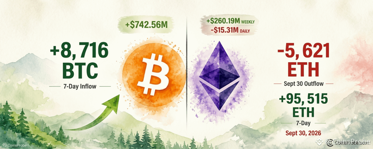
Article
Bitcoin ETFs Pull $742.56M in 7 Days While Ethereum Sees $15M Single-Day ExitKey Highlights
Bitcoin ETFs recorded +8,716 BTC ($742.56M) in 7-day net inflows through September 30 per LookonchainEthereum ETFs flipped negative on the day — single-session outflow of 5,621 ETH ($15.31M) despite a positive weekly totalBitcoin captured 74.1% of the combined $1.0B weekly ETF inflow across both asset classesSeptember 30 BTC daily inflow of +628 BTC was ~50% below the week's 1,245 BTC daily average
BREAKING
Bitcoin spot ETFs recorded a combined seven-day net inflow of +8,716 BTC — equivalent to $742.56 million — through September 30, according to Lookonchain. The same session saw Ethereum ETFs post a single-day net outflow of 5,621 ETH ($15.31 million), even as the seven-day Ethereum ETF picture remained positive.
At the time of writing, Bitcoin is trading at approximately $84,131 — down 0.07% over the past 24 hours — giving the weekly ETF inflow figure a realized dollar value of $742.56 million against a live market cap of approximately $1.69 trillion.
Bitcoin ETFs — Weekly Demand Versus Daily Pace
The seven-day inflow of 8,716 BTC translates to a daily average of approximately 1,245 BTC per session across the week. Tuesday’s single-day reading of +628 BTC ($53.48 million) came in roughly 50% below that weekly average — indicating that demand intensity decelerated into the final session of the period rather than accelerating.
At the current BTC price of $84,131, the 7-day inflow of 8,716 BTC represents approximately 0.044% of Bitcoin’s total circulating market cap absorbed by ETF vehicles in a single week. For context, the seven-day dollar inflow of $742.56 million equals roughly 2.55% of Bitcoin’s entire 24-hour global trading volume ($29.16 billion) — a ratio that indicates ETF demand is a structurally meaningful but not dominant force relative to spot market liquidity on any given day.
Ethereum ETFs — Divergence Between Daily and Weekly Signal
Ethereum ETFs present a split picture that warrants careful reading. The seven-day net inflow stands at +95,515 ETH ($260.19 million) — a positive weekly result. However, the September 30 session alone registered a net outflow of 5,621 ETH ($15.31 million), reversing direction sharply within an otherwise constructive weekly window.
The single-day outflow of 5,621 ETH represents approximately 5.89% of the entire seven-day inflow of 95,515 ETH — meaning one session erased nearly 6% of the week’s accumulated demand. Whether this reflects tactical profit-taking at the end of a calendar month or the beginning of a sustained reversal cannot be determined from flow data alone. What the data does confirm is that ETH ETF demand is less consistent than BTC ETF demand over this specific window.
ETFs Net Inflow on Sept 2026 | Source: @lookonchain (X)
Cross-Asset Concentration — Where the Institutional Dollar Went
Combining both asset classes, total seven-day net ETF inflows across Bitcoin and Ethereum products reached approximately $1.0026 billion ($742.56M BTC + $260.19M ETH). Bitcoin ETFs captured 74.1% of that combined weekly inflow; Ethereum ETFs accounted for the remaining 25.9%.
On a single-day basis, the picture inverts: Bitcoin ETFs logged +$53.48 million while Ethereum ETFs logged -$15.31 million, producing a net combined daily result of approximately +$38.17 million — with Bitcoin absorbing 140% of the combined figure while ETH flows acted as a drag.
Asset 1D Net Flow 7D Net Flow 7D Share of Combined Bitcoin (BTC) +$53.48M +$742.56M 74.1% Ethereum (ETH) -$15.31M +$260.19M 25.9% Combined +$38.17M +$1,002.75M 100%
Source: Lookonchain — September 30 ETF Flow Update
What the Data Confirms — and What It Does Not
The seven-day Bitcoin ETF inflow of $742.56 million confirms sustained net buying pressure from regulated ETF vehicles across the full week ending September 30. It does not confirm accelerating demand — Tuesday’s below-average single-day reading of +628 BTC signals the week closed on a softer note than it opened.
The Ethereum seven-day figure of +$260.19 million confirms that ETH ETF products attracted net capital across the week. The September 30 single-day outflow of -$15.31 million does not negate the weekly trend but does introduce an end-of-month caution flag that warrants monitoring in early October sessions.
Readers tracking institutional positioning in digital assets can find additional context on exchange-level developments in our coverage of Binance’s latest bStock pair listings and on tokenization flows through Avalanche’s RWA ecosystem milestone.
Watch October 1 ETF flow data as the first post-month-end session — a meaningful retest of whether the September 30 Ethereum outflow was month-end rebalancing or the start of a directional shift. For Bitcoin, sustaining daily inflows above the 1,245 BTC weekly average would confirm institutional demand held pace entering Q4.
Disclaimer: This article is for informational purposes only and does not constitute financial advice. Always conduct your own research before making any investment decisions.
Bitcoin ETFs Pull $742.56M in 7 Days While Ethereum Sees $15M Single-Day Exit
Key Highlights
Bitcoin ETFs recorded +8,716 BTC ($742.56M) in 7-day net inflows through September 30 per LookonchainEthereum ETFs flipped negative on the day — single-session outflow of 5,621 ETH ($15.31M) despite a positive weekly totalBitcoin captured 74.1% of the combined $1.0B weekly ETF inflow across both asset classesSeptember 30 BTC daily inflow of +628 BTC was ~50% below the week's 1,245 BTC daily average
BREAKING
Bitcoin spot ETFs recorded a combined seven-day net inflow of +8,716 BTC — equivalent to $742.56 million — through September 30, according to Lookonchain. The same session saw Ethereum ETFs post a single-day net outflow of 5,621 ETH ($15.31 million), even as the seven-day Ethereum ETF picture remained positive.
At the time of writing, Bitcoin is trading at approximately $84,131 — down 0.07% over the past 24 hours — giving the weekly ETF inflow figure a realized dollar value of $742.56 million against a live market cap of approximately $1.69 trillion.
Bitcoin ETFs — Weekly Demand Versus Daily Pace
The seven-day inflow of 8,716 BTC translates to a daily average of approximately 1,245 BTC per session across the week. Tuesday’s single-day reading of +628 BTC ($53.48 million) came in roughly 50% below that weekly average — indicating that demand intensity decelerated into the final session of the period rather than accelerating.
At the current BTC price of $84,131, the 7-day inflow of 8,716 BTC represents approximately 0.044% of Bitcoin’s total circulating market cap absorbed by ETF vehicles in a single week. For context, the seven-day dollar inflow of $742.56 million equals roughly 2.55% of Bitcoin’s entire 24-hour global trading volume ($29.16 billion) — a ratio that indicates ETF demand is a structurally meaningful but not dominant force relative to spot market liquidity on any given day.
Ethereum ETFs — Divergence Between Daily and Weekly Signal
Ethereum ETFs present a split picture that warrants careful reading. The seven-day net inflow stands at +95,515 ETH ($260.19 million) — a positive weekly result. However, the September 30 session alone registered a net outflow of 5,621 ETH ($15.31 million), reversing direction sharply within an otherwise constructive weekly window.
The single-day outflow of 5,621 ETH represents approximately 5.89% of the entire seven-day inflow of 95,515 ETH — meaning one session erased nearly 6% of the week’s accumulated demand. Whether this reflects tactical profit-taking at the end of a calendar month or the beginning of a sustained reversal cannot be determined from flow data alone. What the data does confirm is that ETH ETF demand is less consistent than BTC ETF demand over this specific window.
ETFs Net Inflow on Sept 2026 | Source: @lookonchain (X)
Cross-Asset Concentration — Where the Institutional Dollar Went
Combining both asset classes, total seven-day net ETF inflows across Bitcoin and Ethereum products reached approximately $1.0026 billion ($742.56M BTC + $260.19M ETH). Bitcoin ETFs captured 74.1% of that combined weekly inflow; Ethereum ETFs accounted for the remaining 25.9%.
On a single-day basis, the picture inverts: Bitcoin ETFs logged +$53.48 million while Ethereum ETFs logged -$15.31 million, producing a net combined daily result of approximately +$38.17 million — with Bitcoin absorbing 140% of the combined figure while ETH flows acted as a drag.
Asset 1D Net Flow 7D Net Flow 7D Share of Combined Bitcoin (BTC) +$53.48M +$742.56M 74.1% Ethereum (ETH) -$15.31M +$260.19M 25.9% Combined +$38.17M +$1,002.75M 100%
Source: Lookonchain — September 30 ETF Flow Update
What the Data Confirms — and What It Does Not
The seven-day Bitcoin ETF inflow of $742.56 million confirms sustained net buying pressure from regulated ETF vehicles across the full week ending September 30. It does not confirm accelerating demand — Tuesday’s below-average single-day reading of +628 BTC signals the week closed on a softer note than it opened.
The Ethereum seven-day figure of +$260.19 million confirms that ETH ETF products attracted net capital across the week. The September 30 single-day outflow of -$15.31 million does not negate the weekly trend but does introduce an end-of-month caution flag that warrants monitoring in early October sessions.
Readers tracking institutional positioning in digital assets can find additional context on exchange-level developments in our coverage of Binance’s latest bStock pair listings and on tokenization flows through Avalanche’s RWA ecosystem milestone.
Watch October 1 ETF flow data as the first post-month-end session — a meaningful retest of whether the September 30 Ethereum outflow was month-end rebalancing or the start of a directional shift. For Bitcoin, sustaining daily inflows above the 1,245 BTC weekly average would confirm institutional demand held pace entering Q4.
Disclaimer: This article is for informational purposes only and does not constitute financial advice. Always conduct your own research before making any investment decisions.
Bitcoin ETFs recorded +8,716 BTC ($742.56M) in 7-day net inflows through September 30 per LookonchainEthereum ETFs flipped negative on the day — single-session outflow of 5,621 ETH ($15.31M) despite a positive weekly totalBitcoin captured 74.1% of the combined $1.0B weekly ETF inflow across both asset classesSeptember 30 BTC daily inflow of +628 BTC was ~50% below the week's 1,245 BTC daily average
BREAKING
Bitcoin spot ETFs recorded a combined seven-day net inflow of +8,716 BTC — equivalent to $742.56 million — through September 30, according to Lookonchain. The same session saw Ethereum ETFs post a single-day net outflow of 5,621 ETH ($15.31 million), even as the seven-day Ethereum ETF picture remained positive.
At the time of writing, Bitcoin is trading at approximately $84,131 — down 0.07% over the past 24 hours — giving the weekly ETF inflow figure a realized dollar value of $742.56 million against a live market cap of approximately $1.69 trillion.
Bitcoin ETFs — Weekly Demand Versus Daily Pace
The seven-day inflow of 8,716 BTC translates to a daily average of approximately 1,245 BTC per session across the week. Tuesday’s single-day reading of +628 BTC ($53.48 million) came in roughly 50% below that weekly average — indicating that demand intensity decelerated into the final session of the period rather than accelerating.
At the current BTC price of $84,131, the 7-day inflow of 8,716 BTC represents approximately 0.044% of Bitcoin’s total circulating market cap absorbed by ETF vehicles in a single week. For context, the seven-day dollar inflow of $742.56 million equals roughly 2.55% of Bitcoin’s entire 24-hour global trading volume ($29.16 billion) — a ratio that indicates ETF demand is a structurally meaningful but not dominant force relative to spot market liquidity on any given day.
Ethereum ETFs — Divergence Between Daily and Weekly Signal
Ethereum ETFs present a split picture that warrants careful reading. The seven-day net inflow stands at +95,515 ETH ($260.19 million) — a positive weekly result. However, the September 30 session alone registered a net outflow of 5,621 ETH ($15.31 million), reversing direction sharply within an otherwise constructive weekly window.
The single-day outflow of 5,621 ETH represents approximately 5.89% of the entire seven-day inflow of 95,515 ETH — meaning one session erased nearly 6% of the week’s accumulated demand. Whether this reflects tactical profit-taking at the end of a calendar month or the beginning of a sustained reversal cannot be determined from flow data alone. What the data does confirm is that ETH ETF demand is less consistent than BTC ETF demand over this specific window.
ETFs Net Inflow on Sept 2026 | Source: @lookonchain (X)
Cross-Asset Concentration — Where the Institutional Dollar Went
Combining both asset classes, total seven-day net ETF inflows across Bitcoin and Ethereum products reached approximately $1.0026 billion ($742.56M BTC + $260.19M ETH). Bitcoin ETFs captured 74.1% of that combined weekly inflow; Ethereum ETFs accounted for the remaining 25.9%.
On a single-day basis, the picture inverts: Bitcoin ETFs logged +$53.48 million while Ethereum ETFs logged -$15.31 million, producing a net combined daily result of approximately +$38.17 million — with Bitcoin absorbing 140% of the combined figure while ETH flows acted as a drag.
Asset 1D Net Flow 7D Net Flow 7D Share of Combined Bitcoin (BTC) +$53.48M +$742.56M 74.1% Ethereum (ETH) -$15.31M +$260.19M 25.9% Combined +$38.17M +$1,002.75M 100%
Source: Lookonchain — September 30 ETF Flow Update
What the Data Confirms — and What It Does Not
The seven-day Bitcoin ETF inflow of $742.56 million confirms sustained net buying pressure from regulated ETF vehicles across the full week ending September 30. It does not confirm accelerating demand — Tuesday’s below-average single-day reading of +628 BTC signals the week closed on a softer note than it opened.
The Ethereum seven-day figure of +$260.19 million confirms that ETH ETF products attracted net capital across the week. The September 30 single-day outflow of -$15.31 million does not negate the weekly trend but does introduce an end-of-month caution flag that warrants monitoring in early October sessions.
Readers tracking institutional positioning in digital assets can find additional context on exchange-level developments in our coverage of Binance’s latest bStock pair listings and on tokenization flows through Avalanche’s RWA ecosystem milestone.
Watch October 1 ETF flow data as the first post-month-end session — a meaningful retest of whether the September 30 Ethereum outflow was month-end rebalancing or the start of a directional shift. For Bitcoin, sustaining daily inflows above the 1,245 BTC weekly average would confirm institutional demand held pace entering Q4.
Disclaimer: This article is for informational purposes only and does not constitute financial advice. Always conduct your own research before making any investment decisions.
2
3
2.8k
·
--
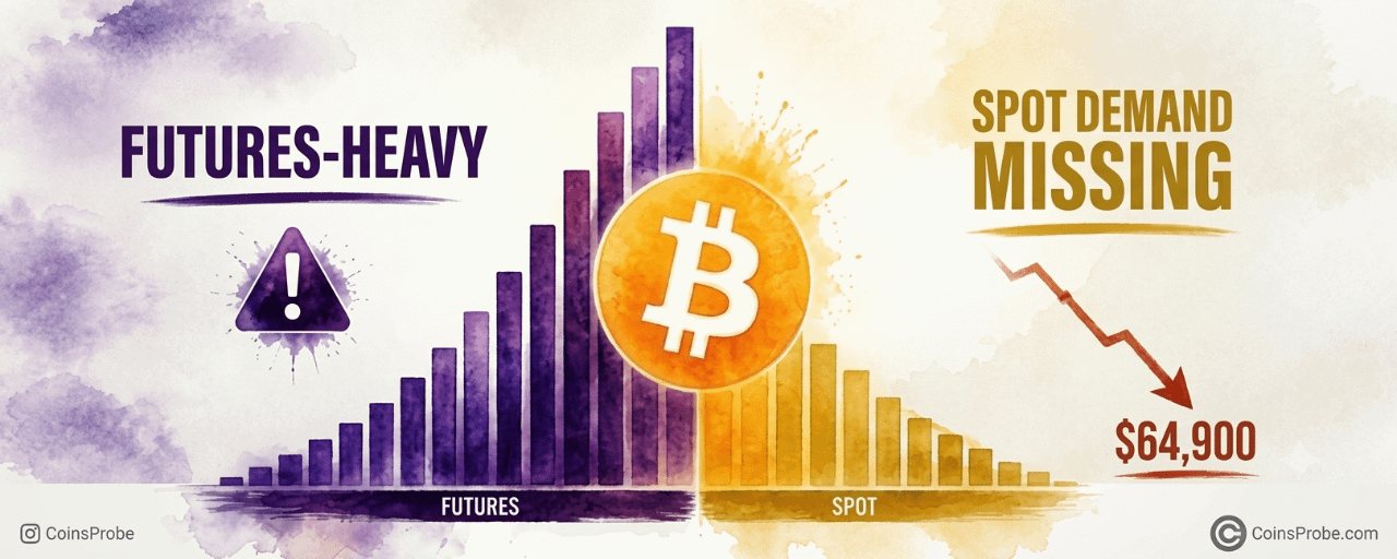
Article
Bitcoin’s Rebound Is Futures-Led — Spot Demand Is the Missing PieceKey Highlights
Bitcoin trades at $84,456 (+0.31% 24h) as Binance dominance chart shows near-total futures-heavy (purple) bar dominanceCryptoQuant analyst Darkfost warns: spot demand "remains the missing piece" — futures-led rebounds "could quickly become unstable"Spot-dominant baseline sits at $64,900 — a futures unwind without spot re-entry risks a 23% drawdown from current levelsWatch for gold (spot-dominant) bars returning on Binance dominance chart as the single structural confirmation signal
Bitcoin is trading at $84,456 — up just 0.31% in the past 24 hours — with a market cap of $1.697 trillion. The flat price action masks a structural problem beneath the surface: the current rebound is being driven almost entirely by futures activity, while spot demand — the engine behind every durable Bitcoin rally in this cycle — remains absent.
That warning comes directly from CryptoQuant analyst Darkfost (@Darkfost_Coc), who writes: “Right now, that spot demand remains the missing piece, and without it, this rebound driven mostly by futures could quickly become unstable.” The signal is drawn from Binance’s spot-vs-futures dominance data — a real-time gauge of whether Bitcoin’s price is being lifted by genuine buying or by leveraged positioning.
What Spot-vs-Futures Dominance Actually Measures
This is not a price chart. It is a market structure chart. On Binance — the world’s largest crypto exchange by volume — each daily bar is classified as either spot-dominant (gold), balanced (pink), or futures-heavy (purple), depending on which side of the market is driving price action. When spot buyers are active, they absorb sell pressure with real capital — there is no leverage to unwind. When futures dominate, the price move is built on margin: positions that can be liquidated the moment conditions shift.
The distinction matters enormously for durability. A spot-led rally requires real demand to reverse. A futures-led rally can collapse in hours if funding rates spike or sentiment turns, triggering cascading liquidations with no spot bid beneath them.
The Chart — Futures Purple Has Taken Over
The Binance dominance chart shared by @cryptoquant_com covers January 2023 through September 2026 on daily bars. The picture it presents is stark: recent bars are overwhelmingly purple — futures-heavy — while spot-dominant gold bars and balanced pink bars have nearly disappeared from the sequence. This is not a minor shift. It is a near-complete transition in who is moving Bitcoin’s price.
Binance: Spot vs Futures Dominance Analysis | Source: @cryptoquant_com (X)
The chart identifies three reference zones worth anchoring to. The spot-dominant baseline sits near $64,900 — the level at which spot buyers were the primary driver. A balanced zone exists around $76,900, where neither futures nor spot was decisively dominant. The peak resistance from the September 2025 cycle high registered near $105,000 — a level reached when spot demand was actively present. Bitcoin is currently at $84,456, sitting in territory where futures have fully taken command.
Why This Pattern Has Preceded Corrections Before
Darkfost’s analysis points to mid-2024 as the clearest historical parallel. During that period, a similar divergence emerged on Binance: futures volume surged and drove price higher while spot participation contracted. The result was not a sustained advance — it was instability followed by a sharp correction back into the zone where spot buyers had previously established support.
The contrast with genuine rallies is instructive. The May 2024 recovery and the January 2025 cycle peak were both accompanied by heavy spot-dominant bars on this same chart. Those moves had a structural foundation: real capital entering the market, absorbing sell pressure, and anchoring price at successively higher levels. The current move has none of that. Futures positioning can create the appearance of momentum, but it cannot create the demand necessary to hold a level under pressure.
This is directly relevant to the broader question of whether Bitcoin’s recent recovery from the mid-$70,000s represents a genuine trend reversal or a leveraged bounce. As Bitcoin’s buy pressure has been sitting at a decision point, the composition of that pressure — not just its magnitude — is what determines whether a rally holds.
The Risk Scenario — What an Unwind Looks Like
If spot demand fails to re-enter and futures positioning becomes overextended, the liquidation math is straightforward. Darkfost’s chart identifies the $64,900–$76,900 zone as the support band where spot buyers last held meaningful positions. A futures unwind that finds no spot bid at current levels could rapidly compress price back toward that range — a move of 9% to 23% from current prices.
This does not require a macro catalyst. Leveraged markets unwind on their own mechanics: funding rate spikes reduce the incentive to hold long futures positions, stop-loss clusters accelerate selling, and without spot absorption, each level breaks faster than the last. The $76,900 balanced zone is the first line of real structural interest. Below that, $64,900 is where spot dominance was last genuinely established.
It is worth comparing this to what happened when Bitcoin absorbed $276 million in exchange outflows earlier this cycle — price held the $83K–$84K range, but only because spot demand was actively present to absorb the flow. That condition no longer appears to be in place.
Bullish Scenario — Spot Demand Returns
If spot-dominant gold bars begin reappearing on the Binance dominance chart — particularly with sustained volume above the $76,900 balanced zone — the futures-led rebound gains structural credibility. A rotation back toward spot dominance at current prices would represent genuine demand entering at $84,000+, which would make the level defensible. A sustained move toward the $105,000 September 2025 resistance would require this transition to occur.
Bearish Scenario — Futures Unwind Without Spot Bid
Continued purple dominance with no spot re-entry, combined with any deterioration in macro sentiment or a funding rate spike, creates the conditions for a rapid retracement. The first support level to watch is $76,900. If that breaks without spot absorption, the next meaningful zone is the $64,900 spot-dominant baseline — representing a potential 23% drawdown from current levels.
The One Metric to Watch
Darkfost’s framework reduces to a single actionable data point: the color of the bars on Binance’s spot-vs-futures dominance chart. Not price. Not RSI. Not funding rates. The composition of volume. When gold and pink bars return in meaningful frequency at or above current price levels, the structural argument for this rebound changes. Until then, the foundation remains thin.
Tom Lee’s bull market declaration rests on macro and sentiment conditions — but on-chain market structure data from CryptoQuant tells a more cautious story at the Binance level. Both can be true simultaneously: macro conditions improving while the specific mechanics of Bitcoin’s current move remain fragile.
Bitcoin is trading at $84,456. The rebound from mid-$70,000s lows is real in price terms, but Darkfost’s Binance dominance data makes clear it is built almost entirely on futures positioning rather than spot demand. The $64,900–$76,900 support band is what stands between the current price and a full reset to spot-dominant baseline conditions. Spot demand re-entry — visible as gold bars returning to the dominance chart — is the single confirmation signal that would change this structural assessment. Until it appears, watch $76,900 as the first meaningful test of whether any real bid exists beneath this move.
Disclaimer: The views and analysis presented in this article are for informational purposes only and reflect the author’s perspective, not financial advice. Technical patterns and indicators discussed are subject to market volatility and may or may not yield anticipated results. Investors are advised to exercise caution, conduct independent research, and make decisions aligned with their individual risk tolerance.
Bitcoin’s Rebound Is Futures-Led — Spot Demand Is the Missing Piece
Key Highlights
Bitcoin trades at $84,456 (+0.31% 24h) as Binance dominance chart shows near-total futures-heavy (purple) bar dominanceCryptoQuant analyst Darkfost warns: spot demand "remains the missing piece" — futures-led rebounds "could quickly become unstable"Spot-dominant baseline sits at $64,900 — a futures unwind without spot re-entry risks a 23% drawdown from current levelsWatch for gold (spot-dominant) bars returning on Binance dominance chart as the single structural confirmation signal
Bitcoin is trading at $84,456 — up just 0.31% in the past 24 hours — with a market cap of $1.697 trillion. The flat price action masks a structural problem beneath the surface: the current rebound is being driven almost entirely by futures activity, while spot demand — the engine behind every durable Bitcoin rally in this cycle — remains absent.
That warning comes directly from CryptoQuant analyst Darkfost (@Darkfost_Coc), who writes: “Right now, that spot demand remains the missing piece, and without it, this rebound driven mostly by futures could quickly become unstable.” The signal is drawn from Binance’s spot-vs-futures dominance data — a real-time gauge of whether Bitcoin’s price is being lifted by genuine buying or by leveraged positioning.
What Spot-vs-Futures Dominance Actually Measures
This is not a price chart. It is a market structure chart. On Binance — the world’s largest crypto exchange by volume — each daily bar is classified as either spot-dominant (gold), balanced (pink), or futures-heavy (purple), depending on which side of the market is driving price action. When spot buyers are active, they absorb sell pressure with real capital — there is no leverage to unwind. When futures dominate, the price move is built on margin: positions that can be liquidated the moment conditions shift.
The distinction matters enormously for durability. A spot-led rally requires real demand to reverse. A futures-led rally can collapse in hours if funding rates spike or sentiment turns, triggering cascading liquidations with no spot bid beneath them.
The Chart — Futures Purple Has Taken Over
The Binance dominance chart shared by @cryptoquant_com covers January 2023 through September 2026 on daily bars. The picture it presents is stark: recent bars are overwhelmingly purple — futures-heavy — while spot-dominant gold bars and balanced pink bars have nearly disappeared from the sequence. This is not a minor shift. It is a near-complete transition in who is moving Bitcoin’s price.
Binance: Spot vs Futures Dominance Analysis | Source: @cryptoquant_com (X)
The chart identifies three reference zones worth anchoring to. The spot-dominant baseline sits near $64,900 — the level at which spot buyers were the primary driver. A balanced zone exists around $76,900, where neither futures nor spot was decisively dominant. The peak resistance from the September 2025 cycle high registered near $105,000 — a level reached when spot demand was actively present. Bitcoin is currently at $84,456, sitting in territory where futures have fully taken command.
Why This Pattern Has Preceded Corrections Before
Darkfost’s analysis points to mid-2024 as the clearest historical parallel. During that period, a similar divergence emerged on Binance: futures volume surged and drove price higher while spot participation contracted. The result was not a sustained advance — it was instability followed by a sharp correction back into the zone where spot buyers had previously established support.
The contrast with genuine rallies is instructive. The May 2024 recovery and the January 2025 cycle peak were both accompanied by heavy spot-dominant bars on this same chart. Those moves had a structural foundation: real capital entering the market, absorbing sell pressure, and anchoring price at successively higher levels. The current move has none of that. Futures positioning can create the appearance of momentum, but it cannot create the demand necessary to hold a level under pressure.
This is directly relevant to the broader question of whether Bitcoin’s recent recovery from the mid-$70,000s represents a genuine trend reversal or a leveraged bounce. As Bitcoin’s buy pressure has been sitting at a decision point, the composition of that pressure — not just its magnitude — is what determines whether a rally holds.
The Risk Scenario — What an Unwind Looks Like
If spot demand fails to re-enter and futures positioning becomes overextended, the liquidation math is straightforward. Darkfost’s chart identifies the $64,900–$76,900 zone as the support band where spot buyers last held meaningful positions. A futures unwind that finds no spot bid at current levels could rapidly compress price back toward that range — a move of 9% to 23% from current prices.
This does not require a macro catalyst. Leveraged markets unwind on their own mechanics: funding rate spikes reduce the incentive to hold long futures positions, stop-loss clusters accelerate selling, and without spot absorption, each level breaks faster than the last. The $76,900 balanced zone is the first line of real structural interest. Below that, $64,900 is where spot dominance was last genuinely established.
It is worth comparing this to what happened when Bitcoin absorbed $276 million in exchange outflows earlier this cycle — price held the $83K–$84K range, but only because spot demand was actively present to absorb the flow. That condition no longer appears to be in place.
Bullish Scenario — Spot Demand Returns
If spot-dominant gold bars begin reappearing on the Binance dominance chart — particularly with sustained volume above the $76,900 balanced zone — the futures-led rebound gains structural credibility. A rotation back toward spot dominance at current prices would represent genuine demand entering at $84,000+, which would make the level defensible. A sustained move toward the $105,000 September 2025 resistance would require this transition to occur.
Bearish Scenario — Futures Unwind Without Spot Bid
Continued purple dominance with no spot re-entry, combined with any deterioration in macro sentiment or a funding rate spike, creates the conditions for a rapid retracement. The first support level to watch is $76,900. If that breaks without spot absorption, the next meaningful zone is the $64,900 spot-dominant baseline — representing a potential 23% drawdown from current levels.
The One Metric to Watch
Darkfost’s framework reduces to a single actionable data point: the color of the bars on Binance’s spot-vs-futures dominance chart. Not price. Not RSI. Not funding rates. The composition of volume. When gold and pink bars return in meaningful frequency at or above current price levels, the structural argument for this rebound changes. Until then, the foundation remains thin.
Tom Lee’s bull market declaration rests on macro and sentiment conditions — but on-chain market structure data from CryptoQuant tells a more cautious story at the Binance level. Both can be true simultaneously: macro conditions improving while the specific mechanics of Bitcoin’s current move remain fragile.
Bitcoin is trading at $84,456. The rebound from mid-$70,000s lows is real in price terms, but Darkfost’s Binance dominance data makes clear it is built almost entirely on futures positioning rather than spot demand. The $64,900–$76,900 support band is what stands between the current price and a full reset to spot-dominant baseline conditions. Spot demand re-entry — visible as gold bars returning to the dominance chart — is the single confirmation signal that would change this structural assessment. Until it appears, watch $76,900 as the first meaningful test of whether any real bid exists beneath this move.
Disclaimer: The views and analysis presented in this article are for informational purposes only and reflect the author’s perspective, not financial advice. Technical patterns and indicators discussed are subject to market volatility and may or may not yield anticipated results. Investors are advised to exercise caution, conduct independent research, and make decisions aligned with their individual risk tolerance.
Bitcoin trades at $84,456 (+0.31% 24h) as Binance dominance chart shows near-total futures-heavy (purple) bar dominanceCryptoQuant analyst Darkfost warns: spot demand "remains the missing piece" — futures-led rebounds "could quickly become unstable"Spot-dominant baseline sits at $64,900 — a futures unwind without spot re-entry risks a 23% drawdown from current levelsWatch for gold (spot-dominant) bars returning on Binance dominance chart as the single structural confirmation signal
Bitcoin is trading at $84,456 — up just 0.31% in the past 24 hours — with a market cap of $1.697 trillion. The flat price action masks a structural problem beneath the surface: the current rebound is being driven almost entirely by futures activity, while spot demand — the engine behind every durable Bitcoin rally in this cycle — remains absent.
That warning comes directly from CryptoQuant analyst Darkfost (@Darkfost_Coc), who writes: “Right now, that spot demand remains the missing piece, and without it, this rebound driven mostly by futures could quickly become unstable.” The signal is drawn from Binance’s spot-vs-futures dominance data — a real-time gauge of whether Bitcoin’s price is being lifted by genuine buying or by leveraged positioning.
What Spot-vs-Futures Dominance Actually Measures
This is not a price chart. It is a market structure chart. On Binance — the world’s largest crypto exchange by volume — each daily bar is classified as either spot-dominant (gold), balanced (pink), or futures-heavy (purple), depending on which side of the market is driving price action. When spot buyers are active, they absorb sell pressure with real capital — there is no leverage to unwind. When futures dominate, the price move is built on margin: positions that can be liquidated the moment conditions shift.
The distinction matters enormously for durability. A spot-led rally requires real demand to reverse. A futures-led rally can collapse in hours if funding rates spike or sentiment turns, triggering cascading liquidations with no spot bid beneath them.
The Chart — Futures Purple Has Taken Over
The Binance dominance chart shared by @cryptoquant_com covers January 2023 through September 2026 on daily bars. The picture it presents is stark: recent bars are overwhelmingly purple — futures-heavy — while spot-dominant gold bars and balanced pink bars have nearly disappeared from the sequence. This is not a minor shift. It is a near-complete transition in who is moving Bitcoin’s price.
Binance: Spot vs Futures Dominance Analysis | Source: @cryptoquant_com (X)
The chart identifies three reference zones worth anchoring to. The spot-dominant baseline sits near $64,900 — the level at which spot buyers were the primary driver. A balanced zone exists around $76,900, where neither futures nor spot was decisively dominant. The peak resistance from the September 2025 cycle high registered near $105,000 — a level reached when spot demand was actively present. Bitcoin is currently at $84,456, sitting in territory where futures have fully taken command.
Why This Pattern Has Preceded Corrections Before
Darkfost’s analysis points to mid-2024 as the clearest historical parallel. During that period, a similar divergence emerged on Binance: futures volume surged and drove price higher while spot participation contracted. The result was not a sustained advance — it was instability followed by a sharp correction back into the zone where spot buyers had previously established support.
The contrast with genuine rallies is instructive. The May 2024 recovery and the January 2025 cycle peak were both accompanied by heavy spot-dominant bars on this same chart. Those moves had a structural foundation: real capital entering the market, absorbing sell pressure, and anchoring price at successively higher levels. The current move has none of that. Futures positioning can create the appearance of momentum, but it cannot create the demand necessary to hold a level under pressure.
This is directly relevant to the broader question of whether Bitcoin’s recent recovery from the mid-$70,000s represents a genuine trend reversal or a leveraged bounce. As Bitcoin’s buy pressure has been sitting at a decision point, the composition of that pressure — not just its magnitude — is what determines whether a rally holds.
The Risk Scenario — What an Unwind Looks Like
If spot demand fails to re-enter and futures positioning becomes overextended, the liquidation math is straightforward. Darkfost’s chart identifies the $64,900–$76,900 zone as the support band where spot buyers last held meaningful positions. A futures unwind that finds no spot bid at current levels could rapidly compress price back toward that range — a move of 9% to 23% from current prices.
This does not require a macro catalyst. Leveraged markets unwind on their own mechanics: funding rate spikes reduce the incentive to hold long futures positions, stop-loss clusters accelerate selling, and without spot absorption, each level breaks faster than the last. The $76,900 balanced zone is the first line of real structural interest. Below that, $64,900 is where spot dominance was last genuinely established.
It is worth comparing this to what happened when Bitcoin absorbed $276 million in exchange outflows earlier this cycle — price held the $83K–$84K range, but only because spot demand was actively present to absorb the flow. That condition no longer appears to be in place.
Bullish Scenario — Spot Demand Returns
If spot-dominant gold bars begin reappearing on the Binance dominance chart — particularly with sustained volume above the $76,900 balanced zone — the futures-led rebound gains structural credibility. A rotation back toward spot dominance at current prices would represent genuine demand entering at $84,000+, which would make the level defensible. A sustained move toward the $105,000 September 2025 resistance would require this transition to occur.
Bearish Scenario — Futures Unwind Without Spot Bid
Continued purple dominance with no spot re-entry, combined with any deterioration in macro sentiment or a funding rate spike, creates the conditions for a rapid retracement. The first support level to watch is $76,900. If that breaks without spot absorption, the next meaningful zone is the $64,900 spot-dominant baseline — representing a potential 23% drawdown from current levels.
The One Metric to Watch
Darkfost’s framework reduces to a single actionable data point: the color of the bars on Binance’s spot-vs-futures dominance chart. Not price. Not RSI. Not funding rates. The composition of volume. When gold and pink bars return in meaningful frequency at or above current price levels, the structural argument for this rebound changes. Until then, the foundation remains thin.
Tom Lee’s bull market declaration rests on macro and sentiment conditions — but on-chain market structure data from CryptoQuant tells a more cautious story at the Binance level. Both can be true simultaneously: macro conditions improving while the specific mechanics of Bitcoin’s current move remain fragile.
Bitcoin is trading at $84,456. The rebound from mid-$70,000s lows is real in price terms, but Darkfost’s Binance dominance data makes clear it is built almost entirely on futures positioning rather than spot demand. The $64,900–$76,900 support band is what stands between the current price and a full reset to spot-dominant baseline conditions. Spot demand re-entry — visible as gold bars returning to the dominance chart — is the single confirmation signal that would change this structural assessment. Until it appears, watch $76,900 as the first meaningful test of whether any real bid exists beneath this move.
Disclaimer: The views and analysis presented in this article are for informational purposes only and reflect the author’s perspective, not financial advice. Technical patterns and indicators discussed are subject to market volatility and may or may not yield anticipated results. Investors are advised to exercise caution, conduct independent research, and make decisions aligned with their individual risk tolerance.
1
1
1.2k
·
--
Partiellement vrai
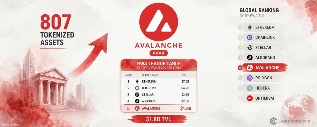
Article
Avalanche Ranks #5 Globally in RWA Tokenization With 807 Assets on ChainKey Highlights
AVAX ranks #5 globally in RWA tokenization with $1.8B TVL and 807 tokenized assets on-chain807 assets vs. Stellar's 49 assets despite Stellar ranking #4 — AVAX leads on institutional breadthAnalyst CryptoBullet1 cites RWA positioning as a core structural reason for sustained AVAX bullishnessEthereum holds $21,881.1B RWA TVL — the key competitive risk to the AVAX thesis
Avalanche has quietly built one of the most consequential Real World Asset ecosystems in crypto. With $1.8 billion in RWA TVL and 807 tokenized assets secured on its network, AVAX ranks #5 globally among all blockchain networks for real-world asset tokenization — a structural position that extends well beyond short-term price dynamics.
That positioning is precisely what analyst CryptoBullet1 (@CryptoBullet1) flagged on September 30, writing: “$AVAX is big in RWA — One of the reasons why I remain bullish on $AVAX.”
The statement is not speculation — it is grounded in a league-table snapshot showing Avalanche’s specific rank, TVL, and asset count relative to every competing L1.
The RWA League Table — Where AVAX Actually Stands
CryptoBullet1 shared a global RWA TVL ranking table that places Avalanche in precise competitive context. The data reveals a network that punches above its TVL weight in one critical dimension: asset breadth.
RWA League Table – Avalanche (AVAX) Analysis | Source: @CryptoBullet1 (X)
The table shows Avalanche at $1.8B TVL — above Liquid Network ($1.6B, ranked #6) and below Stellar ($3.4B above Avalanche, ranked #4). Ethereum dominates the top of the table at $21,881.1B, roughly 12x larger than the rest of the top 10 combined. That gap is real and should not be dismissed.
But the metric that distinguishes AVAX from its nearest competitors is asset count. Avalanche hosts 807 individual tokenized assets — compared to Stellar’s 49 despite Stellar ranking one position higher by TVL. More assets on-chain means more institutional counterparties, more product types, and deeper ecosystem participation. TVL measures the dollar value locked; asset count measures the breadth of institutional adoption. AVAX leads the latter by a wide margin at its tier.
Why RWA TVL Is a Structural Demand Driver for AVAX
Real World Asset tokenization is not a narrative — it is a contractual infrastructure need. Every tokenized treasury bill, private credit instrument, real estate token, or fund share requires a settlement layer. When institutions choose Avalanche as that layer, they generate sustained, non-speculative demand for AVAX utility: gas fees, subnet creation, staking requirements, and validator economics.
The mechanism is direct: more RWA assets on Avalanche → more transactions settled on-chain → more AVAX consumed in fees and staking → structural buy pressure independent of retail sentiment cycles. This is categorically different from a token that benefits from “narrative momentum” — RWA flows are institutional, contractual, and recurring.
For context on AVAX’s broader technical picture, analysts have previously identified key price targets at $25, $65, and $147 following horizontal reclaims — levels that take on additional weight when the fundamental backdrop includes $1.8B in RWA TVL and a top-5 global ranking.
The Competitive Risk — Ethereum’s Lead Is Structural Too
Intellectual honesty requires stating the counterpoint directly. Ethereum’s $21,881.1B RWA TVL is not just larger — it is in a different category. The institutions deploying the largest RWA positions (BlackRock’s BUIDL, Franklin Templeton’s FOBXX, Ondo Finance) are primarily Ethereum-native. The trust, liquidity depth, and regulatory familiarity those institutions have with Ethereum L1 creates switching costs that $1.8B in AVAX TVL has not yet overcome.
What Avalanche does have — the 807 asset count — suggests a diversified institutional base rather than concentration in one or two flagship products. That breadth is the bullish case. A network with hundreds of issuers across multiple asset classes is harder to displace than one with a few dominant players. The risk is that TVL concentration in Ethereum accelerates rather than disperses, leaving AVAX as a Tier-2 settlement layer indefinitely.
Bullish Scenario
If Avalanche’s asset count continues expanding — crossing 1,000+ tokenized assets — institutional TVL would be expected to follow, compressing the gap with Stellar and pushing AVAX toward Rank #4. Combined with prior technical targets identified by analysts at $65 and $147, sustained RWA inflow provides the fundamental underpinning for a multi-leg rally. The catalyst to watch: any major traditional financial institution publicly deploying an Avalanche-native RWA product.
Bearish Scenario
If Ethereum’s RWA dominance accelerates and AVAX fails to grow its TVL beyond the $1.8B level over the next two quarters, the ranking advantage becomes academic. A stagnant TVL with a declining asset count would signal institutional disengagement — removing the structural demand argument entirely and leaving AVAX exposed to its technical support levels without fundamental cover.
The Signal CryptoBullet1 Is Actually Making
CryptoBullet1’s bullish thesis is not about price targets or chart patterns. It is about regime positioning: Avalanche has already secured a seat at the institutional tokenization table. A top-5 global ranking with 807 assets is not a projection — it is a live data point from the RWA league table. The analyst’s framing — “one of the reasons I remain bullish” — implies this is one of multiple structural factors, not a single-variable thesis.
The distinction matters. RWA TVL at $1.8B does not guarantee AVAX price appreciation. But it does establish that Avalanche is generating real institutional usage independent of retail market cycles. That is a different risk profile than a network whose entire value case depends on speculation.
AVAX’s $1.8B RWA TVL and 807-asset on-chain ecosystem place it in the top five globally — a structural position that CryptoBullet1 identifies as a core, non-speculative reason for sustained bullishness. The critical threshold to watch: whether asset count crosses 1,000 and whether TVL closes the gap with Stellar’s position. Those two metrics, tracked in real time via RWA aggregators, will determine whether the #5 ranking is a ceiling or a floor.
Disclaimer: This article is for informational purposes only and does not constitute financial advice. Always conduct your own research before making any investment decisions.
Avalanche Ranks #5 Globally in RWA Tokenization With 807 Assets on Chain
Key Highlights
AVAX ranks #5 globally in RWA tokenization with $1.8B TVL and 807 tokenized assets on-chain807 assets vs. Stellar's 49 assets despite Stellar ranking #4 — AVAX leads on institutional breadthAnalyst CryptoBullet1 cites RWA positioning as a core structural reason for sustained AVAX bullishnessEthereum holds $21,881.1B RWA TVL — the key competitive risk to the AVAX thesis
Avalanche has quietly built one of the most consequential Real World Asset ecosystems in crypto. With $1.8 billion in RWA TVL and 807 tokenized assets secured on its network, AVAX ranks #5 globally among all blockchain networks for real-world asset tokenization — a structural position that extends well beyond short-term price dynamics.
That positioning is precisely what analyst CryptoBullet1 (@CryptoBullet1) flagged on September 30, writing: “$AVAX is big in RWA — One of the reasons why I remain bullish on $AVAX.”
The statement is not speculation — it is grounded in a league-table snapshot showing Avalanche’s specific rank, TVL, and asset count relative to every competing L1.
The RWA League Table — Where AVAX Actually Stands
CryptoBullet1 shared a global RWA TVL ranking table that places Avalanche in precise competitive context. The data reveals a network that punches above its TVL weight in one critical dimension: asset breadth.
RWA League Table – Avalanche (AVAX) Analysis | Source: @CryptoBullet1 (X)
The table shows Avalanche at $1.8B TVL — above Liquid Network ($1.6B, ranked #6) and below Stellar ($3.4B above Avalanche, ranked #4). Ethereum dominates the top of the table at $21,881.1B, roughly 12x larger than the rest of the top 10 combined. That gap is real and should not be dismissed.
But the metric that distinguishes AVAX from its nearest competitors is asset count. Avalanche hosts 807 individual tokenized assets — compared to Stellar’s 49 despite Stellar ranking one position higher by TVL. More assets on-chain means more institutional counterparties, more product types, and deeper ecosystem participation. TVL measures the dollar value locked; asset count measures the breadth of institutional adoption. AVAX leads the latter by a wide margin at its tier.
Why RWA TVL Is a Structural Demand Driver for AVAX
Real World Asset tokenization is not a narrative — it is a contractual infrastructure need. Every tokenized treasury bill, private credit instrument, real estate token, or fund share requires a settlement layer. When institutions choose Avalanche as that layer, they generate sustained, non-speculative demand for AVAX utility: gas fees, subnet creation, staking requirements, and validator economics.
The mechanism is direct: more RWA assets on Avalanche → more transactions settled on-chain → more AVAX consumed in fees and staking → structural buy pressure independent of retail sentiment cycles. This is categorically different from a token that benefits from “narrative momentum” — RWA flows are institutional, contractual, and recurring.
For context on AVAX’s broader technical picture, analysts have previously identified key price targets at $25, $65, and $147 following horizontal reclaims — levels that take on additional weight when the fundamental backdrop includes $1.8B in RWA TVL and a top-5 global ranking.
The Competitive Risk — Ethereum’s Lead Is Structural Too
Intellectual honesty requires stating the counterpoint directly. Ethereum’s $21,881.1B RWA TVL is not just larger — it is in a different category. The institutions deploying the largest RWA positions (BlackRock’s BUIDL, Franklin Templeton’s FOBXX, Ondo Finance) are primarily Ethereum-native. The trust, liquidity depth, and regulatory familiarity those institutions have with Ethereum L1 creates switching costs that $1.8B in AVAX TVL has not yet overcome.
What Avalanche does have — the 807 asset count — suggests a diversified institutional base rather than concentration in one or two flagship products. That breadth is the bullish case. A network with hundreds of issuers across multiple asset classes is harder to displace than one with a few dominant players. The risk is that TVL concentration in Ethereum accelerates rather than disperses, leaving AVAX as a Tier-2 settlement layer indefinitely.
Bullish Scenario
If Avalanche’s asset count continues expanding — crossing 1,000+ tokenized assets — institutional TVL would be expected to follow, compressing the gap with Stellar and pushing AVAX toward Rank #4. Combined with prior technical targets identified by analysts at $65 and $147, sustained RWA inflow provides the fundamental underpinning for a multi-leg rally. The catalyst to watch: any major traditional financial institution publicly deploying an Avalanche-native RWA product.
Bearish Scenario
If Ethereum’s RWA dominance accelerates and AVAX fails to grow its TVL beyond the $1.8B level over the next two quarters, the ranking advantage becomes academic. A stagnant TVL with a declining asset count would signal institutional disengagement — removing the structural demand argument entirely and leaving AVAX exposed to its technical support levels without fundamental cover.
The Signal CryptoBullet1 Is Actually Making
CryptoBullet1’s bullish thesis is not about price targets or chart patterns. It is about regime positioning: Avalanche has already secured a seat at the institutional tokenization table. A top-5 global ranking with 807 assets is not a projection — it is a live data point from the RWA league table. The analyst’s framing — “one of the reasons I remain bullish” — implies this is one of multiple structural factors, not a single-variable thesis.
The distinction matters. RWA TVL at $1.8B does not guarantee AVAX price appreciation. But it does establish that Avalanche is generating real institutional usage independent of retail market cycles. That is a different risk profile than a network whose entire value case depends on speculation.
AVAX’s $1.8B RWA TVL and 807-asset on-chain ecosystem place it in the top five globally — a structural position that CryptoBullet1 identifies as a core, non-speculative reason for sustained bullishness. The critical threshold to watch: whether asset count crosses 1,000 and whether TVL closes the gap with Stellar’s position. Those two metrics, tracked in real time via RWA aggregators, will determine whether the #5 ranking is a ceiling or a floor.
Disclaimer: This article is for informational purposes only and does not constitute financial advice. Always conduct your own research before making any investment decisions.
AVAX ranks #5 globally in RWA tokenization with $1.8B TVL and 807 tokenized assets on-chain807 assets vs. Stellar's 49 assets despite Stellar ranking #4 — AVAX leads on institutional breadthAnalyst CryptoBullet1 cites RWA positioning as a core structural reason for sustained AVAX bullishnessEthereum holds $21,881.1B RWA TVL — the key competitive risk to the AVAX thesis
Avalanche has quietly built one of the most consequential Real World Asset ecosystems in crypto. With $1.8 billion in RWA TVL and 807 tokenized assets secured on its network, AVAX ranks #5 globally among all blockchain networks for real-world asset tokenization — a structural position that extends well beyond short-term price dynamics.
That positioning is precisely what analyst CryptoBullet1 (@CryptoBullet1) flagged on September 30, writing: “$AVAX is big in RWA — One of the reasons why I remain bullish on $AVAX.”
The statement is not speculation — it is grounded in a league-table snapshot showing Avalanche’s specific rank, TVL, and asset count relative to every competing L1.
The RWA League Table — Where AVAX Actually Stands
CryptoBullet1 shared a global RWA TVL ranking table that places Avalanche in precise competitive context. The data reveals a network that punches above its TVL weight in one critical dimension: asset breadth.
RWA League Table – Avalanche (AVAX) Analysis | Source: @CryptoBullet1 (X)
The table shows Avalanche at $1.8B TVL — above Liquid Network ($1.6B, ranked #6) and below Stellar ($3.4B above Avalanche, ranked #4). Ethereum dominates the top of the table at $21,881.1B, roughly 12x larger than the rest of the top 10 combined. That gap is real and should not be dismissed.
But the metric that distinguishes AVAX from its nearest competitors is asset count. Avalanche hosts 807 individual tokenized assets — compared to Stellar’s 49 despite Stellar ranking one position higher by TVL. More assets on-chain means more institutional counterparties, more product types, and deeper ecosystem participation. TVL measures the dollar value locked; asset count measures the breadth of institutional adoption. AVAX leads the latter by a wide margin at its tier.
Why RWA TVL Is a Structural Demand Driver for AVAX
Real World Asset tokenization is not a narrative — it is a contractual infrastructure need. Every tokenized treasury bill, private credit instrument, real estate token, or fund share requires a settlement layer. When institutions choose Avalanche as that layer, they generate sustained, non-speculative demand for AVAX utility: gas fees, subnet creation, staking requirements, and validator economics.
The mechanism is direct: more RWA assets on Avalanche → more transactions settled on-chain → more AVAX consumed in fees and staking → structural buy pressure independent of retail sentiment cycles. This is categorically different from a token that benefits from “narrative momentum” — RWA flows are institutional, contractual, and recurring.
For context on AVAX’s broader technical picture, analysts have previously identified key price targets at $25, $65, and $147 following horizontal reclaims — levels that take on additional weight when the fundamental backdrop includes $1.8B in RWA TVL and a top-5 global ranking.
The Competitive Risk — Ethereum’s Lead Is Structural Too
Intellectual honesty requires stating the counterpoint directly. Ethereum’s $21,881.1B RWA TVL is not just larger — it is in a different category. The institutions deploying the largest RWA positions (BlackRock’s BUIDL, Franklin Templeton’s FOBXX, Ondo Finance) are primarily Ethereum-native. The trust, liquidity depth, and regulatory familiarity those institutions have with Ethereum L1 creates switching costs that $1.8B in AVAX TVL has not yet overcome.
What Avalanche does have — the 807 asset count — suggests a diversified institutional base rather than concentration in one or two flagship products. That breadth is the bullish case. A network with hundreds of issuers across multiple asset classes is harder to displace than one with a few dominant players. The risk is that TVL concentration in Ethereum accelerates rather than disperses, leaving AVAX as a Tier-2 settlement layer indefinitely.
Bullish Scenario
If Avalanche’s asset count continues expanding — crossing 1,000+ tokenized assets — institutional TVL would be expected to follow, compressing the gap with Stellar and pushing AVAX toward Rank #4. Combined with prior technical targets identified by analysts at $65 and $147, sustained RWA inflow provides the fundamental underpinning for a multi-leg rally. The catalyst to watch: any major traditional financial institution publicly deploying an Avalanche-native RWA product.
Bearish Scenario
If Ethereum’s RWA dominance accelerates and AVAX fails to grow its TVL beyond the $1.8B level over the next two quarters, the ranking advantage becomes academic. A stagnant TVL with a declining asset count would signal institutional disengagement — removing the structural demand argument entirely and leaving AVAX exposed to its technical support levels without fundamental cover.
The Signal CryptoBullet1 Is Actually Making
CryptoBullet1’s bullish thesis is not about price targets or chart patterns. It is about regime positioning: Avalanche has already secured a seat at the institutional tokenization table. A top-5 global ranking with 807 assets is not a projection — it is a live data point from the RWA league table. The analyst’s framing — “one of the reasons I remain bullish” — implies this is one of multiple structural factors, not a single-variable thesis.
The distinction matters. RWA TVL at $1.8B does not guarantee AVAX price appreciation. But it does establish that Avalanche is generating real institutional usage independent of retail market cycles. That is a different risk profile than a network whose entire value case depends on speculation.
AVAX’s $1.8B RWA TVL and 807-asset on-chain ecosystem place it in the top five globally — a structural position that CryptoBullet1 identifies as a core, non-speculative reason for sustained bullishness. The critical threshold to watch: whether asset count crosses 1,000 and whether TVL closes the gap with Stellar’s position. Those two metrics, tracked in real time via RWA aggregators, will determine whether the #5 ranking is a ceiling or a floor.
Disclaimer: This article is for informational purposes only and does not constitute financial advice. Always conduct your own research before making any investment decisions.
2
3
4.2k
·
--
Vérifié
Article
NEAR Surges Bitwise NEAR ETF Debuts on NYSE Arca With $35.5M Day-1 InflowsKey Highlights
NEAR is trading at $5.32 — up 11.61% — after Bitwise NEAR ETF ($NRR) began trading on NYSE Arca on September 29, 2026Day-1 stats: $36M AUM and $35.5M net inflows — 98.6% of total AUM arrived on the first trading day per @NEARProtocol$NRR is the first spot NEAR ETP in the United States, requiring direct spot token purchases to back every share issuedWatch $5.50 resistance and daily $NRR inflow data — sustained flows confirm structural bid; stalled inflows signal one-day premium
NEAR Protocol is trading at $5.32 — up 11.61% in 24 hours with a market cap of $6.95 billion — and the move has a single, named, verifiable cause. The Bitwise NEAR ETF (ticker: $NRR), the first spot NEAR exchange-traded product in the United States, began trading on NYSE Arca on September 29, 2026.
The official @NEARProtocol account confirmed the listing directly. A follow-up post from the same account disclosed day-one trading statistics: $36 million in assets under management and $35.5 million in net inflows on the first day alone. That is not a slow institutional drip — 98.6% of the ETF’s total AUM arrived on day one.
What the Bitwise NEAR ETF Actually Is
A spot ETF holds the underlying asset directly, not derivatives. When $35.5 million flows into $NRR on day one, Bitwise — as the issuer — must purchase NEAR tokens to back those shares. That is direct, structural buy pressure on spot markets, not speculative positioning. This is the mechanism connecting the ETF launch to NEAR’s price move.
This is categorically different from a futures ETF, which holds cash-settled contracts and creates no direct demand for the underlying token. The $NRR structure means every dollar of inflow requires a corresponding dollar of NEAR acquired and held. At $5.32 per token, $35.5 million represents approximately 6.67 million NEAR tokens removed from circulating supply into a custodied vehicle.
For context on what institutional ETF access has meant for other assets: Bitcoin spot ETFs drew $655 million in net inflows on their first trading day in January 2024. NEAR’s $35.5 million day-one figure is smaller in absolute terms but represents a meaningful institutional signal for a $6.95 billion market-cap asset entering a new distribution channel.
Day-One Numbers — What the Data Shows
Metric Value ETF Ticker $NRR Exchange NYSE Arca Issuer Bitwise Day-1 AUM $36M Day-1 Net Inflows $35.5M Inflows as % of AUM 98.6% NEAR 24h Spot Volume $1.38B
Bitwise NEAR ETF Day-1 Stats | Source: @NEARProtocol (X) · September 29, 2026
The $1.38 billion in 24-hour spot volume on NEAR is also notable. It represents a significant volume surge relative to the protocol’s $137.51 million TVL on DeFiLlama — confirming that the price action is driven by secondary-market demand, not internal DeFi activity.
NEAR AI Cloud — A Parallel Catalyst
Alongside the ETF launch, the protocol posted a separate milestone on September 29: Claude Sonnet 5.5 is now live on NEAR AI Cloud. The integration brings Anthropic’s latest model — featuring adaptive reasoning and a 1 million token context window — to NEAR’s agent-optimized infrastructure. The official post confirmed it is optimized for agentic AI workloads.
This is not the primary driver of today’s price move — the ETF is — but it establishes a product narrative that institutional buyers now accessing NEAR through $NRR can point to. AI agent infrastructure is a credible use-case thesis for a spot ETF pitch. The two announcements arriving simultaneously was not coincidental timing.
On-Chain Ecosystem Context
NEAR’s on-chain fundamentals provide context for where the protocol stands at the moment institutional access opens up.
TVL of $374.85 million and 30-day fees of $6.92 million indicate a protocol that has not yet translated its brand momentum into deep DeFi liquidity. That gap is also the argument for why institutional capital via $NRR matters — it brings a buyer that is not constrained by DeFi yield curves or DEX slippage. The protocol has separately highlighted $32 billion in NEAR Intents volume as a broader ecosystem adoption metric, though that figure encompasses cross-chain activity beyond the base chain DeFiLlama captures.
Near Protocol Key Metrics | Source: Defillama
NEAR’s technical setup heading into this ETF launch has been building for months. The protocol recently printed an inverse head-and-shoulders breakout with a $6.00 target in focus, and longer-term analysts have flagged a macro double bottom with $8 and $20 as subsequent targets. The ETF catalyst now arrives directly into that technical structure.
Key Levels to Watch
The $5.50 level is the immediate resistance overhead. A clean close above $5.50 opens the path toward $5.80, which aligns with prior consolidation from earlier in 2026. On the downside, $4.80 is the first meaningful support — a loss of that level would suggest the ETF launch has been fully priced in without follow-through institutional buying in subsequent sessions.
The critical question for the days ahead is whether $NRR inflows continue beyond day one. Day-one ETF inflows are partly a function of pent-up demand from institutions that could not previously access NEAR without custodial complexity. If inflows sustain at even 20% of the day-one rate — approximately $7 million per day — that represents ongoing structural buy pressure on spot markets. If they revert to near-zero, the ETF premium evaporates.
Bullish Scenario
NEAR reclaims and closes above $5.50 with $NRR reporting continued inflows in week-one data. At $5.80 resistance cleared, the $6.00 inverse head-and-shoulders target identified in prior technical analysis comes into play. Sustained institutional accumulation via the ETF would provide a structural bid that pure spot markets lacked previously.
Bearish Scenario
$NRR inflows stall sharply after day one, removing the structural bid. NEAR loses the $4.80 support level — a ~9.8% decline from current price — which would signal that the 11.61% move was entirely a first-day premium with no follow-through. Loss of $4.50 would indicate a full retracement of the ETF-driven move.
The Bitwise NEAR ETF is a structural event, not a sentiment trade. $35.5 million in day-one net inflows — representing 98.6% of total AUM — confirms that institutional demand for regulated NEAR exposure was real and immediate. At $5.32, NEAR has priced in the launch; what it has not yet priced in is whether that demand is a one-day event or a recurring flow. Watch $NRR’s daily inflow data and the $5.50 resistance level as the two data points that answer that question in real time.
Disclaimer: The views and analysis presented in this article are for informational purposes only and reflect the author’s perspective, not financial advice. Technical patterns and indicators discussed are subject to market volatility and may or may not yield anticipated results. Investors are advised to exercise caution, conduct independent research, and make decisions aligned with their individual risk tolerance.
NEAR Surges Bitwise NEAR ETF Debuts on NYSE Arca With $35.5M Day-1 Inflows
Key Highlights
NEAR is trading at $5.32 — up 11.61% — after Bitwise NEAR ETF ($NRR) began trading on NYSE Arca on September 29, 2026Day-1 stats: $36M AUM and $35.5M net inflows — 98.6% of total AUM arrived on the first trading day per @NEARProtocol$NRR is the first spot NEAR ETP in the United States, requiring direct spot token purchases to back every share issuedWatch $5.50 resistance and daily $NRR inflow data — sustained flows confirm structural bid; stalled inflows signal one-day premium
NEAR Protocol is trading at $5.32 — up 11.61% in 24 hours with a market cap of $6.95 billion — and the move has a single, named, verifiable cause. The Bitwise NEAR ETF (ticker: $NRR), the first spot NEAR exchange-traded product in the United States, began trading on NYSE Arca on September 29, 2026.
The official @NEARProtocol account confirmed the listing directly. A follow-up post from the same account disclosed day-one trading statistics: $36 million in assets under management and $35.5 million in net inflows on the first day alone. That is not a slow institutional drip — 98.6% of the ETF’s total AUM arrived on day one.
What the Bitwise NEAR ETF Actually Is
A spot ETF holds the underlying asset directly, not derivatives. When $35.5 million flows into $NRR on day one, Bitwise — as the issuer — must purchase NEAR tokens to back those shares. That is direct, structural buy pressure on spot markets, not speculative positioning. This is the mechanism connecting the ETF launch to NEAR’s price move.
This is categorically different from a futures ETF, which holds cash-settled contracts and creates no direct demand for the underlying token. The $NRR structure means every dollar of inflow requires a corresponding dollar of NEAR acquired and held. At $5.32 per token, $35.5 million represents approximately 6.67 million NEAR tokens removed from circulating supply into a custodied vehicle.
For context on what institutional ETF access has meant for other assets: Bitcoin spot ETFs drew $655 million in net inflows on their first trading day in January 2024. NEAR’s $35.5 million day-one figure is smaller in absolute terms but represents a meaningful institutional signal for a $6.95 billion market-cap asset entering a new distribution channel.
Day-One Numbers — What the Data Shows
Metric Value ETF Ticker $NRR Exchange NYSE Arca Issuer Bitwise Day-1 AUM $36M Day-1 Net Inflows $35.5M Inflows as % of AUM 98.6% NEAR 24h Spot Volume $1.38B
Bitwise NEAR ETF Day-1 Stats | Source: @NEARProtocol (X) · September 29, 2026
The $1.38 billion in 24-hour spot volume on NEAR is also notable. It represents a significant volume surge relative to the protocol’s $137.51 million TVL on DeFiLlama — confirming that the price action is driven by secondary-market demand, not internal DeFi activity.
NEAR AI Cloud — A Parallel Catalyst
Alongside the ETF launch, the protocol posted a separate milestone on September 29: Claude Sonnet 5.5 is now live on NEAR AI Cloud. The integration brings Anthropic’s latest model — featuring adaptive reasoning and a 1 million token context window — to NEAR’s agent-optimized infrastructure. The official post confirmed it is optimized for agentic AI workloads.
This is not the primary driver of today’s price move — the ETF is — but it establishes a product narrative that institutional buyers now accessing NEAR through $NRR can point to. AI agent infrastructure is a credible use-case thesis for a spot ETF pitch. The two announcements arriving simultaneously was not coincidental timing.
On-Chain Ecosystem Context
NEAR’s on-chain fundamentals provide context for where the protocol stands at the moment institutional access opens up.
TVL of $374.85 million and 30-day fees of $6.92 million indicate a protocol that has not yet translated its brand momentum into deep DeFi liquidity. That gap is also the argument for why institutional capital via $NRR matters — it brings a buyer that is not constrained by DeFi yield curves or DEX slippage. The protocol has separately highlighted $32 billion in NEAR Intents volume as a broader ecosystem adoption metric, though that figure encompasses cross-chain activity beyond the base chain DeFiLlama captures.
Near Protocol Key Metrics | Source: Defillama
NEAR’s technical setup heading into this ETF launch has been building for months. The protocol recently printed an inverse head-and-shoulders breakout with a $6.00 target in focus, and longer-term analysts have flagged a macro double bottom with $8 and $20 as subsequent targets. The ETF catalyst now arrives directly into that technical structure.
Key Levels to Watch
The $5.50 level is the immediate resistance overhead. A clean close above $5.50 opens the path toward $5.80, which aligns with prior consolidation from earlier in 2026. On the downside, $4.80 is the first meaningful support — a loss of that level would suggest the ETF launch has been fully priced in without follow-through institutional buying in subsequent sessions.
The critical question for the days ahead is whether $NRR inflows continue beyond day one. Day-one ETF inflows are partly a function of pent-up demand from institutions that could not previously access NEAR without custodial complexity. If inflows sustain at even 20% of the day-one rate — approximately $7 million per day — that represents ongoing structural buy pressure on spot markets. If they revert to near-zero, the ETF premium evaporates.
Bullish Scenario
NEAR reclaims and closes above $5.50 with $NRR reporting continued inflows in week-one data. At $5.80 resistance cleared, the $6.00 inverse head-and-shoulders target identified in prior technical analysis comes into play. Sustained institutional accumulation via the ETF would provide a structural bid that pure spot markets lacked previously.
Bearish Scenario
$NRR inflows stall sharply after day one, removing the structural bid. NEAR loses the $4.80 support level — a ~9.8% decline from current price — which would signal that the 11.61% move was entirely a first-day premium with no follow-through. Loss of $4.50 would indicate a full retracement of the ETF-driven move.
The Bitwise NEAR ETF is a structural event, not a sentiment trade. $35.5 million in day-one net inflows — representing 98.6% of total AUM — confirms that institutional demand for regulated NEAR exposure was real and immediate. At $5.32, NEAR has priced in the launch; what it has not yet priced in is whether that demand is a one-day event or a recurring flow. Watch $NRR’s daily inflow data and the $5.50 resistance level as the two data points that answer that question in real time.
Disclaimer: The views and analysis presented in this article are for informational purposes only and reflect the author’s perspective, not financial advice. Technical patterns and indicators discussed are subject to market volatility and may or may not yield anticipated results. Investors are advised to exercise caution, conduct independent research, and make decisions aligned with their individual risk tolerance.
NEAR is trading at $5.32 — up 11.61% — after Bitwise NEAR ETF ($NRR) began trading on NYSE Arca on September 29, 2026Day-1 stats: $36M AUM and $35.5M net inflows — 98.6% of total AUM arrived on the first trading day per @NEARProtocol$NRR is the first spot NEAR ETP in the United States, requiring direct spot token purchases to back every share issuedWatch $5.50 resistance and daily $NRR inflow data — sustained flows confirm structural bid; stalled inflows signal one-day premium
NEAR Protocol is trading at $5.32 — up 11.61% in 24 hours with a market cap of $6.95 billion — and the move has a single, named, verifiable cause. The Bitwise NEAR ETF (ticker: $NRR), the first spot NEAR exchange-traded product in the United States, began trading on NYSE Arca on September 29, 2026.
The official @NEARProtocol account confirmed the listing directly. A follow-up post from the same account disclosed day-one trading statistics: $36 million in assets under management and $35.5 million in net inflows on the first day alone. That is not a slow institutional drip — 98.6% of the ETF’s total AUM arrived on day one.
What the Bitwise NEAR ETF Actually Is
A spot ETF holds the underlying asset directly, not derivatives. When $35.5 million flows into $NRR on day one, Bitwise — as the issuer — must purchase NEAR tokens to back those shares. That is direct, structural buy pressure on spot markets, not speculative positioning. This is the mechanism connecting the ETF launch to NEAR’s price move.
This is categorically different from a futures ETF, which holds cash-settled contracts and creates no direct demand for the underlying token. The $NRR structure means every dollar of inflow requires a corresponding dollar of NEAR acquired and held. At $5.32 per token, $35.5 million represents approximately 6.67 million NEAR tokens removed from circulating supply into a custodied vehicle.
For context on what institutional ETF access has meant for other assets: Bitcoin spot ETFs drew $655 million in net inflows on their first trading day in January 2024. NEAR’s $35.5 million day-one figure is smaller in absolute terms but represents a meaningful institutional signal for a $6.95 billion market-cap asset entering a new distribution channel.
Day-One Numbers — What the Data Shows
Metric Value ETF Ticker $NRR Exchange NYSE Arca Issuer Bitwise Day-1 AUM $36M Day-1 Net Inflows $35.5M Inflows as % of AUM 98.6% NEAR 24h Spot Volume $1.38B
Bitwise NEAR ETF Day-1 Stats | Source: @NEARProtocol (X) · September 29, 2026
The $1.38 billion in 24-hour spot volume on NEAR is also notable. It represents a significant volume surge relative to the protocol’s $137.51 million TVL on DeFiLlama — confirming that the price action is driven by secondary-market demand, not internal DeFi activity.
NEAR AI Cloud — A Parallel Catalyst
Alongside the ETF launch, the protocol posted a separate milestone on September 29: Claude Sonnet 5.5 is now live on NEAR AI Cloud. The integration brings Anthropic’s latest model — featuring adaptive reasoning and a 1 million token context window — to NEAR’s agent-optimized infrastructure. The official post confirmed it is optimized for agentic AI workloads.
This is not the primary driver of today’s price move — the ETF is — but it establishes a product narrative that institutional buyers now accessing NEAR through $NRR can point to. AI agent infrastructure is a credible use-case thesis for a spot ETF pitch. The two announcements arriving simultaneously was not coincidental timing.
On-Chain Ecosystem Context
NEAR’s on-chain fundamentals provide context for where the protocol stands at the moment institutional access opens up.
TVL of $374.85 million and 30-day fees of $6.92 million indicate a protocol that has not yet translated its brand momentum into deep DeFi liquidity. That gap is also the argument for why institutional capital via $NRR matters — it brings a buyer that is not constrained by DeFi yield curves or DEX slippage. The protocol has separately highlighted $32 billion in NEAR Intents volume as a broader ecosystem adoption metric, though that figure encompasses cross-chain activity beyond the base chain DeFiLlama captures.
Near Protocol Key Metrics | Source: Defillama
NEAR’s technical setup heading into this ETF launch has been building for months. The protocol recently printed an inverse head-and-shoulders breakout with a $6.00 target in focus, and longer-term analysts have flagged a macro double bottom with $8 and $20 as subsequent targets. The ETF catalyst now arrives directly into that technical structure.
Key Levels to Watch
The $5.50 level is the immediate resistance overhead. A clean close above $5.50 opens the path toward $5.80, which aligns with prior consolidation from earlier in 2026. On the downside, $4.80 is the first meaningful support — a loss of that level would suggest the ETF launch has been fully priced in without follow-through institutional buying in subsequent sessions.
The critical question for the days ahead is whether $NRR inflows continue beyond day one. Day-one ETF inflows are partly a function of pent-up demand from institutions that could not previously access NEAR without custodial complexity. If inflows sustain at even 20% of the day-one rate — approximately $7 million per day — that represents ongoing structural buy pressure on spot markets. If they revert to near-zero, the ETF premium evaporates.
Bullish Scenario
NEAR reclaims and closes above $5.50 with $NRR reporting continued inflows in week-one data. At $5.80 resistance cleared, the $6.00 inverse head-and-shoulders target identified in prior technical analysis comes into play. Sustained institutional accumulation via the ETF would provide a structural bid that pure spot markets lacked previously.
Bearish Scenario
$NRR inflows stall sharply after day one, removing the structural bid. NEAR loses the $4.80 support level — a ~9.8% decline from current price — which would signal that the 11.61% move was entirely a first-day premium with no follow-through. Loss of $4.50 would indicate a full retracement of the ETF-driven move.
The Bitwise NEAR ETF is a structural event, not a sentiment trade. $35.5 million in day-one net inflows — representing 98.6% of total AUM — confirms that institutional demand for regulated NEAR exposure was real and immediate. At $5.32, NEAR has priced in the launch; what it has not yet priced in is whether that demand is a one-day event or a recurring flow. Watch $NRR’s daily inflow data and the $5.50 resistance level as the two data points that answer that question in real time.
Disclaimer: The views and analysis presented in this article are for informational purposes only and reflect the author’s perspective, not financial advice. Technical patterns and indicators discussed are subject to market volatility and may or may not yield anticipated results. Investors are advised to exercise caution, conduct independent research, and make decisions aligned with their individual risk tolerance.
1
1.4k
·
--
Article
Bitcoin Absorbs $276M Bitget Exodus in One Hour — Price Holds $83K–$84KKey Highlights
Bitcoin holds $83K–$84K as 3,326 BTC (~$276M) exits Bitget in 60 minutes after withdrawal reopeningSingle-hour outflow equals ~12 days of normal Bitget daily BTC withdrawals, per @IT_Tech_PL via CryptoQuantPrice reaction: flat — demand absorption at $83K–$84K absorbs full distressed sell event without breakdownKey levels: $82K invalidation (bearish) vs. $87K–$87.5K resistance (bull confirmation target)
Bitcoin is trading at approximately $83,203 — down just 0.10% over the past 24 hours — with a market capitalization of $1.67 trillion. That near-flat performance is the story. Not because nothing happened, but because something extraordinary happened and the price barely flinched.
On-chain analyst @IT_Tech_PL, writing via CryptoQuant, put it plainly: “In the first hour, 3,326 BTC (~$276M) left the exchange… That first hour alone moved about 12 days’ worth of normal outflows. Price barely moved and held 83–84K.” That is not a routine data point. It is a structural signal about who is absorbing supply right now.
What Happened — The Bitget Withdrawal Event
Bitget reopened BTC withdrawals following the exchange’s $388 million hack that forced a temporary suspension. The moment the gates opened, pent-up withdrawal demand was released in a single compressed burst.
The numbers: 3,326 BTC — approximately $276 million at current prices — left Bitget in the first 60 minutes after reopening. To put that in context, @IT_Tech_PL’s data shows that this single hour represented roughly 12 days’ worth of normal daily outflow from the exchange, compressed into one window.
Metric Value BTC withdrawn (1 hour) 3,326 BTC (~$276M) Normal daily outflow (estimate) ~277 BTC/day Compression factor ~12× normal daily outflow BTC price during event $83,000–$84,000 Price reaction Essentially flat
Source: @IT_Tech_PL via CryptoQuant
Under normal market conditions, a forced exit of this scale — concentrated into a single hour — would be expected to generate meaningful sell-side pressure on spot markets. Holders withdrawing from an exchange that just suffered a $388M exploit are, rationally, motivated sellers. The fact that Bitcoin absorbed every dollar of that potential supply without breaking $83K is the signal.
Why Price Resilience During Forced Selling Matters
This is not about Bitget specifically. It is about what the price response reveals about the current demand structure underneath Bitcoin.
When a large, concentrated outflow event — driven by fear, not conviction — fails to suppress price, the market is communicating that buy-side liquidity at this level is deep enough to absorb distressed selling. This is the mechanical definition of accumulation: sellers exist, buyers match them, and price does not clear lower.
CryptoQuant’s chart for the August 30–September 29 window shows the September 28–29 withdrawal spike as the single largest outflow event on the 30-day chart — a vertical green bar with no comparable precedent in the prior month. Bitcoin’s price line across that same window holds $83K–$84K without a meaningful breakdown.
Bitcoin Exchange Withdrawals – Bitget | Aug 30 – Sep 29 | Source: @cryptoquant_com (X)
Bitcoin Exchange Withdrawals — Bitget | Aug 30–Sep 29 | Source: @cryptoquant_com (X)
The prior context matters here too. The Bitget hacker moved $351.6M — swapping ETH for BTC via THORChain — creating a separate but related supply-side event in the weeks prior. Bitcoin absorbed that as well. Two significant forced supply events. Price is still above $83K.
The Key Levels — Support, Resistance, and Invalidation
Per the CryptoQuant chart analysis, three levels define the current structure:
$83K–$84K — Current support zone. This is where price held during the withdrawal event. Holding here is the baseline bull case.$82K — Invalidation. A sustained close below $82K would signal that the demand absorption documented above was not sufficient to maintain the trend. This is the level to watch for regime change.$87K–$87.5K — Resistance, per the late-September chart peak. Reclaiming this zone on volume would confirm the accumulation thesis and open the next leg.
Bullish Scenario — Hold Above $83K
Bitcoin continues to hold $83K–$84K as support. The demand absorption documented in the withdrawal event proves durable. Price grinds toward $87K–$87.5K resistance. A weekly close above $87.5K would be the first confirmation that the post-hack supply overhang has been fully cleared and the market is structurally ready for expansion.
Bearish Scenario — Break Below $82K
A clean daily close below $82K would indicate the demand that absorbed the Bitget outflow was short-term arbitrage rather than structural accumulation. In that scenario, mid-September’s $76K–$77K low becomes the next logical support test — a roughly 8–9% drawdown from current levels. This outcome would require a re-evaluation of the accumulation thesis entirely.
What This Is — And What It Isn’t
This is not a guarantee of upside. One hour of price resilience does not define a bull market. What it does confirm, with precision, is that at $83K–$84K, there exists sufficient buy-side demand to absorb 3,326 BTC of concentrated selling without price dislocation. That is a measurable, documented fact — not an interpretation.
The Bitget situation also carries an important caveat: withdrawal events from hacked exchanges are structurally different from normal exchange outflows. Users withdrawing post-hack may move coins to cold storage rather than sell immediately. The full impact on spot supply may be lagged. However, the price response — or lack thereof — is real-time and unambiguous.
Bitcoin’s $276M absorption test returned a passing grade. The market printed it in one hour at $83K–$84K. Whether the demand that absorbed that supply sustains at these levels is the only question that matters now. Watch $82K as the invalidation line and $87.5K as the confirmation target. One of those levels will answer the question.
Disclaimer: This article is for informational purposes only and does not constitute financial advice. Always conduct your own research before making any investment decisions.
Bitcoin Absorbs $276M Bitget Exodus in One Hour — Price Holds $83K–$84K
Key Highlights
Bitcoin holds $83K–$84K as 3,326 BTC (~$276M) exits Bitget in 60 minutes after withdrawal reopeningSingle-hour outflow equals ~12 days of normal Bitget daily BTC withdrawals, per @IT_Tech_PL via CryptoQuantPrice reaction: flat — demand absorption at $83K–$84K absorbs full distressed sell event without breakdownKey levels: $82K invalidation (bearish) vs. $87K–$87.5K resistance (bull confirmation target)
Bitcoin is trading at approximately $83,203 — down just 0.10% over the past 24 hours — with a market capitalization of $1.67 trillion. That near-flat performance is the story. Not because nothing happened, but because something extraordinary happened and the price barely flinched.
On-chain analyst @IT_Tech_PL, writing via CryptoQuant, put it plainly: “In the first hour, 3,326 BTC (~$276M) left the exchange… That first hour alone moved about 12 days’ worth of normal outflows. Price barely moved and held 83–84K.” That is not a routine data point. It is a structural signal about who is absorbing supply right now.
What Happened — The Bitget Withdrawal Event
Bitget reopened BTC withdrawals following the exchange’s $388 million hack that forced a temporary suspension. The moment the gates opened, pent-up withdrawal demand was released in a single compressed burst.
The numbers: 3,326 BTC — approximately $276 million at current prices — left Bitget in the first 60 minutes after reopening. To put that in context, @IT_Tech_PL’s data shows that this single hour represented roughly 12 days’ worth of normal daily outflow from the exchange, compressed into one window.
Metric Value BTC withdrawn (1 hour) 3,326 BTC (~$276M) Normal daily outflow (estimate) ~277 BTC/day Compression factor ~12× normal daily outflow BTC price during event $83,000–$84,000 Price reaction Essentially flat
Source: @IT_Tech_PL via CryptoQuant
Under normal market conditions, a forced exit of this scale — concentrated into a single hour — would be expected to generate meaningful sell-side pressure on spot markets. Holders withdrawing from an exchange that just suffered a $388M exploit are, rationally, motivated sellers. The fact that Bitcoin absorbed every dollar of that potential supply without breaking $83K is the signal.
Why Price Resilience During Forced Selling Matters
This is not about Bitget specifically. It is about what the price response reveals about the current demand structure underneath Bitcoin.
When a large, concentrated outflow event — driven by fear, not conviction — fails to suppress price, the market is communicating that buy-side liquidity at this level is deep enough to absorb distressed selling. This is the mechanical definition of accumulation: sellers exist, buyers match them, and price does not clear lower.
CryptoQuant’s chart for the August 30–September 29 window shows the September 28–29 withdrawal spike as the single largest outflow event on the 30-day chart — a vertical green bar with no comparable precedent in the prior month. Bitcoin’s price line across that same window holds $83K–$84K without a meaningful breakdown.
Bitcoin Exchange Withdrawals – Bitget | Aug 30 – Sep 29 | Source: @cryptoquant_com (X)
Bitcoin Exchange Withdrawals — Bitget | Aug 30–Sep 29 | Source: @cryptoquant_com (X)
The prior context matters here too. The Bitget hacker moved $351.6M — swapping ETH for BTC via THORChain — creating a separate but related supply-side event in the weeks prior. Bitcoin absorbed that as well. Two significant forced supply events. Price is still above $83K.
The Key Levels — Support, Resistance, and Invalidation
Per the CryptoQuant chart analysis, three levels define the current structure:
$83K–$84K — Current support zone. This is where price held during the withdrawal event. Holding here is the baseline bull case.$82K — Invalidation. A sustained close below $82K would signal that the demand absorption documented above was not sufficient to maintain the trend. This is the level to watch for regime change.$87K–$87.5K — Resistance, per the late-September chart peak. Reclaiming this zone on volume would confirm the accumulation thesis and open the next leg.
Bullish Scenario — Hold Above $83K
Bitcoin continues to hold $83K–$84K as support. The demand absorption documented in the withdrawal event proves durable. Price grinds toward $87K–$87.5K resistance. A weekly close above $87.5K would be the first confirmation that the post-hack supply overhang has been fully cleared and the market is structurally ready for expansion.
Bearish Scenario — Break Below $82K
A clean daily close below $82K would indicate the demand that absorbed the Bitget outflow was short-term arbitrage rather than structural accumulation. In that scenario, mid-September’s $76K–$77K low becomes the next logical support test — a roughly 8–9% drawdown from current levels. This outcome would require a re-evaluation of the accumulation thesis entirely.
What This Is — And What It Isn’t
This is not a guarantee of upside. One hour of price resilience does not define a bull market. What it does confirm, with precision, is that at $83K–$84K, there exists sufficient buy-side demand to absorb 3,326 BTC of concentrated selling without price dislocation. That is a measurable, documented fact — not an interpretation.
The Bitget situation also carries an important caveat: withdrawal events from hacked exchanges are structurally different from normal exchange outflows. Users withdrawing post-hack may move coins to cold storage rather than sell immediately. The full impact on spot supply may be lagged. However, the price response — or lack thereof — is real-time and unambiguous.
Bitcoin’s $276M absorption test returned a passing grade. The market printed it in one hour at $83K–$84K. Whether the demand that absorbed that supply sustains at these levels is the only question that matters now. Watch $82K as the invalidation line and $87.5K as the confirmation target. One of those levels will answer the question.
Disclaimer: This article is for informational purposes only and does not constitute financial advice. Always conduct your own research before making any investment decisions.
Bitcoin holds $83K–$84K as 3,326 BTC (~$276M) exits Bitget in 60 minutes after withdrawal reopeningSingle-hour outflow equals ~12 days of normal Bitget daily BTC withdrawals, per @IT_Tech_PL via CryptoQuantPrice reaction: flat — demand absorption at $83K–$84K absorbs full distressed sell event without breakdownKey levels: $82K invalidation (bearish) vs. $87K–$87.5K resistance (bull confirmation target)
Bitcoin is trading at approximately $83,203 — down just 0.10% over the past 24 hours — with a market capitalization of $1.67 trillion. That near-flat performance is the story. Not because nothing happened, but because something extraordinary happened and the price barely flinched.
On-chain analyst @IT_Tech_PL, writing via CryptoQuant, put it plainly: “In the first hour, 3,326 BTC (~$276M) left the exchange… That first hour alone moved about 12 days’ worth of normal outflows. Price barely moved and held 83–84K.” That is not a routine data point. It is a structural signal about who is absorbing supply right now.
What Happened — The Bitget Withdrawal Event
Bitget reopened BTC withdrawals following the exchange’s $388 million hack that forced a temporary suspension. The moment the gates opened, pent-up withdrawal demand was released in a single compressed burst.
The numbers: 3,326 BTC — approximately $276 million at current prices — left Bitget in the first 60 minutes after reopening. To put that in context, @IT_Tech_PL’s data shows that this single hour represented roughly 12 days’ worth of normal daily outflow from the exchange, compressed into one window.
Metric Value BTC withdrawn (1 hour) 3,326 BTC (~$276M) Normal daily outflow (estimate) ~277 BTC/day Compression factor ~12× normal daily outflow BTC price during event $83,000–$84,000 Price reaction Essentially flat
Source: @IT_Tech_PL via CryptoQuant
Under normal market conditions, a forced exit of this scale — concentrated into a single hour — would be expected to generate meaningful sell-side pressure on spot markets. Holders withdrawing from an exchange that just suffered a $388M exploit are, rationally, motivated sellers. The fact that Bitcoin absorbed every dollar of that potential supply without breaking $83K is the signal.
Why Price Resilience During Forced Selling Matters
This is not about Bitget specifically. It is about what the price response reveals about the current demand structure underneath Bitcoin.
When a large, concentrated outflow event — driven by fear, not conviction — fails to suppress price, the market is communicating that buy-side liquidity at this level is deep enough to absorb distressed selling. This is the mechanical definition of accumulation: sellers exist, buyers match them, and price does not clear lower.
CryptoQuant’s chart for the August 30–September 29 window shows the September 28–29 withdrawal spike as the single largest outflow event on the 30-day chart — a vertical green bar with no comparable precedent in the prior month. Bitcoin’s price line across that same window holds $83K–$84K without a meaningful breakdown.
Bitcoin Exchange Withdrawals – Bitget | Aug 30 – Sep 29 | Source: @cryptoquant_com (X)
Bitcoin Exchange Withdrawals — Bitget | Aug 30–Sep 29 | Source: @cryptoquant_com (X)
The prior context matters here too. The Bitget hacker moved $351.6M — swapping ETH for BTC via THORChain — creating a separate but related supply-side event in the weeks prior. Bitcoin absorbed that as well. Two significant forced supply events. Price is still above $83K.
The Key Levels — Support, Resistance, and Invalidation
Per the CryptoQuant chart analysis, three levels define the current structure:
$83K–$84K — Current support zone. This is where price held during the withdrawal event. Holding here is the baseline bull case.$82K — Invalidation. A sustained close below $82K would signal that the demand absorption documented above was not sufficient to maintain the trend. This is the level to watch for regime change.$87K–$87.5K — Resistance, per the late-September chart peak. Reclaiming this zone on volume would confirm the accumulation thesis and open the next leg.
Bullish Scenario — Hold Above $83K
Bitcoin continues to hold $83K–$84K as support. The demand absorption documented in the withdrawal event proves durable. Price grinds toward $87K–$87.5K resistance. A weekly close above $87.5K would be the first confirmation that the post-hack supply overhang has been fully cleared and the market is structurally ready for expansion.
Bearish Scenario — Break Below $82K
A clean daily close below $82K would indicate the demand that absorbed the Bitget outflow was short-term arbitrage rather than structural accumulation. In that scenario, mid-September’s $76K–$77K low becomes the next logical support test — a roughly 8–9% drawdown from current levels. This outcome would require a re-evaluation of the accumulation thesis entirely.
What This Is — And What It Isn’t
This is not a guarantee of upside. One hour of price resilience does not define a bull market. What it does confirm, with precision, is that at $83K–$84K, there exists sufficient buy-side demand to absorb 3,326 BTC of concentrated selling without price dislocation. That is a measurable, documented fact — not an interpretation.
The Bitget situation also carries an important caveat: withdrawal events from hacked exchanges are structurally different from normal exchange outflows. Users withdrawing post-hack may move coins to cold storage rather than sell immediately. The full impact on spot supply may be lagged. However, the price response — or lack thereof — is real-time and unambiguous.
Bitcoin’s $276M absorption test returned a passing grade. The market printed it in one hour at $83K–$84K. Whether the demand that absorbed that supply sustains at these levels is the only question that matters now. Watch $82K as the invalidation line and $87.5K as the confirmation target. One of those levels will answer the question.
Disclaimer: This article is for informational purposes only and does not constitute financial advice. Always conduct your own research before making any investment decisions.
120
·
--
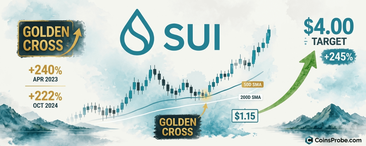
Article
SUI Golden Cross Forms — Last Two Signals Led to +220% Rallies, Target $4Key Highlights
SUI trades at $1.15 (+2.96% 24h, $4.72B market cap) as a golden cross forms on the daily chartAnalyst @alicharts flags 50D SMA crossing above 200D SMA — prior two instances produced +240.25% and +222.45% rallies$4.00 price target requires +245% from current $1.15; key resistance at $1.80 and $3.00Invalidation level: $0.72 — a break below negates the golden cross thesis entirely
SUI is trading at $1.15 — up 2.96% in 24 hours — with a market cap of $4.72 billion, as one of the most reliable trend-reversal signals in technical analysis begins to form on its daily chart: a golden cross.
Crypto analyst Ali Martinez (@alicharts) flagged the setup on September 30, 2026, identifying SUI as “on the verge of printing a new golden cross, with the 50-day SMA beginning to cross above the 200-day SMA.” Martinez called it “a major bullish trend signal” that “could mark the beginning of a longer-term bull market” — with a price target of $4.00.
What a Golden Cross Actually Measures
The golden cross is not a price level — it is a momentum event. It occurs when a shorter-term moving average (the 50-day SMA) crosses above a longer-term one (the 200-day SMA), signaling that recent price action has accelerated above the longer-term trend baseline. The 200-day SMA acts as the long-cycle anchor; when the 50-day breaches it from below, it reflects sustained buying pressure that has outpaced months of prior selling.
This matters on the daily chart because the 200-day SMA represents roughly 40 weeks of price history. A cross above it is not noise — it requires a structural shift in momentum to execute.
The Track Record — Two Prior Golden Crosses, Two +220%+ Rallies
The daily chart shared by @alicharts documents SUI’s prior golden cross instances across the 2025 cycle. Both resulted in sustained rallies of comparable magnitude:
Instance Signal Type Rally Produced Golden Cross #1 (2025 Cycle — Early) 50D SMA crosses above 200D SMA +240.25% Golden Cross #2 (2025 Cycle — Mid) 50D SMA crosses above 200D SMA +222.45% Golden Cross #3 (Forming — Sept 2026) 50D SMA crossing above 200D SMA Target: +245% to$4.00
Source: @alicharts daily SUI chart, September 30, 2026
Two-for-two is a track record. The current signal is now forming at a structurally similar setup — a deep correction from prior highs followed by a base at approximately $0.72, now recovering with the 50-day SMA curling upward through the 200-day SMA.
Reading the Chart — Levels That Matter
Ali Martinez’s daily SUI chart reveals the full structure of the current setup. Price bottomed near $0.72 — the key support zone — before recovering to current levels around $1.15–$1.16. Two resistance checkpoints stand between current price and the $4.00 target: $1.80 (first resistance) and $3.00 (second major resistance). The $4.00 target represents a +245% move from the $1.15 entry level.
SUI Daily Chart Analysis | Source: @alicharts (X)
The prior percentage moves annotated on the left side of the chart — the +240.25% and +222.45% labels — represent already-completed rallies from the 2025 cycle peaks, confirming the pattern context. The current formation mirrors those prior launchpad conditions: base established, golden cross imminent, momentum returning.
Key Levels — Support, Resistance, and the Invalidation Line
Three prices define this trade:
$0.72 — Support / Invalidation: The recent cycle low. A sustained breakdown below this level would invalidate the golden cross thesis and suggest the 200-day SMA is not acting as support but rather resistance from below.$1.80 — First Resistance: The initial checkpoint. A clean break and hold above $1.80 on daily closes would confirm the trend reversal is advancing as expected.$3.00 — Second Resistance: The intermediate target before the $4.00 zone. Historical resistance from the 2025 cycle structure. Clearing $3.00 on high volume opens the direct path to Martinez’s target.
Bullish Scenario — Confirmed Golden Cross and $1.80 Reclaim
If SUI’s 50-day SMA completes the cross above the 200-day SMA on a daily close, and price subsequently reclaims and holds $1.80, the pattern aligns with the two prior golden cross instances that each produced 220%–240% gains. From $1.80, the next measured move targets $3.00, then $4.00. The +245% path from current levels to $4.00 is consistent with both prior precedents.
Bearish Scenario — Death Cross Invalidation at $0.72
A failure of the golden cross — where the 50-day SMA stalls and rolls back below the 200-day SMA — combined with a breakdown below the $0.72 support level would negate the current bullish structure entirely. In that scenario, SUI would be printing a failed golden cross, historically a bearish signal when the cross reverses quickly, with downside risk reopening toward prior accumulation zones.
Two-for-Two Becomes Three-for-Three — or Doesn’t
SUI’s golden cross is forming at $1.15 with a documented two-for-two track record of producing +220% to +240% rallies in both prior instances this cycle, per Ali Martinez’s daily chart analysis. The mechanism is straightforward: the 50-day SMA crossing above the 200-day SMA signals that medium-term momentum has structurally overtaken the long-term trend, historically the inflection point for SUI’s largest sustained moves.
The $4.00 target requires +245% from current price, with $1.80 and $3.00 as the intermediate checkpoints that will define whether the third instance matches its predecessors. Watch $0.72 as the hard invalidation — and watch $1.80 as the first confirmation that the cross is holding.
Disclaimer: The views and analysis presented in this article are for informational purposes only and reflect the author’s perspective, not financial advice. Technical patterns and indicators discussed are subject to market volatility and may or may not yield anticipated results. Investors are advised to exercise caution, conduct independent research, and make decisions aligned with their individual risk tolerance.
SUI Golden Cross Forms — Last Two Signals Led to +220% Rallies, Target $4
Key Highlights
SUI trades at $1.15 (+2.96% 24h, $4.72B market cap) as a golden cross forms on the daily chartAnalyst @alicharts flags 50D SMA crossing above 200D SMA — prior two instances produced +240.25% and +222.45% rallies$4.00 price target requires +245% from current $1.15; key resistance at $1.80 and $3.00Invalidation level: $0.72 — a break below negates the golden cross thesis entirely
SUI is trading at $1.15 — up 2.96% in 24 hours — with a market cap of $4.72 billion, as one of the most reliable trend-reversal signals in technical analysis begins to form on its daily chart: a golden cross.
Crypto analyst Ali Martinez (@alicharts) flagged the setup on September 30, 2026, identifying SUI as “on the verge of printing a new golden cross, with the 50-day SMA beginning to cross above the 200-day SMA.” Martinez called it “a major bullish trend signal” that “could mark the beginning of a longer-term bull market” — with a price target of $4.00.
What a Golden Cross Actually Measures
The golden cross is not a price level — it is a momentum event. It occurs when a shorter-term moving average (the 50-day SMA) crosses above a longer-term one (the 200-day SMA), signaling that recent price action has accelerated above the longer-term trend baseline. The 200-day SMA acts as the long-cycle anchor; when the 50-day breaches it from below, it reflects sustained buying pressure that has outpaced months of prior selling.
This matters on the daily chart because the 200-day SMA represents roughly 40 weeks of price history. A cross above it is not noise — it requires a structural shift in momentum to execute.
The Track Record — Two Prior Golden Crosses, Two +220%+ Rallies
The daily chart shared by @alicharts documents SUI’s prior golden cross instances across the 2025 cycle. Both resulted in sustained rallies of comparable magnitude:
Instance Signal Type Rally Produced Golden Cross #1 (2025 Cycle — Early) 50D SMA crosses above 200D SMA +240.25% Golden Cross #2 (2025 Cycle — Mid) 50D SMA crosses above 200D SMA +222.45% Golden Cross #3 (Forming — Sept 2026) 50D SMA crossing above 200D SMA Target: +245% to$4.00
Source: @alicharts daily SUI chart, September 30, 2026
Two-for-two is a track record. The current signal is now forming at a structurally similar setup — a deep correction from prior highs followed by a base at approximately $0.72, now recovering with the 50-day SMA curling upward through the 200-day SMA.
Reading the Chart — Levels That Matter
Ali Martinez’s daily SUI chart reveals the full structure of the current setup. Price bottomed near $0.72 — the key support zone — before recovering to current levels around $1.15–$1.16. Two resistance checkpoints stand between current price and the $4.00 target: $1.80 (first resistance) and $3.00 (second major resistance). The $4.00 target represents a +245% move from the $1.15 entry level.
SUI Daily Chart Analysis | Source: @alicharts (X)
The prior percentage moves annotated on the left side of the chart — the +240.25% and +222.45% labels — represent already-completed rallies from the 2025 cycle peaks, confirming the pattern context. The current formation mirrors those prior launchpad conditions: base established, golden cross imminent, momentum returning.
Key Levels — Support, Resistance, and the Invalidation Line
Three prices define this trade:
$0.72 — Support / Invalidation: The recent cycle low. A sustained breakdown below this level would invalidate the golden cross thesis and suggest the 200-day SMA is not acting as support but rather resistance from below.$1.80 — First Resistance: The initial checkpoint. A clean break and hold above $1.80 on daily closes would confirm the trend reversal is advancing as expected.$3.00 — Second Resistance: The intermediate target before the $4.00 zone. Historical resistance from the 2025 cycle structure. Clearing $3.00 on high volume opens the direct path to Martinez’s target.
Bullish Scenario — Confirmed Golden Cross and $1.80 Reclaim
If SUI’s 50-day SMA completes the cross above the 200-day SMA on a daily close, and price subsequently reclaims and holds $1.80, the pattern aligns with the two prior golden cross instances that each produced 220%–240% gains. From $1.80, the next measured move targets $3.00, then $4.00. The +245% path from current levels to $4.00 is consistent with both prior precedents.
Bearish Scenario — Death Cross Invalidation at $0.72
A failure of the golden cross — where the 50-day SMA stalls and rolls back below the 200-day SMA — combined with a breakdown below the $0.72 support level would negate the current bullish structure entirely. In that scenario, SUI would be printing a failed golden cross, historically a bearish signal when the cross reverses quickly, with downside risk reopening toward prior accumulation zones.
Two-for-Two Becomes Three-for-Three — or Doesn’t
SUI’s golden cross is forming at $1.15 with a documented two-for-two track record of producing +220% to +240% rallies in both prior instances this cycle, per Ali Martinez’s daily chart analysis. The mechanism is straightforward: the 50-day SMA crossing above the 200-day SMA signals that medium-term momentum has structurally overtaken the long-term trend, historically the inflection point for SUI’s largest sustained moves.
The $4.00 target requires +245% from current price, with $1.80 and $3.00 as the intermediate checkpoints that will define whether the third instance matches its predecessors. Watch $0.72 as the hard invalidation — and watch $1.80 as the first confirmation that the cross is holding.
Disclaimer: The views and analysis presented in this article are for informational purposes only and reflect the author’s perspective, not financial advice. Technical patterns and indicators discussed are subject to market volatility and may or may not yield anticipated results. Investors are advised to exercise caution, conduct independent research, and make decisions aligned with their individual risk tolerance.
SUI trades at $1.15 (+2.96% 24h, $4.72B market cap) as a golden cross forms on the daily chartAnalyst @alicharts flags 50D SMA crossing above 200D SMA — prior two instances produced +240.25% and +222.45% rallies$4.00 price target requires +245% from current $1.15; key resistance at $1.80 and $3.00Invalidation level: $0.72 — a break below negates the golden cross thesis entirely
SUI is trading at $1.15 — up 2.96% in 24 hours — with a market cap of $4.72 billion, as one of the most reliable trend-reversal signals in technical analysis begins to form on its daily chart: a golden cross.
Crypto analyst Ali Martinez (@alicharts) flagged the setup on September 30, 2026, identifying SUI as “on the verge of printing a new golden cross, with the 50-day SMA beginning to cross above the 200-day SMA.” Martinez called it “a major bullish trend signal” that “could mark the beginning of a longer-term bull market” — with a price target of $4.00.
What a Golden Cross Actually Measures
The golden cross is not a price level — it is a momentum event. It occurs when a shorter-term moving average (the 50-day SMA) crosses above a longer-term one (the 200-day SMA), signaling that recent price action has accelerated above the longer-term trend baseline. The 200-day SMA acts as the long-cycle anchor; when the 50-day breaches it from below, it reflects sustained buying pressure that has outpaced months of prior selling.
This matters on the daily chart because the 200-day SMA represents roughly 40 weeks of price history. A cross above it is not noise — it requires a structural shift in momentum to execute.
The Track Record — Two Prior Golden Crosses, Two +220%+ Rallies
The daily chart shared by @alicharts documents SUI’s prior golden cross instances across the 2025 cycle. Both resulted in sustained rallies of comparable magnitude:
Instance Signal Type Rally Produced Golden Cross #1 (2025 Cycle — Early) 50D SMA crosses above 200D SMA +240.25% Golden Cross #2 (2025 Cycle — Mid) 50D SMA crosses above 200D SMA +222.45% Golden Cross #3 (Forming — Sept 2026) 50D SMA crossing above 200D SMA Target: +245% to$4.00
Source: @alicharts daily SUI chart, September 30, 2026
Two-for-two is a track record. The current signal is now forming at a structurally similar setup — a deep correction from prior highs followed by a base at approximately $0.72, now recovering with the 50-day SMA curling upward through the 200-day SMA.
Reading the Chart — Levels That Matter
Ali Martinez’s daily SUI chart reveals the full structure of the current setup. Price bottomed near $0.72 — the key support zone — before recovering to current levels around $1.15–$1.16. Two resistance checkpoints stand between current price and the $4.00 target: $1.80 (first resistance) and $3.00 (second major resistance). The $4.00 target represents a +245% move from the $1.15 entry level.
SUI Daily Chart Analysis | Source: @alicharts (X)
The prior percentage moves annotated on the left side of the chart — the +240.25% and +222.45% labels — represent already-completed rallies from the 2025 cycle peaks, confirming the pattern context. The current formation mirrors those prior launchpad conditions: base established, golden cross imminent, momentum returning.
Key Levels — Support, Resistance, and the Invalidation Line
Three prices define this trade:
$0.72 — Support / Invalidation: The recent cycle low. A sustained breakdown below this level would invalidate the golden cross thesis and suggest the 200-day SMA is not acting as support but rather resistance from below.$1.80 — First Resistance: The initial checkpoint. A clean break and hold above $1.80 on daily closes would confirm the trend reversal is advancing as expected.$3.00 — Second Resistance: The intermediate target before the $4.00 zone. Historical resistance from the 2025 cycle structure. Clearing $3.00 on high volume opens the direct path to Martinez’s target.
Bullish Scenario — Confirmed Golden Cross and $1.80 Reclaim
If SUI’s 50-day SMA completes the cross above the 200-day SMA on a daily close, and price subsequently reclaims and holds $1.80, the pattern aligns with the two prior golden cross instances that each produced 220%–240% gains. From $1.80, the next measured move targets $3.00, then $4.00. The +245% path from current levels to $4.00 is consistent with both prior precedents.
Bearish Scenario — Death Cross Invalidation at $0.72
A failure of the golden cross — where the 50-day SMA stalls and rolls back below the 200-day SMA — combined with a breakdown below the $0.72 support level would negate the current bullish structure entirely. In that scenario, SUI would be printing a failed golden cross, historically a bearish signal when the cross reverses quickly, with downside risk reopening toward prior accumulation zones.
Two-for-Two Becomes Three-for-Three — or Doesn’t
SUI’s golden cross is forming at $1.15 with a documented two-for-two track record of producing +220% to +240% rallies in both prior instances this cycle, per Ali Martinez’s daily chart analysis. The mechanism is straightforward: the 50-day SMA crossing above the 200-day SMA signals that medium-term momentum has structurally overtaken the long-term trend, historically the inflection point for SUI’s largest sustained moves.
The $4.00 target requires +245% from current price, with $1.80 and $3.00 as the intermediate checkpoints that will define whether the third instance matches its predecessors. Watch $0.72 as the hard invalidation — and watch $1.80 as the first confirmation that the cross is holding.
Disclaimer: The views and analysis presented in this article are for informational purposes only and reflect the author’s perspective, not financial advice. Technical patterns and indicators discussed are subject to market volatility and may or may not yield anticipated results. Investors are advised to exercise caution, conduct independent research, and make decisions aligned with their individual risk tolerance.
201
·
--
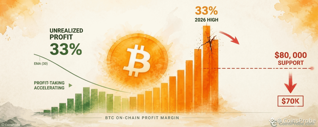
Article
Bitcoin Profit-Taking Hits 2026 High — $80K Is the Line That MattersKey Highlights
Bitcoin's unrealized profit margin hit 33% — a 2026 high and the highest reading since December 2024, per CryptoQuantProfit-taking volume reached its highest point of 2026, with demand metrics simultaneously fading$80,000 is the first critical on-chain support — loss of this level risks a deeper retracement toward $70,000Bull market structure remains intact: Bitcoin is still trading above its realized price on-chain
Bitcoin is trading near $82,600–$83,600 as on-chain data delivers one of its clearest distribution warnings of the year. Traders are locking in gains at the fastest pace since the cycle began, unrealized profit margins have hit a 2026 high of 33%, and demand is measurably softening. The bull market structure remains intact — but the rally is showing real cracks, not sentiment noise.
That assessment comes directly from CryptoQuant, the on-chain analytics platform whose analysts track Bitcoin’s realized profit and loss flows in real time. Their exact words: “Holders are cashing in. Profit-taking just hit a 2026 high, trader unrealized profits reached 33%, and demand is fading. The bull market is intact, but the rally is showing cracks. $80K is the first support to watch.” That is not a hedged observation — it is a declarative, data-backed conclusion with a specific level attached.
The On-Chain Signal — Unrealized Profit Margin at 33%
The Unrealized Profit/Loss Margin measures what percentage of Bitcoin’s circulating supply is sitting in profit relative to its cost basis, expressed as a margin above or below breakeven. When this reading climbs sharply, it signals that a large share of the market is deep in profit — and historically, that is when distribution pressure intensifies as holders convert unrealized gains into realized ones.
CryptoQuant’s chart shows the margin has reached approximately 33% — the highest reading in 2026 and the highest since December 2024. The green bars representing unrealized profit are expanding while the 30-period EMA on the margin line is curling lower, a configuration that has historically coincided with local tops rather than continuation. Critically, prior 40%+ margin readings — seen during Bitcoin’s run toward $103,000–$105,000 — preceded significant pullbacks, including the correction from roughly $110,000 back toward $75,000. At 33%, the current reading sits just below that historically dangerous threshold, suggesting sellers are active but not yet exhausted.
Bitcoin On-Chain Trader Analysis | Source: @cryptoquant_com (X)
The bull market structural argument remains supported by one key data point: Bitcoin’s price is still trading above its realized price — shown in pink on the CryptoQuant chart — meaning the average coin in circulation was acquired at a lower price than today’s market price. That is the technical definition of a bull market regime on-chain. The warning is not about regime change. It is about near-term distribution within a functioning bull market.
Profit-Taking at a 2026 High — What That Actually Means
Profit-taking metrics measure the volume of Bitcoin being moved on-chain at a price higher than its acquisition cost — in other words, coins moving into exchanges or wallets at a realized gain. When this metric hits a cycle high, it means more Bitcoin is being sold for profit right now than at any prior point in 2026. That is supply entering the market from a position of strength, not panic.
This matters for price because realized profit is not a lagging indicator — it is a direct measure of sell-side pressure. Every Bitcoin sold for profit is a coin that moved from a long-term holder to a shorter-term buyer, typically at or near current market prices. If demand cannot absorb that flow at current levels, price must fall to find clearing prices where buyers are willing to step in. CryptoQuant’s note that demand is fading compounds the concern: rising supply from profit-takers meeting declining new demand is the textbook setup for a near-term correction.
For context on how these dynamics have played out historically, the Bitcoin LTH MVRV analysis at CoinsProbe tracks how long-term holder behavior has historically preceded major price inflections — the current profit-taking surge follows a similar script.
$80,000 — Why This Level Is Structural, Not Arbitrary
CryptoQuant’s designation of $80,000 as the first critical support is grounded in on-chain cost basis data, not technical charting preference. The $80,000 zone represents a dense cluster of realized prices for coins acquired during Bitcoin’s prior accumulation range — meaning a large cohort of holders have a cost basis near this level. A sustained close below $80,000 would push those holders into unrealized loss territory, historically the point at which conviction weakens and selling accelerates.
The chart analysis reinforces this: below $80,000, the next meaningful support cluster sits in the $70,000 zone, with the 12% loss threshold from current levels placing a floor near $60,000 in an extended drawdown scenario. Those are not targets — they are the levels where historical on-chain data shows buyers have previously absorbed distribution pressure and reversed price.
One useful parallel: the $70,000–$75,000 reload zone cited by CryptoQuant’s chart as a potential re-entry area sits just below the $80,000 support. If profit-taking volume does not abate and demand continues to fade, that is the range where compression of the margin toward 0% — a historical capitulation signal — would be expected to emerge.
Bull Market Intact — But Cracks Are Measurable
The distinction CryptoQuant draws is precise and worth preserving. This is not a bear market call. Bitcoin trading above its realized price means the structural bull market regime is technically unchanged. What the data identifies is a local exhaustion signal — a period where the rally has generated enough profit to incentivize mass distribution, and where demand has not kept pace with that supply.
This mirrors the setup that preceded corrections earlier in the cycle. When the margin was at 40%+ near the $103,000–$105,000 resistance zone, the subsequent correction reached $75,000 — a drawdown of approximately 28%. The current 33% margin reading, if it follows the same arc without reaching the 40% threshold, implies a shallower but still meaningful pullback, with $80,000 as the first test.
For traders who have tracked Bitcoin’s demand metrics across timeframes, this aligns with broader observations about cycle behavior — the same on-chain framework that flagged recovery in earlier stress periods is now quantifying the cooling at the top of the rally range.
Bullish Scenario — $80K Holds as Support
If Bitcoin defends the $80,000 level on a closing basis — particularly a weekly close — the profit-taking wave could be absorbed without structural damage. A compression of the unrealized profit margin back toward 20%–25% would signal that distribution has run its course and a new demand cohort has stepped in at lower prices. In that case, the path back toward $103,000–$105,000 resistance reopens, with the prior all-time high zone as the next meaningful target above.
Bearish Scenario — $80K Fails on a Close
A sustained daily or weekly close below $80,000 removes the structural on-chain support that has kept this bull market intact. In that scenario, the chart identifies $70,000 as the next demand zone, with $60,000 representing the 12% loss threshold from realized price — a level that has historically triggered capitulation and forced selling from weaker hands. The margin compression toward 0% in that range would be the on-chain signal to watch for a potential reversal and re-entry.
Bitcoin’s broader on-chain regime has not broken. But the data from CryptoQuant is unambiguous: profit-taking is at a 2026 high, unrealized profit margins are at their most elevated reading since December 2024, and demand is measurably fading. That combination has preceded corrections within bull markets before. Watch $80,000 — a weekly close below it opens the $70,000 test. A hold at $80,000 keeps the continuation case alive.
Disclaimer: The views and analysis presented in this article are for informational purposes only and reflect the author’s perspective, not financial advice. Technical patterns and indicators discussed are subject to market volatility and may or may not yield anticipated results. Investors are advised to exercise caution, conduct independent research, and make decisions aligned with their individual risk tolerance.
Bitcoin Profit-Taking Hits 2026 High — $80K Is the Line That Matters
Key Highlights
Bitcoin's unrealized profit margin hit 33% — a 2026 high and the highest reading since December 2024, per CryptoQuantProfit-taking volume reached its highest point of 2026, with demand metrics simultaneously fading$80,000 is the first critical on-chain support — loss of this level risks a deeper retracement toward $70,000Bull market structure remains intact: Bitcoin is still trading above its realized price on-chain
Bitcoin is trading near $82,600–$83,600 as on-chain data delivers one of its clearest distribution warnings of the year. Traders are locking in gains at the fastest pace since the cycle began, unrealized profit margins have hit a 2026 high of 33%, and demand is measurably softening. The bull market structure remains intact — but the rally is showing real cracks, not sentiment noise.
That assessment comes directly from CryptoQuant, the on-chain analytics platform whose analysts track Bitcoin’s realized profit and loss flows in real time. Their exact words: “Holders are cashing in. Profit-taking just hit a 2026 high, trader unrealized profits reached 33%, and demand is fading. The bull market is intact, but the rally is showing cracks. $80K is the first support to watch.” That is not a hedged observation — it is a declarative, data-backed conclusion with a specific level attached.
The On-Chain Signal — Unrealized Profit Margin at 33%
The Unrealized Profit/Loss Margin measures what percentage of Bitcoin’s circulating supply is sitting in profit relative to its cost basis, expressed as a margin above or below breakeven. When this reading climbs sharply, it signals that a large share of the market is deep in profit — and historically, that is when distribution pressure intensifies as holders convert unrealized gains into realized ones.
CryptoQuant’s chart shows the margin has reached approximately 33% — the highest reading in 2026 and the highest since December 2024. The green bars representing unrealized profit are expanding while the 30-period EMA on the margin line is curling lower, a configuration that has historically coincided with local tops rather than continuation. Critically, prior 40%+ margin readings — seen during Bitcoin’s run toward $103,000–$105,000 — preceded significant pullbacks, including the correction from roughly $110,000 back toward $75,000. At 33%, the current reading sits just below that historically dangerous threshold, suggesting sellers are active but not yet exhausted.
Bitcoin On-Chain Trader Analysis | Source: @cryptoquant_com (X)
The bull market structural argument remains supported by one key data point: Bitcoin’s price is still trading above its realized price — shown in pink on the CryptoQuant chart — meaning the average coin in circulation was acquired at a lower price than today’s market price. That is the technical definition of a bull market regime on-chain. The warning is not about regime change. It is about near-term distribution within a functioning bull market.
Profit-Taking at a 2026 High — What That Actually Means
Profit-taking metrics measure the volume of Bitcoin being moved on-chain at a price higher than its acquisition cost — in other words, coins moving into exchanges or wallets at a realized gain. When this metric hits a cycle high, it means more Bitcoin is being sold for profit right now than at any prior point in 2026. That is supply entering the market from a position of strength, not panic.
This matters for price because realized profit is not a lagging indicator — it is a direct measure of sell-side pressure. Every Bitcoin sold for profit is a coin that moved from a long-term holder to a shorter-term buyer, typically at or near current market prices. If demand cannot absorb that flow at current levels, price must fall to find clearing prices where buyers are willing to step in. CryptoQuant’s note that demand is fading compounds the concern: rising supply from profit-takers meeting declining new demand is the textbook setup for a near-term correction.
For context on how these dynamics have played out historically, the Bitcoin LTH MVRV analysis at CoinsProbe tracks how long-term holder behavior has historically preceded major price inflections — the current profit-taking surge follows a similar script.
$80,000 — Why This Level Is Structural, Not Arbitrary
CryptoQuant’s designation of $80,000 as the first critical support is grounded in on-chain cost basis data, not technical charting preference. The $80,000 zone represents a dense cluster of realized prices for coins acquired during Bitcoin’s prior accumulation range — meaning a large cohort of holders have a cost basis near this level. A sustained close below $80,000 would push those holders into unrealized loss territory, historically the point at which conviction weakens and selling accelerates.
The chart analysis reinforces this: below $80,000, the next meaningful support cluster sits in the $70,000 zone, with the 12% loss threshold from current levels placing a floor near $60,000 in an extended drawdown scenario. Those are not targets — they are the levels where historical on-chain data shows buyers have previously absorbed distribution pressure and reversed price.
One useful parallel: the $70,000–$75,000 reload zone cited by CryptoQuant’s chart as a potential re-entry area sits just below the $80,000 support. If profit-taking volume does not abate and demand continues to fade, that is the range where compression of the margin toward 0% — a historical capitulation signal — would be expected to emerge.
Bull Market Intact — But Cracks Are Measurable
The distinction CryptoQuant draws is precise and worth preserving. This is not a bear market call. Bitcoin trading above its realized price means the structural bull market regime is technically unchanged. What the data identifies is a local exhaustion signal — a period where the rally has generated enough profit to incentivize mass distribution, and where demand has not kept pace with that supply.
This mirrors the setup that preceded corrections earlier in the cycle. When the margin was at 40%+ near the $103,000–$105,000 resistance zone, the subsequent correction reached $75,000 — a drawdown of approximately 28%. The current 33% margin reading, if it follows the same arc without reaching the 40% threshold, implies a shallower but still meaningful pullback, with $80,000 as the first test.
For traders who have tracked Bitcoin’s demand metrics across timeframes, this aligns with broader observations about cycle behavior — the same on-chain framework that flagged recovery in earlier stress periods is now quantifying the cooling at the top of the rally range.
Bullish Scenario — $80K Holds as Support
If Bitcoin defends the $80,000 level on a closing basis — particularly a weekly close — the profit-taking wave could be absorbed without structural damage. A compression of the unrealized profit margin back toward 20%–25% would signal that distribution has run its course and a new demand cohort has stepped in at lower prices. In that case, the path back toward $103,000–$105,000 resistance reopens, with the prior all-time high zone as the next meaningful target above.
Bearish Scenario — $80K Fails on a Close
A sustained daily or weekly close below $80,000 removes the structural on-chain support that has kept this bull market intact. In that scenario, the chart identifies $70,000 as the next demand zone, with $60,000 representing the 12% loss threshold from realized price — a level that has historically triggered capitulation and forced selling from weaker hands. The margin compression toward 0% in that range would be the on-chain signal to watch for a potential reversal and re-entry.
Bitcoin’s broader on-chain regime has not broken. But the data from CryptoQuant is unambiguous: profit-taking is at a 2026 high, unrealized profit margins are at their most elevated reading since December 2024, and demand is measurably fading. That combination has preceded corrections within bull markets before. Watch $80,000 — a weekly close below it opens the $70,000 test. A hold at $80,000 keeps the continuation case alive.
Disclaimer: The views and analysis presented in this article are for informational purposes only and reflect the author’s perspective, not financial advice. Technical patterns and indicators discussed are subject to market volatility and may or may not yield anticipated results. Investors are advised to exercise caution, conduct independent research, and make decisions aligned with their individual risk tolerance.
Bitcoin's unrealized profit margin hit 33% — a 2026 high and the highest reading since December 2024, per CryptoQuantProfit-taking volume reached its highest point of 2026, with demand metrics simultaneously fading$80,000 is the first critical on-chain support — loss of this level risks a deeper retracement toward $70,000Bull market structure remains intact: Bitcoin is still trading above its realized price on-chain
Bitcoin is trading near $82,600–$83,600 as on-chain data delivers one of its clearest distribution warnings of the year. Traders are locking in gains at the fastest pace since the cycle began, unrealized profit margins have hit a 2026 high of 33%, and demand is measurably softening. The bull market structure remains intact — but the rally is showing real cracks, not sentiment noise.
That assessment comes directly from CryptoQuant, the on-chain analytics platform whose analysts track Bitcoin’s realized profit and loss flows in real time. Their exact words: “Holders are cashing in. Profit-taking just hit a 2026 high, trader unrealized profits reached 33%, and demand is fading. The bull market is intact, but the rally is showing cracks. $80K is the first support to watch.” That is not a hedged observation — it is a declarative, data-backed conclusion with a specific level attached.
The On-Chain Signal — Unrealized Profit Margin at 33%
The Unrealized Profit/Loss Margin measures what percentage of Bitcoin’s circulating supply is sitting in profit relative to its cost basis, expressed as a margin above or below breakeven. When this reading climbs sharply, it signals that a large share of the market is deep in profit — and historically, that is when distribution pressure intensifies as holders convert unrealized gains into realized ones.
CryptoQuant’s chart shows the margin has reached approximately 33% — the highest reading in 2026 and the highest since December 2024. The green bars representing unrealized profit are expanding while the 30-period EMA on the margin line is curling lower, a configuration that has historically coincided with local tops rather than continuation. Critically, prior 40%+ margin readings — seen during Bitcoin’s run toward $103,000–$105,000 — preceded significant pullbacks, including the correction from roughly $110,000 back toward $75,000. At 33%, the current reading sits just below that historically dangerous threshold, suggesting sellers are active but not yet exhausted.
Bitcoin On-Chain Trader Analysis | Source: @cryptoquant_com (X)
The bull market structural argument remains supported by one key data point: Bitcoin’s price is still trading above its realized price — shown in pink on the CryptoQuant chart — meaning the average coin in circulation was acquired at a lower price than today’s market price. That is the technical definition of a bull market regime on-chain. The warning is not about regime change. It is about near-term distribution within a functioning bull market.
Profit-Taking at a 2026 High — What That Actually Means
Profit-taking metrics measure the volume of Bitcoin being moved on-chain at a price higher than its acquisition cost — in other words, coins moving into exchanges or wallets at a realized gain. When this metric hits a cycle high, it means more Bitcoin is being sold for profit right now than at any prior point in 2026. That is supply entering the market from a position of strength, not panic.
This matters for price because realized profit is not a lagging indicator — it is a direct measure of sell-side pressure. Every Bitcoin sold for profit is a coin that moved from a long-term holder to a shorter-term buyer, typically at or near current market prices. If demand cannot absorb that flow at current levels, price must fall to find clearing prices where buyers are willing to step in. CryptoQuant’s note that demand is fading compounds the concern: rising supply from profit-takers meeting declining new demand is the textbook setup for a near-term correction.
For context on how these dynamics have played out historically, the Bitcoin LTH MVRV analysis at CoinsProbe tracks how long-term holder behavior has historically preceded major price inflections — the current profit-taking surge follows a similar script.
$80,000 — Why This Level Is Structural, Not Arbitrary
CryptoQuant’s designation of $80,000 as the first critical support is grounded in on-chain cost basis data, not technical charting preference. The $80,000 zone represents a dense cluster of realized prices for coins acquired during Bitcoin’s prior accumulation range — meaning a large cohort of holders have a cost basis near this level. A sustained close below $80,000 would push those holders into unrealized loss territory, historically the point at which conviction weakens and selling accelerates.
The chart analysis reinforces this: below $80,000, the next meaningful support cluster sits in the $70,000 zone, with the 12% loss threshold from current levels placing a floor near $60,000 in an extended drawdown scenario. Those are not targets — they are the levels where historical on-chain data shows buyers have previously absorbed distribution pressure and reversed price.
One useful parallel: the $70,000–$75,000 reload zone cited by CryptoQuant’s chart as a potential re-entry area sits just below the $80,000 support. If profit-taking volume does not abate and demand continues to fade, that is the range where compression of the margin toward 0% — a historical capitulation signal — would be expected to emerge.
Bull Market Intact — But Cracks Are Measurable
The distinction CryptoQuant draws is precise and worth preserving. This is not a bear market call. Bitcoin trading above its realized price means the structural bull market regime is technically unchanged. What the data identifies is a local exhaustion signal — a period where the rally has generated enough profit to incentivize mass distribution, and where demand has not kept pace with that supply.
This mirrors the setup that preceded corrections earlier in the cycle. When the margin was at 40%+ near the $103,000–$105,000 resistance zone, the subsequent correction reached $75,000 — a drawdown of approximately 28%. The current 33% margin reading, if it follows the same arc without reaching the 40% threshold, implies a shallower but still meaningful pullback, with $80,000 as the first test.
For traders who have tracked Bitcoin’s demand metrics across timeframes, this aligns with broader observations about cycle behavior — the same on-chain framework that flagged recovery in earlier stress periods is now quantifying the cooling at the top of the rally range.
Bullish Scenario — $80K Holds as Support
If Bitcoin defends the $80,000 level on a closing basis — particularly a weekly close — the profit-taking wave could be absorbed without structural damage. A compression of the unrealized profit margin back toward 20%–25% would signal that distribution has run its course and a new demand cohort has stepped in at lower prices. In that case, the path back toward $103,000–$105,000 resistance reopens, with the prior all-time high zone as the next meaningful target above.
Bearish Scenario — $80K Fails on a Close
A sustained daily or weekly close below $80,000 removes the structural on-chain support that has kept this bull market intact. In that scenario, the chart identifies $70,000 as the next demand zone, with $60,000 representing the 12% loss threshold from realized price — a level that has historically triggered capitulation and forced selling from weaker hands. The margin compression toward 0% in that range would be the on-chain signal to watch for a potential reversal and re-entry.
Bitcoin’s broader on-chain regime has not broken. But the data from CryptoQuant is unambiguous: profit-taking is at a 2026 high, unrealized profit margins are at their most elevated reading since December 2024, and demand is measurably fading. That combination has preceded corrections within bull markets before. Watch $80,000 — a weekly close below it opens the $70,000 test. A hold at $80,000 keeps the continuation case alive.
Disclaimer: The views and analysis presented in this article are for informational purposes only and reflect the author’s perspective, not financial advice. Technical patterns and indicators discussed are subject to market volatility and may or may not yield anticipated results. Investors are advised to exercise caution, conduct independent research, and make decisions aligned with their individual risk tolerance.
108
·
--
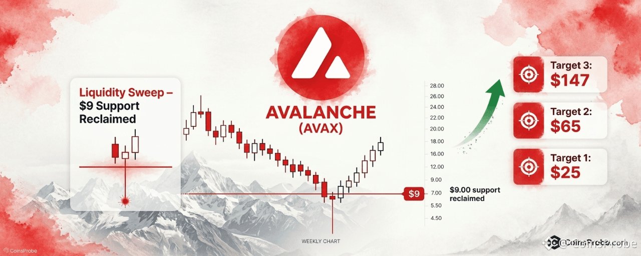
Article
AVAX Reclaims Key Horizontal — Analyst Eyes $25, $65, and $147 TargetsKey Highlights
AVAX trades at $11.56 after reclaiming $9 horizontal support — the Summer 2026 cycle lowAnalyst CryptoBullet1 sets three targets: $25 (+116%), $65 (+462%), $147 (+1,171%) from current price$9 is the thesis anchor — a weekly close below invalidates the entire bullish structureDescending trendline from 2022 sits at $22–$25 — a weekly close above is the first confirmation trigger
Avalanche (AVAX) is trading at approximately $11.56 — holding above the $9 horizontal support level that defined the Summer 2026 cycle low. The reclaim of that level is not a minor technical development: it is the structural reset that one analyst argues marks the end of AVAX’s worst drawdown in this cycle.
That analyst is CryptoBullet1 (@CryptoBullet1), who flagged the move on September 29, 2026. His exact words: “I doubt that $AVAX will return to those Summer 2026 prices. IMO the worst is over for $AVAX holders.” He set three sequential price targets: $25, $65, and $147 — implying upside of +116%, +462%, and +1,171% from current levels respectively.
The Signal — A Liquidity Sweep Below $9, Then a Reclaim
The weekly AVAX/USDT chart on Binance tells a specific structural story. During the summer of 2026, price wicked below the $9 horizontal support — a classic liquidity grab that swept stop-losses and retail exits accumulated beneath that level. The candle closed back above $9, and AVAX has since been consolidating above it.
This is not a breakout. It is a reclaim. The distinction matters. A reclaim confirms that the prior support held on a closing basis after being tested — it is a stronger signal than a simple bounce, because it demonstrates sustained buying interest at that zone rather than a momentary reaction.
CryptoBullet1’s weekly chart shows the $9 horizontal as a thick black support line, with a visible wick extending below it during the Summer 2026 low. Price is now consolidating above that line, facing a descending dotted resistance trendline that originates from AVAX’s 2022 highs and currently sits in the $22–$25 zone.
AVAX/USDT Weekly Analysis | Source: @CryptoBullet1 (X)
The Three Targets — What Each One Represents
The three targets are not arbitrary. They map to specific structural levels on the weekly chart, with each representing a distinct phase of the recovery thesis.
Target Price Upside from$11.56 Significance Target 1 $25 +116% Descending resistance trendline breakout zone Target 2 $65 +462% Mid-cycle resistance from 2023–2024 consolidation Target 3 $147 +1,171% Macro cycle target — near prior all-time high zone
Source: @CryptoBullet1 (X) — AVAX/USDT Weekly, Binance
Target 1 at $25 is the most structurally significant near-term level. The descending trendline from 2022 currently intersects in the $22–$25 range on the weekly timeframe. A sustained weekly close above $25 would confirm a trendline breakout — the structural precondition for the larger moves toward $65 and $147. Without that close, the descending resistance remains intact and the recovery thesis stays untested at its first major hurdle.
Why the $9 Level Is the Thesis Anchor
Every part of this analysis depends on $9 holding. CryptoBullet1’s argument that “the worst is over” is predicated entirely on the liquidity sweep being a one-time event — a terminal flush that cleared weak hands and established a cycle low. If AVAX returns below $9 on a weekly closing basis, that interpretation is invalidated.
The mechanism behind the liquidity grab matters here. When price briefly traded below $9, it triggered stop-losses placed by traders who had bought the $9 support zone across previous months. That cascade of selling — representing genuine exits, not just paper losses — is what CryptoBullet1 identifies as the capitulation event. The wick-and-recover pattern on the weekly chart is the visual evidence that buyers stepped in at exactly those prices, absorbing the stop-loss cascade and pushing price back above the level within the same weekly candle.
The Descending Trendline — The One Obstacle
The bullish thesis from $11.56 to $147 is not a straight line. The descending resistance trendline — drawn from the 2022 highs through subsequent lower highs — currently intersects the $22–$25 zone on the weekly chart. This is the structural barrier that separates Target 1 from the current price.
Until AVAX closes a weekly candle above $25, the trendline remains unbroken. A rejection at that trendline without a weekly close above it would mean the recovery from the Summer 2026 low has stalled at its first major test. That is not a thesis-killer — it would simply mean a longer consolidation period before the eventual breakout — but it would delay the timeline for Targets 2 and 3 significantly.
AVAX’s longer-term narrative has evolved considerably over the past year. For context on what has changed in the ecosystem, read our piece on what has replaced the Avalanche hype among top altcoins.
Bullish Scenario — Weekly Close Above $25
A sustained weekly close above $25 confirms the descending trendline breakout that has capped AVAX since 2022. That opens the measured move toward $65 as the next structural target — a level representing the 2023–2024 mid-cycle resistance zone. From $65, a continuation toward the $147 macro target becomes technically viable, consistent with CryptoBullet1’s full three-stage recovery thesis.
Bearish Scenario — Weekly Close Below $9
A confirmed weekly close below $9 invalidates the liquidity-sweep-as-bottom interpretation entirely. It would mean the Summer 2026 wick was not a terminal flush but a temporary pause before further downside. In that scenario, the next meaningful support would need to be identified from lower timeframe structure, and the three targets outlined above would require reassessment from a lower base.
The Recovery Thesis in Summary
CryptoBullet1’s analysis presents a staged recovery structure: the Summer 2026 liquidity sweep at $9 marks the cycle low → price reclaims $9 support on a closing basis → consolidation builds above support → price tests and breaks the descending trendline at $25 → staged moves toward $65 and then $147 follow. Each stage requires the prior stage to complete before it becomes active. The thesis is linear and binary: $9 holds or it doesn’t.
At $11.56, AVAX sits 116% below Target 1, 462% below Target 2, and 1,171% below the main target of $147. The reclaim of $9 has occurred. The next confirmation event is a weekly close above $25 — the descending trendline breakout that would validate the full recovery structure. Until that close is printed, the thesis is intact but unconfirmed at its first major test. Watch $9 as the invalidation level and $25 as the first confirmation that the worst is structurally behind AVAX holders.
Disclaimer: The views and analysis presented in this article are for informational purposes only and reflect the author’s perspective, not financial advice. Technical patterns and indicators discussed are subject to market volatility and may or may not yield anticipated results. Investors are advised to exercise caution, conduct independent research, and make decisions aligned with their individual risk tolerance.
AVAX Reclaims Key Horizontal — Analyst Eyes $25, $65, and $147 Targets
Key Highlights
AVAX trades at $11.56 after reclaiming $9 horizontal support — the Summer 2026 cycle lowAnalyst CryptoBullet1 sets three targets: $25 (+116%), $65 (+462%), $147 (+1,171%) from current price$9 is the thesis anchor — a weekly close below invalidates the entire bullish structureDescending trendline from 2022 sits at $22–$25 — a weekly close above is the first confirmation trigger
Avalanche (AVAX) is trading at approximately $11.56 — holding above the $9 horizontal support level that defined the Summer 2026 cycle low. The reclaim of that level is not a minor technical development: it is the structural reset that one analyst argues marks the end of AVAX’s worst drawdown in this cycle.
That analyst is CryptoBullet1 (@CryptoBullet1), who flagged the move on September 29, 2026. His exact words: “I doubt that $AVAX will return to those Summer 2026 prices. IMO the worst is over for $AVAX holders.” He set three sequential price targets: $25, $65, and $147 — implying upside of +116%, +462%, and +1,171% from current levels respectively.
The Signal — A Liquidity Sweep Below $9, Then a Reclaim
The weekly AVAX/USDT chart on Binance tells a specific structural story. During the summer of 2026, price wicked below the $9 horizontal support — a classic liquidity grab that swept stop-losses and retail exits accumulated beneath that level. The candle closed back above $9, and AVAX has since been consolidating above it.
This is not a breakout. It is a reclaim. The distinction matters. A reclaim confirms that the prior support held on a closing basis after being tested — it is a stronger signal than a simple bounce, because it demonstrates sustained buying interest at that zone rather than a momentary reaction.
CryptoBullet1’s weekly chart shows the $9 horizontal as a thick black support line, with a visible wick extending below it during the Summer 2026 low. Price is now consolidating above that line, facing a descending dotted resistance trendline that originates from AVAX’s 2022 highs and currently sits in the $22–$25 zone.
AVAX/USDT Weekly Analysis | Source: @CryptoBullet1 (X)
The Three Targets — What Each One Represents
The three targets are not arbitrary. They map to specific structural levels on the weekly chart, with each representing a distinct phase of the recovery thesis.
Target Price Upside from$11.56 Significance Target 1 $25 +116% Descending resistance trendline breakout zone Target 2 $65 +462% Mid-cycle resistance from 2023–2024 consolidation Target 3 $147 +1,171% Macro cycle target — near prior all-time high zone
Source: @CryptoBullet1 (X) — AVAX/USDT Weekly, Binance
Target 1 at $25 is the most structurally significant near-term level. The descending trendline from 2022 currently intersects in the $22–$25 range on the weekly timeframe. A sustained weekly close above $25 would confirm a trendline breakout — the structural precondition for the larger moves toward $65 and $147. Without that close, the descending resistance remains intact and the recovery thesis stays untested at its first major hurdle.
Why the $9 Level Is the Thesis Anchor
Every part of this analysis depends on $9 holding. CryptoBullet1’s argument that “the worst is over” is predicated entirely on the liquidity sweep being a one-time event — a terminal flush that cleared weak hands and established a cycle low. If AVAX returns below $9 on a weekly closing basis, that interpretation is invalidated.
The mechanism behind the liquidity grab matters here. When price briefly traded below $9, it triggered stop-losses placed by traders who had bought the $9 support zone across previous months. That cascade of selling — representing genuine exits, not just paper losses — is what CryptoBullet1 identifies as the capitulation event. The wick-and-recover pattern on the weekly chart is the visual evidence that buyers stepped in at exactly those prices, absorbing the stop-loss cascade and pushing price back above the level within the same weekly candle.
The Descending Trendline — The One Obstacle
The bullish thesis from $11.56 to $147 is not a straight line. The descending resistance trendline — drawn from the 2022 highs through subsequent lower highs — currently intersects the $22–$25 zone on the weekly chart. This is the structural barrier that separates Target 1 from the current price.
Until AVAX closes a weekly candle above $25, the trendline remains unbroken. A rejection at that trendline without a weekly close above it would mean the recovery from the Summer 2026 low has stalled at its first major test. That is not a thesis-killer — it would simply mean a longer consolidation period before the eventual breakout — but it would delay the timeline for Targets 2 and 3 significantly.
AVAX’s longer-term narrative has evolved considerably over the past year. For context on what has changed in the ecosystem, read our piece on what has replaced the Avalanche hype among top altcoins.
Bullish Scenario — Weekly Close Above $25
A sustained weekly close above $25 confirms the descending trendline breakout that has capped AVAX since 2022. That opens the measured move toward $65 as the next structural target — a level representing the 2023–2024 mid-cycle resistance zone. From $65, a continuation toward the $147 macro target becomes technically viable, consistent with CryptoBullet1’s full three-stage recovery thesis.
Bearish Scenario — Weekly Close Below $9
A confirmed weekly close below $9 invalidates the liquidity-sweep-as-bottom interpretation entirely. It would mean the Summer 2026 wick was not a terminal flush but a temporary pause before further downside. In that scenario, the next meaningful support would need to be identified from lower timeframe structure, and the three targets outlined above would require reassessment from a lower base.
The Recovery Thesis in Summary
CryptoBullet1’s analysis presents a staged recovery structure: the Summer 2026 liquidity sweep at $9 marks the cycle low → price reclaims $9 support on a closing basis → consolidation builds above support → price tests and breaks the descending trendline at $25 → staged moves toward $65 and then $147 follow. Each stage requires the prior stage to complete before it becomes active. The thesis is linear and binary: $9 holds or it doesn’t.
At $11.56, AVAX sits 116% below Target 1, 462% below Target 2, and 1,171% below the main target of $147. The reclaim of $9 has occurred. The next confirmation event is a weekly close above $25 — the descending trendline breakout that would validate the full recovery structure. Until that close is printed, the thesis is intact but unconfirmed at its first major test. Watch $9 as the invalidation level and $25 as the first confirmation that the worst is structurally behind AVAX holders.
Disclaimer: The views and analysis presented in this article are for informational purposes only and reflect the author’s perspective, not financial advice. Technical patterns and indicators discussed are subject to market volatility and may or may not yield anticipated results. Investors are advised to exercise caution, conduct independent research, and make decisions aligned with their individual risk tolerance.
AVAX trades at $11.56 after reclaiming $9 horizontal support — the Summer 2026 cycle lowAnalyst CryptoBullet1 sets three targets: $25 (+116%), $65 (+462%), $147 (+1,171%) from current price$9 is the thesis anchor — a weekly close below invalidates the entire bullish structureDescending trendline from 2022 sits at $22–$25 — a weekly close above is the first confirmation trigger
Avalanche (AVAX) is trading at approximately $11.56 — holding above the $9 horizontal support level that defined the Summer 2026 cycle low. The reclaim of that level is not a minor technical development: it is the structural reset that one analyst argues marks the end of AVAX’s worst drawdown in this cycle.
That analyst is CryptoBullet1 (@CryptoBullet1), who flagged the move on September 29, 2026. His exact words: “I doubt that $AVAX will return to those Summer 2026 prices. IMO the worst is over for $AVAX holders.” He set three sequential price targets: $25, $65, and $147 — implying upside of +116%, +462%, and +1,171% from current levels respectively.
The Signal — A Liquidity Sweep Below $9, Then a Reclaim
The weekly AVAX/USDT chart on Binance tells a specific structural story. During the summer of 2026, price wicked below the $9 horizontal support — a classic liquidity grab that swept stop-losses and retail exits accumulated beneath that level. The candle closed back above $9, and AVAX has since been consolidating above it.
This is not a breakout. It is a reclaim. The distinction matters. A reclaim confirms that the prior support held on a closing basis after being tested — it is a stronger signal than a simple bounce, because it demonstrates sustained buying interest at that zone rather than a momentary reaction.
CryptoBullet1’s weekly chart shows the $9 horizontal as a thick black support line, with a visible wick extending below it during the Summer 2026 low. Price is now consolidating above that line, facing a descending dotted resistance trendline that originates from AVAX’s 2022 highs and currently sits in the $22–$25 zone.
AVAX/USDT Weekly Analysis | Source: @CryptoBullet1 (X)
The Three Targets — What Each One Represents
The three targets are not arbitrary. They map to specific structural levels on the weekly chart, with each representing a distinct phase of the recovery thesis.
Target Price Upside from$11.56 Significance Target 1 $25 +116% Descending resistance trendline breakout zone Target 2 $65 +462% Mid-cycle resistance from 2023–2024 consolidation Target 3 $147 +1,171% Macro cycle target — near prior all-time high zone
Source: @CryptoBullet1 (X) — AVAX/USDT Weekly, Binance
Target 1 at $25 is the most structurally significant near-term level. The descending trendline from 2022 currently intersects in the $22–$25 range on the weekly timeframe. A sustained weekly close above $25 would confirm a trendline breakout — the structural precondition for the larger moves toward $65 and $147. Without that close, the descending resistance remains intact and the recovery thesis stays untested at its first major hurdle.
Why the $9 Level Is the Thesis Anchor
Every part of this analysis depends on $9 holding. CryptoBullet1’s argument that “the worst is over” is predicated entirely on the liquidity sweep being a one-time event — a terminal flush that cleared weak hands and established a cycle low. If AVAX returns below $9 on a weekly closing basis, that interpretation is invalidated.
The mechanism behind the liquidity grab matters here. When price briefly traded below $9, it triggered stop-losses placed by traders who had bought the $9 support zone across previous months. That cascade of selling — representing genuine exits, not just paper losses — is what CryptoBullet1 identifies as the capitulation event. The wick-and-recover pattern on the weekly chart is the visual evidence that buyers stepped in at exactly those prices, absorbing the stop-loss cascade and pushing price back above the level within the same weekly candle.
The Descending Trendline — The One Obstacle
The bullish thesis from $11.56 to $147 is not a straight line. The descending resistance trendline — drawn from the 2022 highs through subsequent lower highs — currently intersects the $22–$25 zone on the weekly chart. This is the structural barrier that separates Target 1 from the current price.
Until AVAX closes a weekly candle above $25, the trendline remains unbroken. A rejection at that trendline without a weekly close above it would mean the recovery from the Summer 2026 low has stalled at its first major test. That is not a thesis-killer — it would simply mean a longer consolidation period before the eventual breakout — but it would delay the timeline for Targets 2 and 3 significantly.
AVAX’s longer-term narrative has evolved considerably over the past year. For context on what has changed in the ecosystem, read our piece on what has replaced the Avalanche hype among top altcoins.
Bullish Scenario — Weekly Close Above $25
A sustained weekly close above $25 confirms the descending trendline breakout that has capped AVAX since 2022. That opens the measured move toward $65 as the next structural target — a level representing the 2023–2024 mid-cycle resistance zone. From $65, a continuation toward the $147 macro target becomes technically viable, consistent with CryptoBullet1’s full three-stage recovery thesis.
Bearish Scenario — Weekly Close Below $9
A confirmed weekly close below $9 invalidates the liquidity-sweep-as-bottom interpretation entirely. It would mean the Summer 2026 wick was not a terminal flush but a temporary pause before further downside. In that scenario, the next meaningful support would need to be identified from lower timeframe structure, and the three targets outlined above would require reassessment from a lower base.
The Recovery Thesis in Summary
CryptoBullet1’s analysis presents a staged recovery structure: the Summer 2026 liquidity sweep at $9 marks the cycle low → price reclaims $9 support on a closing basis → consolidation builds above support → price tests and breaks the descending trendline at $25 → staged moves toward $65 and then $147 follow. Each stage requires the prior stage to complete before it becomes active. The thesis is linear and binary: $9 holds or it doesn’t.
At $11.56, AVAX sits 116% below Target 1, 462% below Target 2, and 1,171% below the main target of $147. The reclaim of $9 has occurred. The next confirmation event is a weekly close above $25 — the descending trendline breakout that would validate the full recovery structure. Until that close is printed, the thesis is intact but unconfirmed at its first major test. Watch $9 as the invalidation level and $25 as the first confirmation that the worst is structurally behind AVAX holders.
Disclaimer: The views and analysis presented in this article are for informational purposes only and reflect the author’s perspective, not financial advice. Technical patterns and indicators discussed are subject to market volatility and may or may not yield anticipated results. Investors are advised to exercise caution, conduct independent research, and make decisions aligned with their individual risk tolerance.
1
356
·
--
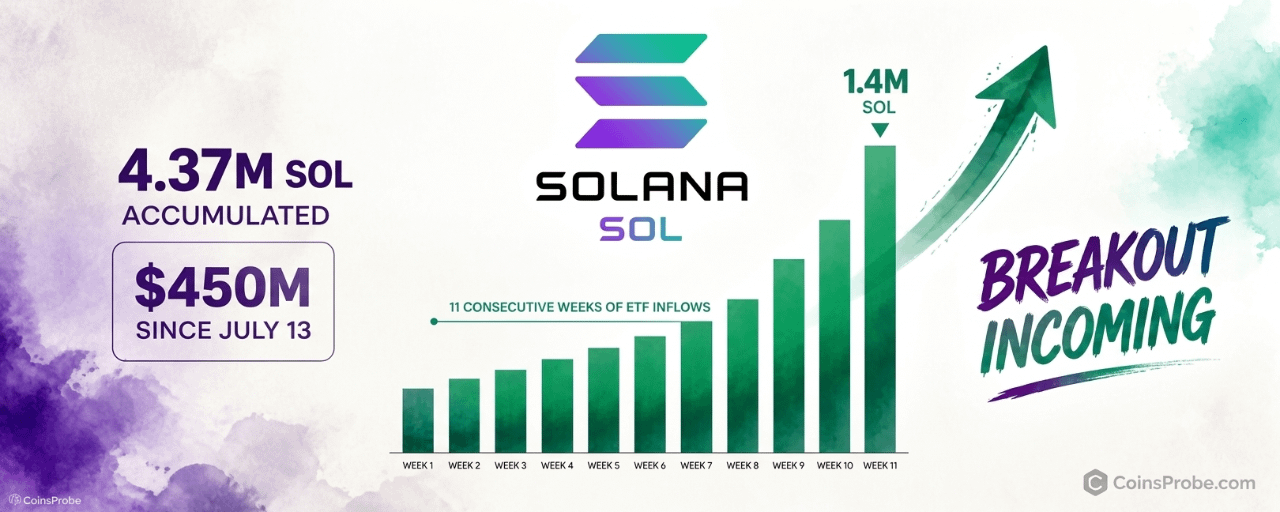
Article
Solana ETF Inflows Hit 11 Straight Weeks — Is a Breakout Incoming?Key Highlights
US Spot Solana ETFs accumulated 4.37M SOL (~$450M) since July 13 — 11 consecutive weeks of net inflowsSeptember 21 recorded the largest single-week ETF inflow on the chart: ~1.35–1.4M SOL, an accelerating trendAnalyst @alicharts flags 11 straight inflow weeks and is watching the next leg higher toward $150Watch for ETF weekly inflow continuation above 1M SOL — first negative week breaks the 11-streak thesis
Solana is building a case that institutional money is not rotating out — it is accelerating in. US Spot Solana ETFs have absorbed approximately 4.37 million SOL, worth around $450 million, since July 13, marking 11 consecutive weeks of net inflows with no interruption.
Crypto analyst Ali Martinez (@alicharts) flags the streak directly: “US Spot Solana ETFs have accumulated roughly 4.37 million $SOL, worth around $450 million, since July 13. That marks 11 consecutive weeks of net inflows. With institutional demand continuing to absorb Solana, I’m watching for the next leg higher toward $150.”
His framing is unambiguous: this is a supply absorption event, not a sentiment trade.
The ETF Flow Data — What 11 Consecutive Weeks Actually Means
ETF net inflows measure the difference between new capital entering a fund and capital exiting it each week. A single week of inflows can be noise. Three weeks is a trend. Eleven consecutive weeks with zero negative bars is a structural statement about institutional conviction.
The flow chart shared by @alicharts covers weekly ETF data from August 3 through September 21, 2026. What it shows is not a flat accumulation trend — it is an accelerating one. Inflows surged to approximately 1.2 million SOL in the week ending August 24, pulled back modestly into August 31, then hit their highest single-week reading of the entire series at the September 21 bar: an estimated 1.35 to 1.4 million SOL — the strongest institutional weekly buy on record for US Spot Solana ETFs.
SOL ETF Net Flows Analysis | Source: @alicharts (X)
The acceleration matters. If institutional buyers were simply holding a position, inflows would flatten. Instead the final data point on this chart is the largest. That is not consolidation — that is demand expanding at the margin.
Why Supply Absorption Changes the Price Equation
At 4.37 million SOL accumulated since July 13, US Spot ETFs have removed a measurable portion of liquid supply from the open market. This is the direct mechanism connecting ETF inflows to price: spot ETFs must hold the underlying asset, meaning every unit of net inflow represents SOL physically purchased and held off exchange.
The math is straightforward. At approximately $103 per SOL (the implied price from $450M across 4.37M SOL), institutional buyers have been averaging in throughout a range and are now sitting on a position that dwarfs typical retail accumulation events. For context, a single on-chain whale trade that attracted significant attention involved a SOL trader sitting on a $23M unrealized gain from a $67.88M 20x long — the ETF accumulation at $450M is an order of magnitude larger.
When supply tightens and a single demand cohort (in this case, regulated US ETF vehicles) is buying consistently without selling, the price required to source additional SOL rises. That is not a prediction — it is an arithmetic consequence of supply and demand.
ETF Inflows as a Leading Signal — And Its Limitations
ETF flow data is a sentiment and demand indicator, not a direct price trigger. The distinction matters. Inflows confirm that institutional buyers have been active — they do not guarantee that price will respond immediately or proportionally.
What the 11-week streak does confirm with certainty:
Sustained demand: No single week of outflows across the entire accumulation period since July 13Accelerating pace: The September 21 weekly bar (~1.35–1.4M SOL) is the highest on the entire chartScale: $450 million in ETF-driven spot buying represents institutional-grade conviction, not retail positioning
What it does not confirm: the exact price level at which the market reprices this demand, or the timing of any breakout move. ETF flows lag price action in some market phases — buyers accumulate through range, and price only responds when the float of available sellers is exhausted.
Analysts tracking the broader Solana ecosystem have separately noted setups that could accompany an institutional-driven leg higher. Among the altcoin layer, pattern watchers have flagged that tokens within the Solana ecosystem are showing pre-explosion patterns — a signal that is historically consistent with late-stage accumulation in the underlying asset before a directional move.
Institutional Infrastructure Deepening Around Solana
The ETF accumulation data does not exist in isolation. Regulated derivatives infrastructure for Solana has been expanding in parallel. The Moscow Exchange launched perpetual futures for Solana alongside Bitcoin, Ethereum, XRP, and Tron — adding another regulated venue where institutional participants can manage SOL exposure. More futures venues mean more hedging capacity, which lowers the friction cost for large spot positions.
When spot ETF accumulation, ecosystem altcoin positioning, and regulated derivatives expansion occur simultaneously, the structural backdrop for a directional move strengthens — not because any single signal guarantees a breakout, but because the conditions that historically precede sustained institutional-driven rallies are present across multiple dimensions.
Bullish Scenario
If ETF inflows stay above 1 million SOL per week through October, supply keeps tightening. @alicharts is watching the next leg higher, with $150 as the level on the board from current prices near $119. With no corresponding outflow pressure, the spot market float tightens and a breakout from the current range opens the next technical leg higher as flagged by @alicharts. The September 21 inflow acceleration — the largest single-week reading on record — would serve as the demand confirmation signal.
Bearish Scenario
If ETF inflows turn negative for even one week — breaking the 11-week streak — it would signal the first institutional demand reversal since July 13. A net outflow week would not immediately invalidate the bullish structure, but two consecutive negative bars would indicate the supply absorption thesis has stalled. The $450M accumulated position would then become overhead supply rather than support.
The 11-week streak is the metric to watch. @alicharts’ call is built on it continuing. DeFiLlama’s daily Solana revenue data and real-time ETF flow trackers will update that picture as October progresses. Eleven consecutive inflow weeks have put the breakout setup on the table — whether week twelve extends or breaks the streak will determine whether it stays there.
Disclaimer: The views and analysis presented in this article are for informational purposes only and reflect the author’s perspective, not financial advice. Technical patterns and indicators discussed are subject to market volatility and may or may not yield anticipated results. Investors are advised to exercise caution, conduct independent research, and make decisions aligned with their individual risk tolerance.
Solana ETF Inflows Hit 11 Straight Weeks — Is a Breakout Incoming?
Key Highlights
US Spot Solana ETFs accumulated 4.37M SOL (~$450M) since July 13 — 11 consecutive weeks of net inflowsSeptember 21 recorded the largest single-week ETF inflow on the chart: ~1.35–1.4M SOL, an accelerating trendAnalyst @alicharts flags 11 straight inflow weeks and is watching the next leg higher toward $150Watch for ETF weekly inflow continuation above 1M SOL — first negative week breaks the 11-streak thesis
Solana is building a case that institutional money is not rotating out — it is accelerating in. US Spot Solana ETFs have absorbed approximately 4.37 million SOL, worth around $450 million, since July 13, marking 11 consecutive weeks of net inflows with no interruption.
Crypto analyst Ali Martinez (@alicharts) flags the streak directly: “US Spot Solana ETFs have accumulated roughly 4.37 million $SOL, worth around $450 million, since July 13. That marks 11 consecutive weeks of net inflows. With institutional demand continuing to absorb Solana, I’m watching for the next leg higher toward $150.”
His framing is unambiguous: this is a supply absorption event, not a sentiment trade.
The ETF Flow Data — What 11 Consecutive Weeks Actually Means
ETF net inflows measure the difference between new capital entering a fund and capital exiting it each week. A single week of inflows can be noise. Three weeks is a trend. Eleven consecutive weeks with zero negative bars is a structural statement about institutional conviction.
The flow chart shared by @alicharts covers weekly ETF data from August 3 through September 21, 2026. What it shows is not a flat accumulation trend — it is an accelerating one. Inflows surged to approximately 1.2 million SOL in the week ending August 24, pulled back modestly into August 31, then hit their highest single-week reading of the entire series at the September 21 bar: an estimated 1.35 to 1.4 million SOL — the strongest institutional weekly buy on record for US Spot Solana ETFs.
SOL ETF Net Flows Analysis | Source: @alicharts (X)
The acceleration matters. If institutional buyers were simply holding a position, inflows would flatten. Instead the final data point on this chart is the largest. That is not consolidation — that is demand expanding at the margin.
Why Supply Absorption Changes the Price Equation
At 4.37 million SOL accumulated since July 13, US Spot ETFs have removed a measurable portion of liquid supply from the open market. This is the direct mechanism connecting ETF inflows to price: spot ETFs must hold the underlying asset, meaning every unit of net inflow represents SOL physically purchased and held off exchange.
The math is straightforward. At approximately $103 per SOL (the implied price from $450M across 4.37M SOL), institutional buyers have been averaging in throughout a range and are now sitting on a position that dwarfs typical retail accumulation events. For context, a single on-chain whale trade that attracted significant attention involved a SOL trader sitting on a $23M unrealized gain from a $67.88M 20x long — the ETF accumulation at $450M is an order of magnitude larger.
When supply tightens and a single demand cohort (in this case, regulated US ETF vehicles) is buying consistently without selling, the price required to source additional SOL rises. That is not a prediction — it is an arithmetic consequence of supply and demand.
ETF Inflows as a Leading Signal — And Its Limitations
ETF flow data is a sentiment and demand indicator, not a direct price trigger. The distinction matters. Inflows confirm that institutional buyers have been active — they do not guarantee that price will respond immediately or proportionally.
What the 11-week streak does confirm with certainty:
Sustained demand: No single week of outflows across the entire accumulation period since July 13Accelerating pace: The September 21 weekly bar (~1.35–1.4M SOL) is the highest on the entire chartScale: $450 million in ETF-driven spot buying represents institutional-grade conviction, not retail positioning
What it does not confirm: the exact price level at which the market reprices this demand, or the timing of any breakout move. ETF flows lag price action in some market phases — buyers accumulate through range, and price only responds when the float of available sellers is exhausted.
Analysts tracking the broader Solana ecosystem have separately noted setups that could accompany an institutional-driven leg higher. Among the altcoin layer, pattern watchers have flagged that tokens within the Solana ecosystem are showing pre-explosion patterns — a signal that is historically consistent with late-stage accumulation in the underlying asset before a directional move.
Institutional Infrastructure Deepening Around Solana
The ETF accumulation data does not exist in isolation. Regulated derivatives infrastructure for Solana has been expanding in parallel. The Moscow Exchange launched perpetual futures for Solana alongside Bitcoin, Ethereum, XRP, and Tron — adding another regulated venue where institutional participants can manage SOL exposure. More futures venues mean more hedging capacity, which lowers the friction cost for large spot positions.
When spot ETF accumulation, ecosystem altcoin positioning, and regulated derivatives expansion occur simultaneously, the structural backdrop for a directional move strengthens — not because any single signal guarantees a breakout, but because the conditions that historically precede sustained institutional-driven rallies are present across multiple dimensions.
Bullish Scenario
If ETF inflows stay above 1 million SOL per week through October, supply keeps tightening. @alicharts is watching the next leg higher, with $150 as the level on the board from current prices near $119. With no corresponding outflow pressure, the spot market float tightens and a breakout from the current range opens the next technical leg higher as flagged by @alicharts. The September 21 inflow acceleration — the largest single-week reading on record — would serve as the demand confirmation signal.
Bearish Scenario
If ETF inflows turn negative for even one week — breaking the 11-week streak — it would signal the first institutional demand reversal since July 13. A net outflow week would not immediately invalidate the bullish structure, but two consecutive negative bars would indicate the supply absorption thesis has stalled. The $450M accumulated position would then become overhead supply rather than support.
The 11-week streak is the metric to watch. @alicharts’ call is built on it continuing. DeFiLlama’s daily Solana revenue data and real-time ETF flow trackers will update that picture as October progresses. Eleven consecutive inflow weeks have put the breakout setup on the table — whether week twelve extends or breaks the streak will determine whether it stays there.
Disclaimer: The views and analysis presented in this article are for informational purposes only and reflect the author’s perspective, not financial advice. Technical patterns and indicators discussed are subject to market volatility and may or may not yield anticipated results. Investors are advised to exercise caution, conduct independent research, and make decisions aligned with their individual risk tolerance.
US Spot Solana ETFs accumulated 4.37M SOL (~$450M) since July 13 — 11 consecutive weeks of net inflowsSeptember 21 recorded the largest single-week ETF inflow on the chart: ~1.35–1.4M SOL, an accelerating trendAnalyst @alicharts flags 11 straight inflow weeks and is watching the next leg higher toward $150Watch for ETF weekly inflow continuation above 1M SOL — first negative week breaks the 11-streak thesis
Solana is building a case that institutional money is not rotating out — it is accelerating in. US Spot Solana ETFs have absorbed approximately 4.37 million SOL, worth around $450 million, since July 13, marking 11 consecutive weeks of net inflows with no interruption.
Crypto analyst Ali Martinez (@alicharts) flags the streak directly: “US Spot Solana ETFs have accumulated roughly 4.37 million $SOL, worth around $450 million, since July 13. That marks 11 consecutive weeks of net inflows. With institutional demand continuing to absorb Solana, I’m watching for the next leg higher toward $150.”
His framing is unambiguous: this is a supply absorption event, not a sentiment trade.
The ETF Flow Data — What 11 Consecutive Weeks Actually Means
ETF net inflows measure the difference between new capital entering a fund and capital exiting it each week. A single week of inflows can be noise. Three weeks is a trend. Eleven consecutive weeks with zero negative bars is a structural statement about institutional conviction.
The flow chart shared by @alicharts covers weekly ETF data from August 3 through September 21, 2026. What it shows is not a flat accumulation trend — it is an accelerating one. Inflows surged to approximately 1.2 million SOL in the week ending August 24, pulled back modestly into August 31, then hit their highest single-week reading of the entire series at the September 21 bar: an estimated 1.35 to 1.4 million SOL — the strongest institutional weekly buy on record for US Spot Solana ETFs.
SOL ETF Net Flows Analysis | Source: @alicharts (X)
The acceleration matters. If institutional buyers were simply holding a position, inflows would flatten. Instead the final data point on this chart is the largest. That is not consolidation — that is demand expanding at the margin.
Why Supply Absorption Changes the Price Equation
At 4.37 million SOL accumulated since July 13, US Spot ETFs have removed a measurable portion of liquid supply from the open market. This is the direct mechanism connecting ETF inflows to price: spot ETFs must hold the underlying asset, meaning every unit of net inflow represents SOL physically purchased and held off exchange.
The math is straightforward. At approximately $103 per SOL (the implied price from $450M across 4.37M SOL), institutional buyers have been averaging in throughout a range and are now sitting on a position that dwarfs typical retail accumulation events. For context, a single on-chain whale trade that attracted significant attention involved a SOL trader sitting on a $23M unrealized gain from a $67.88M 20x long — the ETF accumulation at $450M is an order of magnitude larger.
When supply tightens and a single demand cohort (in this case, regulated US ETF vehicles) is buying consistently without selling, the price required to source additional SOL rises. That is not a prediction — it is an arithmetic consequence of supply and demand.
ETF Inflows as a Leading Signal — And Its Limitations
ETF flow data is a sentiment and demand indicator, not a direct price trigger. The distinction matters. Inflows confirm that institutional buyers have been active — they do not guarantee that price will respond immediately or proportionally.
What the 11-week streak does confirm with certainty:
Sustained demand: No single week of outflows across the entire accumulation period since July 13Accelerating pace: The September 21 weekly bar (~1.35–1.4M SOL) is the highest on the entire chartScale: $450 million in ETF-driven spot buying represents institutional-grade conviction, not retail positioning
What it does not confirm: the exact price level at which the market reprices this demand, or the timing of any breakout move. ETF flows lag price action in some market phases — buyers accumulate through range, and price only responds when the float of available sellers is exhausted.
Analysts tracking the broader Solana ecosystem have separately noted setups that could accompany an institutional-driven leg higher. Among the altcoin layer, pattern watchers have flagged that tokens within the Solana ecosystem are showing pre-explosion patterns — a signal that is historically consistent with late-stage accumulation in the underlying asset before a directional move.
Institutional Infrastructure Deepening Around Solana
The ETF accumulation data does not exist in isolation. Regulated derivatives infrastructure for Solana has been expanding in parallel. The Moscow Exchange launched perpetual futures for Solana alongside Bitcoin, Ethereum, XRP, and Tron — adding another regulated venue where institutional participants can manage SOL exposure. More futures venues mean more hedging capacity, which lowers the friction cost for large spot positions.
When spot ETF accumulation, ecosystem altcoin positioning, and regulated derivatives expansion occur simultaneously, the structural backdrop for a directional move strengthens — not because any single signal guarantees a breakout, but because the conditions that historically precede sustained institutional-driven rallies are present across multiple dimensions.
Bullish Scenario
If ETF inflows stay above 1 million SOL per week through October, supply keeps tightening. @alicharts is watching the next leg higher, with $150 as the level on the board from current prices near $119. With no corresponding outflow pressure, the spot market float tightens and a breakout from the current range opens the next technical leg higher as flagged by @alicharts. The September 21 inflow acceleration — the largest single-week reading on record — would serve as the demand confirmation signal.
Bearish Scenario
If ETF inflows turn negative for even one week — breaking the 11-week streak — it would signal the first institutional demand reversal since July 13. A net outflow week would not immediately invalidate the bullish structure, but two consecutive negative bars would indicate the supply absorption thesis has stalled. The $450M accumulated position would then become overhead supply rather than support.
The 11-week streak is the metric to watch. @alicharts’ call is built on it continuing. DeFiLlama’s daily Solana revenue data and real-time ETF flow trackers will update that picture as October progresses. Eleven consecutive inflow weeks have put the breakout setup on the table — whether week twelve extends or breaks the streak will determine whether it stays there.
Disclaimer: The views and analysis presented in this article are for informational purposes only and reflect the author’s perspective, not financial advice. Technical patterns and indicators discussed are subject to market volatility and may or may not yield anticipated results. Investors are advised to exercise caution, conduct independent research, and make decisions aligned with their individual risk tolerance.
527
·
--
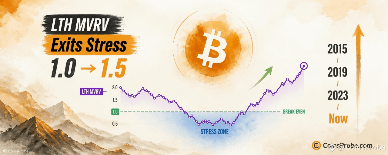
Article
Bitcoin LTH MVRV Exits Stress Zone — What History Says Happens NextKey Highlights
Bitcoin's 6M–10Y LTH Adjusted MVRV has crossed back above 1.0, exiting shallow stress — per @_Crypto_glass via CryptoQuantEvery prior sub-1.0 exit in this cohort (2012, 2015, 2019, 2023) preceded a sustained Bitcoin bull runCurrent MVRV reading ~1.2–1.5 vs. historical sell-signal exhaustion zone at 8–10 — significant headroom remainsWatch $85,000–$88,000 as the structural floor; a sustained break below returns cohort to loss territory
Bitcoin is trading at approximately $97,000 — and beneath that price, one of the most consequential on-chain resets of this cycle has just completed. The Adjusted Long-Term Holder MVRV for the 6-month to 10-year cohort has crossed back above 1.0, exiting what CryptoQuant classifies as a shallow stress zone. This is not a speculative signal. It is a documented regime transition that has preceded every major Bitcoin bull run since 2012.
The observation comes from @_Crypto_glass, published through @cryptoquant_com. Their exact framing: “The 6M–10Y cohort has moved out of shallow sub-1.0 stress and back into aggregate profit. This is a constructive reset for this holder group, not a deep or persistent loss phase.” That distinction — constructive reset versus deep capitulation — is the analytical load-bearing point of this entire signal.
What the Adjusted LTH MVRV Actually Measures
The MVRV ratio compares an asset’s market value to its realized value — in simpler terms, it compares what Bitcoin is worth today versus what holders paid for it. A reading below 1.0 means the cohort is, in aggregate, holding at a loss. A reading above 1.0 means they have returned to aggregate profit.
The Adjusted variant applied here strips out coins that are likely lost or permanently dormant, producing a cleaner read of active long-term conviction holders. The 6-month to 10-year cohort filters further — these are not traders. These are investors who have held through multiple cycles, through 80% drawdowns, through protocol crises. Their collective cost basis moving back above market price is structurally meaningful in a way that short-term holder data is not.
When this cohort dips below MVRV 1.0, it enters what the chart defines as an “Extreme Underwater” zone — shaded in blue. These episodes are rare, brief, and historically have resolved in only one direction.
The Historical Pattern — 2012, 2015, 2019, 2023, and Now
The chart shared by @_Crypto_glass spans 2012 through 2026, and the blue stress zones appear clearly at five distinct moments. Each prior resolution — the MVRV crossing back above 1.0 — preceded a sustained multi-month advance in Bitcoin’s price. The 2015 exit preceded Bitcoin’s climb from approximately $250 to $20,000 across the following two years. The 2019 exit preceded the recovery from the $3,200 bear market low. The 2023 exit followed the FTX capitulation low near $15,500 and preceded the rally that eventually carried Bitcoin past $100,000.
The current 2025–2026 stress episode — visible as the most recent blue zone on the chart — is now resolving in identical fashion. MVRV is crossing back above 1.0, with the current reading estimated at approximately 1.2–1.5. This is not near any historical sell-signal territory. Prior cycle peaks saw the Adjusted LTH MVRV reach readings of 8 to 10. The distance between current levels and historical exhaustion zones represents substantial potential upside before this cohort reaches the profit levels that have historically triggered distribution.
@_Crypto_glass’s chart reveals the purple MVRV line exiting the blue shaded zone and returning to positive territory — mirroring the structural recovery patterns of 2012, 2015, 2019, and 2023. The realized price trend (shown in orange) continues moving upward, confirming that the long-term cost basis is expanding in a healthy, non-parabolic fashion.
BTC Adjusted LTH MVRV Analysis | Source: @cryptoquant_com (X)
Why “Constructive Reset” Matters More Than “No Capitulation”
The specific language @_Crypto_glass uses — constructive reset — carries analytical weight. A deep capitulation event, such as what occurred in late 2022, forces long-term holders into realized losses and often triggers forced selling cascades. That is a different market structure than what the data shows today.
The current sub-1.0 episode was shallow and short-lived. Long-term holders did not sell in distress. The cost basis of the 6M–10Y cohort remained close enough to market price that the return to profit required only a modest price recovery — not a new all-time high. That is the definition of healthy consolidation: a reset that restores the cohort to aggregate profit without requiring the kind of violent repricing that shakes out weak hands at scale.
This also matters for what it rules out. A persistent sub-1.0 reading — lasting months with no recovery — would suggest structural selling pressure from even the most committed holders. That is not what the data shows. The stress was temporary. The exit is now confirmed.
For context on how institutional demand is reinforcing this on-chain picture, Crypto Spot ETFs recently logged $2.71B in weekly net inflows with Bitcoin commanding 70.8% of that share — a structural demand signal that complements the LTH MVRV reset. And the short-term picture is similarly constructive: BTC short-term holder selling recently hit multi-year lows while a 2022 reversal fractal aligned — two timeframes now pointing in the same direction.
What This Does Not Confirm
The MVRV exit from stress is a regime signal, not a price prediction. It confirms that the structural condition of the long-term holder base has normalized — it does not specify when Bitcoin will make its next leg higher, nor does it guarantee a specific percentage gain. Prior post-stress recoveries ranged from moderate (2019’s 150% recovery before the COVID crash interrupted) to extreme (the 2015 exit preceding an eventual 8,000%+ advance to the 2017 peak).
The signal also does not rule out short-term price volatility. Bitcoin could retest the $88,000–$90,000 range and the MVRV would still read constructively if that dip remained brief. What would invalidate the signal is a sustained return below MVRV 1.0 — meaning price drops sharply enough, for long enough, that the 6M–10Y cohort re-enters aggregate loss territory.
Bullish Scenario
Bitcoin holds above $90,000 as a floor, MVRV continues rising toward the 2.0–3.0 range — a level consistent with mid-cycle momentum phases in 2016 and 2020 — and the realized price trend continues expanding. Historical precedent from the 2023 equivalent exit suggests a sustained multi-month advance with intermediate targets at $110,000, $130,000, and eventually the MVRV 8–10 exhaustion zone that has historically corresponded with cycle peak pricing.
Bearish Scenario
A decisive break below $85,000 sustained over multiple weeks would push the 6M–10Y cohort back into sub-1.0 MVRV territory, invalidating the constructive reset interpretation and signaling that the stress phase is not yet resolved. That outcome would shift the analytical framework from recovery to potential prolonged consolidation.
The Level Traders Are Watching
The MVRV 1.0 threshold is now the key structural line. As long as Bitcoin’s price sustains the conditions that keep the 6M–10Y cohort in aggregate profit — broadly, price above approximately $85,000–$88,000 based on current cohort cost basis estimates — the reset thesis remains intact. The next meaningful resistance in MVRV terms is not price resistance but ratio resistance: the 3.0 level, which in prior cycles marked the transition from early recovery to full bull market acceleration. At current readings of 1.2–1.5, that zone remains well ahead.
The Adjusted LTH MVRV has exited shallow stress in four prior cycles — 2012, 2015, 2019, and 2023. Each time, the outcome was not a modest bounce. Each time, it was the beginning of a sustained advance. The current exit carries the same structural fingerprint. MVRV at approximately 1.2–1.5 against a historical exhaustion ceiling of 8–10 means the cohort with the strongest hands in the market has just returned to profit, and history says they will not sell until that ratio is a multiple of where it stands today. Watch $85,000 as the level that, if lost on a sustained basis, forces a reassessment of everything above.
Disclaimer: This article is for informational purposes only and does not constitute financial advice. Always conduct your own research before making any investment decisions.
Bitcoin LTH MVRV Exits Stress Zone — What History Says Happens Next
Key Highlights
Bitcoin's 6M–10Y LTH Adjusted MVRV has crossed back above 1.0, exiting shallow stress — per @_Crypto_glass via CryptoQuantEvery prior sub-1.0 exit in this cohort (2012, 2015, 2019, 2023) preceded a sustained Bitcoin bull runCurrent MVRV reading ~1.2–1.5 vs. historical sell-signal exhaustion zone at 8–10 — significant headroom remainsWatch $85,000–$88,000 as the structural floor; a sustained break below returns cohort to loss territory
Bitcoin is trading at approximately $97,000 — and beneath that price, one of the most consequential on-chain resets of this cycle has just completed. The Adjusted Long-Term Holder MVRV for the 6-month to 10-year cohort has crossed back above 1.0, exiting what CryptoQuant classifies as a shallow stress zone. This is not a speculative signal. It is a documented regime transition that has preceded every major Bitcoin bull run since 2012.
The observation comes from @_Crypto_glass, published through @cryptoquant_com. Their exact framing: “The 6M–10Y cohort has moved out of shallow sub-1.0 stress and back into aggregate profit. This is a constructive reset for this holder group, not a deep or persistent loss phase.” That distinction — constructive reset versus deep capitulation — is the analytical load-bearing point of this entire signal.
What the Adjusted LTH MVRV Actually Measures
The MVRV ratio compares an asset’s market value to its realized value — in simpler terms, it compares what Bitcoin is worth today versus what holders paid for it. A reading below 1.0 means the cohort is, in aggregate, holding at a loss. A reading above 1.0 means they have returned to aggregate profit.
The Adjusted variant applied here strips out coins that are likely lost or permanently dormant, producing a cleaner read of active long-term conviction holders. The 6-month to 10-year cohort filters further — these are not traders. These are investors who have held through multiple cycles, through 80% drawdowns, through protocol crises. Their collective cost basis moving back above market price is structurally meaningful in a way that short-term holder data is not.
When this cohort dips below MVRV 1.0, it enters what the chart defines as an “Extreme Underwater” zone — shaded in blue. These episodes are rare, brief, and historically have resolved in only one direction.
The Historical Pattern — 2012, 2015, 2019, 2023, and Now
The chart shared by @_Crypto_glass spans 2012 through 2026, and the blue stress zones appear clearly at five distinct moments. Each prior resolution — the MVRV crossing back above 1.0 — preceded a sustained multi-month advance in Bitcoin’s price. The 2015 exit preceded Bitcoin’s climb from approximately $250 to $20,000 across the following two years. The 2019 exit preceded the recovery from the $3,200 bear market low. The 2023 exit followed the FTX capitulation low near $15,500 and preceded the rally that eventually carried Bitcoin past $100,000.
The current 2025–2026 stress episode — visible as the most recent blue zone on the chart — is now resolving in identical fashion. MVRV is crossing back above 1.0, with the current reading estimated at approximately 1.2–1.5. This is not near any historical sell-signal territory. Prior cycle peaks saw the Adjusted LTH MVRV reach readings of 8 to 10. The distance between current levels and historical exhaustion zones represents substantial potential upside before this cohort reaches the profit levels that have historically triggered distribution.
@_Crypto_glass’s chart reveals the purple MVRV line exiting the blue shaded zone and returning to positive territory — mirroring the structural recovery patterns of 2012, 2015, 2019, and 2023. The realized price trend (shown in orange) continues moving upward, confirming that the long-term cost basis is expanding in a healthy, non-parabolic fashion.
BTC Adjusted LTH MVRV Analysis | Source: @cryptoquant_com (X)
Why “Constructive Reset” Matters More Than “No Capitulation”
The specific language @_Crypto_glass uses — constructive reset — carries analytical weight. A deep capitulation event, such as what occurred in late 2022, forces long-term holders into realized losses and often triggers forced selling cascades. That is a different market structure than what the data shows today.
The current sub-1.0 episode was shallow and short-lived. Long-term holders did not sell in distress. The cost basis of the 6M–10Y cohort remained close enough to market price that the return to profit required only a modest price recovery — not a new all-time high. That is the definition of healthy consolidation: a reset that restores the cohort to aggregate profit without requiring the kind of violent repricing that shakes out weak hands at scale.
This also matters for what it rules out. A persistent sub-1.0 reading — lasting months with no recovery — would suggest structural selling pressure from even the most committed holders. That is not what the data shows. The stress was temporary. The exit is now confirmed.
For context on how institutional demand is reinforcing this on-chain picture, Crypto Spot ETFs recently logged $2.71B in weekly net inflows with Bitcoin commanding 70.8% of that share — a structural demand signal that complements the LTH MVRV reset. And the short-term picture is similarly constructive: BTC short-term holder selling recently hit multi-year lows while a 2022 reversal fractal aligned — two timeframes now pointing in the same direction.
What This Does Not Confirm
The MVRV exit from stress is a regime signal, not a price prediction. It confirms that the structural condition of the long-term holder base has normalized — it does not specify when Bitcoin will make its next leg higher, nor does it guarantee a specific percentage gain. Prior post-stress recoveries ranged from moderate (2019’s 150% recovery before the COVID crash interrupted) to extreme (the 2015 exit preceding an eventual 8,000%+ advance to the 2017 peak).
The signal also does not rule out short-term price volatility. Bitcoin could retest the $88,000–$90,000 range and the MVRV would still read constructively if that dip remained brief. What would invalidate the signal is a sustained return below MVRV 1.0 — meaning price drops sharply enough, for long enough, that the 6M–10Y cohort re-enters aggregate loss territory.
Bullish Scenario
Bitcoin holds above $90,000 as a floor, MVRV continues rising toward the 2.0–3.0 range — a level consistent with mid-cycle momentum phases in 2016 and 2020 — and the realized price trend continues expanding. Historical precedent from the 2023 equivalent exit suggests a sustained multi-month advance with intermediate targets at $110,000, $130,000, and eventually the MVRV 8–10 exhaustion zone that has historically corresponded with cycle peak pricing.
Bearish Scenario
A decisive break below $85,000 sustained over multiple weeks would push the 6M–10Y cohort back into sub-1.0 MVRV territory, invalidating the constructive reset interpretation and signaling that the stress phase is not yet resolved. That outcome would shift the analytical framework from recovery to potential prolonged consolidation.
The Level Traders Are Watching
The MVRV 1.0 threshold is now the key structural line. As long as Bitcoin’s price sustains the conditions that keep the 6M–10Y cohort in aggregate profit — broadly, price above approximately $85,000–$88,000 based on current cohort cost basis estimates — the reset thesis remains intact. The next meaningful resistance in MVRV terms is not price resistance but ratio resistance: the 3.0 level, which in prior cycles marked the transition from early recovery to full bull market acceleration. At current readings of 1.2–1.5, that zone remains well ahead.
The Adjusted LTH MVRV has exited shallow stress in four prior cycles — 2012, 2015, 2019, and 2023. Each time, the outcome was not a modest bounce. Each time, it was the beginning of a sustained advance. The current exit carries the same structural fingerprint. MVRV at approximately 1.2–1.5 against a historical exhaustion ceiling of 8–10 means the cohort with the strongest hands in the market has just returned to profit, and history says they will not sell until that ratio is a multiple of where it stands today. Watch $85,000 as the level that, if lost on a sustained basis, forces a reassessment of everything above.
Disclaimer: This article is for informational purposes only and does not constitute financial advice. Always conduct your own research before making any investment decisions.
Bitcoin's 6M–10Y LTH Adjusted MVRV has crossed back above 1.0, exiting shallow stress — per @_Crypto_glass via CryptoQuantEvery prior sub-1.0 exit in this cohort (2012, 2015, 2019, 2023) preceded a sustained Bitcoin bull runCurrent MVRV reading ~1.2–1.5 vs. historical sell-signal exhaustion zone at 8–10 — significant headroom remainsWatch $85,000–$88,000 as the structural floor; a sustained break below returns cohort to loss territory
Bitcoin is trading at approximately $97,000 — and beneath that price, one of the most consequential on-chain resets of this cycle has just completed. The Adjusted Long-Term Holder MVRV for the 6-month to 10-year cohort has crossed back above 1.0, exiting what CryptoQuant classifies as a shallow stress zone. This is not a speculative signal. It is a documented regime transition that has preceded every major Bitcoin bull run since 2012.
The observation comes from @_Crypto_glass, published through @cryptoquant_com. Their exact framing: “The 6M–10Y cohort has moved out of shallow sub-1.0 stress and back into aggregate profit. This is a constructive reset for this holder group, not a deep or persistent loss phase.” That distinction — constructive reset versus deep capitulation — is the analytical load-bearing point of this entire signal.
What the Adjusted LTH MVRV Actually Measures
The MVRV ratio compares an asset’s market value to its realized value — in simpler terms, it compares what Bitcoin is worth today versus what holders paid for it. A reading below 1.0 means the cohort is, in aggregate, holding at a loss. A reading above 1.0 means they have returned to aggregate profit.
The Adjusted variant applied here strips out coins that are likely lost or permanently dormant, producing a cleaner read of active long-term conviction holders. The 6-month to 10-year cohort filters further — these are not traders. These are investors who have held through multiple cycles, through 80% drawdowns, through protocol crises. Their collective cost basis moving back above market price is structurally meaningful in a way that short-term holder data is not.
When this cohort dips below MVRV 1.0, it enters what the chart defines as an “Extreme Underwater” zone — shaded in blue. These episodes are rare, brief, and historically have resolved in only one direction.
The Historical Pattern — 2012, 2015, 2019, 2023, and Now
The chart shared by @_Crypto_glass spans 2012 through 2026, and the blue stress zones appear clearly at five distinct moments. Each prior resolution — the MVRV crossing back above 1.0 — preceded a sustained multi-month advance in Bitcoin’s price. The 2015 exit preceded Bitcoin’s climb from approximately $250 to $20,000 across the following two years. The 2019 exit preceded the recovery from the $3,200 bear market low. The 2023 exit followed the FTX capitulation low near $15,500 and preceded the rally that eventually carried Bitcoin past $100,000.
The current 2025–2026 stress episode — visible as the most recent blue zone on the chart — is now resolving in identical fashion. MVRV is crossing back above 1.0, with the current reading estimated at approximately 1.2–1.5. This is not near any historical sell-signal territory. Prior cycle peaks saw the Adjusted LTH MVRV reach readings of 8 to 10. The distance between current levels and historical exhaustion zones represents substantial potential upside before this cohort reaches the profit levels that have historically triggered distribution.
@_Crypto_glass’s chart reveals the purple MVRV line exiting the blue shaded zone and returning to positive territory — mirroring the structural recovery patterns of 2012, 2015, 2019, and 2023. The realized price trend (shown in orange) continues moving upward, confirming that the long-term cost basis is expanding in a healthy, non-parabolic fashion.
BTC Adjusted LTH MVRV Analysis | Source: @cryptoquant_com (X)
Why “Constructive Reset” Matters More Than “No Capitulation”
The specific language @_Crypto_glass uses — constructive reset — carries analytical weight. A deep capitulation event, such as what occurred in late 2022, forces long-term holders into realized losses and often triggers forced selling cascades. That is a different market structure than what the data shows today.
The current sub-1.0 episode was shallow and short-lived. Long-term holders did not sell in distress. The cost basis of the 6M–10Y cohort remained close enough to market price that the return to profit required only a modest price recovery — not a new all-time high. That is the definition of healthy consolidation: a reset that restores the cohort to aggregate profit without requiring the kind of violent repricing that shakes out weak hands at scale.
This also matters for what it rules out. A persistent sub-1.0 reading — lasting months with no recovery — would suggest structural selling pressure from even the most committed holders. That is not what the data shows. The stress was temporary. The exit is now confirmed.
For context on how institutional demand is reinforcing this on-chain picture, Crypto Spot ETFs recently logged $2.71B in weekly net inflows with Bitcoin commanding 70.8% of that share — a structural demand signal that complements the LTH MVRV reset. And the short-term picture is similarly constructive: BTC short-term holder selling recently hit multi-year lows while a 2022 reversal fractal aligned — two timeframes now pointing in the same direction.
What This Does Not Confirm
The MVRV exit from stress is a regime signal, not a price prediction. It confirms that the structural condition of the long-term holder base has normalized — it does not specify when Bitcoin will make its next leg higher, nor does it guarantee a specific percentage gain. Prior post-stress recoveries ranged from moderate (2019’s 150% recovery before the COVID crash interrupted) to extreme (the 2015 exit preceding an eventual 8,000%+ advance to the 2017 peak).
The signal also does not rule out short-term price volatility. Bitcoin could retest the $88,000–$90,000 range and the MVRV would still read constructively if that dip remained brief. What would invalidate the signal is a sustained return below MVRV 1.0 — meaning price drops sharply enough, for long enough, that the 6M–10Y cohort re-enters aggregate loss territory.
Bullish Scenario
Bitcoin holds above $90,000 as a floor, MVRV continues rising toward the 2.0–3.0 range — a level consistent with mid-cycle momentum phases in 2016 and 2020 — and the realized price trend continues expanding. Historical precedent from the 2023 equivalent exit suggests a sustained multi-month advance with intermediate targets at $110,000, $130,000, and eventually the MVRV 8–10 exhaustion zone that has historically corresponded with cycle peak pricing.
Bearish Scenario
A decisive break below $85,000 sustained over multiple weeks would push the 6M–10Y cohort back into sub-1.0 MVRV territory, invalidating the constructive reset interpretation and signaling that the stress phase is not yet resolved. That outcome would shift the analytical framework from recovery to potential prolonged consolidation.
The Level Traders Are Watching
The MVRV 1.0 threshold is now the key structural line. As long as Bitcoin’s price sustains the conditions that keep the 6M–10Y cohort in aggregate profit — broadly, price above approximately $85,000–$88,000 based on current cohort cost basis estimates — the reset thesis remains intact. The next meaningful resistance in MVRV terms is not price resistance but ratio resistance: the 3.0 level, which in prior cycles marked the transition from early recovery to full bull market acceleration. At current readings of 1.2–1.5, that zone remains well ahead.
The Adjusted LTH MVRV has exited shallow stress in four prior cycles — 2012, 2015, 2019, and 2023. Each time, the outcome was not a modest bounce. Each time, it was the beginning of a sustained advance. The current exit carries the same structural fingerprint. MVRV at approximately 1.2–1.5 against a historical exhaustion ceiling of 8–10 means the cohort with the strongest hands in the market has just returned to profit, and history says they will not sell until that ratio is a multiple of where it stands today. Watch $85,000 as the level that, if lost on a sustained basis, forces a reassessment of everything above.
Disclaimer: This article is for informational purposes only and does not constitute financial advice. Always conduct your own research before making any investment decisions.
123
·
--
Vérifié

Article
Why Is HBAR Surging? Sibos Booth, NVIDIA Safety Platform Mention, and IBM CloudKey Highlights
HBAR surges 35% to $0.1267, with market cap at $5.578 billion, as Hedera posts live from Sibos 2026 booth DISM03.Hedera Council is named in NVIDIA’s Open Agent Safety Platform — representation, not a disclosed paid NVIDIA contract.Hashgraph’s IDTrust is listed on the IBM Cloud Catalog, adding an enterprise channel alongside Sibos demos of HashSphere, Asseto, and CLPR.
Hedera (HBAR) is trading at $0.1267, up 35% in the past 24 hours, with a market cap of $5.578 billion. Those numbers will move. The catalysts will not: official Hedera posts from Sibos and NVIDIA landed today, and an IBM Cloud listing was already in the tape last week.
This is enterprise-visibility tape. It is not a disclosed NVIDIA revenue deal.
Sibos Day 1 — Booth DISM03
@hedera posted that Sibos day 1 is live and told attendees to visit @hashgraph at booth DISM03 for:
HashSphere — private DLT network with interoperabilityAsseto — tokenized asset platformCLPR — bridgeless cross-ledger protocolHedera’s public permissioned network and Council governance
A follow-up flagged a 12:00 p.m. session at the Linux Foundation Decentralized Trust booth (DISM10) with Hashgraph CPO Shyam Nagarajan and Head of Enterprise Growth Kash Balhotra on moving money and assets without borders and bridges.
Sibos is SWIFT’s annual banking and payments conference. The audience is treasuries, banks, and market-infrastructure teams — not a crypto Twitter Space. Hedera showing HashSphere, Asseto, and CLPR there is a real event. It is still a booth and a panel, not a signed mandate.
CLPR was already contributed to LF Decentralized Trust as a lab earlier in the week. Sibos is the live demo of that work.
NVIDIA Open Agent Safety Platform — What Was Actually Said
NVIDIA CEO Jensen Huang said NVIDIA launched the Open Agent Safety Platform with more than 100 industry partners, combining OpenShell and Sentry as an open ecosystem for trusted agent systems.
@hedera quote-posted that announcement: “Great to see Hedera Council representation on the NVIDIA Open Agent Safety Platform.”
Read that sentence as written.
Confirmed: Hedera Council is represented on that platform list.Not confirmed: NVIDIA named Hedera as the default trust layer, required HCS rail, or a paid integration with disclosed terms.Not confirmed: every NVIDIA-compliant AI agent automatically becomes an HCS user.
Hedera’s actual product in this lane is still Hedera Consensus Service — independent ordering and timestamps for events, with sensitive data kept off-chain. Prior work with EQTY Lab and Accenture on verifiable / auditable AI sits in that same stack. Use it as context. Do not rewrite today’s NVIDIA post into a new exclusive partnership.
Source: @JensenHuang (X)
IBM Cloud — The Catalyst the First Draft Skipped
Before Sibos opened, The Hashgraph Group’s IDTrust identity stack (people, devices, AI agents) was listed on the IBM Cloud Catalog, with Hashgraph Group also described as an IBM partner. That is a distribution channel into enterprise IT, separate from a conference booth.
A complete WHY on this rally should carry three items, not two: IBM Cloud / IDTrust, Sibos demos, and NVIDIA Council representation.
What the Volume Does Not Prove
A ~$940 million session is large versus a quiet HBAR day. It does not prove the flow is all spot, and it does not prove Sibos or NVIDIA will show up as HCS fees next month. Hedera has not published revenue tied to the NVIDIA platform mention.
What is confirmed: official posts, a named booth, named products, Council representation on NVIDIA’s new safety platform, and a prior IBM Cloud listing.
What is not confirmed: contract value, default-platform status, or a structural jump in network throughput.
Scenarios
Bullish: Post-Sibos, Hedera or Hashgraph names a signed bank/RWA integration, or NVIDIA/partners describe Hedera as more than a Council logo. Price holding above the breakout zone near $0.12 keeps the event bid intact. Longer resistance discussed around $0.18–$0.20 is only in play if the tape stays bid after the conference week.
Bearish: No follow-up announcements and the NVIDIA line stays “representation.” Then this reads as a one-day headline squeeze. A loss of the $0.10 area would argue the premium has faded.
Watch HCS activity and any post-Sibos release with a counterparty name. Until then, HBAR is repricing visibility — Sibos floor, a NVIDIA ecosystem mention, and IBM Cloud distribution — not a booked NVIDIA contract.
Disclaimer: The views and analysis presented in this article are for informational purposes only and reflect the author’s perspective, not financial advice. Technical patterns and indicators discussed are subject to market volatility and may or may not yield anticipated results. Investors are advised to exercise caution, conduct independent research, and make decisions aligned with their individual risk tolerance.
Why Is HBAR Surging? Sibos Booth, NVIDIA Safety Platform Mention, and IBM Cloud
Key Highlights
HBAR surges 35% to $0.1267, with market cap at $5.578 billion, as Hedera posts live from Sibos 2026 booth DISM03.Hedera Council is named in NVIDIA’s Open Agent Safety Platform — representation, not a disclosed paid NVIDIA contract.Hashgraph’s IDTrust is listed on the IBM Cloud Catalog, adding an enterprise channel alongside Sibos demos of HashSphere, Asseto, and CLPR.
Hedera (HBAR) is trading at $0.1267, up 35% in the past 24 hours, with a market cap of $5.578 billion. Those numbers will move. The catalysts will not: official Hedera posts from Sibos and NVIDIA landed today, and an IBM Cloud listing was already in the tape last week.
This is enterprise-visibility tape. It is not a disclosed NVIDIA revenue deal.
Sibos Day 1 — Booth DISM03
@hedera posted that Sibos day 1 is live and told attendees to visit @hashgraph at booth DISM03 for:
HashSphere — private DLT network with interoperabilityAsseto — tokenized asset platformCLPR — bridgeless cross-ledger protocolHedera’s public permissioned network and Council governance
A follow-up flagged a 12:00 p.m. session at the Linux Foundation Decentralized Trust booth (DISM10) with Hashgraph CPO Shyam Nagarajan and Head of Enterprise Growth Kash Balhotra on moving money and assets without borders and bridges.
Sibos is SWIFT’s annual banking and payments conference. The audience is treasuries, banks, and market-infrastructure teams — not a crypto Twitter Space. Hedera showing HashSphere, Asseto, and CLPR there is a real event. It is still a booth and a panel, not a signed mandate.
CLPR was already contributed to LF Decentralized Trust as a lab earlier in the week. Sibos is the live demo of that work.
NVIDIA Open Agent Safety Platform — What Was Actually Said
NVIDIA CEO Jensen Huang said NVIDIA launched the Open Agent Safety Platform with more than 100 industry partners, combining OpenShell and Sentry as an open ecosystem for trusted agent systems.
@hedera quote-posted that announcement: “Great to see Hedera Council representation on the NVIDIA Open Agent Safety Platform.”
Read that sentence as written.
Confirmed: Hedera Council is represented on that platform list.Not confirmed: NVIDIA named Hedera as the default trust layer, required HCS rail, or a paid integration with disclosed terms.Not confirmed: every NVIDIA-compliant AI agent automatically becomes an HCS user.
Hedera’s actual product in this lane is still Hedera Consensus Service — independent ordering and timestamps for events, with sensitive data kept off-chain. Prior work with EQTY Lab and Accenture on verifiable / auditable AI sits in that same stack. Use it as context. Do not rewrite today’s NVIDIA post into a new exclusive partnership.
Source: @JensenHuang (X)
IBM Cloud — The Catalyst the First Draft Skipped
Before Sibos opened, The Hashgraph Group’s IDTrust identity stack (people, devices, AI agents) was listed on the IBM Cloud Catalog, with Hashgraph Group also described as an IBM partner. That is a distribution channel into enterprise IT, separate from a conference booth.
A complete WHY on this rally should carry three items, not two: IBM Cloud / IDTrust, Sibos demos, and NVIDIA Council representation.
What the Volume Does Not Prove
A ~$940 million session is large versus a quiet HBAR day. It does not prove the flow is all spot, and it does not prove Sibos or NVIDIA will show up as HCS fees next month. Hedera has not published revenue tied to the NVIDIA platform mention.
What is confirmed: official posts, a named booth, named products, Council representation on NVIDIA’s new safety platform, and a prior IBM Cloud listing.
What is not confirmed: contract value, default-platform status, or a structural jump in network throughput.
Scenarios
Bullish: Post-Sibos, Hedera or Hashgraph names a signed bank/RWA integration, or NVIDIA/partners describe Hedera as more than a Council logo. Price holding above the breakout zone near $0.12 keeps the event bid intact. Longer resistance discussed around $0.18–$0.20 is only in play if the tape stays bid after the conference week.
Bearish: No follow-up announcements and the NVIDIA line stays “representation.” Then this reads as a one-day headline squeeze. A loss of the $0.10 area would argue the premium has faded.
Watch HCS activity and any post-Sibos release with a counterparty name. Until then, HBAR is repricing visibility — Sibos floor, a NVIDIA ecosystem mention, and IBM Cloud distribution — not a booked NVIDIA contract.
Disclaimer: The views and analysis presented in this article are for informational purposes only and reflect the author’s perspective, not financial advice. Technical patterns and indicators discussed are subject to market volatility and may or may not yield anticipated results. Investors are advised to exercise caution, conduct independent research, and make decisions aligned with their individual risk tolerance.
HBAR surges 35% to $0.1267, with market cap at $5.578 billion, as Hedera posts live from Sibos 2026 booth DISM03.Hedera Council is named in NVIDIA’s Open Agent Safety Platform — representation, not a disclosed paid NVIDIA contract.Hashgraph’s IDTrust is listed on the IBM Cloud Catalog, adding an enterprise channel alongside Sibos demos of HashSphere, Asseto, and CLPR.
Hedera (HBAR) is trading at $0.1267, up 35% in the past 24 hours, with a market cap of $5.578 billion. Those numbers will move. The catalysts will not: official Hedera posts from Sibos and NVIDIA landed today, and an IBM Cloud listing was already in the tape last week.
This is enterprise-visibility tape. It is not a disclosed NVIDIA revenue deal.
Sibos Day 1 — Booth DISM03
@hedera posted that Sibos day 1 is live and told attendees to visit @hashgraph at booth DISM03 for:
HashSphere — private DLT network with interoperabilityAsseto — tokenized asset platformCLPR — bridgeless cross-ledger protocolHedera’s public permissioned network and Council governance
A follow-up flagged a 12:00 p.m. session at the Linux Foundation Decentralized Trust booth (DISM10) with Hashgraph CPO Shyam Nagarajan and Head of Enterprise Growth Kash Balhotra on moving money and assets without borders and bridges.
Sibos is SWIFT’s annual banking and payments conference. The audience is treasuries, banks, and market-infrastructure teams — not a crypto Twitter Space. Hedera showing HashSphere, Asseto, and CLPR there is a real event. It is still a booth and a panel, not a signed mandate.
CLPR was already contributed to LF Decentralized Trust as a lab earlier in the week. Sibos is the live demo of that work.
NVIDIA Open Agent Safety Platform — What Was Actually Said
NVIDIA CEO Jensen Huang said NVIDIA launched the Open Agent Safety Platform with more than 100 industry partners, combining OpenShell and Sentry as an open ecosystem for trusted agent systems.
@hedera quote-posted that announcement: “Great to see Hedera Council representation on the NVIDIA Open Agent Safety Platform.”
Read that sentence as written.
Confirmed: Hedera Council is represented on that platform list.Not confirmed: NVIDIA named Hedera as the default trust layer, required HCS rail, or a paid integration with disclosed terms.Not confirmed: every NVIDIA-compliant AI agent automatically becomes an HCS user.
Hedera’s actual product in this lane is still Hedera Consensus Service — independent ordering and timestamps for events, with sensitive data kept off-chain. Prior work with EQTY Lab and Accenture on verifiable / auditable AI sits in that same stack. Use it as context. Do not rewrite today’s NVIDIA post into a new exclusive partnership.
Source: @JensenHuang (X)
IBM Cloud — The Catalyst the First Draft Skipped
Before Sibos opened, The Hashgraph Group’s IDTrust identity stack (people, devices, AI agents) was listed on the IBM Cloud Catalog, with Hashgraph Group also described as an IBM partner. That is a distribution channel into enterprise IT, separate from a conference booth.
A complete WHY on this rally should carry three items, not two: IBM Cloud / IDTrust, Sibos demos, and NVIDIA Council representation.
What the Volume Does Not Prove
A ~$940 million session is large versus a quiet HBAR day. It does not prove the flow is all spot, and it does not prove Sibos or NVIDIA will show up as HCS fees next month. Hedera has not published revenue tied to the NVIDIA platform mention.
What is confirmed: official posts, a named booth, named products, Council representation on NVIDIA’s new safety platform, and a prior IBM Cloud listing.
What is not confirmed: contract value, default-platform status, or a structural jump in network throughput.
Scenarios
Bullish: Post-Sibos, Hedera or Hashgraph names a signed bank/RWA integration, or NVIDIA/partners describe Hedera as more than a Council logo. Price holding above the breakout zone near $0.12 keeps the event bid intact. Longer resistance discussed around $0.18–$0.20 is only in play if the tape stays bid after the conference week.
Bearish: No follow-up announcements and the NVIDIA line stays “representation.” Then this reads as a one-day headline squeeze. A loss of the $0.10 area would argue the premium has faded.
Watch HCS activity and any post-Sibos release with a counterparty name. Until then, HBAR is repricing visibility — Sibos floor, a NVIDIA ecosystem mention, and IBM Cloud distribution — not a booked NVIDIA contract.
Disclaimer: The views and analysis presented in this article are for informational purposes only and reflect the author’s perspective, not financial advice. Technical patterns and indicators discussed are subject to market volatility and may or may not yield anticipated results. Investors are advised to exercise caution, conduct independent research, and make decisions aligned with their individual risk tolerance.
1
1.3k
·
--
Vérifié

Article
Why Is ALGO Surging? CEO’s NYSE Debut and a 5-Year Self-Sustainability PlanKey Highlights
ALGO surges +16% to $0.1359— driven by CEO William Herkelrath's confirmed NYSE/FINTECHTV appearance Sept. 29Herkelrath's Community AMA commits to self-sustainability within 5 years, no fee increases, and multi-chain support by 2027Algorand has live post-quantum accounts on-chain today — confirmed by the Foundation on Sept. 25
Algorand (ALGO) is trading near $0.1359, up about 16% in the past 24 hours, with a market cap around $1.2 billion. The move is sitting on two official Foundation items: CEO William Herkelrath goes live from the NYSE tomorrow, and a weekend AMA that put dates on Algorand 2.0.
Earlier in the session ALGO was closer to $0.13 on a double-digit bounce. The direction is the same. The exact print will keep moving.
Catalyst 1 — NYSE / FINTECHTV on September 29
@AlgoFoundation confirmed Herkelrath will speak on FINTECHTV on Tuesday, September 29 at 9:50 AM ET, live from the New York Stock Exchange. Watch link posted by the Foundation: terminal.fintech.tv.
This is his first high-profile public slot since taking the CEO job (he succeeded Staci Warden). An NYSE floor hit is not a listing and not a partnership. It is a visibility event aimed at a TradFi audience. Treat it as a scheduled appearance, not as proof of institutional buying.
Catalyst 2 — What the AMA Actually Committed To
On September 26 the Foundation posted highlights from Herkelrath’s Reddit Community AMA. The bullets that matter:
Self-sustainability in under 5 years is the top Algorand 2.0 priority. Existing initiatives are being reviewed against that goal.The plan is to sell services the market will pay for, then use that revenue to become net buyers of $ALGO and raise node-operator payouts.No plans to raise transaction fees. Higher-value products may be priced at the application layer instead.Network security / post-quantum is framed as the moat: PQ attestation and validation services for other chains, plus non-crypto and tokenized-market use cases. PQ accounts are already described as live in production — that is current product, not only a 2027 slide.Enterprises should be able to use the network without touching ALGO directly.Multi-chain (bridging, swapping, messaging) is part of the 2027 strategy, with more implementation detail expected in early Q1 2027.
Those are Foundation-published commitments. They are not revenue yet.
What the On-Chain Baseline Still Shows
Algorand DeFi is still small versus the 5-year pitch. Recent DeFiLlama-style prints put TVL near $39 million, DEX volume in the low millions per week, and daily fees in the thousands. That gap is the execution risk: net-buyer status needs paid services that do not show at scale today.
Levels After the Interview
Bullish: ALGO holds the bounce through the September 29 appearance and keeps demand above the pre-spike zone. Next area to watch is roughly $0.14–$0.15.
Bearish: Sell-the-news after the TV slot. A daily close back under $0.125 would argue the move was the event tape, not new sustained bid.
Same pattern as prior ALGO headline spikes: the announcement reprices first, follow-through only shows up if the interview or the AMA plan produces more than one session of volume.
Watch the 9:50 AM ET FINTECHTV hit. That is the dated event. The 5-year buyer plan is the longer scorecard.
Disclaimer: The views and analysis presented in this article are for informational purposes only and reflect the author’s perspective, not financial advice. Technical patterns and indicators discussed are subject to market volatility and may or may not yield anticipated results. Investors are advised to exercise caution, conduct independent research, and make decisions aligned with their individual risk tolerance.
Why Is ALGO Surging? CEO’s NYSE Debut and a 5-Year Self-Sustainability Plan
Key Highlights
ALGO surges +16% to $0.1359— driven by CEO William Herkelrath's confirmed NYSE/FINTECHTV appearance Sept. 29Herkelrath's Community AMA commits to self-sustainability within 5 years, no fee increases, and multi-chain support by 2027Algorand has live post-quantum accounts on-chain today — confirmed by the Foundation on Sept. 25
Algorand (ALGO) is trading near $0.1359, up about 16% in the past 24 hours, with a market cap around $1.2 billion. The move is sitting on two official Foundation items: CEO William Herkelrath goes live from the NYSE tomorrow, and a weekend AMA that put dates on Algorand 2.0.
Earlier in the session ALGO was closer to $0.13 on a double-digit bounce. The direction is the same. The exact print will keep moving.
Catalyst 1 — NYSE / FINTECHTV on September 29
@AlgoFoundation confirmed Herkelrath will speak on FINTECHTV on Tuesday, September 29 at 9:50 AM ET, live from the New York Stock Exchange. Watch link posted by the Foundation: terminal.fintech.tv.
This is his first high-profile public slot since taking the CEO job (he succeeded Staci Warden). An NYSE floor hit is not a listing and not a partnership. It is a visibility event aimed at a TradFi audience. Treat it as a scheduled appearance, not as proof of institutional buying.
Catalyst 2 — What the AMA Actually Committed To
On September 26 the Foundation posted highlights from Herkelrath’s Reddit Community AMA. The bullets that matter:
Self-sustainability in under 5 years is the top Algorand 2.0 priority. Existing initiatives are being reviewed against that goal.The plan is to sell services the market will pay for, then use that revenue to become net buyers of $ALGO and raise node-operator payouts.No plans to raise transaction fees. Higher-value products may be priced at the application layer instead.Network security / post-quantum is framed as the moat: PQ attestation and validation services for other chains, plus non-crypto and tokenized-market use cases. PQ accounts are already described as live in production — that is current product, not only a 2027 slide.Enterprises should be able to use the network without touching ALGO directly.Multi-chain (bridging, swapping, messaging) is part of the 2027 strategy, with more implementation detail expected in early Q1 2027.
Those are Foundation-published commitments. They are not revenue yet.
What the On-Chain Baseline Still Shows
Algorand DeFi is still small versus the 5-year pitch. Recent DeFiLlama-style prints put TVL near $39 million, DEX volume in the low millions per week, and daily fees in the thousands. That gap is the execution risk: net-buyer status needs paid services that do not show at scale today.
Levels After the Interview
Bullish: ALGO holds the bounce through the September 29 appearance and keeps demand above the pre-spike zone. Next area to watch is roughly $0.14–$0.15.
Bearish: Sell-the-news after the TV slot. A daily close back under $0.125 would argue the move was the event tape, not new sustained bid.
Same pattern as prior ALGO headline spikes: the announcement reprices first, follow-through only shows up if the interview or the AMA plan produces more than one session of volume.
Watch the 9:50 AM ET FINTECHTV hit. That is the dated event. The 5-year buyer plan is the longer scorecard.
Disclaimer: The views and analysis presented in this article are for informational purposes only and reflect the author’s perspective, not financial advice. Technical patterns and indicators discussed are subject to market volatility and may or may not yield anticipated results. Investors are advised to exercise caution, conduct independent research, and make decisions aligned with their individual risk tolerance.
ALGO surges +16% to $0.1359— driven by CEO William Herkelrath's confirmed NYSE/FINTECHTV appearance Sept. 29Herkelrath's Community AMA commits to self-sustainability within 5 years, no fee increases, and multi-chain support by 2027Algorand has live post-quantum accounts on-chain today — confirmed by the Foundation on Sept. 25
Algorand (ALGO) is trading near $0.1359, up about 16% in the past 24 hours, with a market cap around $1.2 billion. The move is sitting on two official Foundation items: CEO William Herkelrath goes live from the NYSE tomorrow, and a weekend AMA that put dates on Algorand 2.0.
Earlier in the session ALGO was closer to $0.13 on a double-digit bounce. The direction is the same. The exact print will keep moving.
Catalyst 1 — NYSE / FINTECHTV on September 29
@AlgoFoundation confirmed Herkelrath will speak on FINTECHTV on Tuesday, September 29 at 9:50 AM ET, live from the New York Stock Exchange. Watch link posted by the Foundation: terminal.fintech.tv.
This is his first high-profile public slot since taking the CEO job (he succeeded Staci Warden). An NYSE floor hit is not a listing and not a partnership. It is a visibility event aimed at a TradFi audience. Treat it as a scheduled appearance, not as proof of institutional buying.
Catalyst 2 — What the AMA Actually Committed To
On September 26 the Foundation posted highlights from Herkelrath’s Reddit Community AMA. The bullets that matter:
Self-sustainability in under 5 years is the top Algorand 2.0 priority. Existing initiatives are being reviewed against that goal.The plan is to sell services the market will pay for, then use that revenue to become net buyers of $ALGO and raise node-operator payouts.No plans to raise transaction fees. Higher-value products may be priced at the application layer instead.Network security / post-quantum is framed as the moat: PQ attestation and validation services for other chains, plus non-crypto and tokenized-market use cases. PQ accounts are already described as live in production — that is current product, not only a 2027 slide.Enterprises should be able to use the network without touching ALGO directly.Multi-chain (bridging, swapping, messaging) is part of the 2027 strategy, with more implementation detail expected in early Q1 2027.
Those are Foundation-published commitments. They are not revenue yet.
What the On-Chain Baseline Still Shows
Algorand DeFi is still small versus the 5-year pitch. Recent DeFiLlama-style prints put TVL near $39 million, DEX volume in the low millions per week, and daily fees in the thousands. That gap is the execution risk: net-buyer status needs paid services that do not show at scale today.
Levels After the Interview
Bullish: ALGO holds the bounce through the September 29 appearance and keeps demand above the pre-spike zone. Next area to watch is roughly $0.14–$0.15.
Bearish: Sell-the-news after the TV slot. A daily close back under $0.125 would argue the move was the event tape, not new sustained bid.
Same pattern as prior ALGO headline spikes: the announcement reprices first, follow-through only shows up if the interview or the AMA plan produces more than one session of volume.
Watch the 9:50 AM ET FINTECHTV hit. That is the dated event. The 5-year buyer plan is the longer scorecard.
Disclaimer: The views and analysis presented in this article are for informational purposes only and reflect the author’s perspective, not financial advice. Technical patterns and indicators discussed are subject to market volatility and may or may not yield anticipated results. Investors are advised to exercise caution, conduct independent research, and make decisions aligned with their individual risk tolerance.
2
360
Connectez-vous pour découvrir plus de contenu
Rejoignez la communauté mondiale des adeptes de cryptomonnaies sur Binance Square
⚡️ Suviez les dernières informations importantes sur les cryptomonnaies.
💬 Jugé digne de confiance par la plus grande plateforme d’échange de cryptomonnaies au monde.
👍 Découvrez les connaissances que partagent les créateurs vérifiés.
Adresse e-mail/Nº de téléphone
Sujets d’actualité
AmazonPlansToSell$8BNvidiaChips
411 vues
23 mentions
🔥 Amazon's $8B NVIDIA Chip Move: What It Means for Tech & Markets
Nurul Hasnat Samir
·0 mentions J’aime
·88 vues
NEARFallsToAround$4.70Down14%
27,586 vues
56 mentions
EthereumFoundationLaunchesZkAPIOnMainnet
28,307 vues
427 mentions