$NMR Candlestick Patterns
• Red Candlesticks: The chart shows a series of large, red candlesticks, particularly in the recent past. A red candlestick indicates that the closing price was lower than the opening price for that time period. The long bodies of these red candles suggest strong selling pressure, or a bearish trend, where sellers are in control and pushing the price down.
• Green Candlesticks: There are some green candlesticks, which show a period where the price closed higher than it opened (a bullish trend). However, the recent trend appears to be dominated by red candles, indicating a downward price movement.
• Wicks/Shadows: The wicks (the thin lines extending from the top and bottom of the candle bodies) represent the high and low prices reached during the period. The wicks on the red candles are relatively short on the bottom, but the upper wicks on some of the green candles are longer, which could indicate that prices were pushed higher, but then selling pressure brought them back down.$NMR
Technical Indicators
The chart also displays several technical indicators that provide more context for the price action:
• Bollinger Bands (BOLL): This indicator consists of three lines: a middle band (a simple moving average) and an upper and lower band that are typically two standard deviations away from the middle band.
• The middle band is labeled MB: 20.59.
• The upper band is labeled UP: 21.27.
• The lower band is labeled DN: 19.90.
• Bollinger Bands are used to measure volatility and identify overbought or oversold conditions. When the price is near the upper band, it may be considered overbought, and when it's near the lower band, it may be oversold.
• In the provided image, the price is currently at $20.62, which is below the middle band but within the lower half of the Bollinger Bands. The bands themselves appear to be relatively close together, which can indicate a period of low volatility. A "squeeze" or narrowing of the bands often precedes a period of increased volatility and a potential breakout in either direction.
• Moving Averages (MA): Moving Averages help to smooth out price data and identify the direction of a trend. The chart shows two moving averages:
• MA(5): 31.590.25 - This is the 5-period moving average.
• MA(10): 29,656.66 - This is the 10-period moving average.
• The MA(5) has crossed below the MA(10) in the period before the current view, which is a classic bearish signal known as a "death cross." This suggests that the short-term momentum is weaker than the longer-term momentum.
• Relative Strength Index (RSI): The RSI is a momentum oscillator that measures the speed and change of price movements.
• The chart shows the RSI with a value of RSI(6): 53.30.
• An RSI reading of 70 or higher is considered overbought, while a reading of 30 or lower is considered oversold. A value of 53.30 is in the middle range, suggesting that the asset is not currently in an extreme overbought or oversold condition.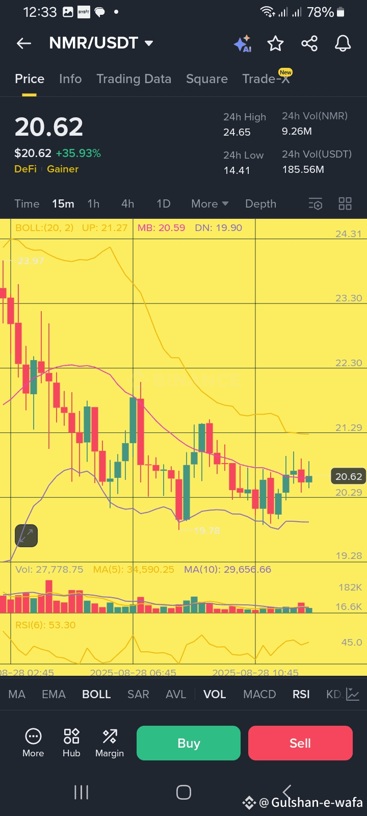
• Volume (VOL): The volume bars at the bottom of the chart show the trading volume.
• Vol: 27.778.75 (This appears to be the volume for the selected time period).
• High volume on a down move (a large red candle) can confirm the strength of the bearish trend, while low volume might suggest the move is not as significant.#TradeStories