The biggest “dimensionality reduction” of Bubblemaps is not how beautiful the map is, but how it embeds the map into the entries you would already go to. On the token page of Etherscan, on the market pages of DEXScreener/DEXTools, on the issuance and trading interfaces of Pump.fun/Photon, users can pop up layers of holding structure and address clusters without changing environments; this directly reduces misjudgments at the critical moment. The platform-side content and official updates have repeatedly listed these integrations, emphasizing the low-friction path of “watching the market is watching the map.”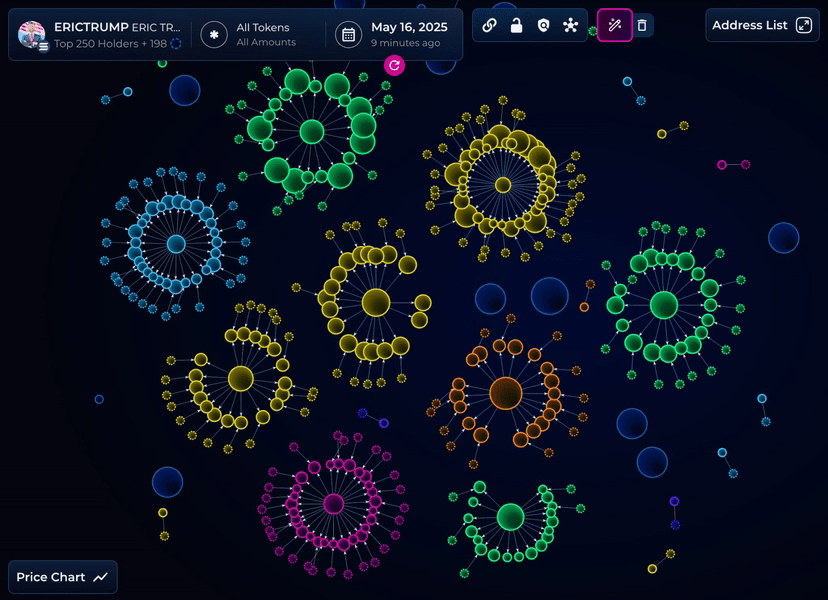
Why is this critical? Most losses occur within seconds to minutes of the decision window; if users have to copy the address, switch to a tool, and then paste it for queries, the risk control actions are often driven by emotions. Embedding the risk check into a single click: Is there a large cluster? Is there frequent interconversion? Are there synchronized reductions at critical moments? All of these can provide an “intuitive score” from the perspective of the underlying map. For institutions or semi-professional teams, the Pro package can use iframe/API to embed the map directly into internal dashboards, shortening the manual risk control process to “click + note.”
The expansion of outreach is also reflected in the flow of people. The official page “Partnering with Us” states directly “500,000 unique visitors per month” and encourages project teams to list their own tokens or NFT collections on public maps in exchange for transparency and exposure. This is not a simple “traffic diversion,” but rather reducing the survival space of “black box distribution” through public maps. For project teams, treating the map as a “transparency ornament” on their official website or white paper can actually reduce baseless doubts.
Looking at Solana. V2 integrated with Pump.fun, Photon, Bullx, and DEX Screener in its release note, and the reason is straightforward: Solana's “high-frequency new coin—quick in and out” model most needs “maps as entry.” In this ecosystem, rigid candlestick indicators are hard to signal before “distribution and accumulation”; to understand early trends, knowing who is on stage and whether they are connected is key clues. Embedding makes this clue the “first reaction.”
Practical advice: Include the “bubble chart that comes with the entry” in your daily checklist, and at least perform a concentration and interconversion scan 30 seconds before placing an order; in the investment research document, consistently display the “entry screenshot + map frame,” allowing readers to understand your judgment basis in a familiar interface. This kind of “on-site risk control” is often more useful than post-analysis.
@Bubblemaps.io #Bubblemaps $BMT