In terms of token due diligence, the key issues boil down to four: Is the concentration too high? Are the associated addresses abnormal? Is liquidity being drained? Is there 'prophetic behavior' in the time window? Bubblemaps' graphical representation revolves around these four points. The common process can be summarized as follows: first look at the size distribution of the bubbles in the front row of holdings, then see if the connections form a highly cohesive cluster, then track the connectivity of the cluster with exchanges and bridge contracts, and finally start the time replay to compare structural changes before and after events. The community provided a step-by-step operational example in August this year, detailing the essentials of 'how to interpret concentration and direction from the graph.'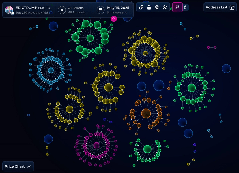
Concentration is the first step. If the top five or ten bubbles are significantly larger than other holders, it may not necessarily indicate risk, but further confirmation is needed in conjunction with unlocking plans and wallet tags. Connection strength is the second step. If these large bubbles are interconnected and the connections are dense, it can easily form a structure that appears 'dispersed but is actually internally circulating.' The timeline is the third step. Rewinding to the early distribution stage, check if there are large transfers concentrating towards a few new addresses, or if there is internal rotation before and after large unlocks; the time function of v2 is designed for this purpose.
Next is the direction of liquidity. Common external nodes on the graph are exchanges and cross-chain bridge contracts; identifying them can help determine if funds are exiting or migrating cross-chain. For exchanges, if there is a cluster focusing on a few custodial addresses with thick connections in a short time, it usually indicates potential selling pressure; for bridges, if connections are concentrated towards cross-chain gateways, check the mirrored graph of the target chain for any structural migration. Bubblemaps' product documentation provides a series of tips on 'how to judge the patterns behind the clusters,' emphasizing first identifying the structure, then attributing it with labels to reduce misjudgment rates.
For hot ecosystems, the platform's multi-chain coverage reduces the cost of horizontal comparisons. The introduction of the Solana sector highlights 'wallet relationships - holding structure - risk alerts' as the three main points. By comparing the graphics of the same token on the Ethereum side, inter-chain liquidity movements can be evaluated. For example, if the cluster on the Ethereum side shrinks while the cluster on the Solana side expands, and the timelines align, it indicates a migration of the funding center across ecosystems. For researchers tracking seasonal themes, this graphical alignment significantly speeds up judgment.
Beyond functionality, the platform is also reinforcing user stickiness through activities. Starting in July, reward activities around content creation and trading interactions have increased exposure while announcing support for TON, expanding coverage through the Telegram ecosystem. Such activities do not change the meaning of the graph but bring changes to user structure and query preferences. For researchers, this means that the 'graph' of popular contracts and newly issued tokens updates faster, making it easier to keep up with trends.
Due diligence is about weighting probabilities, not stamping conclusions. Any visual output needs to be cross-verified with white papers, contract codes, lock-up information, and CEX announcements. The value of Bubblemaps lies in making the hardest step—finding structural clues among vast addresses—into reusable public steps. With the v2 tool completing the time dimension and potential relationship identification, the completion of this public step is higher, and the community's collaborative efficiency around the graph is also stronger.
@Bubblemaps.io #Bubblemaps $BMT
