The blockchain world claims to be completely transparent, and all transaction records can be found in a browser. You can open Etherscan, Solscan, or Basescan to see who holds how many tokens and who transferred to whom. But honestly, just looking at a bunch of addresses and numbers can feel like reading 'alien language' for most people, making it hard to piece together a meaningful picture.
At this point, Bubblemaps acts like a combination of a magnifying glass and a map, helping us 'visualize' cold, hard data.
🎈 The rules are simple: understand it in four steps.
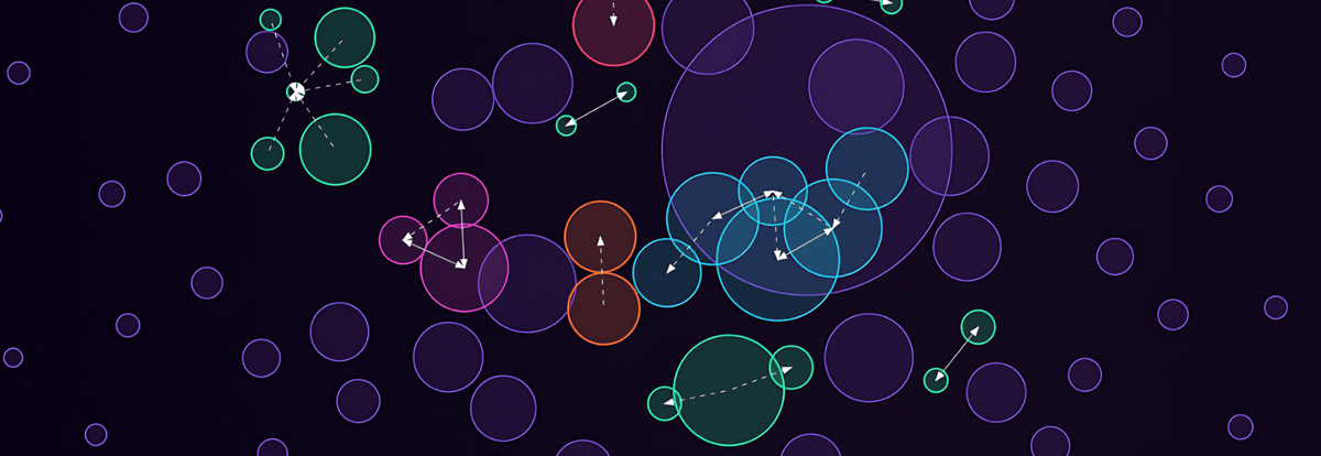
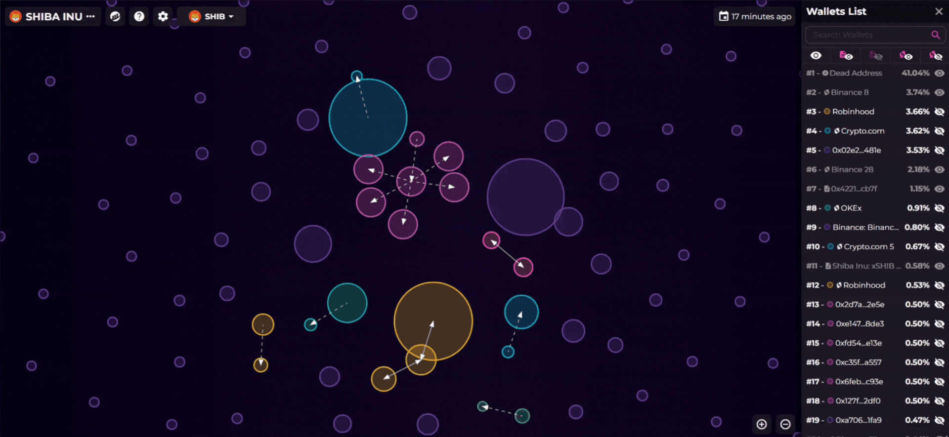
One bubble = one wallet.
At most, only the top 150 wallets are displayed.Bubble size = holding ratio.
The larger the bubble, the more it represents holding.Bubble connection = there are transactions.
As long as two wallets have had a Gas Token transaction (ETH, SOL, BNB...), a line will be drawn between them.The appearance of the line = interaction direction.
Dashed line: one-way transfer.
Solid line: mutual transfers.
This way, you not only know who the big players are, but you can also see if these big players are part of the 'same group'.
🔍 Real case: from Bonk to Bitget Token.
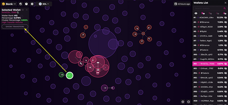
Bonk (Solana)
Click on a bubble, and the details will be displayed in the upper left corner: ranking, holding ratio, and how much supply is controlled by the cluster. Then, click 'Show Transfers' to immediately see who it has interacted with.Bitget Token (ETH)
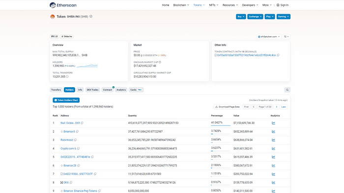
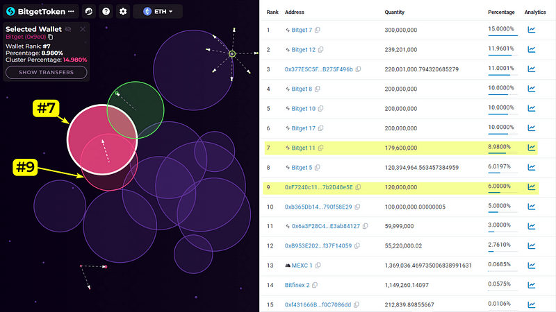
On Etherscan, you can only see 'Top Holders', but on Bubblemaps, you will see a line between wallet #9 and wallet #7. It turns out #9 once transferred 0.1 ETH to #7, marking the beginning of a small cluster.
Bubblemaps: Rules of the Game
🧩 The meaning behind the cluster.
When you see a long string of wallets connected together, it could indicate:
The project team is issuing airdrops/pre-sales.
Marketing wallets are distributing tokens.
They may actually all be the wallets of the same investor.
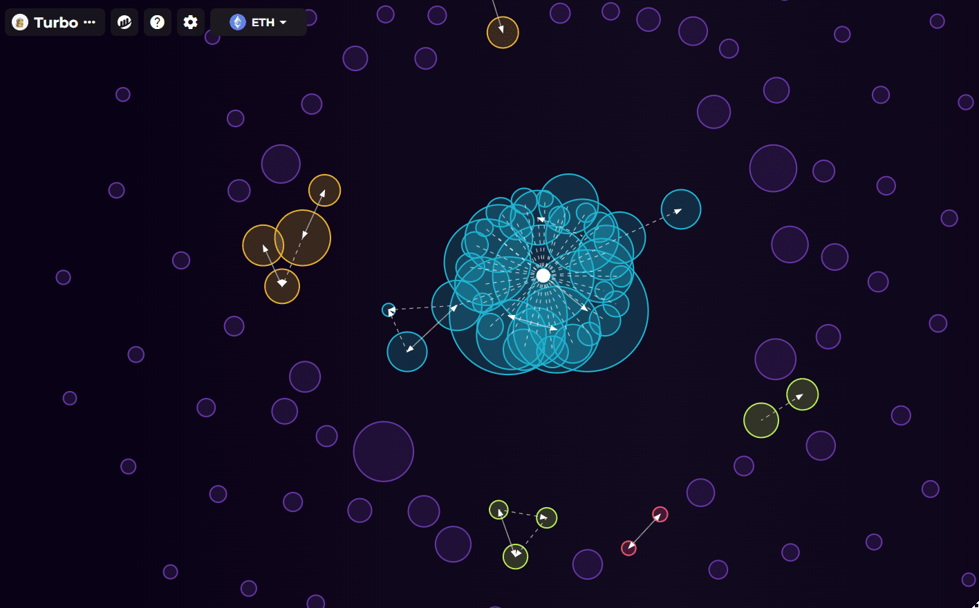
For example, the pre-sale of Turbo (ETH) is very classic: the central wallet #3 received a bunch of ETH and then distributed $TURBO back. This is a 'typical pre-sale cluster'.
🚨 How to catch anomalies?
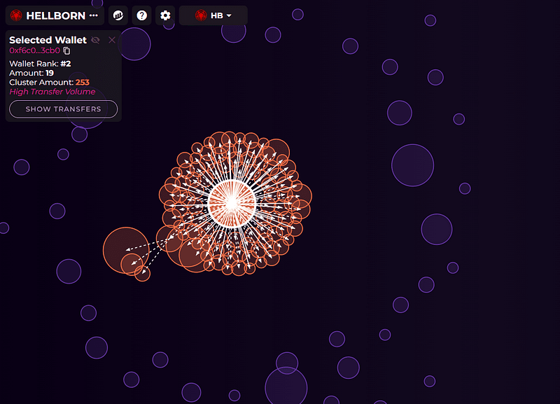
There's something even more horrifying: some malicious projects engage in 'market manipulation'.
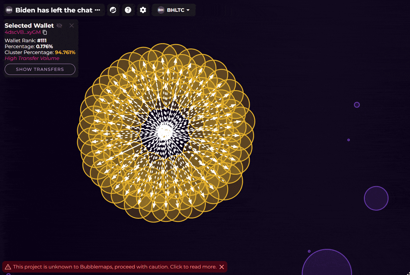
Like the case of BHLTC (SOL), wallet #111 is connected to 110 big players, controlling 91% of the supply. This is very dangerous because if these wallets sell off at the same time, the price will crash directly.
So be cautious when you see the following situations:
A single cluster controls too much supply.
Wallets are transferring back and forth wildly.
No lockup but massive sell-offs.
Traditional blockchain explorers give you 'static data', while Bubblemaps provides you with an 'interactive network map'. Through these bubbles and lines, we can quickly see:
Which are normal trading networks.
Which are actually 'self-directed' by the project team.
Which big players hold the keys to influencing the market.
In today's trend of meme coins and the emergence of new projects, knowing how to read bubble maps is a super useful skill to avoid being 'cut'.
