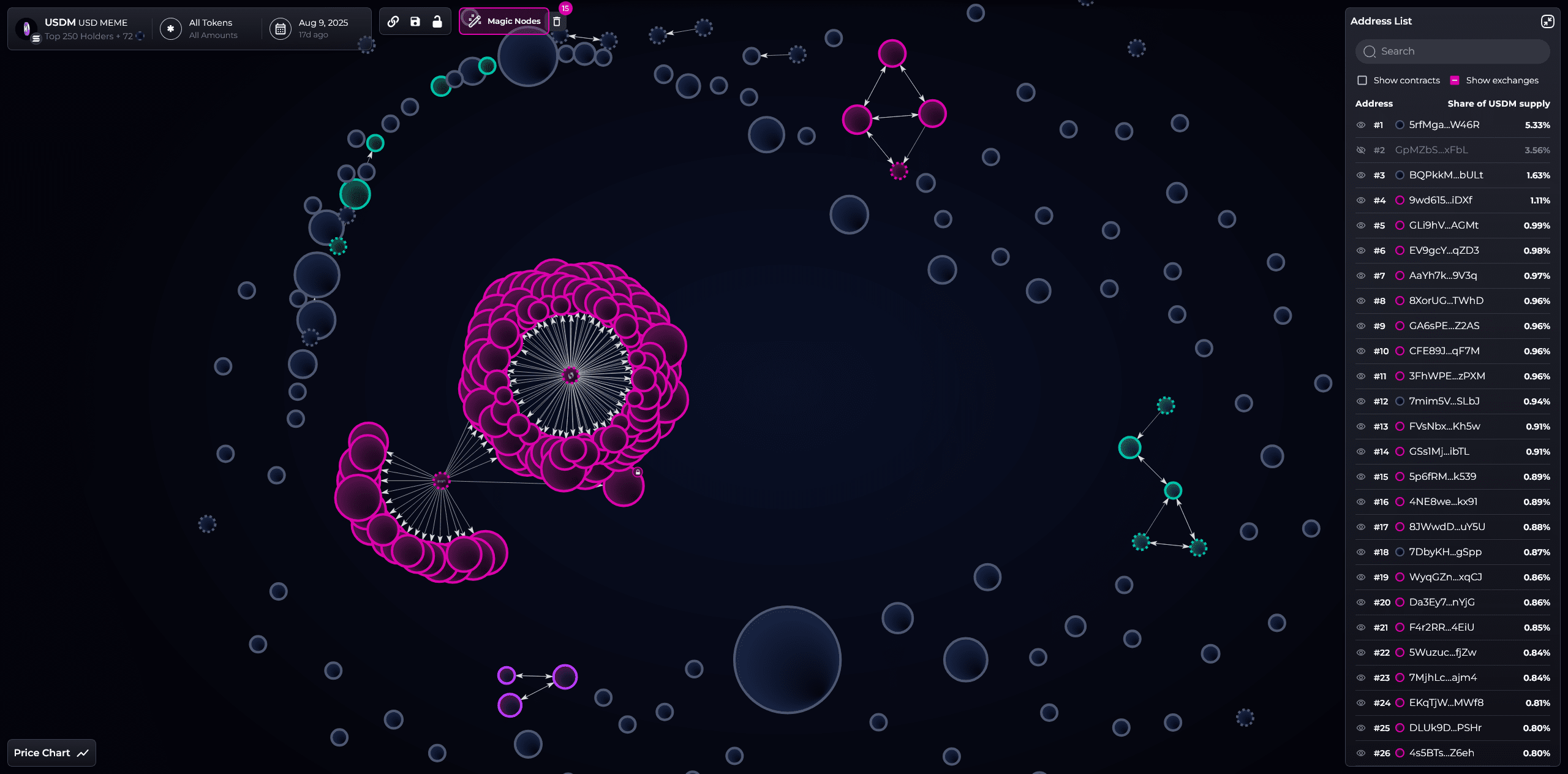
⚠️ A chart, a pitfall. USDM was marked by Bubblemaps shortly after going live: 70% of supply was bundled by a single cluster, resulting in the price nearly dropping to zero within 24 hours. The K-line wrote it as a "waterfall", while the bubble chart noted "structural risk" the day before.
Come in and see for yourself! So crazy! https://v2.bubblemaps.io/map/YFfdZN48mfz4uIngioDv

🧩 Why is 70% concentration a big red light?
Imagine a balloon (token price) tied to several ropes (large holdings): the fewer and more concentrated the ropes, the more any loosened rope causes the balloon to fall straight down. Uneven distribution = extremely high single point risk of selling pressure. Bubblemaps illustrates these "ropes" as bubbles and connections, allowing you to judge whether "this balloon is tied securely" without needing to crawl through block explorers.
🔬 Three-stage pre-risk control (change post-mortem dissection to pre-screening)
① Before going live: Look at token economics and distribution: whether there is excessive concentration in teams/treasuries, and whether there is a commitment to linear unlocking and transparent treasury addresses.
② On launch day: Use the bubble chart to check the ratios and interconnectivity of the top 20/50/200, if you see "giant bundled clusters" or multiple addresses originating from the same source wallet, raise the risk level.
③ After going live 24–72h: Use Time Travel to observe the shipment rhythm; in conjunction with the exchange order book and on-chain transfers, if you see "volume precedes news" (large amounts transferred into CEX before a rise), do not chase, reduce positions, and wait.
🛡️ Treat Intel Desk as an external review
Uncertain, and no time to dig deep? Submit cases to Intel Desk, letting the community make "suspicion = check first" a habit; verification results flow back to frontend integration (such as DEXScreener), forming the "last mile risk control" from research to trading.
📊 Quantitative threshold for traders (customizable)
— Concentration threshold: Top 20 > 35%, Top 200 > 75% → Red light;
— Synchronization threshold: Within 6–12 hours before/after listing, if multiple addresses are accumulating or selling in the same direction → Yellow light turns red;
— Off-chain comparison: Align with announcement and KOL post timings, if "volume precedes news" → Directly reduce leverage.
Price is the result, distribution is the reason. USDM tells us: when seeing 70% concentration, retract your hands first. Let the bubble chart be your first line of stop loss. — This article does not constitute investment advice.
