Today, I reorganized my notes and added details, treating it as the 'first lesson' for new followers, helping you avoid the misconception of 'only looking at rises and falls' and understand the real intentions of the operators behind the candlesticks.
In fact, it took me three years of watching candlesticks to finally understand: candlesticks themselves are 'silent candles' that neither help you predict tomorrow's rise and fall nor are they some 'market password book'. But they have a key role—secretly 'projecting' the operators' operational ideas and capital movements on the screen. Want to accurately predict trends based on a few candles? Basically impossible; but if you can understand the 'operator codes' hidden within the candlesticks, at least you can avoid most traps and won't be led by the operators to cut losses or chase highs.
Based on my practical experience over the past few years, I have summarized three commonly used but often overlooked 'operator codes', each accompanied by identification methods and practical cases that new followers can directly refer to in trading.
Code one: false breakout, real lift—classic trick of operators to 'scare retail investors into cutting losses'
This is the most commonly used method by operators to wash the market, especially during volatile market conditions, where out of ten breakouts, seven may be 'false'. The specific 'script' is often like this:
Originally, the price was moving along a certain important support level (for example, previous lows, the 60-day moving average, or key round numbers), then suddenly one day, it 'plunges' during the trading session, directly smashing through this support level—at this point, the comment section and social groups instantly explode, and retail investors see 'it broke, it’s going to crash', panicking and cutting losses; but while retail investors are cutting losses, the operators are quietly collecting these low-priced shares. By half an hour or an hour before the market closes, they quietly pull the price back above the support level, leaving a 'long lower shadow' candlestick.
Many beginners are 'tricked' into losing shares this way; the next day they see the price rise and can only slap their thighs in regret. I will teach you two simple identification methods to see through false breakouts at a glance:
1. Watching the closing position is more important than watching the intraday breakout: focus on the 1-hour candlestick (you can also look at 15 minutes for short-term), if the support is only broken intraday but the 1-hour candlestick can close back above the support level, it is likely the operators are washing the market, not a true breakout; if the close is also below the support level, then it is time to be wary of a true breakout.
2. Look for 'abnormal' trading volume: at the moment of breaking the support, the trading volume suddenly surges (for example, normally 100 million in trading volume, but surging to 300 million at the breakout), but when pulling back to the support level, the trading volume noticeably shrinks (back to below 100 million)—this is a typical 'counter-trading trace', where the operators create panic by smashing down the price and then pull it back up quietly, with very few real retail investors participating.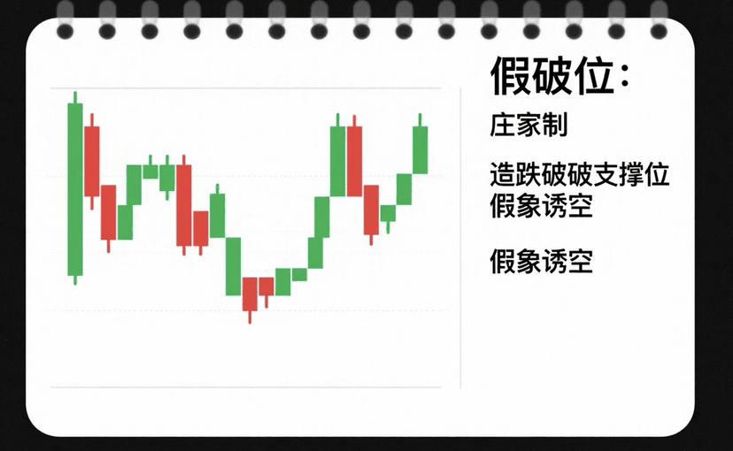
Code two: volume-price divergence—'warning signal' for market reversal.
'Volume and price rising together' and 'volume and price falling together' are the normal market conditions; once there is 'divergence between volume and price', we must be wary that the operators are 'up to something'. There are two common situations that beginners must remember:
• The first type: rising price with decreasing volume—false prosperity, unable to rise: the price has reached a new high, but the trading volume has been decreasing compared to previous days and weeks. What does this indicate? On the surface, it seems the market is rising, but fewer and fewer people are willing to buy in, with the rise relying solely on the operators 'pulling themselves up', lacking real capital support, it's just 'false growth', and a pullback could happen at any time.
I fell into this pit last year: I was watching a popular coin, which continuously set new highs on the daily chart for three days, rising from 120 to 160, but the daily trading volume dropped from 1.5 billion to 800 million, and then to 500 million—I was thinking at the time, 'It has broken out and can rise to 200', but then on the afternoon of the third day, a big bearish candlestick (commonly referred to as a 'head-chopper') directly dropped from 160 to 130, losing all the profits I had made and even incurring some capital losses.
• The second type: stable price with increasing volume—quietly accumulating, ready to rise: the price doesn't move much and remains in a small range (for example, fluctuating no more than 3%), but the trading volume suddenly increases to 2-3 times the normal amount. This situation is mostly the operators 'secretly accumulating shares'—they don't want to raise the price too high for fear of retail investors following along, so they slowly buy shares during the sideways movement. Once they have accumulated enough shares, there is a high probability of a surge.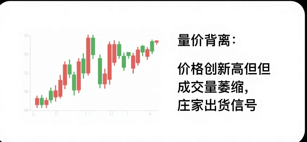
Code three: high-level consolidation—not resting, but a signal that the operators are 'secretly distributing' shares.
Many people think that 'sideways means the market is resting, and after a long period it will surge', but that is actually incorrect—sideways positions vary greatly, and the intentions of the operators are completely different: bottom sideways means the operators are accumulating; high sideways means the operators are distributing.
First, clarify the difference between 'bottom' and 'high': the bottom refers to the price after experiencing a significant drop (for example, dropping 30%-50%) and then starting to move sideways; the high refers to the price after rising (for example, rising more than 50%) and then starting to move sideways. The identification methods for these two types of sideways are sufficient by looking at two points:
1. Characteristics of bottom sideways: volume is 'gently increasing'—for example, daily trading volume is 10%-20% more than before, and it won't suddenly surge; on the candlestick chart, even if a bearish candlestick appears, it will quickly be swallowed by a bullish candlestick (for instance, if it drops 2% today, it will rise 3% tomorrow to recover), the overall rhythm is 'small bullish candles slowly pushing, quick recovery of short bearish candles', which indicates the operators are quietly accumulating shares, unafraid of retail investors snatching them.
2. Characteristics of high sideways: volume is 'gradually shrinking'—initially, when the market is sideways, the trading volume is normal, but it gradually decreases; on the candlestick chart, bearish candles will 'slowly engulf bullish candles' (for example, if it rises 1% today, drops 1.5% tomorrow, and then drops 1% the day after), bullish candles become weaker and can’t push up. More dangerously, if the open interest suddenly surges at this time (for instance, if the open interest in the futures market increases by 50%), that means the operators are 'counter-trading', selling shares while using artificially inflated open interest to attract retail investors to follow; likely leading to a 'sharp drop', commonly referred to as 'the storm is coming'.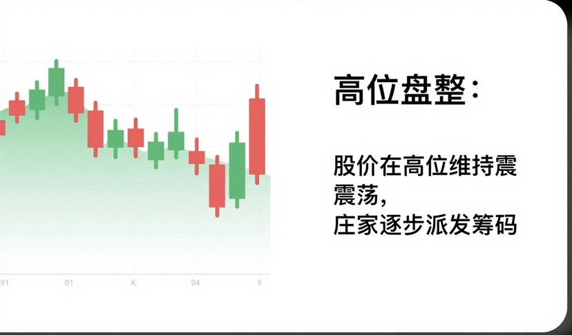
Finally, let me tell new followers: Are candlesticks useful? They are, but it's definitely not about buying when 'today's close is a bullish candle and selling when it's a bearish candle'. What’s truly useful is interpreting the rises and falls of candlesticks and changes in trading volume to understand whether the operators are 'accumulating' or 'distributing', whether they are 'washing the market' or truly breaking out.
When you can understand these three 'operator codes', watching the market is like watching a movie with subtitles—you can clearly see every move of the operators and their underlying intentions, and you won't be confused by surface rises and falls. If you don't want to keep going in circles of 'chasing highs and cutting losses'.