How do friends who want to trade cryptocurrencies read K-line charts? How to read cryptocurrency K-line charts?
Before answering this question, let everyone understand the K-line chart in the cryptocurrency market. The K-line chart, due to its shape resembling a candle, is also known as a candlestick chart or candlestick curve chart.
The English word for candle (Candle) and curve (Curve) both start with the 'K' sound, hence it is abbreviated as K-line chart. After understanding the K-line chart in the cryptocurrency market, let's get back to the main topic.
How to learn to read K-line charts in the cryptocurrency market? What is the basic knowledge of K-line charts in the cryptocurrency market? Below, the editor from Script Home will provide a detailed introduction to the basic knowledge of K-line charts in the cryptocurrency market!
How to learn to read K-line charts in the cryptocurrency market?
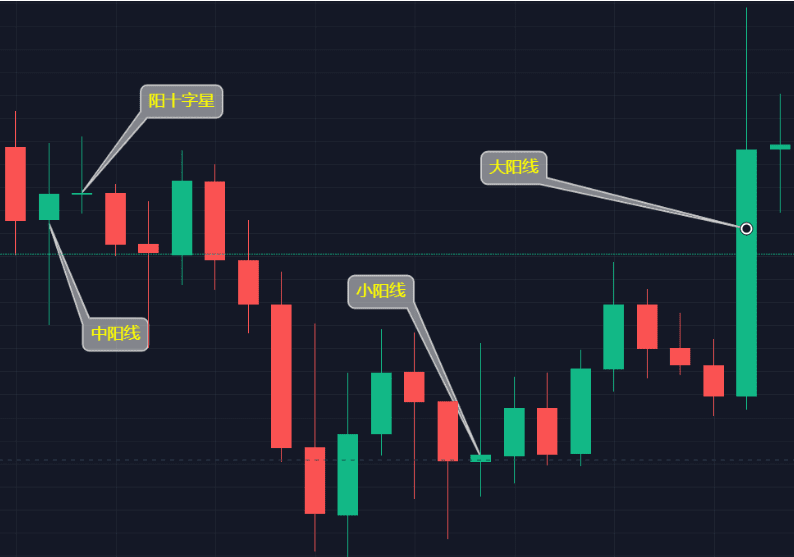
1. Look at the bullish and bearish candles; they represent the trend direction. Most exchanges and analysis software in the cryptocurrency market use green to represent bullish candles and red to represent bearish candles. A bullish candle indicates a continued rise.
A bearish candle indicates a continued decline. For example, after a period of struggle between bulls and bears, closing higher than opening indicates that bulls are in control, and bullish candles predict the next stage.
The trend will continue to rise, at least ensuring inertia for the initial phase of the next stage. Conversely, the bearish candle's downward momentum is the same.
2. Look at the size of the entity; the size of the entity represents the underlying momentum. The larger the entity, the more obvious the upward or downward momentum, and vice versa.
The entity is the portion where the closing price is higher than the opening price. The larger the bullish candle entity, the greater the upward momentum. The larger the bullish candle entity, the greater the underlying upward momentum.
The upward momentum will be greater than that of a smaller bullish candle. Conversely, the downward momentum of a bearish candle is the same.
Look at the length of the shadows; shadows represent reversal signals. The longer the shadow in one direction, the less favorable it is for the stock price to move in that direction. The longer the upper shadow, the less favorable it is for the stock price.
is rising. The longer the lower shadow, the less advantageous it is for the coin price to decline. Taking the upper shadow as an example, after a period of struggle between bulls and bears, the bulls lose ground, regardless of whether the K-line is bearish or bullish.
This indicates a bullish trend, and the upper shadow portion constitutes the upper resistance for the next stage, with a higher probability of price adjustment downward.
Basic knowledge explanation of K-line charts in the cryptocurrency market.
1. Bullish and Bearish Candles
The main components of the K-line chart are two: bullish candles and bearish candles. Most exchanges and analysis software in the cryptocurrency market use green to represent bullish candles and red to represent bearish candles.
In general, a bullish candle represents the buying side (bulls), while a bearish candle represents the selling side (bears). The side with stronger power will appear as the corresponding K-line. For example, in the daily chart, today's buying power.
If buying power is greater than selling power, then today's candlestick on the daily chart will be a bullish candle (green bar). Conversely, if a bearish candle (red bar) appears, it indicates stronger selling power.
Besides that, sometimes there will also appear upper shadows, lower shadows, doji stars, etc. These are further methods of judging bullish and bearish forces, which we won't discuss here.
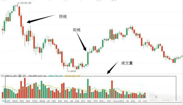
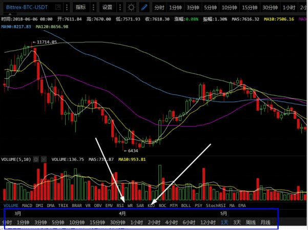
In the lower part of the above chart (black box), the red and green bars represent the trading volume for that time period. If it is a daily chart, then one bar represents the trading volume for that day.
Volume, and the hourly chart represents the trading volume for one hour. The higher the trading volume, the taller the bar.
The green bars represent stronger buying power, while the red bars represent stronger selling power, corresponding to the bearish and bullish candles above.
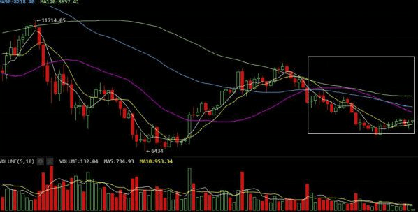
2. Moving Average Chart
In addition to bearish and bullish candles, there are also several lines of different colors in the K-line chart: white, yellow, purple, etc. These differently colored lines are moving averages. Each colored line represents.
The lines represent different moving averages: 5-day moving average, 10-day moving average, 90-day moving average - all of these are possible, as moving averages can be freely set.
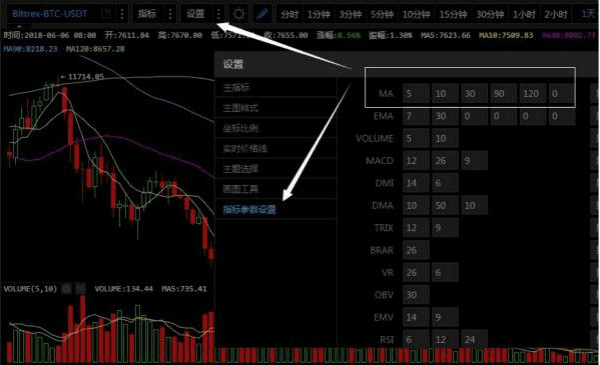
Taking aicoin as an example, after opening the K-line chart, click on the top 【Settings】 - 【Indicator Parameter Settings】 and fill in the corresponding numbers in the MA column. If you set the 5-day line.
Just fill in the number 5.
What is a moving average?
The moving average (MA) refers to the arithmetic average over a certain trading time period, connecting these points calculated daily forms the moving average. For example: the 5-day moving average is.
The weighted average price of closing prices for 5 trading days, then connected to form a line.
3. Time Chart
At the very bottom of the K-line chart, we can see many time options, such as: 1 minute, 1 hour, 1 day, 3 days, weekly, etc. This represents different time intervals.
The trend of the time period. If you click on 1 day, you will be looking at the daily chart, which means the trend for each day. 1 minute means looking at the trend for each minute of that day.
Generally speaking, daily, 1-hour, and 4-hour charts are the most commonly used, of course, 1-minute charts, weekly, and monthly charts are also used occasionally.
4. Other Information
Above the K-line chart, there is also some information, as shown below. Open: XXXX, which is the opening price, Close: XXX, representing the closing price, MA5, MA10 are the moving averages for that time.
The moving average for the period of 5 days or 10 days.
How to learn to read K-line charts in the cryptocurrency market? Through the above introduction, I believe everyone has some understanding of how to read K-line charts in the cryptocurrency market. In the digital currency market, technical analysis is.
Analysis is a very important indicator for predicting short-term market trends, commonly referred to as K-line charts. Whether you believe in or revere technical analysis, being able to read K-line charts is crucial.
It is necessary to exclude technical issues such as technical patterns, indicators, and the struggle between bulls and bears. The price trend of a cryptocurrency, trading volume, lowest point, and highest point are all important.