What does a mature trading system look like?
All trading systems consist of four frameworks:
1. Judging the trend direction
2. Selection of entry conditions and entry positions
3. Setting stop-loss after opening a position and profit target levels
4. The application of capital management.
All trading systems consist of these four frameworks. Regarding trading systems, here are two more points to note:
First: Trading systems can be composed of the indicators that everyone is most familiar with, but after composition, they cannot be directly put into practice. After establishing a trading system, enter the next phase of backtesting, and through extensive backtesting validation, confirm that the trading system can be profitable before gradually implementing it.
Second, the trading system should not be overly complicated; it should be easy to execute. Stick to one principle: the simpler it is to profit, the better it can be executed.
MACD bottom fishing captures bullish trends, seizing the golden trading opportunities! Easily identify the high and low points of the market.
One, MACD is the most commonly used indicator for experts.
The MACD indicator plays an extremely special role in technical analysis and is an essential part of learning technical analysis. Its importance can be articulated in at least the following points.
First, the MACD indicator is the most effective technical indicator tested by historical trends and is also the most widely used indicator.
Second, the MACD indicator is derived from the EMA moving average indicator and has a good application effect in grasping trending markets. Trend investors generally refer to this indicator in practice.
Third, the top and bottom divergence of the MACD indicator is recognized as one of the best methods for 'bottom fishing and topping out'. This method is an important tool for concretizing trend theory and wave theory.
Fourth, many veterans have had the experience: when starting to learn the MACD indicator, they later abandon it, only to return to the MACD indicator after a long period of study and real-world testing. This highlights the uniqueness of this indicator.
Fifth, the application of the MACD indicator in quantitative trading is also very widespread.
Due to these advantages, the MACD indicator has become the most commonly used technical indicator among professional traders.
Two, the concept and calculation of the MACD indicator
The MACD indicator, which stands for Moving Average Convergence Divergence, was created by Gerald Appel to track price trends and analyze buy/sell timing in technical analysis. This indicator is commonly used in trading software and is known as the 'King of Indicators.' As shown in the figure below.
The MACD indicator in cryptocurrency consists of the DIF fast line, DEA slow line, MACD histogram, and the zero axis, referred to as 'three lines and one axis.' Investors analyze price movements through crossovers, divergences, breakouts, support, and resistance of these lines and axis. The widespread application of the MACD indicator in many trading software indicates that it is one of the most effective and practical indicators verified by history.
Three, the golden cross and dead cross of the MACD
The 'golden cross' and 'dead cross' patterns are extremely important formations in technical indicator analysis. The golden cross pattern, also known as a golden crossover, refers to a shorter-term indicator line crossing upward through a longer-term indicator line (of the same type), often indicating an opportunity to buy short-term. If the golden cross pattern appears in
①. After a short-term rapid decline during a downward trend;
②. After a wave of pullback during the upward trend;
③. After a consolidation during the upward trend, when the golden cross pattern appears at a phase low, it is a more reliable buy signal.
A dead cross pattern, also known as a death cross, refers to a shorter-term indicator line crossing downward and crossing through a longer-term indicator line (of the same type), often indicating an opportunity to sell short.
①. After a consolidation during a downward trend;
After a rebound during the upward trend;
A short-term rapid increase during the upward trend, particularly when the dead cross pattern appears at a phase high, is a more reliable sell signal.
After understanding the golden cross and dead cross patterns, we can take a closer look at the golden cross and dead cross patterns of the MACD indicator lines, as their appearance in different locations reflects different market meanings.
Situation One: Buy point of the low-level golden cross
If the golden cross between the DIFF line and DEA line occurs below the zero axis and is far from the zero axis, this golden cross is called a low-level golden cross. Investors may view this golden cross merely as a short-term price rebound, whether the K-line can form a true reversal still requires observation and confirmation with other indicators.
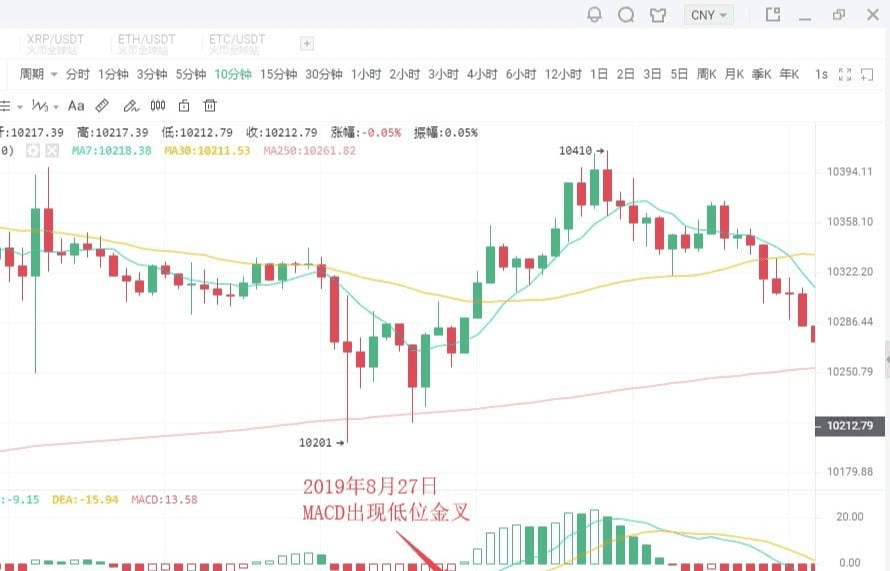
As shown in the figure above:
On August 27, 2019, BTC's 10-minute K-line chart showed a low-level golden cross during a price pullback, followed by a rebound of $200. Short-term investors can seize the opportunity to enter the market.
Situation Two: Buy point of the golden cross near the zero axis
If an upward trend has formed, and the golden cross between the DIFF line and DEA line occurs near the zero axis, it is often an excellent buying opportunity for investors.
This is because after an upward trend forms, a golden cross near the zero axis indicates that the adjustment phase has completely ended, and a new upward trend has begun. If it is also accompanied by a golden cross of the average volume line, it indicates that the price increase is supported by trading volume, making the buy signal more reliable.
Once this buying point appears, investors absolutely must not miss it; otherwise, they will miss a great uptrend.
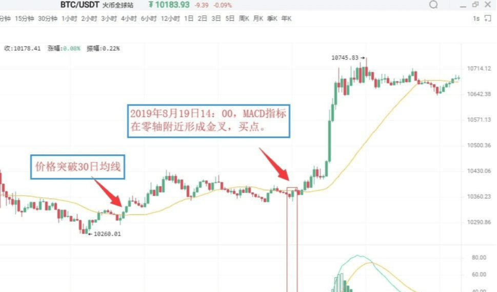
As shown in the figure above:
On August 19, 2019, at 09:30, BTC's 5-minute K-line chart showed that Bitcoin broke above the 30-day moving average, indicating that an upward trend has begun to take shape. For a period thereafter, the price continued to operate almost entirely above the 30-day moving average.
On August 19, 2019, at 14:00, the MACD indicator formed a golden cross near the zero axis, indicating that the market is about to experience a significant upward trend. Investors can decisively buy.
Situation Three: Buy point of the high-level golden cross
If the golden cross between the DIFF line and DEA line occurs above the zero axis and is far from the zero axis, this golden cross is called a high-level golden cross. High-level golden crosses generally appear during consolidation in the K-line's upward process, indicating that the consolidation has ended and the K-line is about to resume the previous upward trend. Therefore, once a high-level golden cross appears, it is a better signal for increasing positions.
In actual combat, when an upward trend forms and the K-line rises slowly and lasts for a long time, once the MACD indicator forms a high-level golden cross, it is often a sign that the K-line is about to accelerate upward.
Due to this, high-level golden crosses can also be used for swing trading. Investors can utilize the MACD indicator to continuously target upward swings.
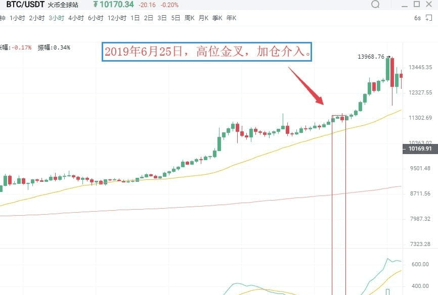
As shown in the figure above:
On June 25, 2019, BTC's 3-hour K-line chart showed that Bitcoin's price rose again after consolidation in an upward trend, while the MACD indicator displayed a high-level golden cross. This indicates that the pullback has ended, and the price will continue the previous upward trend. Investors should seize this opportunity to increase their positions.
Situation Four: Sell point of the low-level dead cross
A low-level dead cross refers to a dead cross occurring far below the zero axis. This kind of low-level dead cross often appears at the end of an upward rebound in a downward trend, thus serving as a sell signal indicating the end of the rebound. At this time, investors who are not in the market should observe, while those holding positions that are deeply trapped may sell first and wait to buy back at a lower price to reduce costs.
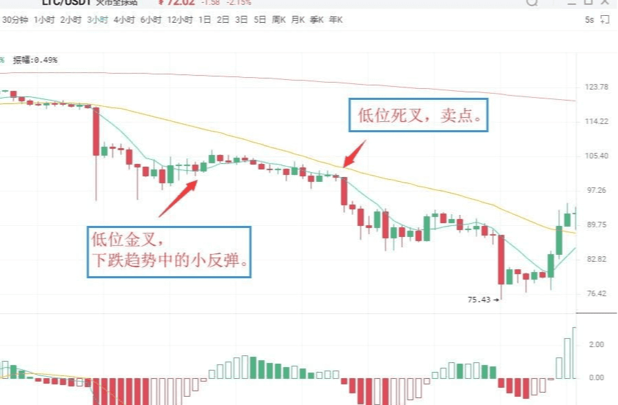
As shown in the figure above:
On July 14, 2019, LTC's 3-hour K-line chart revealed a low-level golden cross in the MACD indicator, followed by a slight rebound in price, which quickly turned downward.
Immediately following, the MACD indicator formed a dead cross below the zero axis, and the K-line began a new downward trend. Spot investors can sell positions at the dead cross and buy back later to reduce holding costs.
Situation Five: Sell point of the dead cross near the zero axis
If the previous market direction has been a downward trend, the intersection formed when the DIFF line breaks below the DEA line near the zero axis is called a dead cross near the zero axis. It indicates that the market has accumulated significant downward momentum near the zero axis. The occurrence of a dead cross suggests the release of downward momentum, and the K-line will continue the original downward trend, serving as a sell signal.
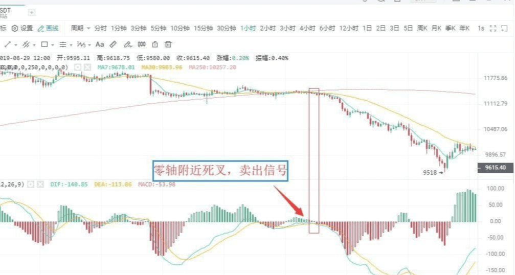
As shown in the figure above:
On August 12, 2019, BTC's 1-hour K-line chart showed that the DIFF line broke below the DEA line near the zero axis, forming a dead cross. This indicates that the market's downward momentum has begun to release, serving as a sell signal. Investors should decisively sell their positions; otherwise, they may be deeply trapped.
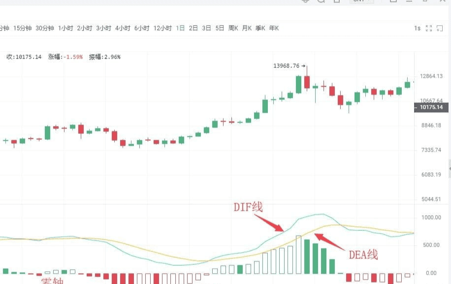
Situation Six: Sell point of the high-level dead cross
The DIFF line breaking below the DEA line at a distance far above the zero axis forms a crossover known as a high-level dead cross. This type of death cross pattern sometimes accompanies the MACD's top divergence. The manifestation is that the price continues to make new highs during the upward momentum, but the MACD indicator's DIF line and DEA line do not continue to rise or maintain upward momentum, forming a divergence with the price’s trend, gradually moving downward.
Above the zero axis, when the DIF line crosses below the DEA line to form a downward crossover pattern, it constitutes a death cross, which is a relatively reliable sell signal.
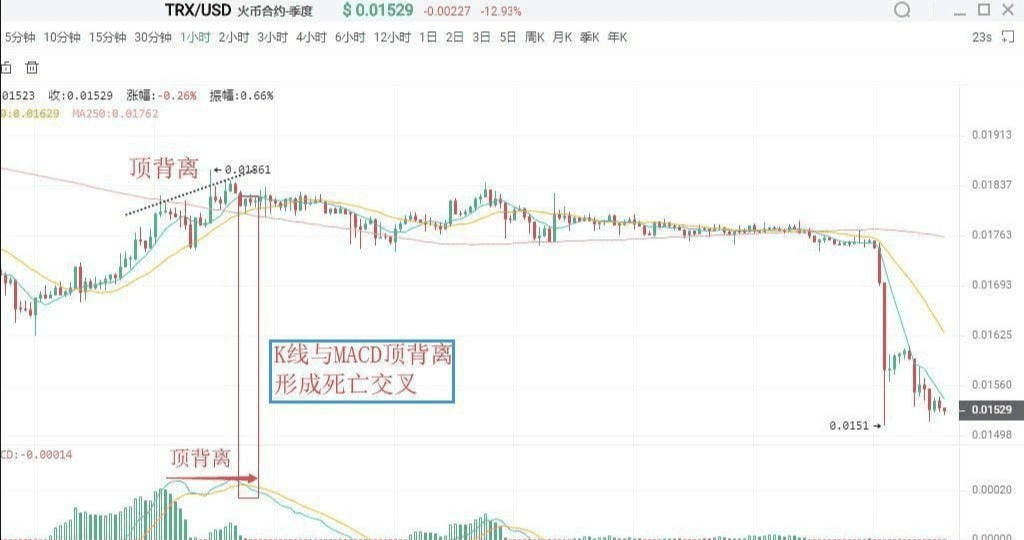
As shown in the figure above:
On August 23, 2019, TRX's 1-hour K-line chart showed that after a previous upward wave, the price continued to make new highs, but the DIF line and DEA line did not continue to rise, forming a death cross, signaling a sell.
Four, divergence between MACD and K-line
Divergence, in physics, describes energy, and in technical analysis, it is a widely used analysis method with a high success rate. In a downward trend, when the price makes a new low, but the indicator line does not make a new low, it is called a bottom divergence, indicating that upward momentum is accumulating, which is a buy signal. In an upward trend, when the price makes a new high, but the indicator line does not make a new high, it is called a top divergence, indicating that downward momentum is accumulating, which is a sell signal.
I. Bottom divergence
(1) Bottom divergence of the MACD histogram and DIFF line
The bottom divergence between the DIFF line and price refers to a situation in a downward trend when the price makes a new low, but the DIFF line does not. It indicates that during the price decline, the DIFF line's decline is less than the price's decline, and upward momentum is accumulating, suggesting a high probability of price stabilization and subsequent upward movement.
The MACD histogram is hidden behind the DIFF line and is divided into red and green. Its divergence from price is an important application of the MACD indicator, widely used in practice. The bottom divergence between the MACD histogram and price indicates that when the price makes new lows, the MACD histogram does not. This means upward momentum is accumulating, suggesting a high probability of price stabilization and subsequent upward movement.
When a bottom divergence appears, investors can grasp specific buying points through two methods.
(2) Specific buying timing
The bottom divergence between the DIFF line, MACD histogram, and price is not a specific moment but a pattern appearing over a period. However, the specific buying timing for investors indicates that the price is about to stop falling. Therefore, to grasp the specific buying timing, when the DIFF line, MACD histogram, and K-line show bottom divergence, investors must combine the bottom divergence with other technical analysis tools to specify the buying points.
First: Change in histogram color or MACD's golden cross
A change in histogram color indicates that market upward momentum has begun to dominate. It typically appears after the 'shortening of the histogram,' although it may be a bit late, it is more reliable. When a bottom divergence occurs, if the histogram successfully changes color or forms a golden cross, investors can buy.
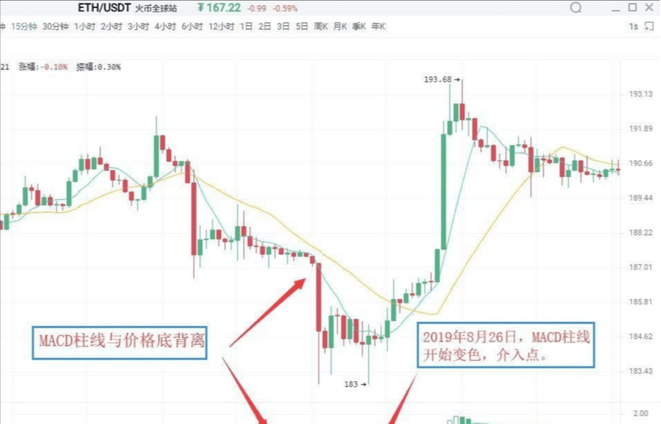
As shown in the figure above:
On August 26, 2019, Ethereum's (ETH) 15-minute K-line chart showed that the price made a new low in a downward trend, but the MACD histogram did not make a new low, forming a bottom divergence between the histogram and the price. This indicates that upward momentum is starting to accumulate, and there is a high likelihood of a subsequent upward trend.
Following this, the histogram changes color, and the overlapping buy signals enhance the reliability of the upward significance. Investors can enter the market when the histogram changes color.
Second, combine with other technical analysis tools and K-line reversal patterns.
Bottom divergence combined with K-line reversal patterns, such as 'single needle probing bottom' and 'bottom three soldiers,' exemplifies the specific application of the 'multi-indicator combination' principle.
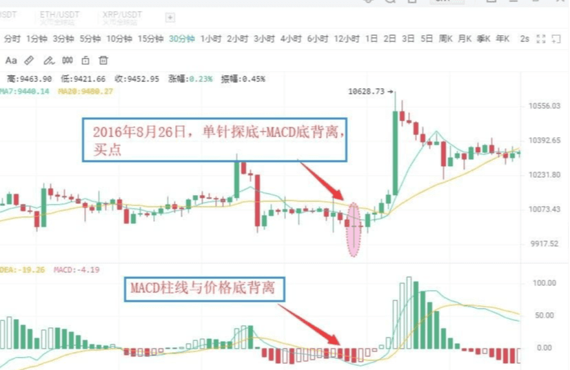
As shown in the figure above:
On August 26, 2016, BTC's 30-minute K-line chart showed that Bitcoin's price made a new low, but the MACD histogram did not make a new low, forming a bottom divergence between the histogram and the price, indicating that market upward momentum is continuously strengthening.
Accompanied by the price's decline and stabilization, a buy signal forms from the 'MACD histogram and price bottom divergence + K-line single needle probing bottom.' Subsequently, the price experiences an upward trend.
Ⅱ. Top divergence
(1) Top divergence of the MACD histogram and DIFF line
The top divergence between the MACD histogram and K-line indicates that during an upward trend, when the price makes a new high, the MACD histogram does not make a new high. This suggests that downward momentum is accumulating, and the price may drop at any time.
The top divergence between the DIFF line and K-line refers to a situation in an upward trend when the price makes a new high, but the DIFF line does not make a new high. This indicates that downward momentum is continuously accumulating, suggesting a high probability of a downward trend in the near future.
(2) Specific sell timing
Similar to bottom divergence, in practice, based on the principle of multi-indicator combination, investors can utilize the following methods to make sell signals more specific.
First: Change in histogram color or MACD's dead cross
After the MACD histogram and K-line form a top divergence, if the histogram suddenly shortens significantly, it indicates that the market's downward momentum has begun to release. Investors should pay attention to sell in a timely manner. A change in the color of the MACD histogram indicates that the downward momentum has gained an advantage, typically appearing after the histogram has been continuously reduced. If a histogram and K-line form a top divergence followed by a change in color or a MACD dead cross, investors should be cautious and exit in a timely manner.
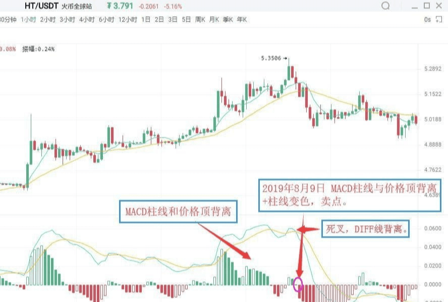
As shown in the figure above:
On August 9, 2019, the HT 1-hour K-line chart showed that Huobi's price hit a new high, but the MACD histogram did not make a new high, forming a top divergence between the histogram and the price. This indicates that the market's downward momentum is starting to accumulate, and the price may soon experience a downward trend.
Subsequently, the MACD histogram changes from red to green, issuing a sell signal of 'histogram and price top divergence + histogram color change.' Investors should pay attention to exit in a timely manner.
Second, combine with other technical analysis tools and K-line reversal patterns.
After the top divergence between the MACD histogram and price appears, if other technical analysis tools also signal a sell at the same time, the reliability of the market's sell signals will significantly increase. At this time, investors should act decisively to exit. Common sell signals in this category include 'histogram and price top divergence + K-line reversal patterns.'
As shown in the figure above:
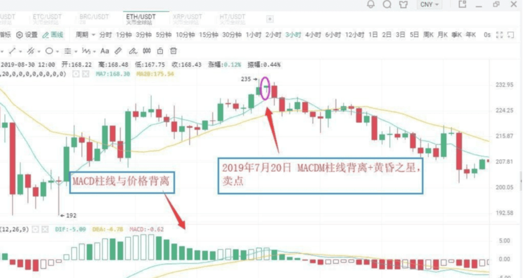
On July 20, 2019, ETH's 3-hour K-line chart showed that Ethereum's price made a new high, but the MACD histogram did not make a new high, forming a top divergence between the histogram and the price. This indicates that downward momentum is continuously strengthening, and the price may experience a downward trend.
Subsequently, the MACD histogram gradually shortens, while the K-line forms a bearish evening star pattern. Investors should pay attention to exit in a timely manner, as a significant downward trend follows.
Appendix:
Evening star: In the process of rising K-line, a long bullish candle appears first, followed by a shorter candle (either bullish or bearish) the next day, which people liken to a star, representing the main part of the K-line combination. The third candle is a long bearish candle that deeply penetrates the body of the first candle. The evening star signals a top reversal, with some predicting an accuracy rate of over 80%.
(Regarding some K-line patterns for tops and bottoms. We will have several dedicated courses to explain this in depth later, and everyone is welcome to continue following.)
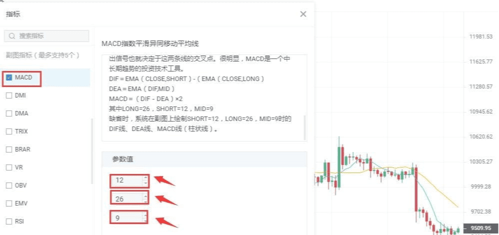
Five, modification of MACD parameters
The lag in response to price changes can sometimes lead to less than ideal buy/sell price points, which is a defect of the MACD indicator. One way to change this situation is to adjust the indicator parameters to make the MACD indicator more responsive to trends, thereby allowing the price points for buying and selling to be more favorable.
In commonly used trading software, the default parameters for the MACD indicator are 12/26/9. Under such parameter settings, the MACD indicator often exhibits significant lag in response to price changes.
The lagging nature of the MACD indicator can be resolved by adjusting the parameters. Common parameter combinations include 5/34/5, 5/10/30, etc. Investors can also explore and experiment more in practice.
Daily performance
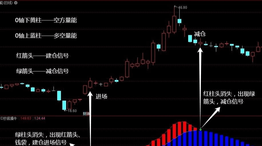
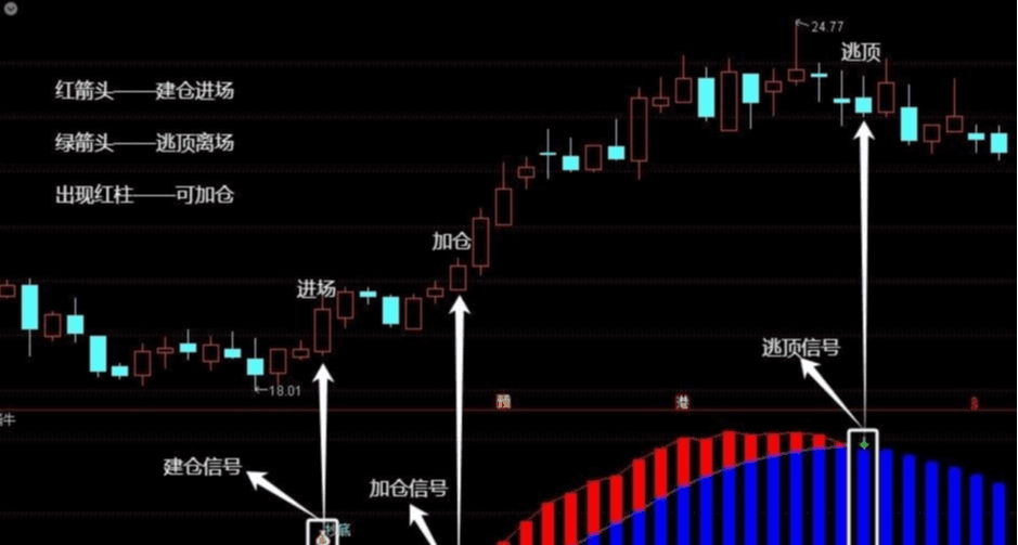
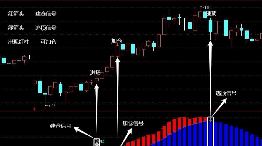
[MACD Bottom Fishing] Key points of the indicator are as follows:
1. The yellow bar below the zero axis represents bearish volume. When the yellow bar's green bar top disappears, and a red arrow and money bag icon appear, this is a building signal, indicating that one can consider buying.
2. When the indicator shows a red bar top above the zero axis, it indicates that bullish strength is starting to increase, and the market trend is shifting from weak to strong. At this time, investors can consider increasing their positions to gain greater profits.
3. The blue bars above the zero axis represent bullish volume. When the red bar tops disappear above the blue bars, and a green arrow appears, this is a signal to escape the top, indicating that one should consider selling to avoid losses from market pullbacks.
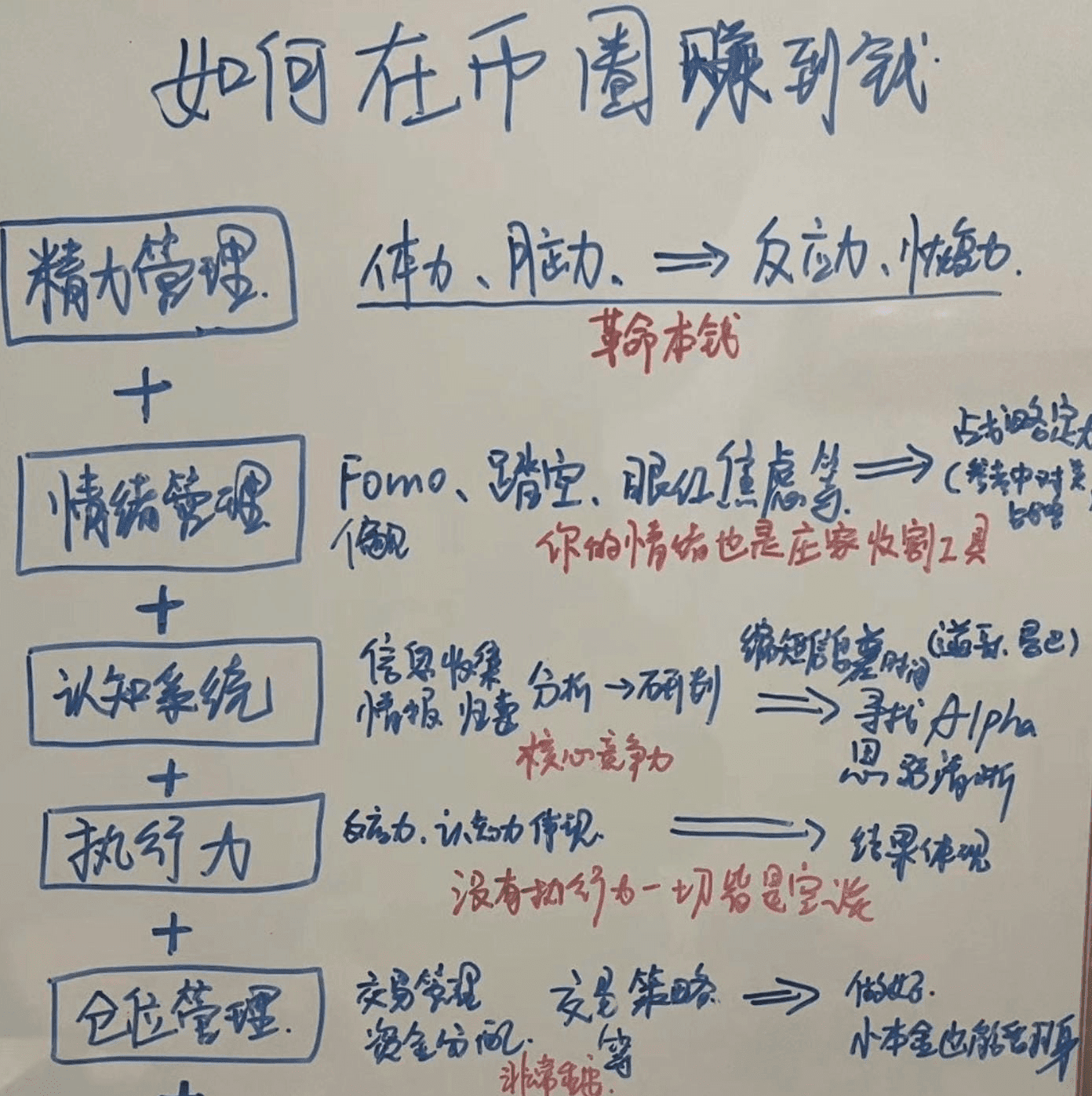
Looking back on the first three years of my cryptocurrency trading career, it was a journey filled with bitterness and challenges. I experienced the painful moment of losing 80% of my assets. However, after deep reflection and self-motivation, I distilled six unshakable rules and resolutely practiced them, ultimately achieving a remarkable turnaround from defeat to victory. At this moment, I selflessly share this valuable experience with all cryptocurrency peers, hoping it serves as a precious guide on your journey!
In the ever-changing ocean of cryptocurrency, true leaders do not solely rely on exceptional skills to stand out, but possess deep insights into market trends and unwavering discipline. Next, I will reveal their six invincible rules to help you navigate the world of cryptocurrency trading with ease and tackle various challenges and risks!


Trading cryptocurrency is not only a contest of technology and luck but also a test of mindset and wisdom. Only those who master these iron rules and strictly adhere to them can stand undefeated in the cryptocurrency field!
These are experiences learned from actual trading; behind each one lies a period of suffering. The purpose of sharing this today is to help everyone avoid detours; it is essential to take it seriously!
Below, I will share basic concepts of the cryptocurrency trading system, market analysis, investment strategies, risk management, technical tools, ecological applications, and regulatory policies.
I hope to provide everyone with a comprehensive review of cryptocurrency trading knowledge, hoping that stock friends can find suitable methods for themselves and learn.
General outline of the cryptocurrency trading system:
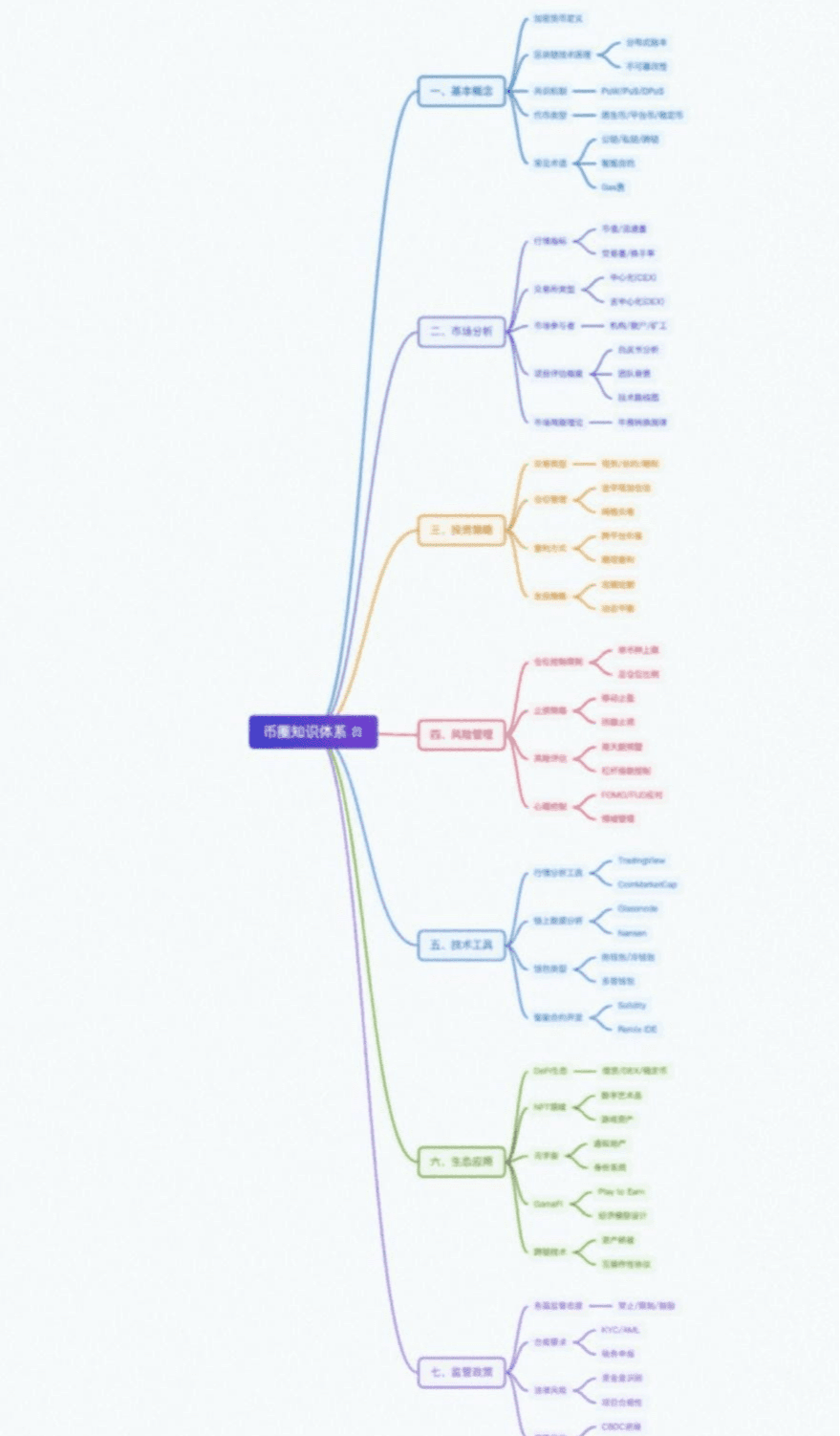
One. Basic concepts of the cryptocurrency field
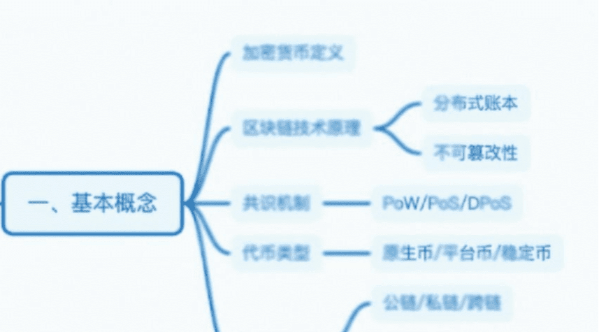
Two. Market analysis in the cryptocurrency field
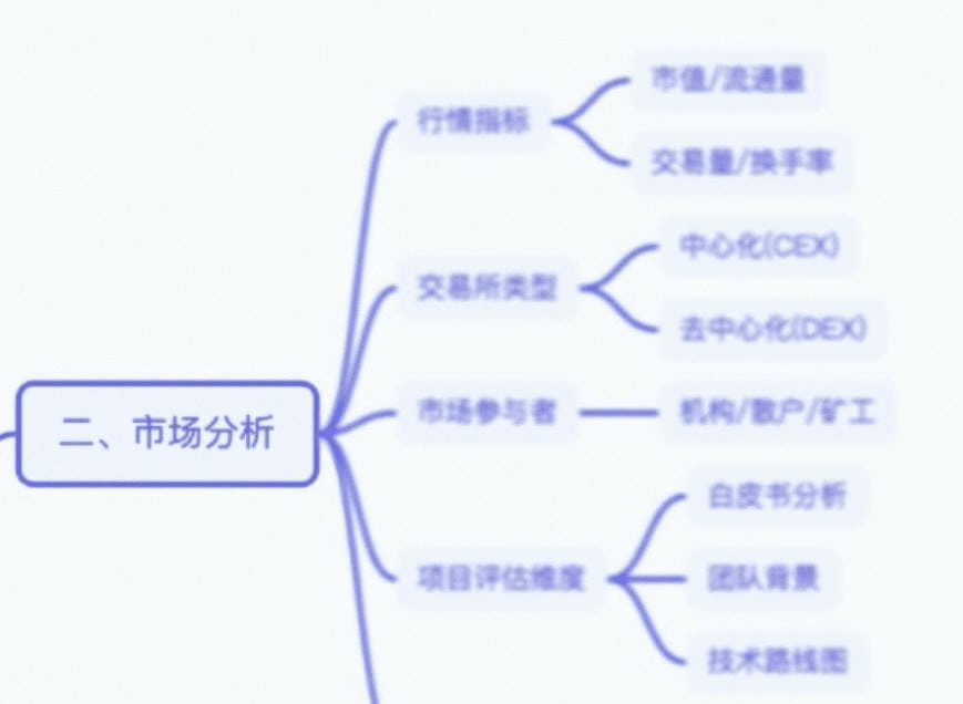
Three. Investment strategies in the cryptocurrency field
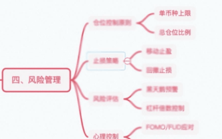
Four, risk management in the cryptocurrency field
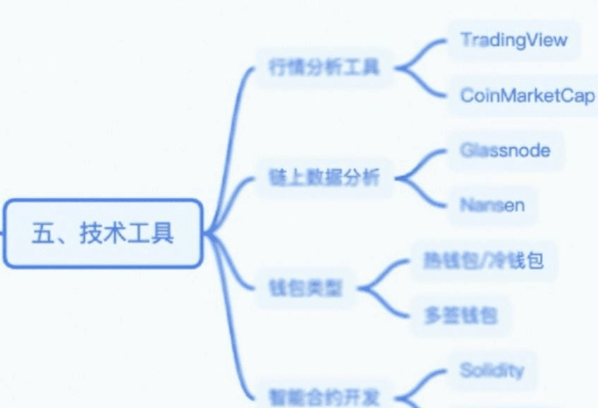
Five: Technical tools in the cryptocurrency field
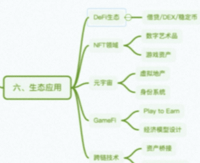
Six: Ecological applications in the cryptocurrency field
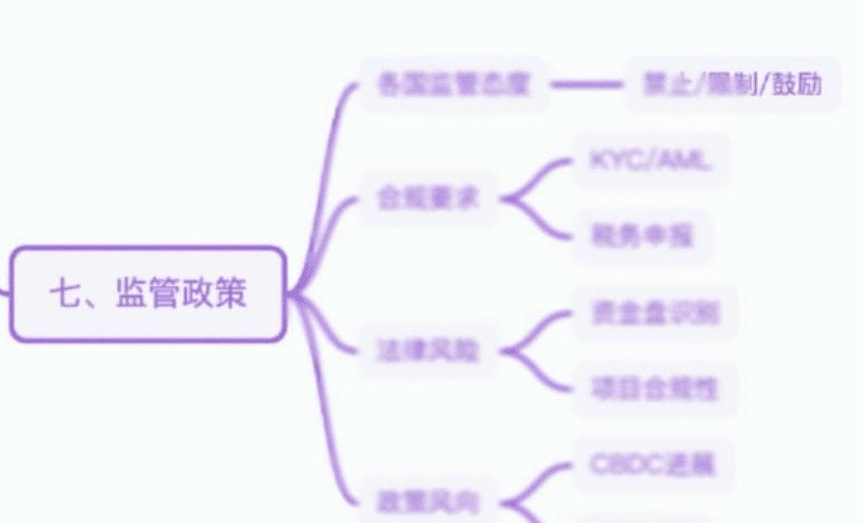
Seven: Regulatory policies in the cryptocurrency field
Trading is both a broad and a meticulous task.
For example, pursuing absolute highs and lows is counterproductive. Being vague about precision and actively taking precautions is acceptable. Perspective means knowing how to set aside meaningless issues.
Win and keep quiet; lose and keep quiet. Showing off your wins is the beginning of your losses. A happy neighbor is suffering; don't wake it up. Moreover, this mindset will make you focus on profits and losses rather than the system. The focus is not on how much you win or lose but on how much you have grown. With great virtue, wealth will naturally come. Life is also speculation; be cautious, and often reflect on your own faults.
Investing is not an industry where diligence is rewarded; in fact, it is often the opposite.
Remember, at any time, your actions may be wrong. Paradoxically, speculation is an endeavor of absolute individual heroism. You must be true to yourself while being able to let go of yourself and actively admit mistakes. How to balance this?
Profit is finding a glimmer of possibility in the impossible, maintaining composure between life and death. Therefore, speculation is life; it is only about sacrificing and gaining. Know when to stop, and then there will be gains.
The old trader only conducts actual trading; the team still has positions to take.
