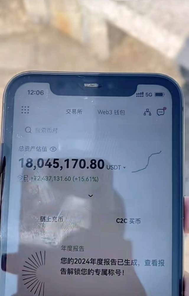
I wouldn't say I have become rich; I barely have financial freedom. In terms of living, I can only say that my expenses are sufficient. As long as the path in life and the market is correct, just strive, and the harvest will not be lacking!
I still remember when I first entered the market, I thought trading cryptocurrencies was very simple. So, I learned a few strategies and candlestick patterns and was eager to prove my abilities in the crypto world. As a result, I paid a heavy price for my arrogance. Later, when my father found out, he scolded me fiercely. From childhood to adulthood, it was the first time my father taught me a lesson, and I secretly vowed not to disappoint him.
The core of successful investing is not to seize more opportunities but to patiently wait and make the most of a single opportunity, to refine a particular asset. When the opportunity arises, use immense willpower to exploit it to the fullest. Such trading results far exceed discovering ten trading opportunities and only scratching the surface each time.
Learning technical skills and firmly grasping the main upward trend is essential. This is not just a cliché; it's from my experience as someone who has walked this path, and I hope others do not take the detours I took. Only those who have been through the rain understand how to shelter others from it! I am undoubtedly lucky; I had a mentor guide me, and now I hope to be like him, providing shelter from the wind and rain.
So how can one do well in trading cryptocurrencies? Once a person enters the financial market, it is difficult to turn back. If you are currently at a loss and still confused, but plan to treat cryptocurrency trading as a second career, you must understand 'the simplest MACD trading strategy'. Grasping this will certainly help you avoid many detours. These are personal experiences and feelings; it is recommended to save and ponder repeatedly!
The MACD indicator is one of the most classic technical indicators among all technical indicators. By correctly using this indicator and combining it with candlestick patterns (daily, weekly), individual stock trends, volume, market trends, and news of bad or good events, one can achieve a good trading effect. Below, I will share the most comprehensive uses of the MACD indicator; only those who can truly understand it are experts; this will only be shared once!
The general judgment criteria for the MACD indicator mainly revolve around the states of the fast and slow moving averages (DIF and DEA lines) and the red and green histograms (MACD histogram), as well as their shapes. General analysis methods mainly include four major aspects: the positions of the DIF and DEA, the crossing situation of the DIF and DEA, the contraction situation of the red histogram, and the shapes of the MACD chart.

01 MACD is the most commonly used indicator by experts.
The role of the MACD indicator in technical analysis is extremely special; it can be said to be an essential part of learning technical analysis. Its importance includes at least the following points:
The MACD indicator is the most effective technical indicator tested by historical trends, and it is also one of the most widely used indicators.
The MACD indicator is derived from the moving average indicator EMA and has a good application effect in grasping trend markets. Trend investors basically need to refer to this indicator in practice.
The top and bottom divergences of the MACD indicator are recognized as the best methods for 'buying low and selling high'. This method is an important tool in the concretization of trend theory and wave theory.
Many veterans have this experience: when they first enter the market, they begin learning about the MACD indicator, then slowly abandon it. After a long period of study and comparison, especially after testing in practice, they ultimately return to the MACD indicator. This shows the uniqueness of this indicator.
The application of the MACD indicator in quantitative trading is also very extensive.
It is precisely because of these advantages that the MACD indicator has become the most commonly used technical indicator among professional traders.
02
The concept and calculation of the MACD indicator.
The MACD indicator, or the Moving Average Convergence Divergence indicator, was created by Gerald Appel to track price trends and analyze candlestick buying and selling opportunities. This indicator is commonly used in trading software and is known as the 'king of indicators'. As shown in [Figure 1].
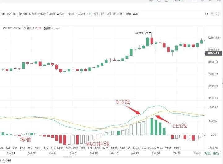
In the crypto world, the MACD indicator consists of the DIF fast line, DEA slow line, MACD histogram, and the zero axis, collectively known as 'three lines and one axis'. Investors analyze price movements through the intersections, divergences, breakthroughs, supports, and resistances of these 'three lines and one axis'. The MACD indicator can become
one of the preferred indicators in many trading software applications, indicating its wide usage. This also indirectly shows that this indicator is one of the most effective and practical indicators tested by history.#币安Alpha上新
03
The golden cross and death cross of the MACD.
'Golden cross' and 'death cross' patterns are extremely important shapes in technical indicator analysis.
The golden cross pattern, also known as the golden crossover, refers to the situation where the shorter cycle indicator line crosses upwards and surpasses the longer cycle indicator line (of the same type), which often indicates the appearance of short-term buying opportunities. If a golden cross pattern appears at
①. After a short-term rapid decline during a downward trend;
②. After a wave of pullback movement during the upward trend;
③. After a consolidation trend during the upward movement,
That is, when the golden cross pattern appears at a stage low point, it is a more reliable buying signal.
The death cross pattern, also known as the death cross, refers to the shorter cycle indicator line crossing downwards and passing through the longer cycle indicator line (of the same type), which often indicates the appearance of a short-term sell opportunity. If the death cross pattern appears
①. After a consolidation trend during a downward movement;
②. After a wave of rebound upward movement during the upward trend;
③. After a short-term rapid increase during an upward trend;
That is, when the death cross pattern appears at a stage high point, it is a more reliable sell signal.
After understanding the golden cross pattern and the death cross pattern, we can take a closer look at the golden cross and death cross of the MACD indicator line; the appearance of golden and death crosses at different positions will reflect different market meanings.
Situation one: Buying point of low-level golden cross. If the position of the DIFF line and DEA line golden cross occurs below the zero axis and is far from the zero axis, this golden cross is called a low-level golden cross. Investors can view this golden cross merely as a short-term price rebound; whether the candlestick can form a true reversal still needs to be observed and confirmed in conjunction with other indicators.
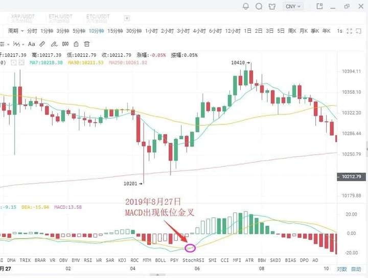
As shown in the figure above: On August 27, 2019, the BTC 10-minute candlestick chart showed that a low-level golden cross appeared with the price's pullback, followed by a rebound of $200. Short-term investors can seize the opportunity to enter.
Situation two: Buying point of golden cross near the zero axis.#非农就业数据来袭
If an upward trend has formed and the golden cross between the DIFF line and DEA line occurs near the zero axis, this is often an excellent buying opportunity for investors.
This is because after an upward trend is formed, a golden cross near the zero axis indicates that the adjustment phase has completely ended and a new round of upward movement has begun. If this is accompanied by a golden cross in the volume line, it indicates that the price increase is supported by trading volume, making the buying signal more reliable. Once this buying point appears, investors should definitely not miss it, or they will miss a big upward trend.
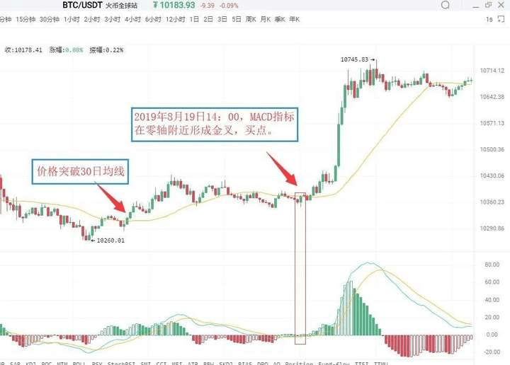
As shown in the figure above: On August 19, 2019, at 09:30, the BTC 5-minute candlestick chart indicated that Bitcoin broke above the 30-day moving average, indicating that an upward trend has begun to take shape. For a period afterward, the price almost continuously operated above the 30-day moving average. At 14:00 on August 19, 2019, the MACD indicator formed a golden cross near the zero axis, indicating that the market is about to experience a significant upward trend. Investors can buy decisively.
Situation three: Buying point of high-level golden cross.
If the DIFF line intersects with the DEA line to form a golden cross above the zero axis, and is in an area far from the zero axis, this golden cross is called a high-level golden cross. High-level golden crosses generally occur in
In the consolidation trend during the upward movement of the candlestick, it indicates that the consolidation has ended, and the candlestick is about to resume the previous upward trend. Therefore, once a high-level golden cross appears, it is a good buying signal for accumulation. In practice, when the upward trend forms, and the candlestick rises slowly and lasts for a long time, once the MACD indicator forms a high-level golden cross, it often indicates that the candlestick is about to accelerate upward. This is why high-level golden crosses can also be used for wave operations. Investors can utilize the MACD indicator to continuously hunt for upward waves in an upward trend.
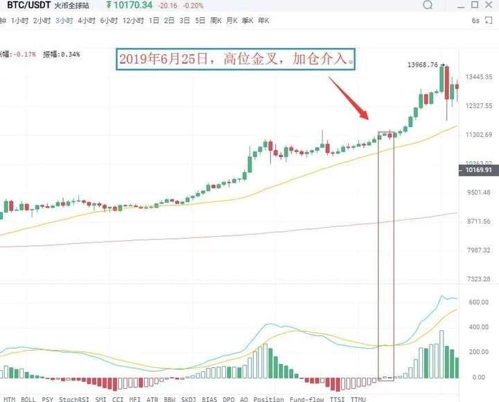
As shown in the figure above: On June 25, 2019, the BTC 3-hour candlestick chart showed that the price of Bitcoin, during an upward trend, rose again after a consolidation, while the MACD indicator appeared a high-level golden cross. This indicates that the pullback has ended, and the price will resume the previous upward trend. Investors should pay attention to seizing this accumulation buying point.
Situation four: Selling point of low-level death cross.
A low-level death cross refers to a death cross that occurs far below the zero axis. This type of low-level death cross often appears at the end of an upward rebound during a downward trend; therefore, a low-level death cross is a sell signal indicating the end of the rebound. At this point, investors who are not in the market should be cautious, while those holding positions who are deeply trapped can sell first and wait to buy back after the price declines to reduce costs.
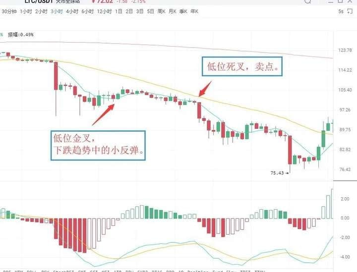
As shown in the figure above: On July 14, 2019, the LTC 3-hour candlestick chart showed that the MACD indicator of Litecoin appeared a low-level golden cross, and the price showed a small rebound. After that, it quickly went down, and soon after, the MACD indicator appeared a death cross below the zero axis. The candlestick then began a new downward trend. Spot investors can sell their positions at the death cross and then buy back to reduce their holding costs.
Situation five: Selling point of death cross near the zero axis. If the previous market direction has been a downward trend, when the DIFF line near the zero axis breaks below the DEA line forming a crossing, it is called a death cross near the zero axis, indicating that the market has accumulated considerable downward momentum near the zero axis. The appearance of the death cross indicates that downward momentum in the market is beginning to release, and the candlestick will continue the original downward trend, signaling a sell.
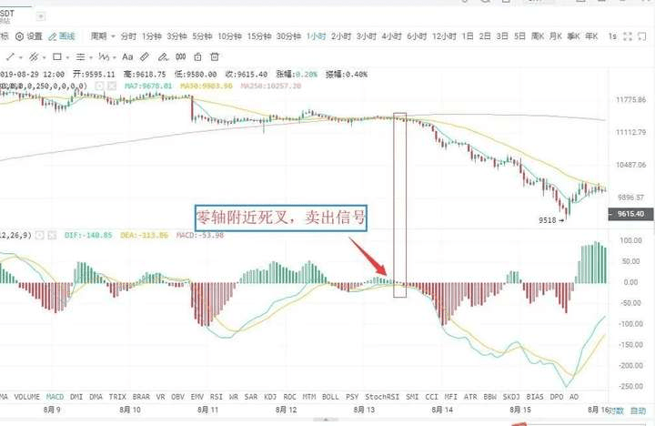
As shown in the figure above: On August 12, 2019, the BTC 1-hour candlestick chart showed that the DIFF line of Bitcoin broke below the DEA line near the zero axis, forming a death cross. This indicates that the market's downward momentum is beginning to release, signaling a sell; investors should sell their positions decisively, or risk being deeply trapped.
Situation six: Selling point of high-level death cross.
A high-level death cross occurs when the DIFF line breaks below the DEA line at a location far above the zero axis. This type of death cross pattern is sometimes accompanied by a MACD divergence. It manifests as: during a continuous upward trend, the price keeps making new highs, but the MACD's DIF line and DEA line no longer continue to rise or climb but instead diverge from the price's trend, gradually moving downward.
Above the zero axis, when the DIF line crosses downward through the DEA line, forming a downward crossing trend, it belongs to a death cross and is a relatively reliable sell signal.

As shown in the figure above: On August 23, 2019, the TRX 1-hour candlestick chart showed that after a previous upward segment, the price continued to make new highs, but the DIF line and DEA line no longer continued to rise, eventually forming a death cross, signaling a sell.
04
MACD and candlestick divergence.
Divergence is a term used in physics to describe momentum; in technical analysis, it is a widely used method with a high success rate. In a downward trend, when the price makes a new low while the indicator line does not make a new low, this is called a bottom divergence, indicating that upward momentum is accumulating.
This is a buying signal. In an upward trend, when the price makes a new high while the indicator line does not make a new high, it is called a top divergence, indicating that downward momentum is accumulating, which signals a sell.
Ⅰ. Bottom divergence.
The bottom divergence between the MACD histogram and the DIFF line.
The bottom divergence between the DIFF line and the price refers to a situation in a downward trend where, when the price makes a new low, the DIFF line does not make a new low. It indicates that during the price's decline, the DIFF line's decline is smaller than the price's decline, and the upward momentum in the market is gradually accumulating, indicating that the price is about to stop falling, with a higher probability of rising in the following period. The MACD histogram, hidden behind the DIFF line, is divided into red and green, and its divergence with the price is an important use of the MACD indicator, widely applied in practice. The bottom divergence between the MACD histogram and the price refers to a situation where the price continuously makes new lows, but the MACD histogram does not follow suit. The upward momentum in the market is accumulating, and the price is about to stop falling, with a higher probability of rising in the next period. When a bottom divergence occurs, investors can grasp specific buying points through two methods.
Specific buying points.
The bottom divergence between the DIFF line, MACD histogram, and price is not a specific point in time but a pattern that appears over a period. However, the specific buying point for investors is a specific moment, indicating that the price is about to stop falling. Therefore, to grasp a specific buying time, when the DIFF line, MACD histogram, and candlestick show a bottom divergence, investors must combine this bottom divergence with other technical analysis tools to specify the buying point.
First: The histogram changes color or the MACD forms a golden cross.
A change in the color of the histogram indicates that the market's upward momentum has begun to dominate. It generally appears after 'the histogram shortens', and while it may be late, it is more reliable. When a bottom divergence occurs, if the histogram changes color or a golden cross forms smoothly, investors can buy.
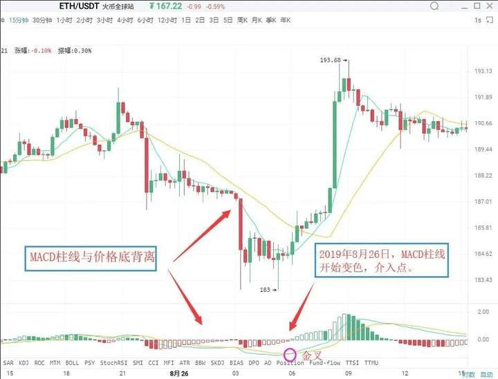
As shown in the figure above: On August 26, 2019, the Ethereum (ETH) 15-minute candlestick chart indicated that the price of Ethereum hit a new low during the decline, but the MACD histogram did not hit a new low, forming a divergence between the histogram and the price. This indicates that the market's upward momentum is beginning to accumulate, and there is a high possibility that a wave of upward movement will follow. Subsequently, the histogram changed color; these two sequential buying signals combined further increased the reliability of the upward meaning. Investors can enter when the histogram changes color.
Second: Combine with other technical analysis tools and candlestick reversal patterns. For instance, combining bottom divergence with candlestick reversal patterns, such as 'single pin bottoming' and 'three soldiers at the bottom', is a concrete application of the 'multiple indicators working together' principle.
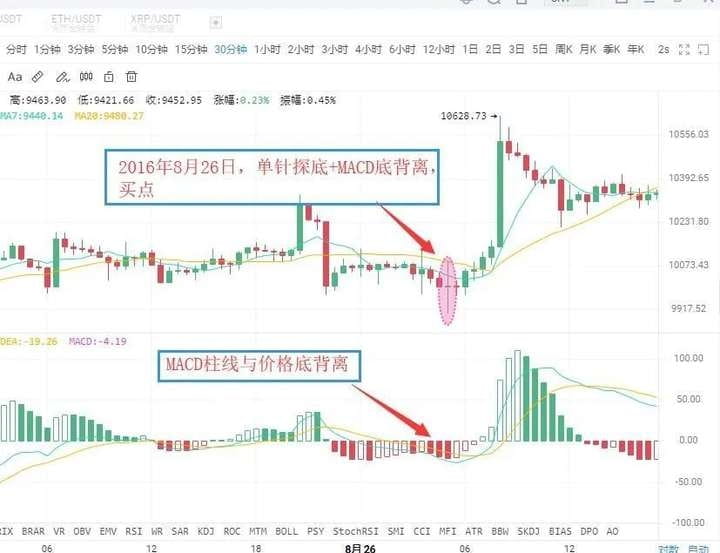
As shown in the figure above: On August 26, 2016, the BTC 30-minute candlestick chart showed that the price of Bitcoin hit a new low, but the MACD histogram did not hit a new low, forming a divergence between the histogram and the price, indicating that the market's upward momentum was continuously strengthening. Accompanied by the price's decline and stabilization, a buying signal was formed: 'MACD histogram and price divergence + candlestick single pin bottoming'. Subsequently, the price showed an upward trend.
Ⅱ. Top divergence.
The top divergence between the MACD histogram and the DIFF line.
The top divergence between the MACD histogram and the candlestick refers to a situation where, during an upward trend, when the price makes a new high, the MACD histogram does not make a new high. This indicates that downward momentum in the market is accumulating, and the price may decline at any time.
The top divergence between the DIFF line and the candlestick refers to a situation in an upward trend where, when the price makes a new high, the DIFF line does not make a new high. This indicates that downward momentum in the market is continually accumulating, and there is a higher probability of a wave of downward movement to follow. The specific selling timing is similar to the bottom divergence; in practice, according to the principle of multiple indicators working together, investors can combine the following methods to make the sell signal more specific.
First: The histogram changes color or the MACD forms a death cross.
After the top divergence between the MACD histogram and the candlestick forms, if the histogram suddenly shortens significantly, it indicates that the market's downward momentum is beginning to release. Investors should pay attention to sell in a timely manner. A change in the MACD histogram indicates that the market's downward momentum has taken over; this generally occurs after the histogram has been continuously shortening. If the histogram and candlestick show a top divergence, followed by a color change in the histogram or a death cross in the MACD, investors should pay attention to exit in a timely manner.
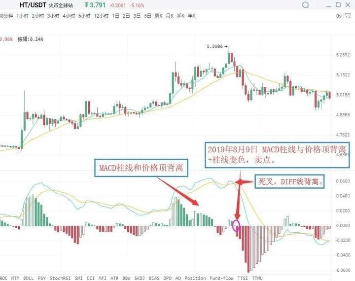
As shown in the figure above: On August 9, 2019, the HT 1-hour candlestick chart indicated that the price of Huobi reached a new high, but the MACD histogram did not reach a new high, forming a divergence between the histogram and the price. This indicates that downward momentum in the market is beginning to accumulate, and the price may experience a downward trend at any time. Subsequently, the MACD histogram changed from red to green, issuing a 'histogram and price top divergence + histogram color change' sell signal. Investors should pay attention to exit in a timely manner.
Second: Combine with other technical analysis tools and candlestick reversal patterns. After the MACD histogram and price top divergence occurs, if other technical analysis tools also simultaneously give sell signals, the reliability of the market's sell meaning will greatly increase, and investors should be cautious and decisive in exiting. Common sell signals in this type often include 'histogram and price top divergence + candlestick reversal patterns' and so on.
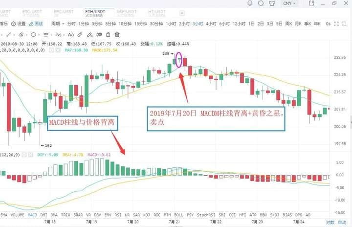
As shown in the figure above: On July 20, 2019, the ETH 3-hour candlestick chart showed that the price of Ethereum made a new high, but the MACD histogram did not reach a new high, forming a divergence between the histogram and the price. This indicates that downward momentum in the market is continuously strengthening, and the price may experience a downward trend. Subsequently, the MACD histogram gradually shortened, while the candlestick formed a bearish evening star pattern. Investors should pay attention to exit in a timely manner, after which the candlestick experienced a significant downward trend.
05
Modification of MACD parameters.
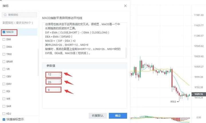
The lag in responding to price changes sometimes results in less than ideal buying and selling price levels; this is a flaw of the MACD indicator. One way to change this situation is by modifying the indicator parameters, making the MACD indicator more sensitive to trends, thus allowing for more ideal buying and selling price levels. In commonly used trading software, the default parameters for the MACD indicator are 12/26/9. Under such parameter settings, the MACD indicator often reacts with noticeable lag to price changes. The lag of the MACD indicator can be addressed by adjusting the parameters. Common parameter combinations include 5/34/5, 5/10/30, etc. Investors can also explore and experiment in practice.
Evening star: In the process of an upward movement, a long bullish candlestick appears first, followed by a shorter candlestick (either bullish or bearish) the next day, which is metaphorically called a star; this is the main part of the candlestick formation. The third candlestick is a long bearish candlestick that has penetrated deeply into the body of the first candlestick. The evening star is a signal of price topping and retreating, with some predicting an accuracy rate of over 80%.
In the crypto world, it is essentially a battle between retail investors and large players. If you do not have cutting-edge information or first-hand data, you can only be cut! Welcome like-minded people in the crypto world to work together to grow stronger.
The martial arts manual has been given to everyone; whether one can become famous in the martial world depends on oneself.
Even the most diligent fisherman would not go out to sea to fish during a storm; instead, he would protect his boat carefully. This season will pass; a sunny day will eventually come! Pay attention to the banquet; I will teach you both fishing and how to fish. The door to the crypto world is always open; only by going with the trend can one lead a life of ease. Save this and remember it!