Core Principles: Strict Positioning | Only Trade BTC+/ETH+ | Stop Loss > Take Profit | Limit to 3 Times
I. Starting Stage: 300U → 1100U (3 Levels Sprint)
Strategy: 100U × 3 times, each with 10x leverage, 7% Take Profit / 5% Stop Loss (Risk-Reward Ratio 1.4:1)
Execution Steps: Level 1 (100U → 200U) Target: Profit 70U (7% Take Profit) Stop Loss: -50U (5%) Success → Enter Level 2, Failure → Remaining 200U Adjust Strategy
Level 2 (200U → 400U) Target: Profit 140U Stop Loss: -100U Success → Level 3, Failure → Remaining 100U Guaranteed Minimum
Level 3 (400U → 800U) Target: Profit 280U Stop Loss: -200U Success → Capital Reaches 1100U, Enter Stable Strategy
Key Discipline: Up to 3 times! Regardless of success or failure, subsequently switch to a conservative approach only trading BTC/ETH, rejecting altcoins (low liquidity, high spike risk)
II. 1100U Stage: Three-Dimensional Matrix Strategy (Ultra Short + Swing + Trend)
Capital Allocation: Ultra Short Position (300U) → 15-Minute Quick In and Out Swing Trade (500U) → 4-Hour Level Trading + Profitable Dollar-Cost Averaging BTC Trend Position (200U) → Weekly Major Opportunity Sniping Reserve Fund (100U) → Emergency Replenishment/Unexpected Opportunities
1. Ultra Short Position (300U, Intraday Trading)
Strategy: 10x leverage, EMA12++MACD+ (5,13,1) Signal Entry: 15-Minute Candlestick Breaks Above the Previous 3 Highs + Volume Take Profit: 3%~5% (Flexible Trailing Stop) Stop Loss: 2% Mandatory Stop Loss Cutoff: Two Consecutive Losses → Pause for 1 Hour
2. Swing Position (500U, 4-Hour Level)
Strategy: 5x leverage, Bollinger Bands + Converging Breakout Entry: 4H Bollinger Band Width <20% Annual Line, Break Above Upper Band for Long/Below Lower Band for Short Stop Loss: 1.5x Band Width Profit Handling: Weekly Profit 40% Dollar-Cost Average BTC
3. Trend Position (200U, Weekly Opportunities)
Strategy: 3x leverage, wait for extreme market conditions: Weekly RSI+(14) <30 (oversold) or >70 (overbought), Daily Chart 3 Consecutive Same Direction Candlesticks, 4-Hour TD Sequence +=9 (reversal signal) Take Profit: Trailing Stop, Risk-Reward Ratio ≥ 3:1
III. Ultimate Risk Control (Death Line) Daily Loss > 15% → Mandatory Rest for 24 Hours Weekly Profit > 30% → Halve Leverage for the Next Day Withdraw 20% of Monthly Profit → Cash Out
Summary: First 3 Levels (100U × 3 times) → Quick Accumulation of Capital After Stage (1100U) → Ultra Short + Swing + Trend Combination Discipline > Technique! Reject Holding Positions, Reject Frequent Trading. This way, you can aim for high returns while controlling risks, suitable for players starting from 300U!

Killer Technique! Please keep an eye on these 8 price action chart patterns; the opportunity to double profits lies within them.
Price Action (Price Action) chart patterns can be said to be a major trading tool for modern traders. Today, I will mainly introduce 8 types of price action chart patterns that have significantly impacted my trading.
Next, I will introduce you to 'BOSS+' and 'BEAR+' along with more other price action chart patterns.
Price Action Pattern #1: Bullish Engulfing Strong Support (BOSS)
Appearing at a strong support level bullish engulfing candlestick pattern. The most important aspect here is not the exact candlestick chart, but its location. Ideally, it should be right at or slightly below the support level.

As the name suggests, BOSS pattern is one of the best price action patterns. The above chart is taken from a book about price action and is one of the best charts describing this pattern.
From the above chart, it can be seen that after the formation of the BOSS price action chart pattern, the price experienced a significant rise.
There are many such cases, the most recent one being the BOSS price action chart pattern of EUR/USD:

The above chart shows a major demand zone/support level. When the price tests it, it forms an inside bar and attracts a large number of market participants to enter. One reason I call this pattern a strong support bullish engulfing is that any candlestick pattern could be the triggering factor.
Price Action Pattern #2: Bearish Engulfing Strong Resistance (BEAR)
This price action chart pattern means that the price needs to test a strong resistance level or supply zone.

The above chart is also taken from (Price Action Trading Manual).
I have found that for this price action pattern, the bearish engulfing (Bearish Engulfing) may be the best candlestick pattern. But from a long-term perspective, this chart pattern will continue to appear.
This is an example of a GBP/USD daily chart from 2018:

From the above chart, we can see that this double candlestick bearish engulfing candlestick pattern has a very strong trend change effect. The engulfing pattern can consist of multiple candlestick bodies. Importantly, the bearish candlestick (red) completely covers the prior bullish candlestick (green) body. This indicates that bears are ready to push the price in the opposite direction for a long time.
BEAR price action chart pattern is considered one of the best bearish price action chart patterns in my trading career.
Price Action Pattern #3: Inside Bar+ in a Trend (IBWT)

IBWT price action pattern is one of my favorite candlestick patterns for two main reasons:
1. High Reliability
2. Provides a high-risk reward ratio; from a trading return perspective, this may be the highest price action chart pattern.
Let’s see why I say this.

Looking at the above chart, the reason this candlestick pattern has such a high risk-reward ratio is that the closing price of the red candlestick is very close to the low of the green candlestick.
This allows for setting stricter stop losses, thus there is a higher risk-reward ratio. In other words, this means you can risk less money to gain more profit.
The diagram below is another example of an inside bar from the Daily DAX chart:

You can see from the above chart that the inside bar only allows you to use a very small stop loss to 'aim' for a larger return. The risk-reward ratio in the above chart is almost 1:12.
This means that if your entry point is 9502 and your stop loss is 9339, you are taking a risk of 163 points, but if the take profit target is 11349, it means the potential return on this trade is a profit of 1847 points.

I have to say this is a very nice trade, with a risk-reward ratio of up to 11.38.
Price Action Pattern #4: Supply Zone Pin Bar+ (SUP)
The SUP chart pattern is one of the most effective bearish continuation patterns. We need the following two conditions to confirm the occurrence of this pattern:
1. Major/Minor Supply Zone/Resistance Level
2. Price Rebound Price Action Pattern

The above chart is from October 23, 2020, showing the 1-hour chart of gold. We can see that the pin bar encountered resistance and fell back at the important level of $1912.
Once the price rises to the pivot level, a price rejection may occur, followed by a sudden price drop.

At this time, you need to decisively enter to seize these trading opportunities. As you can see, after the pin bar encountered resistance, the next candlestick will be a very long bearish candlestick.
Price Action Pattern #5: Random Resistance Rejection (RRR+)

The above chart is the GBP/USD 1-hour chart. It shows a price action chart pattern called RRR (Random Resistance Rejection).
It's called 'random' because it can happen at any point in time, as well as in important 'event convergence zones.'
Similar to previous price action patterns, RRR appears in different timeframe charts. The rule of thumb tells us: 'The higher the timeframe, the more accurate the signal.'
In this case, we observe a resistance level turning into a support level, and a pin bar forming a rebound at that level. Coincidentally, the candlestick on the daily chart is an inside bar.
This is a very good example of high-probability trading. However, it is important to note not to confuse this pattern with a breakout.
Price Action Pattern #6: Demand Zone Candlestick (DZC+)

The above chart is a price action chart pattern obtained from the EUR/USD hourly chart, namely the demand zone candlestick pattern.
To validate this price action pattern, we need to follow two important rules:
1. Secondary Demand Zone 2. Candlestick Confirmation
This chart pattern is very similar to a strong support bullish pattern (BOSS). The only major difference is that it usually appears in a secondary demand zone rather than a primary demand zone. See the diagram below:
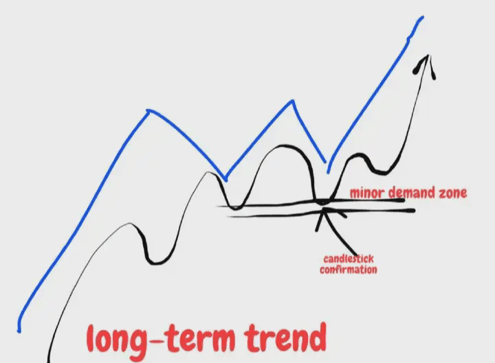
Those familiar with me should know that in trading, I try to stay away from diagonal trend lines or channels. Here, I am just showing you a classic example.
Once a secondary demand zone is identified, we can mark it on the chart and lurk near the price. When the price is 'trapped' in the demand zone, all we need to do is use price action for confirmation and then look for trading opportunities.
This may be one of the most powerful trend continuation techniques, which can also be used to enforce strict stop losses.
Price Action Pattern #7: Theory and Reality (TVR+)

A chart pattern that fails to operate as expected or theoretically with reality. Many traders blindly follow converging triangle patterns, but in reality, they are not as precise as people imagine.
One of the advantages of converging triangles is that they are easy to spot. The problem with this trading setup is that because they are easy to spot, many traders will try to profit from them.
You must know that trading is a zero-sum game, and it does not allow such behavior to exist. Blindly chasing high prices, traders become the ones who get harvested.
One of the issues with TVR price action patterns is shown in the diagram below:

When you identify this triangular pattern, most traders will anticipate that the price will break upwards.
However, contrary to expectations, the price goes in the opposite direction.
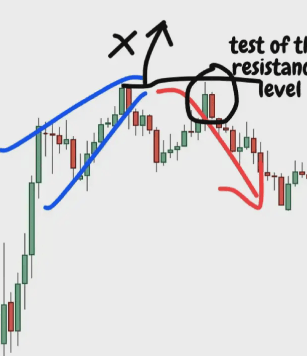
The reason we did not see an upward breakout is that the price was not strong enough to withstand the test of the resistance level and began to turn down.
Before starting to decline, one must also pay attention to the inside bar.
Price Action Pattern #8: Theory and Reality 2 (TVR2)

Let's look at the last price action chart pattern. Of course, this does not mean we have covered all price action patterns. These 8 price action patterns are just some common ones in our daily trading.
So, what can we expect from price action patterns?
We see that when the price fluctuates in a range, a breakout is expected. Traders easily fall into this trap. The closer the price is to the resistance level, the more eager they are to buy.
Let's illustrate it with a sketch:

So how to interpret the bullish and bearish sentiments is determined by capital. And how capital operates actually depends on market reactions and retail traders' actions. Retail traders panic, capital greedily buys in, and when retail traders get greedy, capital immediately escapes. Utilizing emotions to harvest retail traders, capital really does it to perfection, you could say it's effortless.
Please remember! Fighting against emotions is the only way for retail traders.
