The candlestick chart is a price record chart of the trading market. In addition to cryptocurrencies, various trading markets such as stocks, gold, and crude oil will use candlestick charts.

Being able to understand K-line is one of the essential basic skills of technical analysis. Compared with simple price trend lines, K-line can provide more information. This article is an introductory tutorial on K-line, which will explain what K-line is, the principle of K-line, how to interpret K-line, and how to choose the appropriate time frame K-line according to your trading frequency.
What is K-line?
K-line is a chart that records the price trend of the trading market. The figure below is the K-line chart of Bitcoin on the Wei'an Exchange, where red and green are all K-lines, and each one = its corresponding time (four hours in this figure).

The five basic elements of K-line:
1. Opening price
2. Closing price
3. Highest price during the period
4. The lowest price during the period
5. Up or down (open price > closing price = up, open price < closing price = down)
The actual drawing is like this:
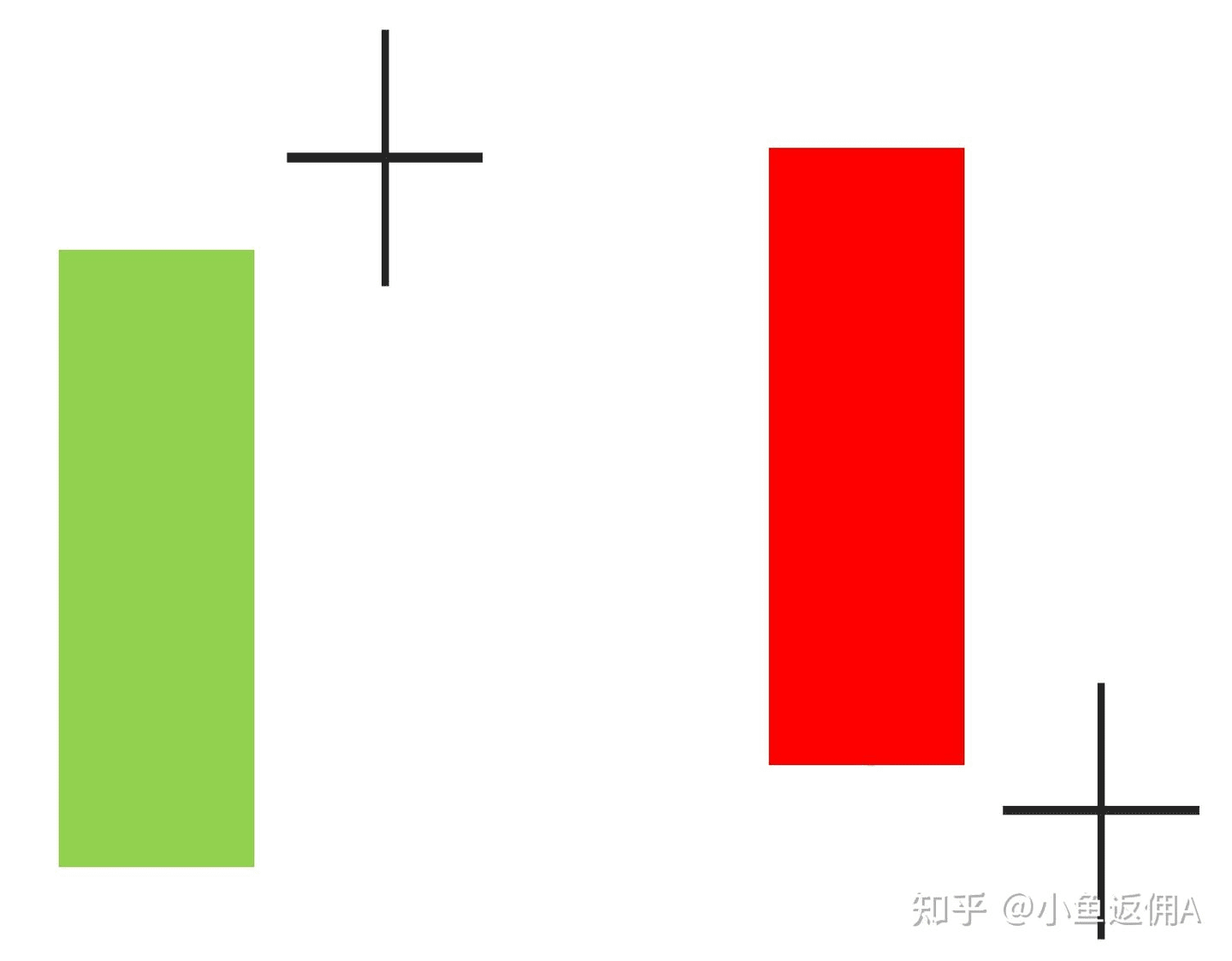
The body of the K-line is between the opening and closing prices.
The highest and lowest prices are the lines above and below the entity, called the upper shadow / lower shadow
Default color: green for rising prices, red for falling prices (colors are adjustable)

The K-line looks a bit like a candle, and some people call it a candle chart. The real part is the candle body, and the shadow part is the candle wick.
Each K-line is drawn according to the trend in the time frame. The cryptocurrency market has no closing time and is trading at any time. Taking the 1-day K-line as an example, the price at 00:00:00 on the day is used as the opening price, and the price at 23:59:59 is used as the closing price. The highest and lowest prices of the day are added to draw the K-line of the day.
Each K-line represents the transaction data in that time. For example, in the crypto market, one day (24 hours) is composed of 6 4-hour K-lines, and one year (365 days) is composed of 365 daily K-lines. The order of the K-lines can be used to observe whether the current market trend is bullish, bearish, or in a consolidation phase, waiting for a direction to move out.
Longer periods can be measured in days, weeks, months, hours or even minutes. Generally, mid- to long-term traders focus on the 4-hour line, daily line, weekly line and other time periods.

General price chart:

K-line chart:

K-line provides more information. The picture shows Bitcoin's 4-hour K-line. By looking at the color, you can know the direction of rise and fall in those 4 hours. By looking at the length of the K-line entity and the length of the upper and lower shadows, you can also know the range of fluctuations in those 4 hours.
Interpretation of a single candlestick
You don’t need to try to interpret every candlestick at the beginning, just focus on some special patterns:
Interpretation of long real body and short shadow candlestick

This kind of K-line with only a real body and almost no shadow is a signal that deserves priority attention. A very long green K-line means that there is a strong buying force during that period, and vice versa, it means a strong selling force.
There are different interpretations when it appears in different positions. If this K-line breakthrough appears after a period of consolidation, it may be a statement that the market has broken out of the deadlock, the buyer has broken through or the seller has broken through, and the market has moved to the next stage. However, if this K-line continues after a long rise or fall, it may be a signal of exhaustion, and the stage market is about to end.
As shown in the figure below, the two big green Ks on the left and right appear in different positions and have different interpretations.

Interpretation of long shadow and short body candlestick

It is just the opposite of the previous one. The body is very short or almost non-existent, but the upper and lower shadows are very long. There are various names for the K-line, such as nail, cross line, pin and so on.
This K-line reflects that buying and selling are in a state of intense pulling during that time, and no one side has clearly won. It also has different interpretations when it appears in different positions. If it appears after the market has gone for a while, for example, a nail appears after a long rise, and a large needle is inserted after a long fall, it means that the buying and selling forces are no longer one-sided, and the other side has begun to counterattack, and the market is brewing a turning force. If it appears in a consolidation and shock market, it only means that the buying and selling forces are still in a fierce confrontation, and no one has won in particular for the time being. The shock may continue, and it is necessary to wait for the market to express its attitude before determining the direction of the next stage.
As shown in the figure below, needles (long upper and lower shadows) can be found at the high and low points in almost every stage. The long shadows after a long period of market trend indicate that the possibility of a change in the market is increasing.

Combining the above two paragraphs, if the following two K-line combinations appear after the market has moved for a long time, it means that the probability of a change in the market is increasing, so pay special attention to it:
Which time period K-line should I look at?

There are so many time scales for K-line, which one should I look at?

K-line interpretation needs to be combined with the previous and next trends. To see the trend from the K-line chart, at least dozens of K-lines are needed. Which time scale should be looked at? It depends on the transaction execution cycle.
If you are investing for the long term, with a monthly trading cycle and only trading once every two or three months, you can use daily K lines. In this trading cycle, there are 60-90 K lines available for judgment. For a longer cycle, such as quarters, with only trading once every two or three quarters, you can use weekly K lines.
If the trading cycle is shorter, trading once every few days, use hourly K or 4-hour K; if the cycle is shorter, trading several times a day, in hours, it may be more appropriate to use 30-minute K or 15-minute K.
After the introduction to K-line, learn more advanced technical analysis: K-line combination and morphology
K-line is the most common price chart in the trading market, with a history of more than two to three hundred years. It is said to have been invented by rice merchants in the Edo period to record the daily changes in rice prices at that time.
Because of its long history, there is a lot of relevant knowledge and research, and you can easily find several bookshelves of K-line books in bookstores/libraries.
After understanding a single K-line, you can further learn how to interpret K-line combinations and the patterns in technical analysis (common W bottom/M head/flag breakthroughs are all patterns).