 In the cryptocurrency world, trading by looking at candlestick charts is basic knowledge that every trader must learn. Candlestick charts are a fundamental challenge for novice traders learning technical analysis, but mastering them can be vastly different. This article simply teaches everyone how to understand candlestick charts; whether one can effectively utilize them depends on one's insight. I believe candlestick charts are like a battlefield map of the cryptocurrency market, reflecting investors' psychological changes and trading tactics.
Candlestick charts are a prerequisite for entering all secondary markets. We also refer to candlestick charts as Japanese candlestick charts, which originated during the Tokugawa shogunate in Japan and were invented by Munehisa Homma. They were initially used to record rice market trends and later introduced to the stock and futures markets due to their unique and detailed representation. Through candlestick charts, we can observe the opening price, closing price, highest price, lowest price, and other fluctuations over a certain period.
First, let’s open a BTC market chart and take a look at a daily line.
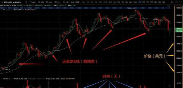 What you see on this chart, with one bar after another (candlestick chart), is: K-line
The bottom horizontal axis represents time (the unit of this chart is: days), the right vertical axis represents the unit (the unit of this chart is: USD), and the red and green bars in the chart are individual K-lines. Each K-line (bar) represents the price change in the market for one day. By connecting the K-lines of each day, we obtain a K-line chart that reflects the market trend.
A chart that briefly introduces K-lines:
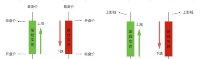 Each K-line represents 4 prices for the day: highest price, lowest price, opening price, and closing price. The portion between the opening price and closing price is drawn as a 'rectangular body', and the highest price and lowest price are connected, forming the K-line.
When the closing price is greater than the opening price, the bar is: green, the price rises, and we call it: a bullish line.
When the closing price is lower than the opening price, the bar is: red, the price falls, and we call it: a bearish line.
Note: In the Chinese stock market, bullish lines are red, and bearish lines are green; in some charts, bullish lines may also be represented as solid bars, while bearish lines may be represented as hollow bars.
Regarding bearish or bullish lines, we collectively refer to the vertical lines protruding upwards from the body as upper shadows, and the vertical lines protruding downwards from the body as lower shadows.
According to the different shapes of K-line charts, they can be divided into the following types:
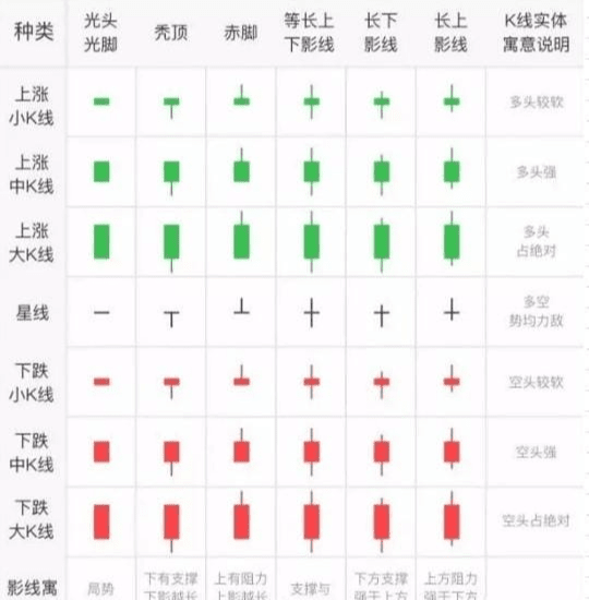 The longer the body, the greater the price difference between the opening price and the closing price. A large bullish line indicates that bulls dominate during the period, showing a clear upward trend; a large bearish line indicates that bears dominate during the period, showing a clear downward trend. The longer the shadow line, the more intense the struggle between bulls and bears, with no impact indicating a one-sided situation.
Among the more special ones is the star line, which has no body or a very small body, only a shadow line, that is, the opening price is equal to or very close to the closing price.
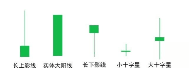 1. Long upper shadow: When this shape appears, it indicates that there is significant selling pressure, and many people are selling.
You can check the newly listed coins on various trading platforms; the K-lines on the first day are almost all of this shape. This is because when digital currencies go on the trading platform, they are often several times higher than the ICO cost price, and many people choose to sell and take profits.
2. Large bullish line: The appearance of this shape indicates a strong upward trend and short-term optimism.
3. Long lower shadow: This shape indicates that buyers are relatively strong, which is what many people see as a 'can't go down shape'. Of course, this judgment is not absolute; the future trend is only known by the big players, and one should not easily place orders just because there is such a K-line.
4. Doji: When this shape appears, coupled with very small trading volume, it indicates that both buyers and sellers are not very active, and trading is not lively.
5. Large doji: This may indicate a balance between bulls and bears, or it may indicate profit-taking. When the trading volume increases and this shape appears, do not act impulsively; it is better to observe.
The situation of bearish lines can be inferred by analogy from the situations listed above.
 I think in actual trading, looking at K-lines alone is far from enough; it must be combined with trading volume for analysis.
Expanding on this would be too much, and it can also easily mislead people to overly trust technical analysis.
This article is a simple K-line popularization for beginners.
Technical analysis can only serve as an auxiliary means for investment; for example, you should know that 'large volume declines are not good', but you must absolutely not blindly trust so-called technical analysis and act recklessly.
For example, if you randomly buy a coin with your eyes closed, the probability of it going up is 50%. Then, through technical analysis, you may increase the probability of it going up after buying to 50.1%.
Finally, I would like to give everyone a very practical piece of advice: do not chase highs based on news to buy coins.
When you hear someone say a certain coin is going to surge, you must remain calm, because the money you are trying to earn is the principal of others; similarly, others are also watching the money in your pocket at all times.
I am Xiaoyue, a professional analyst and teacher, a mentor and friend on your investment journey! As an analyst, the most basic thing is to help everyone make money. To resolve your confusion and positions, let strength speak; when you are lost and don't know what to do, follow Xiaoyue, who will guide you.#加密市场回调 $ETH
